All-New Eredivisie Logo Revealed
The Dutch first division gets a new logo for the 2017-18 season, it was announced today. The new Eredivisie 2017 logo will be already used during the last match day of the 2016-17 season this weekend. Traditionally, next season's Derbystar Eredivisie ball, which was designed by famous designer Henk Schiffmacher, will also be used for the first time on Saturday.
According to the league's statement, the 'evolution of the society and the Eredivisie makes it necessary to renew the logo's look and strength'. Alex Tielbeke, director of Eredivisie CV, explains: "In the Netherlands the Eredivisie has been the country's greatest sports competition for decades and our competition football also benefits from considerable interest at the international level. Eredivisie matches are broadcast in 186 countries and millions of football fans are familiar with our logo."
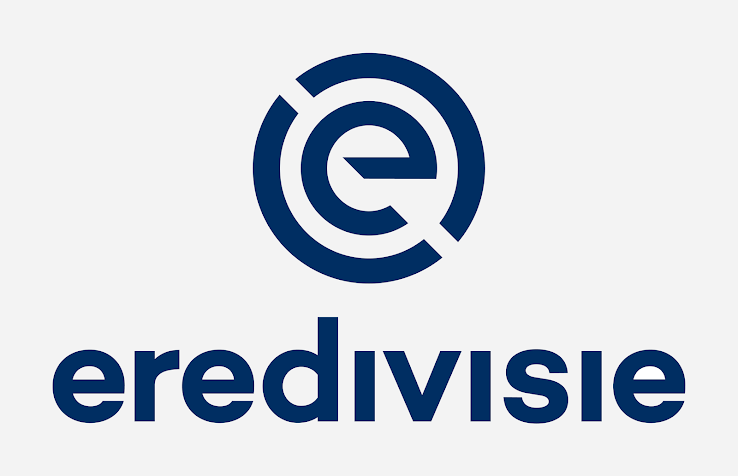
New Eredivisie 2017 Logo
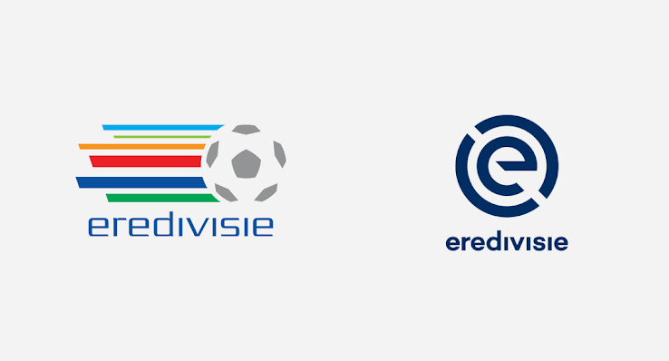
The new Eredivisie logo is totally different to the previous logo.
The new Eredivisie logo was developed by the design agency Dog and Pony. The league published a short video that reveals the characteristics of the new logo and corporate identity.
Alex Tielbeke added: "Last season, in relation to the Eredivisie's 60th anniversary, we used a special jubilee logo, which was based on the former logo. It served as a bridge between the past and the future. The introduction of a new logo is perfectly consistent with the Eredivisie's ambitions for the future."
"For the logo a conscious choice was made to use the link between the 'E' of Eredivisie and the centre circle of the football pitch. It is a powerful logo with a contemporary look. The colors of the Dutch flag are also used in the logo. The stylized 'E' refers to football competitions in both the physical and digital worlds", Alex Tielbeke reveals.
What do you think of the new Eredivisie logo? Let us know in the comments below.


