Norwich City 15-16 Third Kit Is "Made To Be Hated"
 Jul 20, 2015, by Chris

It's pretty disgusting. The first-ever Norwich City 2015-16 Premier League Third Kit is truly awful and useless, designed to "love it or hate it". What's going on here?

Norwich City already revealed the new Canaries 15-16 Home and Away Kits, which had been unpopular amongst supporters because of a massive blank space for the sponsor logo. The English Premier League today launched the new Norwich City 2015-16 Third Kit with the hashtag #LoveOrHate to spark debate on social media.
Norwich City 2015-2016 Third Shirt
This is the bold Norwich City 15-16 Third Jersey.
Design-wise, the new Norwich City 15-16 Third Kit boasts a striking horizontal stripes design featuring the traditional club colors, which are also used for the Norwich City Home and Away Kits. The crew neck collar and the sleeve cuffs are navy, while the Errea logo on the front is white.
I wanted to create a design that had the fun factor
There are many reasons why the new Norwich City 2015-2016 Third Kit is useless. It's the first time in the history that Norwich City has a third kit for a Premier League campaign. The most important one is that it clashes with the home and away kits, so it will probably never actually be used.

However, it's not Errea's fault as the shirt was designed by Steve Balmer-Walters, Head of Retail at the Club. He actually said the following.
Steve Balmer-Walters, Head of Retail at the Club, said: "As it is the first time in the club’s history we've had a third kit in the Premier League, I wanted to create a design that had the fun factor and was really out there."
He also tries to explain his design inspiration.
The hoops represent connecting with the community, and the shirt is all about having fun in the community. This shirt is going to be like marmite; you'll either love it or hate it and that’s the fun of it. We encourage fans to let us know what they think by expressing their views via social media.
1) Norwich's home, away and third kits are the same colour.
2) Youssuf Mulumbu is slowly losing the will to live. pic.twitter.com/qpbruYSWsb
— Chris Mendes (@ChrisMendesUK) July 20, 2015We think it's ridiculous that a Premier League club launches a bad shirt on purpose, and that the Italian brand Errea has not has resisted this kit (Norwich City and Errea recently extended their kit deal until 2024). What's your take on it? Let us know in the comments section below.


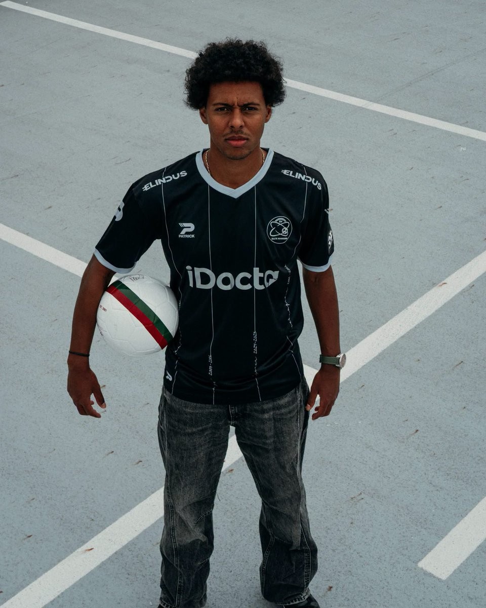
SV Zulte Waregem 26-27 Third Kit Released - 25th Anniversary Design
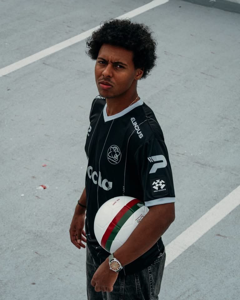
Belgian side SV Zulte Waregem and kit supplier Patrick have officially released their new third kit for the 26-27 season. Celebrating the club's silver jubilee marking 25 years since their formation in 2001, Essevee swap out their traditional red, green, and white colours for an understated black and silver look dubbed "Memories worth a touch of silver."
The Patrick SV Zulte Waregem 26-27 third jersey features a black base detailed with thin vertical silver pinstripes down the front. A closer inspection reveals that the pinstripes incorporate handwritten script documenting key milestones and dates throughout the club's history, highlighting achievements such as their inaugural 2001-02 title and their memorable 2012-13 campaign as league runners-up.
Completing the anniversary aesthetic, the jersey is finished with a silver V-neck collar and matching sleeve cuffs. All branding—including the monochrome SV Zulte Waregem club crest, Patrick maker's marks, and primary sponsors iDocta and Elindus—appears in silver and white to match the unified commemorative design.
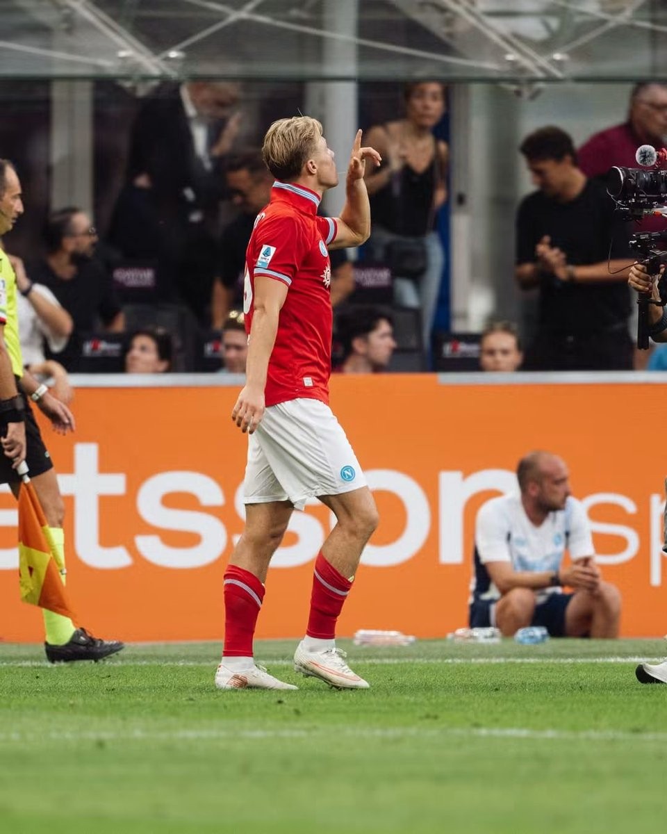
Napoli Wears Last Season's Shorts Against Inter - Here Is Why
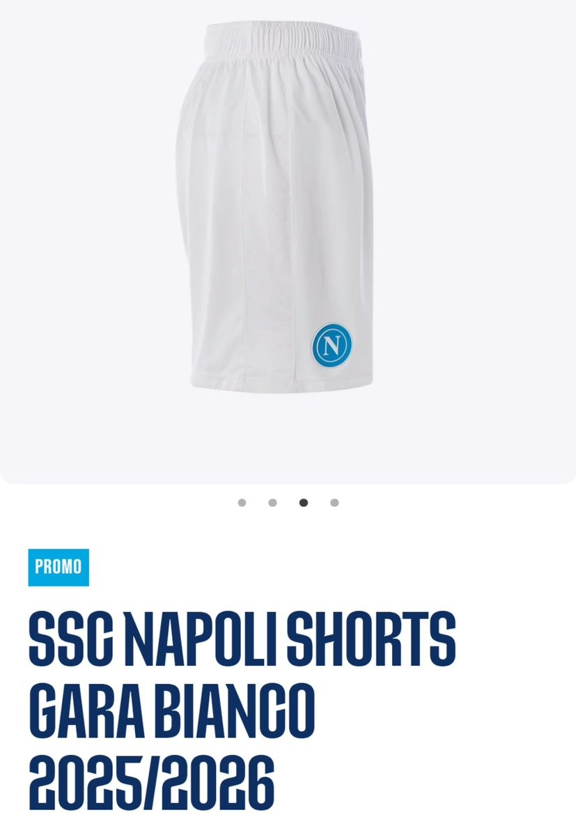
In their Serie A clash against Inter at San Siro, SSC Napoli caught the attention of eagle-eyed Napoli kit expert @TutelaMagliaNA. For the 26-27 centenary season, EA7 designed two distinct pairs of white shorts: the home shorts carry the club's special centenary crest, while the away version features an alternate Mount Vesuvius-themed logo. Because the red jersey used the standard circular Napoli crest, pairing it with either of the 26-27 white shorts would have caused a clash of emblems on the same uniform.
Rather than producing a third set of white change shorts solely to carry the standard badge, Napoli simply reused their plain white match shorts from 25-26.
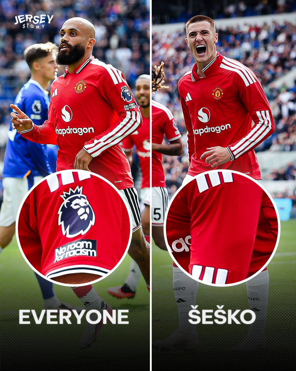

Benjamin Sesko’s Sleeve Badge Error
While all other Manchester United players took the pitch with league badges on both sleeves, Benjamin Šeško was spotted as the only one missing the patch on his left arm for reasons unknown.
Thanks to @jerseystory_vn for the information and collage.