
Stunning Club America 2016 Centenary Kits Released
 Jul 13, 2016, by Pat
The new Club America centenary kit introduces a traditional and smart design, set to complete Nike's Club America 2016-17 centenary set alongside the dark red Club America 2016 centenary away kit. Featuring Club America's all-new centenary logo, the new Nike Club America jerseys were launched yesterday.

The Club America 2016-17 third kit will also pay tribute to the club's 100th anniversary, but will only be launched later in the year, possibly September.
Club America Centenary Kit
This is the stunning Nike Club America 2016-17 centenary kit.


The new Club America 16-17 kit is pale yellow and features the all-new centenary crest to celebrate the club's 100th anniversary. A subtle gradient detail is visible towards the lower part of the Club America centenary kit, while navy trim is present on the sides of the shirt, as well as around the rear of the collar.


Rounding things off centenary-wise, a special 100 logo is placed on the upper back below the collar of the Nike Club America centenary home jersey.
Club America 2016-2017 Away Kit
This is the new Nike Club America centenary away shirt.


The new Club America centenary kit is predominantly dark red, while the club's traditional yellow is used for the Nike and Club America logos, as well as for a line that runs down each side of the shirt. The standout feature of the Club America 16-17 away kit is a a stunning print pattern that sits both on the front and the back.


Tonal piping is visible around the rear of the v-collar of the new Club America centenary shirt, while a 100 logo is placed on the upper back below the collar. As always, the Huawei and Coca-Cola sponsor logos grace the front of the Club America centenary jersey, with Corona taking the position on the upper back.
Interestingly, the dark red color of the Club America 2016-17 away kit was chosen in honor of Torino who functioned as the club's first opponent in the Estadio Azteca, in the 1966 inaugural match.
What are your thoughts on the new Club America 2016-2017 centenary home and away shirts? Let us know in the comments below.


Adidas Gives Czechia and Singapore Identical Kit Designs
Following Czechia's high-profile switch from Puma to Adidas after 33 years, kit enthusiasts quickly spotted an uncanny similarity between Czechia's newly unveiled 26-27 home shirt and another recent Adidas addition: Singapore. Both national teams recently parted ways with long-term suppliers, with Singapore ending a two-decade partnership with Nike just weeks before Czechia ended their three-decade Puma era, only for both to receive remarkably similar shirts from the Three Stripes.
The resemblance between the two red shirts is unmistakable. Both jerseys rely on the exact same template and trim styling, built around a red base with a white crew collar bordered by thin navy blue piping, matching white sleeve cuffs with identical navy trim, and white Three Stripes across the shoulders. The primary visual difference is found in the texture of the fabric, as Singapore's kit incorporates a subtle tonal wave pattern, whereas Czechia's jersey arrives in a plain, solid red finish. Even the promotional launch shots look almost mirrored, with both federations photographing players seated or standing while holding an Adidas Tiro football.
The duplication stems from Adidas' streamlined template strategy when signing new federations on tight turnaround times. With both agreements sealed relatively late in the cycle, bespoke tailor-made graphics were kept to a minimum, resulting in what fans have labeled accidental twin kits on opposite sides of the globe.


Closer Look: Raphinha Tests Next-Gen Adidas Predator 27 Prototype Boots
FC Barcelona winger Raphinha has become the latest star to be spotted testing the next-generation Adidas Predator 2027 prototype boots. Following recent sightings of Jules Koundé and Anthony Gordon, the Brazilian forward laced up the unreleased fold-over tongue model during training, offering the clearest on-pitch look yet at what the Three Stripes have prepared for their flagship control silo.


Barcelona Debut Red Shorts and Socks Variant
Barcelona officially debuted a red shorts and socks variant with their 2026-27 home shirt in the away match against Valencia, avoiding a potential kit clash.
The combination was previously used in a friendly against Birmingham City last month and is set to be used regularly throughout the season. It also marks the fourth time in the last five seasons that Barcelona have used red as a supplementary colour alongside their home shirt.
The new combination made a memorable competitive debut as Barcelona secured a 5-0 win over Valencia.
Thanks to @jerseystory_vn for the information and collage.


SV Zulte Waregem 26-27 Third Kit Released - 25th Anniversary Design
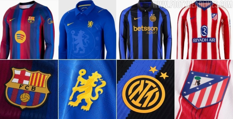
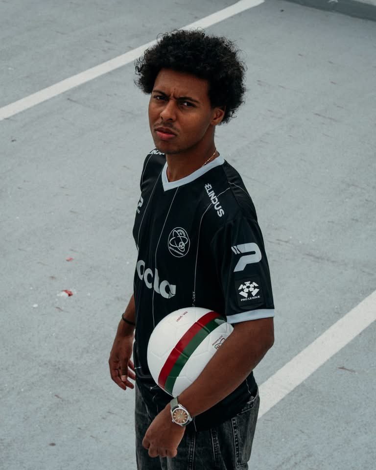
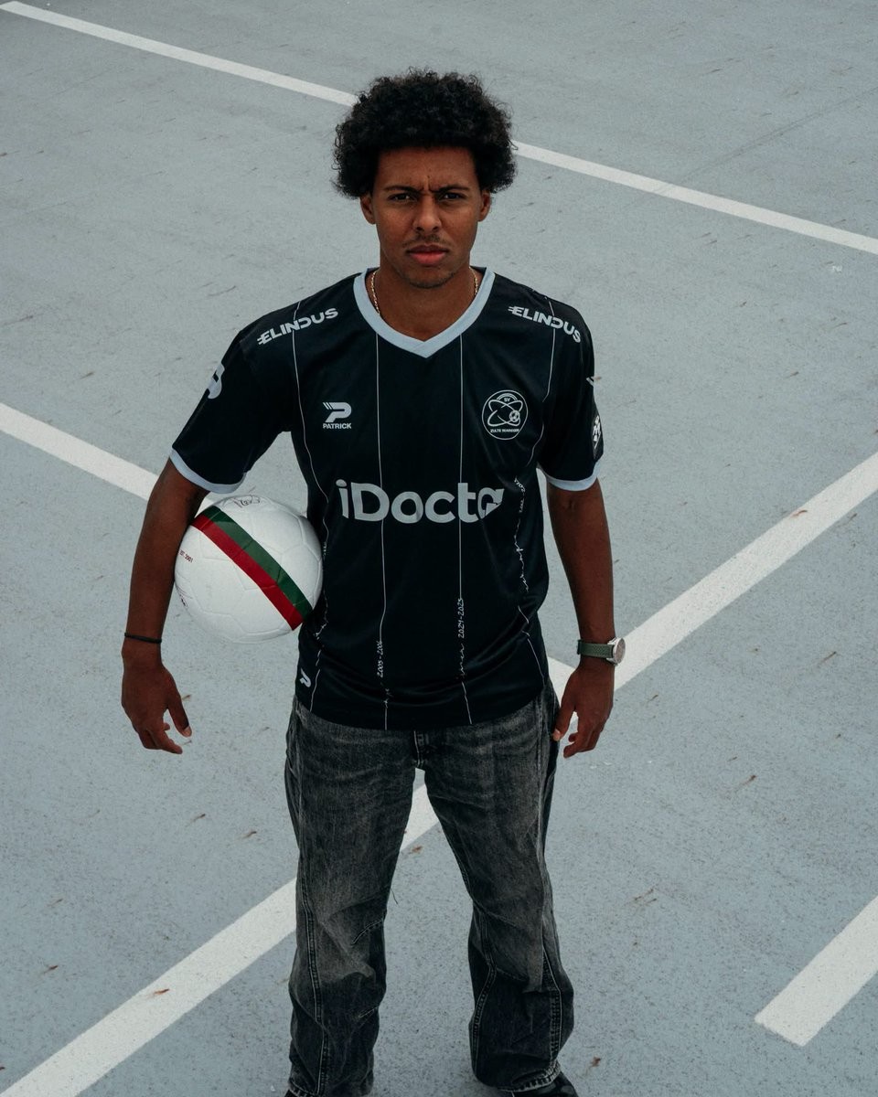
Belgian side SV Zulte Waregem and kit supplier Patrick have officially released their new third kit for the 26-27 season. Celebrating the club's silver jubilee marking 25 years since their formation in 2001, Essevee swap out their traditional red, green, and white colours for an understated black and silver look dubbed "Memories worth a touch of silver."
The Patrick SV Zulte Waregem 26-27 third jersey features a black base detailed with thin vertical silver pinstripes down the front. A closer inspection reveals that the pinstripes incorporate handwritten script documenting key milestones and dates throughout the club's history, highlighting achievements such as their inaugural 2001-02 title and their memorable 2012-13 campaign as league runners-up.
Completing the anniversary aesthetic, the jersey is finished with a silver V-neck collar and matching sleeve cuffs. All branding—including the monochrome SV Zulte Waregem club crest, Patrick maker's marks, and primary sponsors iDocta and Elindus—appears in silver and white to match the unified commemorative design.
Napoli Wears Last Season's Shorts Against Inter - Here Is Why
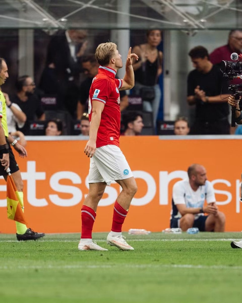
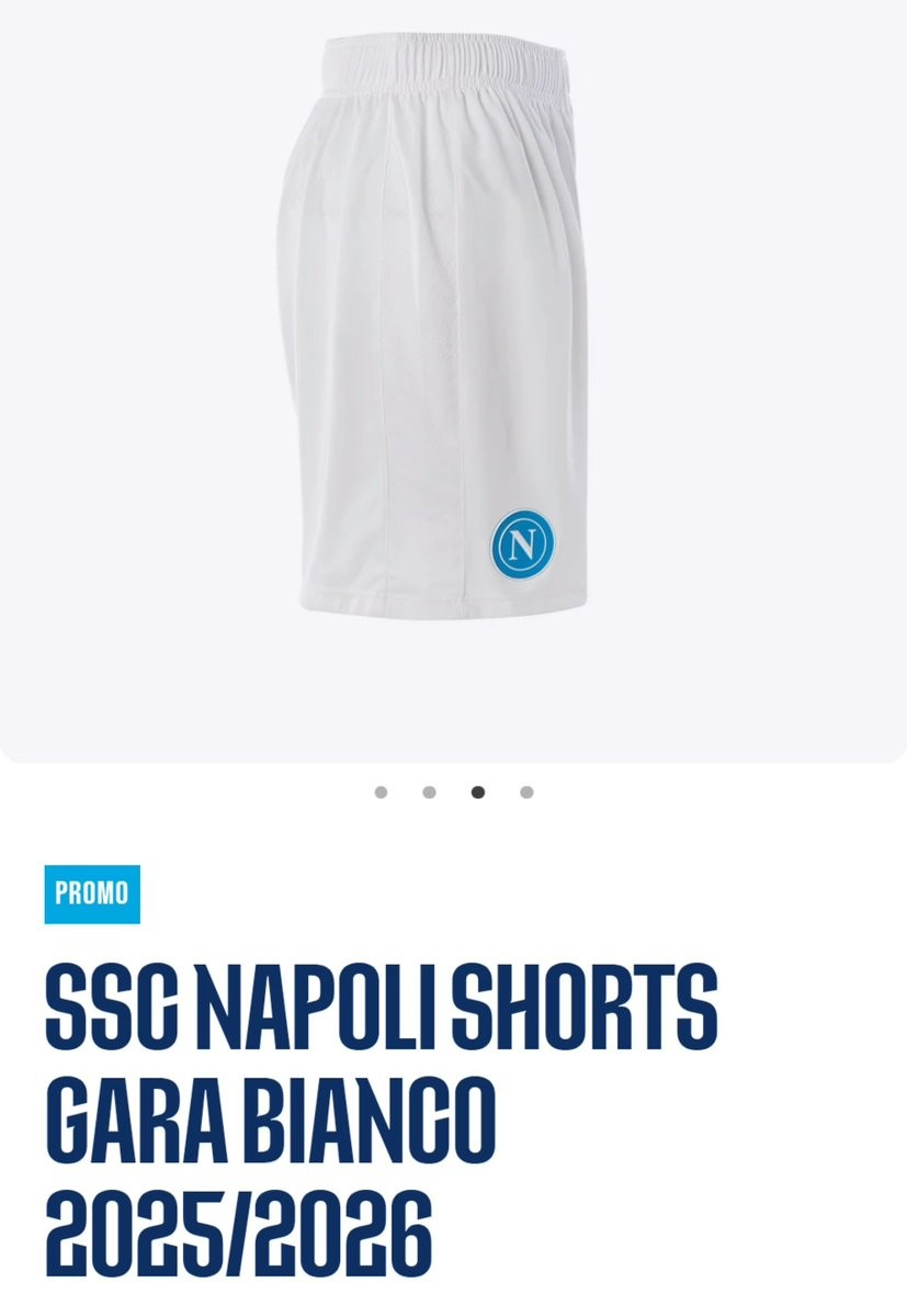
In their Serie A clash against Inter at San Siro, SSC Napoli caught the attention of eagle-eyed Napoli kit expert @TutelaMagliaNA. For the 26-27 centenary season, EA7 designed two distinct pairs of white shorts: the home shorts carry the club's special centenary crest, while the away version features an alternate Mount Vesuvius-themed logo. Because the red jersey used the standard circular Napoli crest, pairing it with either of the 26-27 white shorts would have caused a clash of emblems on the same uniform.
Rather than producing a third set of white change shorts solely to carry the standard badge, Napoli simply reused their plain white match shorts from 25-26.