
Classy Macron Hellas Verona 18-19 Home, Away & Third Kits Released
 Jul 9, 2018, by Pat


Macron and Hellas Verona, recently relegated Serie B side, a few days ago unveiled the club's new 2018-2019 home, away and third kits. The collection rests on three pillars - passion, history and tradition - and this is evident throughout it.

Hellas Verona 18-19 Home Kit
This is the Macron Hellas Verona 2018-2019 home shirt.

The Hellas Verona Macron home shirt is blue with a polo collar as well as yellow details in the knit bottom and in the sleeve edges. The front of the jersey has an ever so subtle has a striped design.


Macron's logo sits on the right chest, with the Hellas Verona badge placed on the opposite side. The inside neck is personalized with a blue label with club emblem and the inscription PER SEMPER GIALLOBLU ('Forever Yellow and Blue'). On the back, under the collar, we can see 'Verona' written in all caps.


White shorts and yellow-blue socks complete the kit.
Hellas Verona 18-19 Away Kit
This image shows the new Verona away jersey.

The jacquard striping also features on the new Hellas Verona away shirt, which is white with a blue Korean collar. The same details as on the home are present both on the inside and outside of the neck of the Hellas Verona 2018-19 away shirt.


Blue shorts and white socks complete the kit.


Hellas Verona 18-19 Third Kit
This is the Hellas Verona 2018-19 third jersey.

Completing the set is the uber-classy Hellas Verona 18-19 third shirt. It's totally black with a black Korean collar, once again completed by the label on the inside and the 'Verona' writing just below it on the back.


On the left chest is an edited version of the club crest, showing only the two mastiffs on the side of the staircase, whilst a subtly obsessed '115' in the background represents the club's age.
Black shorts and socks with gold trim complete the new third kit.

What do you think of the Hellas Verona 18-19 collection by Macron? Drop us a line below.
Thailand Forced to Change Kits at 2026 FIFA ASEAN Cup
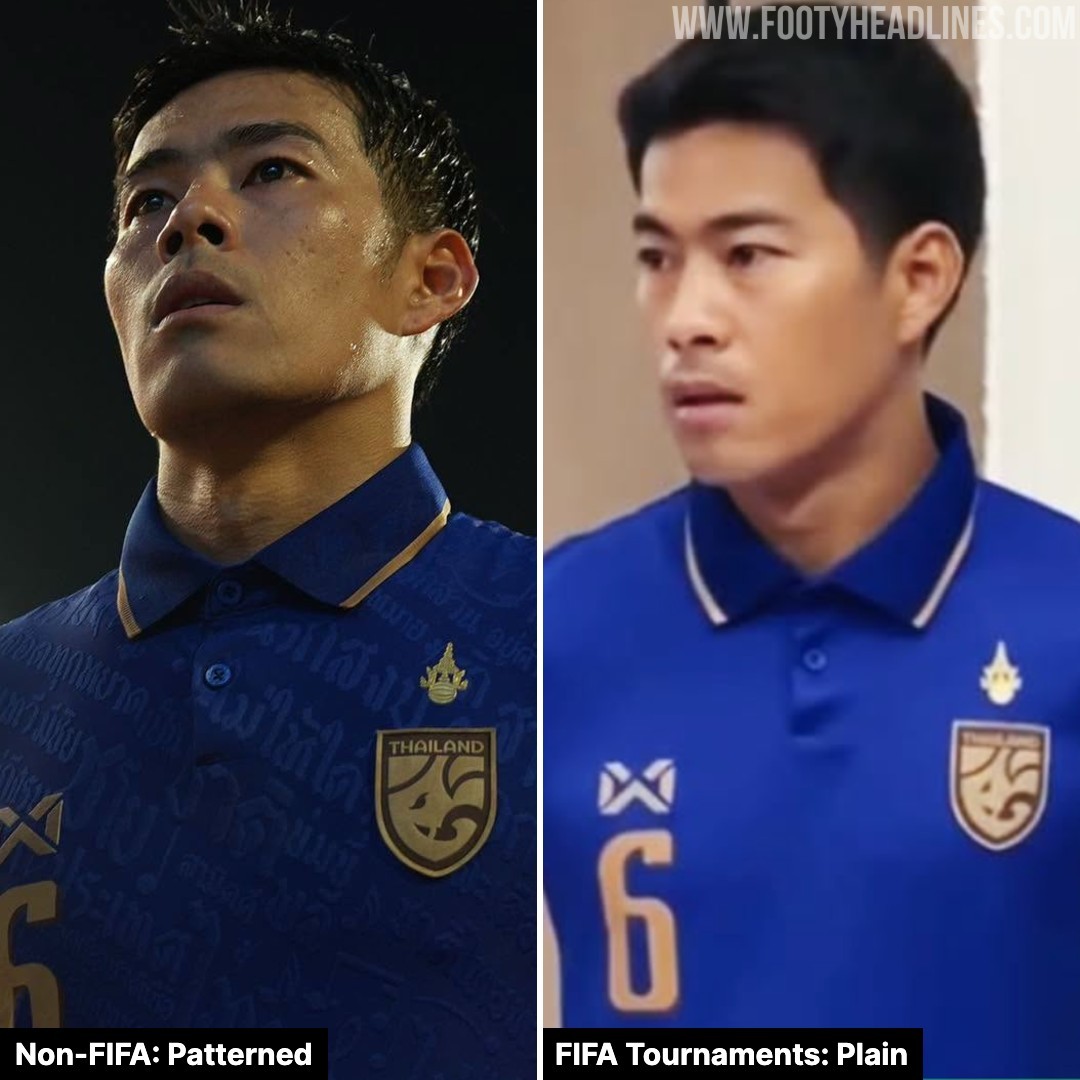
According to Ball Stand Thailand, the Thailand national team and Warrix must modify their kits for the 2026 FIFA ASEAN Cup, as the current uniform violates FIFA regulations.
Laws 4 of the IFAB players' equipment prohibits any political, religious, or personal slogans, statements, or images on match shirt.
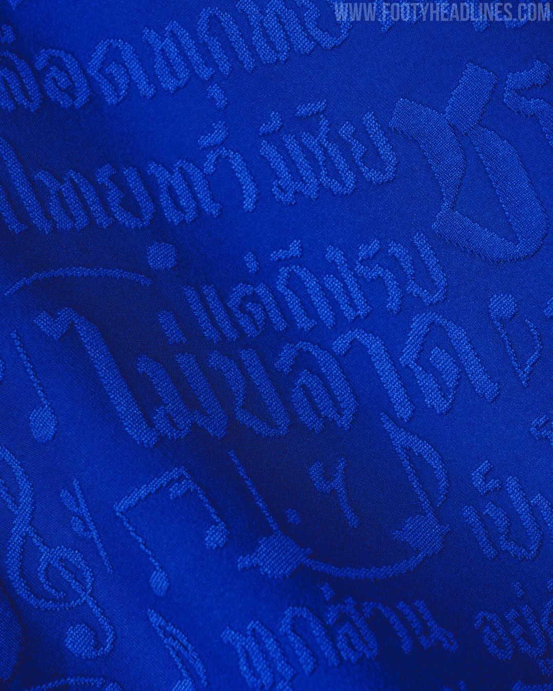
Thailand’s 2026–27 kits by Warrix feature an pattern of the national anthem lyrics. Although national anthem lyrics are not explicitly classified as prohibited text, incorporating a full sentence from the anthem or extracts with ideological undertones onto the kit is still considered a violation of slogan regulations.


Raphinha Becomes Brazil's New Number 10
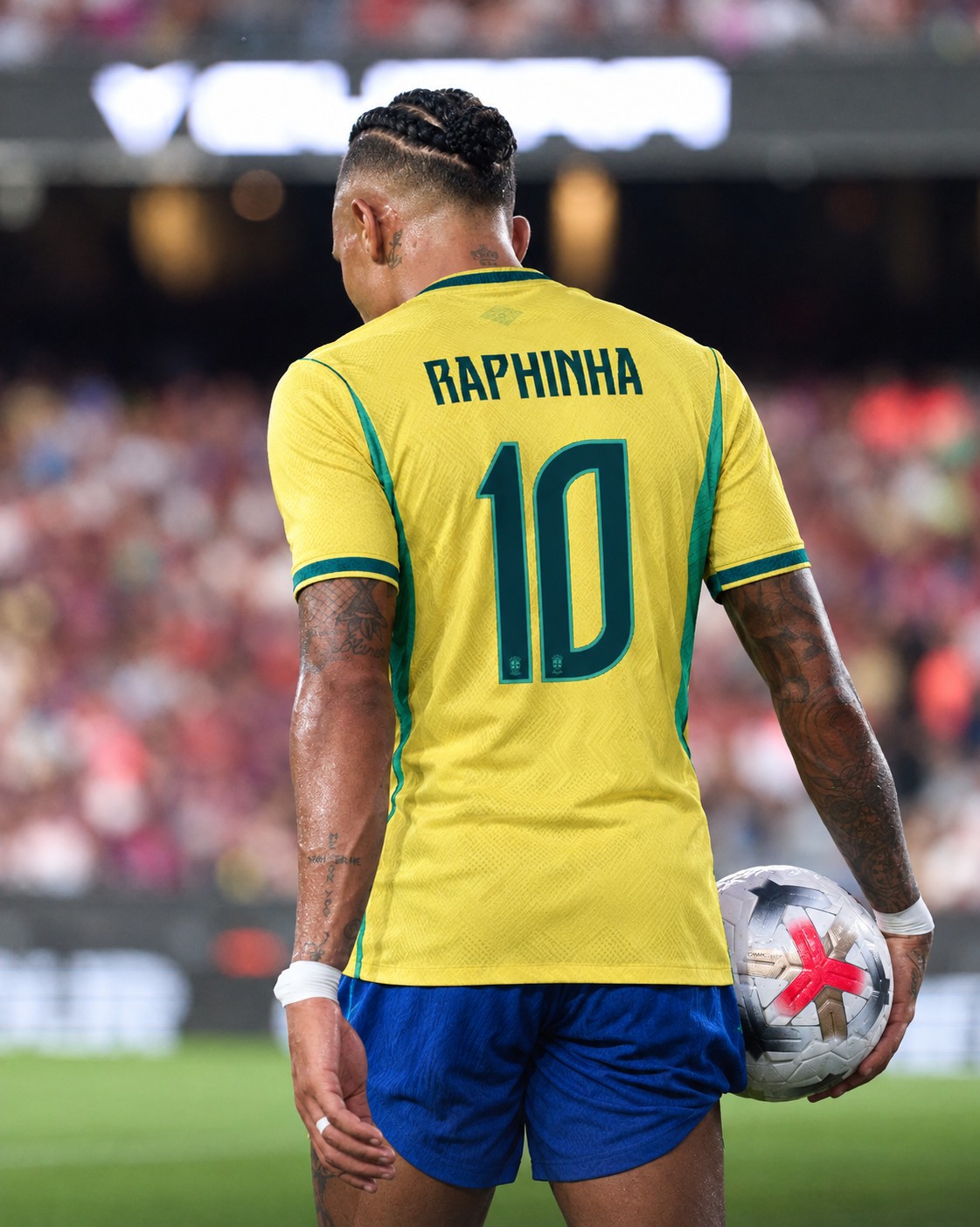
Raphinha officially wore Brazil's iconic No. 10 shirt for the first time in a friendly against Australia, becoming the latest player to inherit the famous number following Neymar's departure from the national team after the 2026 World Cup.
The Barcelona forward is no stranger to the shirt, having already worn No. 10 several times during Brazil's 2026 World Cup qualifying campaign when Neymar was unavailable.
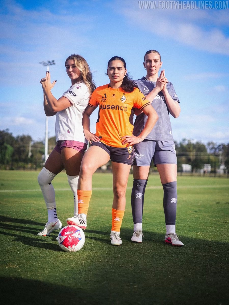
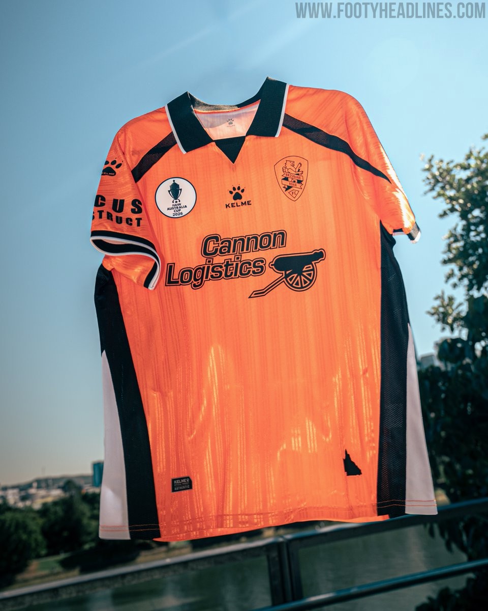
Kelme Brisbane Roar 26-27 Home, Away, Third & Goalkeeper Kits Released - No More Cikers
Brisbane Roar and Spanish brand Kelme have officially launched the club's new kit collection for the 26-27 A-Leagues campaign. The drop represents the manufacturer's first full league set for the Queensland side after signing a three-year technical partnership earlier this year, succeeding previous supplier Cikers.
The 26-27 home kit marks a return to the club's traditional orange and black combination. The jersey features a textured orange base, black trim along the collar and cuffs, and is completed with black shorts and orange socks. The away jersey provides a crisp contrast with an off-white base accented by maroon detailing and shorts, celebrating Queensland's traditional sporting colour. Across the jerseys, the men's team features new primary partner Focus Construct on the front, while the women's shirts display Ausenco.
A major highlight of the release is the retro theme seen across the alternate designs. The vibrant blue third kit revives Brisbane Roar's original 2005 logo above an embossed lion graphic sweeping across the bottom front, accented with orange details. The retro crest also takes center stage on the maroon goalkeeper shirt, which features an elegant polo collar framed by orange piping.

Leicester City 26-27 Third Kit Released
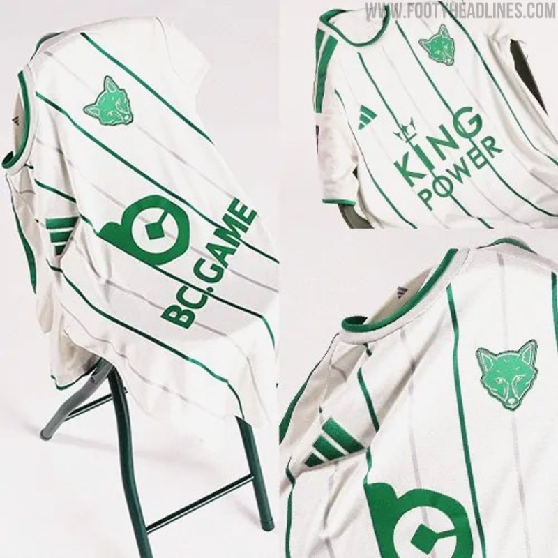
Leicester City and Adidas have officially unveiled their new third kit for the 26-27 season. Arriving seven weeks into the campaign, the fresh strip introduces a distinct look that rounds off the Foxes' wardrobe for the year, joining the blue home and maroon away shirts.
The Adidas Leicester City 26-27 third jersey pairs an off-white base with green vertical pinstripes running down the front. The collar, sleeve cuffs, and signature Three Stripes on the shoulders are also finished in matching green. The standout element of the shirt is the club crest, which replaces the standard full-color badge with a minimalist green fox head emblem. The Adidas Performance logo sits opposite in matching green, while the men's version features BC.GAME and the women's team kit showcases King Power sponsorship.
White shorts and socks with green accents complete the full strip. The Leicester City 26-27 third kit is currently available for pre-order via the club's official online store, with deliveries scheduled to commence in October.
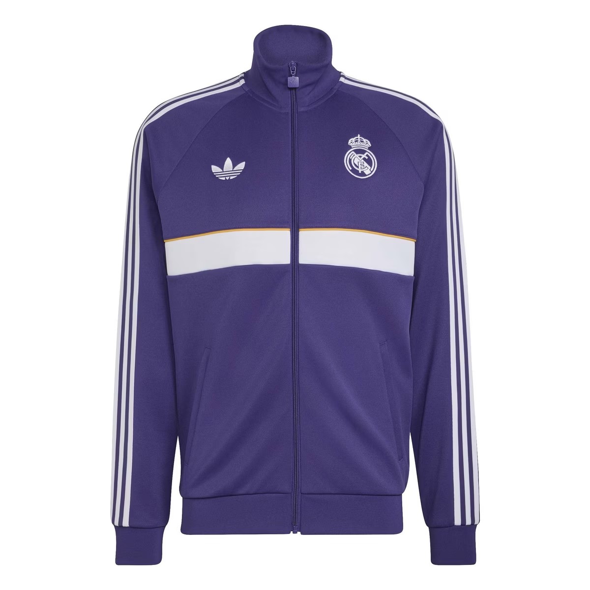
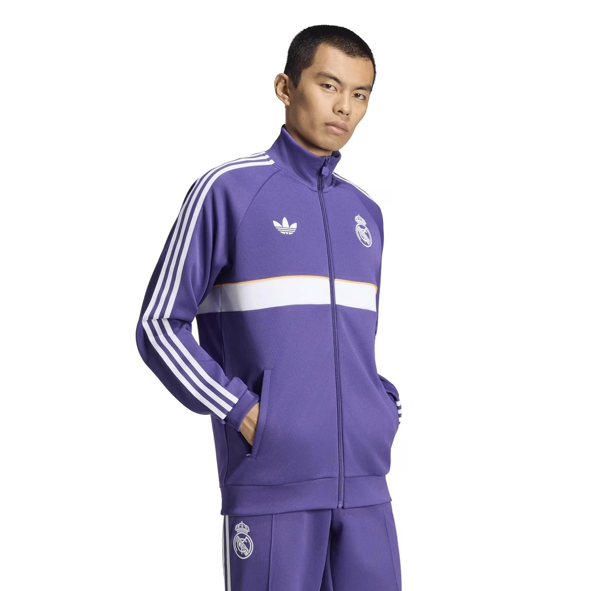
Purple Real Madrid 26-27 Originals Collection Leaked
A brand new lifestyle collection from Real Madrid and Adidas have been leaked via online stores, giving a full look onto its purple Originals tracksuit.
The design of the jacket is identical to away anthem jacket range from the German brand this season, featuring a white horizontal band with a yellow/orange trim. Both logos are displayed in monochrome white, match with the shoulder three-stripes. The full tracksuit is expected to be used as pre-match outfit or anthem jacket, depending the club's own intention.
What do you think of the new Real Madrid 26-27 Originals collection? Let us know in the comments below.

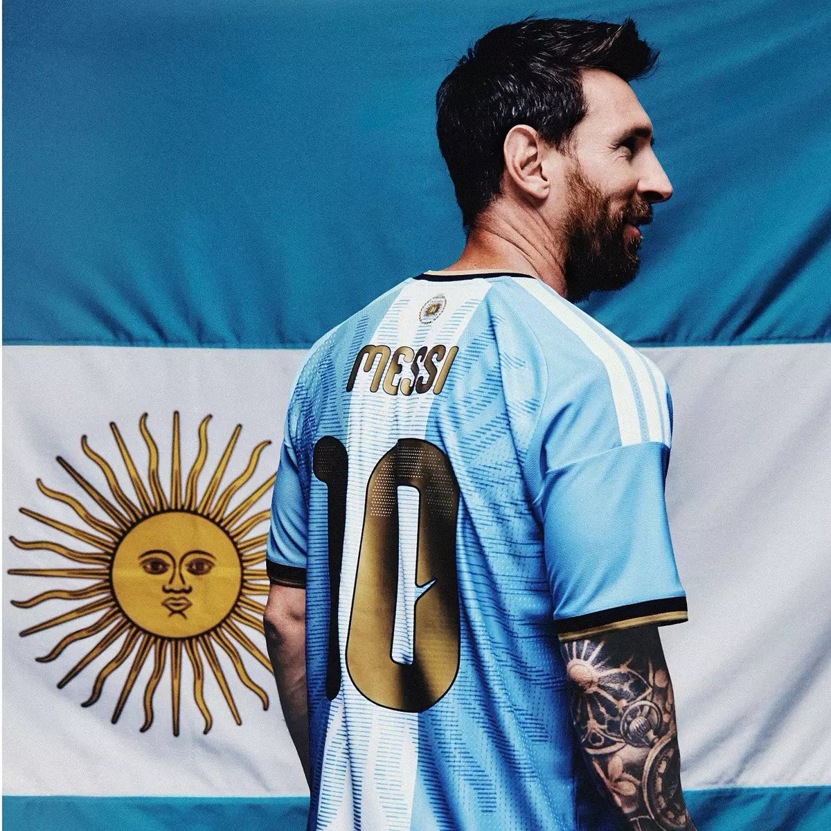
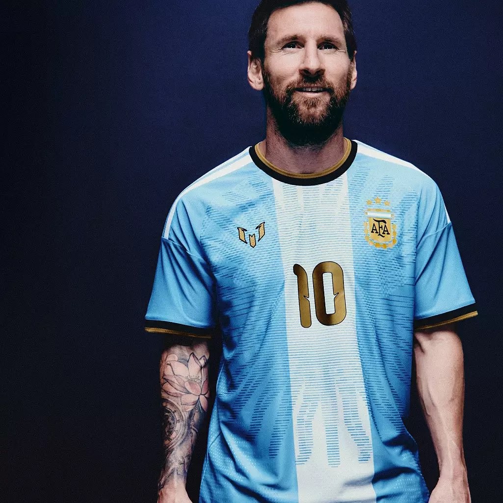
Adidas Argentina Messi 'Farewell' 2026 Kit Leaked - Coming Soon
@EldenMonitors has leaked the launch images of the special Adidas Argentina Messi “Farewell” 2026 jersey, which is set to be released soon.
