"Man City Fans" Put Banner Against Puma - Here Is Why

On Saturday, an image appeared on social media showing off a banner on the bridge over Alan Turing Way (which is next [on the way] to Man City's stadium) that was coming evidently from City fans criticizing Puma. However, while it first appeared as Man City fans would be against Puma, a research reveals that the club was almost certainly used for a political message.

Banner Against Puma Because Of Brand's Sponsoring Of Israel Football Association
The banner reads "Love City. Hate Puma". This message, however, was not put on the banner because of Puma's Manchester City kits or its (products but because Puma is also sponsoring the Israeli national football team.

In fact, the message likely comes because of the political organization Boycott, Divestment, Sanctions (BDS) [Israel], a Palestinian-led movement for freedom, justice and equality.
BDS says that "Global sportswear manufacturer Puma is involved in violations of international law and human rights. Puma is the main sponsor of the Israel Football Association (IFA), which includes teams in Israel’s illegal settlements on occupied Palestinian land."
— Suzanne Benbow (@sooooza) October 26, 2019
#Puma is doing very well with our shirts, especially the black shirt 👍 @PUMA
— 🥇Eng. IBRAHIM ALWABEL🏆 (@CitizenFc) October 26, 2019
Fans who first did not why the banner was put up could not understand why City fans should be against Puma - the Citizens' supporters are mainly happy with Puma's work for the club.

Share your thoughts in the comments below.

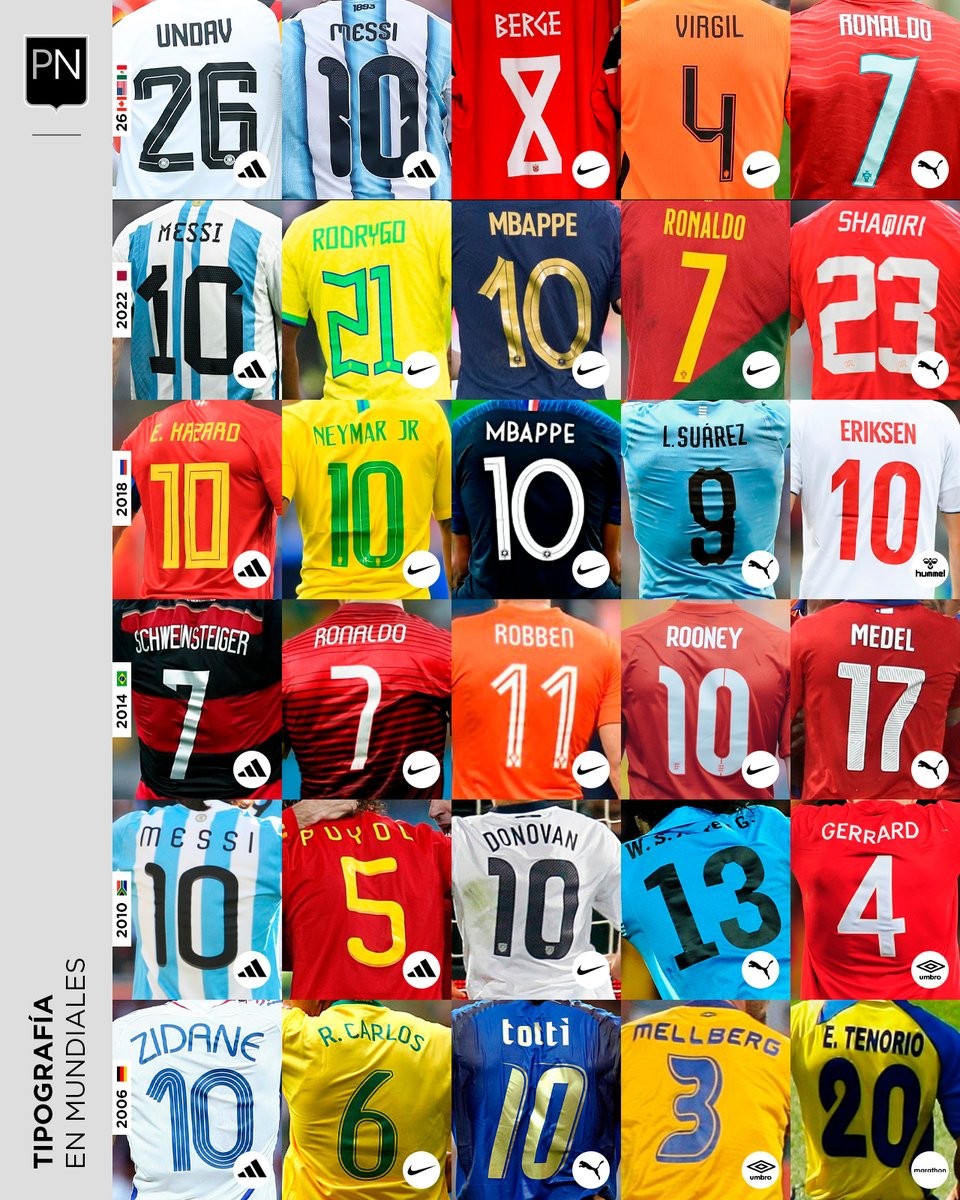
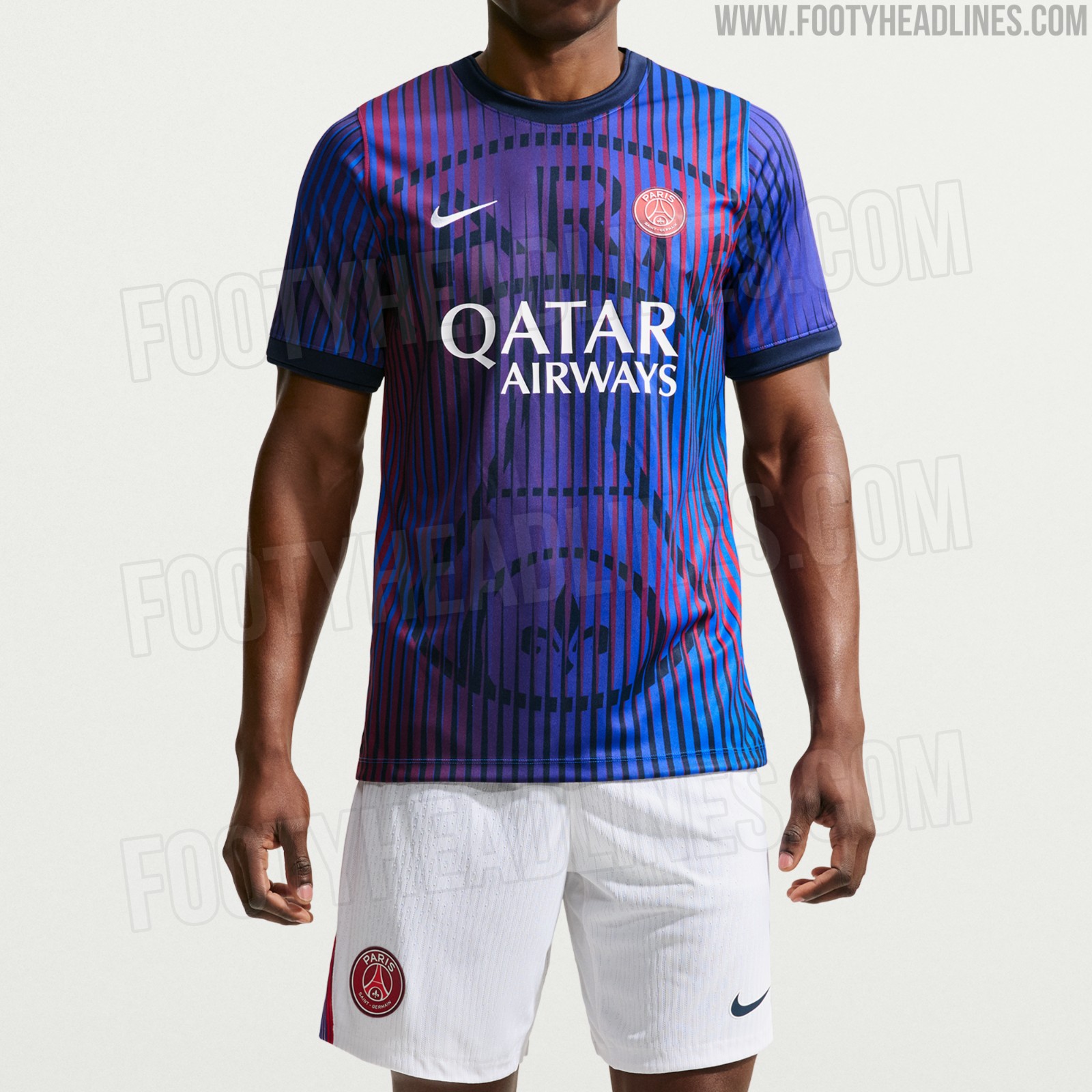
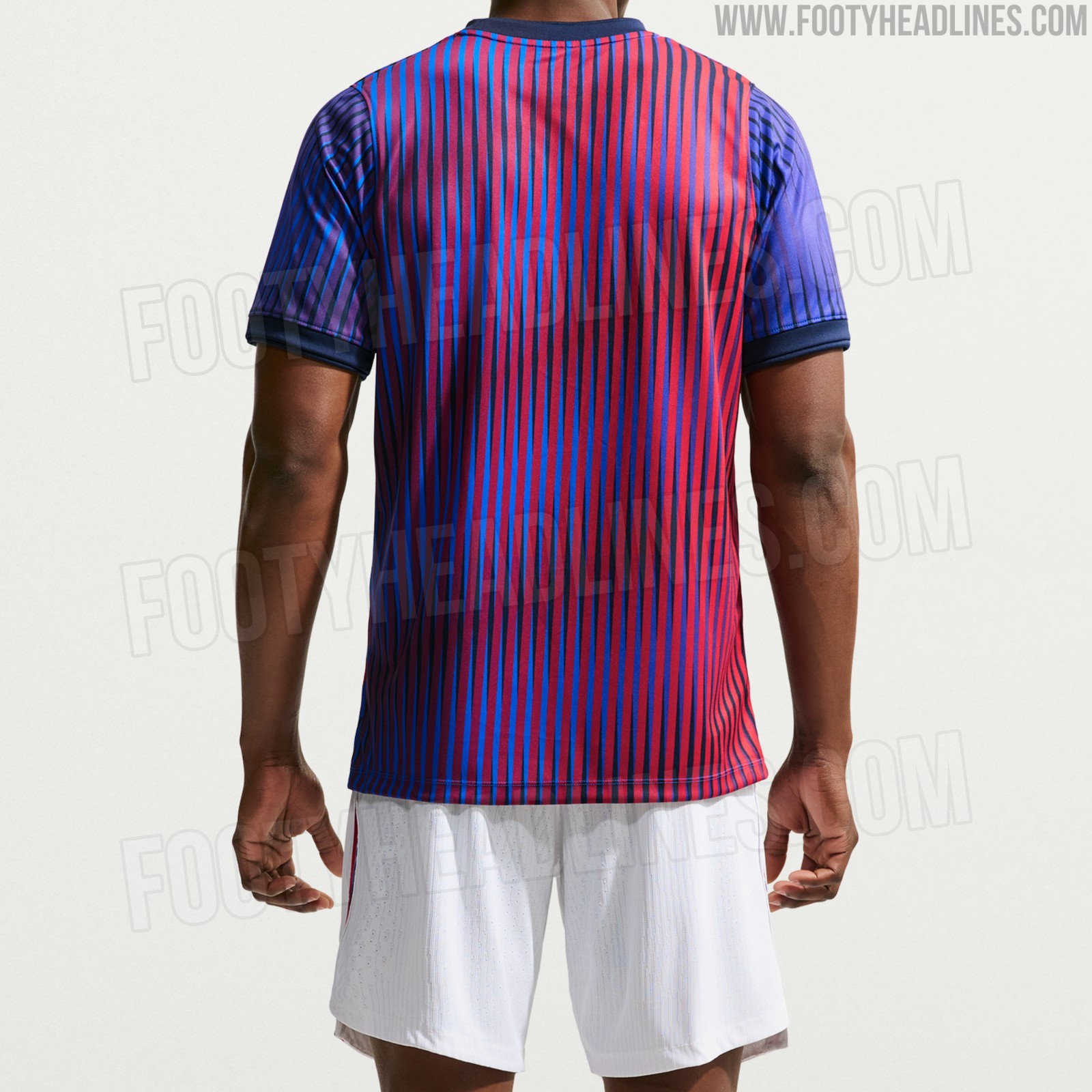
A Look Back at World Cup Shirt Number Typography
Football kit design account @PaladarNegroWeb has shared an interesting retrospective on the typography used for shirt numbers in recent World Cups. The visual language of football kits is often defined by these details, with fonts becoming instantly recognizable symbols of specific tournaments and eras.
The collage highlights various iconic typefaces worn by national teams on the biggest stage. spanning from the 2006 World Cup to the FIFA World Cup.
This overview is part of an ongoing series by the account exploring the visual elements of football. It serves as a great reminder of how deeply typography impacts the overall aesthetic and legacy of a football shirt.


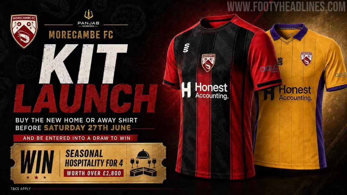
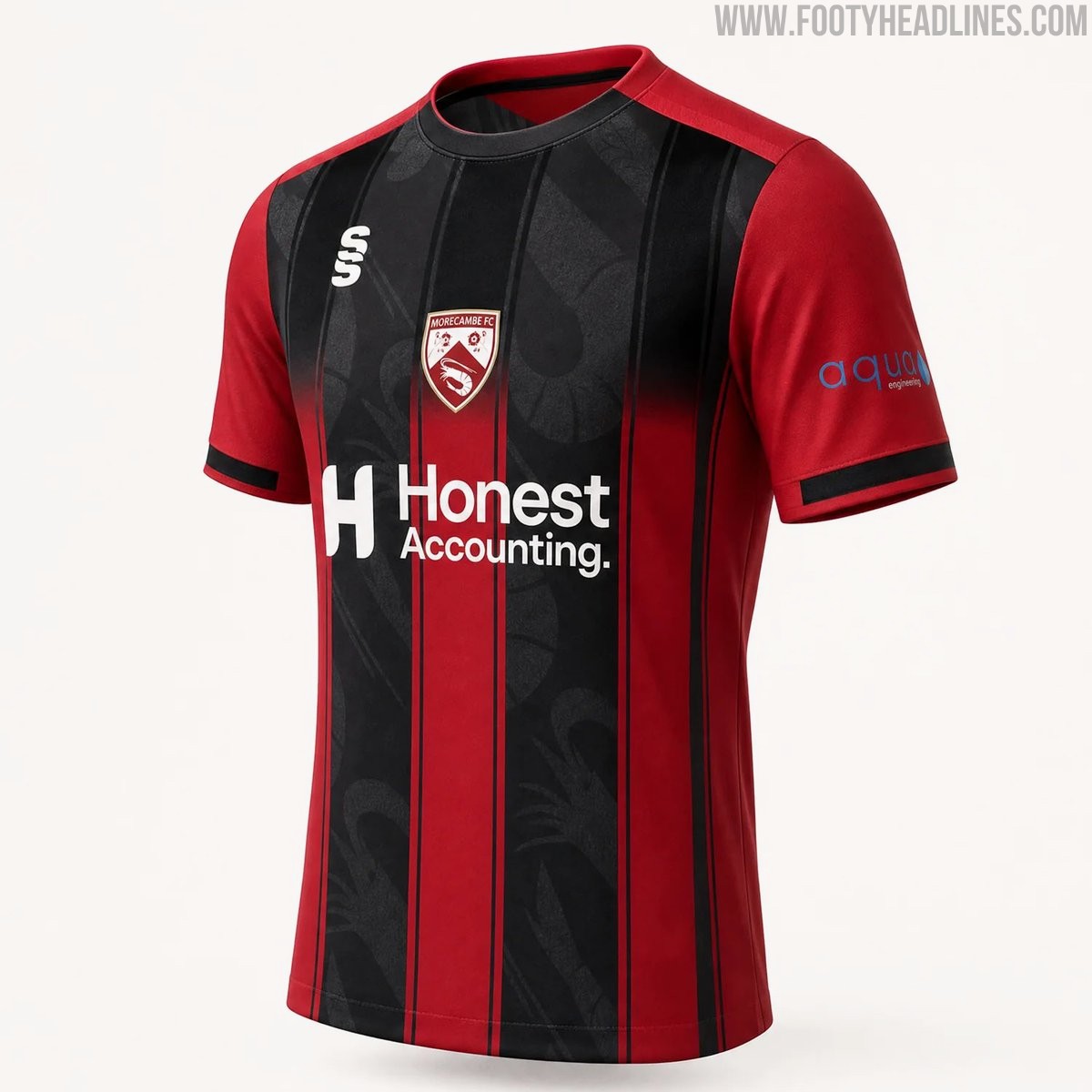
Morecambe 26-27 Home & Away Kits Released
Morecambe FC have officially launched their new 26-27 home and away kits, produced by Surridge Sports. The club received massive backlash for posting AI images for the launch, and later posted a clearer CAD of the home shirt.
The home shirt features the club's traditional red color palette with black detailing, while the away kit introduces a bold combination of purple and yellow. Both designs incorporate modern elements to provide a fresh look for the upcoming National League North campaign.
The new Surridge Sports Morecambe 2026-27 jerseys are currently available for pre-order through the club's official online store.