Better Than The Actual New One? 10+ Chicago Fire Logo Concepts by Fans & Designers
 Nov 24, 2019, by Chris

The new logo of Major League Soccer side Chicago Fire FC was not well received by their fans at all. Shortly after the first pictures of the crest surfaced, both designers and fans created concepts of how they would have liked the new Chicago Fire FC crest to look like. We take a look at some of the best and most popular Chicago Fire FC concept logos.


Best Of | Chicago Fire FC Logo Concepts
The concept logos created by people both feature completely different designs than the old / new Chicago Fire logo, while some are just quick (color) edits of the new crest.
However, while we don't like some of the new concepts, we have to admit that many fit the Fires better, at least at first glance...
ozandod

tbone328
Open_Eye_Signal

stubblesmcgee

LOLKH

aawagner011
@phat7deuce


Do you prefer on of these Chicago Fire crests over the one unveiled by the club? Which is your favorite? Comment below.
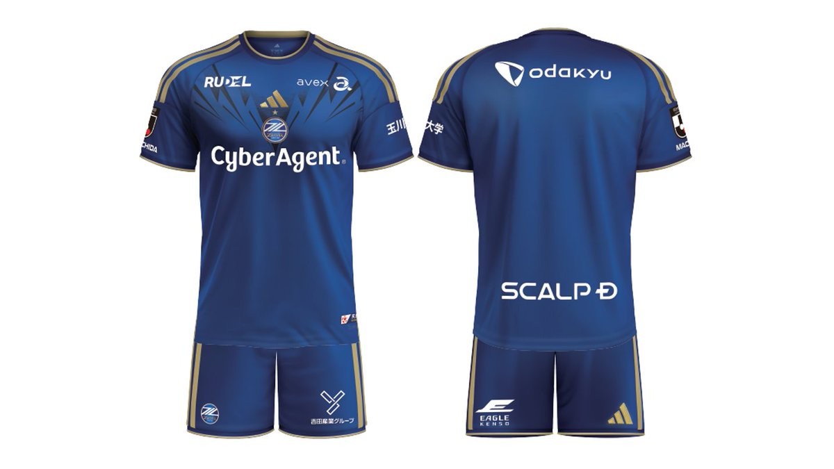
Machida Zelvia 2026-27 Home, Away & Goalkeeper Kits Released
The new Machida Zelvia home, away and goalkeeper shirts for the 2026-27 season have been released. Made by Adidas, the new kits will be worn in the upcoming J1 League campaign, which marks the league's transition to an autumn-spring calendar.
The Adidas Machida Zelvia 2026-27 home shirt features a deep blue base, highlighted by a geometric 'Pulse of Machida' graphic across the front. Gold accents on the collar, the signature Adidas Three Stripes, and the sponsor logos, including main sponsor CyberAgent, complete the design.
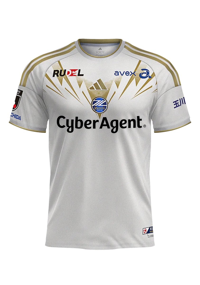
The Adidas Machida Zelvia 2026-27 away and goalkeeper kits have also been unveiled, rounding out the club's collection for the new season. The 2026-27 home kit is currently available to purchase for club members.
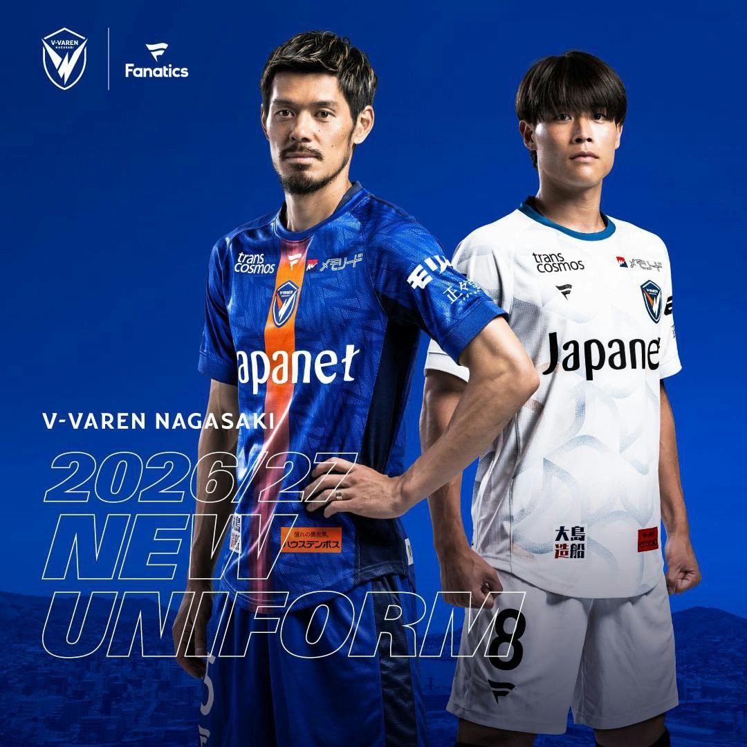
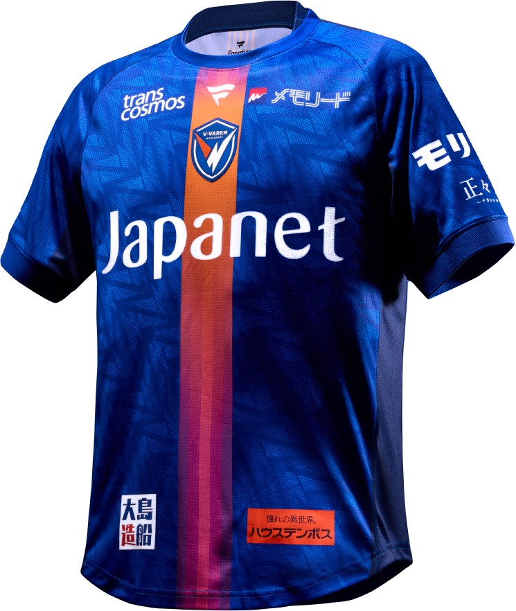
V-Varen Nagasaki 26-27 Home & Away Kits Released
V-Varen Nagasaki have officially unveiled their new home and away kits for the 2026-27 season. Made by Fanatics, the new shirts will be worn in the upcoming J1 League campaign, marking the Japanese top flight's transition to a new fall-spring calendar.
The Fanatics V-Varen Nagasaki 2026-27 home shirt features a bespoke design in the club's traditional colors. The away shirt offers a clean contrasting look, while the goalkeeper kits round off the collection with their own distinct colorways. All shirts carry the Fanatics logo on the right chest alongside the V-Varen Nagasaki crest on the left.
The Fanatics V-Varen Nagasaki 2026-27 home and away kits are available to purchase via the club's official online store.

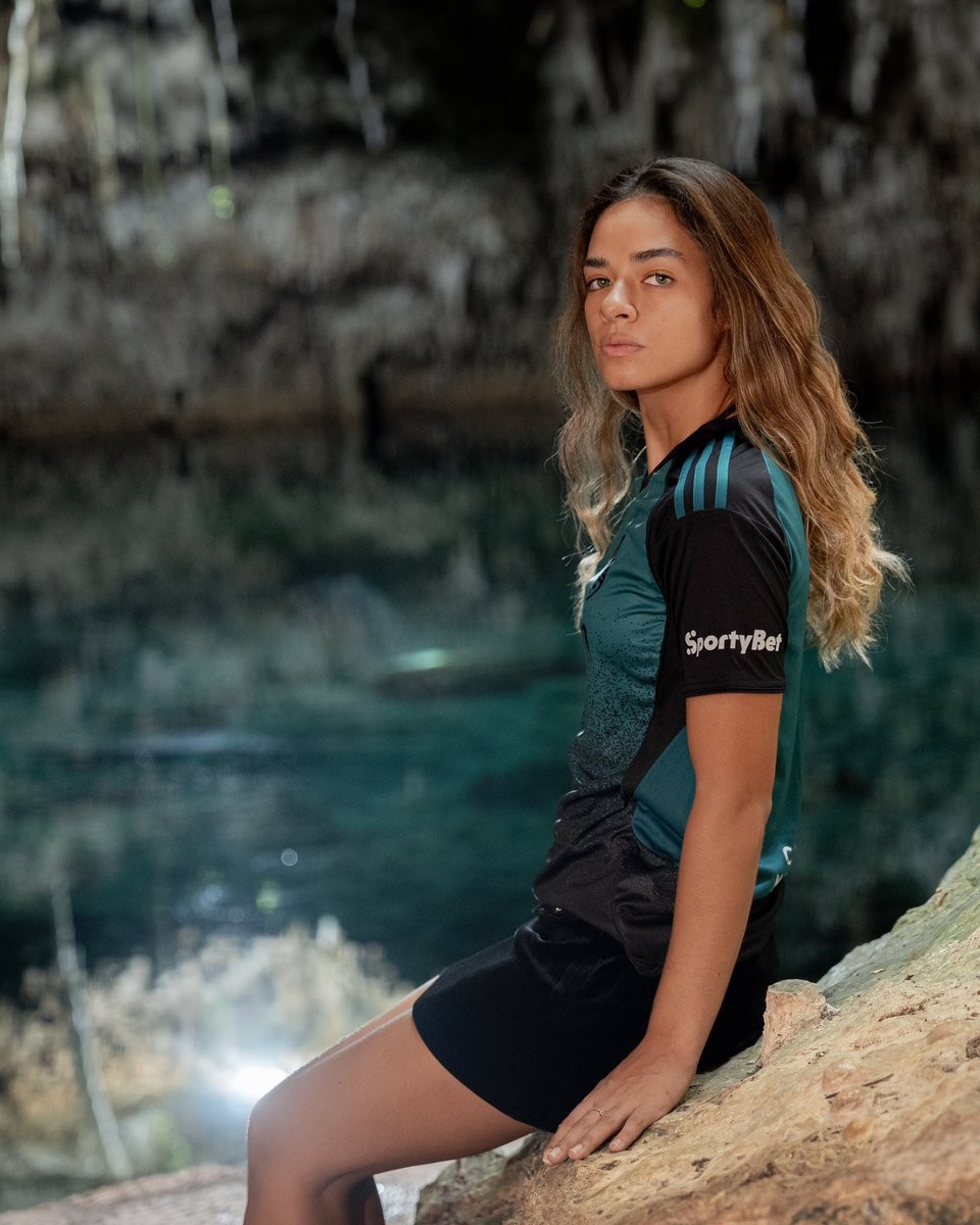
Cancún FC 26-27 'Dark Cenote' Special Kit Released
Mexican club Cancún FC has unveiled its new 2026-27 'Dark Cenote' special kit, made by Adidas. This release serves as a dark counterpart to the club's recently announced 'Cenote' third kit and made its on-pitch debut on July 3, 2026.
The Adidas Cancún FC 2026-27 'Dark Cenote' special jersey features a predominantly dark base design. It pays homage to the state of Quintana Roo and the natural network of cenotes that have united the Mexican Caribbean for thousands of years. The dark color scheme offers a contrasting alternative to the lighter standard third shirt while maintaining the same thematic inspiration.
The Adidas Cancún FC 2026-27 'Dark Cenote' special kit is available to purchase through the club's official physical and online stores. It is a limited edition release and will only be available until current stock runs out.
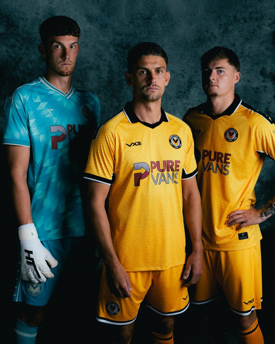
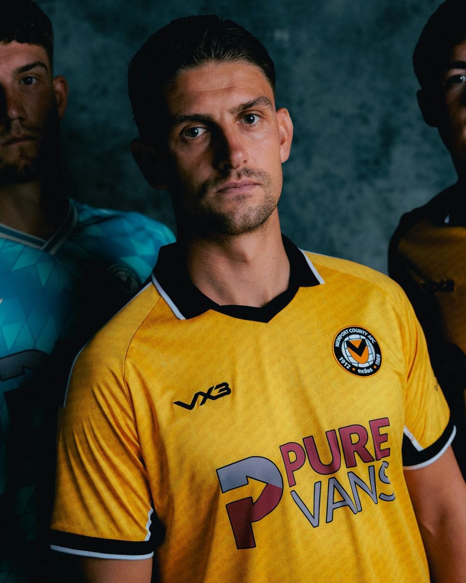
Newport County 26-27 Home Kit Released
The new Newport County 2026-27 home kit was officially released. It is made by VX3 and will be worn in the upcoming League Two campaign.
The VX3 Newport County 2026-27 home shirt features the club's traditional amber base color, paired with black detailing. As a tribute to the club's history and identity, the design incorporates the names of all 25 hall of fame members, which are woven into the amber fabric of the shirt.
Newport Galvanizers will feature as the official sleeve sponsor for the home shirt during the 2026-27 season. The VX3 Newport County 2026-27 home jersey is currently available for pre-order.
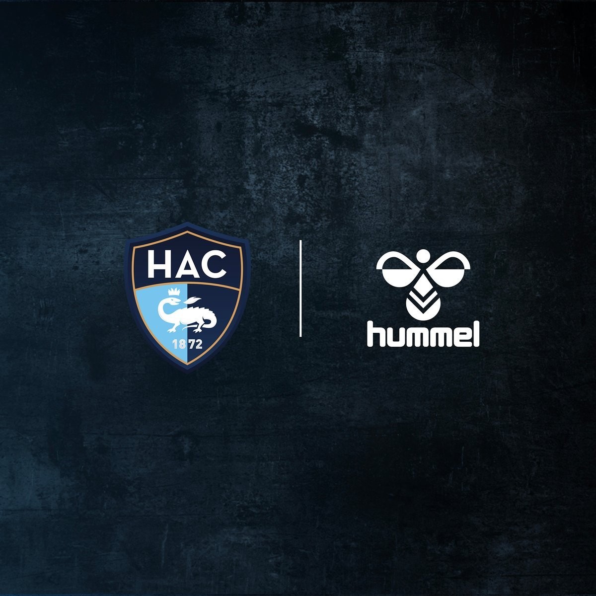
Official: Le Havre Announces Hummel Kit Deal - No More Umbro
French club Le Havre AC has officially announced Hummel as its new kit supplier, starting from the 2026-27 season. This confirms previous reports of the club ending its short-lived partnership with Umbro after just one season.
The official announcement emphasizes the fusion of both brands' rich histories and a deep respect for Le Havre's traditional sky blue and navy colors. Hummel takes over following the bankruptcy of Umbro's French distributor, Royer, which caused significant delivery issues during the previous campaign.
Fans have shared their excitement for the new partnership across social media, anticipating stylish designs that honor the club's heritage. The first Hummel Le Havre kits for the 2026-27 season are expected to be unveiled shortly.
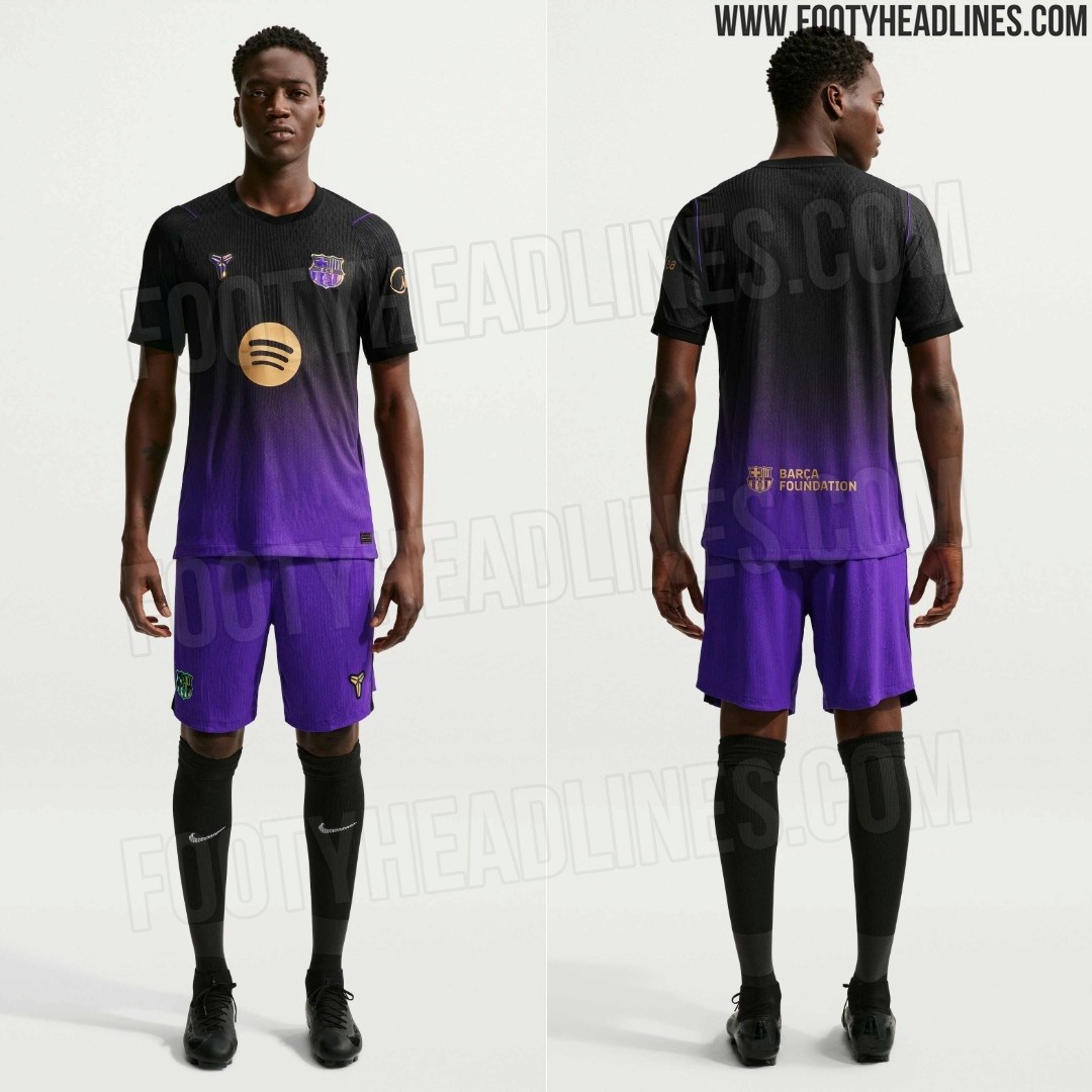
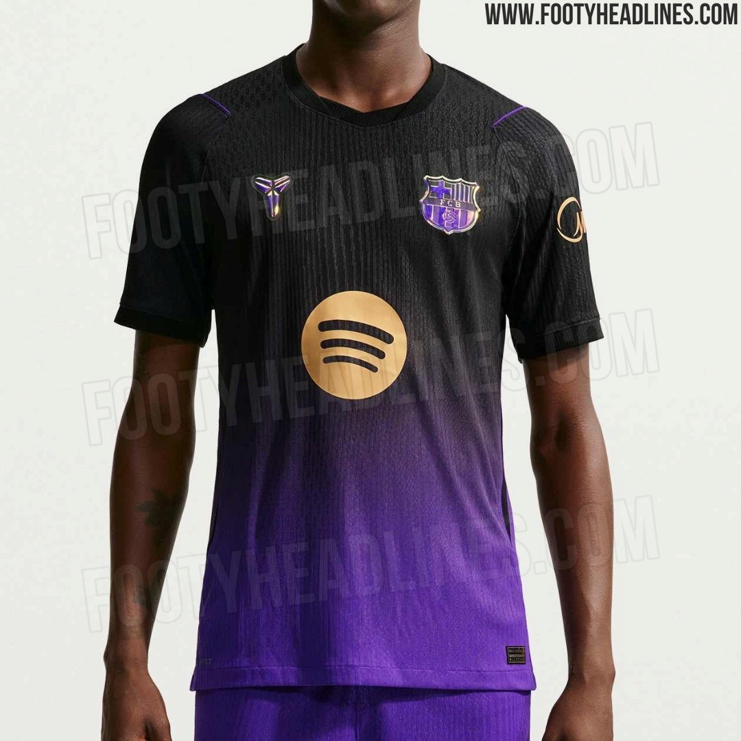
Nike Mamba FC Barcelona 26-27 Away Kit Leaked + Shorts
Footy Headlines can now leak the new official pictures of the Mamba Barcelona 26-27 away kit, including shorts.
The Nike Mamba FC Barcelona 2026-27 away jersey features a purple and black gradient base with gold/iridescent logos and applications.
The kit features the famous quote: “Leave the game better than you found it” inside the collar.
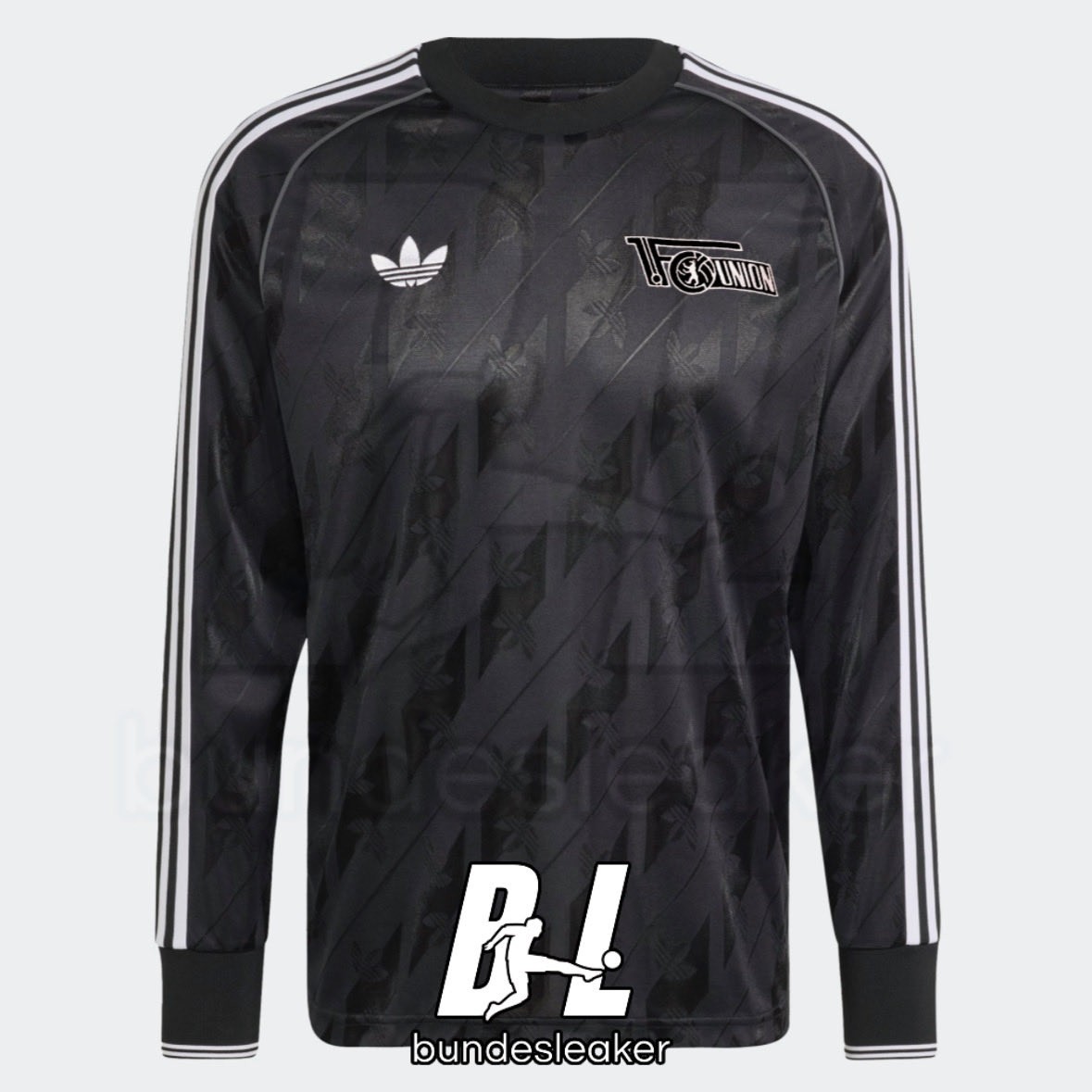
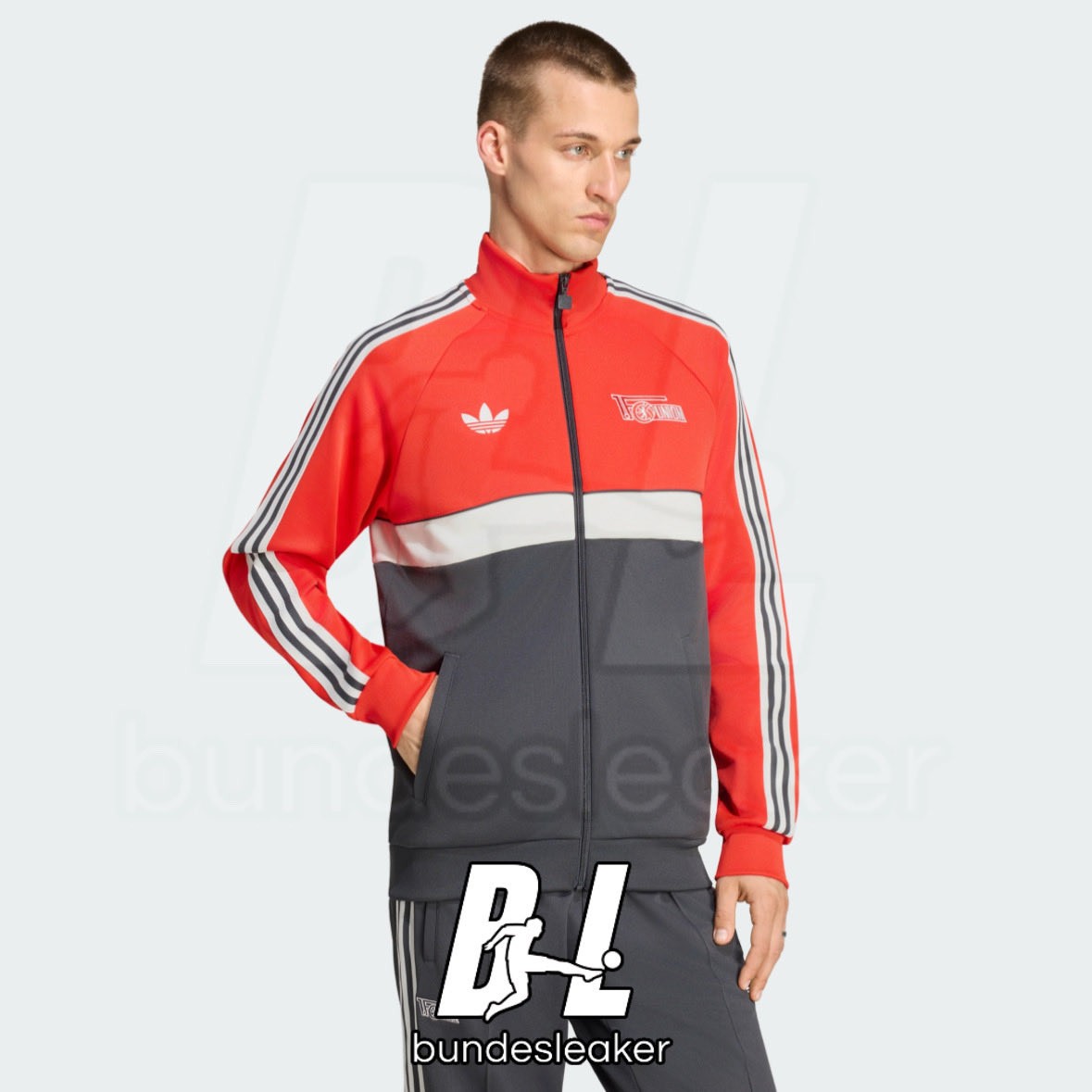
Union Berlin 26-27 Away Lifestyle Collection Leaked
An exclusive leak via @Bundesleaker has revealed the first look at the Union Berlin 2026-27 Originals collection. The new item is part of an upcoming retro-inspired lifestyle collection for the Bundesliga club.
The Adidas Union Berlin 2026-27 OG collection features a clean and classic design in predominantly black. It prominently displays the Trefoil logo, fitting the vintage aesthetic of the Originals line. According to the leaker, while the colors are completely accurate, the final club crest used on the longsleeve could still be subject to minor changes.
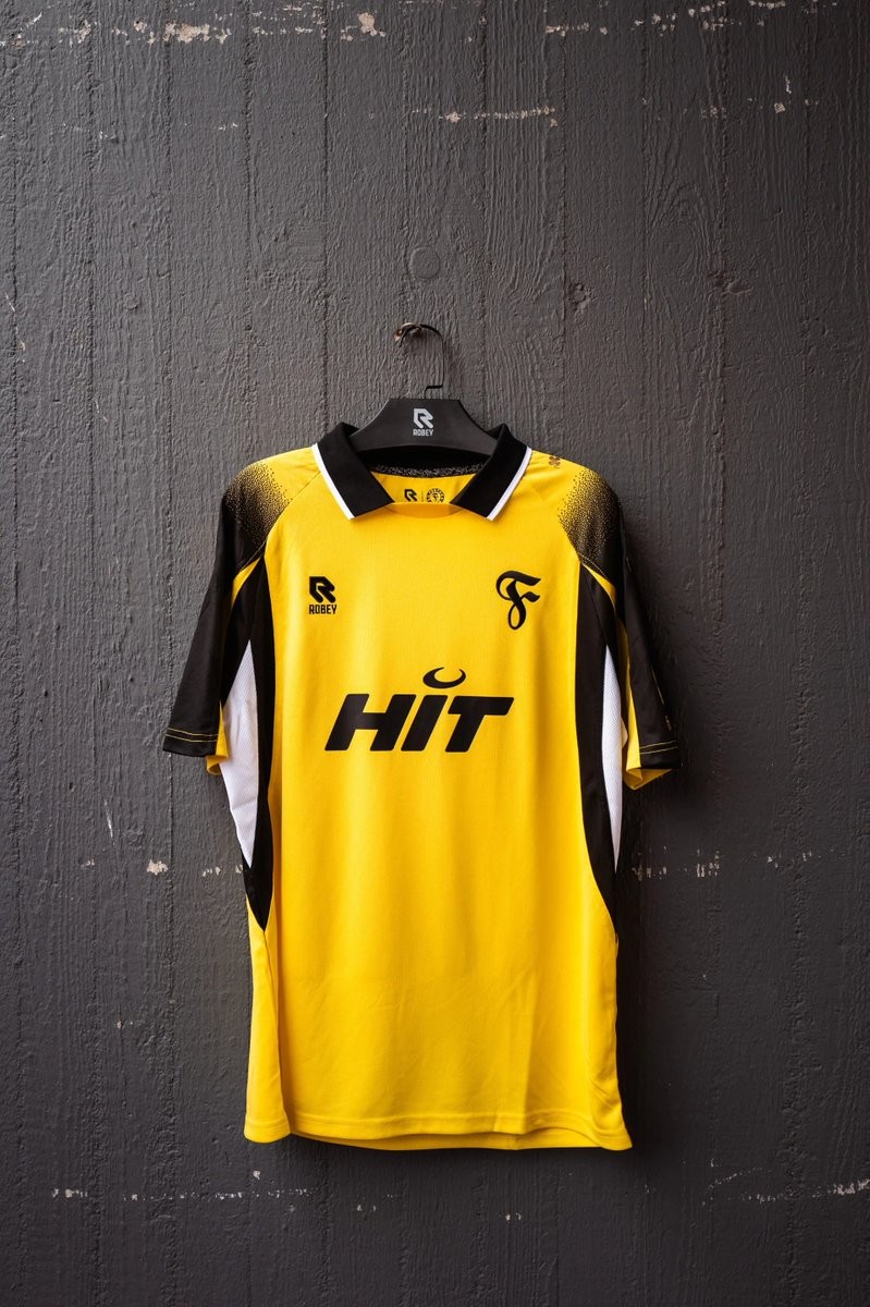
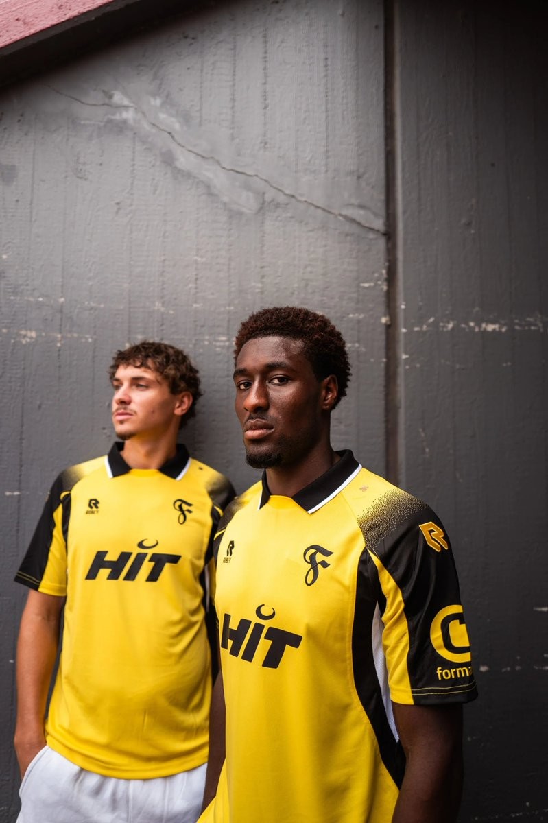
Fortuna Köln 26-27 Third Kit Released
SC Fortuna Köln and Dutch sportswear brand Robey have officially unveiled the club's new third kit for the 2026-27 season. Designed for the upcoming Regionalliga West campaign, the shirt returns to a classic yellow and black colorway. This traditional look pays homage to the club's founding and their stint in the 3. Liga between 2013 and 2020.
This launch follows the release of a special-edition Robey kit for the 2026 Mittelrheinpokal final earlier in the year. That exclusive jersey featured a tri-color gradient, fading from navy blue to light blue and finishing with a white lower half. It also included metallic gold accents on the manufacturer branding, the central sponsor, and a classic retro crest.
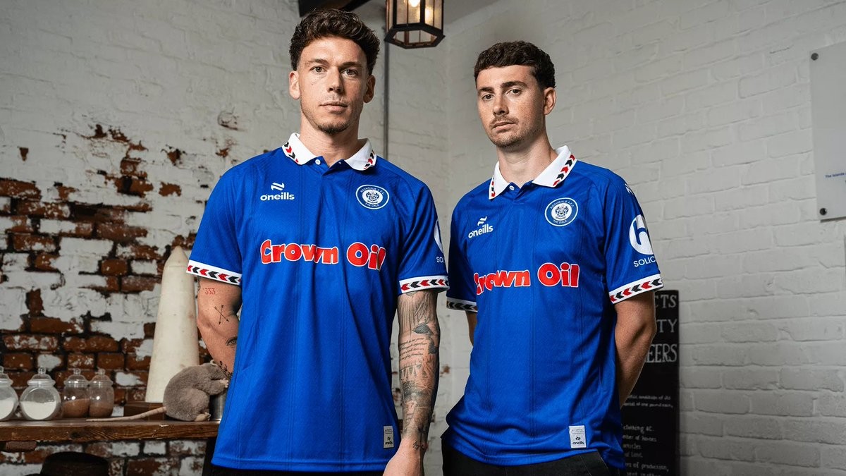
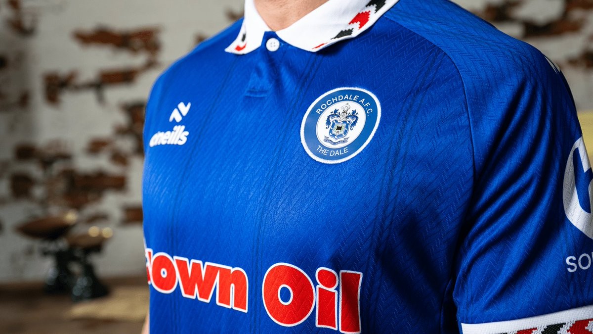
Rochdale 26-27 Home Kit Released
Following the announcement of a multi-year partnership extension with O'Neills, Rochdale AFC have officially unveiled their new 2026-27 home kit. Described by the club as an instant classic, the new strip was launched with a special photoshoot at the historic Rochdale Pioneers Museum and is available to purchase both in-store and online starting July 4.
The O'Neills Rochdale 2026-27 home shirt features a retro-inspired design, combining the club's traditional blue base with a white trim that incorporates distinctive red and black arrows. A classic collar adds to the vintage aesthetic, while long-standing sponsor Crown Oil is prominently displayed on the front. Blue shorts and socks complete the O'Neills Rochdale AFC 2026-27 home kit.
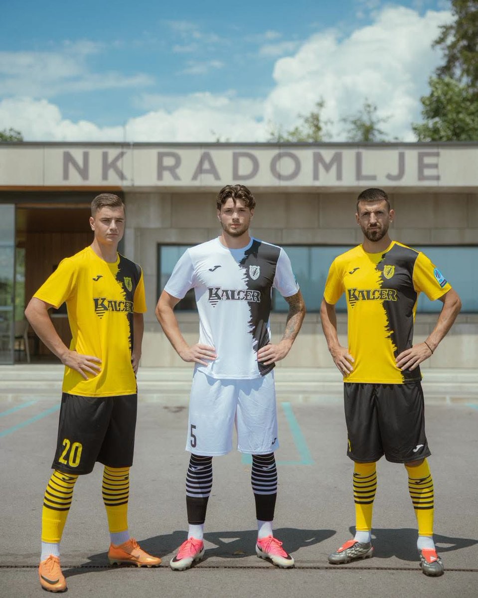

NK Radomlje 2026-27 Home & Away Kits Released
Slovenian PrvaLiga club NK Radomlje have released their new home and away kits for the 2026-27 season. Made by Joma, the new shirts will be worn in the upcoming domestic campaign.
The Joma NK Radomlje 2026-27 home and away jerseys introduce clean designs for the club, keeping in line with their traditional colors. While official club channels have yet to formally announce the kits, images have surfaced online showcasing the new strips. This release aligns with Joma's broader rollout of new kits for various European clubs around the same period.
The new NK Radomlje 2026-27 home and away kits are expected to be available to purchase through the club's official retail channels ahead of the new season.
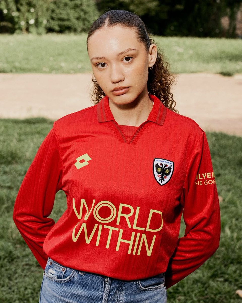
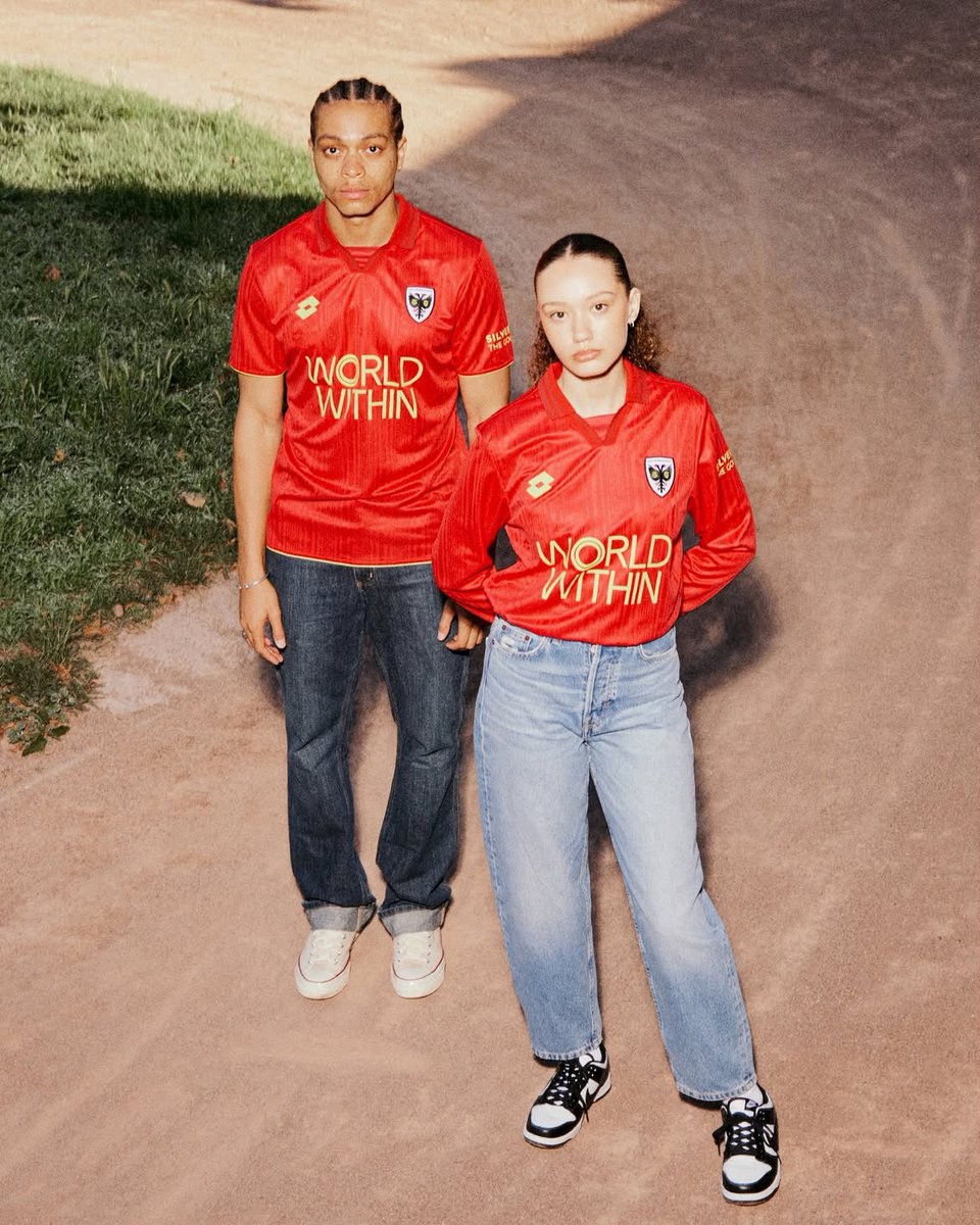
AFC Wimbledon 26-27 Home & Away Kits Released
AFC Wimbledon and Lotto have officially unveiled the club's new home and away kits for the 2026-27 season. The releases celebrate both the club's traditional identity and its rich local history, with both shirts available to purchase from July 4.
The Lotto AFC Wimbledon 2026-27 home shirt introduces a bespoke look in the traditional colors of blue and yellow. Described as blue quartz, the deep and rich base is trimmed in yellow that runs through the collar and cuffs. A standout feature of the design is the extensive use of the famous Lotto logo, which is woven throughout the fabric in a bold repeat pattern.
For the away kit, Lotto and AFC Wimbledon have opted for a striking red and yellow design that pays tribute to the colors worn on the day of their promotion to the top flight on May 3, 1986. The shirt's jacquard fabric is based on the classic Lotto kit worn between 1997 and 1999, featuring a star motif. Additionally, a yellow star on the back honors the Wimbledon Dons, the legendary local speedway team who won seven British championships and were a fixture of Wimbledon life for 77 years.
