Worst & Best Examples: Back Of Football Kits In 2020

Update: Since we first reported about the plain back of football kits more than three months ago (in May 2020), many 2020-21 jerseys have been released. Many of them look great from the front but not so great from the back, while some look good both also if seen from back.

2020-21 Kits With 'Bad Backs':


2020-21 Kits With 'Good Backs':


It is fair to say that 2020 has been a good year for football kits so far, with brands having designed many bespoke yet outstanding kits. However, some only look great at first glance - the back of some shirts is pretty lame...

Back Of Football Kits Is Often Plain

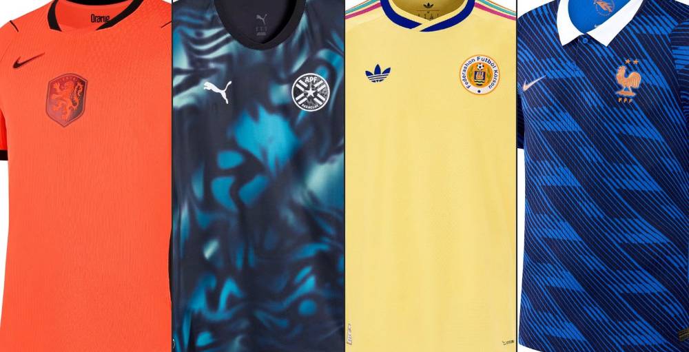
One of the kits that look quite awesome from front but bad from the back is definitely the Adidas Japan 2020 home jersey. Nike's Croatia jersey does also not look really good from the back, there are just too many different geometric shades.


Most of Puma's jerseys look bad from the back as they are very, very often plain, or solid if you prefer. Examples include Italy's and Austria's 2020 kits as well the 2020-2021 jerseys from teams like Marseille, Dortmund and Valencia.


In general, it has to be said that brands are trying to better the back's jerseys - Nike's new 2020 template allows for much more variation and better-looking designs than those Vapor Aeroswift jersey from 2016, which might the worst-ever in terms of designs (no normal sleeves etc).

Examples Of How It Should Be


Of source, there are also various kits that look from the back as good as from the front. A prime example in 2020 is Nike's Barcelona 2020-21 home kit. Others such as Arsenal's 2020-21 home kit do look also quite good with the pattern of the front also on the back (but we would prefer a more classic style).
Arsenal 2020-21 Home Kit


Slovakia 2020-21 Home Kit


Nike Portugal 2020-21 Away Kit


Do you also think that brands should put more focus on the back on football kits? Which is the worst back of a soccer jerseys you know? Share your thoughts in the comments below.
Vintage Football Shirts
from Cult Kits
1998/99 Atletico Madrid Away Socks (Multiple Sizes) Reebok

2002/03 Rangers Caniggia #7 Home Shirt (S) Diadora

1998/00 PSV *Player Issue* BNWT GK Shirt (XL) Nike

2018/19 St Mirren Training Shirt (S) Joma

2011/12 England Young #9 Away Shirt (XL) Umbro

1990 Ennerre #16 Template Shirt (L)

1990 Adidas GK Template Shirt (M)

2013/14 Shrewsbury Away Shirt (M) Surridge

1979/82 Edmonton Drillers *BNWT* Home Shirt (M) Admiral Nasl

2011/12 Roma *BNWT* Away Shirt (Multiple Sizes) Kappa

2026 World Cup Sleeve Badge Guidelines
A graphic shared by @g4ryw4lker presents official FIFA guidelines for the placement of the tournament patch on the right sleeve of national team jerseys for the 2026 World Cup. The badge is only available with Adidas kits.
https://www.footyheadlines.com/2026/05/2026-world-cup-sleeve-badges-revealed.html
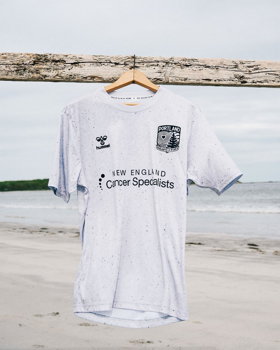
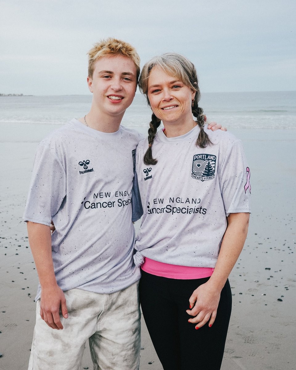
Portland Hearts of Pine Unveil Granite Pre-Match Jersey for Cancer Survivorship Month
Portland Hearts of Pine have partnered with New England Cancer Specialists to release the Granite Pre-Match Jersey honoring Cancer Survivorship Month. The design features a speckled gray texture inspired by Maine granite, reflecting the strength, resilience, and community elements of cancer survivors' journeys.
The left sleeve includes a raised white cancer ribbon that can be personalized with fabric markers in colors representing meaningful cancer experiences. The jersey is set to debut ahead of the club's USL League One fixture against Spokane Velocity on May 30 at Fitzpatrick Stadium in Portland.
It is available for purchase via the team's online shop, at the new club store on Marginal Way, and at the match venue, where fans can customize ribbons on site.

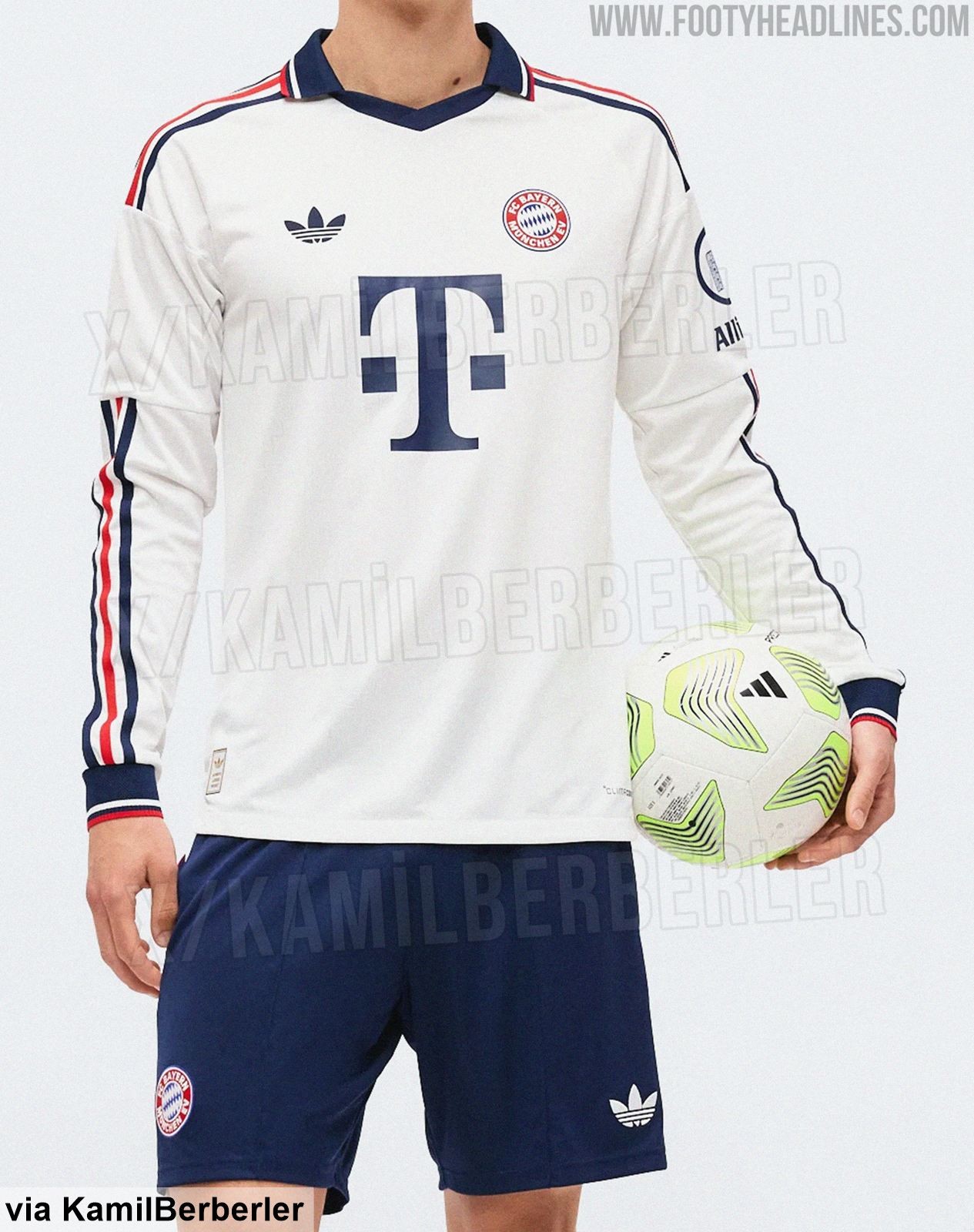
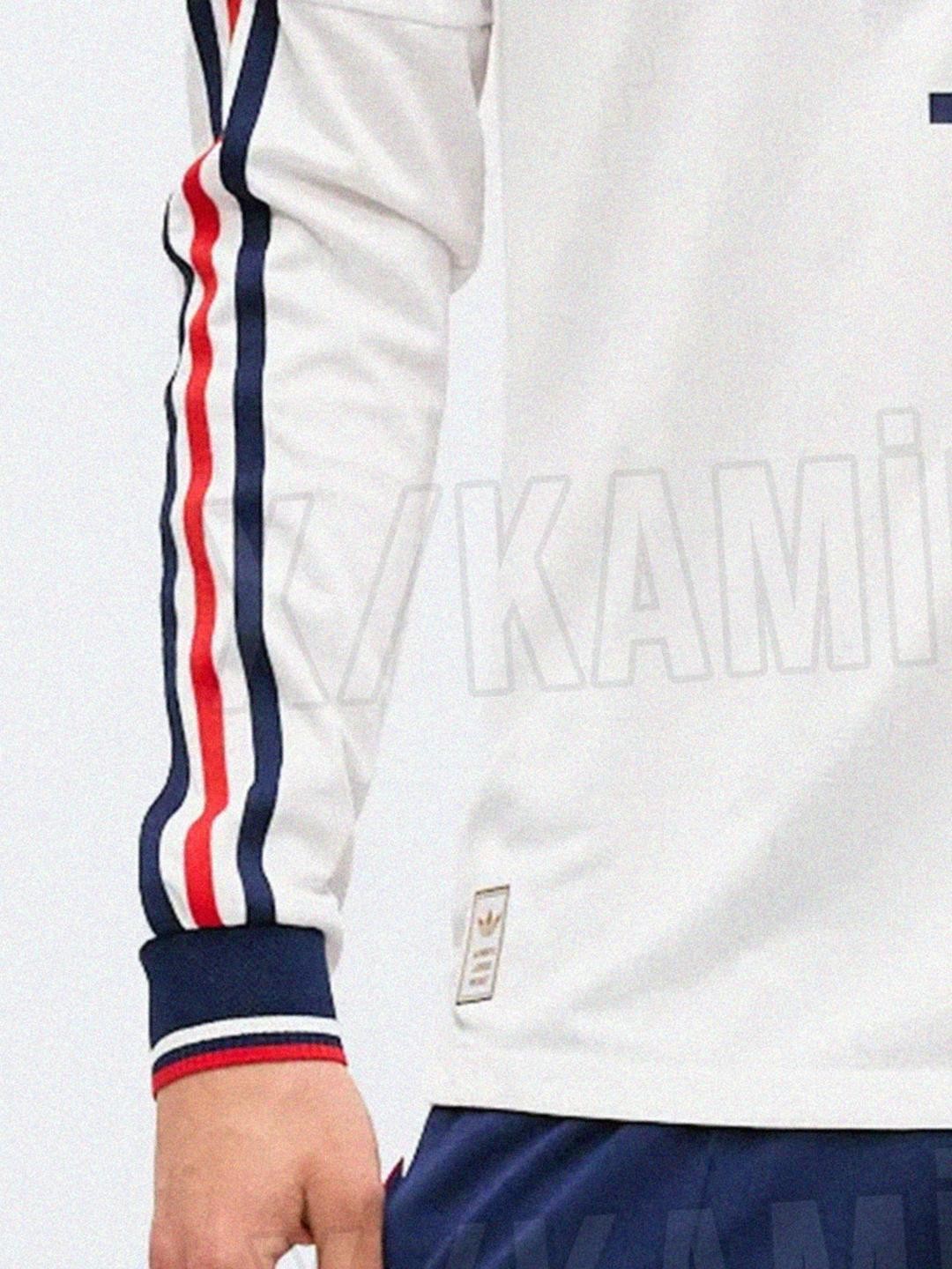
Bayern München 26-27 Away Kit - Long-Sleeve Version
We get the first look at the Adidas Bayern München 2026-2027 away kit in the authentic long-sleeve version, thanks to @KamilBerberler.
https://www.footyheadlines.com/2025/08/bayern-26-27-away-kit.html


Swiss-Ski Releases Limited-Edition "Cheese Jersey"
Swiss-Ski released the Chäs-Trikot 2026 (Cheese Jersey) on May 29, 2026, a limited-edition football jersey produced in exactly 2,026 pieces. The retro-style shirt draws direct inspiration from the legendary "Käsedress" worn by Swiss alpine skiers between 1992 and 1998, featuring a bright yellow base with digitally reconstructed Emmentaler cheese hole patterns from the original racing suit, a white polo collar and the traditional Swiss-Ski federation logo. The design serves as a crossover between winter sports heritage and fan culture, promoted under the slogan 'From the mountain peak to the fan curve'.
The jersey is available to buy online, retailing at CHF 49: https://store.swiss-ski.ch/de/products/football-shirt-cheese


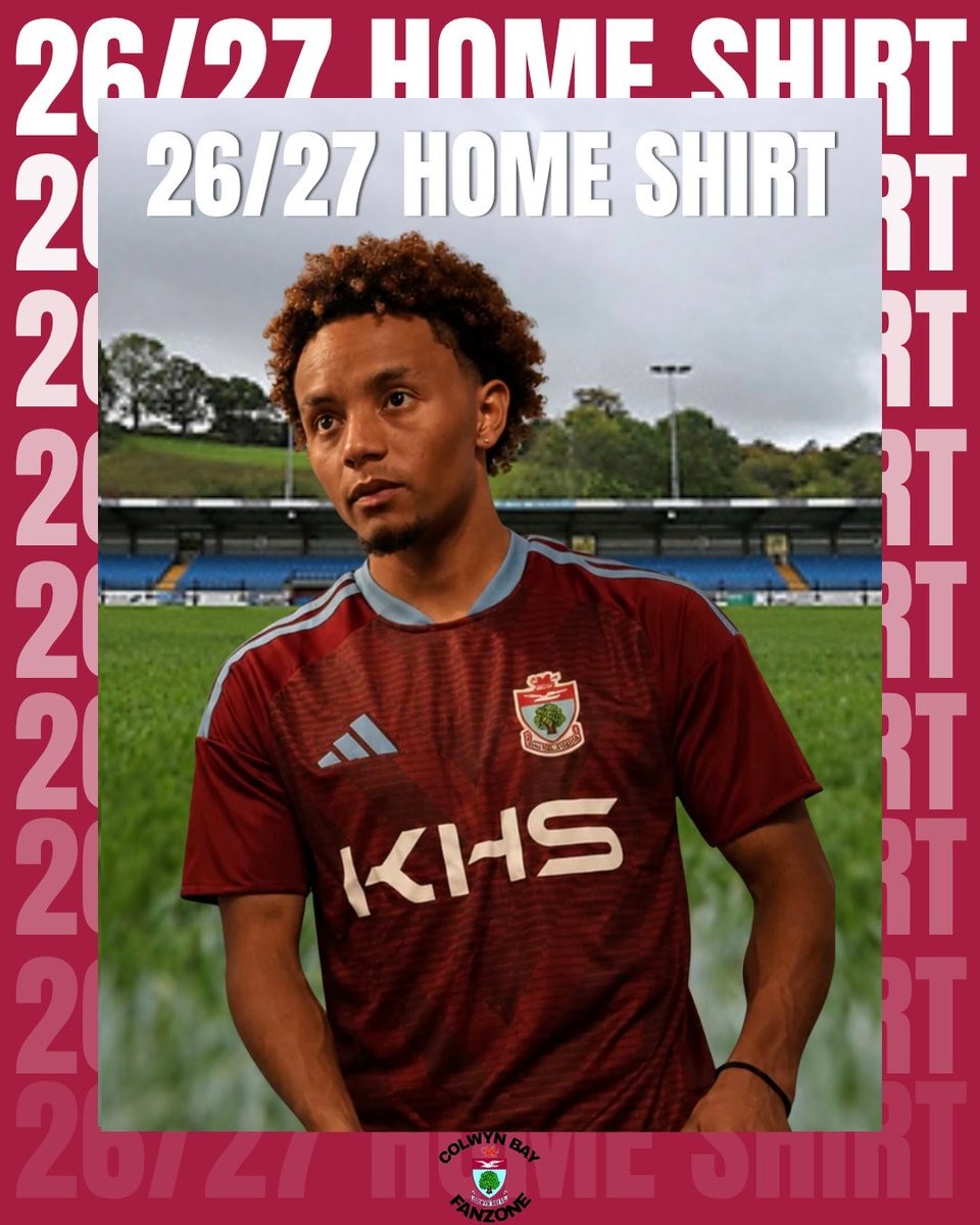
Colwyn Bay 26-27 Home and Away Kits Released
Colwyn Bay Football Club has released its new home and away shirts for the 2026-27 Cymru Premier season. Produced by Adidas under a record five-year teamwear agreement, the kits represent a significant step for the Welsh club following its previous supplier partnership.
The designs were officially unveiled on May 29, 2026, during a membership and kit launch event at the Blue Turtle Arena. Fans have been quick to respond positively to the new Adidas branding across the club's various teams.
Pre-orders for the home and away shirts are now available through the official club store at store1881.com, allowing supporters to secure the kits ahead of the upcoming campaign.

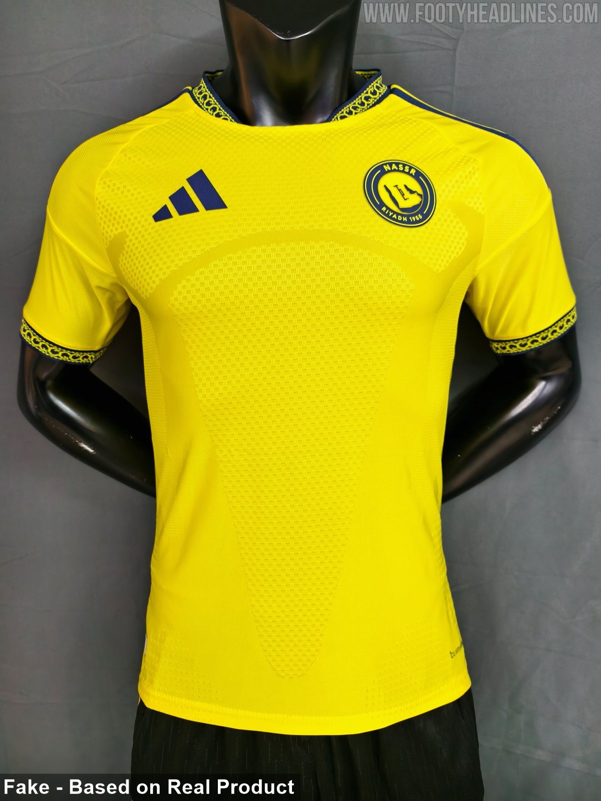
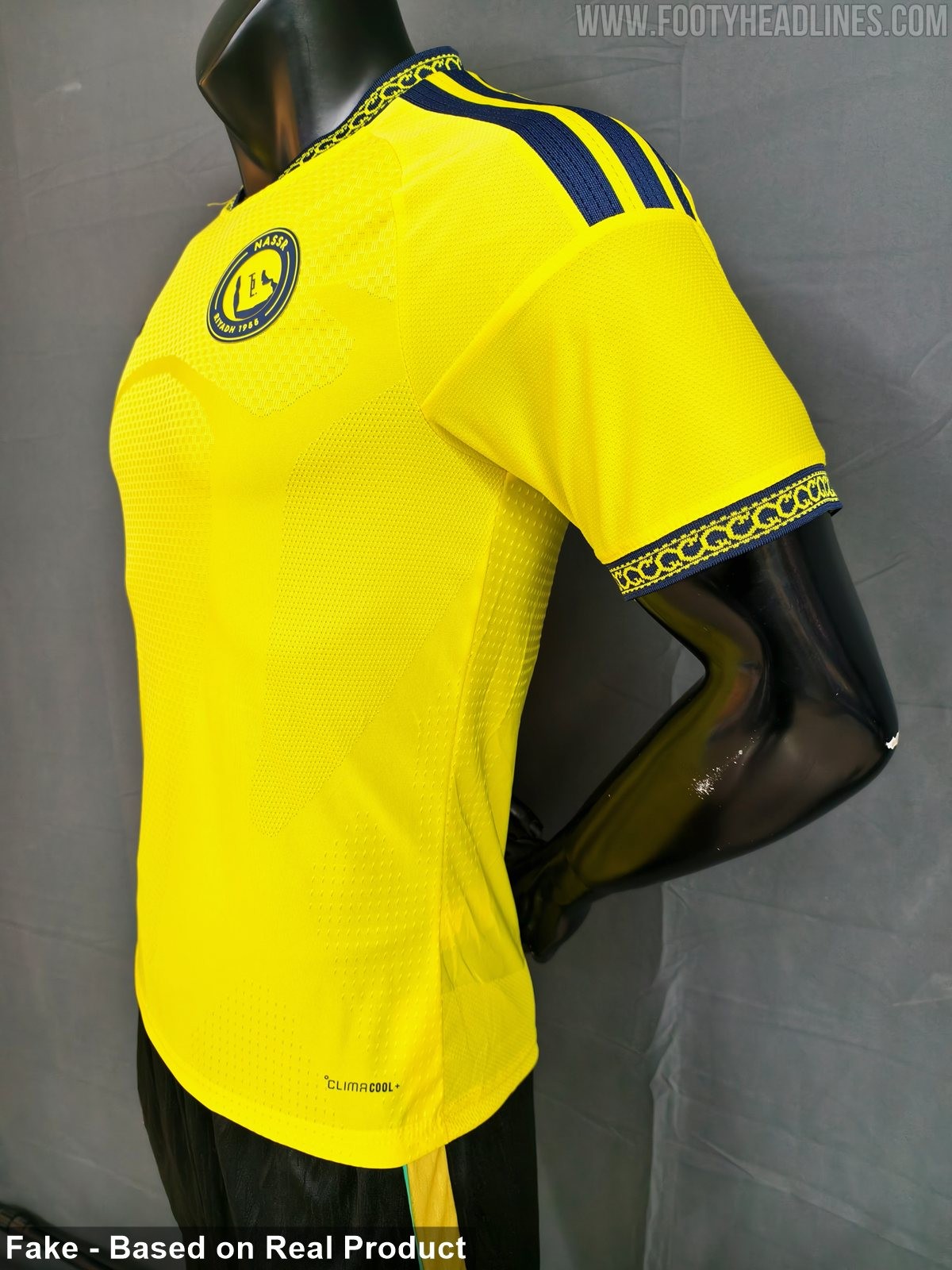
Al-Nassr 26-27 Home Kit Leaked - 9 New Pictures
Footy Headlines can now leak 9 new pictures of the Adidas Al-Nassr 26-27 home kit. Although it is a fake, the design is identical to the real one.
The kit features a yellow base with dark navy shoulder stripes and chest logos.
Both the collar and the sleeve cuffs feature intricate, traditional patterns featured on the crew-neck collar and the sleeve cuffs.
