Roundel Logos Takeover
 Dec 3, 2020, by Chris

Update: Swiss football fan @andrinunterwegs "took the trouble to analyze some of the recent changes of coat of arms in English football - and is shocked."

Roundel Logos Takeover England

Various English tams have changed their logo to a round design, including Manchester City, Forest Green Rovers and Bentford.
Recent Logo Launches: Many Football Clubs Opt For Circular Crests
This week, Spanish La Liga club Deportivo Alavés unveiled its new logo. The new logo ditches the unique pennant shape of the previous crest in favor for a simple circle. Deportivo Alavés was not the first team who recently did a similar change... Thanks to @phildelves for the heads-up.
Recent Logo Launches: Many Football Clubs Opt For Circular Crests
Some clubs who launched a rounded logo recently.

In the past few years, many soccer clubs ditched their old logo or released their first-ever logo. Many, many of them opted for a circular design - Alavés is the most recent example, while other teams who released a rounded logo recently are Inter Miami CF, Stockport County, Toulouse, Charlotte FC (new MLS team) and Brentford.


As mentioned by football crest expert @TheFCIndex, there are several reasons for clubs to have a round logo.
- Social & Gaming (small sizes)
- No detail gets lost on a colour background (kits)
- Easy to invert/outline
- Someone else did it last year and it was a success
Of course, there are some examples of teams who launched a non-circular logo recently. Some prime examples are Iceland and Juventus.

Share your thoughts in the comments below.

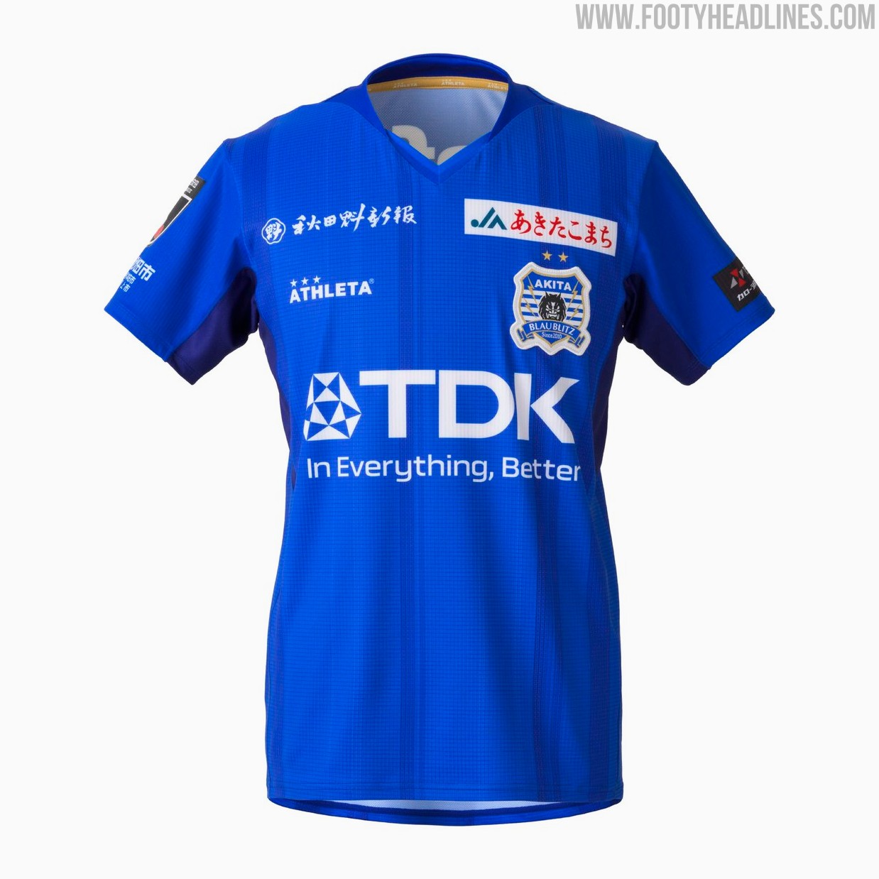
Blaublitz Akita 26-27 Kits Released
Japanese J2 League club Blaublitz Akita have unveiled their new 2026-27 kits. Made by Athleta, the new kits feature a distinct design inspired by the concept of weaving.
The Athleta Blaublitz Akita 2026-27 kits are designed around the theme of weaving, reflected in a woven pattern on the shirts, symbolizing the unity of the stakeholders spinning their efforts onto the pitch.
The new Athleta Blaublitz Akita 2026-27 kits will be available to pre-order starting July 6, 2026, with deliveries planned ahead of the start of the new league season.


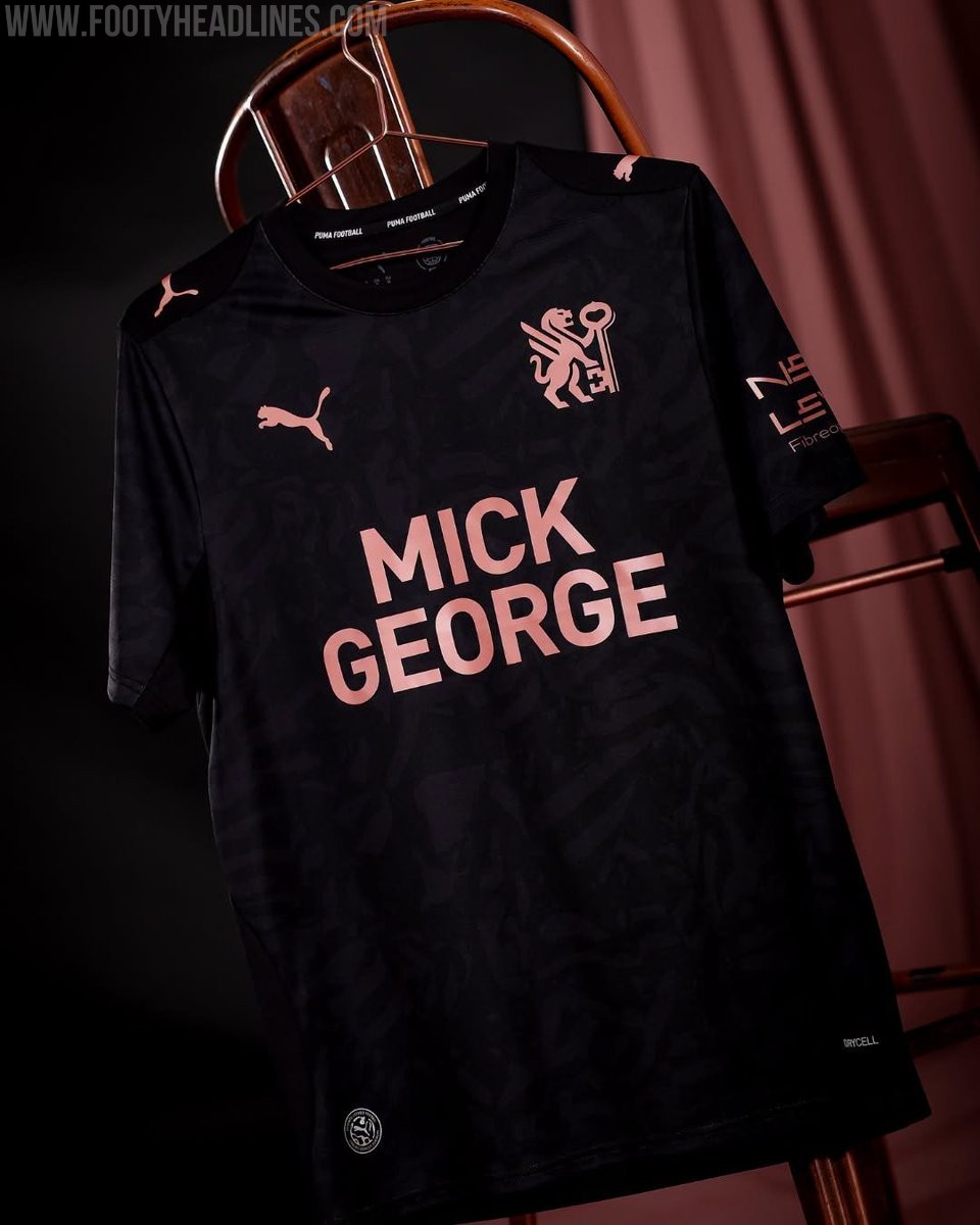
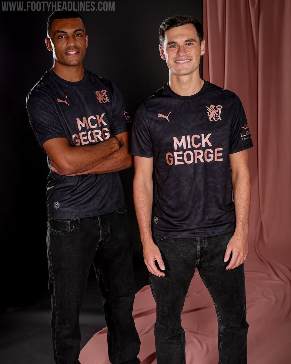
Peterborough United 26-27 Away Kit Released
League One side Peterborough United have officially launched their new Puma away kit for the 2026-27 season. The strip was unveiled during the club's Fan Zone Fun Day event on July 4, following the release of their home kit earlier in the summer.
The Peterborough United 2026-27 away shirt showcases a contemporary design that aligns with the club's new direction. It features a black base with rose gold accents. It also prominently features the club's newly introduced crest, marking a fresh chapter for the team.
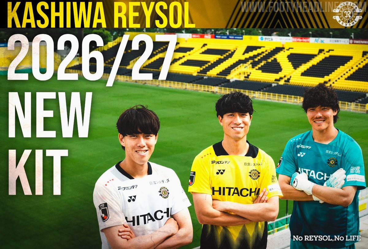
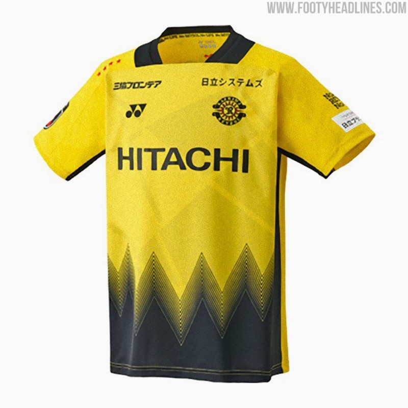
Kashiwa Reysol 26-27 Kits Released
Japanese J1 League club Kashiwa Reysol has officially unveiled its new 2026-27 kits, which are once again designed and manufactured by Yonex. The official launch on July 4 follows a short teaser video released earlier in the week and coincided with the announcement of the club's squad and player numbers for the upcoming season.
The Kashiwa Reysol 2026-27 kits feature a striking design centered around the concept of "Break the Light." The home shirt incorporates the club's traditional yellow and black colors, separated by dynamic geometric patterns that symbolize moving through the light. The away and keeper kits mirror the design in different colors.

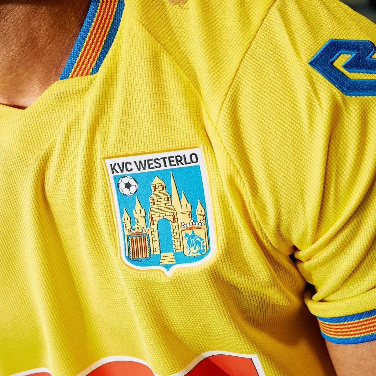
Robey KVC Westerlo 26-27 Home Kit Released - No More Nike
Belgian club KVC Westerlo has unveiled their new 2026-27 home kit, marking the beginning of a new partnership with Robey Sportswear. The Dutch brand takes over from Nike, which had supplied the club's kits since 2022.
The Robey KVC Westerlo 2026-27 home shirt features the club's traditional yellow and blue colors. Launched with the slogan 'Designed for you. Worn by you. Because you are Westel,' the design aims to celebrate the strong bond between the team, its supporters, and the local Kempen region.