Two Teams, One Club: New Houston Dynamo & Houston Dash Logos Unveiled
 Nov 17, 2020, by Simon
Today, Texas-based MLS outfit Houston Dynamo announced significant changes to the club's visual identity as they unveiled a new logo. Additionally, Houston Dash also received a new logo. Now, both logos bear a more obvious resemblance than before to also unify the family that Houston Dynamo and Houston Dash are on a visual basis.

Houston Dynamo FC 2020 Logo & Rebranding

The new Houston Dynamo 2020 logo introduces a lot of changes. Most importantly, the overall shape was changed to now be a hexagon which features two borders. Within these black and orange lines are the three elements that will represent Houston Dynamo F.C. in the future: an orange design element of the initials HD, the white lettering Houston Dynamo FC underneath and an orange lightning graphic at the bottom.
Additionally, the color composition was altered to now only consist of three colors: black, orange and white, whereas the previous logo also incorporated sky blue. Most importantly, the new Houston Dynamo 2020 logo puts an emphasis on the club's hometown with a more prominent appearance of the writing within the logo, while also looking back at the club's inaugural 2006 MLS season by using a hexagonal shape.


For the club's officials Houston Dynamo's 2020 rebranding is an evolution that rightfully also finds its way into the club's visual identity as John Walker explains:
“We just finished our 15th season. When the Dynamo first came to Houston in 2006, it was just the team. They didn’t really have the stadium. They didn’t have a locker room. They didn’t have offices,” team president John Walker said. “It has evolved into something much bigger than just the team, and so this rebrand is really symbolic of an evolution.”
“This process started over two years ago, so it was at that time that we circled a date on the calendar to do it at the end of the 15th season. We thought that would be a turning of the page from the first chapter of the club, and then we’ve evolved, and now we’re coming out with a new version of the club.”
Lastly, Houston Dynamo also added F.C. for football club to the franchise's name.
Houston Dash 2020 Logo

Houston Dash's 2020 rebranding follows the same approach to have a unified visual identity for both Houston football clubs from now on: the new Houston Dash 2020 logo features a hexagonal shape with a sky blue line surrounding similar design elements. This time, the middle part is composed of a massive H in orange and sky blue with the white writing Houston Dash and an orange star sitting underneath.


“This evolution has been a focal point for our Club for the last two years as we strive to exemplify the unique spirit of the city. Houston’s culture, innovation and love for the sport brought us to this momentous day and we reached this turning point with the incredible support of our fans, staff and agency partner, 9th Wonder,” said Dynamo and Dash Chief Marketing Officer Katie Scallan. “Our Club is defined by the city we call home, and we wouldn’t have it any other way.”
What do you think of the rebranding for both Houston football clubs, Houston Dynamo FC and Houston Dash? Drop us a line below.

Venezia and Rapid Wien Release Special Collaborative Kit
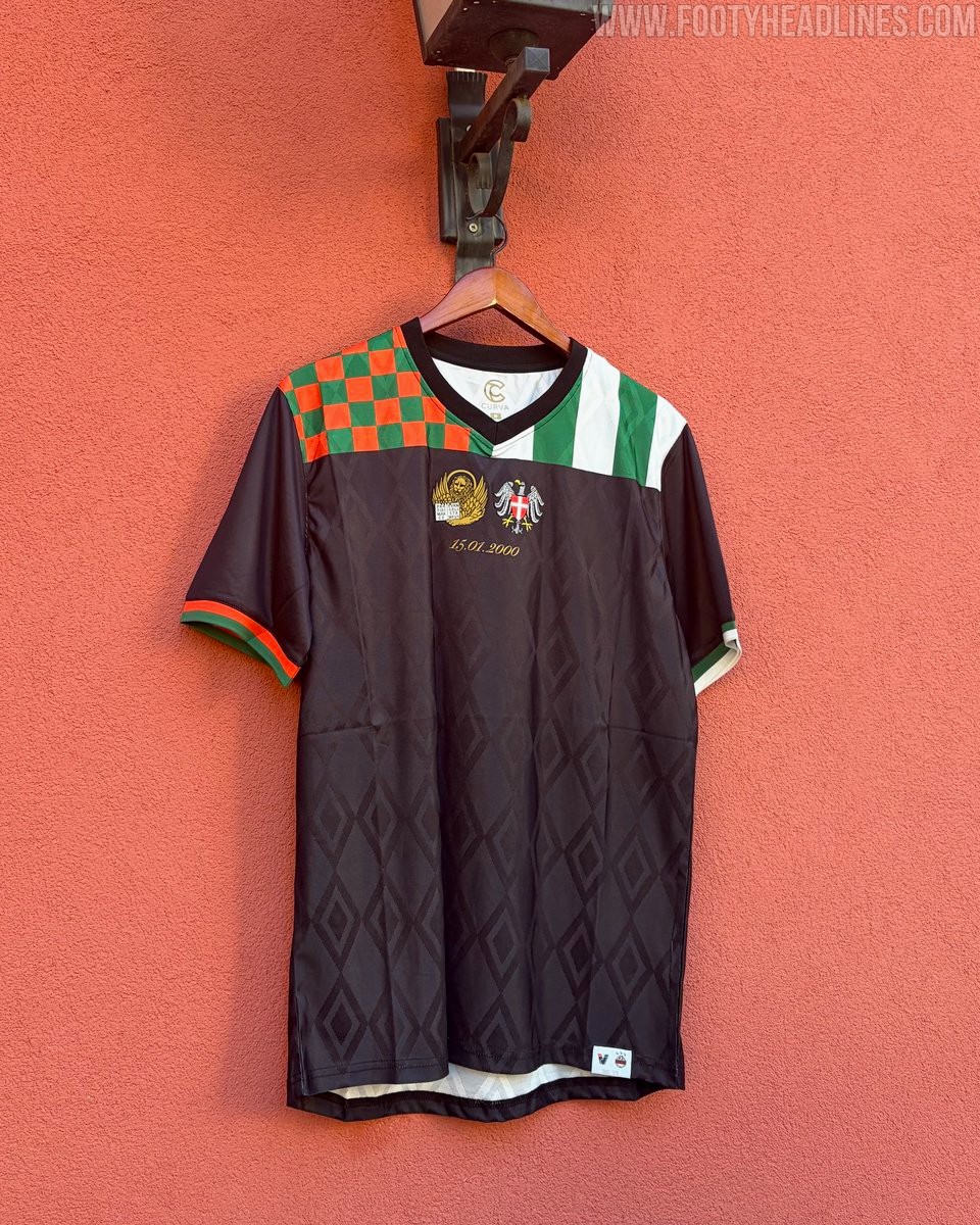
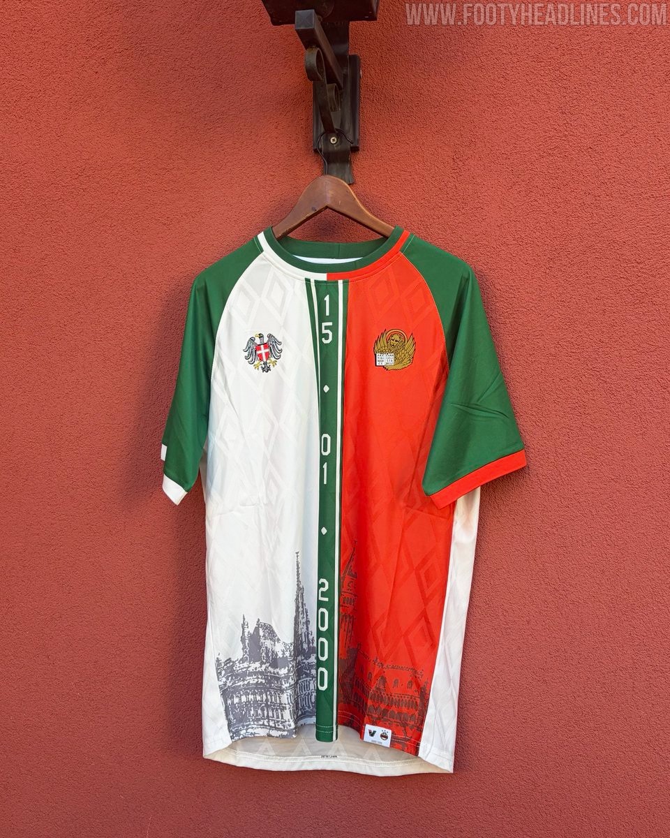
Venezia FC and SK Rapid have unveiled two special limited-edition jerseys to celebrate the 26th anniversary of the historic friendship between their supporters and clubs. The twinning, which officially traces back to January 15, 2000, was commemorated on the pitch during an international friendly at the Stadio Pier Luigi Penzo, with both sides wearing the bespoke designs.
The collaboration includes two distinct shirts designed in close cooperation with the fan groups. The black Unione jersey features an all-over diamond jacquard pattern, complemented by Venezia's orange and green checkerboard on the right shoulder and Rapid's green and white stripes on the left. The white Unione shirt presents a split look blending green and orange accents with line illustrations of iconic architectural landmarks from both Venice and Vienna, including the Doge's Palace and St. Stephen's Cathedral. Both designs place the lion of Saint Mark and the Austrian eagle crests side by side above the date 15.01.2000.
During the friendly match on the Venetian lagoon, the hosts wore the black kit while Rapid took to the pitch in the white version, with Venezia edging a 1-0 victory. The limited-edition jerseys have been made available to supporters through Venezia's official online store and physical club shops.
Unique Jordan PSG 26-27 Third Goalkeeper Kit Leaked - Inspired by Bernard Lama
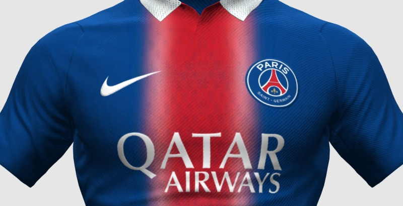
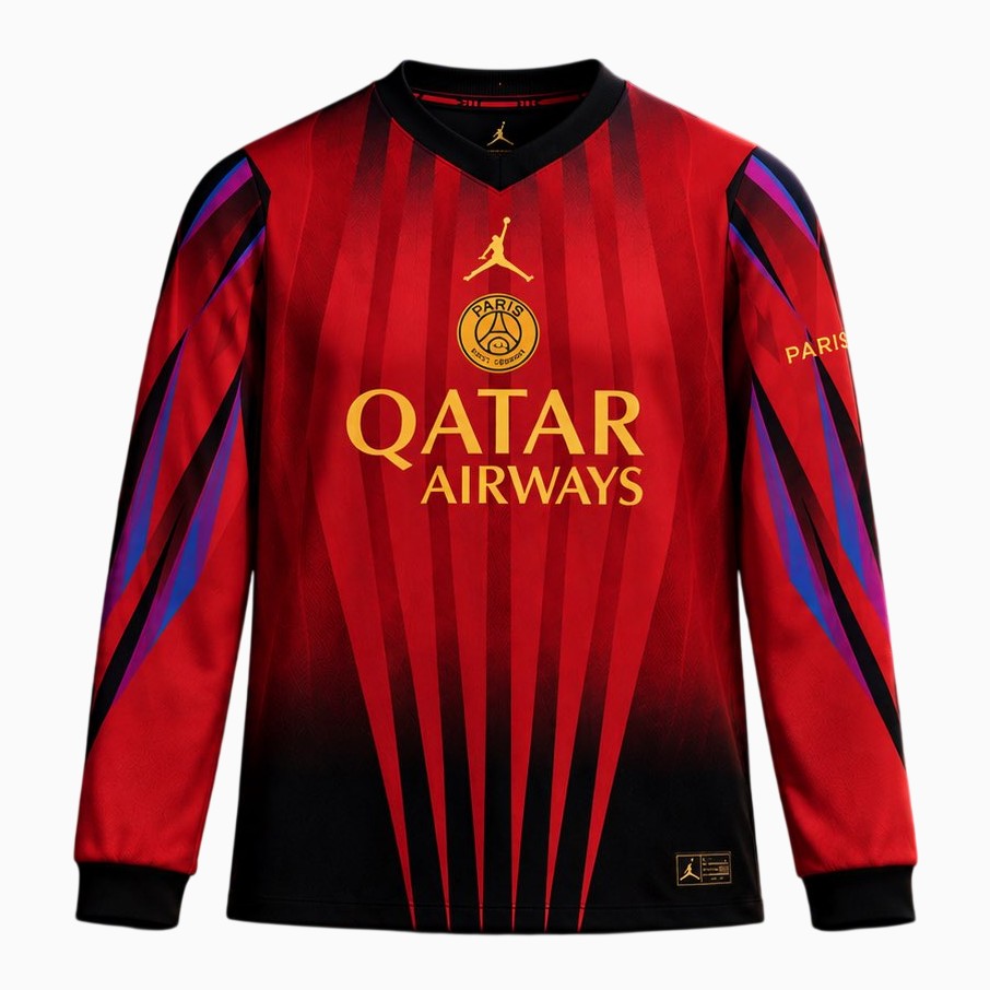
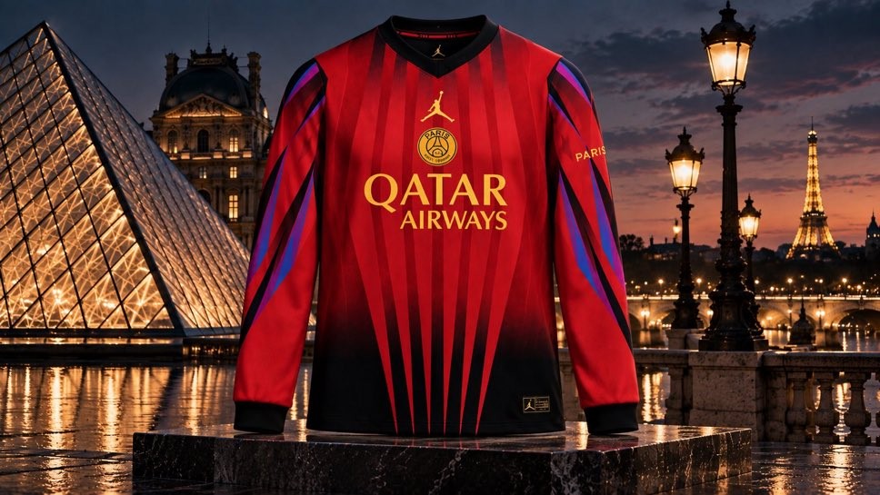
The striking new goalkeeper jersey from the upcoming Paris Saint-Germain x Jordan third collection has leaked courtesy of PSG insider @lasource75006. Scheduled to drop in the coming weeks alongside the club's 26-27 third player kit, the long-sleeve piece pays direct homage to iconic former Paris Saint-Germain shot-stopper Bernard Lama.
The Jordan PSG 26-27 third goalkeeper shirt draws inspiration from the distinctive Nike template worn by Lama during the 1997-98 season. It features a vibrant red base with sharp black vertical stripes tapering upward from the lower hem. The long sleeves are adorned with dynamic graphic streaks in shades of purple, blue, and black, perfectly channeling the flamboyant goalkeeper aesthetics of the late 1990s.
Gold detailing rounds off the design, highlighted by a centrally aligned Jordan Jumpman sitting above a monochrome Paris Saint-Germain crest and the Qatar Airways chest sponsor.
Neuchâtel Xamax 26-27 Fête des Vendanges Special Kit Released
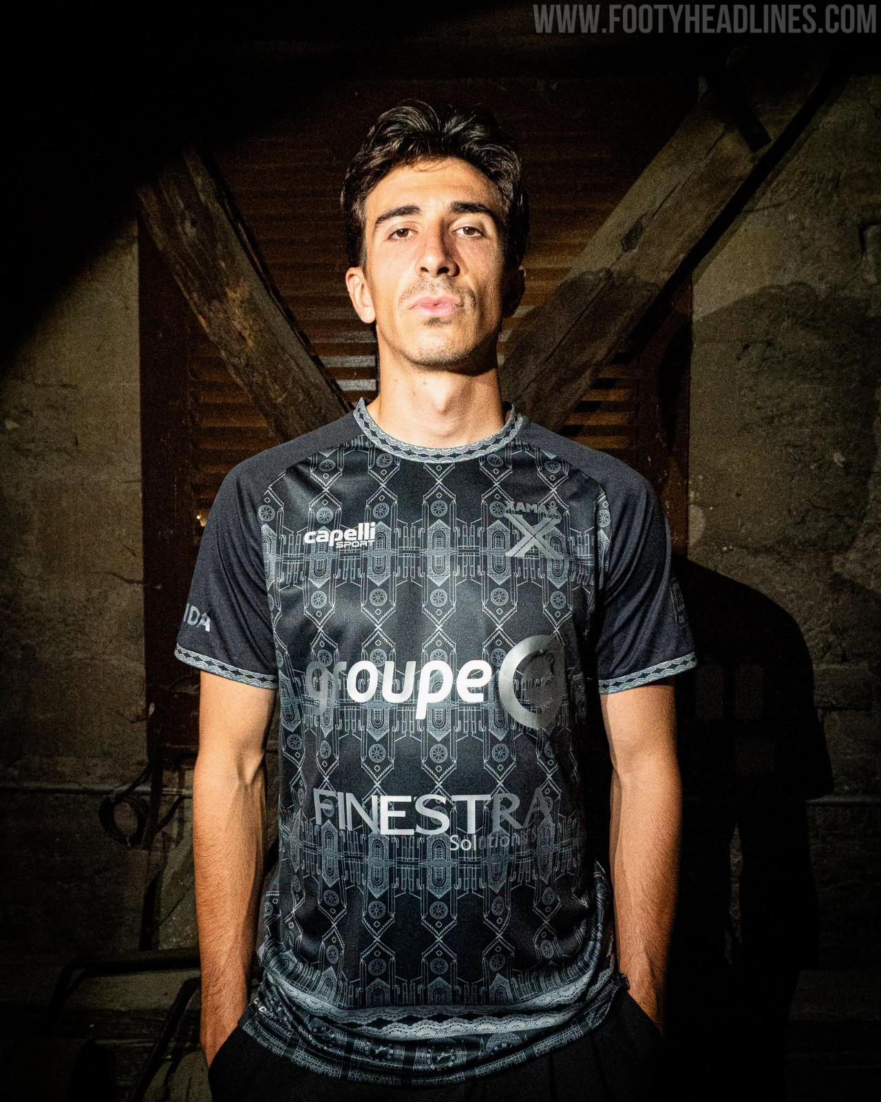
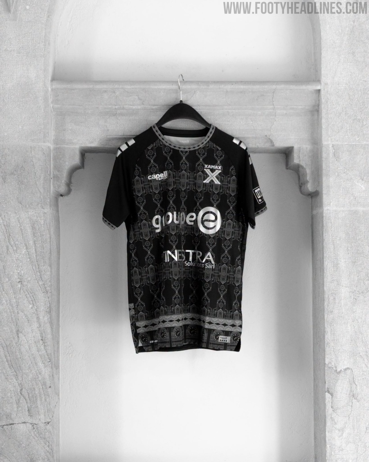
Swiss Challenge League side Neuchâtel Xamax and technical partner Capelli Sport have officially released a special-edition kit for the 2026 Fête des Vendanges, Neuchâtel's iconic annual wine harvest festival. The bespoke design pays tribute to a historic local milestone, commemorating the 750th anniversary of the consecration of the Collegiate Church of Neuchâtel (Collégiale de Neuchâtel), which took place in 1276.
The Capelli Neuchâtel Xamax 26-27 Fête des Vendanges shirt arrives in a sharp black and silver colorway, covered in intricate architectural illustrations of the famous landmark. The front of the jersey features repeating linework depicting the church's Gothic arches, towers, and rose windows, flowing into detailed clock faces and decorative borders around the lower hem. Finished with matching ornate patterns along the collar and cuffs, all sponsor and club logos are rendered in monochrome silver
Montenegro 2026 Home & Away Kits Released
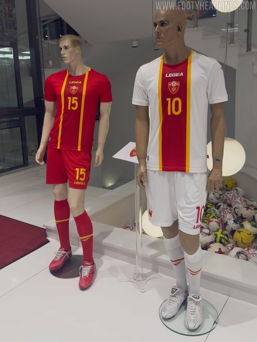
Italian sportswear brand Legea has rolled out the new home and away kits for the Montenegro national football team. The long-standing partnership between Legea and the Football Association of Montenegro continues with a fresh set of bespoke designs showcased on display mannequins.
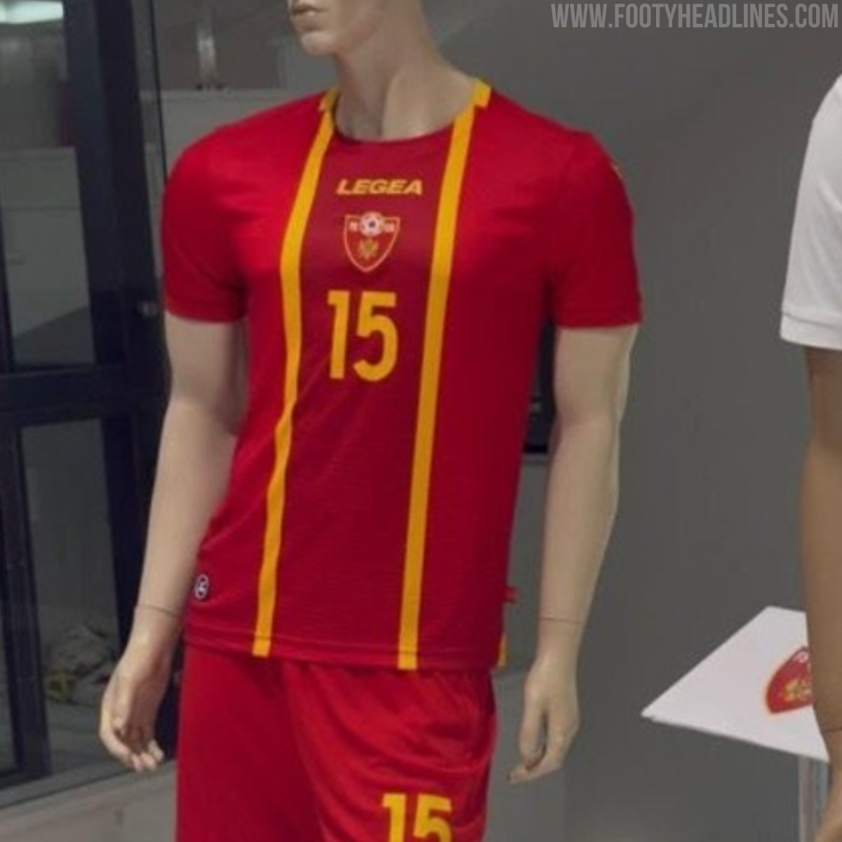
The new Montenegro 2026 home kit is predominantly red, accented with two prominent yellow vertical stripes running down the front of the jersey. In line with the central design focus, the white Legea wordmark and the national federation crest sit centrally on the chest above yellow squad numbering. The strip is rounded off with red shorts featuring yellow detailing and matching red socks.
The 2026 away kit adopts an inverted approach on a clean white base. It features a bold central vertical band in red, neatly outlined by thin yellow borders that run from the collar down to the hem. The Legea logo, national team crest, and front numbers are all aligned inside the central red stripe, completed by white shorts and white socks with subtle red and yellow trims.