Evolution Of The EURO Logos From 1960-2020

- Early Logos (1960-1992): The logos featured the host nation's flag, the UEFA name, and the year, with a consistent design except for a unique Italian logo in 1980.
- Evolution of Creativity (1996-2016): Logos became increasingly creative, incorporating elements like players, host nation themes, nature, and, starting in 2016, the Henri Delaunay Cup.
- Modern and Diverse (2020): The 2020 logo symbolizes unity across 13 host countries with a bridge design and incorporates city-specific logos.
Update: Since the UEFA EURO 1996 in England, there have been sleeve badges. New football kit magazine Kit Mag shared pictures of all UEFA EURO sleeve badges since the EURO 1996.
EURO 2020 is now the 16th iteration of the competition. Let's have a look at all the logos from previous EURO until now to see how they have changed over the years. Huge thanks to @planetafobal for the image.

HISTORY OF THE EURO LOGOS
From 1960 to 1992, all iterations featured the same logo design. Host nation's flag on top, then the UEFA name in bold, geometric font and the year at the bottom right corner. The flags and the UEFA acronym is stylised to be in a flapping motion.

The only exception came in 1980, when the host Italy had a unique logo, a geranium with a football, as well as the usual UEFA flag.

Then came England 96. This was when the EURO logo really started to have much more creativity input. The graphic was colourful, depicting a football whose hexagon patches form a figure of a player shooting a ball. Below the graphic is the competition's name, which came in three different typefaces for the UEFA acronym, EURO 96 and England, respectively.

The year 2000 saw somewhat a similar theme, a graphic of a player kicking the ball with a circular shape in the back ground. This time, though, the name of the hosting nations was not put into text but incorporated directly into the graphic with the flags Netherlands and Belgium taking each half of the player figure. That year also the first to start having the UEFA name in an arch which still presents today.

The warm and sunny weather of Portugal's summer was the main theme for the 2004 EURO. Orange and yellow dominated the logo that had a football placed inside a heart shape and 7 green dots to its' right side.

From sunny seaside we moved to the mountainous areas of Austria and Switzerland in 2008. The high peaks are represented in red, home colours of both countries, while a green football is placed inside the curves of the red mountain. It is a simplistic design with nods to the natural beauty of the hosts.

Moving forward with having a touch of nature in logo design, the EURO 2012's featured two flowers in red/white (Poland) and blue/yellow (Ukraine) with a large football in the middle. Inside each shape is a human figure throwing their hands up in victory.

2016 saw the first EURO logo to include the Henri Delaunay Cup. France approached the design in a modern and subtle manner. Main colours are blue, white, red as per the flag of the nation. The graphic comprises of an elegant and refined collage of shapes to display France's artistic nature. Miguel Viana, designer of this logo as well as the 2012 one, cited his inspiration was 'Celebrating the Art of Football'.

Now the 2020 EURO, the first time where there is not one, not two but 13 countries across Europe that will host the matches. As such, the design feature a green arch, symbolising a bridge that connects and unites everyone, with the famous Henri Delaunay Cup sitting on top. Surrounding the club are celebrating fans of the game. Additionally, each city also has their own logo with their iconic bridge connected to the green bridge of the main EURO logo.

UEFA EURO Sleeve Badges - 1996-2020
The sleeve badges were introduced for the England EURO 1996 and have been there since then.
What do you think of past EURO logos? Let us know down in the comment.

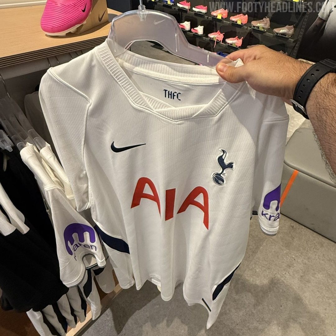
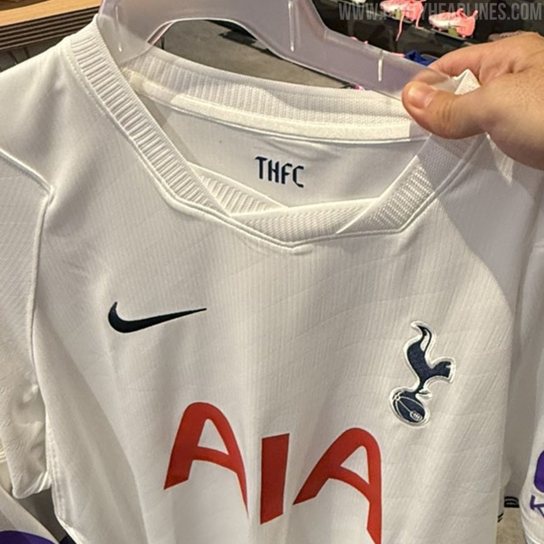
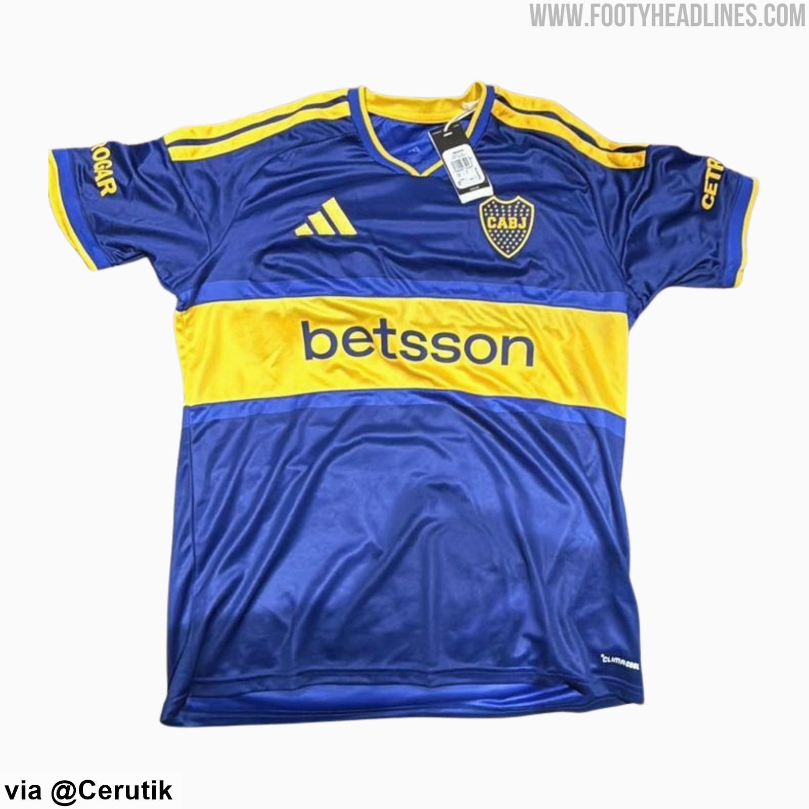
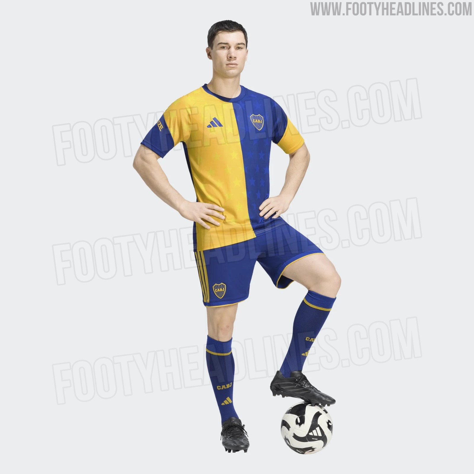
Boca Juniors 26-27 Shirt + Shorts, Socks & Pre-Match Jersey Leaked
We can leak the full look at the Boca Juniors 2026-27 home kit - it is completed by shorts and socks that match the stripe design of the kit.
SV Austria Salzburg 26-27 Home Kit Released
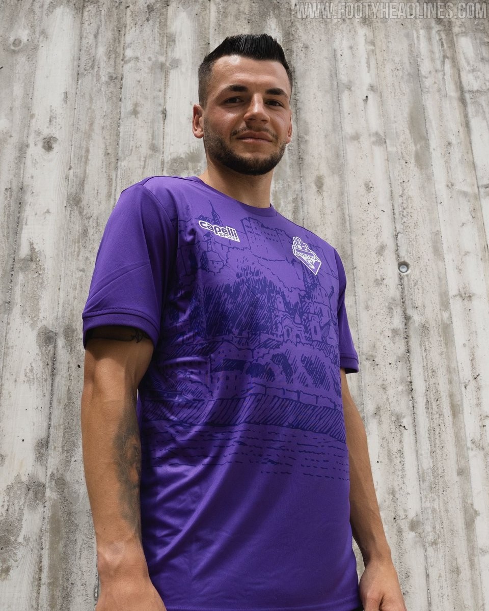
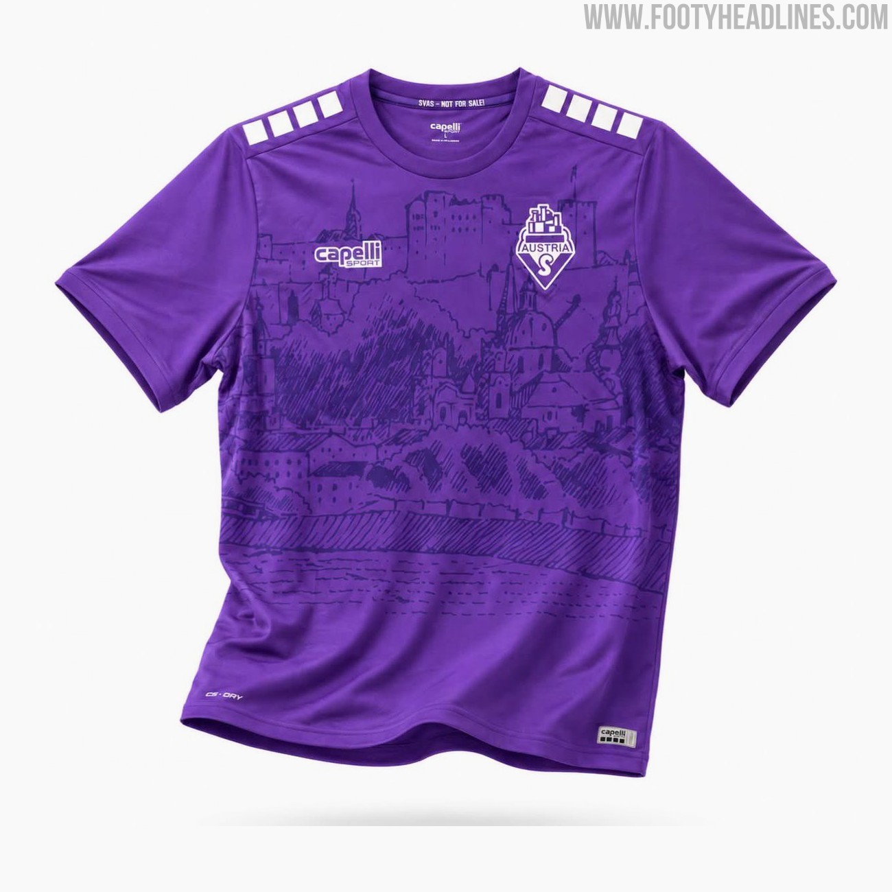
The new SV Austria Salzburg home kit for the 26-27 season has been officially released today. Made by Capelli, the new shirt will be worn by the club in the Austrian 2. Liga.
The Capelli SV Austria Salzburg 2026-27 home jersey features a bespoke design in the club's traditional colors. It incorporates two different tones of violet and is highlighted by a custom graphic showcasing the Hohensalzburg fortress and the towers of the old town, representing the team's local identity and heritage.
The Capelli SV Austria Salzburg 2026-27 home football shirt is available to purchase immediately through the club's official fanshop, retailing at a price of 69 Euro.
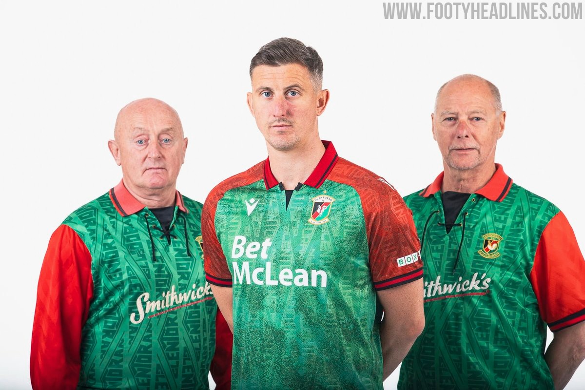
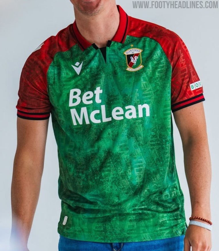
Glentoran 26-27 Home Kit Released
Glentoran and Macron have launched the club's new 2026-27 home kit for the upcoming NIFL Premiership campaign. The design pays homage to the classic 1992-93 shirt worn during their memorable European Cup tie against Marseille, featuring a green body with red sleeves and shoulder panels separated by black trim.
Giving the shirt a distinct early 1990s retro feel, a red fold-over collar is included with black striping and a black V-shaped insert at the front. A tonal graphic pattern runs across both the green and red sections, adding texture to the Macron Eco Fabric. The Macron Hero logo appears in white on the chest and sleeves, sitting opposite the stitched Glentoran crest and its accompanying gold star.
Additional details include the club motto Le Jeu Avant Tout embroidered in white on the back of the collar, and Glentoran FC Est 1882 printed inside the lower hem. Featuring Bet McLean as the main sponsor, the new Glentoran 2026-27 home shirt is completed with matching white shorts and green socks.

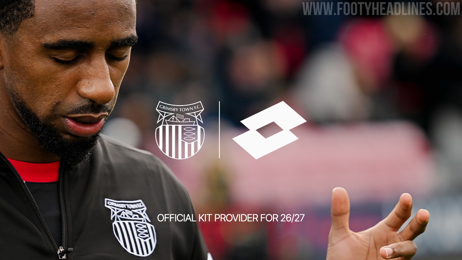

Grimsby Town Announces Lotto Kit Deal
Grimsby Town Football Club has officially announced a multi-year partnership with Italian sportswear brand Lotto Sport, who will become the club's official kit supplier starting from the 2026-27 season. Lotto replaces Umbro, whose kits were supplied to the club in collaboration with Kitlocker.
The announcement has been met with a positive reaction from fans, many of whom fondly remember the club's previous stint with Lotto kits in the late 1990s.
While no official images of the new 2026-27 kits have been released yet, supporters are eagerly anticipating the unveiling of the new designs.

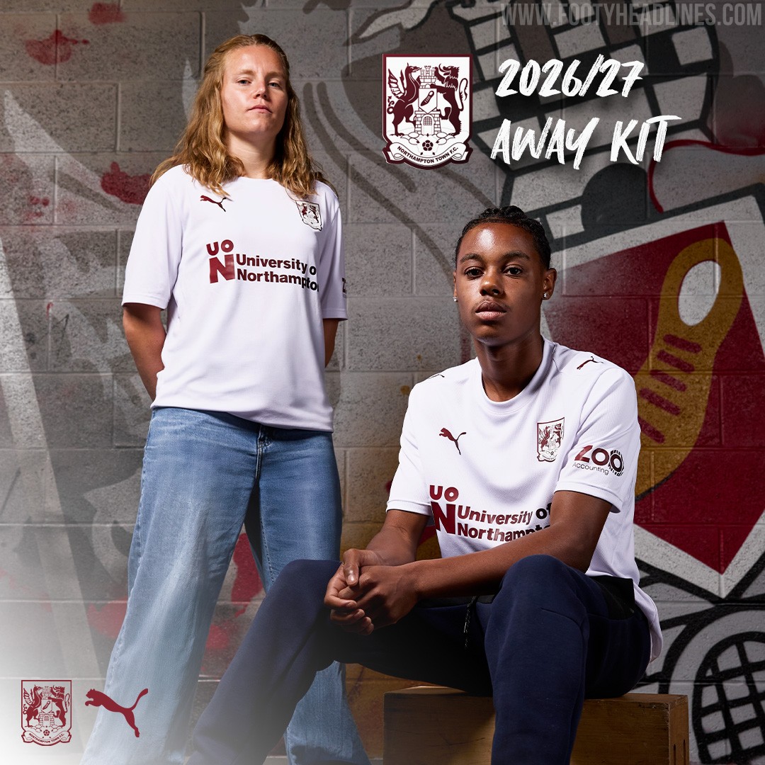
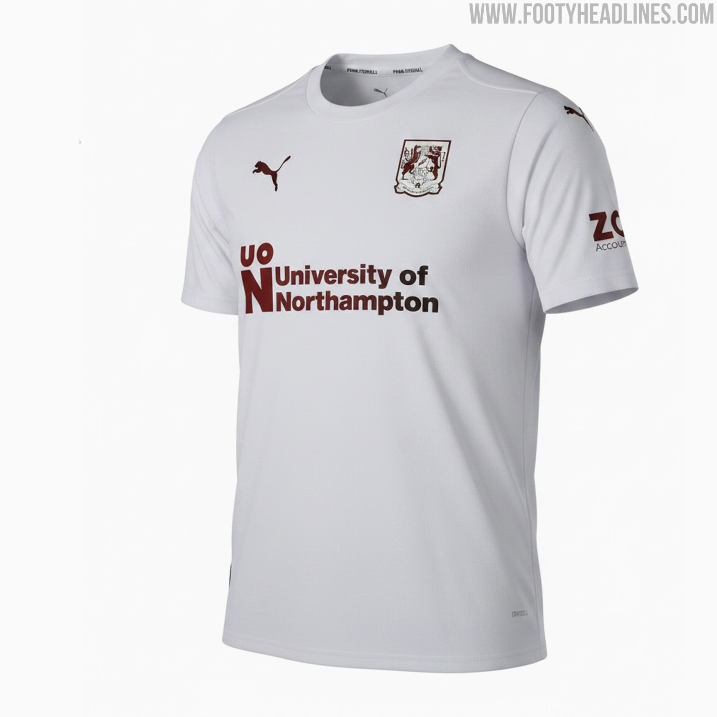
Too Basic? Northampton Town 26-27 Away Kit Released
The new Northampton Town 2026-27 away kit was officially launched today, introducing a clean and simple design by Puma. Featuring a classic white and claret colorway, the shirt has drawn mixed reactions from the fanbase, with some praising its timeless simplicity while others feel the look is a bit too basic. The new Puma Northampton Town 2026-27 away kit is available to purchase online and in the club store.
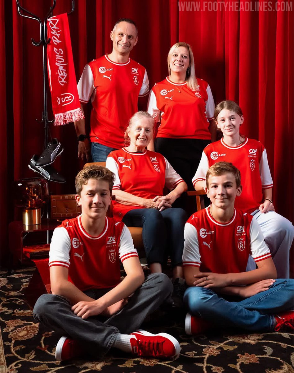
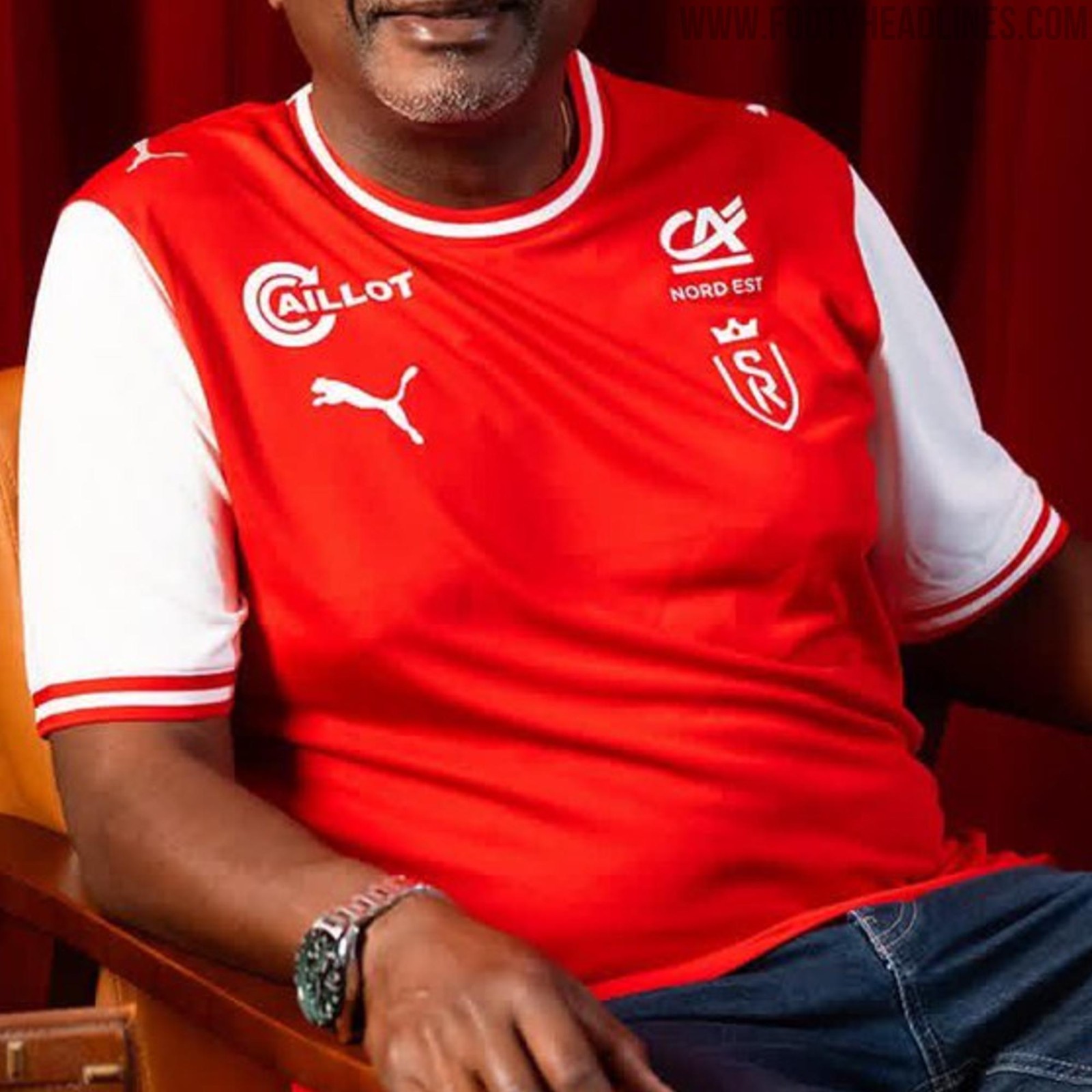
Stade de Reims 26-27 Home Kit Released
French Ligue 2 side Stade de Reims has officially unveiled its new Puma home kit for the 2026-27 season. Launched under the slogan "Toujours le même. Pour toujours le nôtre," the shirt features a simple and traditional red and white design that stays true to the club's heritage. The classic red body is complemented by white sleeves and details, offering a clean and familiar look for the team's upcoming campaign.