New Malta Badge Revealed - Huge Improvement?

One week ago, the Maltese football association presented their brand-new logo. It sees them refine their look and simplify the crest.
New Malta Logo
The Maltese football association took part in UEFA's annual UEFA Grow program, where all European federations are invited. This is a program intended for business development support.
Malta introduced the world to their new football crest, which places more emphasis on the eight-pointed cross than before. The football in the center has also been removed, with the colors being limited to only red and white.

'Malta FA' is written at the top of the roundel logo, using a new font compared to the old badge and choosing to abbreviate the words 'Football Association'. The founding year, 1900, is once again placed at the bottom.
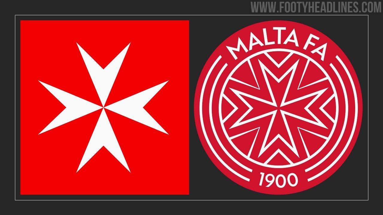
We consider the new logo to be a massive improvement, as it reduces the amount of text and color variety. The new crest clearly focuses on the recognizable Maltese cross and does so quite successfully.
What do you think of Malta's new logo? Comment below?
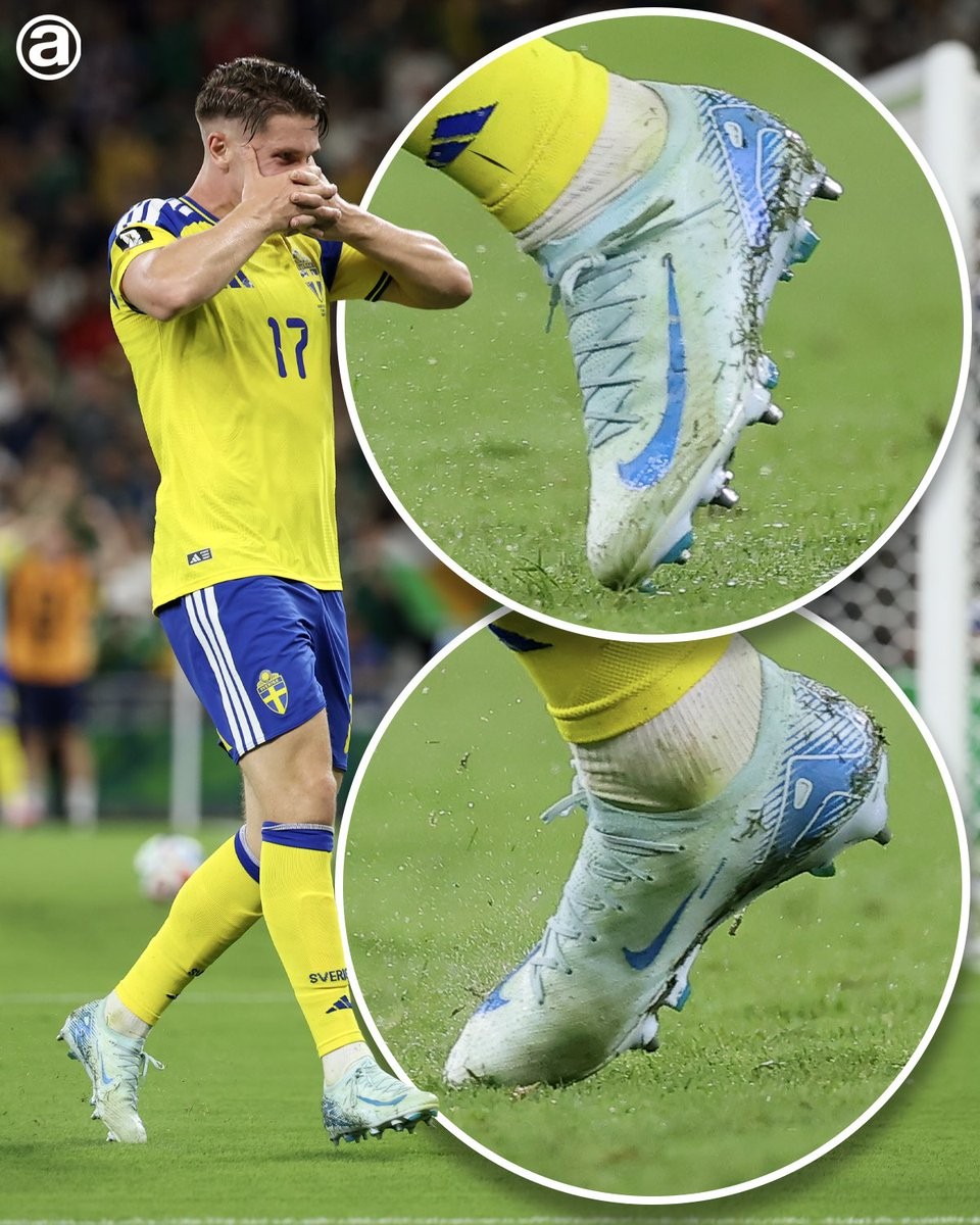
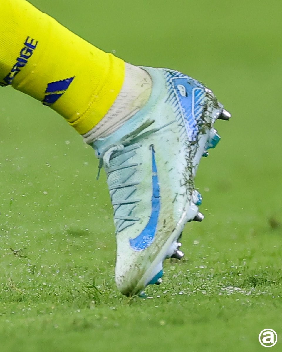
Viktor Gyokeres Sticks to Lucky Old-Gen Nike Mercurial Vapor 16 'Mad Ambition' Boots
Swedish striker Viktor Gyokeres has developed a superstition regarding his football boots, choosing to stick with an older colorway of the Nike Mercurial Vapor 16. Despite Nike releasing several newer packs, the forward continues to wear the Mad Ambition edition. He considers this specific pair to be his lucky boots due to his prolific goalscoring form while wearing them.
Interestingly, Gyokeres has been spotted testing and warming up in newer Nike Mercurial releases. However, when it comes to the actual matches, he consistently reverts to his trusted Mad Ambition Vapor 16s. This practice of wearing new boots during warm-ups but relying on a comfortable, proven pair for competitive play highlights how important gear familiarity and superstition can be for a striker.


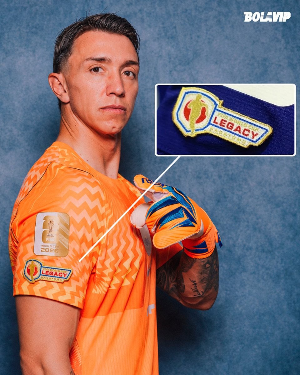
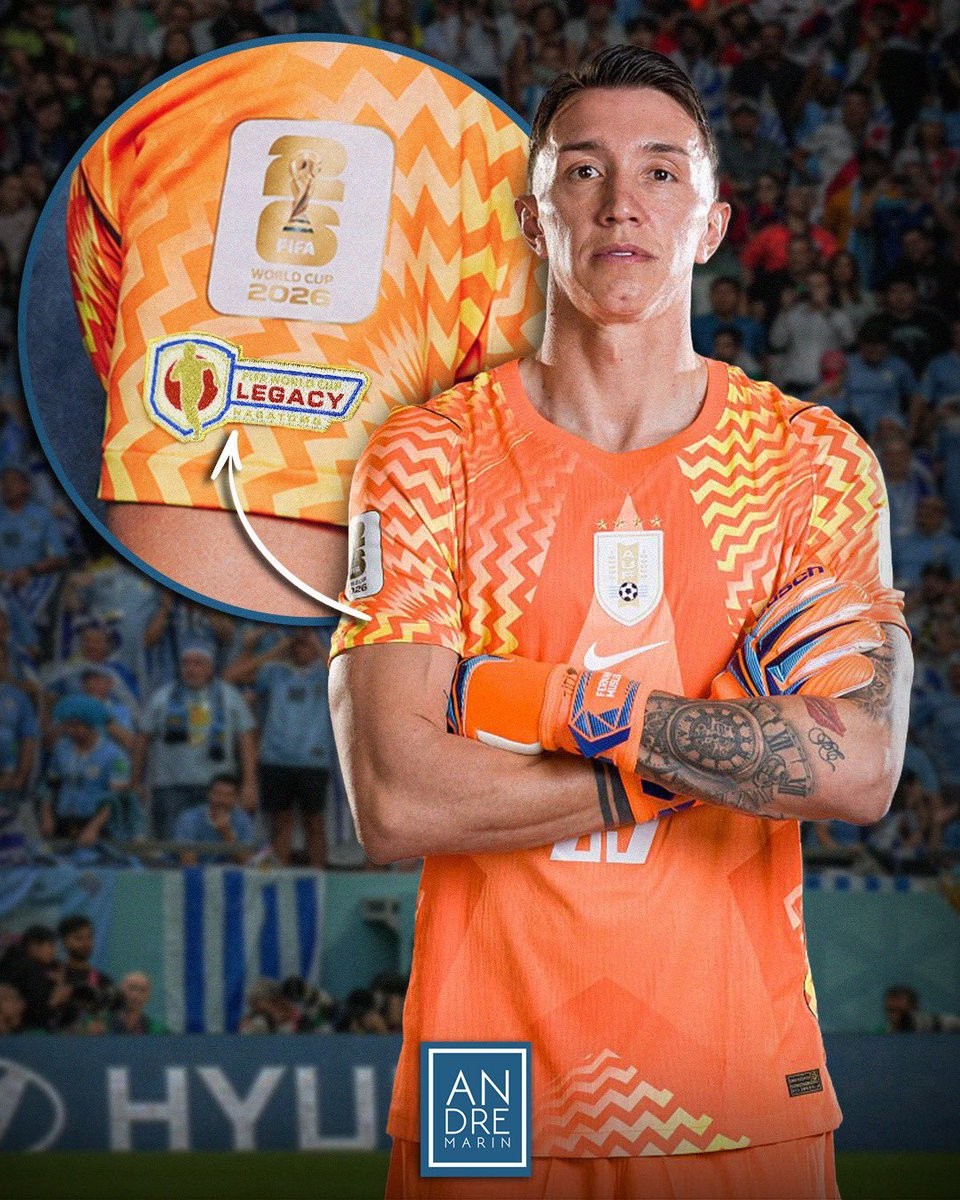
Uruguay Requests FIFA 'Legacy' Patch for Muslera's 2026 World Cup Kit
The Uruguayan Football Association (AUF) has formally requested that FIFA allow goalkeeper Fernando Muslera to wear the special 'Legacy' patch on his jersey sleeve during the 2026 World Cup. The patch is designated for players who have participated in five or more World Cup tournaments, a milestone Muslera is reaching with his inclusion in the 2026 squad.
Muslera was initially excluded from receiving the patch by FIFA because he did not register any playing time during the 2022 World Cup in Qatar, despite being part of the official squad. His previous World Cup appearances came in 2010, 2014, and 2018. The AUF is now pushing for his recognition alongside other five-time tournament veterans such as Lionel Messi, Cristiano Ronaldo, Manuel Neuer, and Luka Modrić.
The 40-year-old goalkeeper is expected to start in Uruguay's opening match of the 2026 World Cup. If FIFA approves the request, Muslera's jersey will feature the 'Legacy' patch, marking his long-standing service to the national team across five different World Cup campaigns.

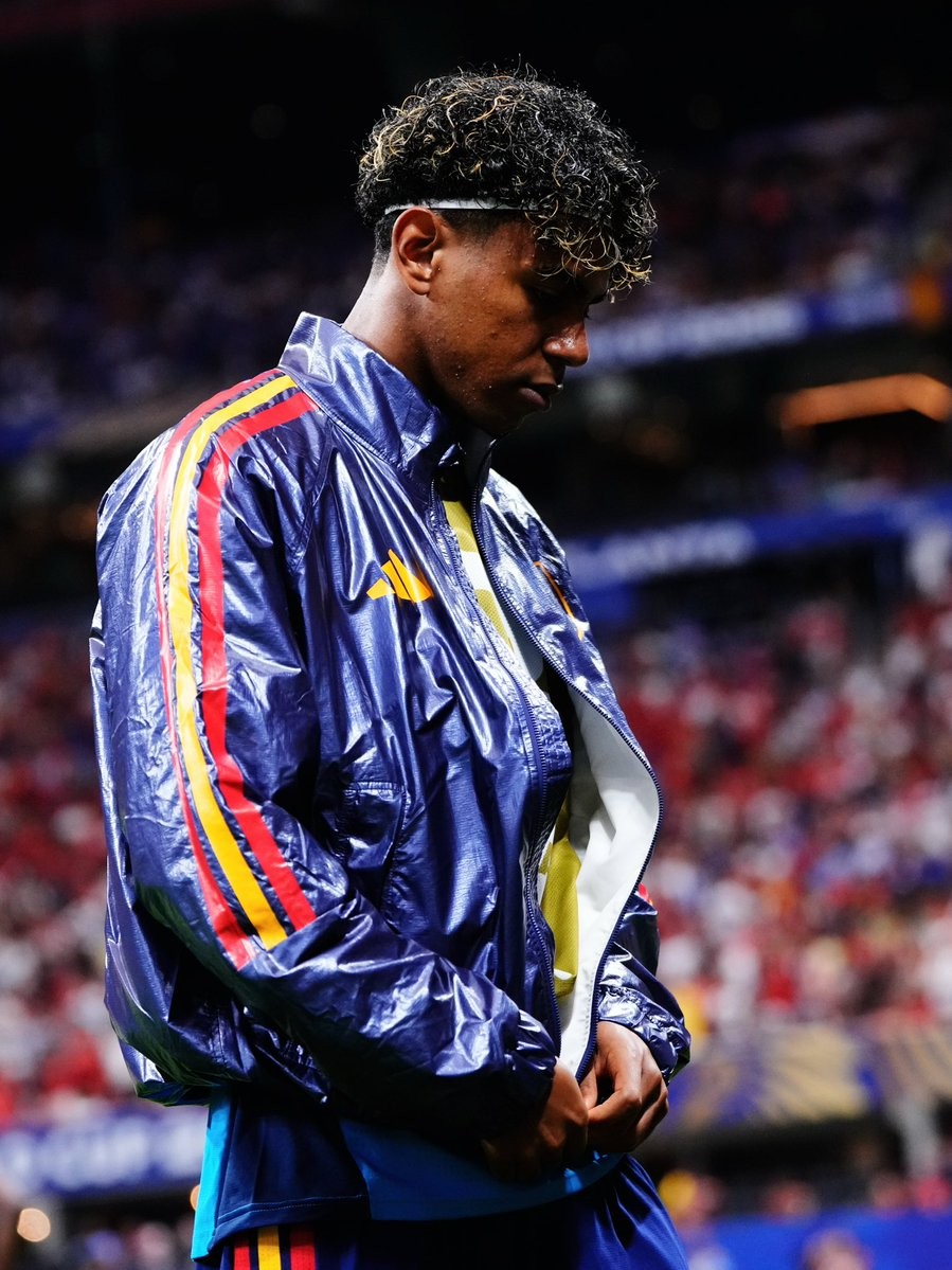
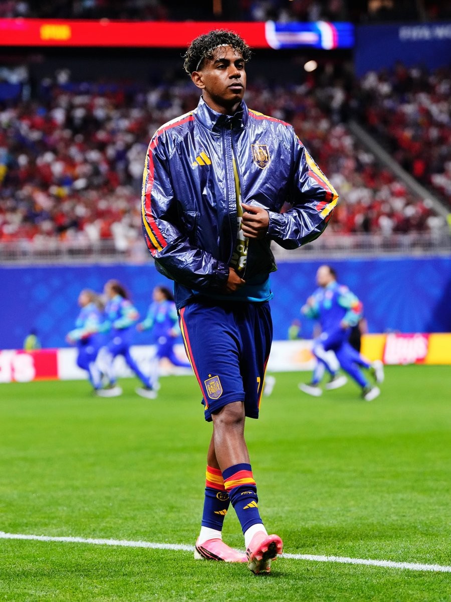
Spain 2026 World Cup Climacool Pre-Match Jacket Turns Heads
Spain's 2026 Climacool pre-match jacket, designed by Adidas for the 2026 World Cup, has caught the attention of fans and media alike. Worn by the players ahead of their matches in the tournament, the jacket has sparked a strong reaction online.
The Adidas Spain 2026 pre-match jacket features the usual design but with the striking, glossy Climacool look.
The Adidas Climacool 2026 World Cup Climacool jacket is not available to buy - Adidas only offers the regular version.

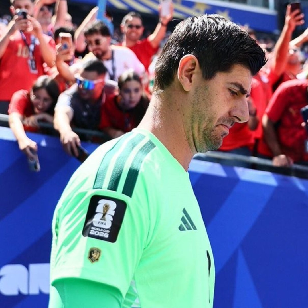
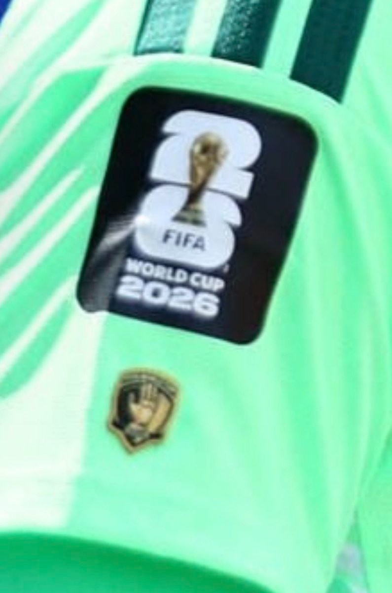
Thibaut Courtois Wears Special World Cup Golden Glove Patch
Following the introduction of special FIFA player patches for the 2026 World Cup, Thibaut Courtois has been spotted wearing a special Golden Glove patch on his Belgium kit, commemorating his award-winning performance at the 2018 tournament.
The new initiative by FIFA allows past award winners, including recipients of the Golden Boot, Golden Ball, and Golden Glove, to display their historic individual achievements directly on the sleeves of their national team shirts.