Haaland Chooses No. 9 Manchester City Shirt
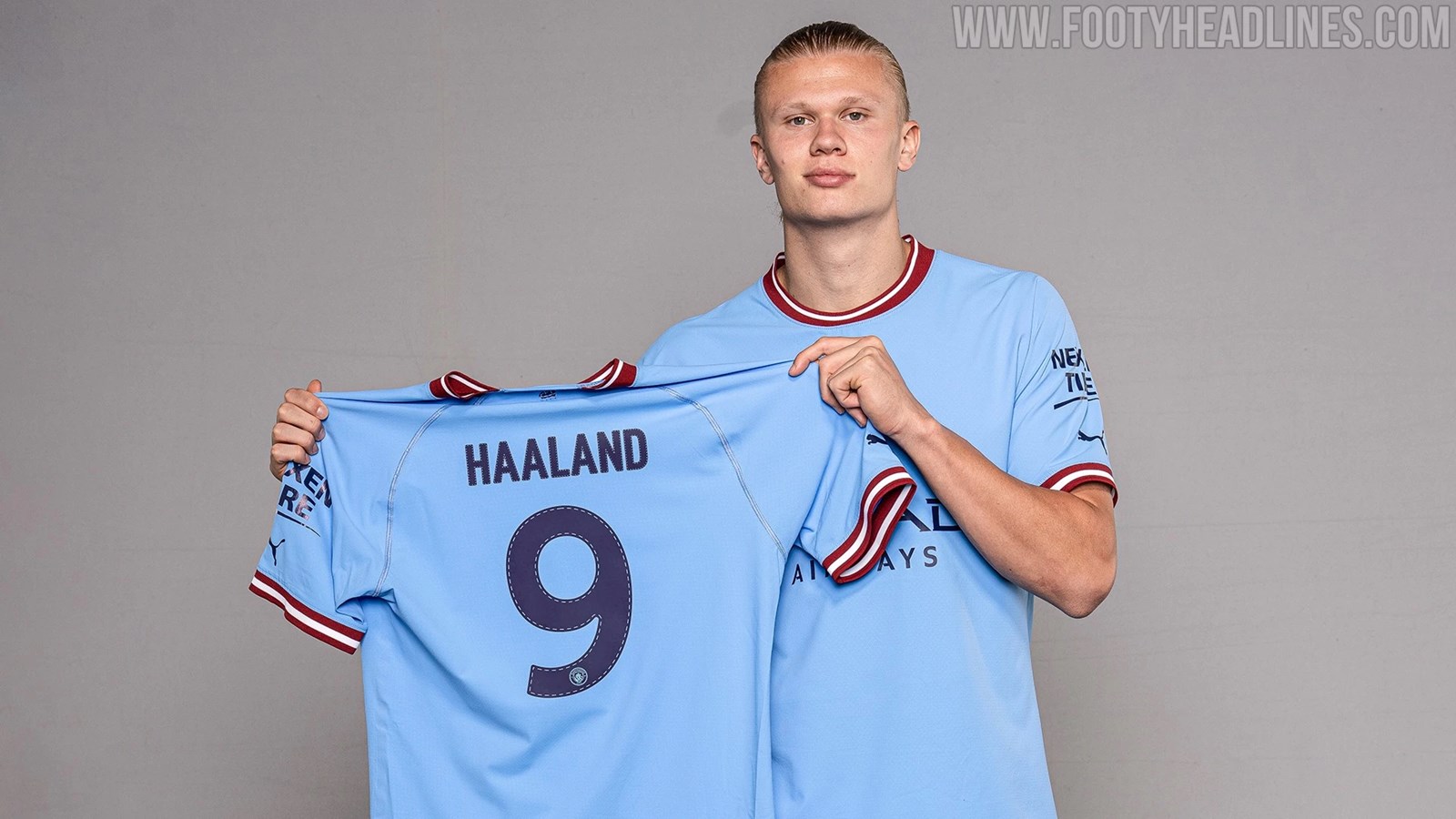
Update: As expected, Erling Haaland has elected to wear the No. 9 shirt at Manchester City. The No. 9 has been free since the departure of Gabriel Jesus.
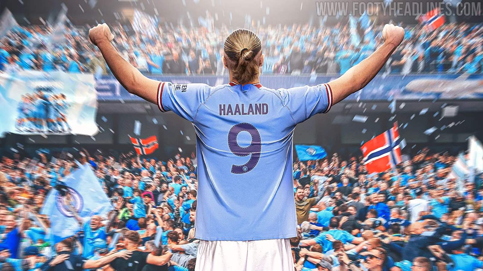
Synonymous with goalscorers, the No. 9 is iconic at City and has previously been worn by hugely popular figures such as Francis Lee, Brian Kidd, Joe Royle, Trevor Francis, Paul Dickov, Niall Quinn and Paulo Wanchope.

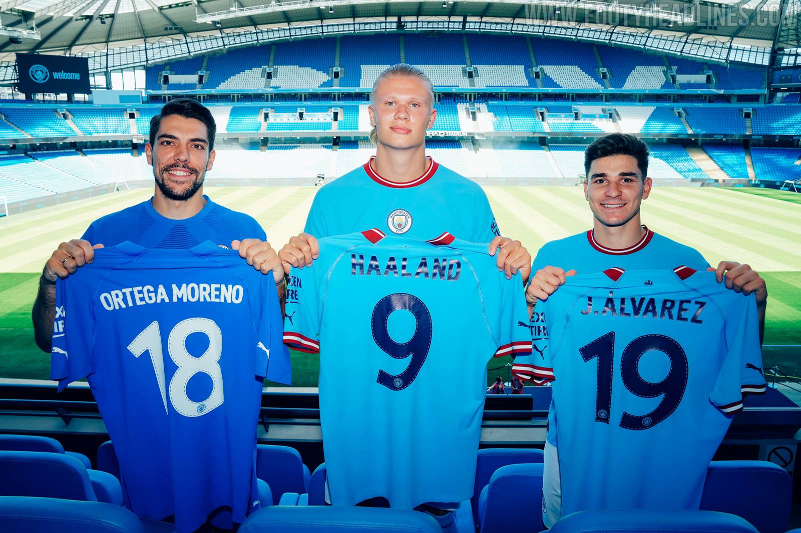

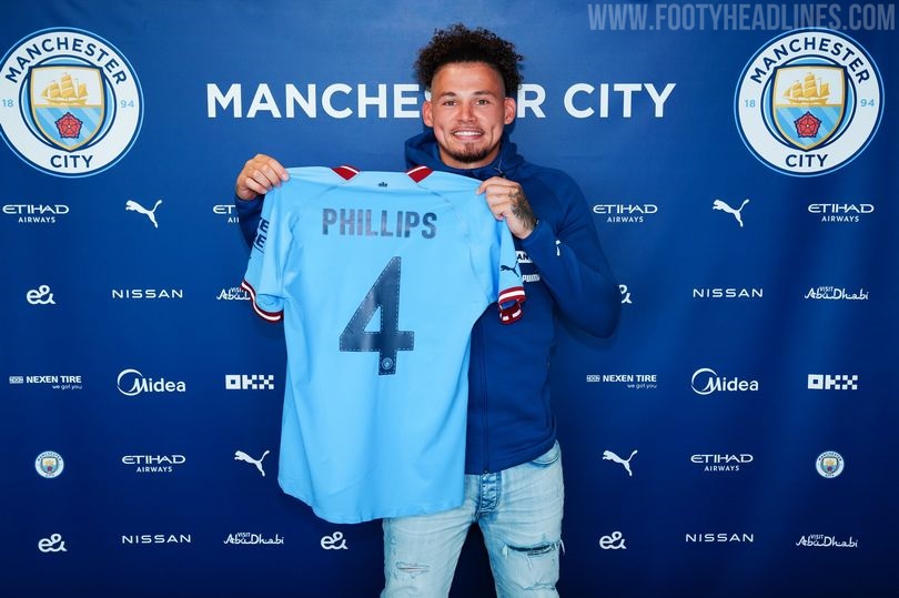
Meanwhile, Ortega gets the No. 18, Kalvin Phillips gets the No. 4, while Julian Alvarez gets the No. 19.
Original Article - June 16 - Haaland Has No Manchester City Shirt Number Yet

One of the biggest transfers of the summer was officially confirmed today, with Erling Haaland signing his 5-year contract with Manchester City and being officially unveiled to the media wearing his new work clothes. One thing that remains unsure however, is which squad number he will wear.
Haaland Unveiled as Manchester City Player
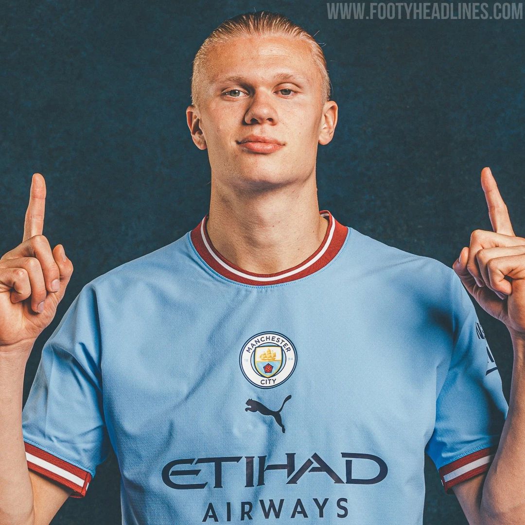
As is par for the course with player unveilings of this scale, Haaland took part in a photoshoot giving the us our first look at him in his new colours. All of the usual poses were in there, including the particularly popular recreation of a childhood photo in which he was wearing Manchester City's 08-09 home shirt made by Le Coq Sportif.

One staple photo was missing though, as there was no shot of the Norwegian holding his new jersey aloft to display his name and number printed on the back. The club themselves have stated that:


Some people online are reading a lot into the following tweet from the man himself, believing it could well be a hint about his chosen number:
To be continued… 🔜 💙 pic.twitter.com/zSbIHFMANT
— Erling Haaland (@ErlingHaaland) June 10, 2022
The number 15 is readily available, so if it was his first choice, there is no reason for it not to be announced as part of his unveiling. It seems likely that he is waiting to see if the number 9 will be vacated by the departure of Gabriel Jesus the start of the 22-23 season, while 15 could be his back-up in the event that Jesus stays on.
Haaland's Man City Shirt Number

There are a few numbers available in the Man City squad, with some seeming more likely than others to be taken up by the Norwegian cyborg. We'll start with the most logical choices.
Number 9

The traditional striker's number. Haaland is a goal-scoring machine so the number 9 would surely be the most fitting for him, given his ability and status. I'ts also what he's been wearing for Dortmund since his initial 6 month spell donning 17. The only snag here is that it is currently occupied by Gabriel Jesus.


The Brazilian is rumoured to be one his way out of the Etihad this summer (possibly to Arsenal), largely due to Haaland's arrival, so if this comes to pass we're almost certain Haaland would pick up the vacant shirt. City could even hold off on announcing Haaland's squad number until after Jesus' transfer, if there is to be one. If he stays, could he give his number to the new main man? It's happened before, with Juan Cuadrado at Juventus and Edinson Cavani both taking a new squad number to allow Cristiano Ronaldo's CR7 identity to avoid any embarrassment.
Number 15

The most notable striker to wear 15 on his back was probably Didier Drogba at Chelsea, but Haaland would have a more personal reason for this choice than his respect for the Ivorian legend. Alfe Inge Haaland, Erling's father, was Man City's number 15 back in the early 2000s.

Like father, like son? It's safe to say that Haaland Junior is more talented than his old man, but taking the same number at the same club would be a nice way of following in his dad's footsteps, maybe while he waits for the number 9 jersey to free up?
Number 19

This was Haaland's number in his first season as a pro in 15-16 for Byrne FK in his homeland. 19 is also quite a popular choice for strikers when their preferred single digit is already taken, with Fernando Torres adopting it during his second spell at Atlético Madrid.
Number 30


It was at Red Bull Salzburg that the giant striker really started to garner attention, and he did so while playing with the number 30 on the back of his shirt. A certain Lionel Messi also started out at Barcelona wearing the number 30, before switching to 19 and of course 10, before reverting to 30 when he joined PSG. Of course, that was mainly because the 10 was already taken, but surely his beginnings with the shirt influenced his choice somewhat. Could we see the same thing from Haaland?

Other Free Numbers
As things stand, Manchester City do not currently have a number 12, 18, 24, 28 or 29 in their squad, so these are also possibilities, but Haaland has no obvious link to any of these. He has previously worn the number 23 for Norway, but City retired that shirt following the death of Marc-Vivien Foé.

Foé passed away after collapsing on the pitch at the 2003 Confederations Cup while playing for Cameroon. He had worn the number 23 while on loan at Manchester City from Lyon.
Whatever number City's new striker ends up going for, the club will sell plenty of shirts with it printed on the back. Which one do you think the Norwegian will choose? Our money is on the number 9, given all the talk of Gabriel Jesus leaving the club and it being the most natural choice for Haaland.
Which number would you like to see him wear? Comment below.


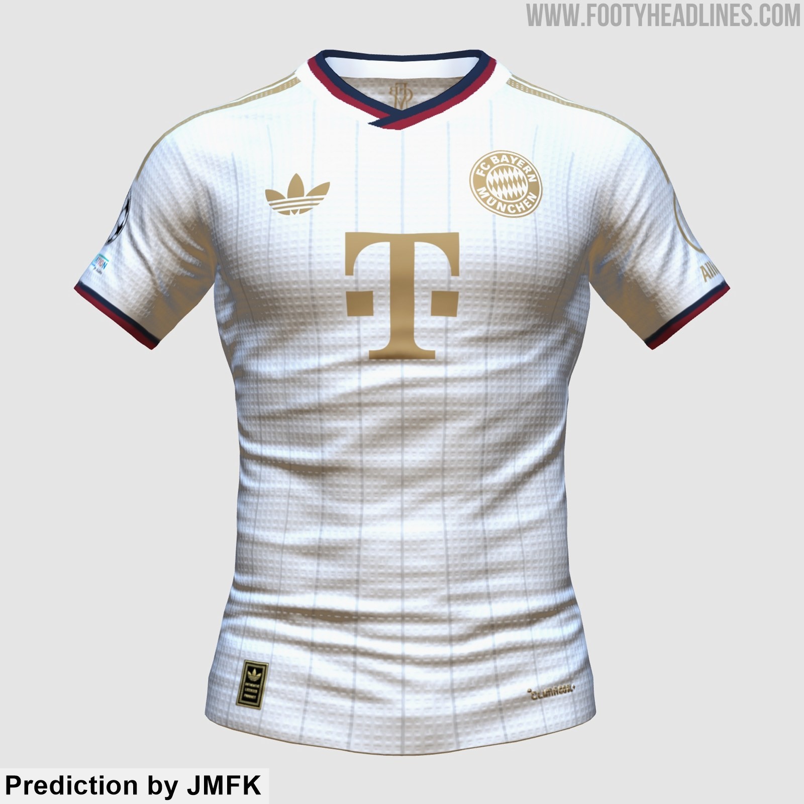
Bayern München 27-28 Away Kit New Prediction
Based on the leaked information, the kit designer JMFK have created the another prediction of the Adidas FC Bayern München 2027-2028 away kit. Please note that this design remains highly speculative.


No More Volt: Reebok Santa Cruz 26-27 Third Kit Released
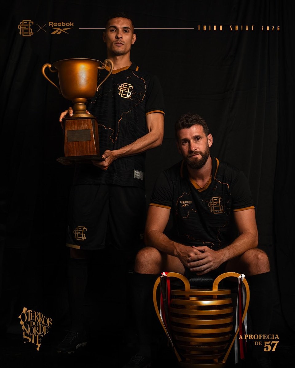
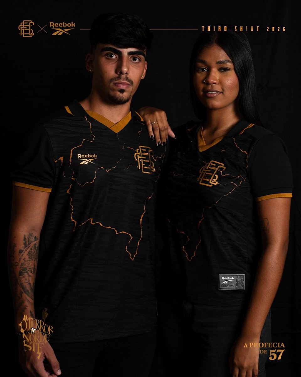
Brazilian club Santa Cruz FC and Reebok have officially unveiled the team's new third kit for the 26-27 season. Titled "A Profecia de 57", the special-edition release celebrates two defining moments in the club's history: the 1957 anthem written by Capiba that coined the nickname "O Terror do Nordeste", and the 2016 Copa do Nordeste title that fulfilled the prophecy ten years ago.
The Reebok Santa Cruz 26-27 third jersey introduces an elegant black and gold design. Across the black base, intricate golden fractured lines trace the geographical outline of Brazil's Northeast region. The front of the shirt features Santa Cruz's classic interlocking SCFC monogram badge rendered in metallic gold, mirrored by Reebok's vector logo on the opposite side. A sharp v-neck collar with gold trim and matching sleeve cuffs complete the look.
Subtle commemorative emblems highlighting "A Profecia de 57" and "O Terror do Nordeste" decorate the release alongside gold numbering on the reverse. Matching black shorts and socks with gold accents complete the new Santa Cruz third uniform.