Real Betis Update Logo
 Sep 14, 2022, by John
We have news from La Liga, as Real Betis have unveiled a new, updated version of their current logo. Along with that, the club's brand identity has seen major improvements.
💚💚💚
— Real Betis Balompié (@RealBetis_en) September 13, 2022
𝐅𝐨𝐫𝐞𝐯𝐞𝐫 𝐆𝐫𝐞𝐞𝐧.
➡ https://t.co/HkDxKgusfT pic.twitter.com/ZkvbrAw9Dd
Betis New Logo
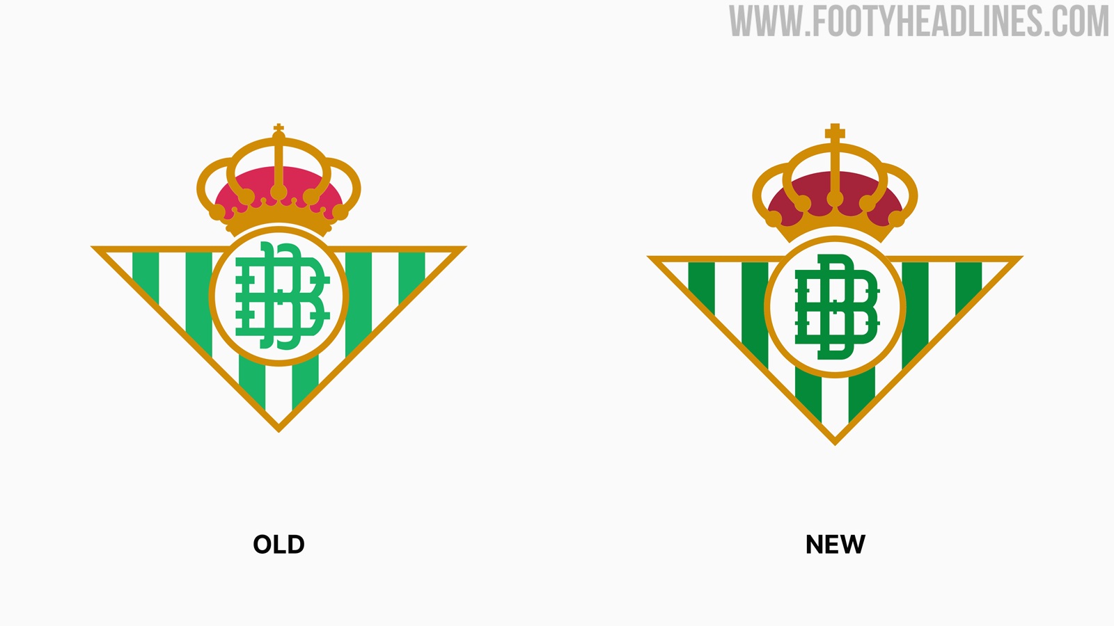
Here is a side-by-side comparison of Betis' old and new crests. Upon first inspection, one might not see all the differences, as they are quite subtle apart from the colours.

The crown above the famous triangle has been slighty simplified and moved upward. The cross at the top is now more visible after being enlarged. Inside the central circle, the lettering was also slightly adjusted.

The colour palette of the club was newly defined with green at the center. 'Green Betis', 'White Azahar', 'Black Quejío', 'Gold Legend' and 'Blue 1907' are the official colour names.


A new typography selection was developed exclusively for Betis by renowned typographer Eduardo Manso. It helps lend the club a unique and more modern look.
What do you think of Betis' new logo? Were the changes necessary? Comment below.
Official Pictures: Manchester United 26-27 Away Kit Leaked
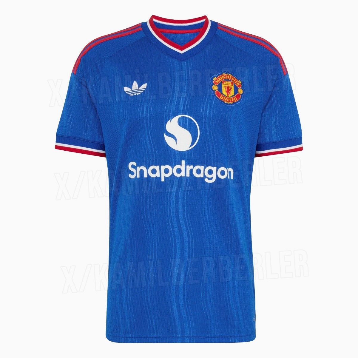
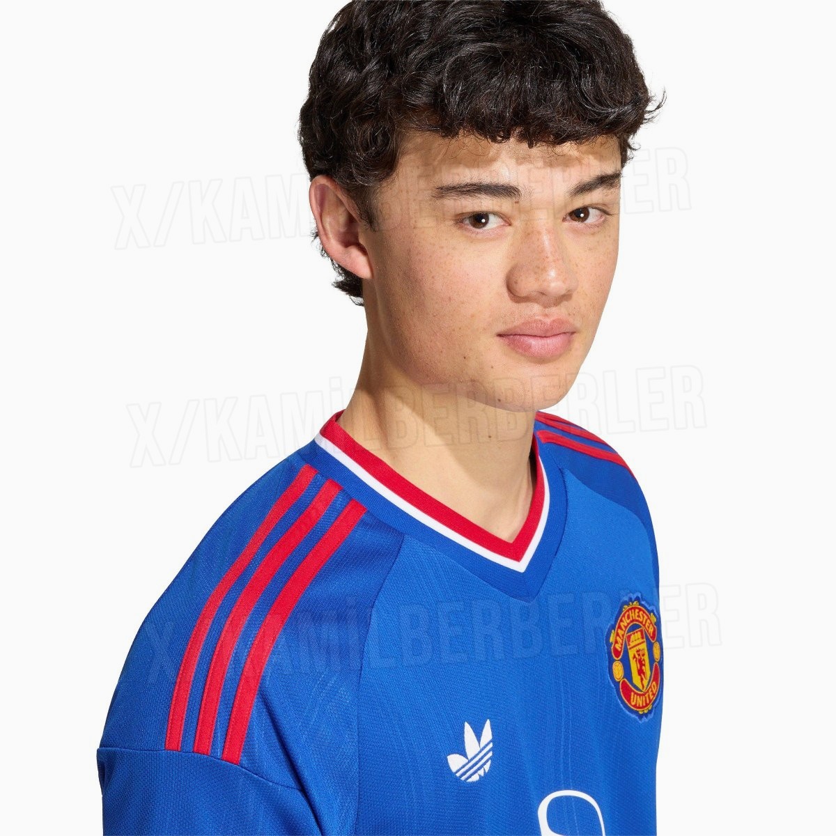
Official images of the new Adidas Manchester United 26-27 away kit have been shared by @KamilBerberler.
The shirt features a blue and red color scheme inspired by the club's classic 1988 away kit and the nearby River Irwell. The official launch of the Manchester United 26-27 away kit is expected to take place on July 22.
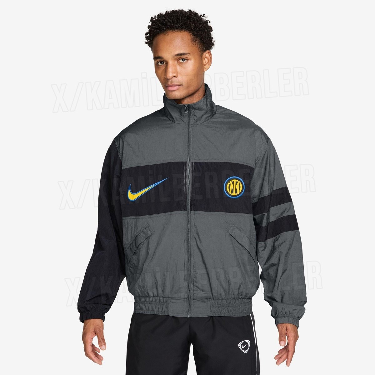
Inter Milan 26-27 i96 Jacket Leaked
Images of the Inter Milan 26-27 i96 jacket have been leaked by football apparel tracker @KamilBerberler. The new Nike track jacket for the Italian club introduces a design that draws inspiration from the famous Nike Premier 1996 design.

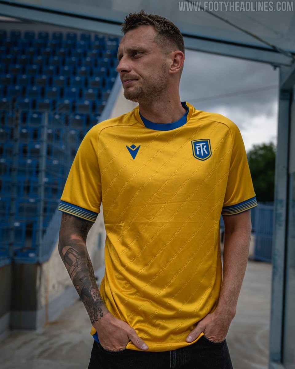
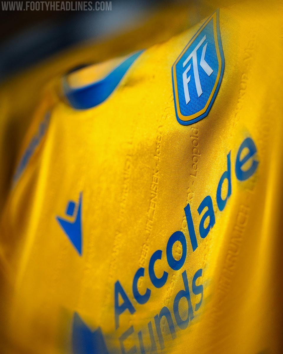
FK Teplice 26-27 Home Kit Released
The new FK Teplice 26-27 home kit by Macron introduces a traditional yellow base with blue accents. The standout element of the shirt is the embossed vertical stripes incorporated into the fabric, which discreetly display the names of all the players from the club's 1976-77 cup-winning team. In addition to the standard version, a clean variant without sponsor logos is also available.
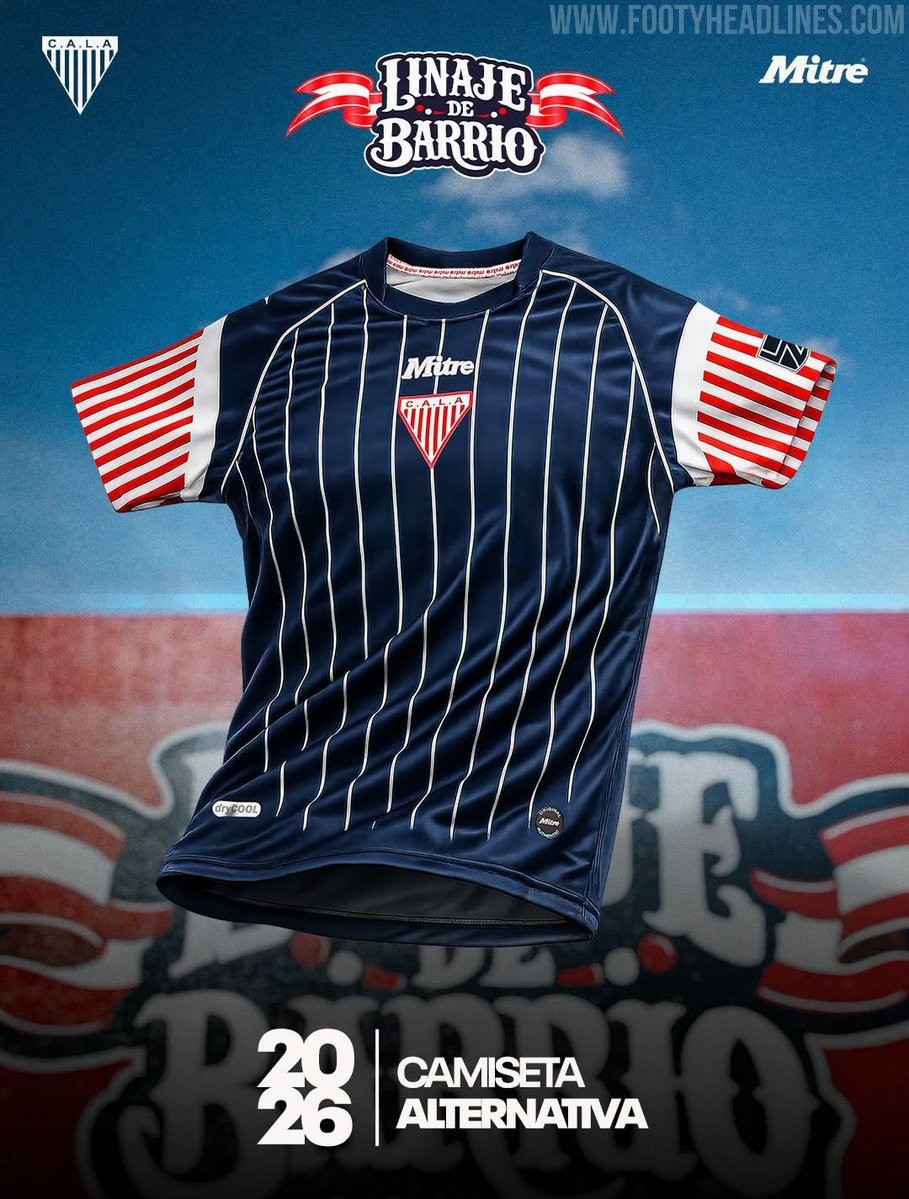
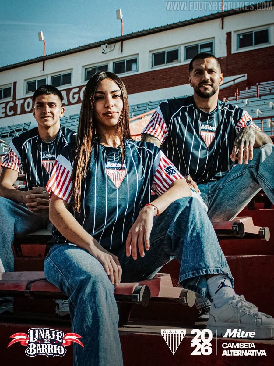
Club Atlético Los Andes 2026 Away Kit Released
Club Atlético Los Andes has launched its new 2026 away kit, manufactured by Mitre. Dubbed 'Linaje de Barrio' (Neighborhood Lineage), the new alternative strip honors the Argentine club's origins.
The Mitre Club Atlético Los Andes 2026 away jersey features a classic aesthetic highlighted by fine vertical pinstripes. This elegant design element pays homage to the suits frequently worn by the club's founder, Don Eduardo Gallardón, delivering a vintage look that symbolizes the team's historic roots.
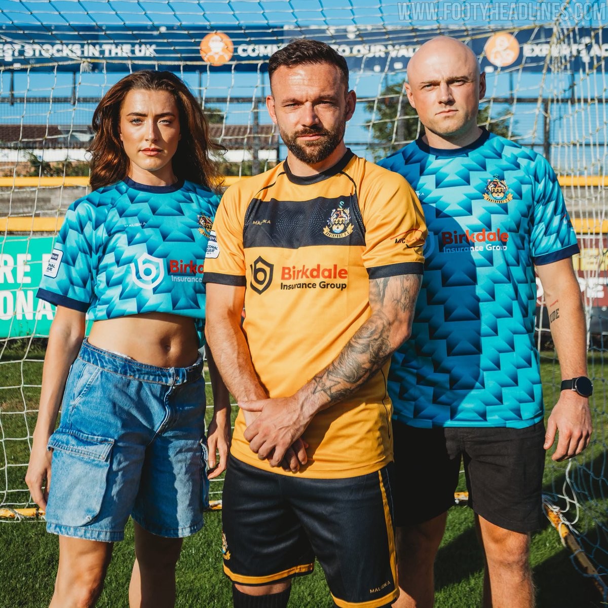

Southport 26-27 Home & Away Kits Released
National League North side Southport FC have unveiled their new 26-27 home and away kits, produced by local manufacturer Malooka.
The new Malooka Southport 26-27 home and away shirts feature bespoke looks.
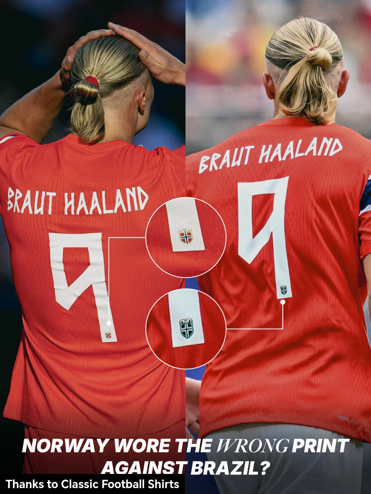
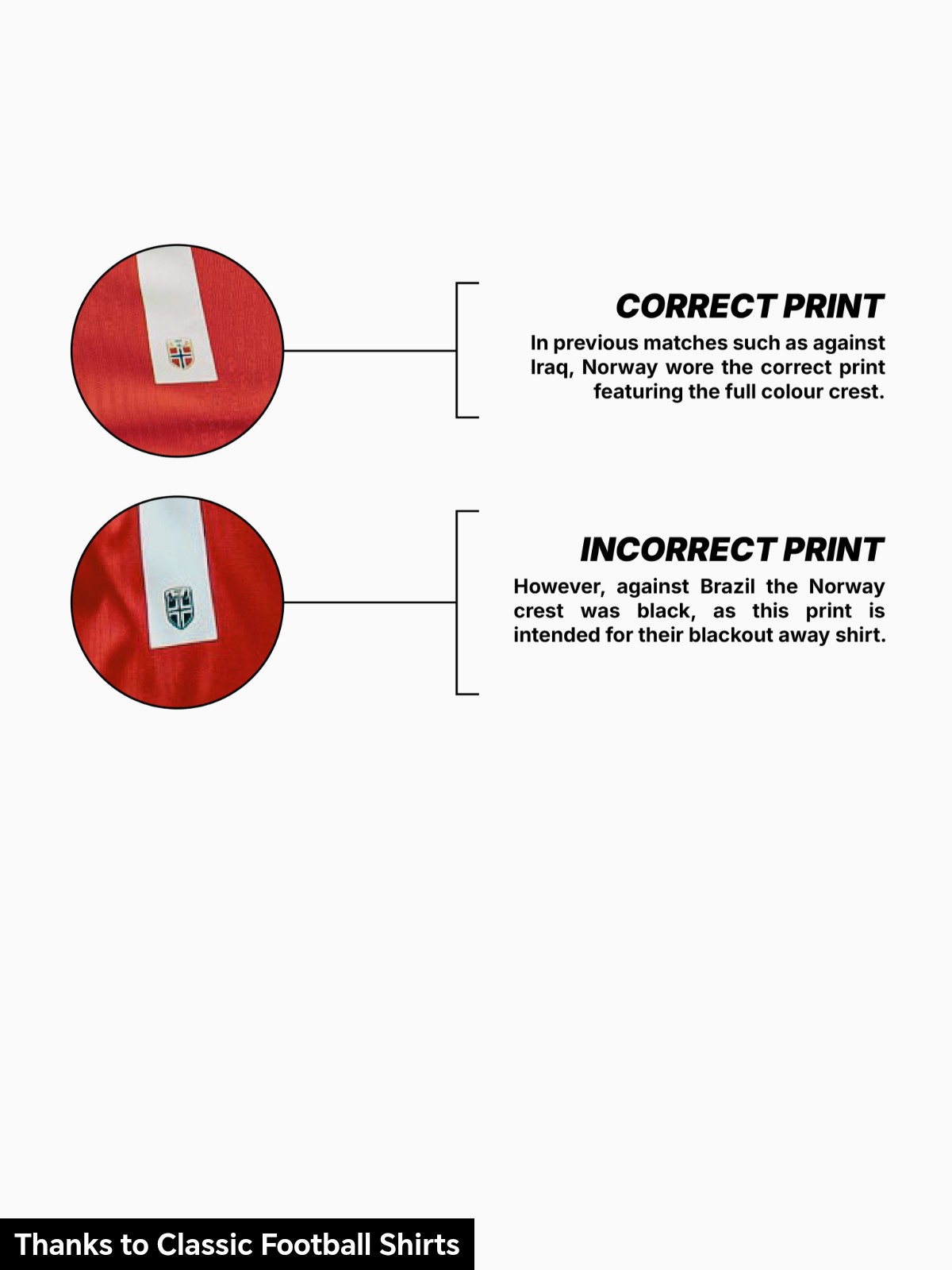
Norway Wear Incorrect Name Set on Home Kit Against Brazil
During the 2026 World Cup group stage, Norway experienced an unusual kit equipment issue. As spotted by football shirt account @kitoftheday365, the Norwegian national team wore an incorrect name and number set during their match against Brazil.
While Norway correctly used their standard home name set on their home shirts during their match against Iraq, a mistake was made for the Brazil fixture. The team wore the away font, featuring the black logo of the away kit.


Messi's Badges in 2026 World Cup
Our partner Jersey Story has created a nice mock-up of Messi's kit with his multiple badges. The Legacy and Golden Ball badges are exclusive to Messi, while the champions front badge and golden FIFA sleeve badge are from the team.