In-Depth | Getting the Best Out of the Worst FC Barcelona Home Kit
La Blaugrana: a name as synonymous with spectacular football kits as the legends that wore them. From the classic 1999-2000 hundredth anniversary FC Barcelona home kit to their perfectly modernized 2014-15 home kit, Nike have regularly demonstrated their ability to design great Barcelona home kits. Even when some of their away kits falter, Nike usually get their home kits spot on.


That was until the mid-2010s, which saw the release of many questionable designs, such as the hoops in 2015, and the Croatian checkers in 2019.


Nike started to release revolutionary designs in the mid-2010s
However, in 2021, Nike released the possibly worst Barcelona home kit of all time, and one of the worst kits Footy Headlines has ever seen.
Why is the 2021-22 FC Barcelona home kit bad?


A common scapegoat is the untraditional stripe graphic unique to this kit. We at Footy Headlines do not actually find this to be its defining shortcoming. Its prime deficiency lies within its misunderstanding of color theory. Well, and those half-half shorts, but we’ll address that later.

Color theory is a set of guidelines followed in design to ensure the appeal of color schemes. Essentially color theory determines what colors pair well with each other. Football kit design has its own color theory. Its adherence, or lack thereof, defines the aesthetic quality of football kits. We find the FC Barcelona 2021-22 home kit one of its worst offenders.


The FC Barcelona 2021-22 home kit pairs what Nike calls Soar, Noble Red, and Pale Ivory together. Respectively, these are a brighter saturated blue, a slightly darker shade of red, and essentially ecru. These colors chosen for the kit just don’t pair well, especially with the radical departure from the traditional Blaugrana stripes. Even though blau translates to blue, and grana translates to garnet, FC Barcelona rarely wear home kits with a brighter shade of blue than red. Usually, they are similar in shade, or the blue is significantly darker. This makes the pairing of these colors look odd for an FC Barcelona kit.
The kit also tries to pair ecru with the Soar and Noble Red. Ecru, derived from French, is the word used for the color of unbleached linen. Often compared to cream coloring, Ecru is a pale grayish yellow in color. Ecru has existed in fabrics and fashion for centuries, further establishing its classic aesthetic. Because of this, it pairs well with dark, rich, classy colors. Let’s look at a kit that used ecru to perfection: the Newcastle United 1995-96 away kit.

Barcelona's 2021-22 home kit was a missed opportunity by Nike, mainly because of the colors
Juxtaposed with the bleached white Tottenham kit, one can clearly see the coloring used for the Newcastle kit’s shorts is in fact ecru. The navy blue, cardinal red, and ecru pair immaculately, making for one of the most iconic kits of all time.
Now compare this masterpiece to the following atrocity:

The brighter modern blue, possibly the brightest shade ever used by the Catalan club, just doesn’t pair with the timeless ecru. The brighter shade of blue also doesn’t really work with the shade of red either, albeit in a less egregious manner. These colors just do not naturally work together and do not satisfy football kit color theory.
How Can the Barcelona 2021-22 Home Kit Be Fixed?

So now that we’ve demonstrated where Nike went wrong, we can fix those issues, and give the FC Barcelona 2021-22 kit the glow-up it deserves. We will be using the PES Master Kit Creator 2.0 to mock up concepts.
First off, to give this redesign a fighting chance, we have to ditch the harlequin shorts. We at Footy Headlines have yet to see an instance where a kit design pulled them off well, so we doubt anyone will mourn their loss.


Now onto the meat of this redesign: color correction. We’ve seen many redesigns of this shirt, some have even been reposted onto Footy Headlines itself. However, most of those have only shown off slight color corrections. We think we can go a step further and create what this shirt always should have been.
So there are two directions we can start off with in terms of color correction: embrace a corrected color scheme with the brighter blue and red, or alter those shades in favor of an ecru pairing. The first initial concept uses the brighter blue and red with traditional white and golden yellow accents, while the former opts for navy and cardinal with ecru accents.
Our concept is a bit inspired by this season's blue-red-navy kit
These do look better, we don’t anticipate much debating about that. However, we mentioned we wanted to go a step further with our final redesign. The latter doesn’t have much room for improvement, and the modern stripe pattern doesn’t suit it as well as the brighter scheme. For these reasons, we’ll build upon the brighter blue and red.
FC Barcelona 2021-22 Home Kit - Final Redesign

Going further, we can add some aesthetic depth to the look. We’ll do what many Barcelona home kits, including this year’s iteration, have done: utilize two shades of blue.

To prevent the mismatched red and blue sleeves from looking unbalanced, we can use navy for the collar, shorts, and sock foldover. We believe this is the best-case scenario for FC Barcelona.


Of course, football kit design is always a matter of opinion. Therefore, we let you vote on the original and our redesigned FC Barcelona 2021-2022 home kit.
Which kit should we redesign next? Let us know in the comments below.
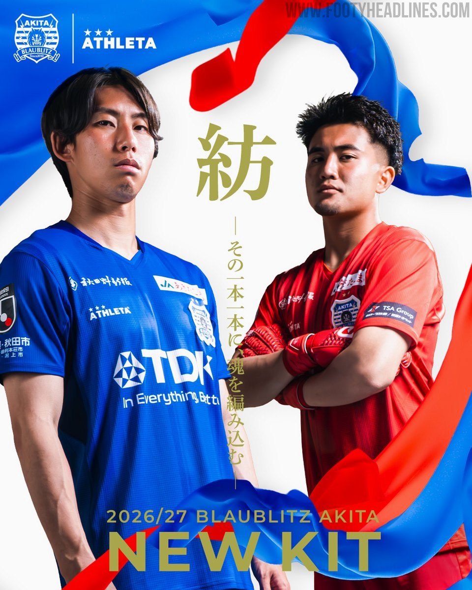
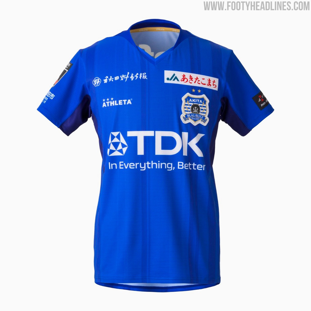
Blaublitz Akita 26-27 Kits Released
Japanese J2 League club Blaublitz Akita have unveiled their new 2026-27 kits. Made by Athleta, the new kits feature a distinct design inspired by the concept of weaving.
The Athleta Blaublitz Akita 2026-27 kits are designed around the theme of weaving, reflected in a woven pattern on the shirts, symbolizing the unity of the stakeholders spinning their efforts onto the pitch.
The new Athleta Blaublitz Akita 2026-27 kits will be available to pre-order starting July 6, 2026, with deliveries planned ahead of the start of the new league season.


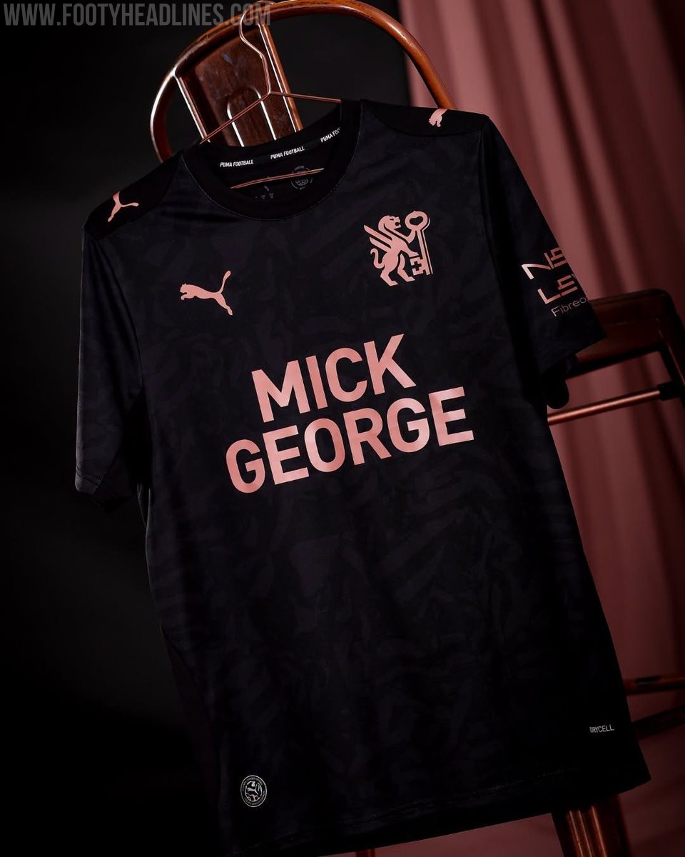
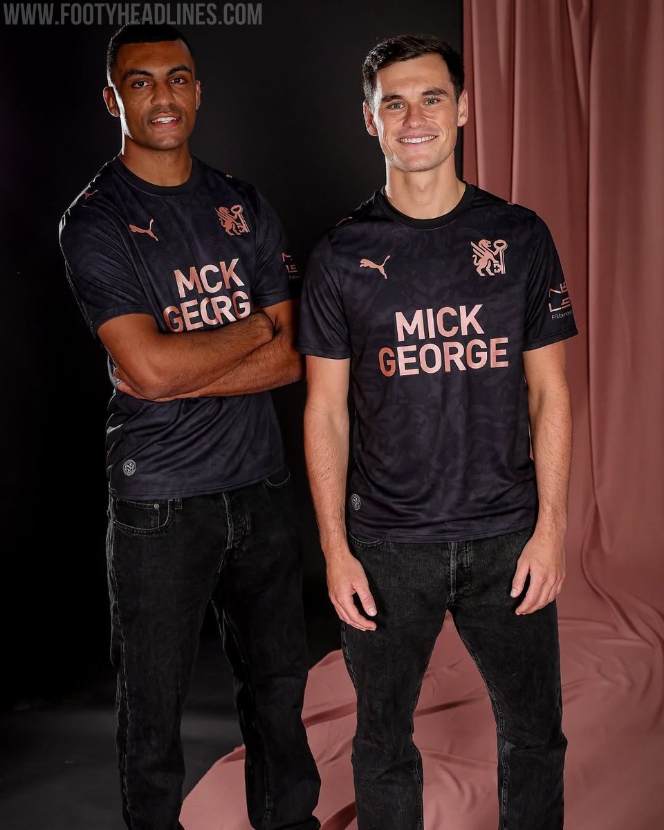
Peterborough United 26-27 Away Kit Released
League One side Peterborough United have officially launched their new Puma away kit for the 2026-27 season. The strip was unveiled during the club's Fan Zone Fun Day event on July 4, following the release of their home kit earlier in the summer.
The Peterborough United 2026-27 away shirt showcases a contemporary design that aligns with the club's new direction. It features a black base with rose gold accents. It also prominently features the club's newly introduced crest, marking a fresh chapter for the team.
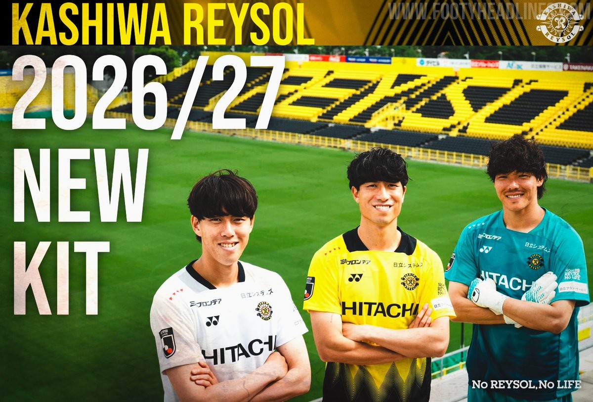
Kashiwa Reysol 26-27 Kits Released
Japanese J1 League club Kashiwa Reysol has officially unveiled its new 2026-27 kits, which are once again designed and manufactured by Yonex. The official launch on July 4 follows a short teaser video released earlier in the week and coincided with the announcement of the club's squad and player numbers for the upcoming season.
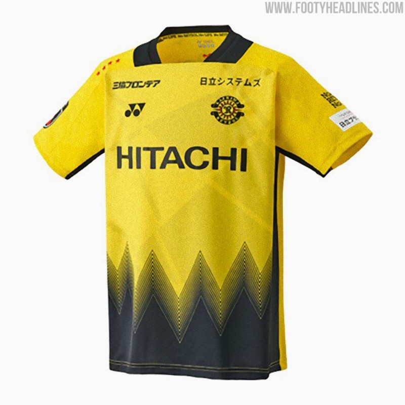
The Kashiwa Reysol 2026-27 kits feature a striking design centered around the concept of "Break the Light." The home shirt incorporates the club's traditional yellow and black colors, separated by dynamic geometric patterns that symbolize moving through the light. The away and keeper kits mirror the design in different colors.
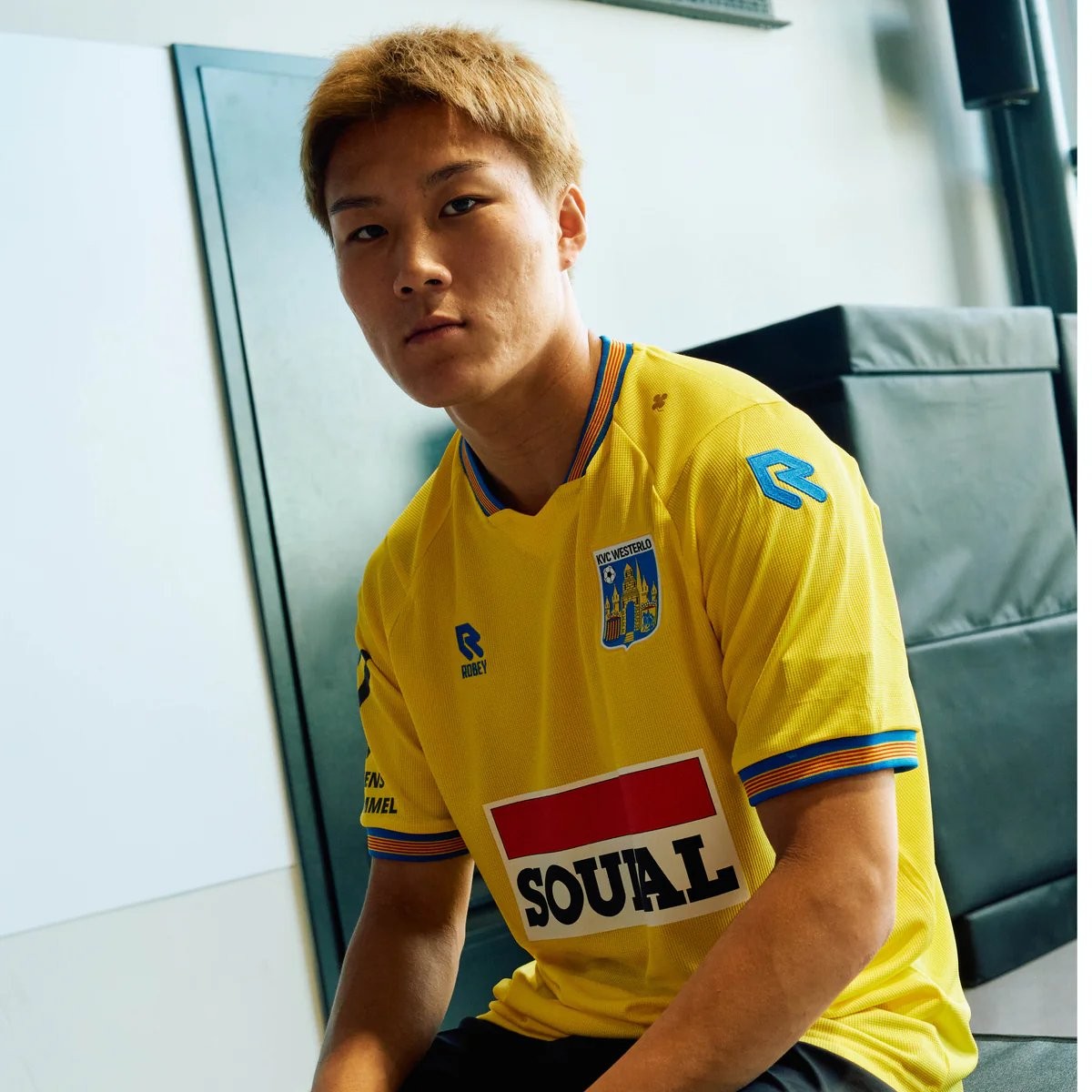
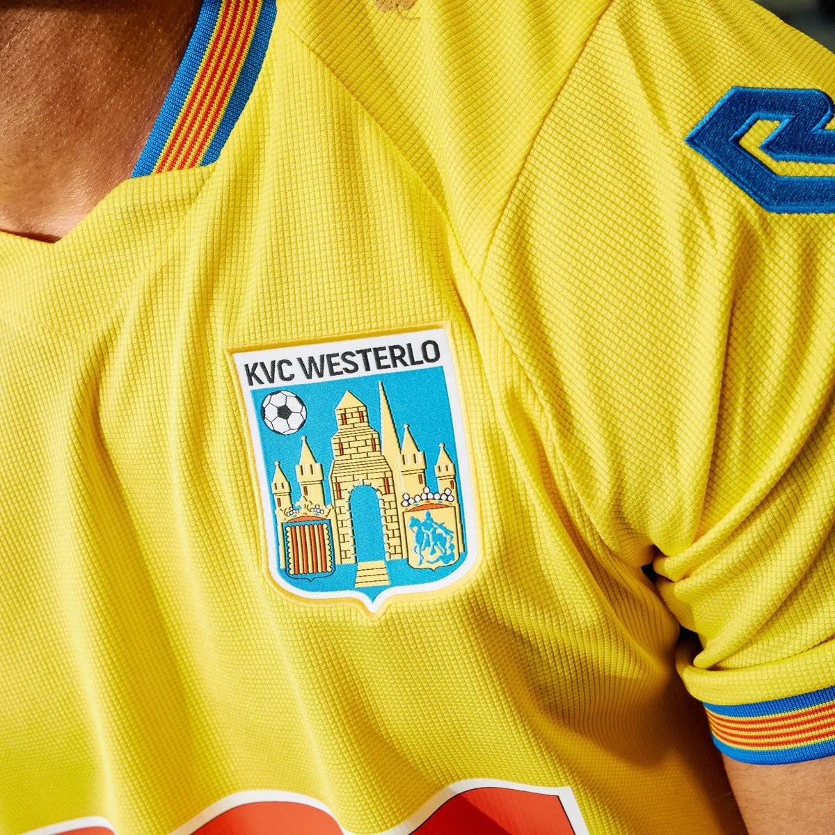
Robey KVC Westerlo 26-27 Home Kit Released - No More Nike
Belgian club KVC Westerlo has unveiled their new 2026-27 home kit, marking the beginning of a new partnership with Robey Sportswear. The Dutch brand takes over from Nike, which had supplied the club's kits since 2022.
The Robey KVC Westerlo 2026-27 home shirt features the club's traditional yellow and blue colors. Launched with the slogan 'Designed for you. Worn by you. Because you are Westel,' the design aims to celebrate the strong bond between the team, its supporters, and the local Kempen region.