Worst Sponsor-Free Kits Ever? Nike J League Shirts Look Awful Without Logos

Nike are selling sponsorless versions of J League sides Sanfrecce Hiroshima and Uruawa Red Diamonds' kits, but the extremely low Swoosh and badge placement makes for a very jarring look.


Worst Sponsorless Kits Ever? J League Shirts Stand Out for the Wrong Reasons

Most football shirt fans and collectors would argue that kits look better without a logo (or logos) splashed all over them, while others say that sponsors can provide balance to a jersey and compliment the design. The latter group will therefore feel somewhat vindicated by the latest sponsor-free shirts on sale from Nike's Japanese website.

Among the regular J League kits there are sponsorless versions of Urawa Red Diamonds and Sanfrecce Hiroshima's home shirts. At the time of their release, the unusually low placement of the Swoosh and badge caught our eye, but on the sponsor-free version it's even more apparent.

The reason for applying the crest and Nike logo so low was to accomodate the sponsor logos which are placed towards the shoulders of each team's match kits. Applying logos on top of the curved seam that runs along the top of the chest of Nike's ADV Dri-Fit template would not work very well for aesthetic and functional reasons, so Nike shifted everything downwards by a few centimetres.


When the sponsor logos are removed - or rather not applied in the first place - the low placement of the Swoosh and the club crest no longer serves a purpose, and results in a decidedly bizarre look. Their positioning is somewhat balanced out on the sponsored version of the shirts, but in the absence of those logos, the balance is thrown way off by the excess blank space on the top half of the shirt. Proof that no sponsor doesn't always look better?


What do you think of this unusual look? Comment below.


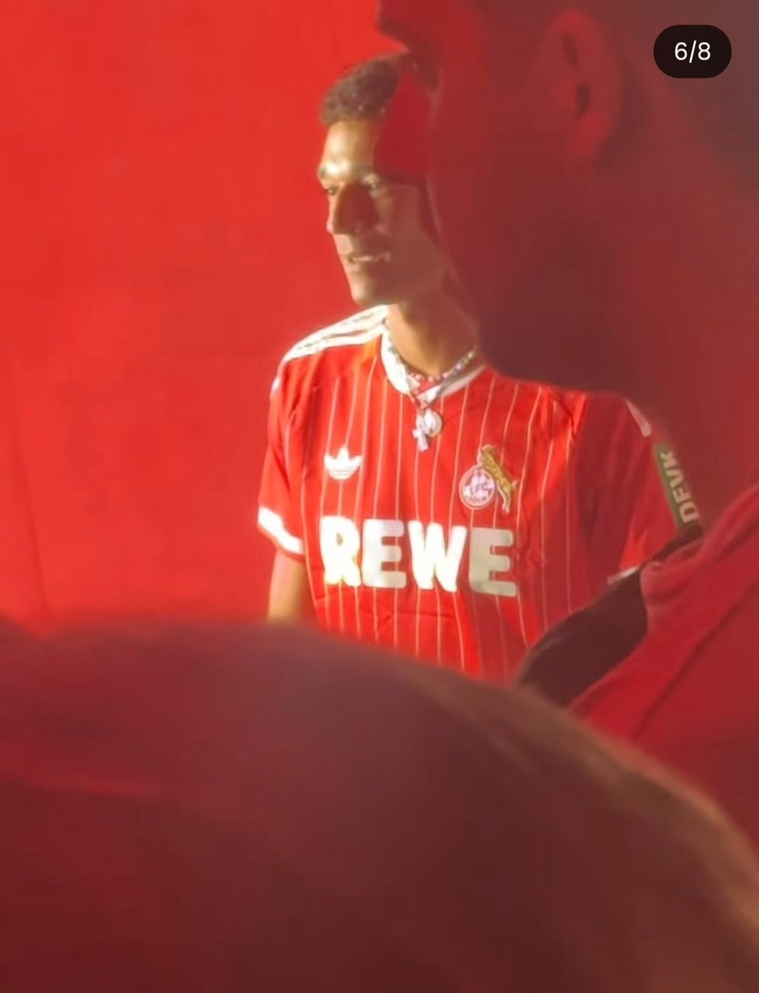
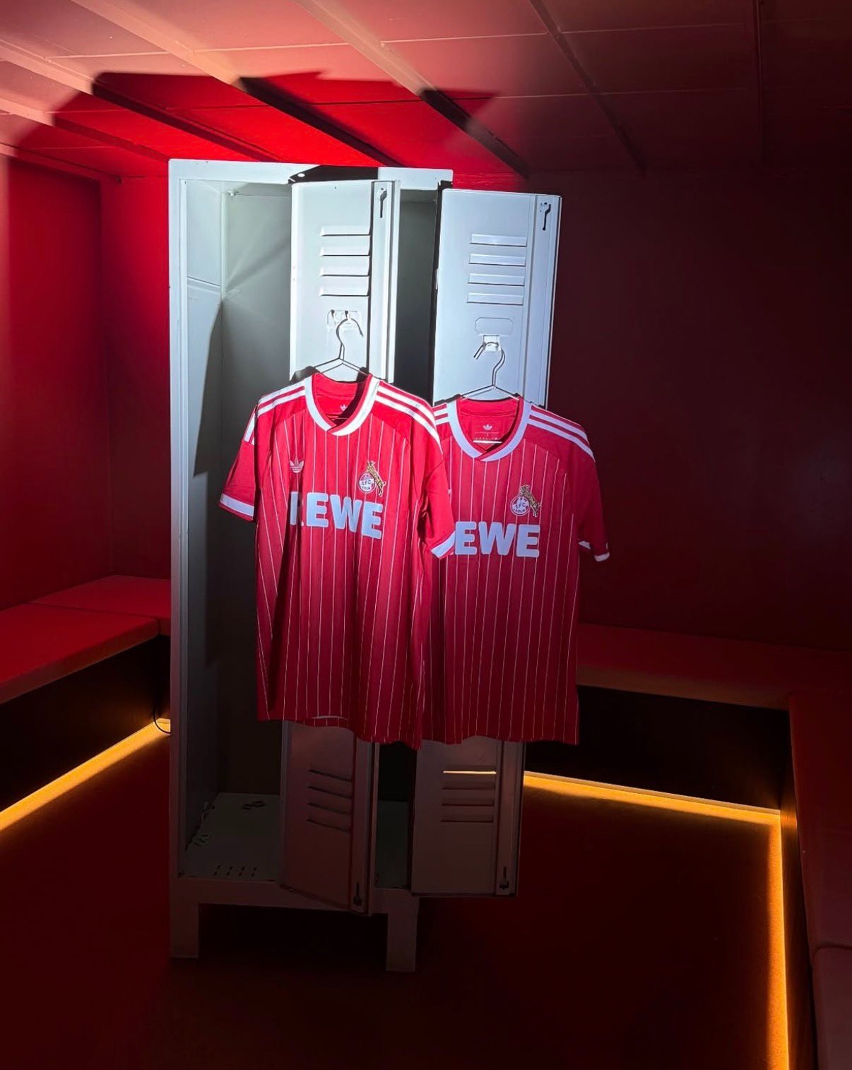
1. FC Köln 26-27 Away Kit Revealed
Köln officially launched its new 26-27 away kit by Adidas last evening, completing the club's jersey lineup for the upcoming season. Following the earlier releases of the white home kit and navy third shirt, the new away strip celebrates the city's iconic "Rut un Wiess" (red and white) colors with a vintage-inspired red base and subtle white pinstripes. The jersey is officially available starting later today, July 28, through the club's official online shop and fan stores. Thanks to our partner Insider Müngersdorf for the product images.


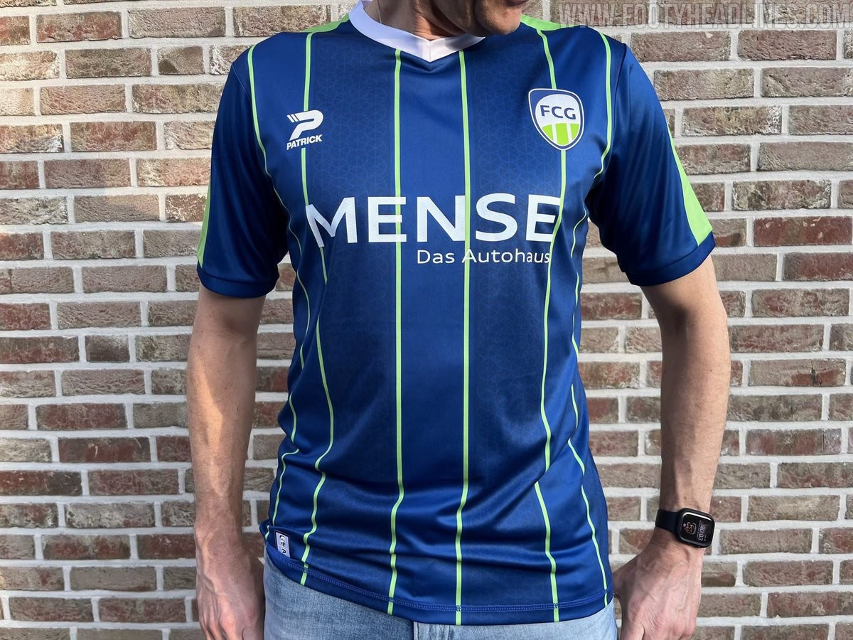
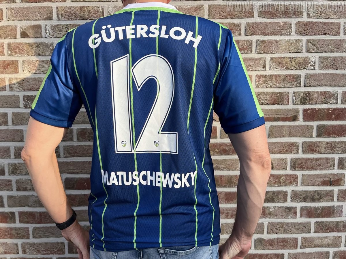
FC Gütersloh 26-27 Home Kit Released
German Regionalliga West side FC Gütersloh and new technical supplier Patrick have officially launched the club's 26-27 home kit. Marking the first home release under the new partnership, the jersey was created in collaboration with design agency Starmerch as a fully custom design without using teamwear templates.
The FC Gütersloh 26-27 home shirt features a deep blue base with alternating tonal stripes, separated by vivid green vertical pinstripes. Incorporating a local connection, the darker blue bands contain a subtle watermark pattern based on the spinning wheel from the Gütersloh city coat of arms. A white V-neck collar and bright green shoulder panels provide contrast, with supplier, sponsor, and back printing appearing in crisp white.
The new home kit debuted on pitch during Gütersloh's Westfalenpokal victory over SC Wiedenbrück. It is currently available for purchase in the official club fanshop priced at €69.50.
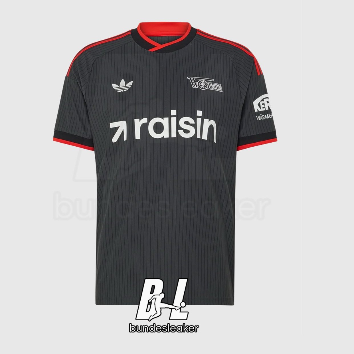
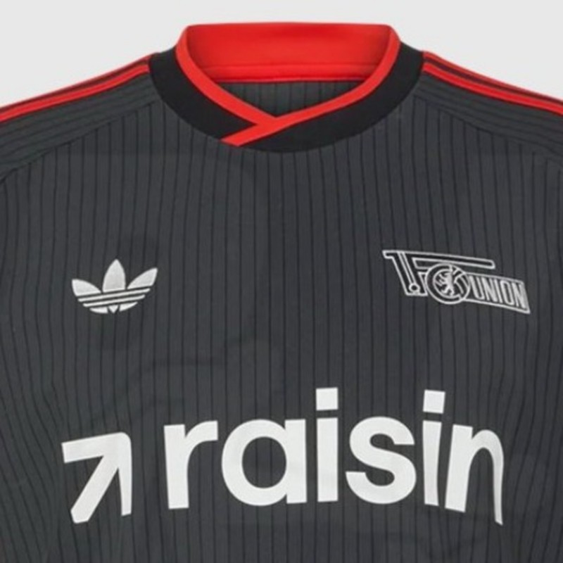
Union Berlin 26-27 Away Kit Leaked - First With Trefoil
The upcoming 1. FC Union Berlin 26-27 away kit has been leaked online via @Bundesleaker. Designed by Adidas, the new away shirt prominently features the iconic Trefoil logo as part of the brand's vintage-inspired approach for away kits in the 26-27 season.
The Adidas Union Berlin 26-27 away shirt comes in a dark charcoal anthracite shade detailed with subtle vertical pinstripes. A monochrome white Union Berlin crest and white Adidas Trefoil sit on the chest alongside white Raisin sponsor branding, while bright red accents line the collar, sleeve cuffs, and the three shoulder stripes.
Meanwhile, the leaked 26-27 goalkeeper shirt showcases a bright light blue base paired with dark blue ribbed elements and collar. It is a streamlined look.
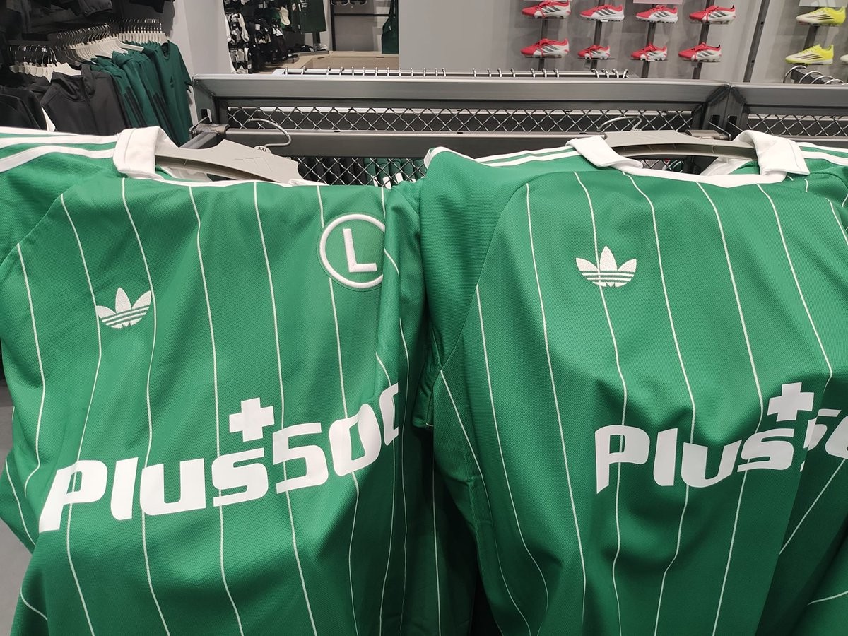
Odd Manufacturing Flaw: Legia Warsaw 26-27 Away Kits Feature Different Trefoil Placements
Legia Warsaw and Adidas officially unveiled the club's new 26-27 away kit, bringing back the iconic Adidas Originals Trefoil logo for the first time in over thirty years. The retro-inspired shirt features a green base decorated with thin white vertical pinstripes and a classic polo collar. However, as the kit hit the shelves in the official club shop, fans quickly noticed an unexpected production quirk.
In-store videos and photos shared by fans show that the positioning of the Adidas Trefoil logo is inconsistent across different jerseys. Due to variations in how the heat-applied logo or pattern was aligned during manufacturing, the Trefoil sits in a noticeably different spot relative to the vertical pinstripes on almost every shirt. On some jerseys, the logo sits directly centered on a pinstripe, while on others it is offset into the green space or sits higher up near the collar seam.
While slight manufacturing tolerances are common in sportswear, seeing such obvious alignment differences across retail stock is an unusual sight for a major Adidas launch. Fans picking up the new 26-27 Legia kit in person may want to inspect multiple hangers in the store to find the exact placement they like best.
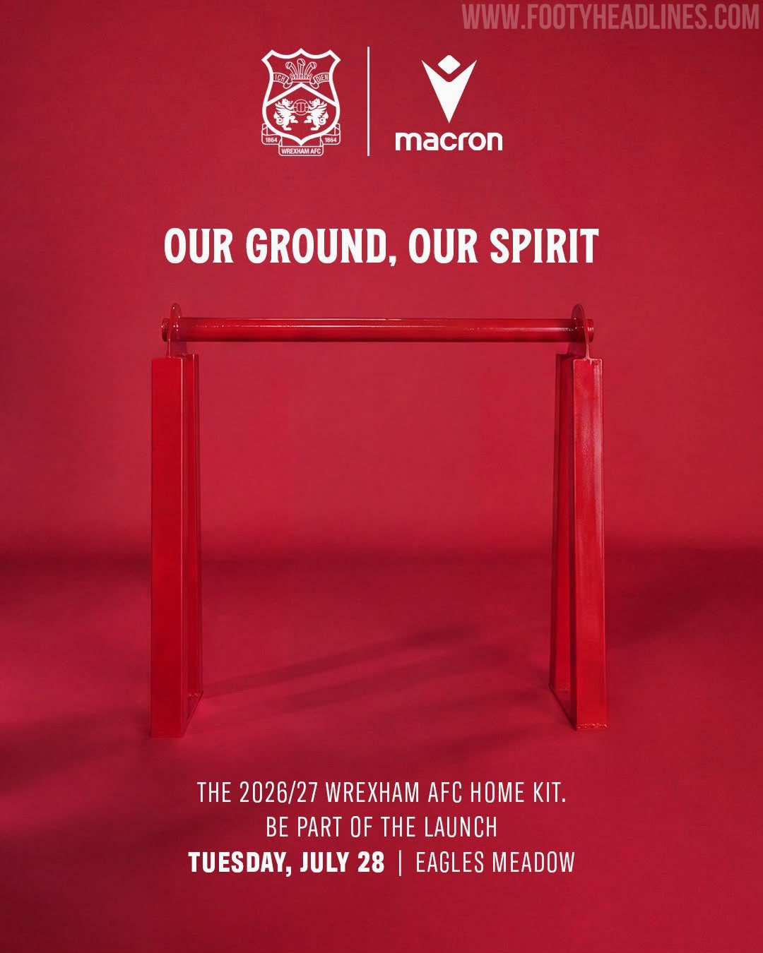
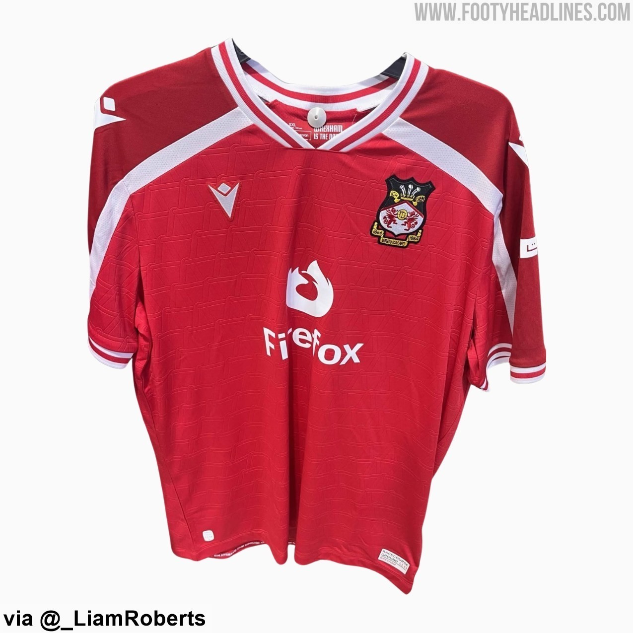
Wrexham Tease 26-27 Home Kit Ahead of Official Release
Wrexham AFC have officially teased their new 26-27 home kit, confirming that the uniform will be revealed on Tuesday, July 28, 2026. The Welsh club released promotional graphics under the tagline "Our Ground, Our Spirit," announcing launch events held simultaneously at Eagles Meadow in Wrexham and Pelé Soccer in New York City at 2:30 PM BST (9:30 AM ET).
The 26-27 home kit, produced by long-term technical partner Macron, marks a new era as web browser Firefox debuts as Wrexham's primary shirt sponsor, replacing United Airlines. Recent leaks and photos showing co-owner Ryan Reynolds presenting the new jersey to WWE star CM Punk have already given fans a detailed look at the design. The shirt features a solid red base with a subtle interlocking 3D embossed pattern, styled with a white V-neck collar and white diagonal accents across the shoulders.
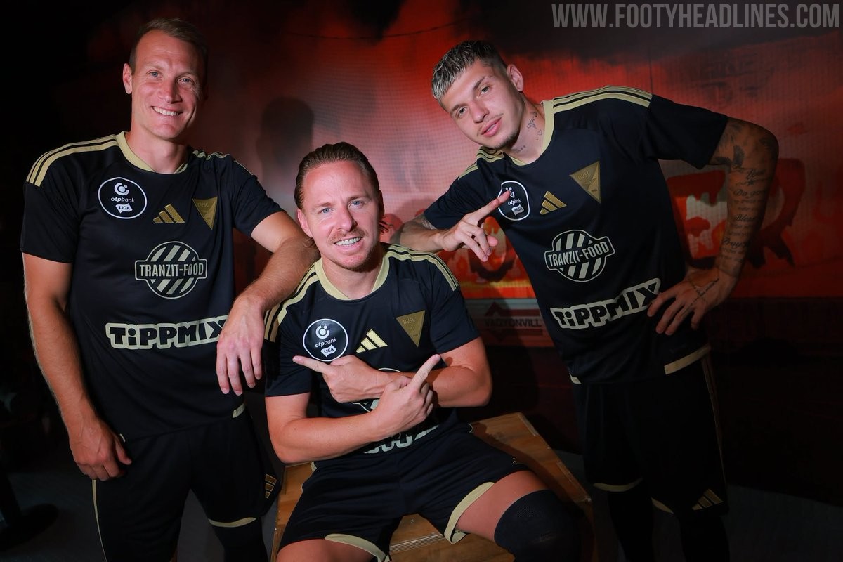
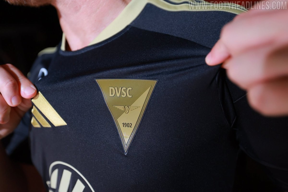
Debreceni VSC 26-27 Third Kit Released
Hungarian club Debreceni VSC has officially launched its new third kit for the 26-27 season.
The Adidas Debreceni VSC 26-27 third jersey features a black base combined with rich gold accents throughout. The signature Adidas three stripes on the shoulders, the brand emblem, collar trim, and all front sponsor logos are finished in metallic gold. A key highlight of the kit is the special triangular gold crest on the left chest, which features the club name, founding year 1902, and winged wheel motif.
On the back below the collar, a small Hungarian national flag is placed directly above a winged wheel graphic to add a subtle local detail. Black shorts and black socks, both decorated with gold trimming, complete the new Adidas Debreceni 26-27 third strip.
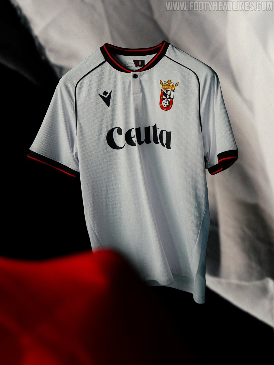
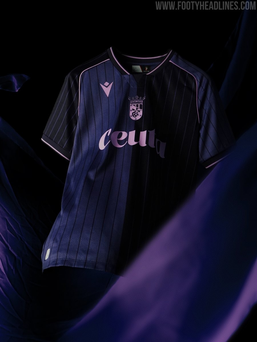
AD Ceuta 26-27 Home & Away Kits Released
Spanish club AD Ceuta FC and technical partner Macron have officially launched the new home and away kits for the 26-27 season. The home shirt offers an elegant classic look dominated by white, enhanced by an all-over embossed pattern alternating the text CEUTA with the club's founding year, 1933. It features a grandad collar with red and black detailing, which is also reflected on the sleeve cuffs, alongside a silicone-printed black Macron Hero and the official club emblem on the chest.
In contrast, the 26-27 away kit introduces a fresh modern aesthetic featuring three distinct shades of purple. The body of the shirt is vertically split between two tones of purple, overlayed with subtle vertical pinstripes across the front and sleeves. Bright purple accents decorate the V-neck collar and sleeve trims, while a monochromatic light purple crest and logo round off the shirt.
Having worn a turquoise third uniform during initial pre-season matches, the Spanish side is now fully prepared with its complete kit collection for the 26-27 campaign.
