Have Parma Got the Best Back Catalogue of Special Kits?
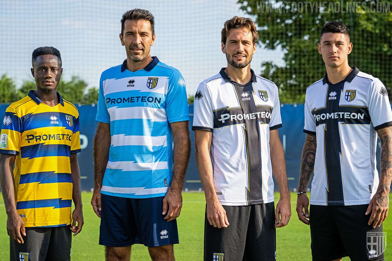
It’s been the norm for a few years now for clubs to launch special kits, but Parma can claim to be amongst the originators of the trend. Here we take a look back at some of their best ones.

Parma’s Special Kits
Ever since their glory days of the late 90s and early 2000s, Parma have been a firm favourite among shirt fans and collectors. Their yellow and blue striped kits from that period became iconic, and their regular cross-bearing jerseys make them instantly recognisable. Aside from the popularity and recognition that their home kits garner, Parma have also a track record of producing the goods with their special kits, which have become a regular fixture for the club, often released to coincide with the date of their foundation.

The last two or three seasons have seen everyone jumping on the one-off kit bandwagon, with some very dubious backstories and reasons given for the release of these jerseys. Although in the grand scheme of things special kits are not strictly necessary, Parma can at least say that theirs have all been centred around their club’s own history and community, with many of them directly benefitting good causes (not to mention that they’ve had some real beauties). In no particular order, check out ten of their best special shirts below.
Black Lives Matter 20-21


The blackout look came to Parma in May 2021, but rather than launching an all-black jersey simply because it looks good, they tied it in with the “Black Lives Matter '' movement. All money raised from the sales of the blackout kits went towards local projects run by the Centre for Immigration, Asylum and International Cooperation as well as the Lilian Thuram Foundation.
Stop Violence Towards Women 17-18


Parma kept the design of their home jersey but switched up the colours back in December 2017. They played in a predominantly pink shirt against lo Spezia in collaboration with an awareness campaign for violence against women called “Maschi chi si immischiano” (men who get involved). The players had worn special pink bracelets in another match, while flyers were given out to spectators at the stadium on another occasion, but the pink shirts had perhaps the furthest reach.
Blucrociati - Not Just Colours 18-19


Rivalries between football teams are much more common than friendships, so the idea behind this kit was quite novel. For over 30 years, Parma and Sampdoria fans have enjoyed a close relationship, so the two clubs decided to celebrate their camaraderie by borrowing each other’s aesthetic for their match at the end of the 18-19 season. The results were a blue Parma shirt with a white, navy and yellow chest band, and a white Samp jersey with a blue and red cross. Two of Italian football’s most distinctive looks, inverted.
AC Parmense Edition 19-20


This shirt was launched on the club’s 106th anniversary, but we all know that a 106th anniversary is a ludicrous number of years to celebrate with a special kit. This gorgeous jersey instead marked the 50th anniversary of an important moment in their history. In 1968 Parma were ordered into liquidation. On the 1st of January 1970, another club, AC Parmense, adopted Parma’s sporting license and the original club was reborn. The white shirt with yellow and blue chest band had been AC Parmense’s traditional home shirt up until that time, but they then adopted Parma’s black cross and name. Their original crest also features on this 19-20 tribute.
Parma Children’s Hospital 21-22


Parma’s 21-22 special shirt managed to kill several birds with one stone, simultaneously referencing a historic jersey from the past as well as some much-loved local architecture, all while contributing to a worthy cause. This kit was reminiscent of the one worn when Parma won their first ever trophy 30 years prior, the 91-92 Coppa Italia, but with the blue and yellow stripes replaced by multicoloured ones, representing the colourful panels of the local children’s hospital. Even the shape of the lines recreated their form. The shirt gave not just a nod to the facility, all proceeds from its sale went directly to the hospital too.
Buffon Anniversary 21-22


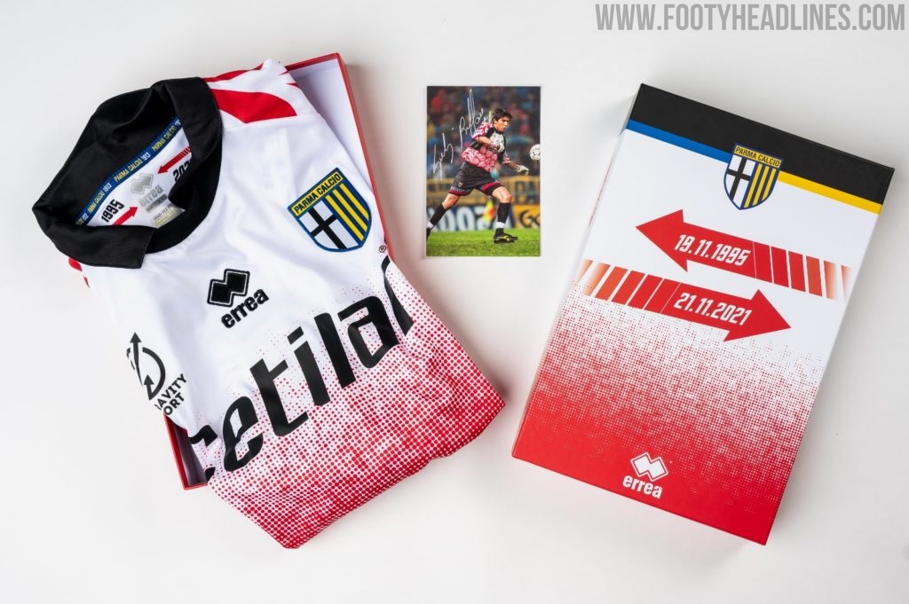
Throwback and remake kits are generally a guaranteed success in terms of sales, thanks to the power that nostalgia wields over us. Some might say that remakes have been done to death recently, but when one of your club’s best ever players returns 26 years on from his debut, what better way to mark such an unlikely occasion? It’s highly doubtful that we’ll ever see another player with a career trajectory and longevity like that of Gigi Buffon, and that’s without even bringing his quality into the equation.
20th Anniversary of 2002 Coppa Italia Victory 22-23


This season’s special kit offering from Parma saw the release of two shirts, one outfield and one goalkeeper version. Harking back to their last Coppa Italia title in 2002, Erreà recreated the away shirt and goalkeeper shirt worn in the final. A great looking pair of kits at the time, they didn’t lose any of their appeal on their reproduction 20 years later. An embroidered anniversary symbol on the back of the neck and the lyrics of one of the fans’ chants inside the collar made sure it lived up to its “special” billing.
Centenary 13-14

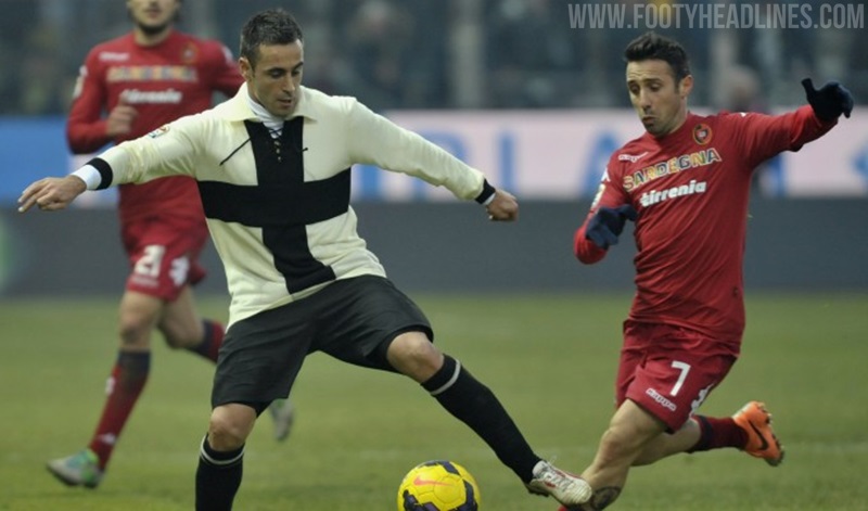
A club’s centenary is the most common and justifiable reason for a special kit, and Erreà went above and beyond for Parma with this effort that was true to tradition in every sense. Foregoing modernity, this jersey was made in Parma from 100% merino wool, produced using techniques like those that were in use at the time when the club was founded.
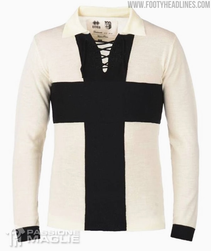


The shirt bore no crest and no logos, save for a label stitched onto the inside of the collar. A serious amount of work went into ensuring that this shirt was as close as possible to the first ones worn by the first Parma players back in 1913.
Capitale della Cultura 19-20


Parma was selected as the European Capital of Culture for the year 2020, a great honour for any city, but possibly the worst year in history for it to happen. The special kit in celebration of the privilege had already been designed and produced, but the outbreak of the Covid pandemic saw extreme lockdown measures put in place and the cultural projects and events cancelled. As a result, the jersey was never worn.
So there you have it. Do any other clubs come to mind for their dedication to putting a lot of thought into their special kits?





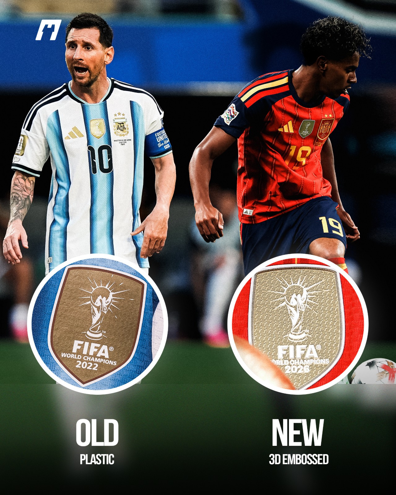
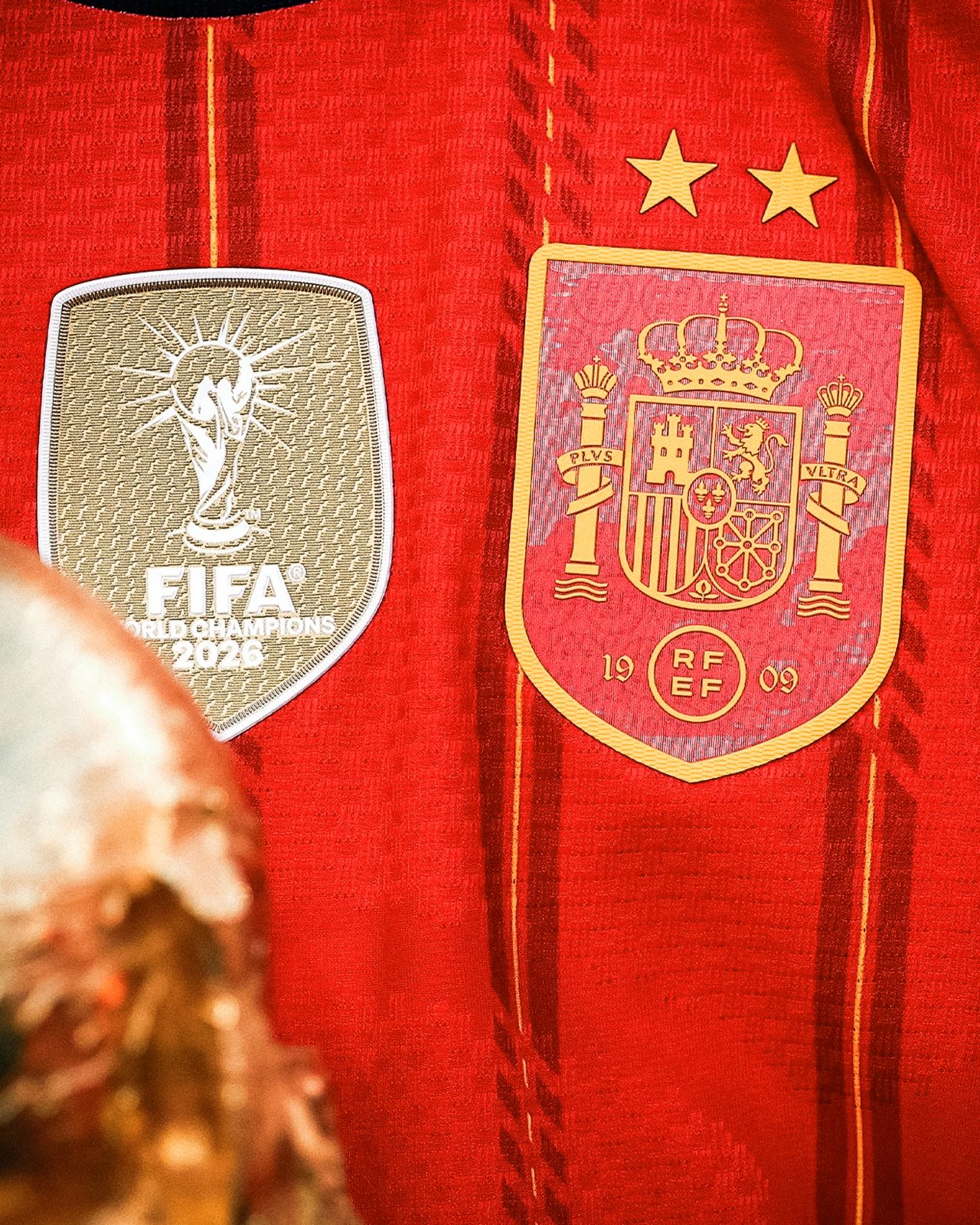
Premium Material Returns to the World Cup Champions Badge
Alongside the second star above the crest, Spain officially unveiled a new 3D embossed World Champions badge during their recent 3-2 victory over England in the UEFA Nations League. This badge previously appeared on Spain's jersey after their 2026 FIFA World Cup triumph.
Compared to the heat-applied plastic version seen on Argentina's kits, the new badge from Cromotransfer offers a significantly more premium look, featuring an embossed surface and a multi-layered structure. Before that, Adidas has increasingly shifted to pre-applying tournament and champions badges directly in its manufacturing facilities.
However, this upgrade will be exclusive to the authentic player-version jerseys. The fan-version replica shirts will continue to feature the standard heat-transferred plastic badge.
Big thanks to @whatthekit_x for the collage.