Have Special Kits Gone Too Far?
 Apr 6, 2024, by Chris
- Borussia Dortmund Special Kits: Dortmund has released four special kits in five seasons, celebrating their stadium's 50th anniversary with one, and fans are largely supportive due to the club sticking to their traditional colors.
- AS Roma "Origins" Kit: Roma debuted a special kit, dubbed "Origins," against their city rivals, which has a Manchester United 2021-22 pattern, dividing fan opinion.
- 1. FC Union Berlin's Away Kit Protest: Union Berlin wore their away "Star Trek" themed kit at home, which sparked protests from fans who saw it as a marketing stunt and want it banned at home games.
Today, Borussia Dortmund, AS Roma, and 1. FC Union Berlin took to the field in special kits, each sparking a unique response.

BVB are a exemplary when it comes to preserving the club's colors
Borussia Dortmund - 4 Special Kits Within 5 Years
BVB lost 0-1 against rivals Stuttgart, who are now 7 points ahead - BVB might fail to qualify for the Champions League.

Dortmund celebrated the 50-year anniversary of their stadium with a special kit. What was possibly even more special than the shirt itself was the tifo of the fans to celebrate the anniversary.
#BVB-Choreo zum 50. Geburtstag des Westfalenstadions. ⚫️🟡 pic.twitter.com/0yU8zWGpXJ
— Patrick Berger (@berger_pj) April 6, 2024
For Borussia Dortmund, it was the fourth special-edition kit within five seasons. Next season, BVB will release five kits; however, Dortmund fans apparently have no problem with the club releasing special kits.


In fact, Borussia Dortmund is exemplary when it comes to staying true to its classic kit colors, which might be one reason why the fans have nothing against special kits. BVB only has black and yellow kits instead of experimenting with colors that have nothing to do with the club.
AS Roma: "Origin" Kit With Manchester United Design

AS Roma debuted a special derby kit in their match against city rivals Lazio. Called the "Origins" kit, it has the old Manchester United 2021-22 kit pattern - quite a joke to call the kit "origin."


Still, the full combination of the kit with white shorts and black socks managed to elevate its overall appearance. However, opinions remained divided among supporters.


1. FC Union Berlin: Away Kit at Home

Union Berlin and its shirt sponsor Paramount+ opted for a special move by wearing a "Star Trek" themed kit. However, instead of putting the Star Trek logo on the red home kit, Union Berlin placed the logo on the away kit.


The decision to put the Star Trek logo on the away kit and wear the away kit at home led to protests from organized fans who viewed it as a bad marketing stunt. The fans were even calling for a ban on such marketing gimmicks during home games.
Clubs need to keep a good balance between tradition and commercial interests
The differing reactions to these special kits underscore the challenge clubs face in balancing tradition with innovation while also navigating commercial interests. As clubs continue to experiment with alternate designs and collaborations, they must carefully consider the sentiments of their loyal fanbase to maintain their connection and support.

It seems like clubs will always find a reason for a special kit, but is it always a good idea?
Are you a fan of special kits? Do you understand Union Berlin fans' desire to ban away kits at home (which is actually a rule in the Premier League)? Let us know in the comments below.


Chattanooga Red Wolves Reveal Vibrant Hispanic Heritage Pre-Match Shirt
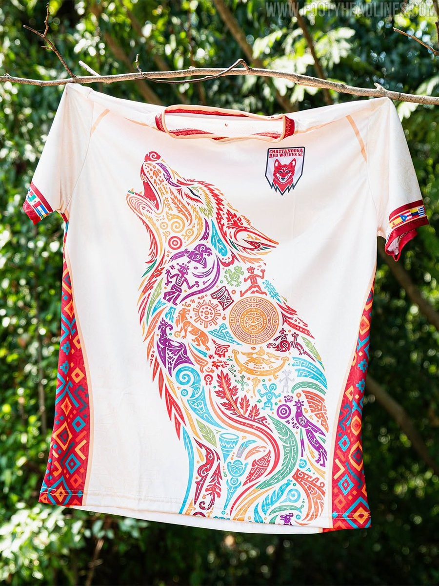
USL League One club Chattanooga Red Wolves SC have unveiled a striking special-edition warm-up top in celebration of Hispanic Heritage Month. Worn ahead of the club's annual Hispanic Heritage Night celebrations, the design pays homage to the rich cultural contributions and traditions of the Hispanic and Latino communities within the local area and across the sport.
Set against an off-white base, the standout feature of the shirt is a massive howling wolf graphic across the front. The silhouette of the club's emblem is brought to life through intricate Mesoamerican and folk art motifs, filled with vibrant shades of teal, red, yellow, orange, and violet. Matching cultural diamond patterns run down the red side panels, while the sleeve cuffs are detailed with horizontal sequences representing various Latin American flags.
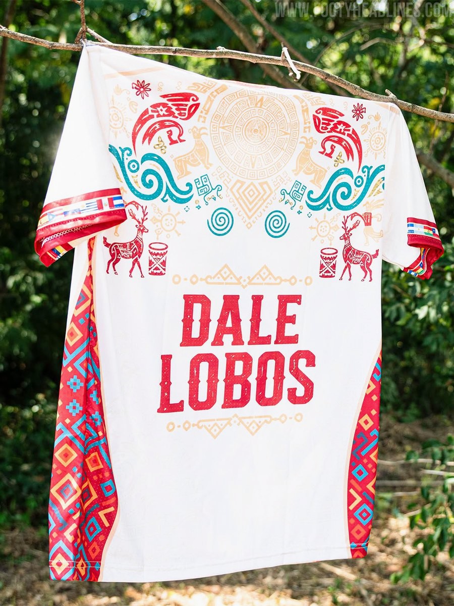
The reverse side continues the celebratory theme with a sun wheel and mythological fauna gracing the upper back. Centered below is the club's rallying cry, "DALE LOBOS," printed in a bold red textured font and framed by geometric borders.
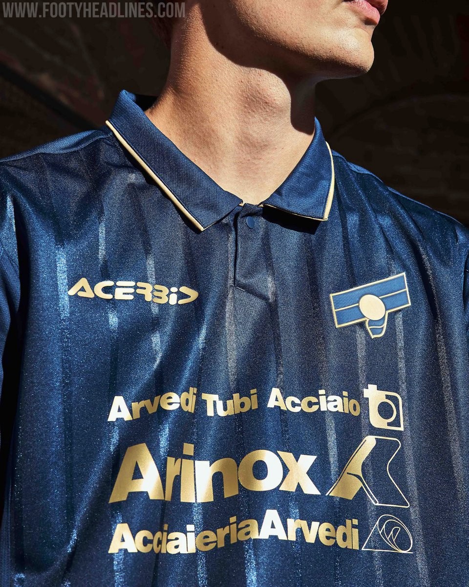
US Cremonese 26-27 Third Kit Released
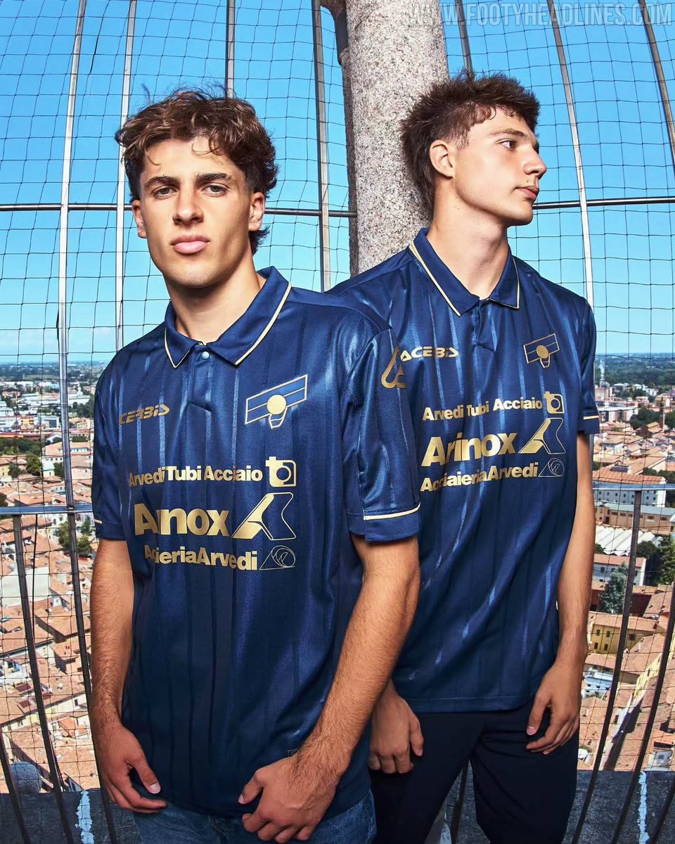
Italian club US Cremonese and technical sponsor Acerbis have officially unveiled their new third kit for the 2026-27 campaign. Designed by Cremona native Carlo Enrico Bonvicini, the jersey is built around a deep navy base enhanced by an alternating pattern of glossy and matte tonal pinstripes for subtle depth.
Elegant golden trim outlines the classic polo collar and sleeve cuffs, complemented by monochrome gold sponsor branding and a reimagined two-tone club crest that references 1980s and 1990s iconography alongside the historical Giovanni Baldesio legend.