

Puma Must Step Up: Galatasaray and Bologna Kits Highlight the Detail Gap
- Detail Gap Highlighted: A direct comparison of the 26-27 kits for Galatasaray (Puma) and Bologna (Macron) sparked a debate, showcasing a noticeable difference in craftsmanship and attention to detail between the two sportswear brands.
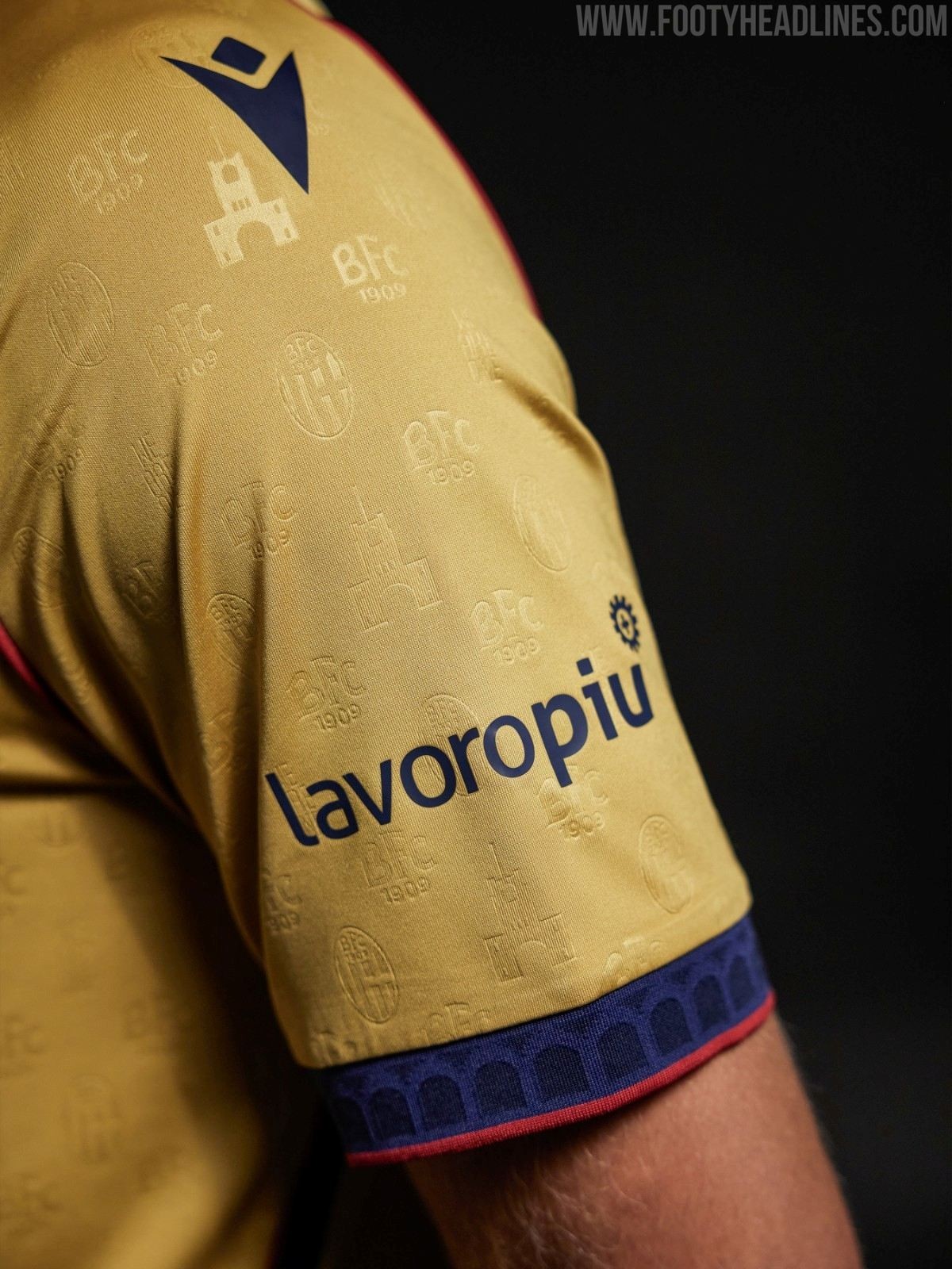
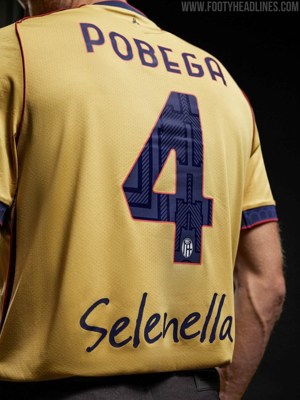
- Macron's Bespoke Detailing for Bologna: Macron's Bologna third kit is praised for its intricate, bespoke elements celebrating the Stadio Renato Dall’Ara's centenary, featuring embossed patterns, club motifs, and stadium illustrations woven into the fabric and player typography.
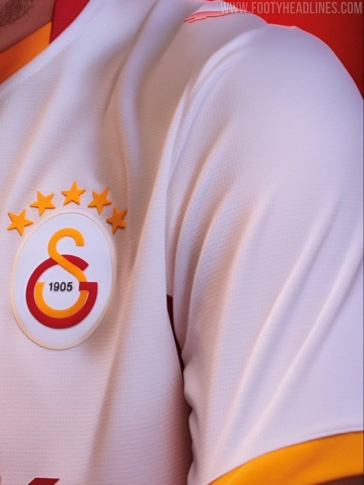
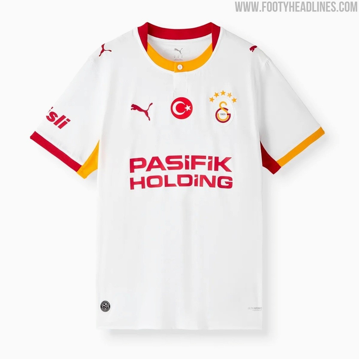
- Puma's Simpler Approach and Industry Trend: Puma's Galatasaray shirt exhibits a much simpler, cleaner design lacking custom textile patterns, reflecting a broader sentiment that major manufacturers often provide less bespoke detailing compared to mid-sized brands like Macron.
A direct comparison between the 26-27 kits of Galatasaray and Bologna has ignited a lively debate among football shirt collectors and fans online, highlighting the noticeable difference in craftsmanship and attention to detail between global powerhouse Puma and Italian sportswear brand Macron.
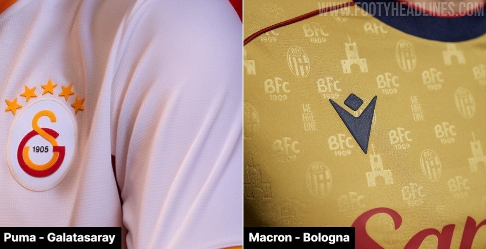
Bologna 26-27 Third Kit vs Galatasaray: A Study in Details
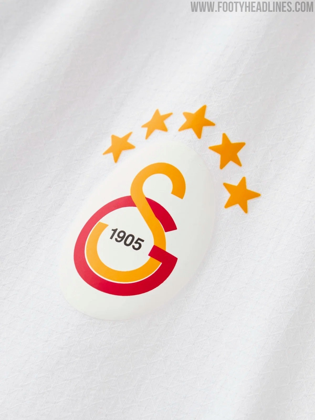
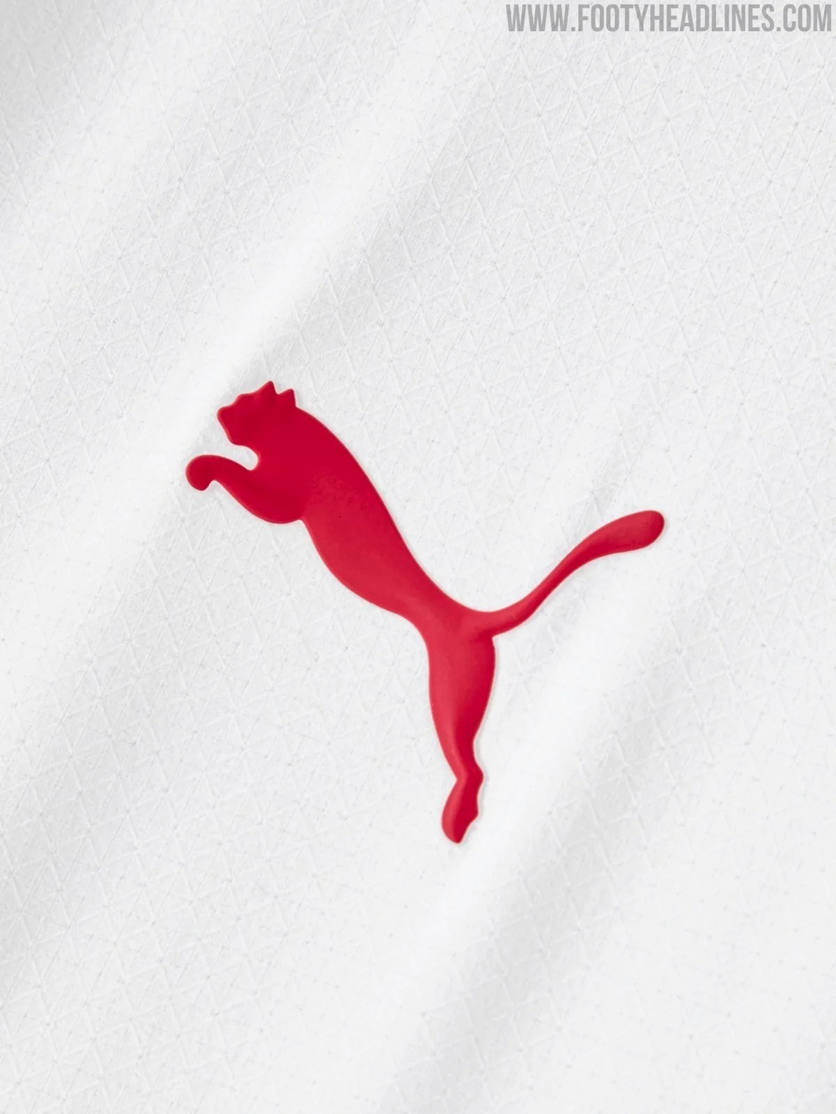
The comparison, shared by kit enthusiast @aliplusdemir on X, places close-up shots of Puma's jersey for Galatasaray alongside Macron's newly unveiled third kit for Bologna.
The side-by-side imagery quickly drew reactions from fans who feel that major manufacturers are often outshined by mid-sized brands when it comes to bespoke detailing and storytelling.
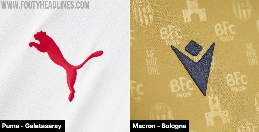
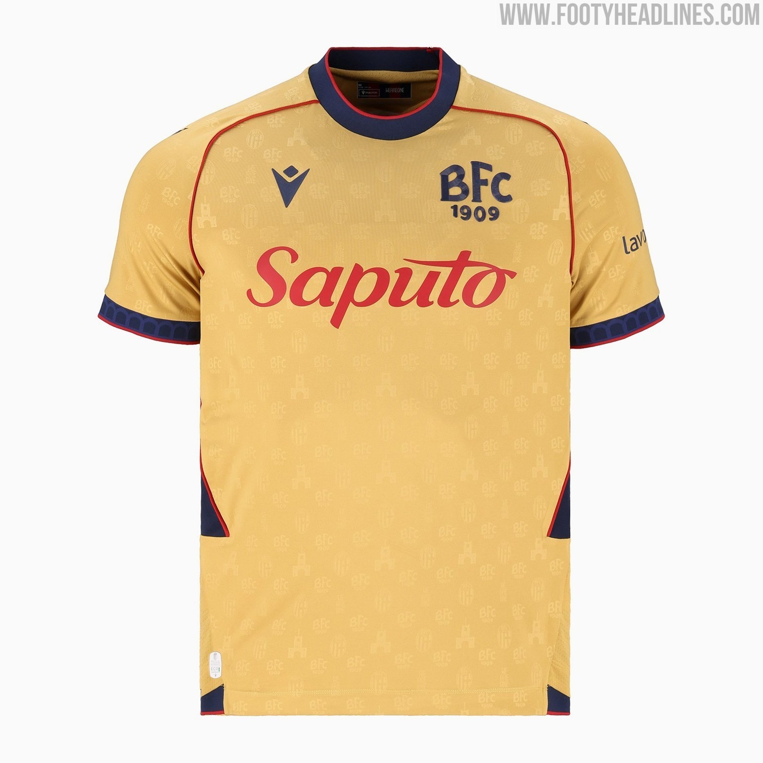
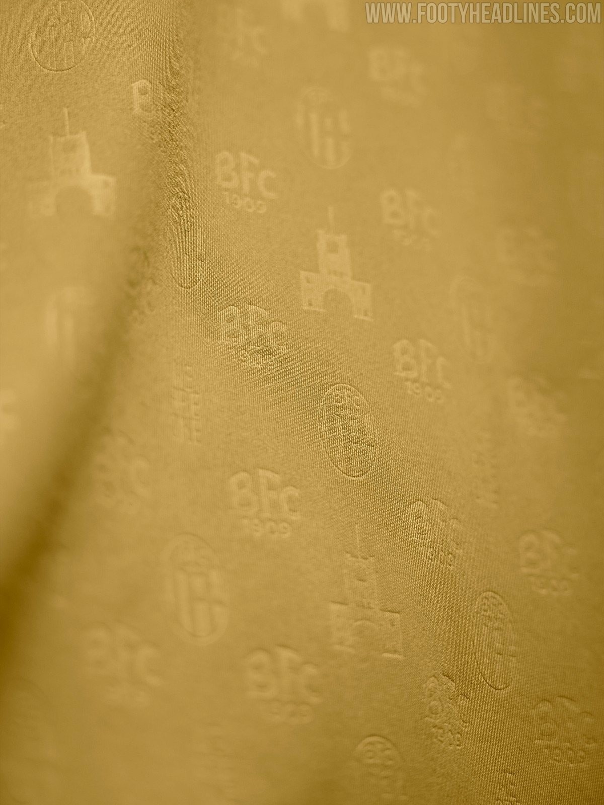
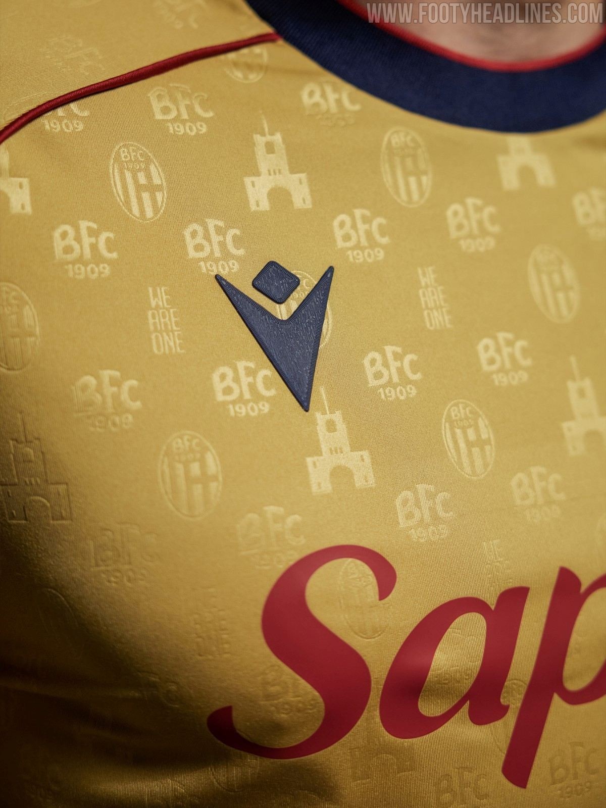
The centerpiece of the discussion is Bologna's striking gold 26-27 third kit, crafted by Macron to celebrate the upcoming centenary of the iconic Stadio Renato Dall’Ara. Rather than delivering a simple color swap, Macron went all-in on bespoke elements.
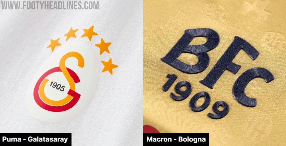
The fabric features an all-over tonal embossed pattern integrating the club crest, the "WE ARE ONE" motto, retro BFC 1909 lettering, and the unmistakable silhouette of the stadium's Torre di Maratona. Even the player typography continues the narrative, featuring graphic illustrations of the stadium's porticoes embedded inside the squad numbers, framed by fine contrast piping along the seams.
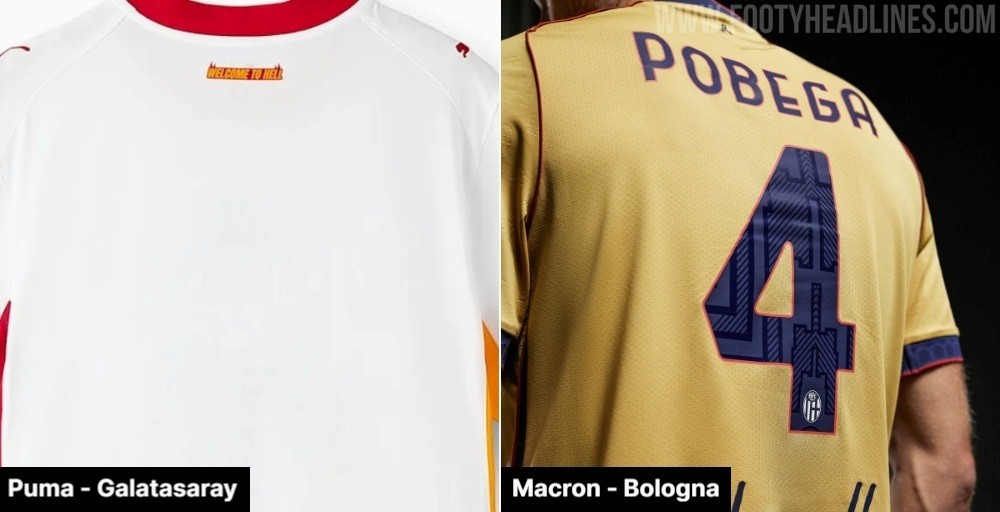
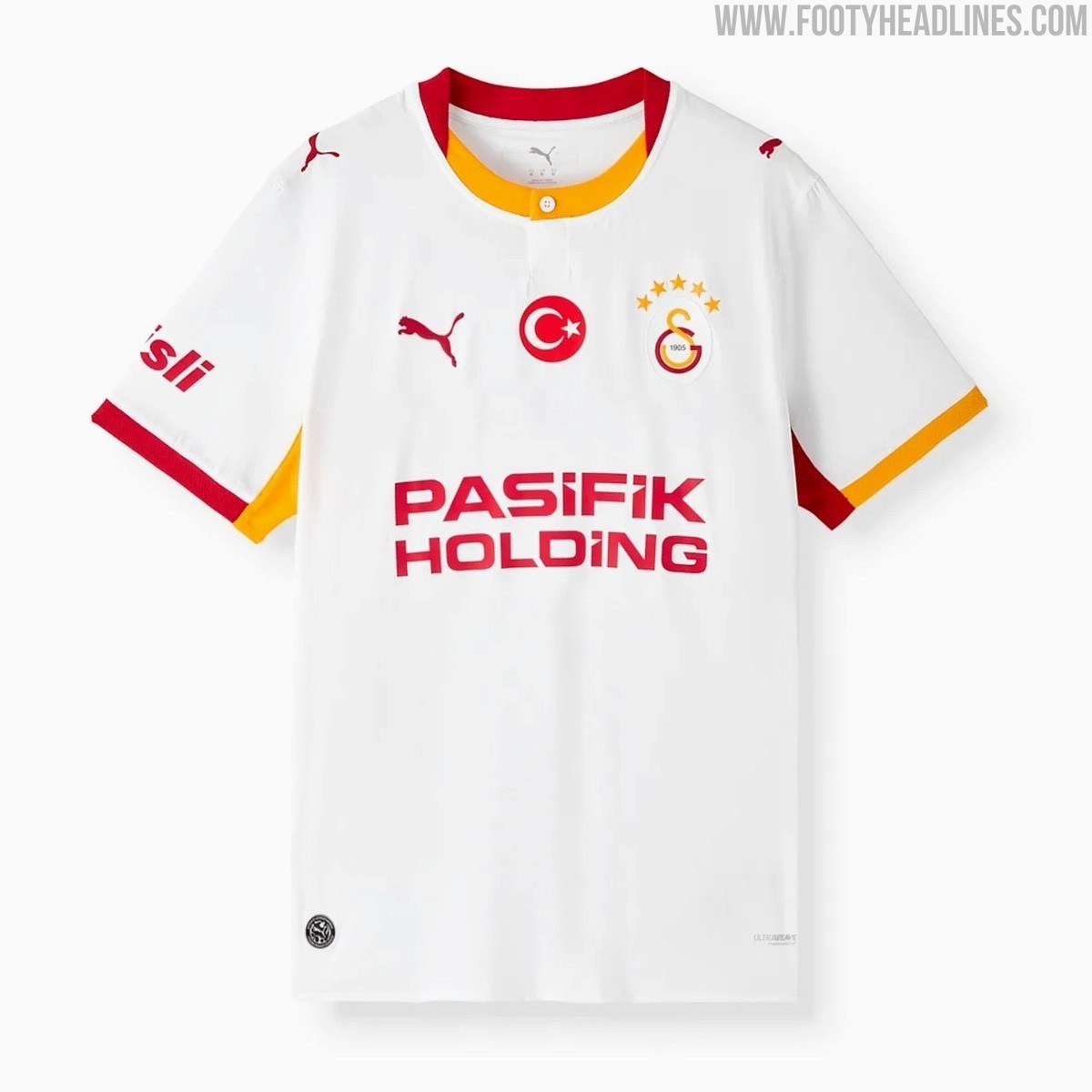
By contrast, the close-up of Puma's shirt for Galatasaray shows a much simpler execution. Set against a smooth, standard knit base, the jersey carries clean lines and heat-applied crest and star details, but lacks any custom textile patterns, jacquard weaves, or hidden club motifs woven into the fabric.
While the shirt delivers a clean, modern aesthetic that looks sharp on the pitch, many supporters feel that a club of Galatasaray's caliber deserves richer, more tailored design treatments rather than straightforward templates.
This comparison reflects a wider sentiment across modern kit culture. While giants like Puma, Nike, and Adidas frequently prioritize sleek, performance-led minimalism, brands such as Macron, Hummel, and Kappa have won plaudits by obsessing over textural depth, historical tributes, and intricate detailing.
For many kit collectors, those subtle bespoke flourishes are precisely what transform a decent football shirt into an unforgettable classic.
Do you think Puma needs to improve its attention to detail and texture, or do you prefer the cleaner, simpler approach? Let us know in the comments below.