
How Barcelona's Away Kit Would Have Looked With a Gradient Spotify Logo
 , by Chris
- Missed Sponsor Opportunity: The Nike FC Barcelona 24-25 away kit, while praised for its sleek design and subtle red-to-blue gradient accents, opted for a solid red Spotify logo, which is considered a missed opportunity to integrate the sponsor seamlessly.
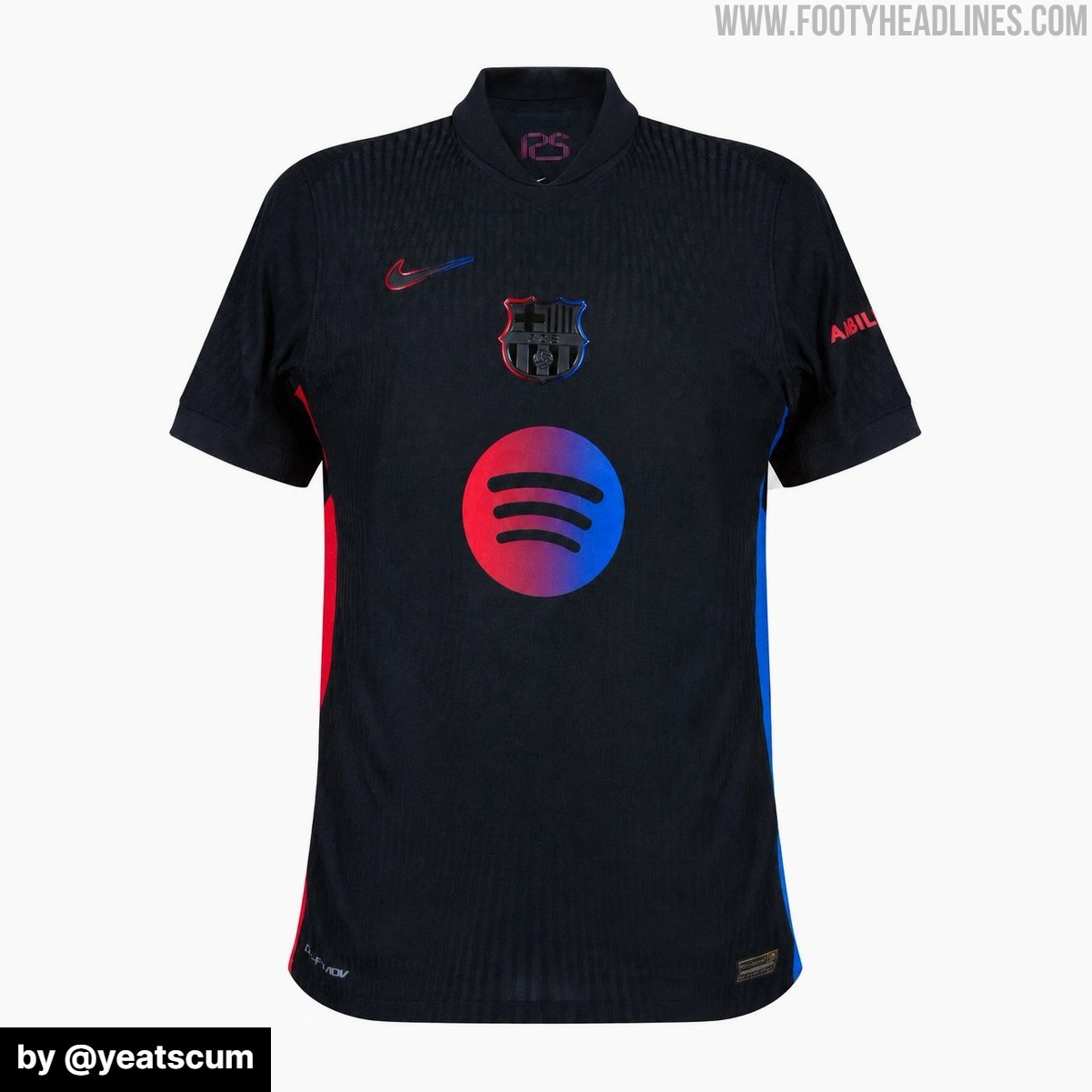
- Cohesive Fan Edits: Fan edits illustrate that incorporating the kit's red-to-blue gradient into the Spotify logo, either as a fill or outline, significantly enhances the jersey's cohesion with the centered club crest and Nike Swoosh.
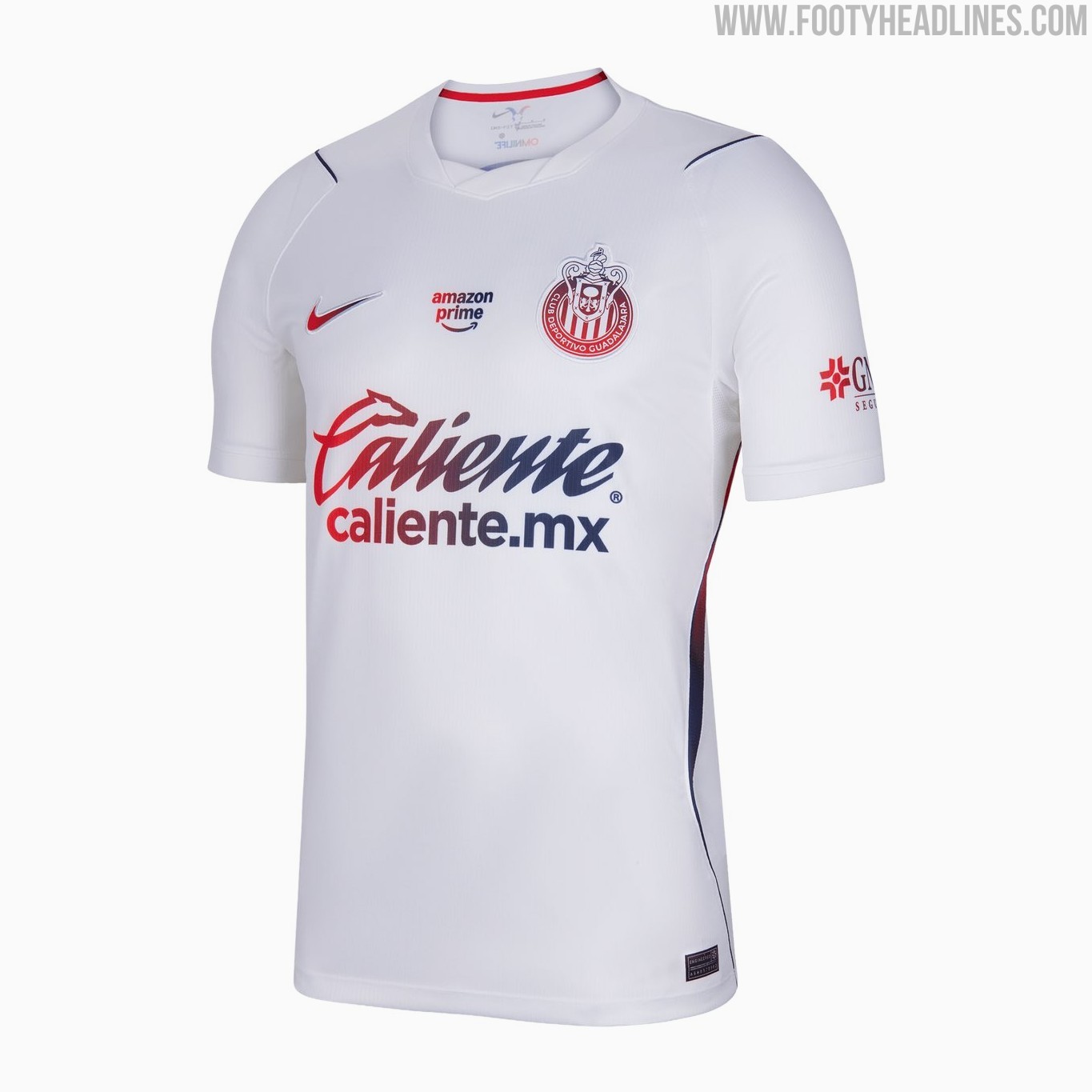
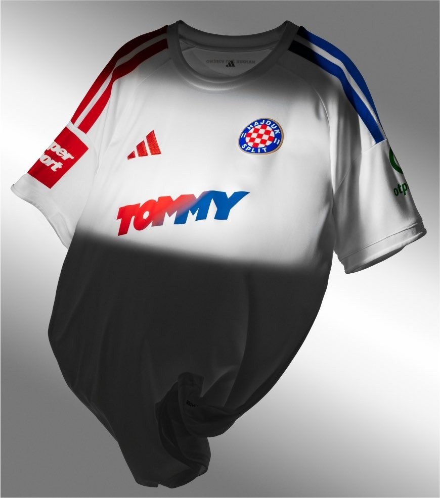
- Precedent for Gradient Logos: Other clubs like Chivas and Hajduk Split have successfully adapted gradient logos for their sponsors in the 2026-27 season, demonstrating the potential for an elevated design that Barcelona could have utilized.
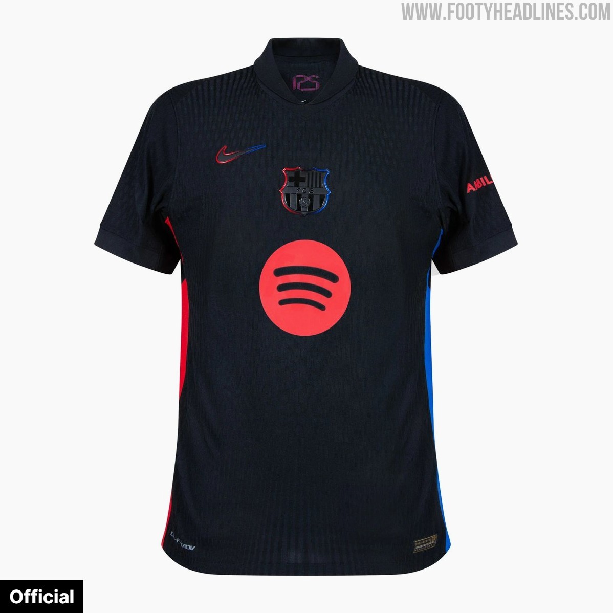
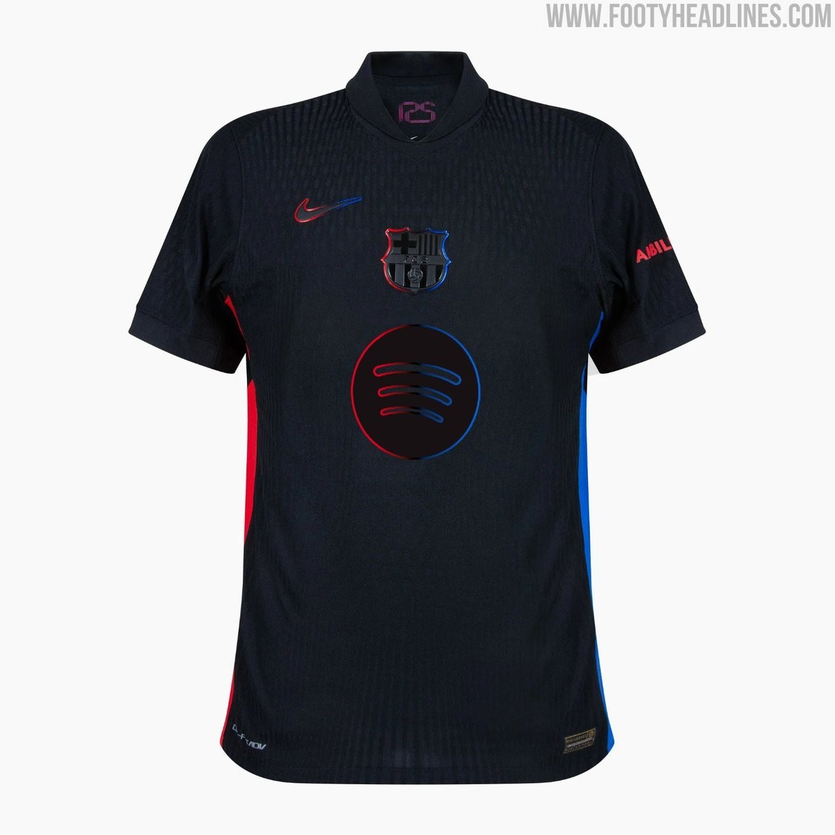
Nike's black FC Barcelona 24-25 away kit was widely praised for its sleek stealth base paired with vibrant red and blue accents. A standout feature of the shirt was the subtle red-to-blue gradient outlining the central Swoosh, the centered club badge, and the side stripes. However, Barcelona/Nike/Spotify opted for a solid red Spotify logo on the chest, leaving us and many others to think that the sponsor design was a missed opportunity. Thanks to our friend The Kitsman for the idea for this.
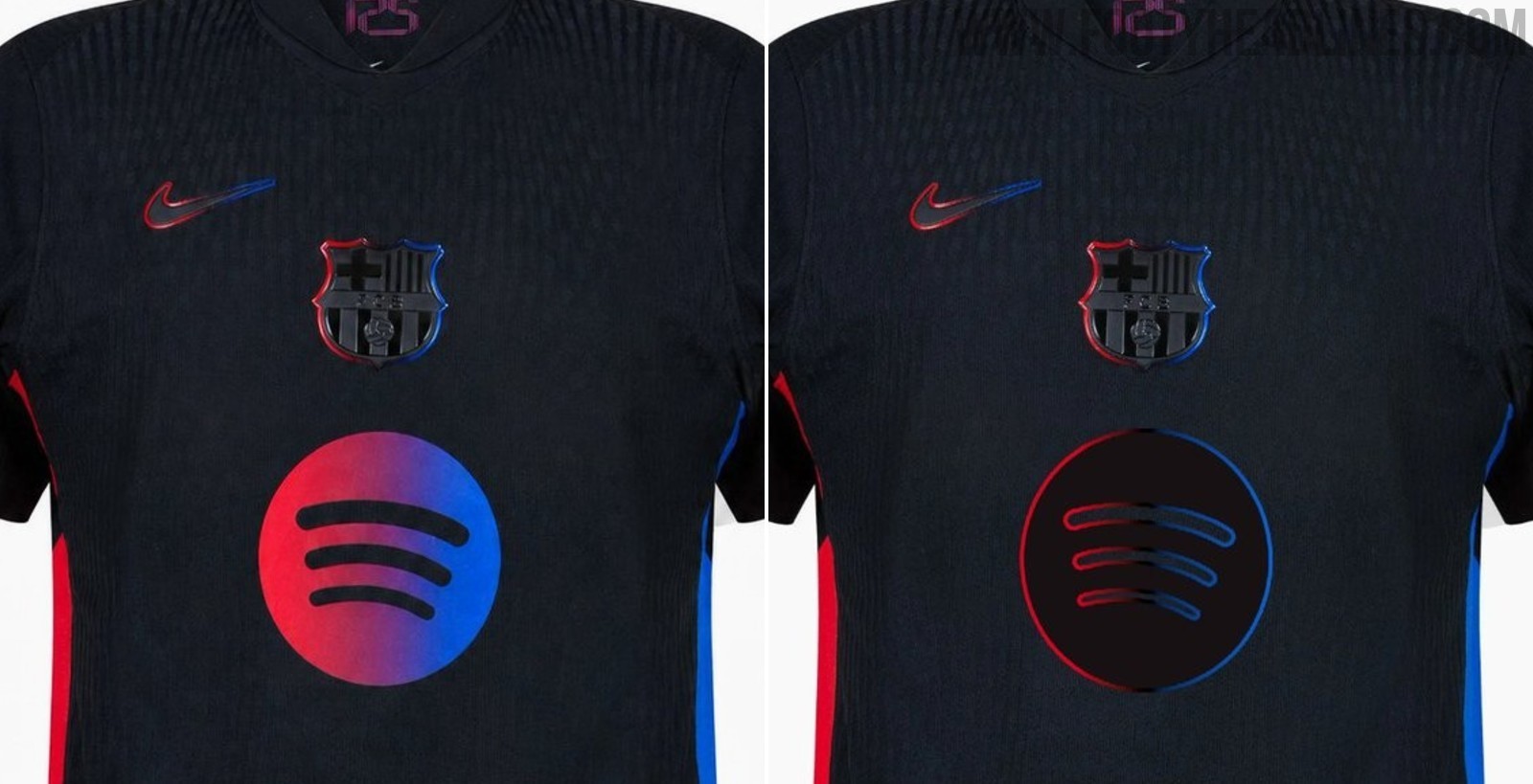
Barcelona 24-25 Away Kit With Gradient Spotify Logo
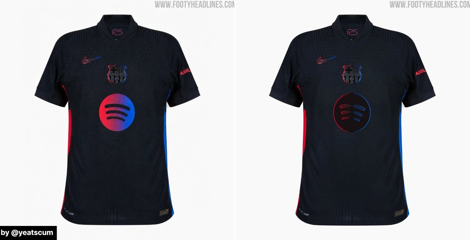
A fan edit created by us and one by @yeatscum highlight how much more cohesive the jersey looks when the Spotify logo incorporates the same gradient. By applying the red-to-blue transition across the emblem - either as a full color fill or as a sleek border outline - the sponsor blends effortlessly with the centered crest and Nike Swoosh.
In the 2026-27 season, Chivas and Hajduk Split both adapted gradient logos for their sponsor, elevating the overall design heavily.
Should Barca have had a gradient Spotify logo on their 2024-2025 away kit? Comment below.