Club América debuted their special Adidas 110th anniversary kit in Liga MX action against Monterrey,...
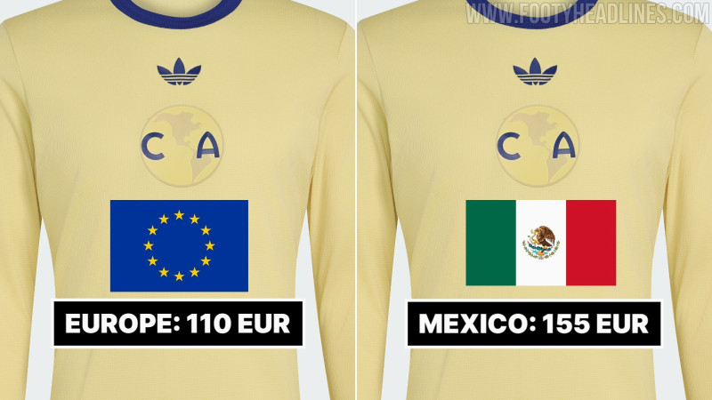
Club América debuted their special Adidas 110th anniversary kit in Liga MX action against Monterrey, bringing the retro-inspired design to the pitch ahead of the club's official founding anniversary on October 12. Released earlier in the week, the commemorative uniform celebrates 110 years of Las Águilas with a distinct aesthetic heavily inspired by the club's 1970s look, featuring a pale yellow base, navy ribbed collar and cuffs, and a historic 1917–1918 circular crest positioned beneath a navy Trefoil.
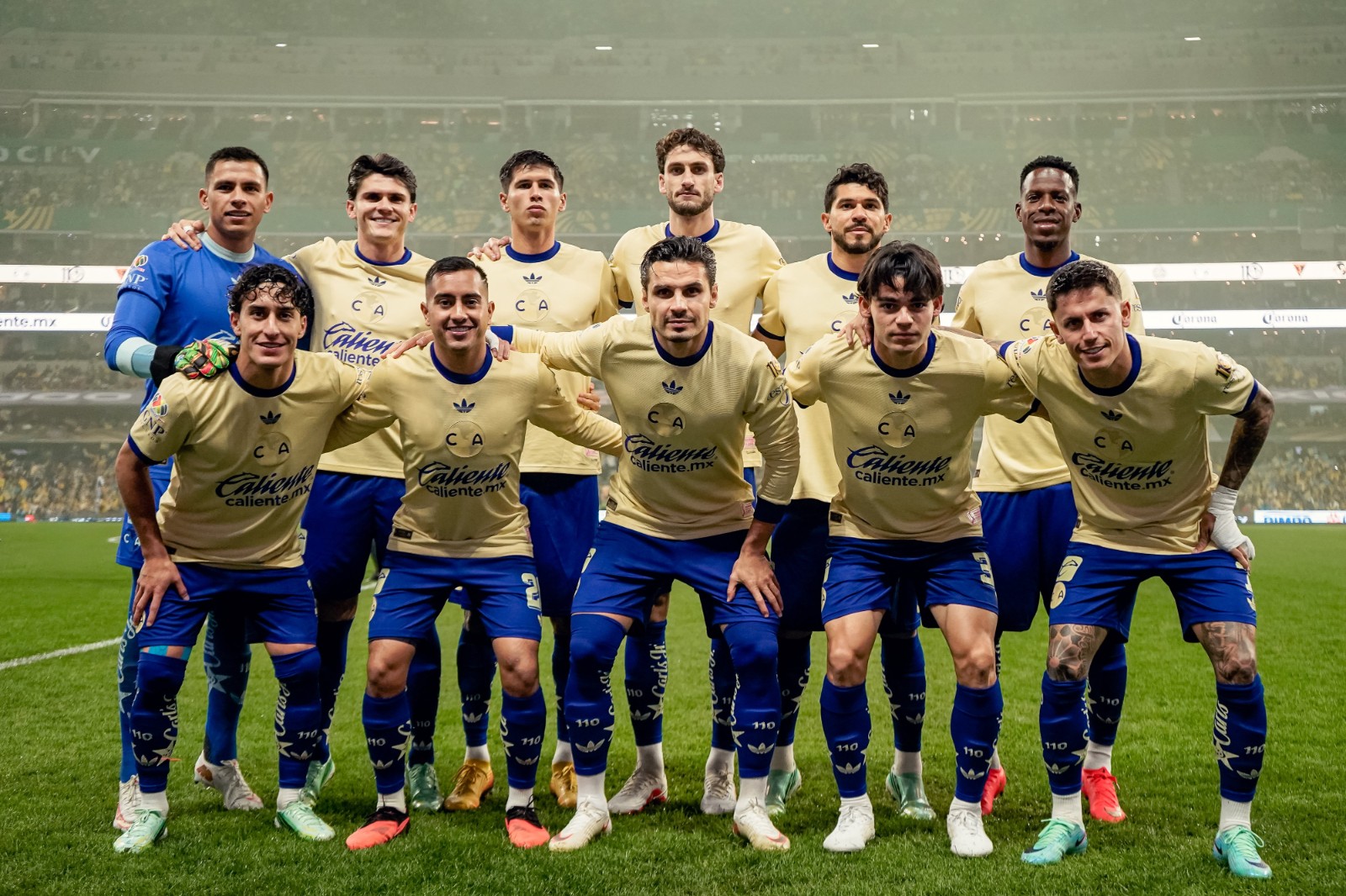
While the retail version earned widespread praise for its completely sponsor-free chest—allowing the heritage crest and minimalist styling to take center stage—the match version inevitably featured full commercial branding. Main shirt sponsor Caliente was applied across the center chest directly underneath the crest, joined by standard sleeve sponsors. The addition drew mixed reactions among shirt enthusiasts, many of whom felt the prominent sponsor graphics compromised the pure, classic feel seen on the retail release.
Despite the added graphics, the strip made a striking impression on the pitch. Club América paired the commemorative shirt with rich navy shorts and matching socks highlighted by "110" anniversary numbering alongside the Adidas Trefoil, completing a memorable look for the milestone celebration.
Club América debuted an intricate Día de Muertos kit font for their 26-27 Liga MX Apertura clash aga...
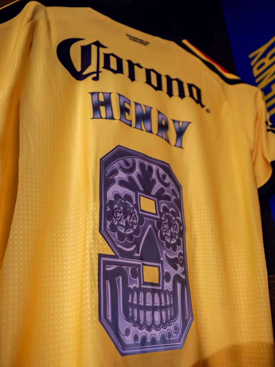
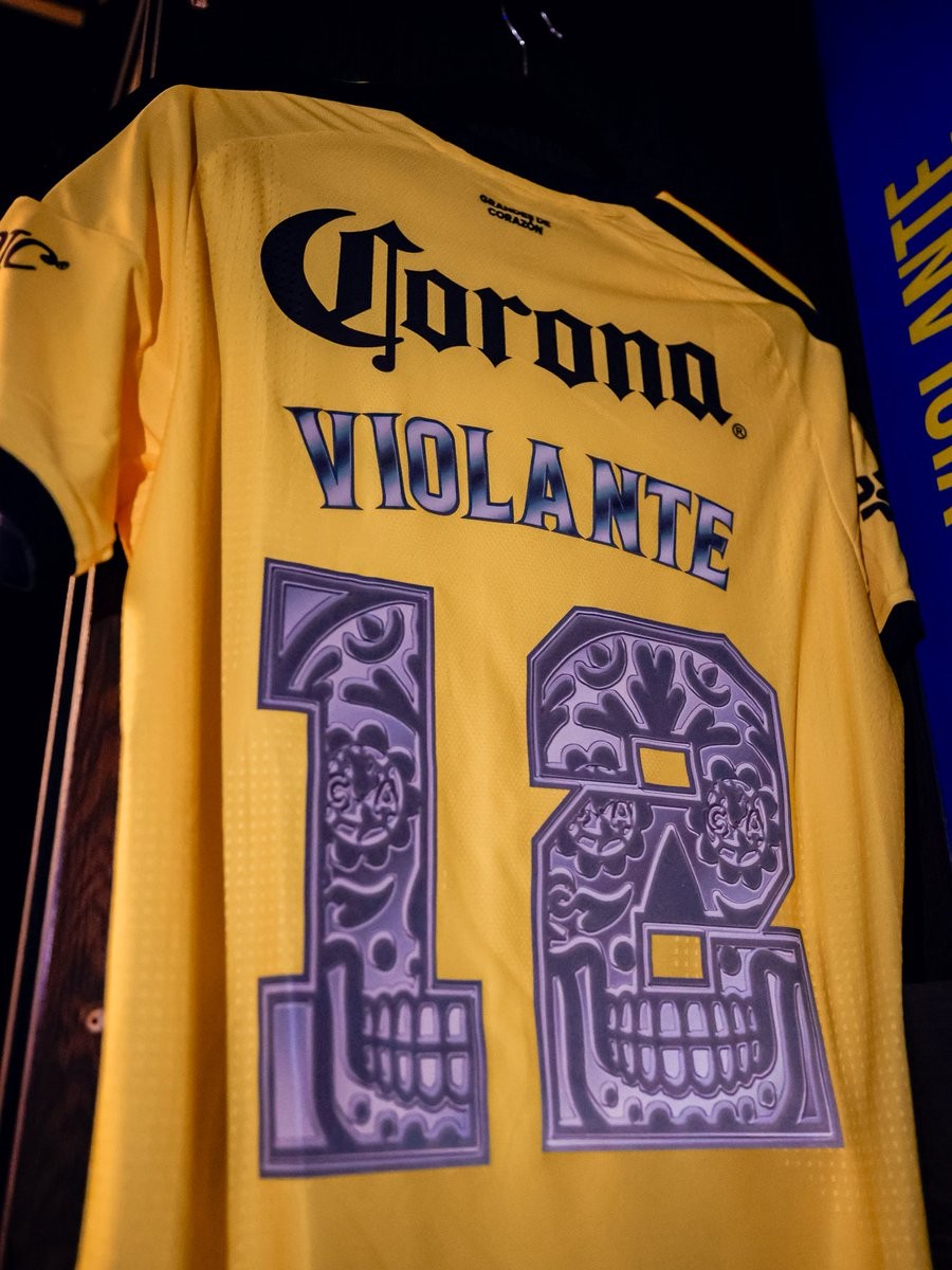
Club América debuted an intricate Día de Muertos kit font for their 26-27 Liga MX Apertura clash against Toluca. The Mexican giants showcased the commemorative lettering in their locker room ahead of the Jornada 15 match, continuing the growing tradition of Liga MX clubs celebrating the iconic Day of the Dead holiday through unique matchday details.
The custom numbers are applied in purple tones and transform each digit into a Mexican sugar skull (calavera). Each number features ornate floral flourishes, stylized geometric patterns, and tooth detailing along the lower jaw, with the club's iconic 'CA' crest subtly embedded into the circular eye sockets of the skull designs. Accompanying the numbers, the player names on the back also boast a matching gradient metallic purple finish.
The special font was worn exclusively for the celebratory fixture on América's yellow home shirts, following similar Día de Muertos typographic tributes recently showcased across Mexico by rivals such as Chivas and Cruz Azul.
Club América has come under scrutiny from kit enthusiasts and fans over the questionable durability...
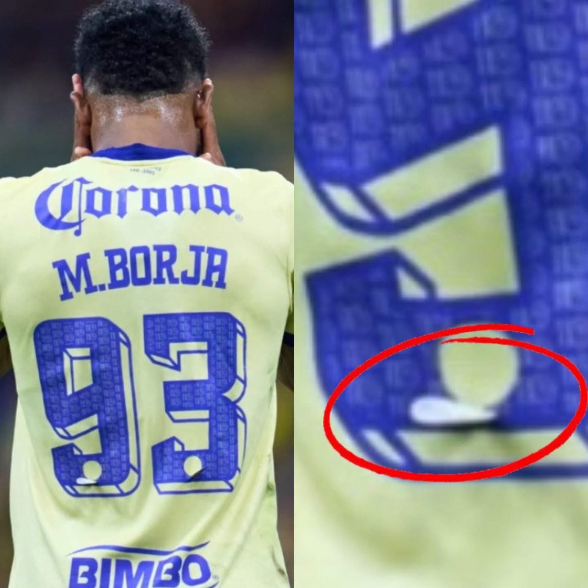
Club América has come under scrutiny from kit enthusiasts and fans over the questionable durability of their player printing. During a recent Liga MX fixture, striker Miguel Borja was spotted with a miniature club crest peeling almost entirely off the blue digit of his number 93 jersey before the final whistle even blew. Big thanks to @BackToTheRetro2.
América has established a habit of using heavily decorated squad numbers featuring micro-patterns and supplementary heat-pressed badges placed directly onto the font. However, the delicate heat-transfer application has sparked widespread mockery online, with fans sarcastically remarking that the only way to prevent the badges from falling off is to never wash or wear the jerseys. Collectors have also questioned why expensive official shirts struggle to endure basic on-pitch friction.
The incident also drew comparisons from rival supporters, including Tigres UANL followers who noted that their club abandoned a similar trend of multi-layered font decorations after just one season. As clubs continually push for bespoke, intricate details on their matchday kits, América's falling crests highlight the persistent challenge of balancing elaborate aesthetic concepts with real-world durability.
Club América debuted an intricate Día de Muertos kit font for their 26-27 Liga MX Apertura clash aga...
Club América debuted an intricate Día de Muertos kit font for their 26-27 Liga MX Apertura clash against Toluca. The Mexican giants showcased the commemorative lettering in their locker room ahead of the Jornada 15 match, continuing the growing tradition of Liga MX clubs celebrating the iconic Day of the Dead holiday through unique matchday details.
The custom numbers are applied in purple tones and transform each digit into a Mexican sugar skull (calavera). Each number features ornate floral flourishes, stylized geometric patterns, and tooth detailing along the lower jaw, with the club's iconic 'CA' crest subtly embedded into the circular eye sockets of the skull designs. Accompanying the numbers, the player names on the back also boast a matching gradient metallic purple finish.
The special font was worn exclusively for the celebratory fixture on América's yellow home shirts, following similar Día de Muertos typographic tributes recently showcased across Mexico by rivals such as Chivas and Cruz Azul.
Club América has come under scrutiny from kit enthusiasts and fans over the questionable durability...
Club América has come under scrutiny from kit enthusiasts and fans over the questionable durability of their player printing. During a recent Liga MX fixture, striker Miguel Borja was spotted with a miniature club crest peeling almost entirely off the blue digit of his number 93 jersey before the final whistle even blew. Big thanks to @BackToTheRetro2.
América has established a habit of using heavily decorated squad numbers featuring micro-patterns and supplementary heat-pressed badges placed directly onto the font. However, the delicate heat-transfer application has sparked widespread mockery online, with fans sarcastically remarking that the only way to prevent the badges from falling off is to never wash or wear the jerseys. Collectors have also questioned why expensive official shirts struggle to endure basic on-pitch friction.
The incident also drew comparisons from rival supporters, including Tigres UANL followers who noted that their club abandoned a similar trend of multi-layered font decorations after just one season. As clubs continually push for bespoke, intricate details on their matchday kits, América's falling crests highlight the persistent challenge of balancing elaborate aesthetic concepts with real-world durability.
Club América debuted their special Adidas 110th anniversary kit in Liga MX action against Monterrey,...
Club América debuted their special Adidas 110th anniversary kit in Liga MX action against Monterrey, bringing the retro-inspired design to the pitch ahead of the club's official founding anniversary on October 12. Released earlier in the week, the commemorative uniform celebrates 110 years of Las Águilas with a distinct aesthetic heavily inspired by the club's 1970s look, featuring a pale yellow base, navy ribbed collar and cuffs, and a historic 1917–1918 circular crest positioned beneath a navy Trefoil.
While the retail version earned widespread praise for its completely sponsor-free chest—allowing the heritage crest and minimalist styling to take center stage—the match version inevitably featured full commercial branding. Main shirt sponsor Caliente was applied across the center chest directly underneath the crest, joined by standard sleeve sponsors. The addition drew mixed reactions among shirt enthusiasts, many of whom felt the prominent sponsor graphics compromised the pure, classic feel seen on the retail release.
Despite the added graphics, the strip made a striking impression on the pitch. Club América paired the commemorative shirt with rich navy shorts and matching socks highlighted by "110" anniversary numbering alongside the Adidas Trefoil, completing a memorable look for the milestone celebration.
Club América has unveiled a special commemorative kit font for the 26-27 season, celebrating Mexican...
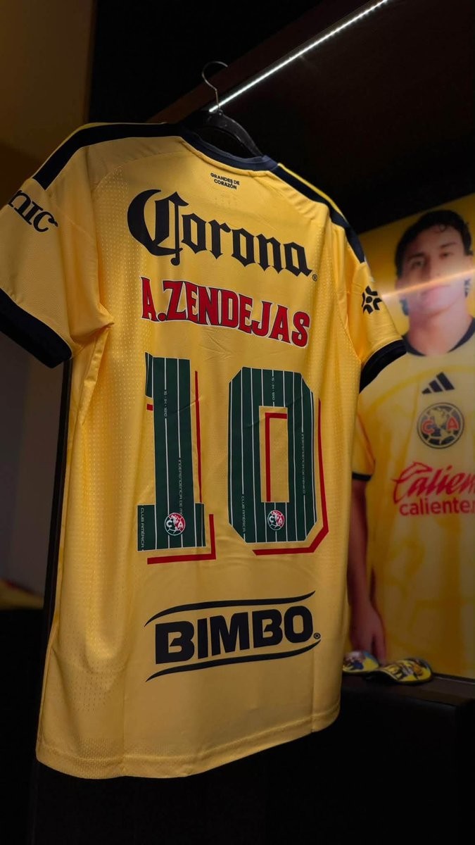
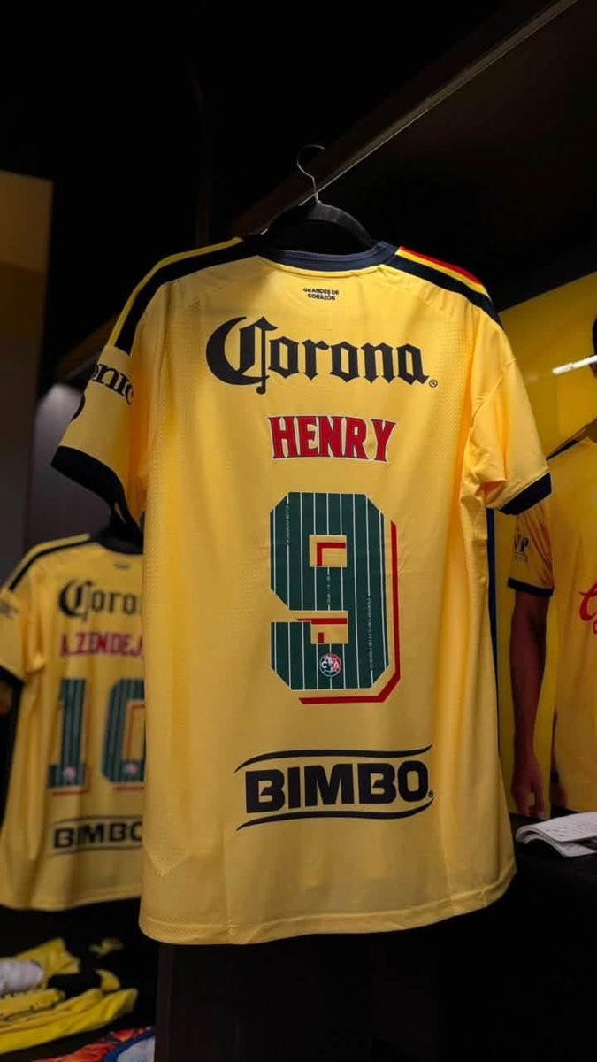
Club América has unveiled a special commemorative kit font for the 26-27 season, celebrating Mexican Independence Day and the club's marquee Clásico matches throughout September. The bespoke nameset replaces the regular squad typography on the back of Las Águilas' primary yellow home shirt, adopting the iconic green, white, and red of the Mexican flag.
The custom numbers feature a deep green base detailed with thin white vertical pinstripes. Embedded along the vertical lines are historic commemorative inscriptions, including the club name, the date "16 - 09 - 1810" marking the start of the Mexican War of Independence, and "INDEPENDENCIA DE MÉXICO". The player names above are rendered in vibrant red with a clean white outline.
To complete the patriotic design, each numeral incorporates a geometric red and cream 3D shadow effect, alongside Club América's crest placed at the base of every digit. The special typography delivers a unique cultural tribute, adding extra identity to the squad's jerseys during one of the most important periods of the Mexican football calendar.
Images of the upcoming Adidas Originals Club América 110th anniversary lifestyle collection have sur...
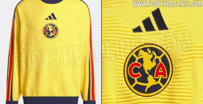
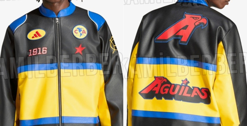
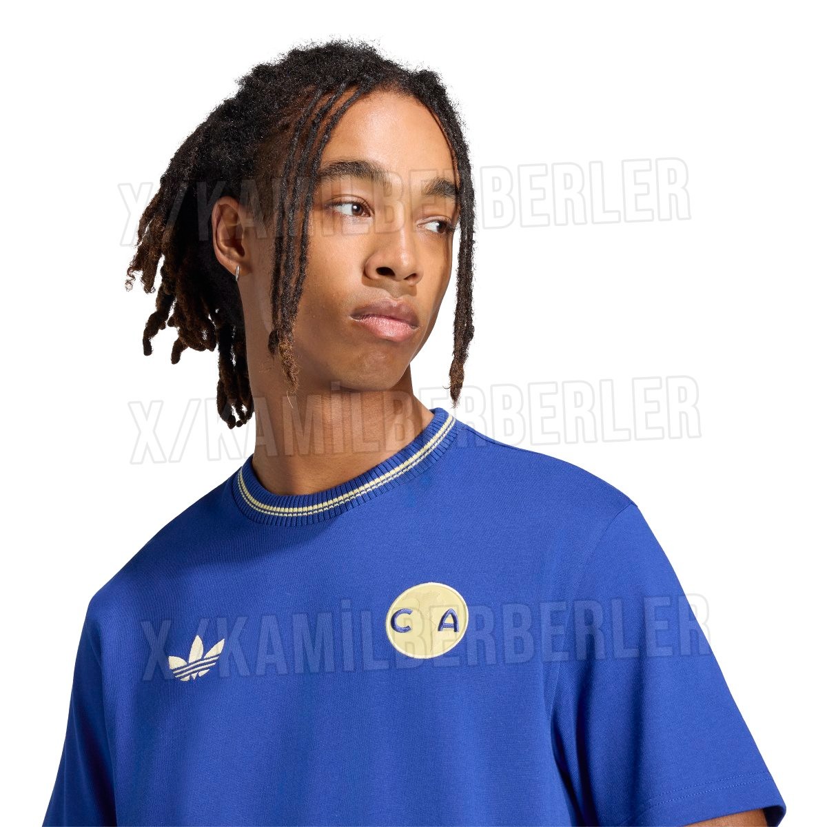
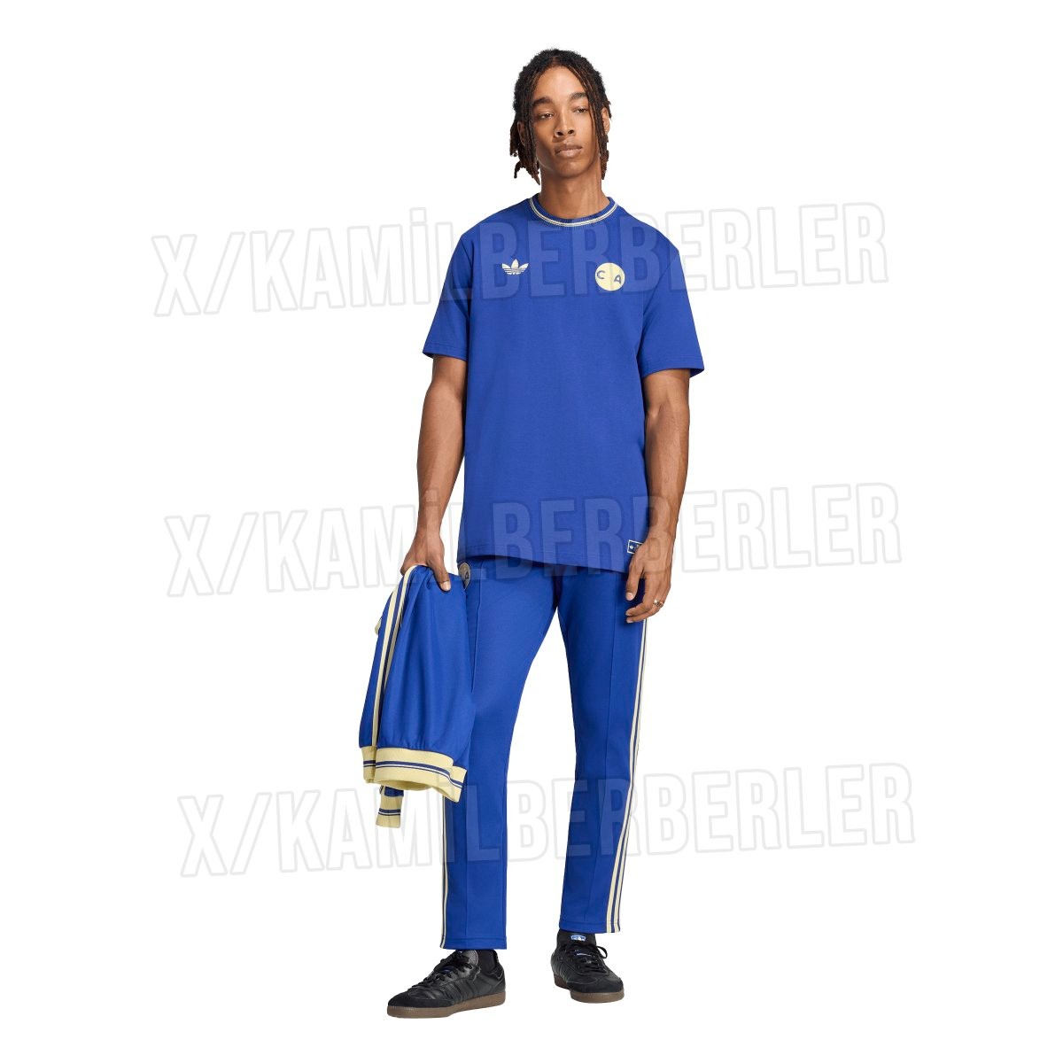
Images of the upcoming Adidas Originals Club América 110th anniversary lifestyle collection have surfaced online. The capsule celebrates the historic Mexican side's 110th birthday since its foundation on October 12, 1916, and is set to accompany a special commemorative 26-27 retro shirt. Thanks to @KamilBerberler.
The lifestyle collection features a track jacket, matching track pants, and a casual t-shirt, all built on a royal blue base with soft pale yellow detailing. Each piece carries the classic Adidas Trefoil logo opposite a vintage circular "CA" badge inspired by the club's earliest years. The track jacket features contrasting three stripes running down the sleeves, a tall ribbed collar, and a special anniversary label reading "1916-2026 CLUB AMÉRICA" alongside the club and brand crests.
This heritage range is designed to complement the upcoming 110th anniversary retro jersey, which takes cues from the club's iconic 1970s looks with a pale cream base and navy accents. The full collection is scheduled to launch around October 2026 to coincide with Las Águilas' official anniversary date.
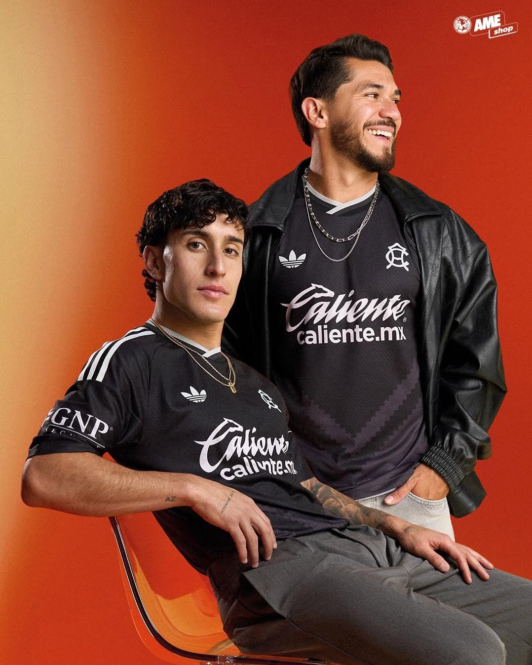
Club América have officially unveiled their new 2026-27 away kit, bringing back the iconic 'CA' cres...
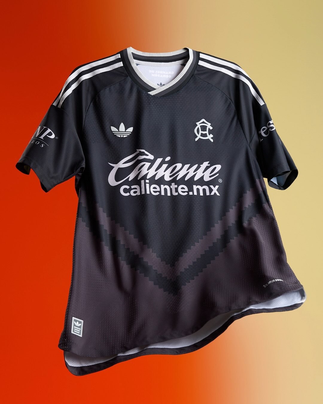
Club América have officially unveiled their new 2026-27 away kit, bringing back the iconic 'CA' crest from the 1980s, complemented by a distinctive chevron pattern across the front of the shirt.
The Adidas Club América 2026-27 away shirt features a sleek dark grey and black base, highlighted by a massive tonal V-shaped chevron graphic dominating both the front and back of the jersey.