
Inter Milan 15-16 Away Kit Released
 Jul 7, 2015, by Chris

The new Nike Inter Milan 2015-2016 Away Shirt introduces a unique design with a striking horizontal stripe on the front, officially released on July 7. It celebrates the 25-years anniversary of Inter's historic 1990-91 season when Inter claimed their first UEFA Cup.

Interestingly, the new Inter Milan 15-16 Away Kit carries the 'driver' logo on the front of the shirt instead of the usual Pirelli logo. Drivers is a brand by Pirelli specialised in tire service.
Inter 2015-16 Away Jersey
This is the new Nike Inter 15-16 Away Kit.

The new Inter Away Shirt combines Inter's iconic colors black, blue and white. On the front of the white Nike Inter Milan 2015-2016 Away Shirt is a striking black and blue horizontal band design with a unique graphic pattern.
The subtle black and blue tonal print shows the scales of Il Biscione. Synonymous with Milan since the 13th century, the snake features on the emblems of two of Milan’s ruling families. The icon also appeared on Inter Milan's bold 2010/11 away kit.
Based on the same template as the Barcelona 2015-16 Away Shirt, the new Inter Milan 15-16 Away Kit features a unique crew-neck collar with blue and black details.


The white driver sponsor logo is placed in the center of the black and blue horizontal stripe of Inter's new kit, while the Swoosh is blue.
The shorts and the socks of the new Inter 2015-2016 Away Kit are white with blue details.
Unique. What do you think of the new Inter Milan 15-16 Away Shirt? Drop us a line below, and check out also the new Inter 15-16 Home and Third Kits.
Racing Santander 26-27 Third Kit Released
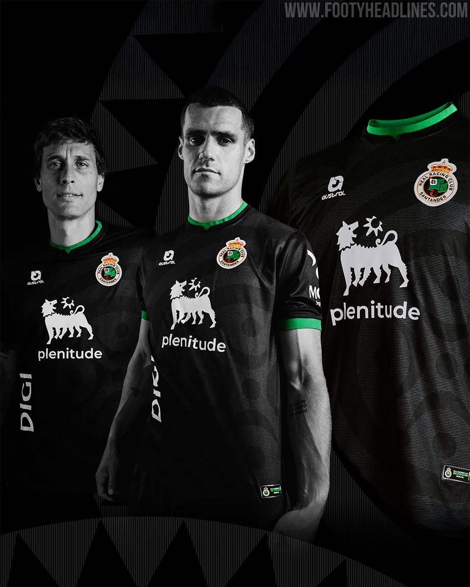
Spanish club Real Racing Club de Santander has officially unveiled its new third kit for the 26-27 season. Designed and produced by local Cantabrian sports brand Austral, the new strip brings back a stealthy black look accented with the club's signature green detailing.
The Austral Racing Santander 26-27 third jersey has a predominantly black base adorned with a tonal graphic pattern inspired by the lábaro cántabro, rendered in varying intensities across the front. Vivid green accents trim the collar, sleeve cuffs, and lower hem, while the sponsors and Austral logo appear in crisp white alongside the full-color club crest. Green shorts and black socks with green turnovers complete the uniform.
As a special tribute to the fanbase, the interior of the shirt is sublimated with the names of all 18,804 club season ticket holders for the 26-27 campaign. The kit debuted with a limited initial release of 500 units on the club's online store before rolling out to the physical shop at El Sardinero.
Giugliano 26-27 Home & Away Kits Released
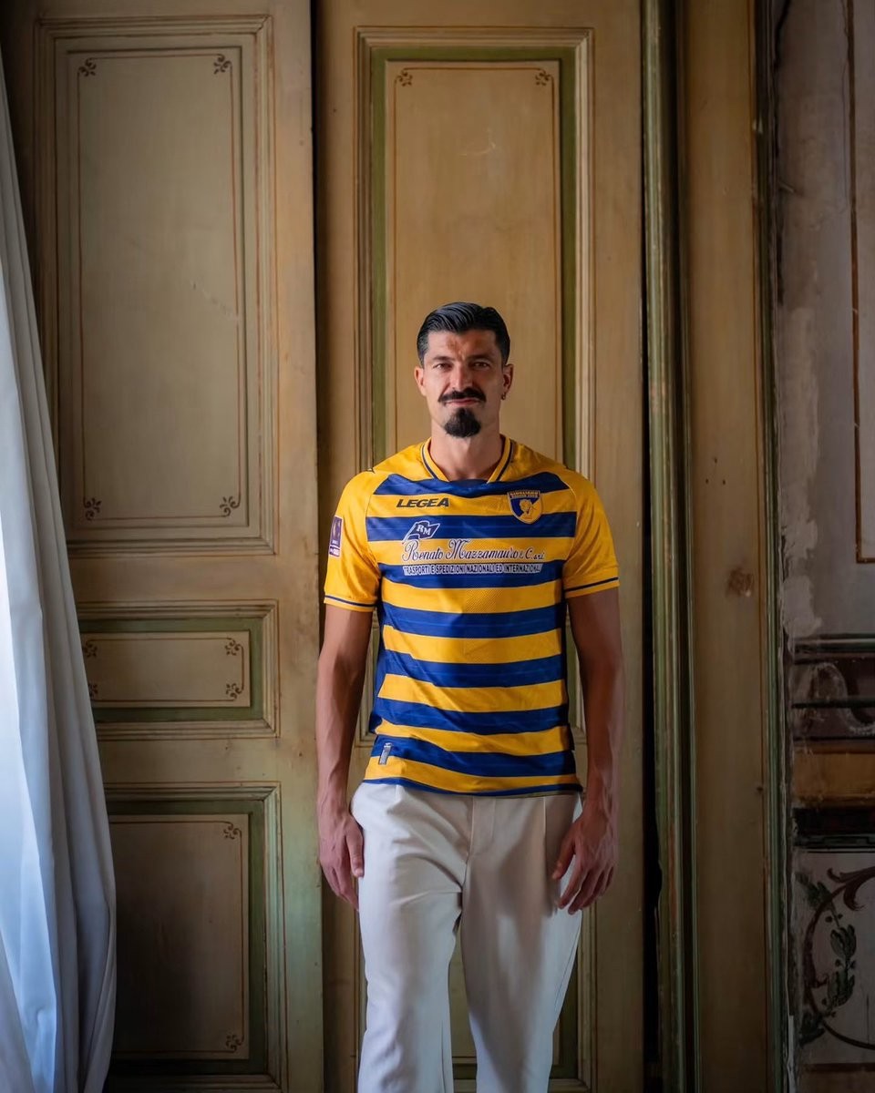
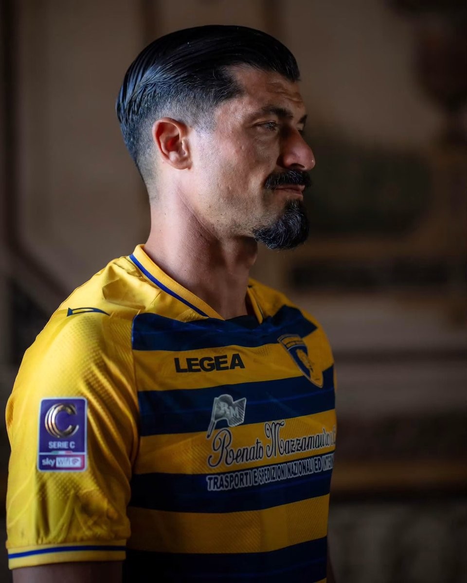
Italian Serie C club Giugliano Calcio 1928 and technical partner Legea have officially unveiled their new home and away kits for the 26-27 season. The Campania-based club, nicknamed the Tigrotti, continue their collaboration with the domestic sportswear brand for the upcoming league campaign.
The Legea Giugliano 26-27 home shirt embraces the club's traditional gialloblù identity with a classic horizontal striped design. Bold blue hoops run across the bright yellow torso, complemented by solid yellow sleeves, subtle blue trim on the cuffs, and a matching crew collar. The chest features the club's tiger crest alongside Legea branding and local principal sponsor graphics.
The Legea Giugliano 26-27 away shirt delivers an ornate design inspired by local classical architecture. Set on an off-white base, the jersey showcases subtle fresco-style illustrations in warm sand tones, highlighted by classical columns, intricate motifs, and the Roman numerals MCMXXVIII honoring the club's founding year of 1928. Matching sand-colored trim on the V-neck collar and sleeve cuffs rounds off the look.
Austria Lustenau Release Special-Edition 26-27 "Vintage" Kit
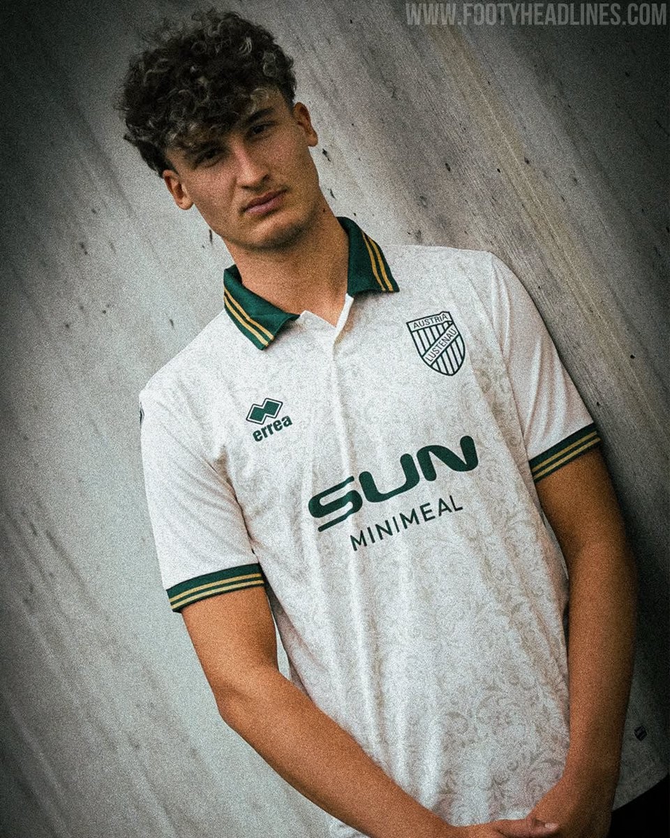
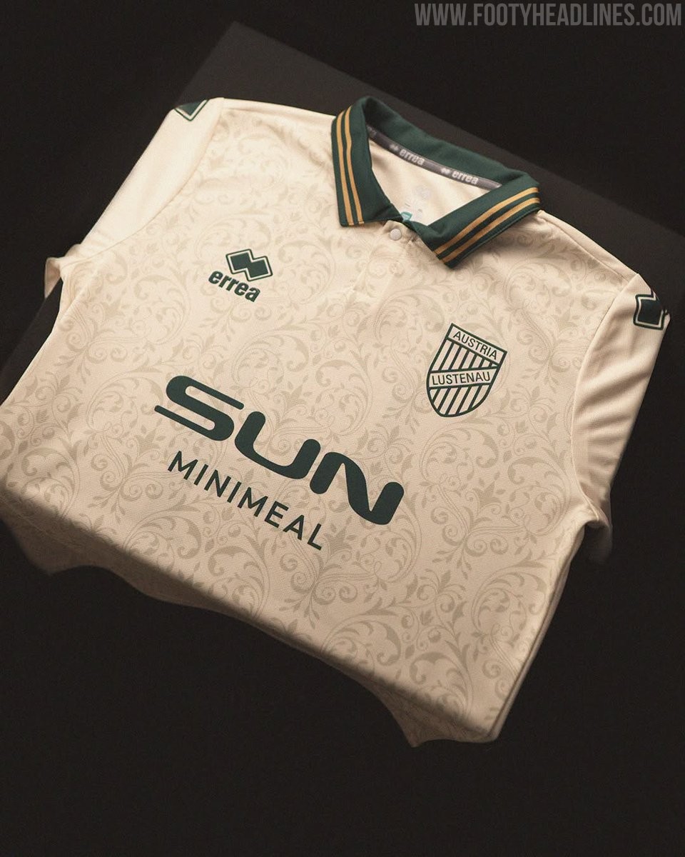
Austrian club SC Austria Lustenau has unveiled a special-edition jersey, dubbed the "Vintage" kit, created in collaboration with Italian brand Erreà. The limited-edition shirt was launched for the friendly match against German giants FC Schalke 04 at the Sun Minimeal Arena.
The Erreà Austria Lustenau 26-27 "Vintage" jersey comes in an off-white cream base adorned with a subtle all-over floral damask pattern. It is complemented by a dark green polo collar with dual gold pinstripes, an aesthetic echoed on the matching ribbed sleeve cuffs. To complete the clean retro look, the club crest, Erreà chest logo, and Sun Minimeal front sponsor are all rendered in monochrome dark green.
On the back, the retro styling continues with an elegant serif typeface in green for the player names and squad numbers. The release represents another custom design from Erreà in their first season outfitting the Austrian side, after taking over the club's technical contract ahead of the 26-27 campaign.
Betting Ban: Brazilian Club Vila Nova Announce BYD Main Shirt Sponsor Deal
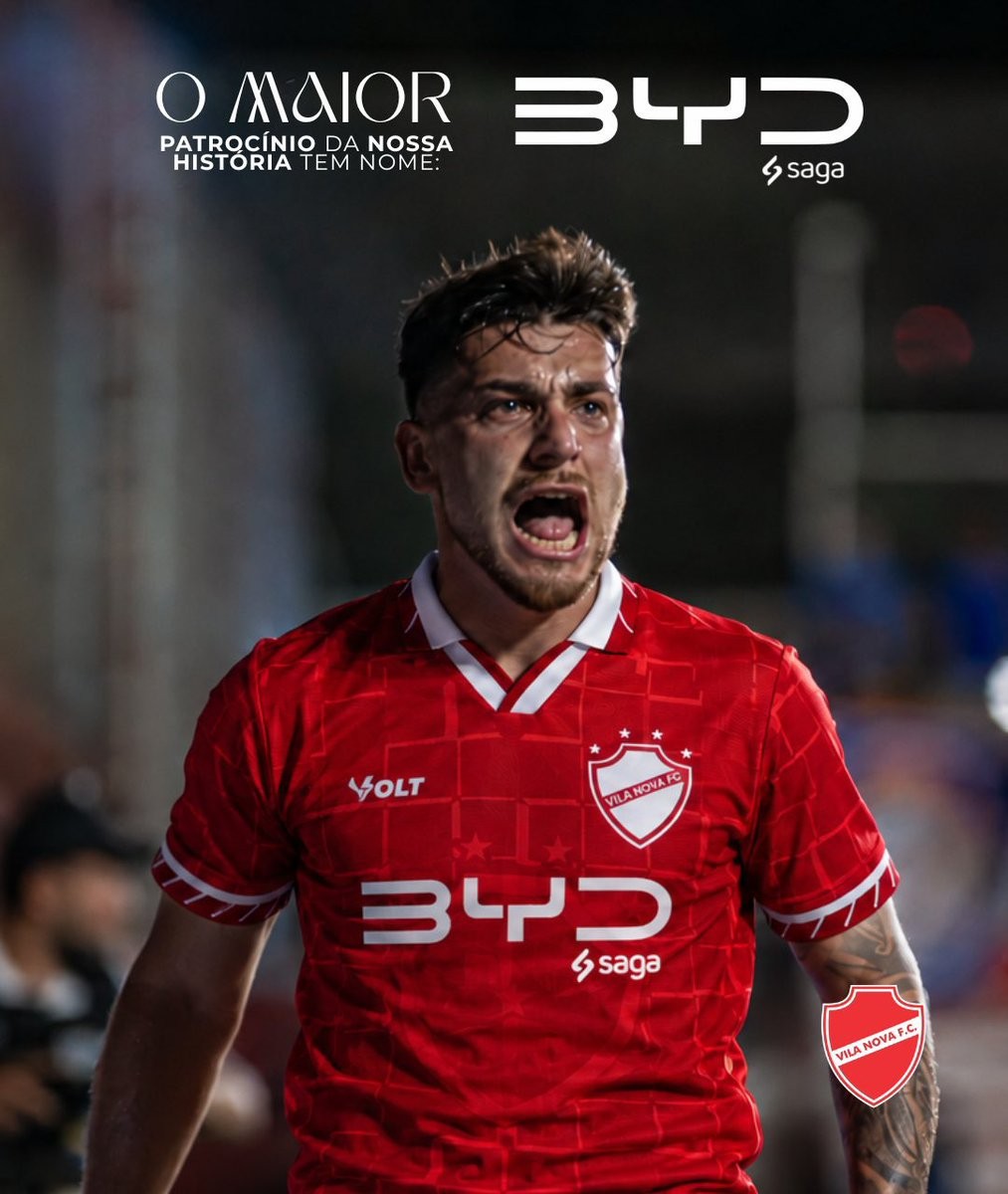
Brazilian club Vila Nova FC has officially announced Chinese electric vehicle giant BYD as its new primary front-of-shirt sponsor. Described by the club as the largest commercial partnership in its history, the agreement places the BYD logo prominently on the chest of the team's Volt Sport kits through the end of 2026, with an option to extend into 2027.
The sponsorship is executed in collaboration with Saga, an authorized dealership network representing BYD in Brazil, whose small logo appears directly underneath the main BYD mark. The automotive manufacturer replaces previous shirt sponsor Bet da Sorte, following a wave of regulatory restrictions on betting companies operating in Brazilian football.
Currently fighting at the top of the Campeonato Brasileiro Série B table and chasing promotion to the top flight, Vila Nova is set to debut the redesigned shirts immediately. The landmark agreement secures vital financial stability for the club's promotion push while expanding BYD's growing footprint across South American football.




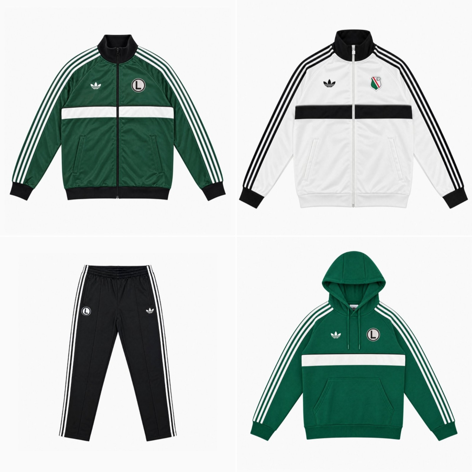

Legia Warsaw Release First Adidas Originals Collection in Decades
Legia Warsaw and Adidas have officially launched an all-new Originals lifestyle collection, marking the club's first dedicated project under the iconic Trefoil banner in decades. The retro-infused streetwear range draws heavily on vintage terrace fashion and archival sportswear aesthetics.
Rendered in Legia's traditional palette of green, white, and black, the drop includes classic full-zip track jackets, hoodies, track pants, and t-shirts. Every piece is detailed with Adidas' signature Trefoil logo and prominent Three Stripes down the sleeves and legs. Fans are also treated to two distinct badge options across the garments, with items arriving with either the club's modern crest or the iconic circular 'eLka' emblem.
The Adidas Originals Legia Warsaw collection is available now through the club's official online fan store and selected physical locations. Prices range from 259 PLN for t-shirts to 419 PLN (60-95 EUR) for the full-zip track tops.


