Adidas Errejota 2016 J. League Ball Revealed
 Dec 17, 2015, by Chris
The brand-new Adidas Errejota 2016 J. League Cup Ball introduces a bespoke design for the 41th edition of the most prestigious Japanese soccer league cup tournament, which is called 2016 J.League Yamazaki Cup for sponsorship reasons. Adidas also revealed a ball for the regular J. League season featuring the standard design of Adidas' 2016 Match Ball, the Adidas Errejota.
Adidas Errejota 2016 J. League Cup Official Match Ball
This is the new Adidas 2016 J. League Cup Ball.

Similar to this year's Adidas J. League Cup Ball, the new Adidas 2016 J. League Cup OMB (Official Match Ball) combines the main color white with golden, red, grey and black design elements. Based on the design language of the Adidas Errejota, which was debuted in the 2015 FIFA Club World Cup and is designed with the the 2016 Rio Olympics in mind, the Adidas J. League Soccer Ball boasts an one-of-a-kind graphic pattern on the upper.
The upper features the official logo of the competition, the lettering 2016 J. League Yamazaki Nabisco Cup as well as the names of all previous Cup winners.
Tech-wise, the Adidas Errejota 2016 J. League Soccer Ball comes with the same technologies as the new Adidas Errejota Ball. However, the Adidas Errejota Ball is actually nothing really new as the ball comes with same features as famous Adidas Brazuca 2014 World Cup Ball. This logically also includes the trademark six-panel design.
Adidas Errejota 2016 J. League Ball
This is the ball for the 2016 J. League season.

Adidas also introduced a ball for the 2016 J. League season featuring exactly the same design as the Adidas Errejota + the logo of the competition.
Bespoke design. What do you think of the brand-new Adidas Errejota 2016 J. League Cup Ball that was just presented yesterday? Let us know in the comments below.

Adidas EQT Flamengo 1992 Retro Collection Leaked
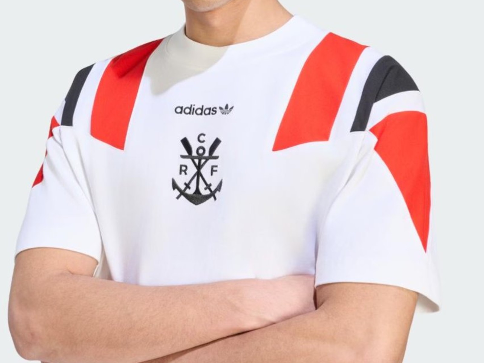
The t-shirt of the Adidas Flamengo 2026 EQT collection has been leaked by @ofertastorcida. It is white with the block stripes in red and black.
Adidas will release a special 1992 EQT retro range for Flamengo, as shared by specialized club outlet Coluna do Fla.
The Adidas Flamengo 1992 2026 retro collection features a striking vintage tracksuit and matching t-shirts that lean heavily into the club's early history and the bold sportswear aesthetics of the 1990s.
The predominantly red and black pieces prominently feature the classic Adidas Trefoil text logo alongside the historic Flamengo rowing crest, deliberately substituting the modern "CRF" monogram for the club's traditional anchor-and-oars emblem.
Which piece from this leaked Flamengo retro collection is your favorite? Let us know in the comments below.


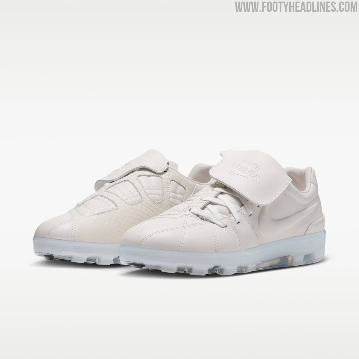
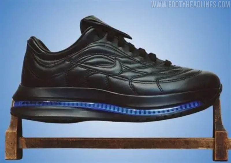
Nike Atelier Total 90 Sneaker Leaked
Nike is expanding its bespoke Atelier lifestyle line with a clean White/Game Royal colorway for the Atelier Total 90 Premium.
Following the debut of a black Merc version originally created alongside French football star Désiré Doué, this new edition offers a lighter take on a Total 90 football-meets-lifestyle hybrid.
The upper of the Atelier Merc Total 90 faithfully recreates the iconic shape of the Total 90 Laser 3, crafted entirely from premium white leather with intricate quilted stitching. A standout feature is a classic fold-over tongue, which comes equipped with a practical Velcro closure and is subtly embossed with Nike Atelier branding. Underneath, the Nike Atelier T90 comes with the Cyroshot cover over the studs.
Priced at a luxury-tier $470, the Nike Atelier Total 90 Premium is scheduled for a December2026 release ahead of the 26-27 season. The shoe will be available through select high-end retailers, including Dover Street Market, as well as via Nike SNKRS.

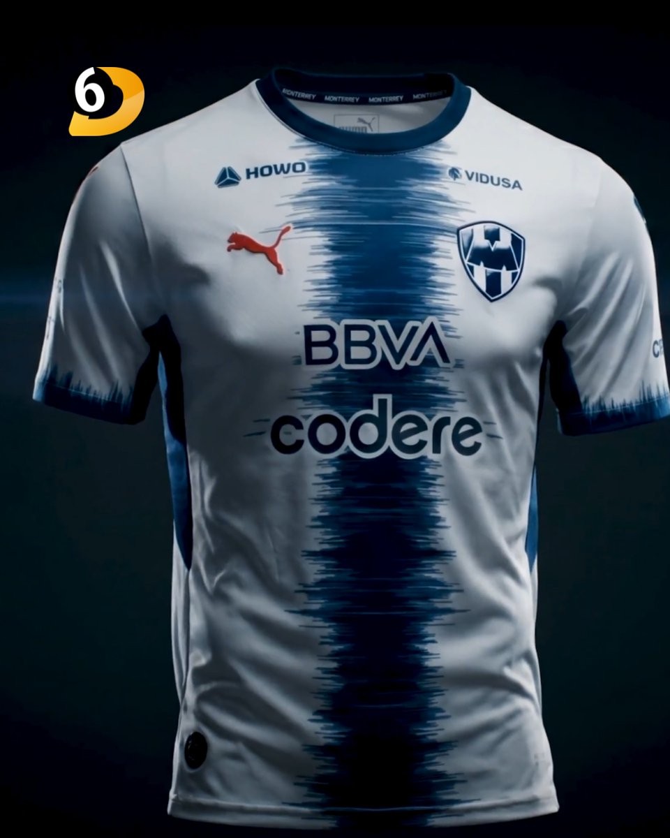
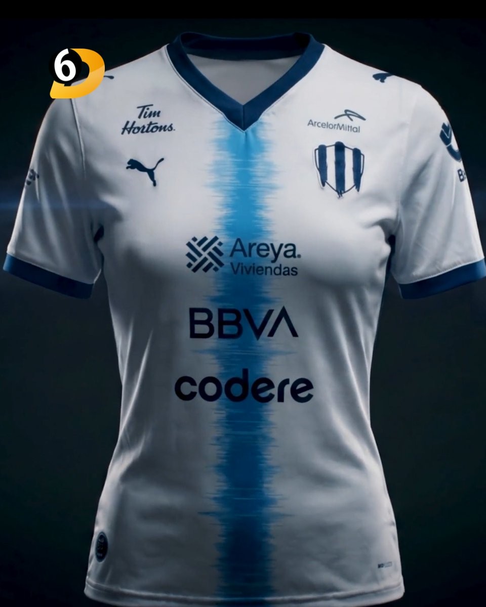
Monterrey 26-27 Away Kit Released
Club de Futbol Monterrey and Puma have officially unveiled the new Rayados 26-27 away kit. The jersey was launched under the campaign theme 'Miles de voces. Un mismo latido.' and will be worn by both the men's and women's teams throughout the upcoming season.
The Puma Monterrey 26-27 away football shirt features a striking design. It is white with a navy brushtroke stripe in the center. The Womens edition has the stripe in a blue.
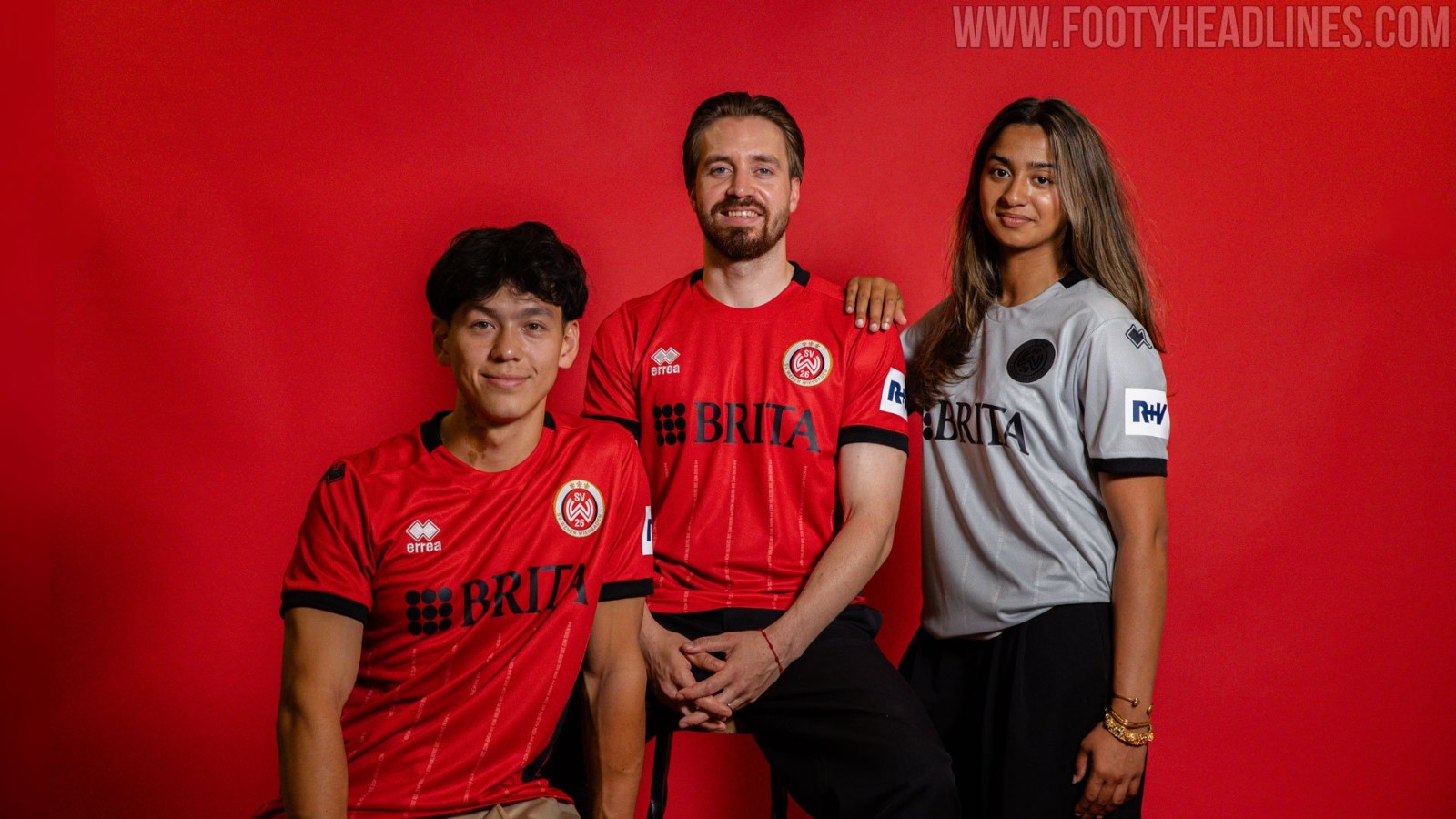
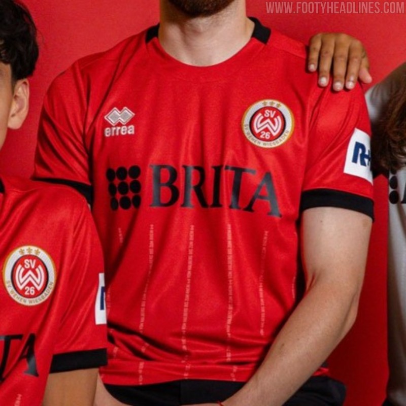
Wehen Wiesbaden 26-27 Home Kit Released
Third division club SV Wehen Wiesbaden has officially unveiled its new 26-27 home kit, produced by Erreà. Released in the year of the club's upcoming centenary, the shirt celebrates the team's roots, history, and territory.
The SV Wehen Wiesbaden 26-27 home jersey features a predominantly red base, incorporating subtle historical and territorial details as a nod to the club's founding in 1926.
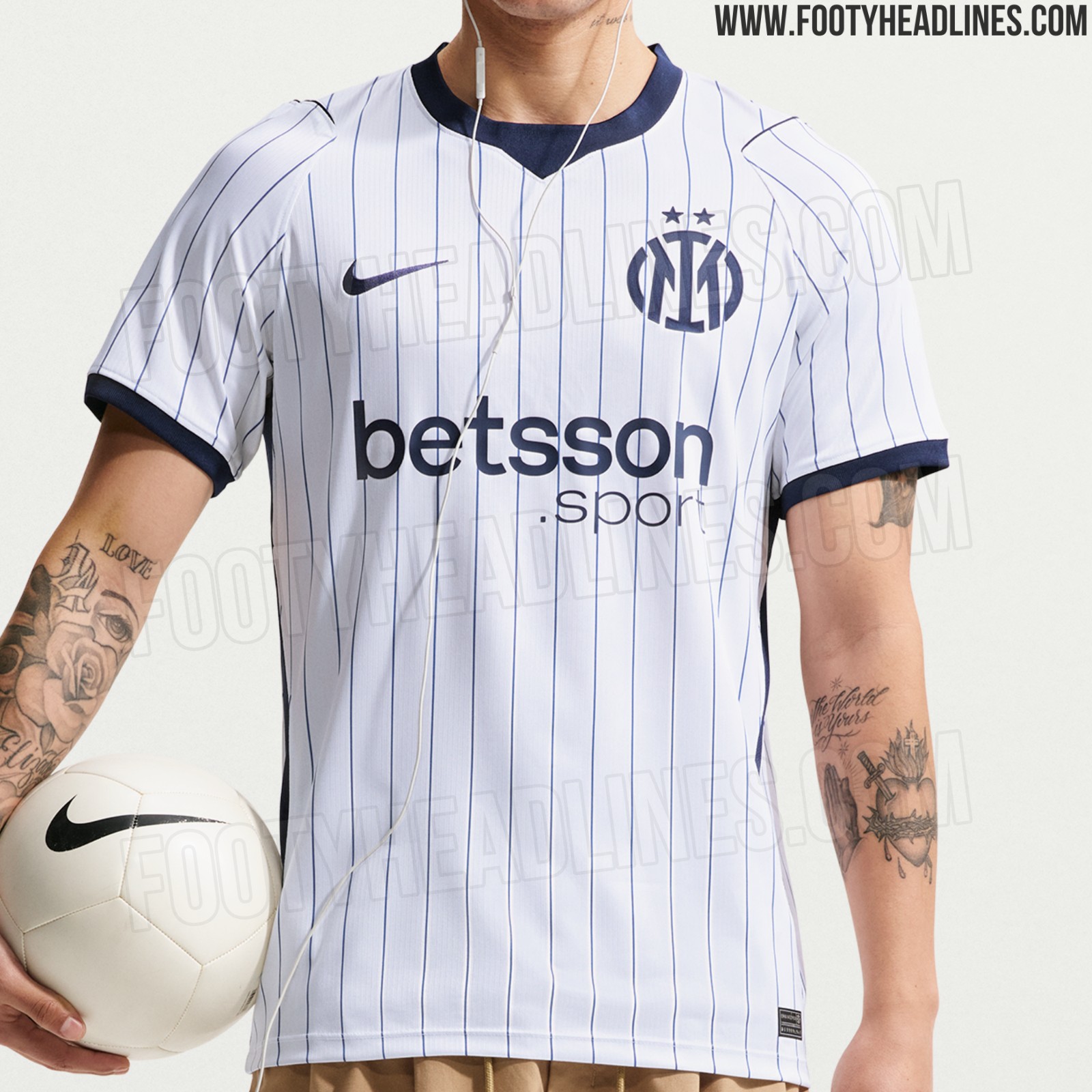
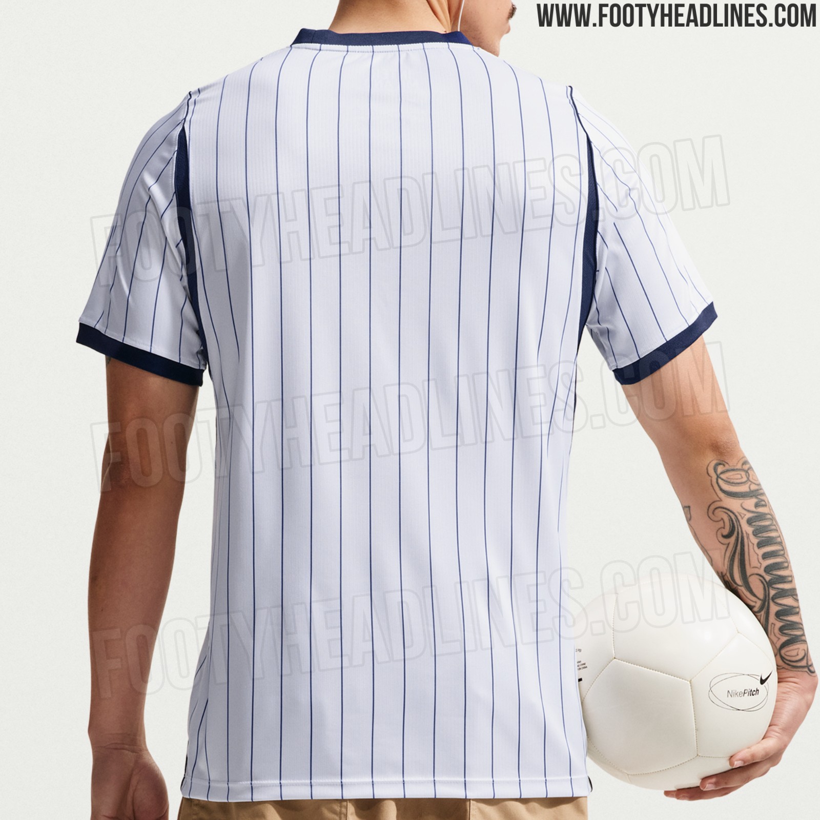
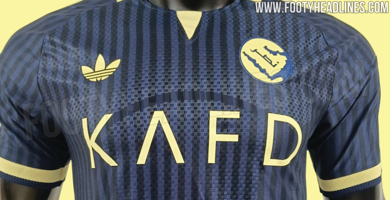
New Images of Inter Milan 26-27 Away Kit Leaked
We can leak new official images of the Nike Internazionale 2026-2027 away kit.