Logo vs Stripes - What Looks Better on the Adidas X PureChaos?
 Feb 11, 2017, by Pat
Barely a day goes by on which the Adidas X 16 (and 17, for that matter) is not criticized for the rather unusual logo placement on the outside and people wonder if it wouldn't look better with the Three Stripes instead of the Adidas logo. This is exactly what we want to take a look at in this post, using the three most recent launches of the X 16+. Thanks to Med for the idea.
Adidas X 16+ Blue Blast
Compare the two variants of the blue and pink Adidas X 16+ below.
Adidas X 16+ Checkered Black
Compare the standard and alternate Checkered Black pack Adidas X 16+ PureChaos below.
Adidas X 16+ Red Limit
Compare the regular and a three-stripe version of the Red Limit Adidas X 16+ PureChaos below.
Having seen three of these, which style do you prefer? Logo or stripes? Comment below.

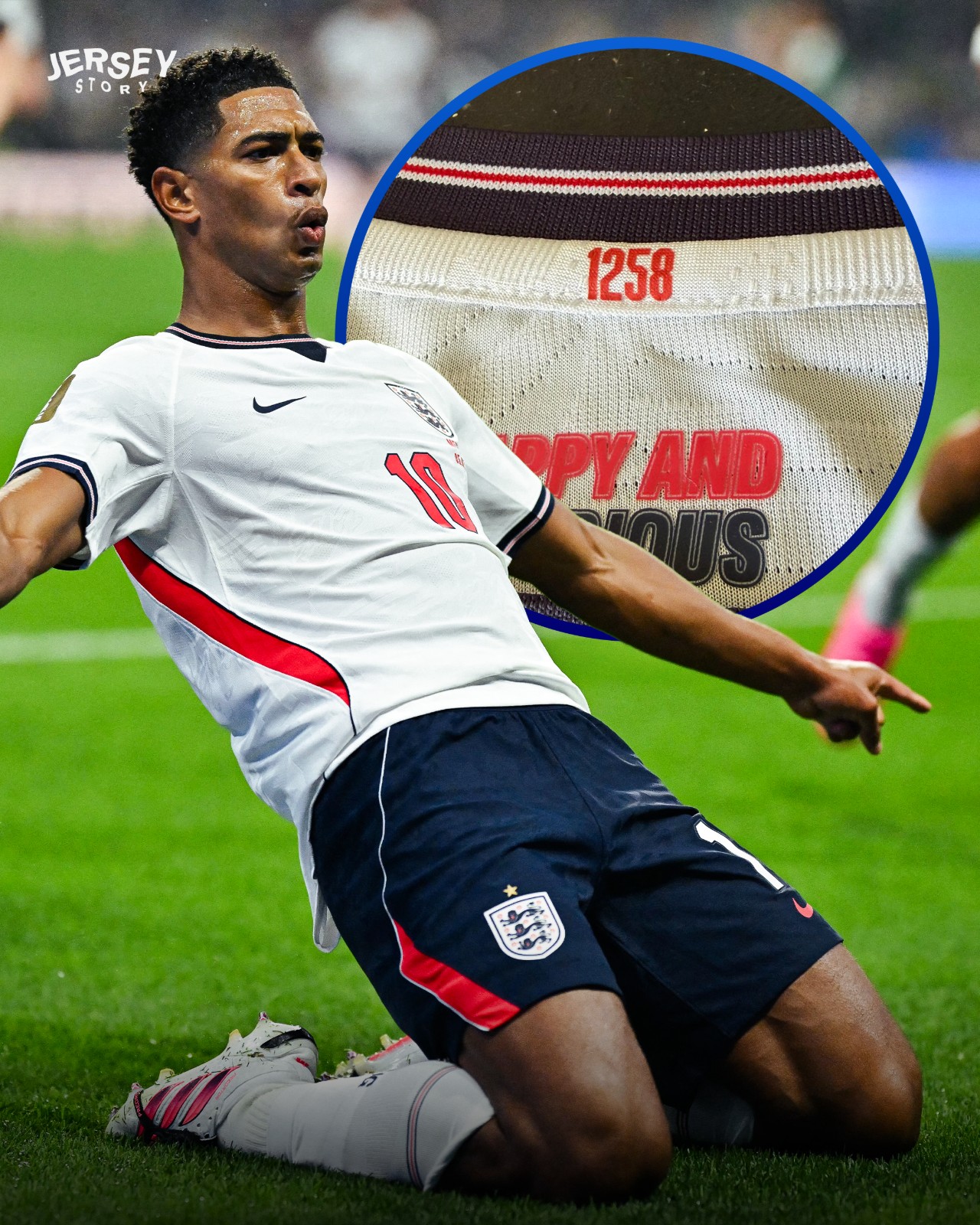
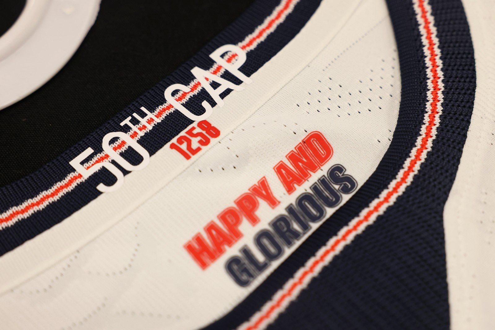
Special Legacy Numbers on England Kits
On the back of the shirt collar, every England player has a specific number called "Legacy Number", which shows the historical order of when they made their debut for the national team. Big thanks to our partner @jerseystory_vn for this interested spotting.
Legacy Numbers first appeared on England match shirts on November 14, 2019, to celebrate the team's historic 1,000th international match against Montenegro.
The player with Legacy Number 1 is goalkeeper Robert Barker, who played in England’s very first official international match against Scotland on November 30, 1872. Meanwhile, the newest name on the list is Rio Ngumoha, who takes number 1,300.
At the 2026 World Cup, the squad member with the lowest legacy number is Jordan Henderson's 1,170.
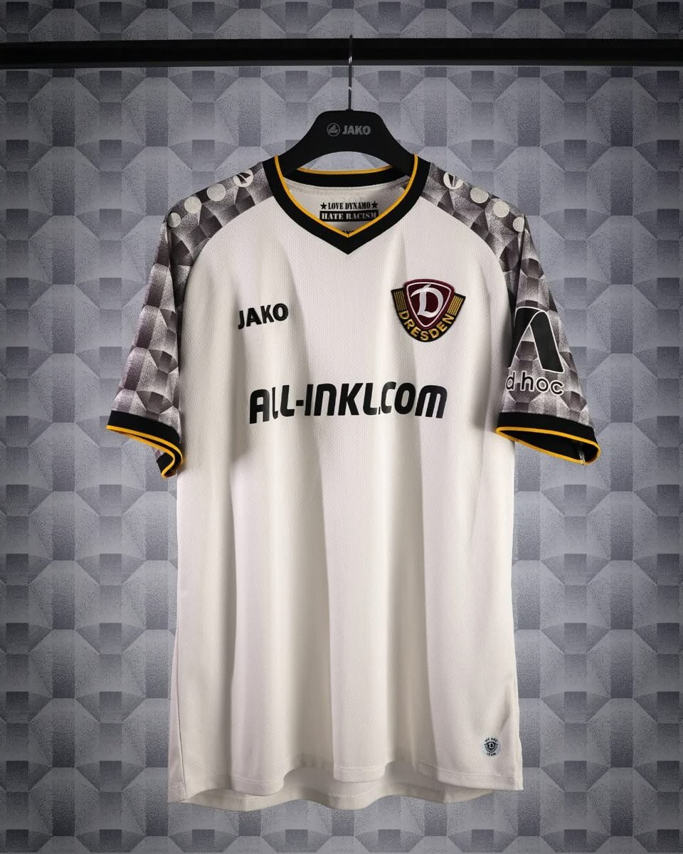
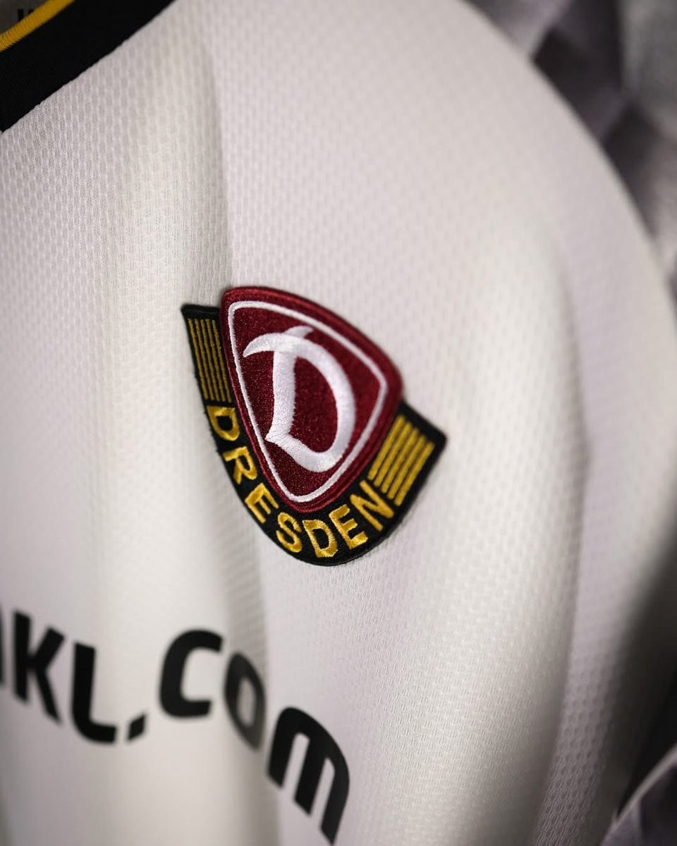
Dynamo Dresden 26-27 Away Kit Released
The new SG Dynamo Dresden away kit for the 26-27 season was officially released today. Manufactured by Jako, the shirt introduces a bespoke design inspired by local history and architecture.
The Jako Dynamo Dresden 26-27 away shirt is predominantly silver-white, highlighted by a striking honeycomb pattern on the sleeves. This unique sleeve detail pays tribute to the facade of the former Hertie department store on Prager Straße, serving as a symbol of the city's post-war reconstruction. The design seamlessly connects the club's identity to Dresden's architectural past.
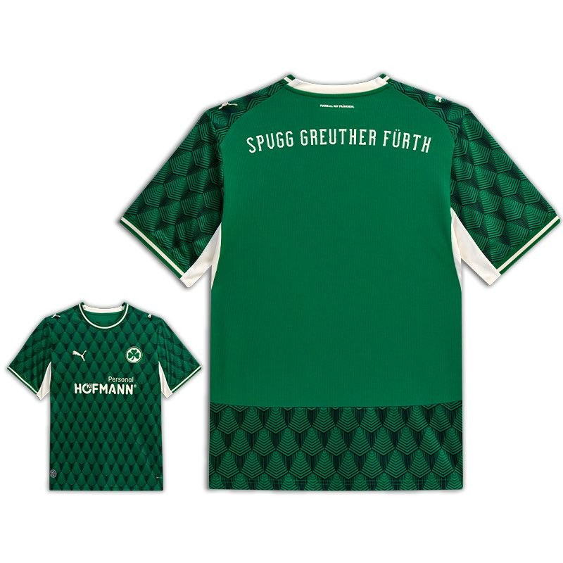
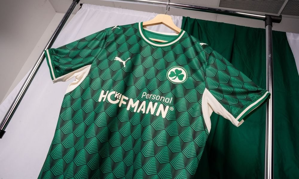
Greuther Fürth 26-27 Away Kit Released
The new SpVgg Greuther Fürth away kit was released today. It is made by Puma and will be worn in the 26-27 2. Bundesliga.
The Puma Greuther Fürth 26-27 away shirt introduces a modern look for the German club, featuring the official club crest and Puma logo. The design incorporates classic elements tailored for the away matches of the upcoming 2. Bundesliga season.
The launch of the Puma Greuther Fürth 26-27 away kit completes the club's set for the new campaign, following the earlier releases of the home and centenary anniversary kits.


AFC Bournemouth 26-27 Home Kit - Fans Unhappy With Sponsor Logo
AFC Bournemouth has officially launched its new 26-27 home kit, marking the beginning of the club's new era with Danish brand Hummel. The shirt was unveiled featuring the club's traditional colors and introduces Vitality as the main front-of-shirt sponsor.
The Hummel AFC Bournemouth 26-27 home jersey features a classic design with cherry red and black stripes. While supporters have generally praised the overall template and the aesthetic of the new Hummel partnership, the execution of the main sponsor has drawn significant criticism.
Fans have quickly voiced their disappointment on social media regarding the circular Vitality logo placed in the center of the chest. Many supporters feel that the large white circular background heavily interrupts the design and detracts from an otherwise strong shirt, with fans expressing a preference for a simpler, text-only sponsor application.
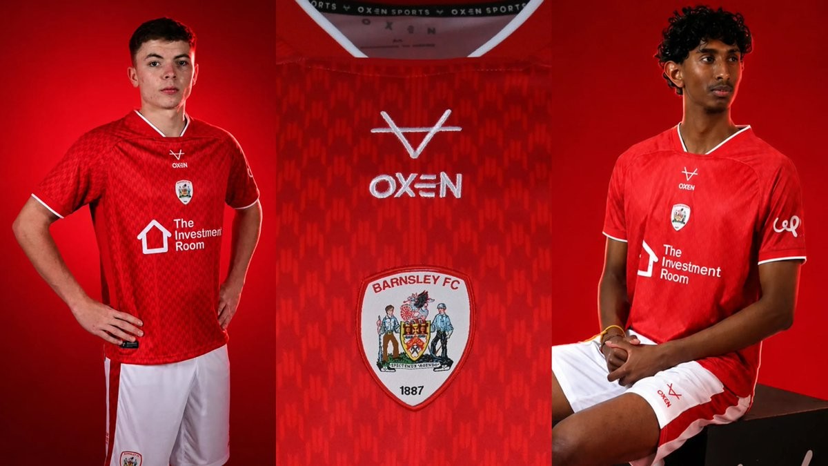
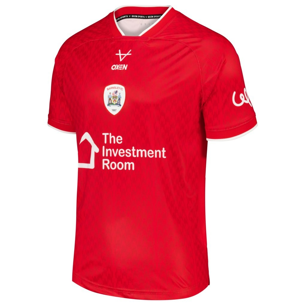
Barnsley 26-27 Home Kit Released
Barnsley FC have officially launched their 26-27 home kit, signaling the latest release in their partnership with UK brand Oxen Sports. The club unveiled the kit under the slogan "Red by tradition. Built for the future.", showcasing a design that balances classic club identity with modern athletic details.
The Barnsley 26-27 home kit features the club's traditional red base complemented by crisp white accents, which are primarily visible on the V-neck collar and sleeve cuffs. The back of the shirt includes subtle but distinct detailing, featuring the word 'Tykes' along with a graphic of the club's mascot, Toby, positioned near the neckline.
