
Mizuno Ehime FC 2019 Kits Released
 Jan 29, 2019, by Simon

A few days ago, the new Ehime FC 2019 jerseys were released, courtesy of Mizuno. Ehime FC currently competes in Japan's second division, the J2 League.

Mizuno Ehime FC 2019 Kits
This image shows a rarity in today's football, the Ehime FC 2019 jerseys, made by Mizuno.
Interestingly, the new Mizuno Ehime FC 2019 kits all rely on the same base design, which clearly features a reference to the Mount Ishizuchi, which is the highest in Western Japan, with 1.982 meters. Therefore, both Ehime FC 2019 jerseys come with a classy geometric pattern, consisting of multiple lines.
Specifically, the Ehime FC 2019 home kit is predominantly orange with the aforementioned geometrical pattern in gray.
As for the Ehime FC away, Mizuno uses the same base design, this time a white base paired with a gray lines design.
Would you like Mizuno to also sponsor more renowned teams, considering their efforts for Ehime FC? Let us know your thoughts down below.

Match Debut? Kylian Mbappé Back in On Boots Ahead of France vs Turkey
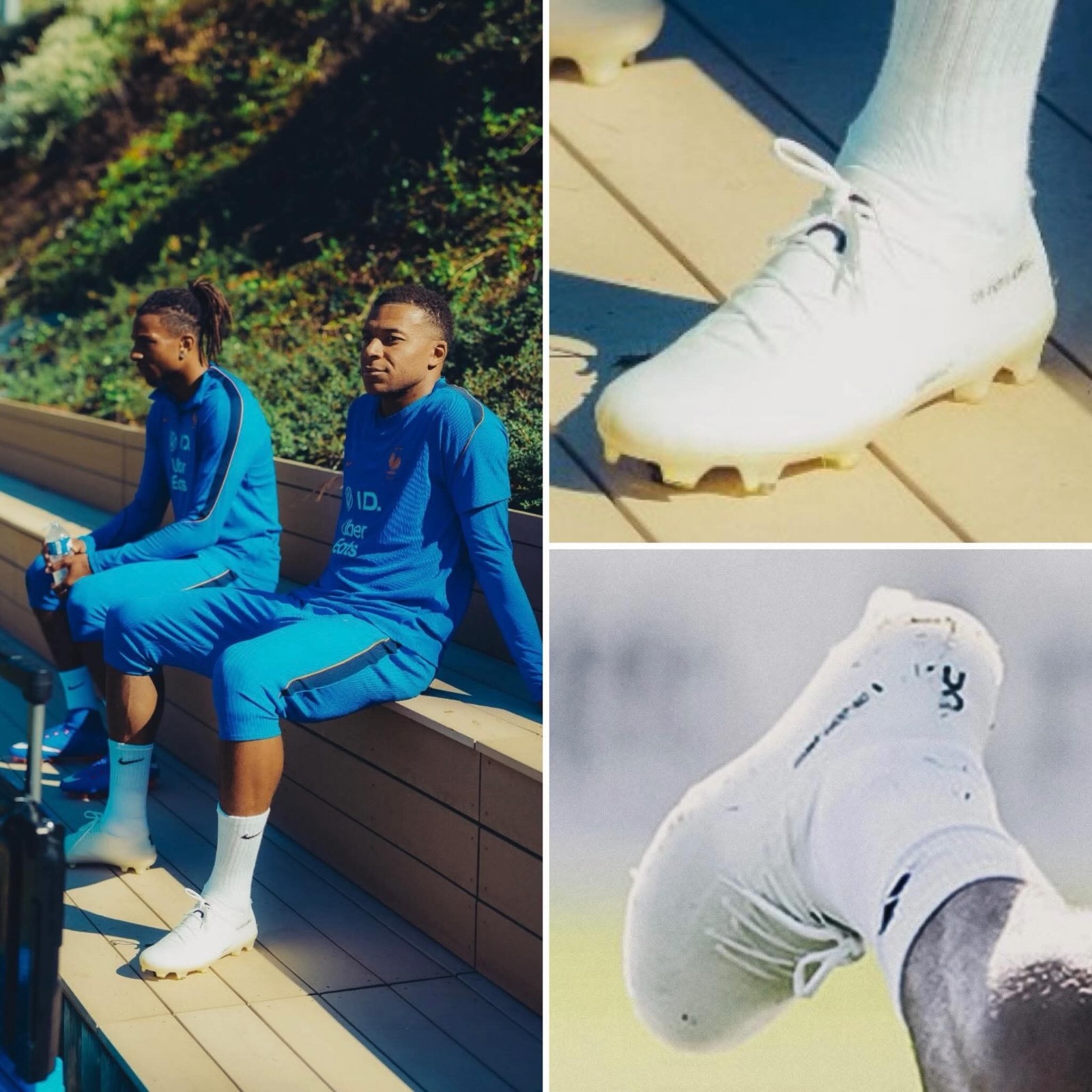
Kylian Mbappé has once again trained in prototype On football boots during France's camp ahead of their UEFA Nations League fixture against Turkey. Following the conclusion of his long-standing partnership with Nike and his high-profile move to the Swiss brand, the French forward has tested On LightSpray prototype cleats in training sessions. Despite testing the new boots behind the scenes and in training, Mbappé wore disguised, unbranded whiteout Nike Mercurial Superfly cleats for the first competitive match against Atlético, leaving his boot choice for the clash with Turkey as one of the key gear storylines to watch.
Official: Santos Announce Adidas Kit Deal From 2028
Santos FC and Adidas have officially confirmed a major agreement that will see the German sportswear giant become the club's official kit supplier starting in the 2028 season. The six-year partnership, running through 2033, marks the third collaboration between both parties following previous stints in 1980–1981 and 1984–1988. Long-time partner Umbro will continue to manufacture the team's kits until its current contract expires at the end of 2027, with Santos opting for Adidas due to expanded global marketing, superior commercial terms, and international distribution across approximately 120 Adidas flagship stores across the Americas, Europe, and Asia.
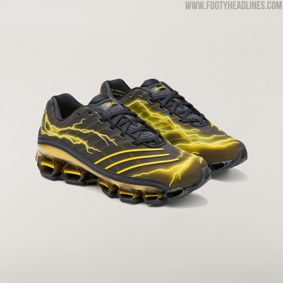
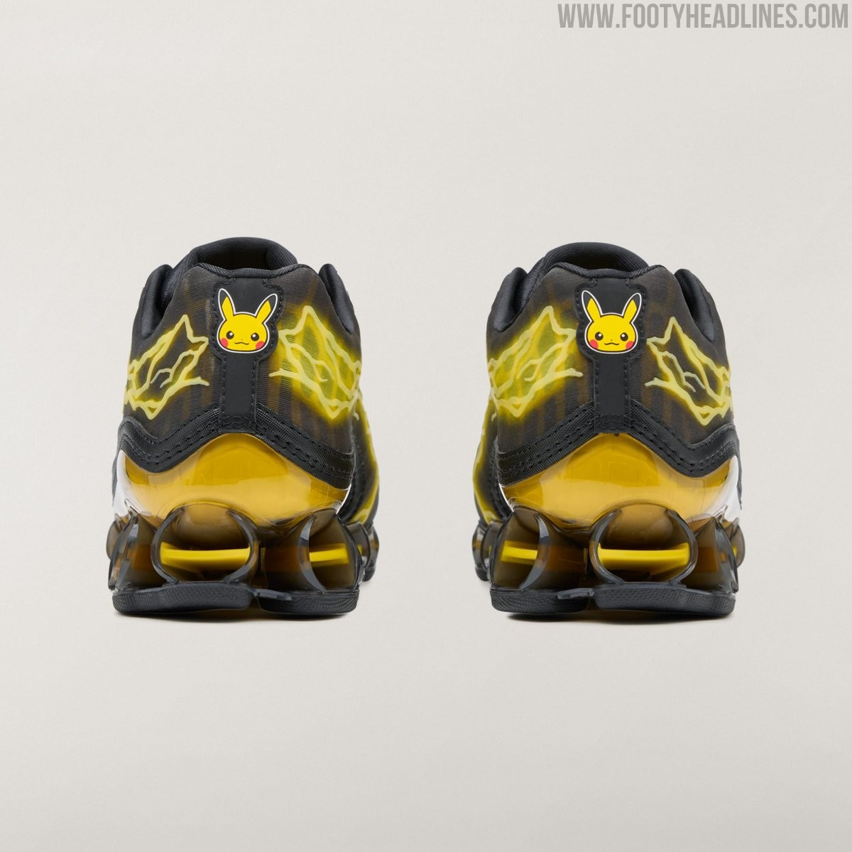
Electrifying: Adidas Pokémon Megaride F50 "Pikachu" Shoes Released
As part of the Pokémon 30th anniversary collection, Adidas Originals has released an eye-catching hybrid sneaker that blends football heritage with retro running technology: the Pokémon x Adidas Megaride F50 "Pikachu". Merging the streamlined upper design inspired by the iconic 2004 F50 football boot with the open-tunnel bounce system of the 2000s Megaride runner, the pair pays direct homage to the franchise's most famous Electric-type Pokémon.
The sneaker features a predominantly black and dark carbon base energized by vibrant yellow accents. Striking yellow lightning bolt graphics surge across the upper with 3D haptic detailing, complemented by three sleek yellow stripes along the forefoot. At the rear, an embroidered Pikachu graphic sits on the heel counter just above a translucent yellow TPU plate, which flows smoothly into the distinctive yellow-accented Megaride cushioning pods.
Finished with collaborative Pokémon tongue badges and themed insoles, the Pokémon x Adidas Megaride F50 "Pikachu" officially dropped on September 24, 2026, with a retail price of $200. It is available through Adidas CONFIRMED and select retailers alongside other models from the milestone capsule.

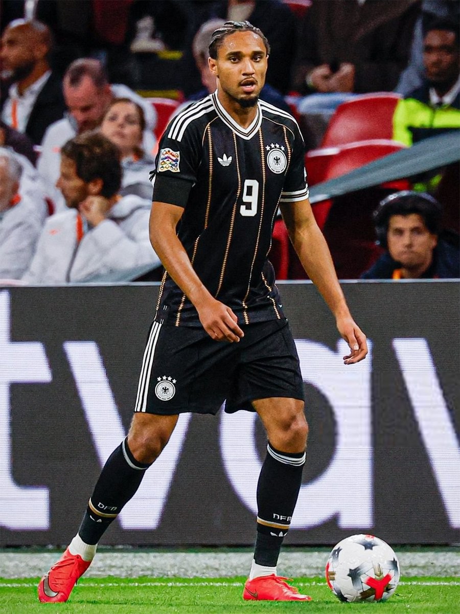
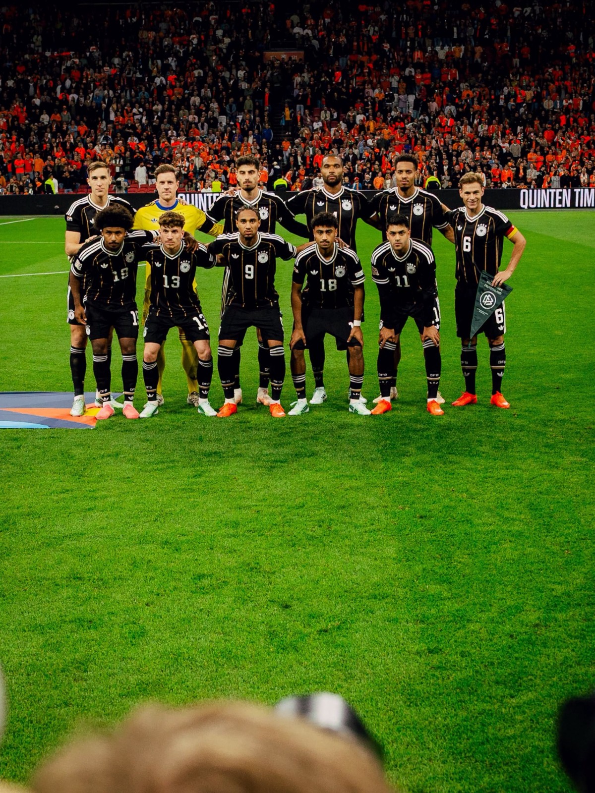
Adidas Germany 2026 Farewell Kit Debuted on Pitch
Germany officially debuted their special edition Adidas farewell kit during their UEFA Nations League clash against the Netherlands. The release marks the final chapter of a legendary 72-year partnership between the German Football Association (DFB) and the Three Stripes, which began in 1954 and will officially come to an end on December 31, 2026, ahead of Nike taking over as technical supplier from 2027.
The tribute shirt features an elegant, predominantly black base decorated with vertical gold diamond pinstripes running down the front. Adidas has opted for the heritage Trefoil logo on the right chest alongside the classic DFB crest used between 1978 and 1996, both rendered in white. A retro-inspired crossover V-neck collar is trimmed in white and gold, mirrored on the sleeve cuffs, while a commemorative "1954" jock tag sits on the bottom hem to honor the historic year the partnership began.
Completed with black shorts and black socks featuring gold detailing, the on-pitch ensemble arrived just days after its official unveiling. Following its high-profile match debut, the Germany 2026 farewell jersey is scheduled to go on general sale via official Adidas channels starting September 26, 2026.



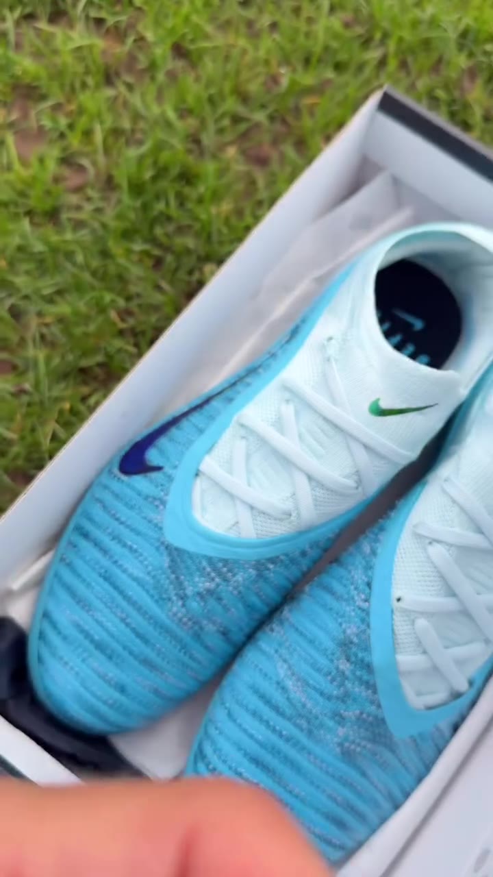
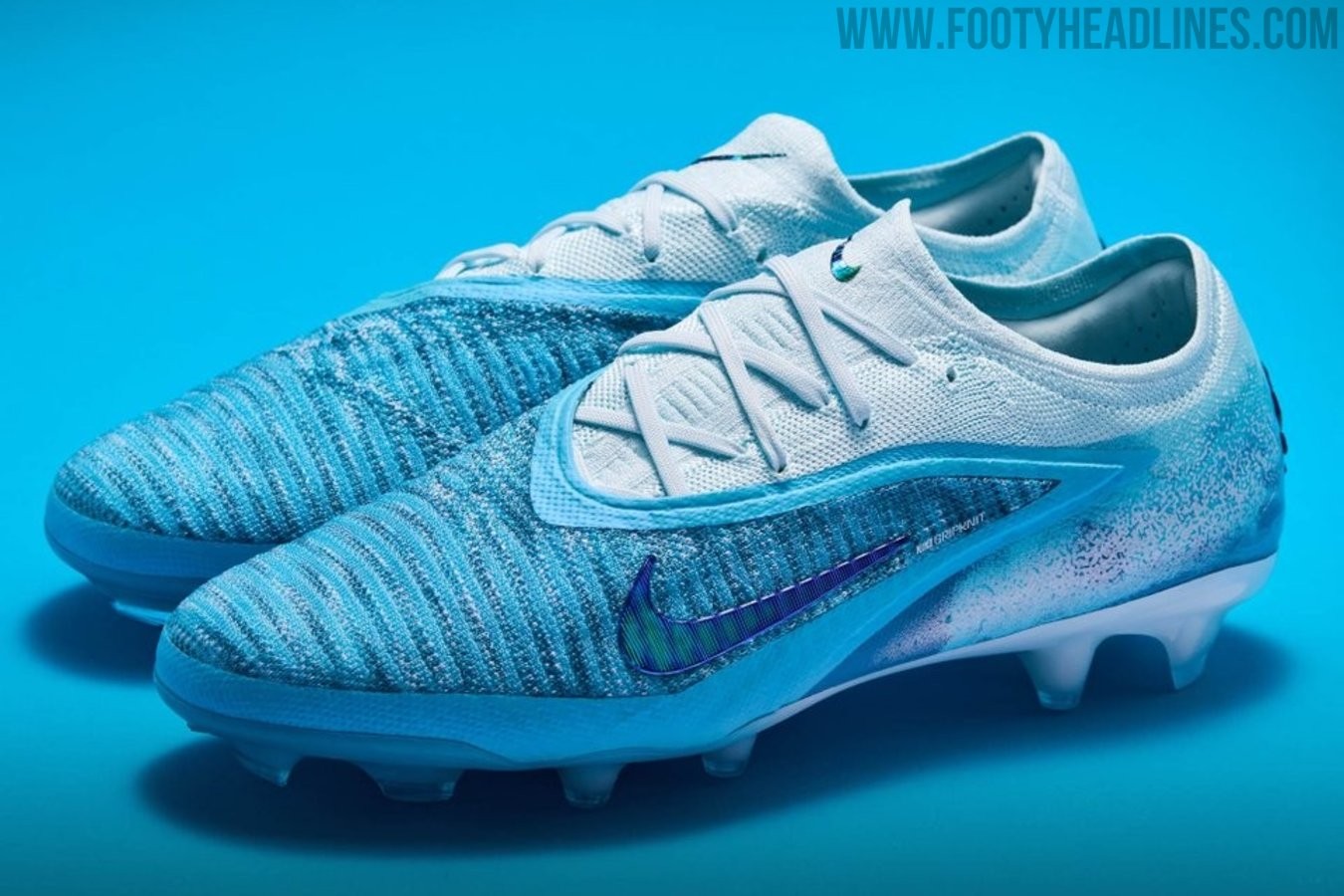
Nike Phantom 6 Haaland Chapter 5 Boots Revealed - Reactive Nike Hydra Upper
Through its partner stores, Nike has officially revealed Erling Haaland's fifth signature edition, the Nike Phantom 6 Haaland Chapter 5 from his Force of Nature collection. Finished in a Baltic Blue colorway with cloud-inspired graphics across the rear, the low-cut boot introduces Nike's Hydra treatment, which uses reactive white ink that vanishes when wet to uncover additional details of the graphic beneath. Engineered for lethal finishing in the 26-27 season, the boot combines a Gripknit upper with a Cyclone 360 soleplate and is scheduled to launch on October 1, 2026. Huge thanks to Pro Direct and Unisportsore for images and the video.
