More Than 4000 Entries - New Official Watford FC Logo Design Competition - Best Of
 Jul 24, 2019, by Chris
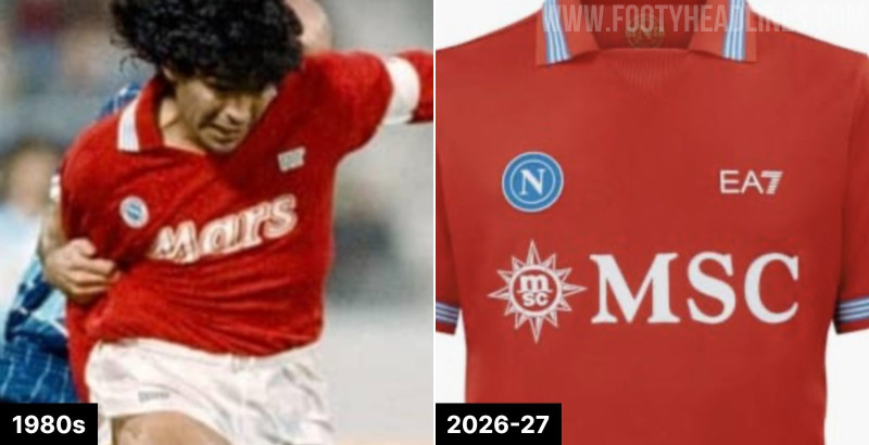
Premier League team Watford FC, who are known as The Hornets, gave designers around the world the chance to design its new badge ahead of the 2020/21 season. We take a look at some of the best designs created by designers worldwide for the new Watford FC crest design competition, which has been already closed.

It is important to note that Watford FC made some 'regulations' for the logo competition, including the colors, symbols as well as other stuff like a simplified version they want to use.
New Watford FC Logo Design Competition - Information About The Club Logo & Design Cobntest

Times are changing for Watford FC. For years the fans have called the team 'The Hornets', but the official badge has included a red hart, a type of deer. Design a new official badge for Watford FC that brings to life the club’s culture and nickname, ‘The Hornets' in a modern way. Your badge can be any shape, but it should be a distinctive shape. Watford FC like that its current badge isn't a traditional circle or shield."

The nickname of the Hornets originates from 1959, when the club changed from playing in blue & white to yellow & black. It was chosen in a supporters’ vote and has stuck with the team ever since. In the 1960s & 70s, the club logo featured a Hornet, however this was changed to a red hart in the late 70s to reflect the county symbol of Hertfordshire, though the nickname remained.

The aim of this competition is to create a new crest that focuses on the clubs nickname 'The Hornets'. This will be the main badge for the club and be used on the football kit and for general branding. This badge should include one of the following: "Watford Football Club", “Watford FC” or “Watford” (in a modern font).
New Watford FC Logo Design Competition - "Best Of"
@allenjwitkowski

DanKNorris

Unknown

by @jono_digital


by @Kalonista

by Lee Scott Design

by luisb10

by Marold76


by @rocknrollrobson

by @roobarb101

by @studiolrj

by Thomas Knapp


by @turbinal_designs

In total, Watford received 4,000 entries for their new logo. That is going to be a hard choice.
Which of these logos is your favorite? Share your thoughts in the comments below.
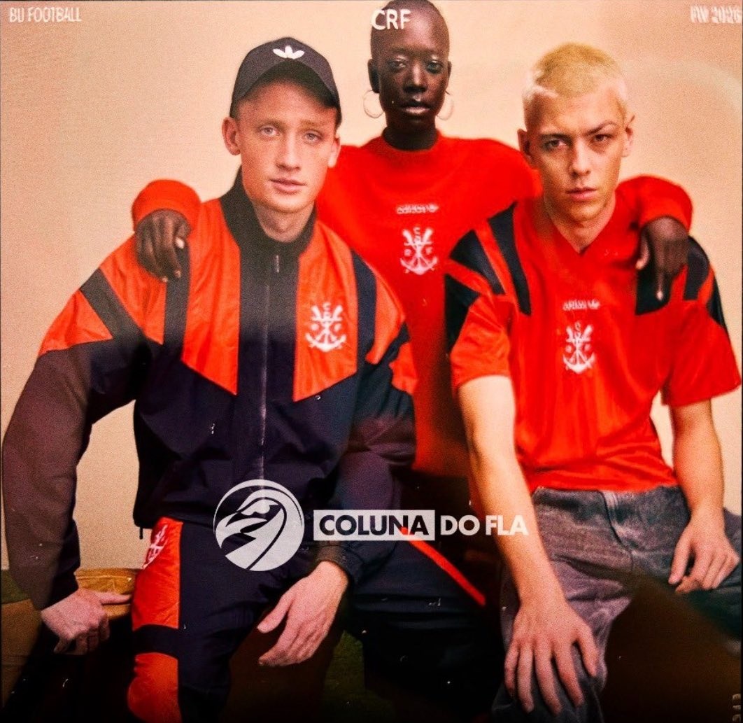
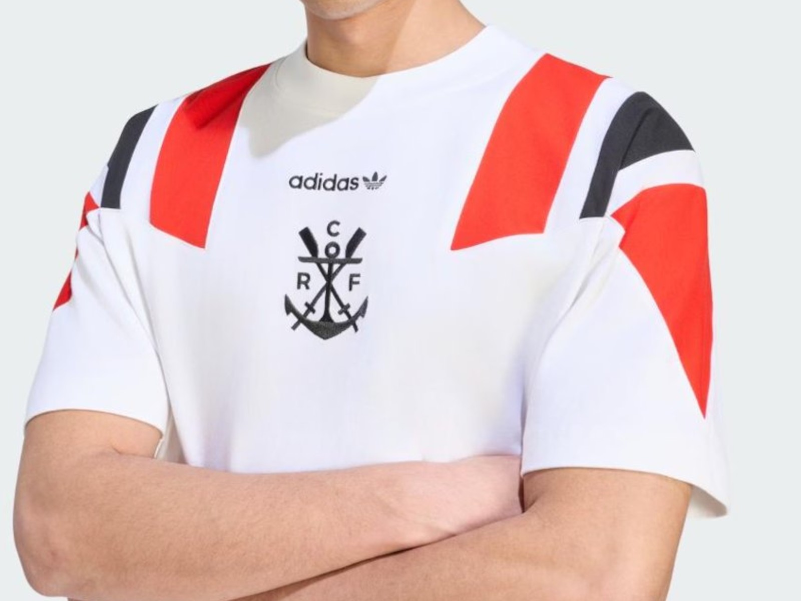
Adidas EQT Flamengo 1992 Retro Collection Leaked
The t-shirt of the Adidas Flamengo 2026 EQT collection has been leaked by @ofertastorcida. It is white with the block stripes in red and black.
Adidas will release a special 1992 EQT retro range for Flamengo, as shared by specialized club outlet Coluna do Fla.
The Adidas Flamengo 1992 2026 retro collection features a striking vintage tracksuit and matching t-shirts that lean heavily into the club's early history and the bold sportswear aesthetics of the 1990s.
The predominantly red and black pieces prominently feature the classic Adidas Trefoil text logo alongside the historic Flamengo rowing crest, deliberately substituting the modern "CRF" monogram for the club's traditional anchor-and-oars emblem.
Which piece from this leaked Flamengo retro collection is your favorite? Let us know in the comments below.


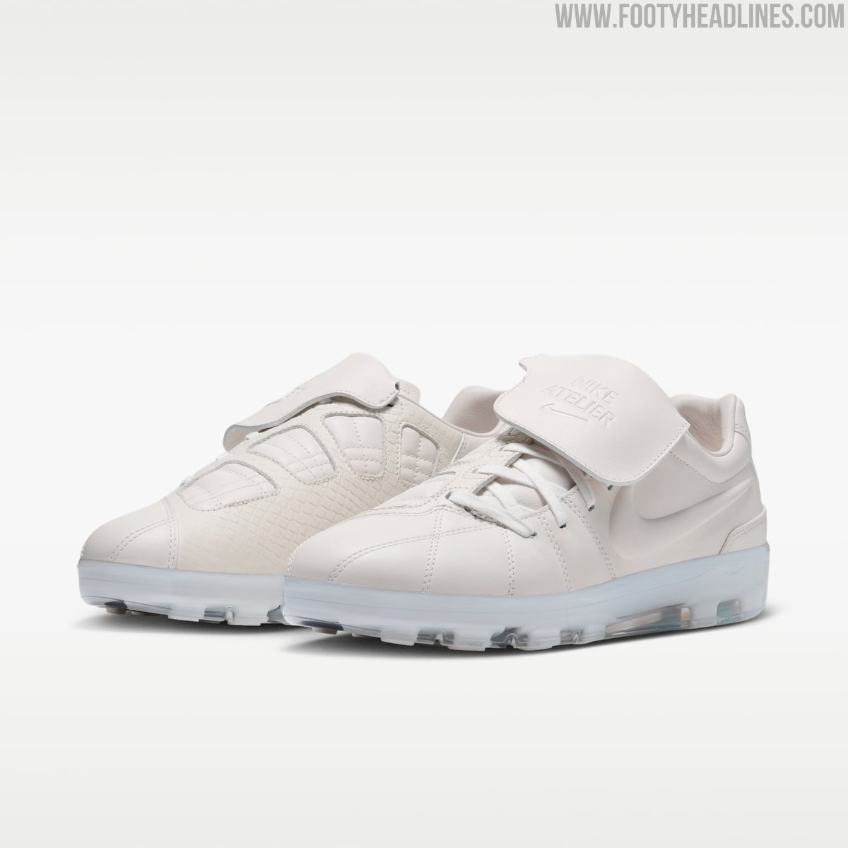
Nike Atelier Total 90 Sneaker Leaked
Nike is expanding its bespoke Atelier lifestyle line with a clean White/Game Royal colorway for the Atelier Total 90 Premium.
Following the debut of a black Merc version originally created alongside French football star Désiré Doué, this new edition offers a lighter take on a Total 90 football-meets-lifestyle hybrid.
The upper of the Atelier Merc Total 90 faithfully recreates the iconic shape of the Total 90 Laser 3, crafted entirely from premium white leather with intricate quilted stitching. A standout feature is a classic fold-over tongue, which comes equipped with a practical Velcro closure and is subtly embossed with Nike Atelier branding. Underneath, the Nike Atelier T90 comes with the Cyroshot cover over the studs.
Priced at a luxury-tier $470, the Nike Atelier Total 90 Premium is scheduled for a December2026 release ahead of the 26-27 season. The shoe will be available through select high-end retailers, including Dover Street Market, as well as via Nike SNKRS.
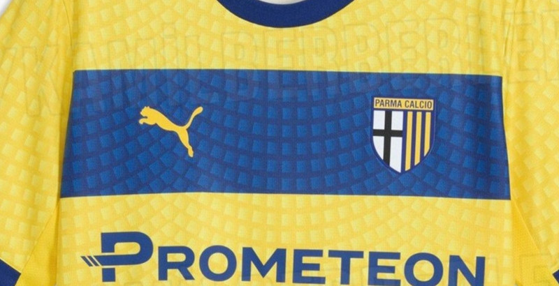

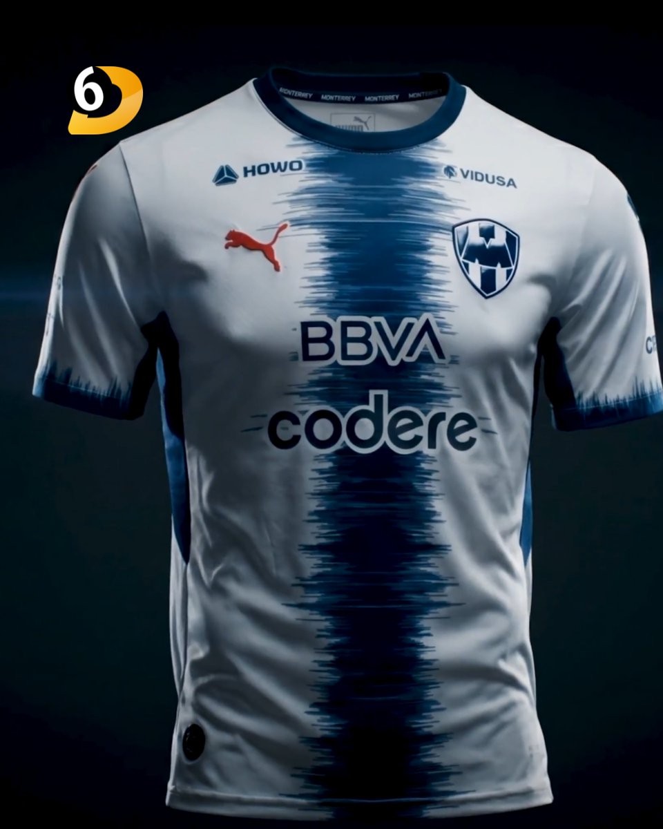
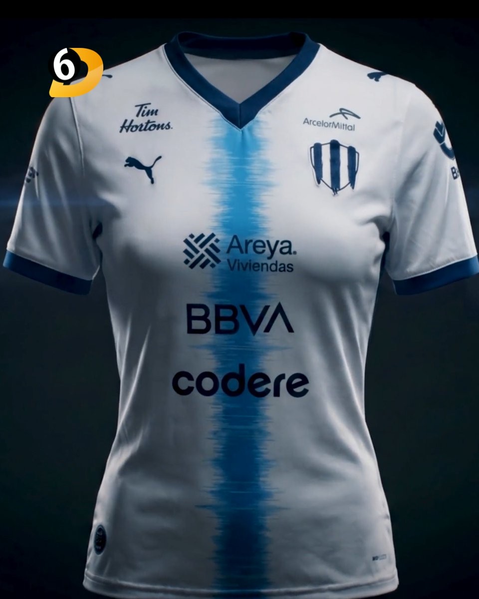
Monterrey 26-27 Away Kit Released
Club de Futbol Monterrey and Puma have officially unveiled the new Rayados 26-27 away kit. The jersey was launched under the campaign theme 'Miles de voces. Un mismo latido.' and will be worn by both the men's and women's teams throughout the upcoming season.
The Puma Monterrey 26-27 away football shirt features a striking design. It is white with a navy brushtroke stripe in the center. The Womens edition has the stripe in a blue.
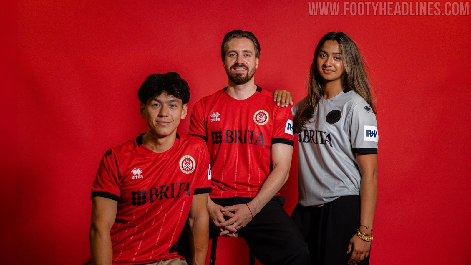
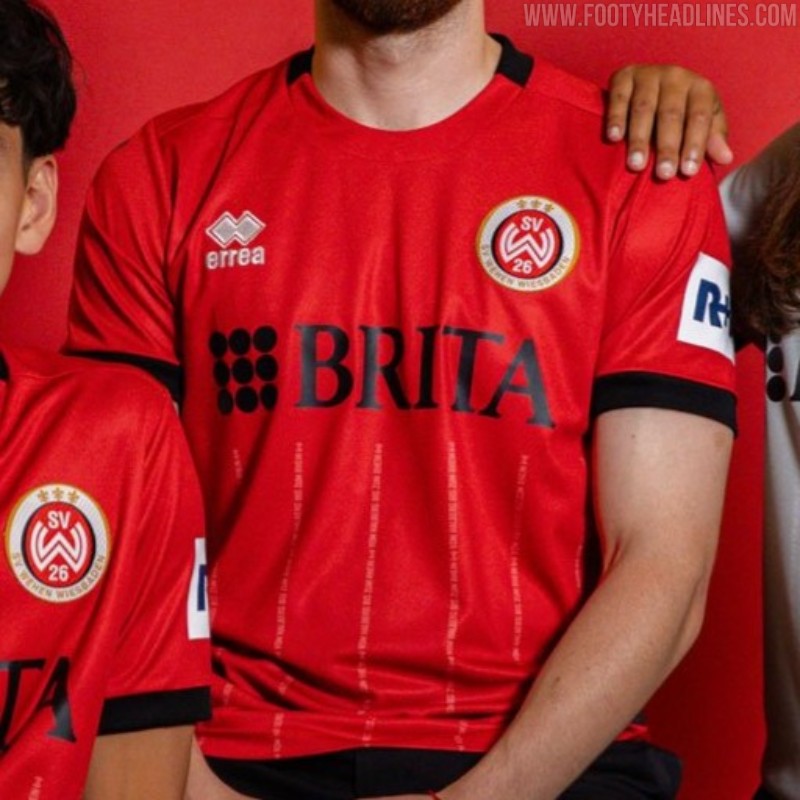
Wehen Wiesbaden 26-27 Home Kit Released
Third division club SV Wehen Wiesbaden has officially unveiled its new 26-27 home kit, produced by Erreà. Released in the year of the club's upcoming centenary, the shirt celebrates the team's roots, history, and territory.
The SV Wehen Wiesbaden 26-27 home jersey features a predominantly red base, incorporating subtle historical and territorial details as a nod to the club's founding in 1926.
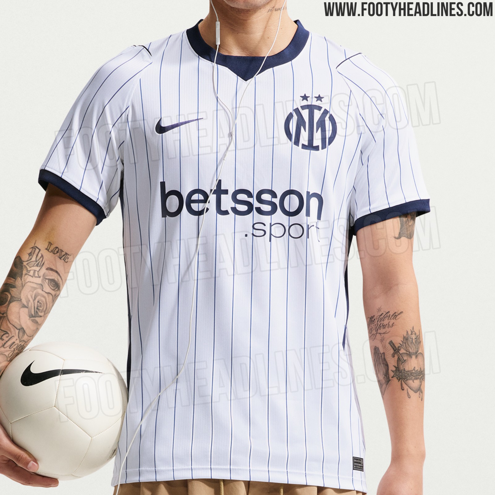
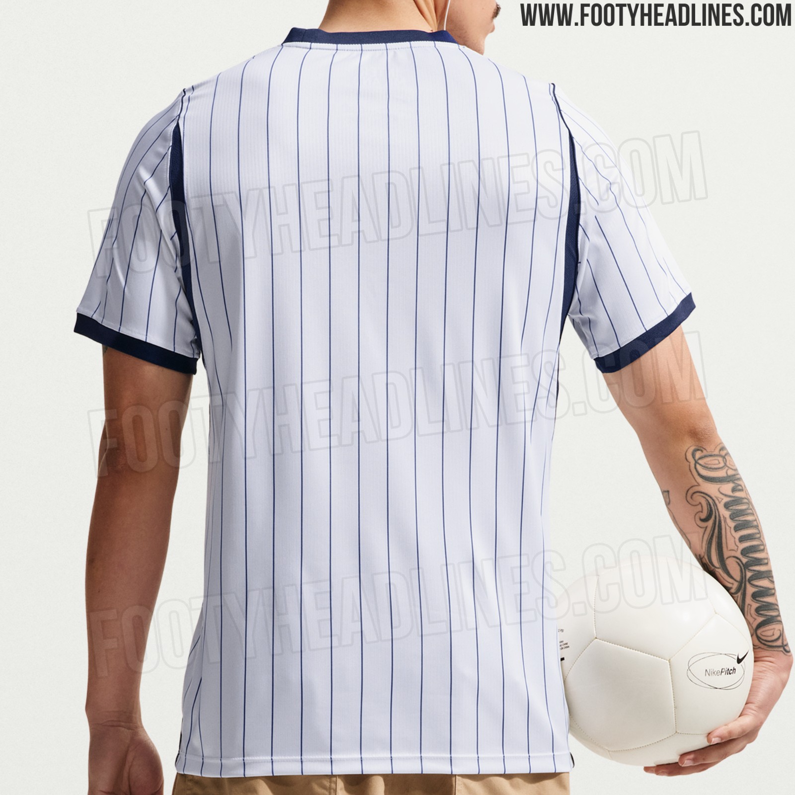
New Images of Inter Milan 26-27 Away Kit Leaked
We can leak new official images of the Nike Internazionale 2026-2027 away kit.