All-New Girondins Bordeaux Logo Revealed
 Jun 30, 2020, by Chris
In May 2020, Girondins Bordeaux CEO Frédéric Longuépée announced that the French club will get a new logo for the 2020-21 season and beyond. Now the new Bordeaux logo was officially unveiled, confirming the one shown off at an event of the club's fan club Ultramarines a couple of days ago.

Girondins' management began the redesign of the logo around one year ago in 2019. The wish is to put the logo in line with the shareholder's desire to develop the “Bordeaux” brand. Working groups were created and the Ultramarines were associated at the start with this approach.
Girondins Bordeaux 2020 Logo
The below image shows the brand-new Girondins de Bordeaux logo.
The new Bordeaux 2020 logo come with many changes compared to the previous crest, which are all in line to "develop the Bordeaux brand". The full name of the club, FCGB, has disappeared. The new logo only comes with the text "Bordeaux Girondins" and the creation date of the club, 1881. The golden color makes its appearance. In addition, the width of the scapular is also different.
The new club emblem forms part of a broder strategy for the club, which includes three pillars.
- A SPORTS PILLAR : regularly target European qualifying places.
- A REGIONAL PILLAR : to be an integral part of the "Gironde community".
- A GLOBAL PILLAR : the prestigious image of Bordeaux in the eyes of the world.

Would you like this to be the new Girondins Bordeaux 2020 logo? Share your thoughts in the comments below.

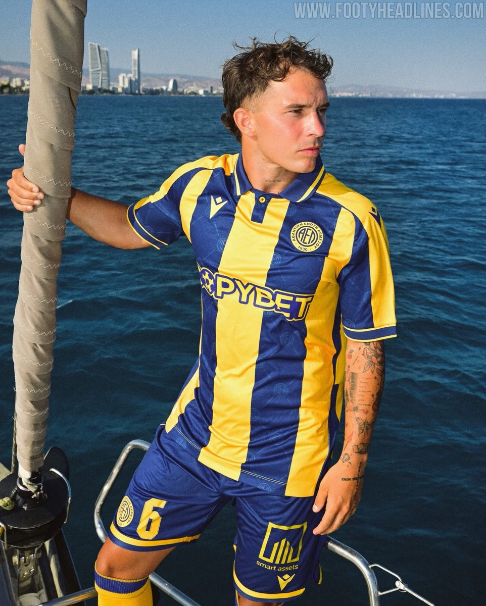
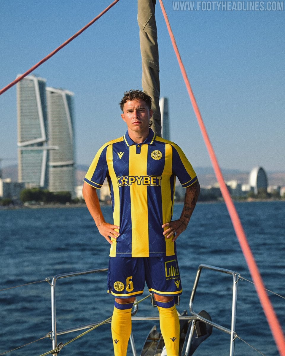
AEL Limassol 26-27 Home Kit Revealed
The new AEL Limassol 26-27 home kit has been revealed. Manufactured by Macron, the new AEL Limassol 26-27 home jersey introduces a stylish design for the Cypriot First Division club's upcoming campaign.

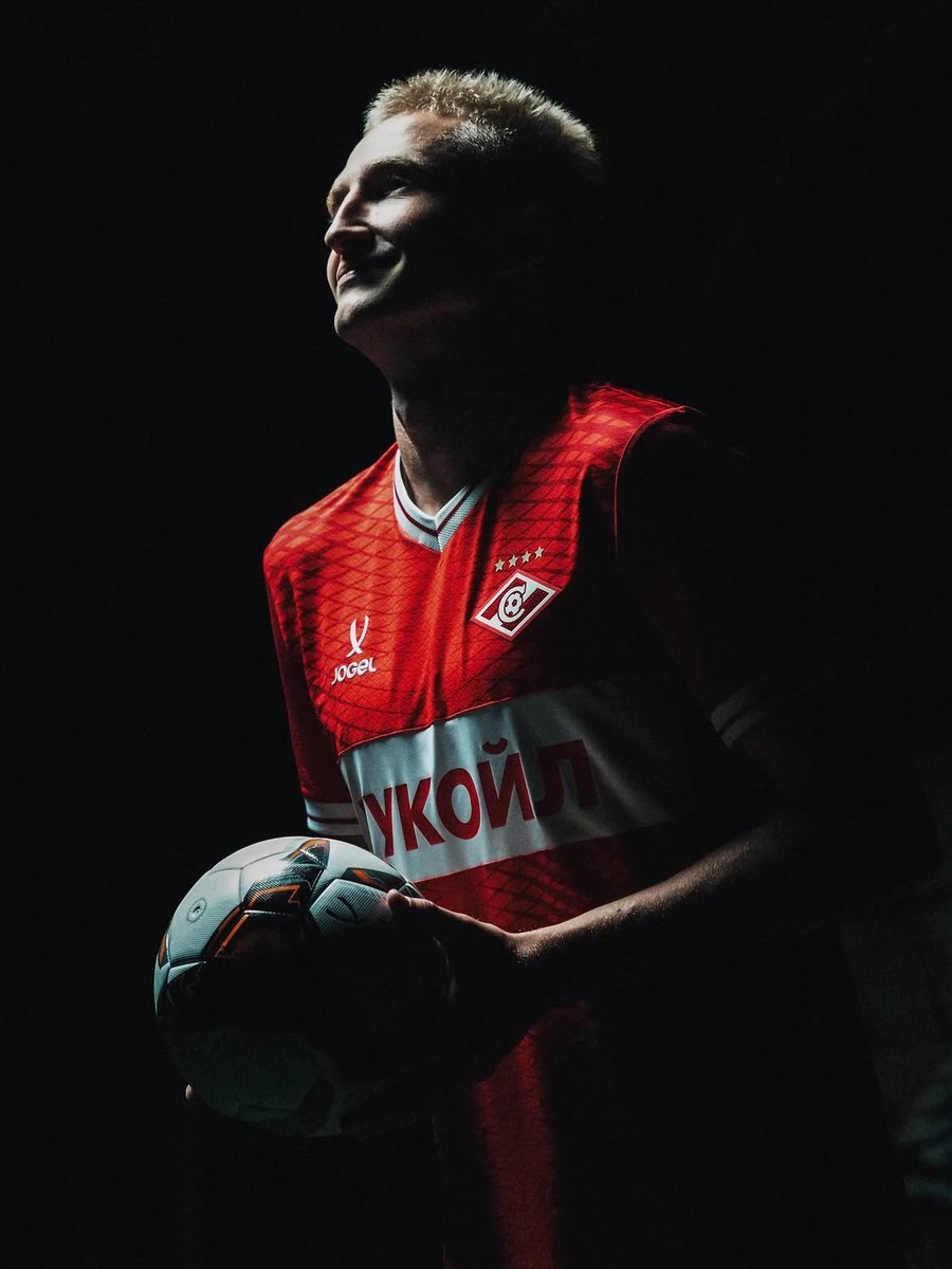
Spartak Moscow 26-27 Home & Away Kits Released
Russian club Spartak Moscow have officially released their new home and away kits for the 26-27 season. The new kits are made by Russian sportswear brand Jogel, which continues to supply kits for the team.
The launch of the Spartak Moscow 26-27 kits took place on the exact same day as the release of the new Zenit Saint Petersburg 26-27 kits. Both sets of jerseys were unveiled concurrently by Jogel in a coordinated drop for two of the most prominent clubs in the Russian Premier League.
The new Jogel Spartak Moscow 26-27 home and away shirts will be worn throughout the upcoming domestic campaign. The simultaneous release highlights the manufacturer's growing presence across Russian football.
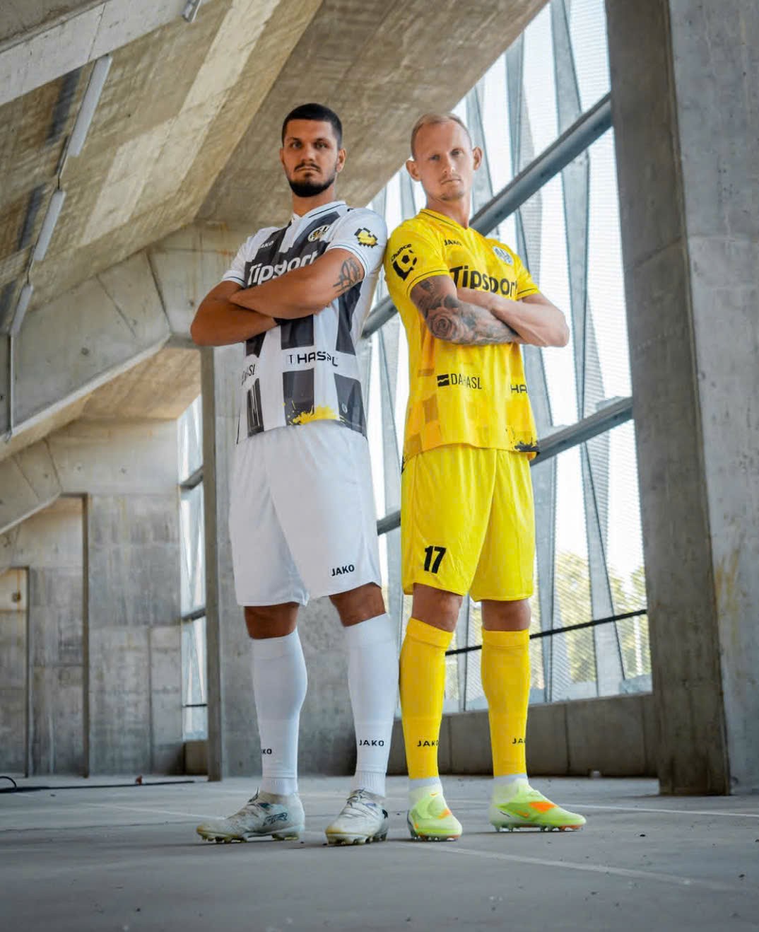
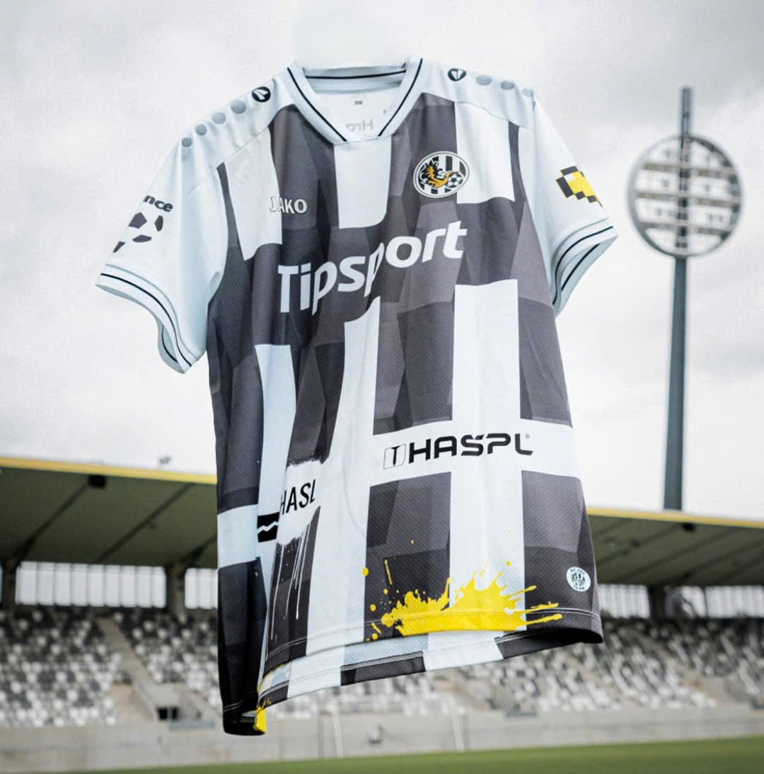
Hradec Králové 26-27 Home & Away Kit Released
Czech First League side Hradec Králové have unveiled their new home and away kit, made by Jako and to be worn in the upcoming 2026-27 season.
The two kits bring contrast approaches: The home kit is an interesting take on the traditional black and white stripes, with subtle abstract inside each stripe and a horizontal black band for sponsor placement. The away kit, on the other hand, is a simple yellow design with similar graphic and black accents.
What do you think of Hradec Králové 2026-27 home and away kits? Leave your thoughts in the comment below.
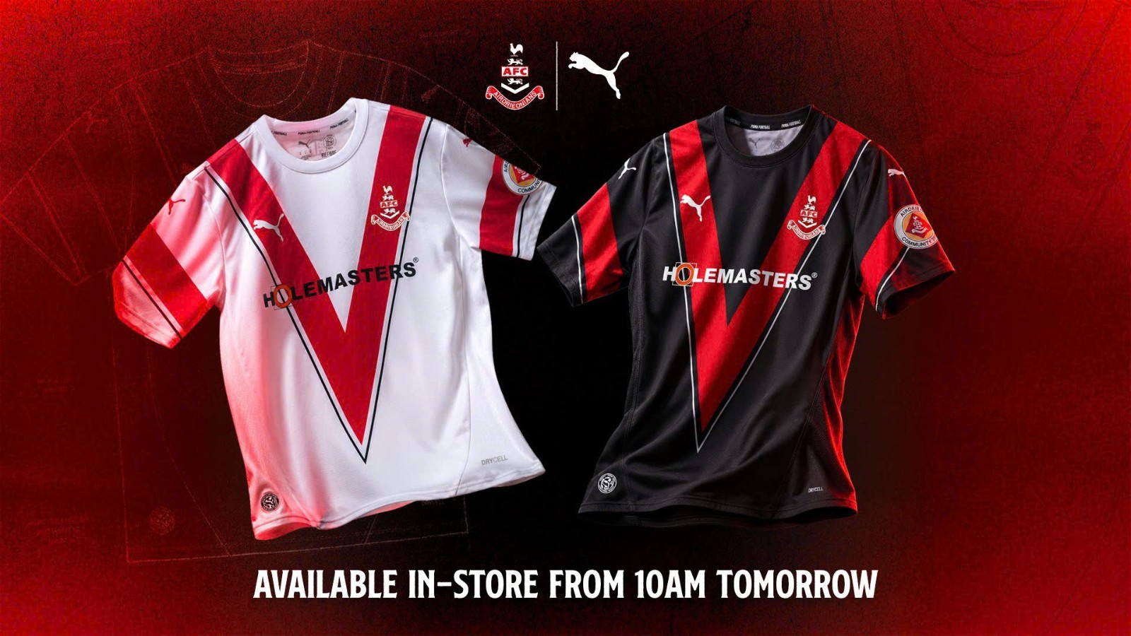
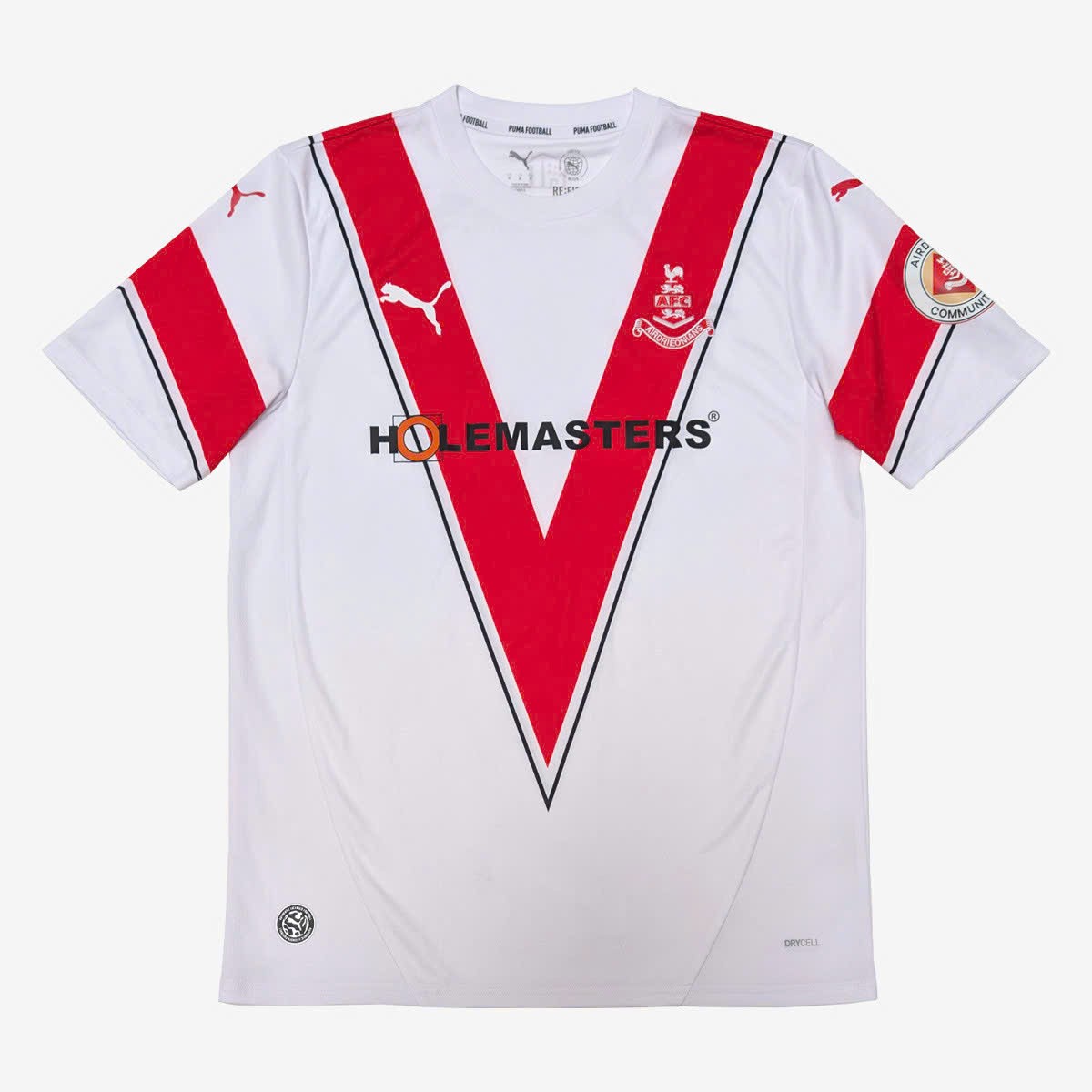
Airdrieonians FC 26-27 Home & Away Kit Released
Scottish League One side Airdrieonians FC have introduced their new looks for the upcoming 2026-27 season, made by Puma.
Both of the new designs share one identical idea: a huge red V-shaped band across the chest - which is also the club's signature graphic. Similar feature also appear on the sleeves, creating a matching full looks. While the home kit use traditional white base, the away kit is in all black.
What do you think about Airdrieonians FC 2026-27 home and away kits? Leave your thoughts in the comment below.

Aston Villa Announces Visit Rwanda as Front-of-Shirt Sponsor
Aston Villa have officially announced Visit Rwanda as the club's new Principal Partner, Official Tourism Partner, and Official Coffee Provider.
Starting from the 26-27 season, the Visit Rwanda logo will appear on the front of all men's, women's, and academy team shirts. The partnership expands the Rwanda Development Board's strategy of utilizing high-profile football sponsorships to promote global tourism.
Described as the most lucrative sponsorship deal in Aston Villa's history, reports indicate the agreement is worth up to £20 million per year including bonuses.
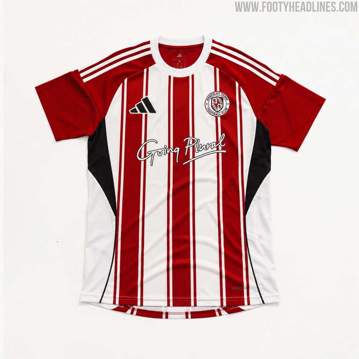
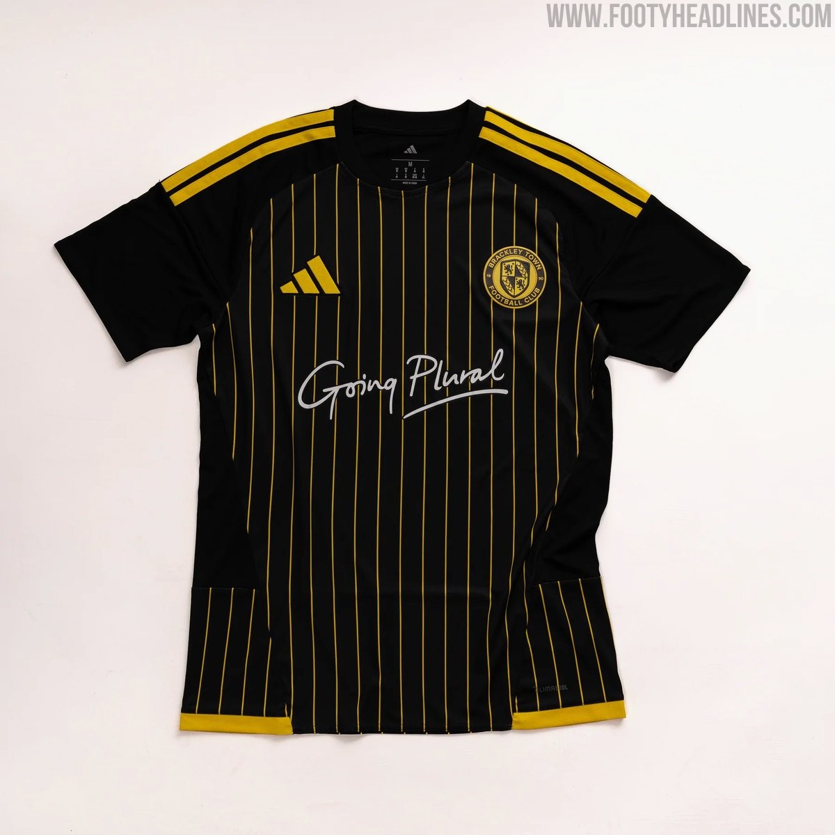
Brackley Town 26-27 Home & Away Kits Released
National League North side Brackley Town FC have officially launched their new Adidas home and away kits for the 26-27 season.
Produced in collaboration with Pro Direct Soccer, the Brackley Town 26-27 home shirt features the club's traditional red and white stripes. The Brackley Town 26-27 away shirt introduces a sleek look with a black base complemented by striking golden-yellow pinstripes.
Both the new home and away kits are available to purchase online, retailing at £50 for adult sizes and £45 for youth sizes.
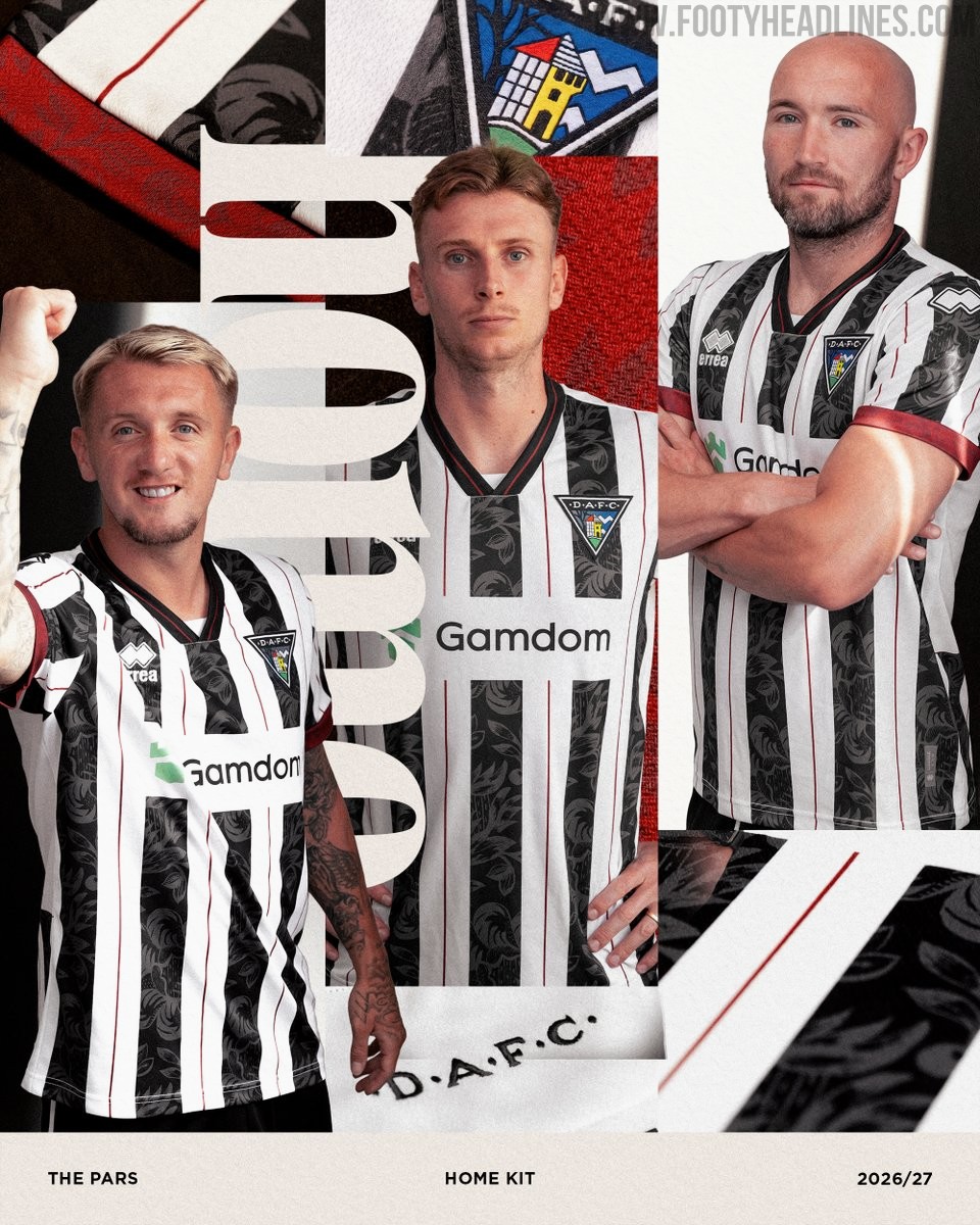
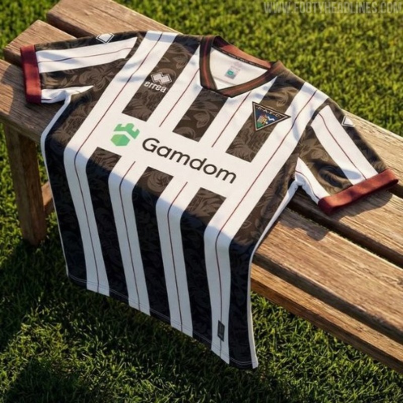
Dunfermline Athletic 26-27 Home Kit Released
The new Dunfermline Athletic 26-27 home kit has been officially released by Erreà. The Dunfermline 2026-27 home jersey offers a fresh take on the club's traditional look by incorporating a refined tone-on-tone floral damask pattern that subtly reimagines their iconic black and white stripes. This unique detailing elevates the classic striped design, which is completed with a simple collar and solid black cuffs. The launch of the home shirt follows the release of the club's away kit earlier in the month.
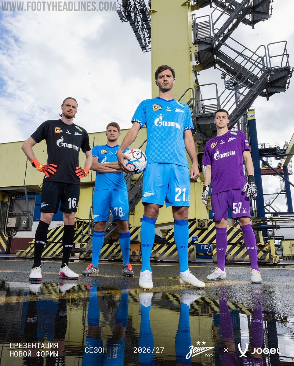
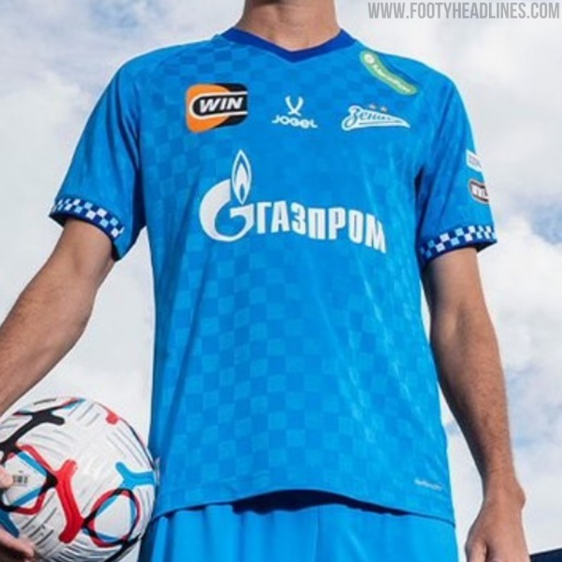
Zenit 26-27 Home & Away Kits Released
Russian club Zenit Saint Petersburg have officially released their new Jogel home and away kits for the 26-27 season under the campaign slogan "Passion and Order!".
Manufactured by Russian sports brand Jögel, the Zenit 26-27 home jersey features the club's traditional blue colors, while the away shirt offers a white alternative. Both kits come with a checker design and horrible, mismatch sponsors.
The new uniforms will be worn by the reigning champions throughout their upcoming domestic campaign.