All-New Belgian Pro League Logo + Brand Identity Launched - Sponsor Version
 Jul 8, 2020, by Chris


Update: The Pro League logo featuring the colors and logo of the league's sponsor Jupiler has been revealed. It looks much better than the previous one and the standard one, at least for us.

Jupiler Belgian Pro League 2020 Logo

The new Jupiler Belgian Pro League 2020 Logo is based on the standard version but with a bull and the colors of Jupiler, a Belgian beer.
"Software Logo": All-New Belgian Pro League Logo + Brand Identity Launched
"Closer to Football": The Belgian first division today unveiled its new brand identity - introducing the all-new Belgian Pro League.

The Pro League renewed its visual identity after 10 years. The branding was created together with branding agency Mirror Mirror, with whom they departed from a white magazine and focused on the essence.
🆕|
— Pro League ⚽️🇧🇪 (@ProLeagueBE) July 1, 2020
Vanaf vandaag trekt de Pro League een nieuw shirt aan.
📺Bekijk hier onze nieuwe look!
--
À partir d’aujourd’hui, la Pro League endosse un nouveau maillot.
📺Découvrez notre nouveau look ici ! #ProLeague #DichterBijVoetbal #PlusProcheDuFootball pic.twitter.com/VicmKj2KL2
Belgian Pro League 2020 Logo


A simplistic look, the new Belgian Pro League logo focuses on the core activity of the Pro League: 1 ball, 2 teams. The visual identity returns in the different league brands and forms the link between the institutional brand Pro League and the leagues.


Brand agency Mirror Mirror is proud of the result: "Our goal was to translate the uniqueness and identity of the Pro League into an overarching visual identity. One that is a perfect translation of what the organisation stands for: passion, emotion, connection and locality. We created a contemporary, strong logo that develops into a dynamic, visual system. We provided a toolbox that helps the Pro League create a lasting connection between clubs, players and supporters".
The visual identity is completed by a new baseline: Closer to football. This baseline breathes what we as the Pro League want to stand for.

"This baseline breathes what we as the Pro League want to stand for," says spokesman Stijn Van Bever. "The passion and love for our teams, the atmosphere in the stands, the intensity on the pitch, the camaraderie in the stands, the seat or in the cafe. We bring the fans closer to the clubs and the clubs closer to the fans, also through the collaboration with our new media partner Eleven Sports. The Pro League must become a strong brand, synonymous with football and passion".


The new sleeve badges of the Pro League were revealed as well - black / gold for the champions, and black / silver for other teams.

What do you think of the new Pro League logo and the brand identity of the Belgian league in general? Share your thoughts in the comments below.
FC Vaduz 26-27 Home, Away & Third Kits Released
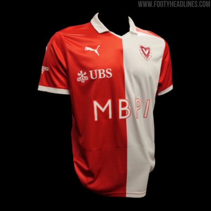
The new FC Vaduz 2026-27 home, away, and third kits have been officially unveiled. Made by Puma, the shirts will be worn during the club's upcoming Swiss Super League campaign following their recent promotion to the top flight.
The Puma FC Vaduz 2026-27 home kit updates the club's traditional split front panel design by replacing the former burgundy half with a clean white section.
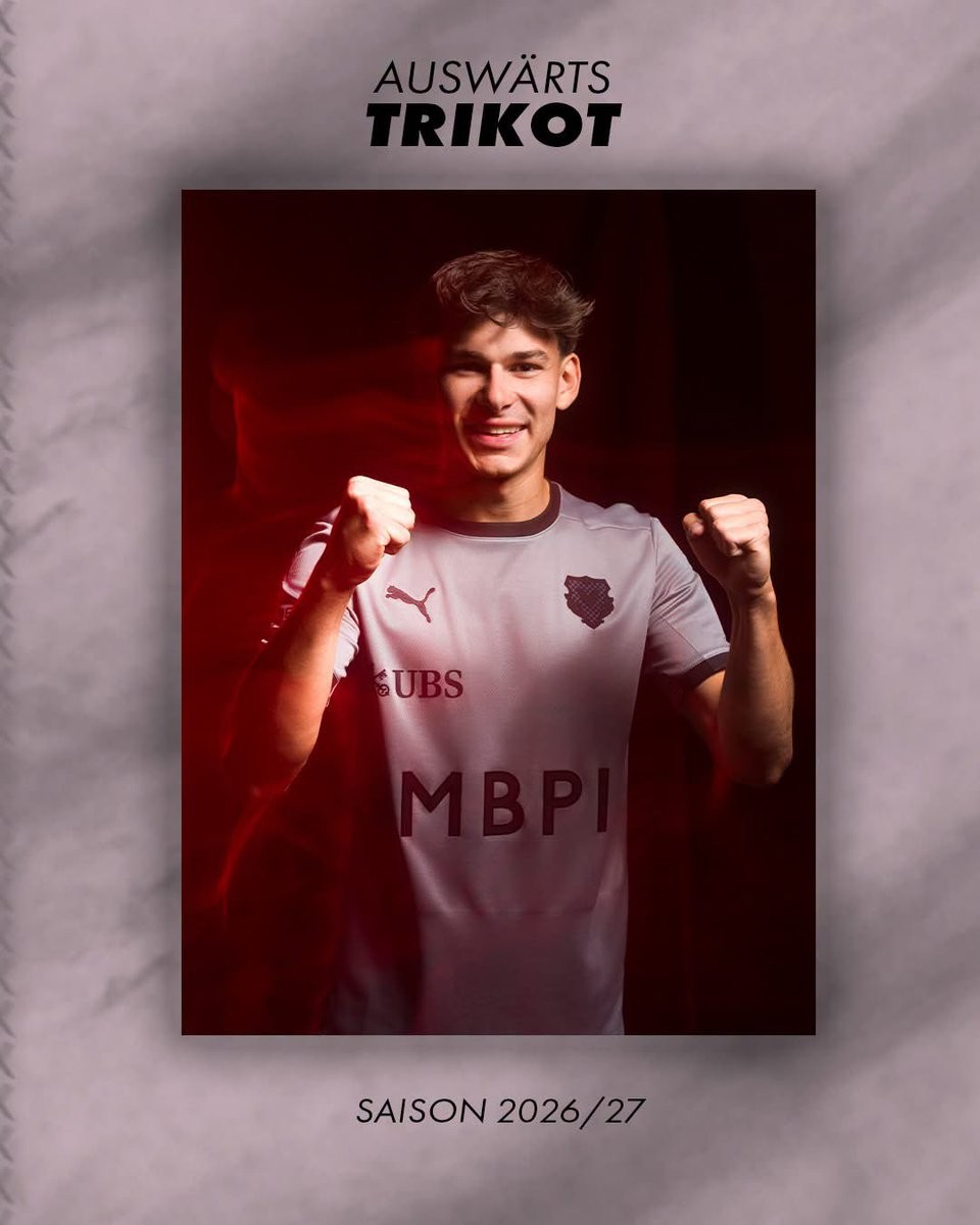
Completing the collection, the Puma FC Vaduz 2026-27 away and third kits were launched shortly after the home shirt to offer alternative looks for the team's travels.
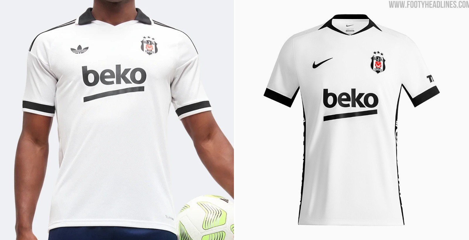
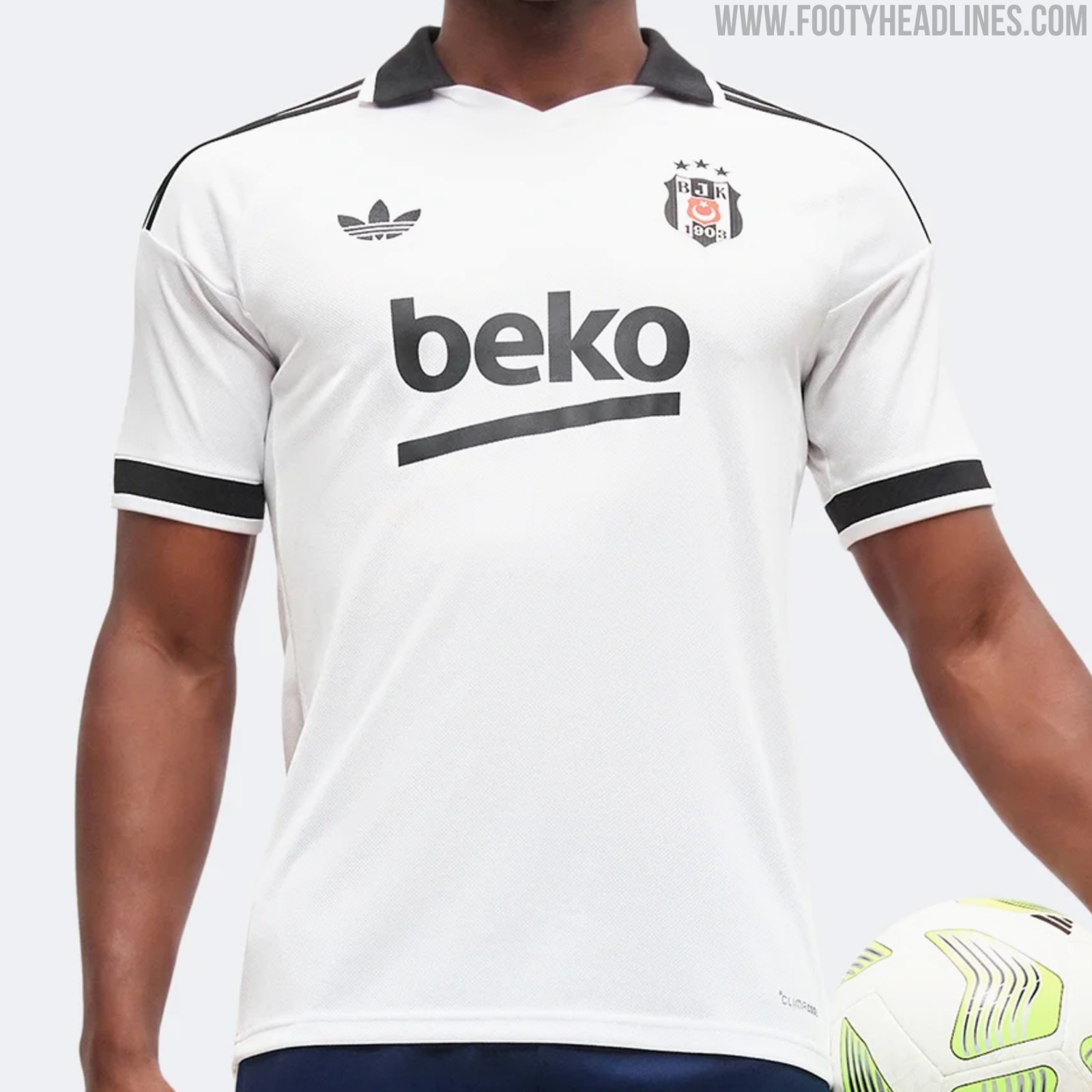
Adidas Besiktas Vs Nike Besiktas 26-27 Kits
Besiktas today released their 2026-2027 Nike kits. Due to the late agreement of the deal, the club received not fully bespoke looks - Adidas had already prepared bespoke designs for Besiktas.

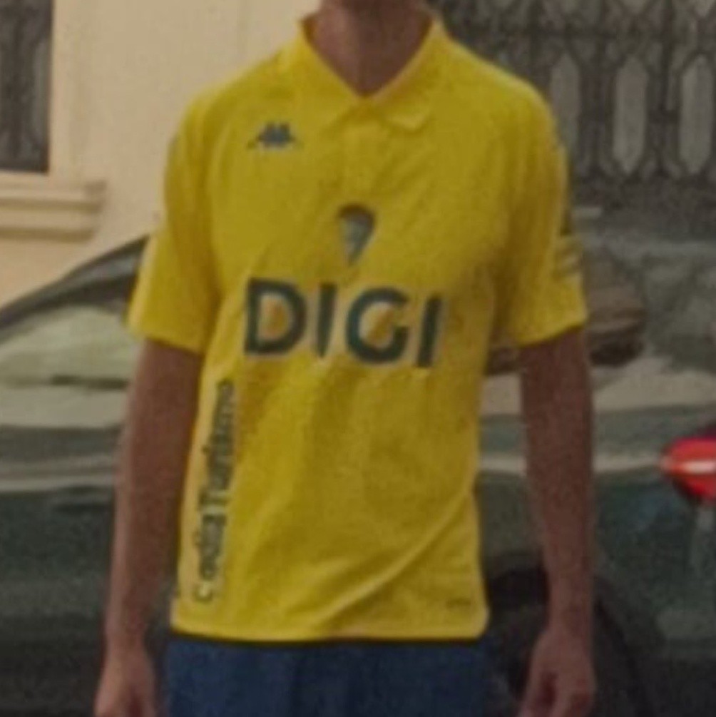
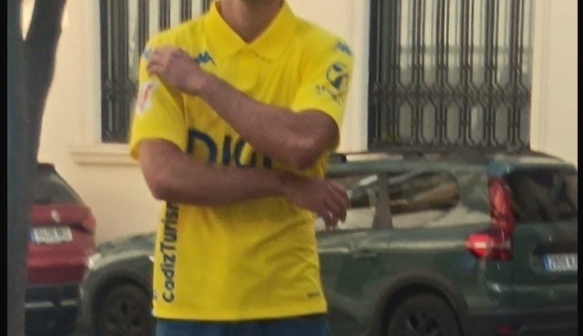
Cádiz 26-27 Home Kit Leaked
The new Cádiz CF 2026-27 home kit has been leaked by local journalist Carlos Sacaluga, providing a first look at the club's inaugural design by their new supplier, Kappa.
The shirt features a remarkably simple, polo-style aesthetic in the club's traditional yellow and blue colors.
Following its appearance online, the minimalist design has drawn a largely negative reaction from supporters, with many criticizing the kit for looking more like a basic polo shirt than a bespoke football jersey.
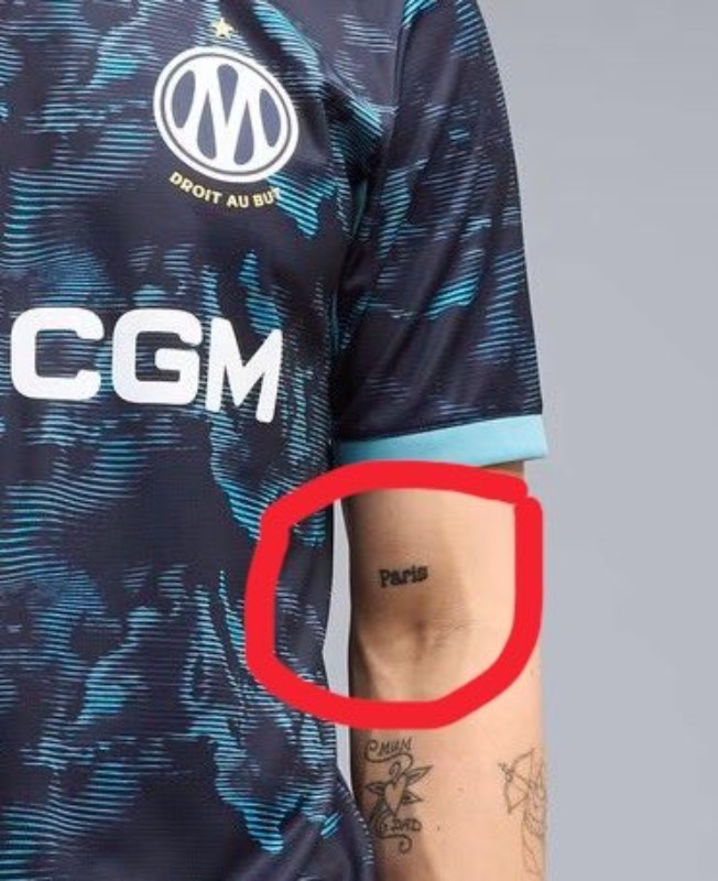
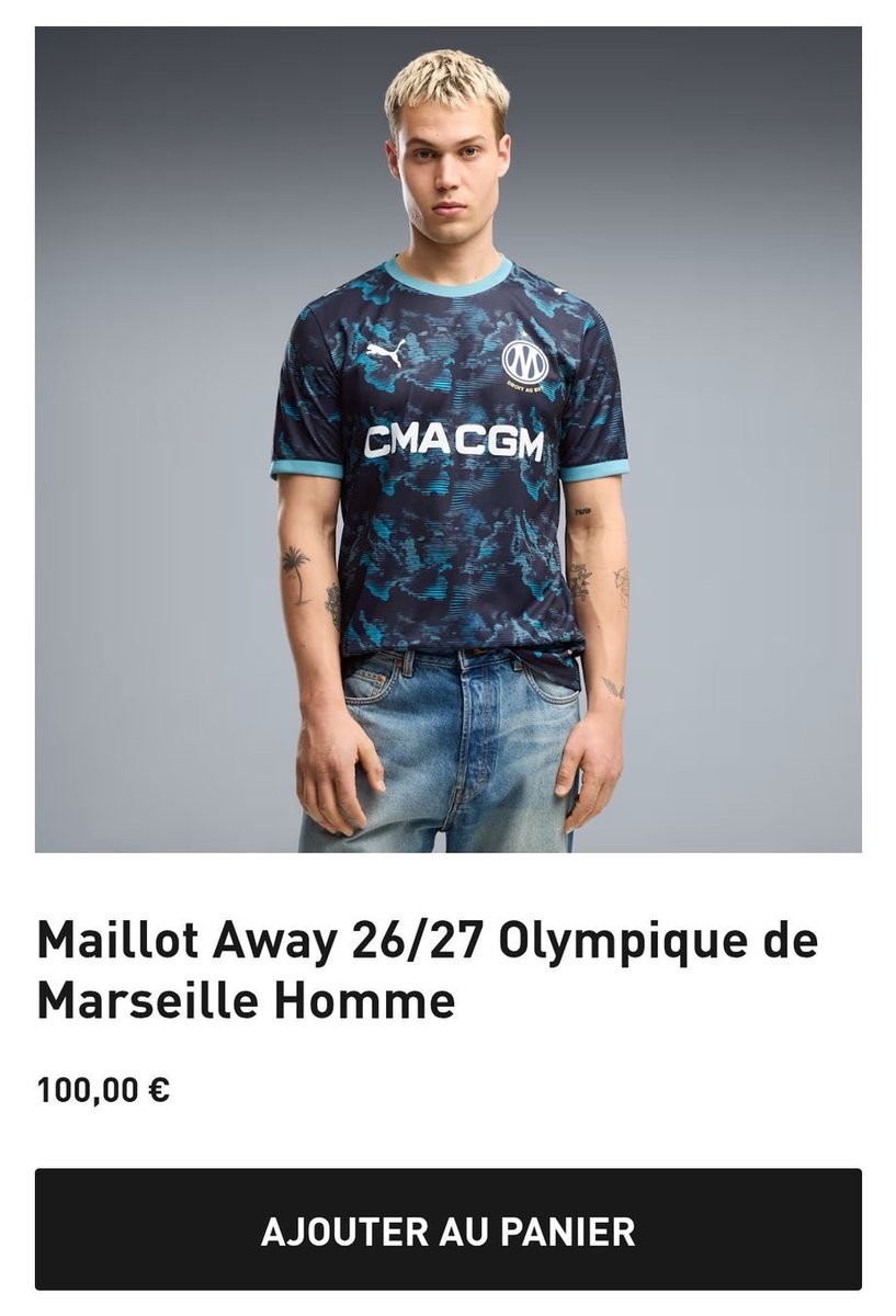
Puma Model for Marseille 2026-27 Away Kit Has "Paris" Tattoo
Puma's promotional campaign for the new Olympique Marseille 2026-27 away kit has sparked controversy and amusement online after eagle-eyed fans spotted a "Paris" tattoo on the arm of one of the models.
The images, which quickly circulated on social media, show the model wearing the new Marseille away shirt with the word "Paris" clearly visible on his forearm, a major faux pas given the fierce rivalry between OM and Paris Saint-Germain. While some fans initially suspected the images were edited, reports suggest the tattoo was visible in official promotional materials and on the club's site before potentially being retouched on Puma's official store.

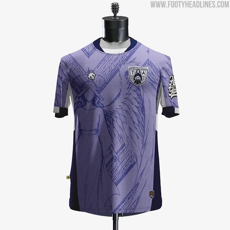
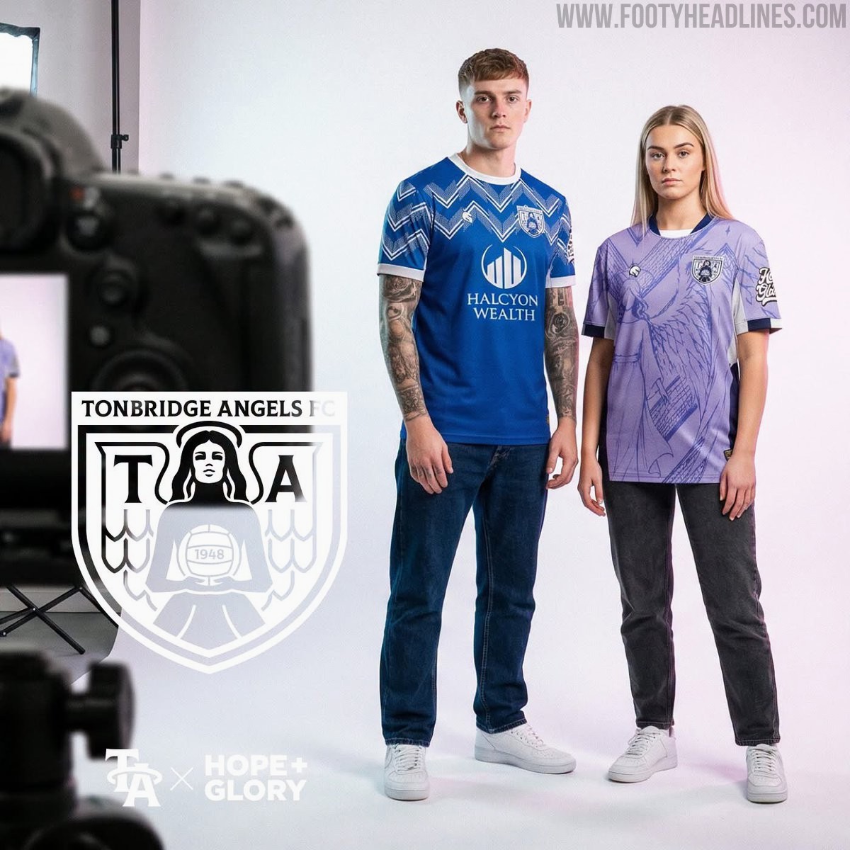
Tonbridge Angels 26-27 Third Kit Released
English National League South side Tonbridge Angels have officially revealed their new 2026-27 third kit, produced by Hope & Glory. Chosen by a vote among the club's owners, the new third shirt features a lilac base color.