Comeback For 21-22: Chelsea's Yellow Kit History
 Nov 16, 2020, by Chris

Last Sunday, we leaked that the Nike Chelsea 21-22 away jersey will be yellow. It is not a new color combo for the club - we take a look back at some of Chelsea's best yellow kits in history, in cooperation with Football Kit Archive.


Chelsea's Yellow Shirts History
Chelsea has had yellow alternative various times during their club history. The first time that they wore a yellow away shirt was in 1963-64, when they used it as "third" / alternative choice.

Since 1963, Chelsea used yellow various times during their history, mostly combined with blue or red applications. However, between 1978 and 1982, they even combined it with green for their away kit.


In the 2000s, Chelsea has had six different yellow alternative kits (if counting the electricity Adidas 2007-08 away kit). Nike did release one yellow kit for the club since they became Chelsea's kit maker in 2017 - the 2018-19 away uniform.


Chelsea FC 2018-19 Away Kit

Chelsea FC 2014-15 Away Kit

Chelsea FC 2008-09 Third Kit

Chelsea FC 2007-08 Away Kit

Chelsea FC 2001-02 Third Kit

Chelsea FC 1996-97 Away Kit
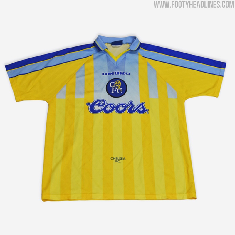
Chelsea FC 1991-93 Third Kit

Chelsea FC 1982-83 Away Kit
Chelsea FC 1978-81 Away Kit

Chelsea FC 1963-64 Away Kit - First Yellow CFC Shirt


Do you like that the new Nike Chelsea 21-22 away kit will be yellow? Which is your favorite of these old yellow Chelsea Football Club shorts? Share your thoughts in the comments below and see Chelsea's full kit history on Kit Archive.



SV Zulte Waregem 26-27 Third Kit Released - 25th Anniversary Design
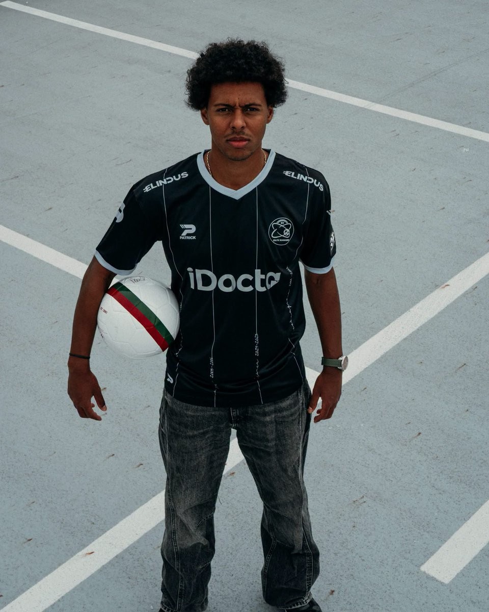
Belgian side SV Zulte Waregem and kit supplier Patrick have officially released their new third kit for the 26-27 season. Celebrating the club's silver jubilee marking 25 years since their formation in 2001, Essevee swap out their traditional red, green, and white colours for an understated black and silver look dubbed "Memories worth a touch of silver."
The Patrick SV Zulte Waregem 26-27 third jersey features a black base detailed with thin vertical silver pinstripes down the front. A closer inspection reveals that the pinstripes incorporate handwritten script documenting key milestones and dates throughout the club's history, highlighting achievements such as their inaugural 2001-02 title and their memorable 2012-13 campaign as league runners-up.
Completing the anniversary aesthetic, the jersey is finished with a silver V-neck collar and matching sleeve cuffs. All branding—including the monochrome SV Zulte Waregem club crest, Patrick maker's marks, and primary sponsors iDocta and Elindus—appears in silver and white to match the unified commemorative design.
Napoli Wears Last Season's Shorts Against Inter - Here Is Why
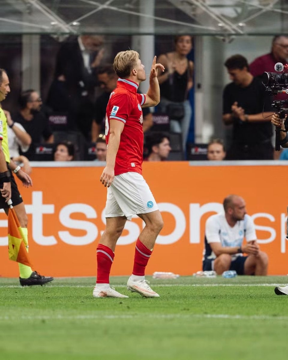
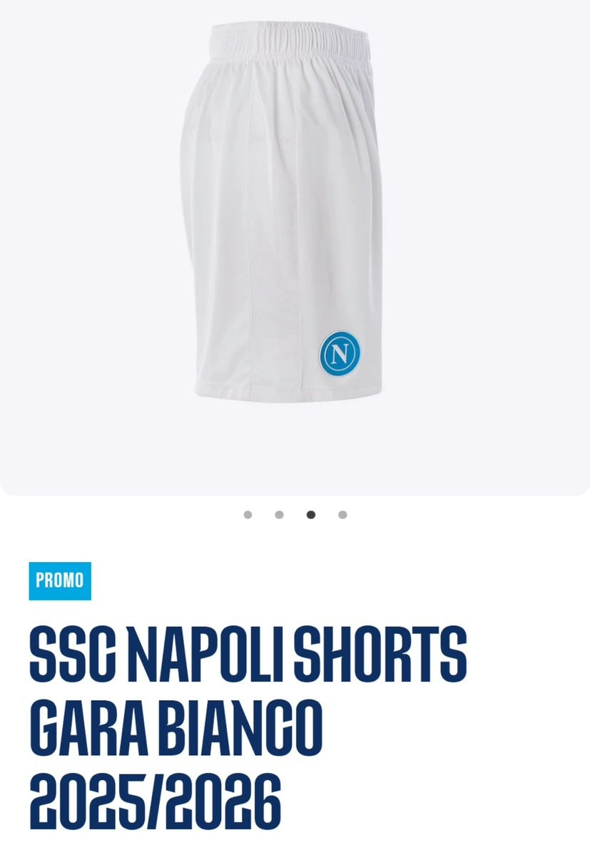
In their Serie A clash against Inter at San Siro, SSC Napoli caught the attention of eagle-eyed Napoli kit expert @TutelaMagliaNA. For the 26-27 centenary season, EA7 designed two distinct pairs of white shorts: the home shorts carry the club's special centenary crest, while the away version features an alternate Mount Vesuvius-themed logo. Because the red jersey used the standard circular Napoli crest, pairing it with either of the 26-27 white shorts would have caused a clash of emblems on the same uniform.
Rather than producing a third set of white change shorts solely to carry the standard badge, Napoli simply reused their plain white match shorts from 25-26.

Benjamin Sesko’s Sleeve Badge Error
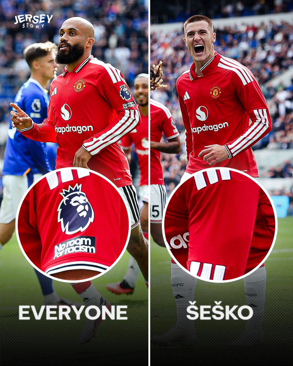
While all other Manchester United players took the pitch with league badges on both sleeves, Benjamin Šeško was spotted as the only one missing the patch on his left arm for reasons unknown.
Thanks to @jerseystory_vn for the information and collage.