New Jeonnam Dragons Logo Revealed
 Jan 29, 2022, by John

Jeonnam Dragons FC, who currently play in South Korea's second division, the K League 2, recently unveiled their new club logo and branding. This new design will serve as the club's symbol from the 2022 season onward.

New Jeonnam Dragons Logo
Here is the old Jeonnam Dragons logo, which came in two different colorways. The left version features the club's original colors, while the right one matches its colors with those on the yellow and black home kits.
The old Jeonnam crest is of course mainly fixated on showcasing the club's main symbol, a dragon. It places a dragon's head onto a shield, which has a diagonal striped pattern in white and purple or black and yellow. The club's name is written above this, with the abbreviation and founding year inscribed at the bottom.

Taking a look at the new 2022 Jeonnam Dragons crest, it becomes apparent that a lot was altered or completely replaced. Stylized versions of the letters 'J' and 'D' are at the center of the strictly yellow and black design. They are surrounded by the suggestion of a shield shape, however, the diagonal stripes are completely gone.

Most noteably, the dragon head has been dropped from the crest, which is unfortunate, since this was such an integral part of the club's look. The club name is still placed above the shield shape, now divided into two rows and with a new font.
This same font will also be used for the Jeonnam's branding.


What do you think of this new logo for the Jeonnam Dragons? Should they have kept the dragon head? Comment below.
Emiliano Martinez Debuts Custom Golden Adidas Predator Yashin Trophy Gloves
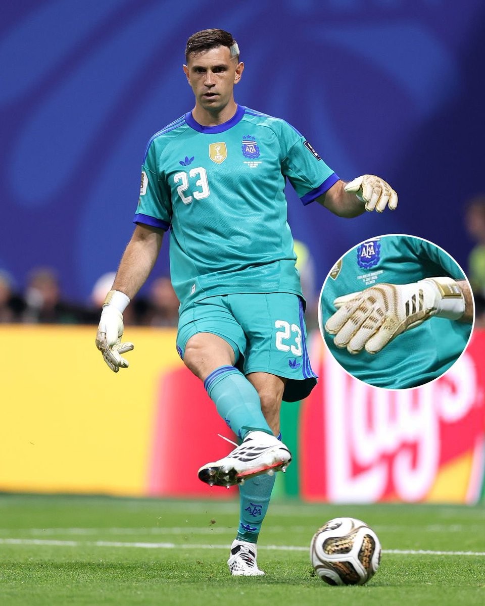
Argentina goalkeeper Emiliano Martinez debuted a unique pair of custom golden Adidas Predator goalkeeper gloves during a recent match against England. The bespoke design was created exclusively for the shot-stopper by Adidas to commemorate a major individual milestone. Big thanks to @marcadegol.
The special edition gloves were presented to Martinez following his second consecutive Yashin Trophy win, honoring his standing as the best goalkeeper in world football. The design features a prominent metallic gold colorway across the backhand and punch zone, serving as a direct visual tribute to the prestigious award.
While the gloves sport this exclusive golden aesthetic, they utilize the standard technology and specifications of the current Adidas Predator goalkeeper line. These celebratory gloves appear to be a player-exclusive creation tailored specifically for Martinez, with no indications of a wider retail release from the Three Stripes.
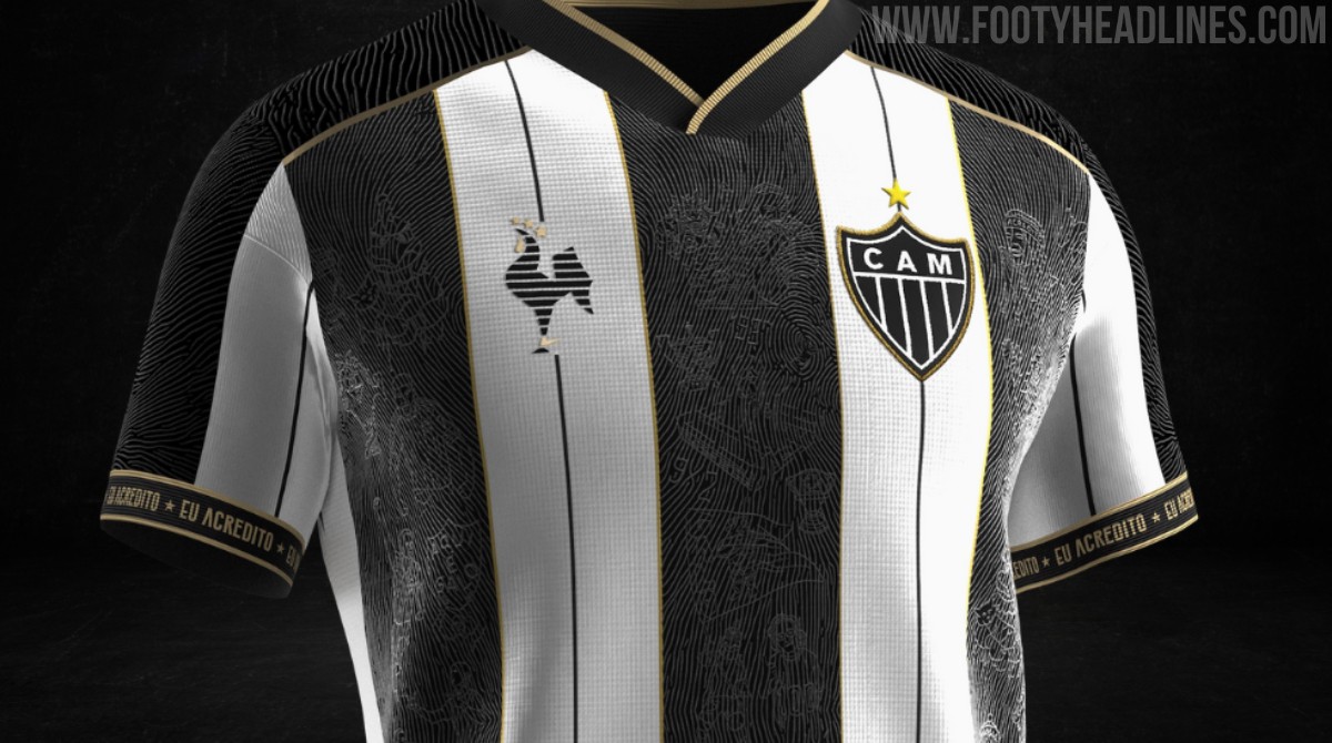
Nike Atlético Mineiro 2026 'Manto da Massa' Kit Confirmed
Atlético Mineiro's highly successful 'Manto da Massa' kit project is set to return in 2026, produced for the first time by their new technical sponsor, Nike.
The club's Director of Business officially revealed the revival of the initiative, though the announcement has sparked backlash among supporters. Fans are criticizing the modified format, which reportedly shifts away from the traditional open fan design and voting process, opting instead for Nike to produce the kit with only select fan involvement.
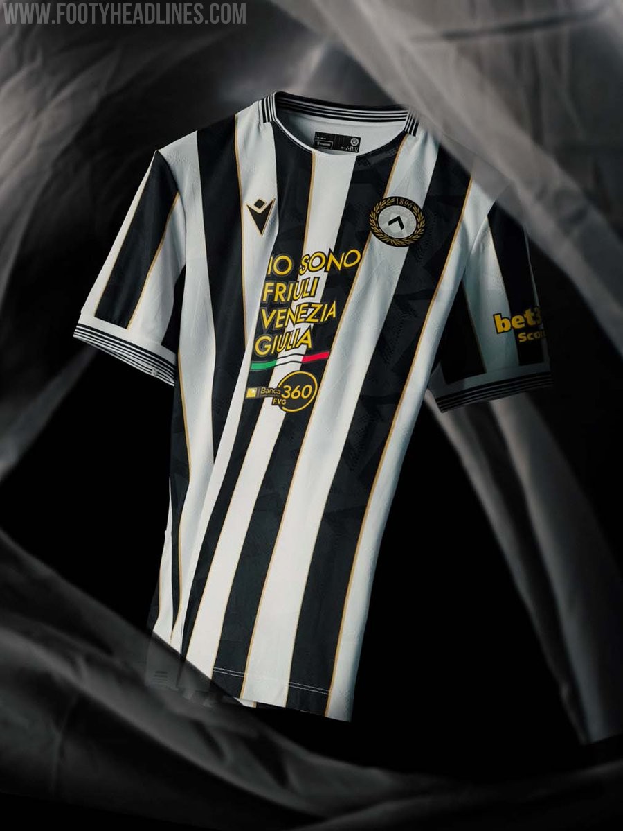

Udinese 26-27 Home Kit Released
The new Udinese 26-27 home kit was officially released today by Macron. Celebrating the club's upcoming 130th anniversary, the design brings a classic rendition of the traditional white and black stripes, elevated by golden trim.
A special detail is featured on the back of the Udinese 26-27 home shirt. The 'aquila patriarcale' (patriarchal eagle), a historical symbol of the Friuli region, is placed on the upper back, adding a strong localized touch to the classic aesthetic of the jersey.
The Macron Udinese 26-27 home kit is available to purchase through the club's and brand's official channels.
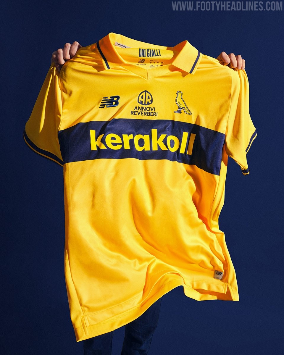

Modena 26-27 Home, Away & Third Kits Released
Modena FC and New Balance have officially unveiled the club's new home, away, and third kits for the 26-27 season. Released under the motto "Una città. Due colori. Tre maglie. Un'unica grande passione" (One city. Two colors. Three shirts. One great passion), the collection blends tradition with a contemporary design to celebrate the club's rich identity.
The New Balance Modena 26-27 home kit features the club's unmistakable yellow base, highlighted by a horizontal blue chest band that pays tribute to their iconic shirts from the early 1980s. The away kit flips the script, utilizing a dominant blue base accented by striking yellow inserts. Rounding out the collection, the third kit offers a refined aesthetic in white, featuring its own blue band to complete the set.
The New Balance Modena 26-27 home, away, and third kits are available at the club's physical store starting July 15, with online sales set to launch on July 16.
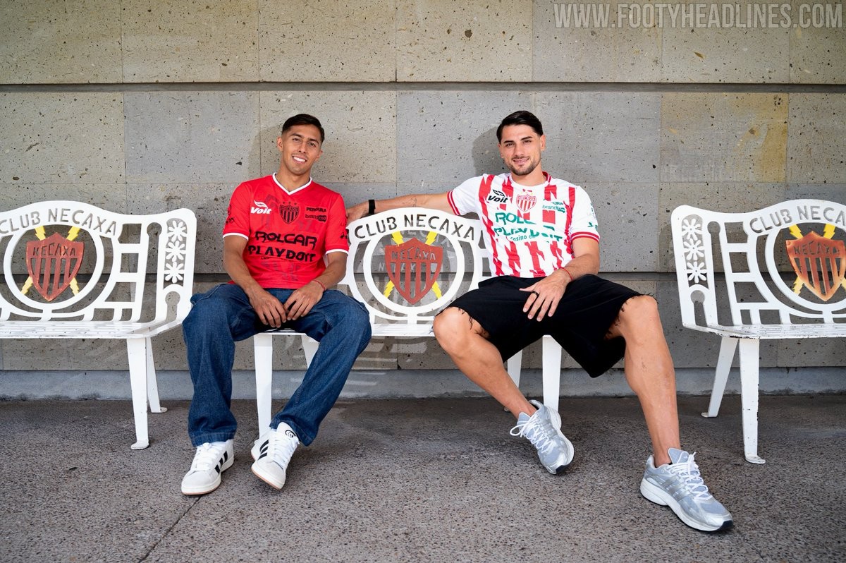
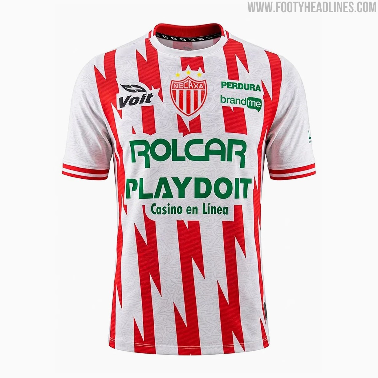
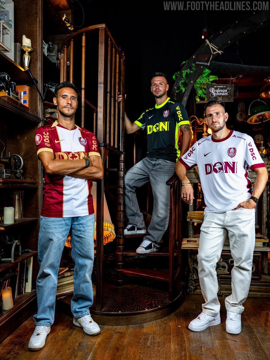
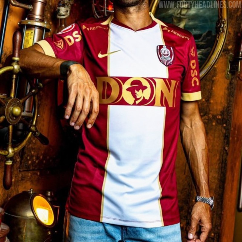
Club Necaxa 26-27 Home & Away Kits Released
Mexican Liga MX side Club Necaxa have officially unveiled their new 26-27 home and away kits made by Voit.
The new shirts feature striking designs that honor the club's nickname, "Los Rayos" (The Lightnings), with the home kit retaining the traditional red and white colors but reimagining the classic stripes as dynamic lightning bolts down the front. The away jersey follows a similar theme, showcasing a bold red base with black details and a corresponding lightning pattern.


AEL Limassol 26-27 Away Kit Revealed
Cypriot First Division club AEL Limassol has officially revealed its new away kit for the 26-27 season. Manufactured by Italian sportswear brand Macron, the AEL Limassol 26-27 away kit could not be more basic.
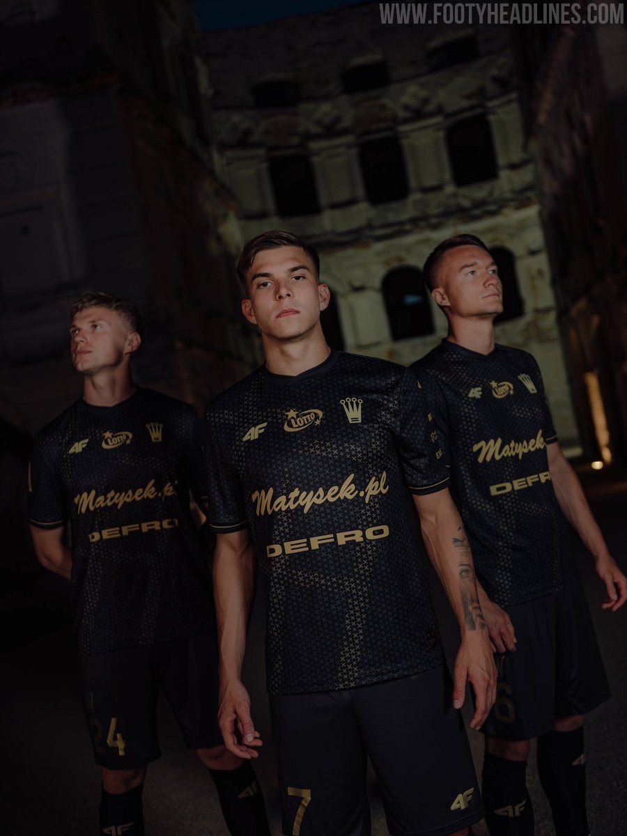
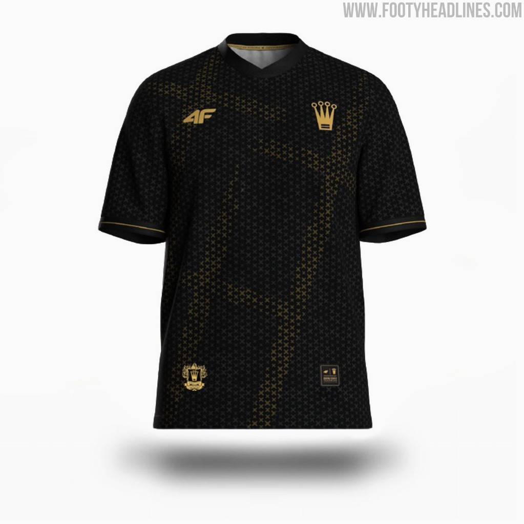
Korona Kielce 26-27 Away Kit Released
The new Korona Kielce 26-27 away kit has been officially released.
Made by 4F and based on a concept by designer @w_kitz, the new Korona Kielce 26-27 away shirt draws inspiration from the theme 'Equites Coronae', representing the players as contemporary knights of the crown. This unique knight-inspired aesthetic is intended to symbolize the club and its region during their away matches.

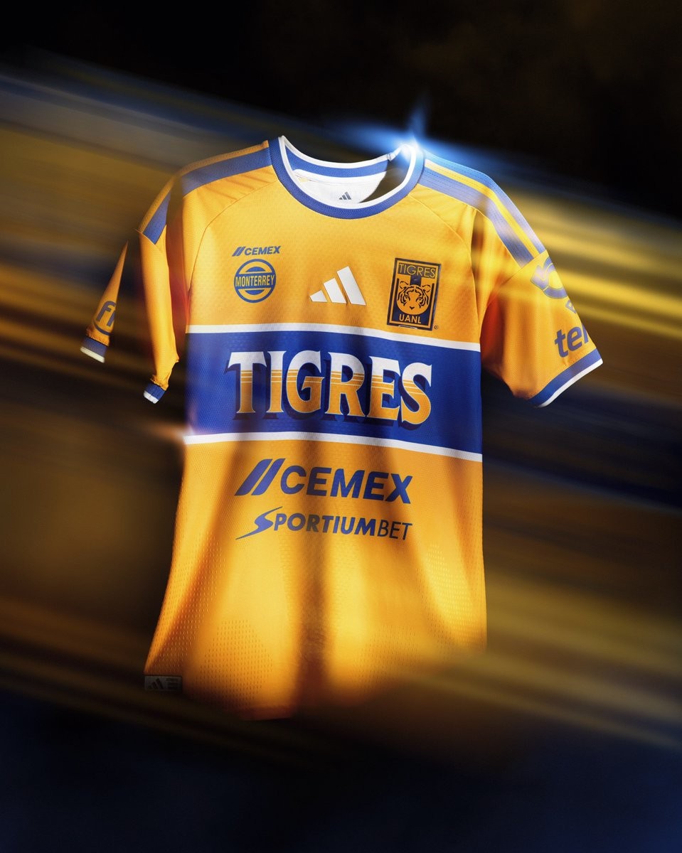
Tigres UANL 26-27 Home Kit Released
Tigres UANL and Adidas have officially launched the club's new 26-27 home kit. The release marks a significant milestone, celebrating a 20-year partnership between the Mexican side and the sportswear brand.
The Adidas Tigres UANL 26-27 home jersey features the club's traditional amber base with blue details and the classic central chest stripe. A standout element of the new design is the typography used for the "Tigres" wording across the chest, which draws inspiration from traditional Mexican sign-painting, known as "rótulo mexicano".

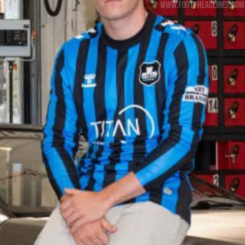
York City 26-27 Third Kit Revealed
Following the launch of their red home and yellow away shirts earlier this month, York City have officially revealed their new 26-27 third kit. It features a black and blue stripes design.
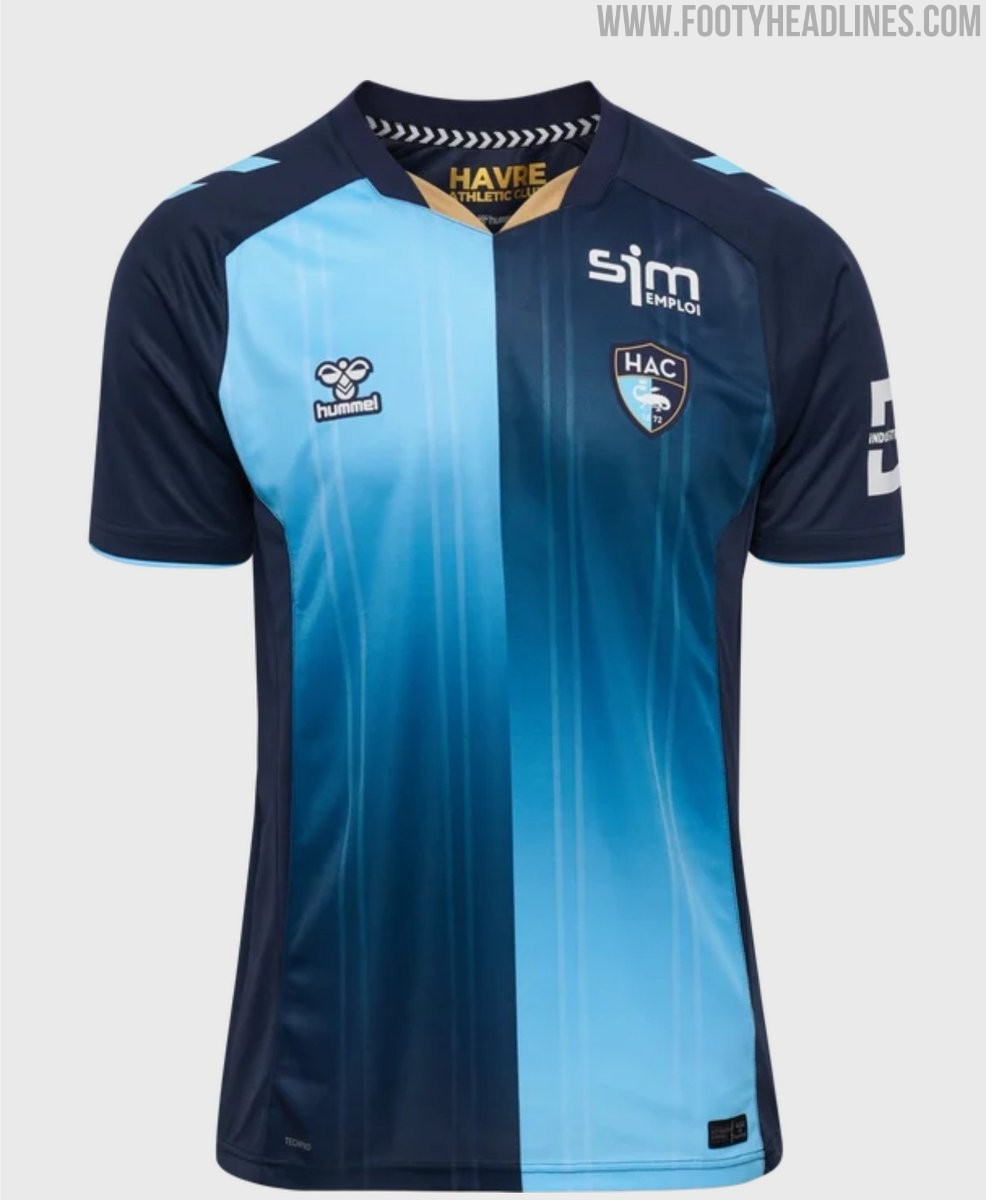
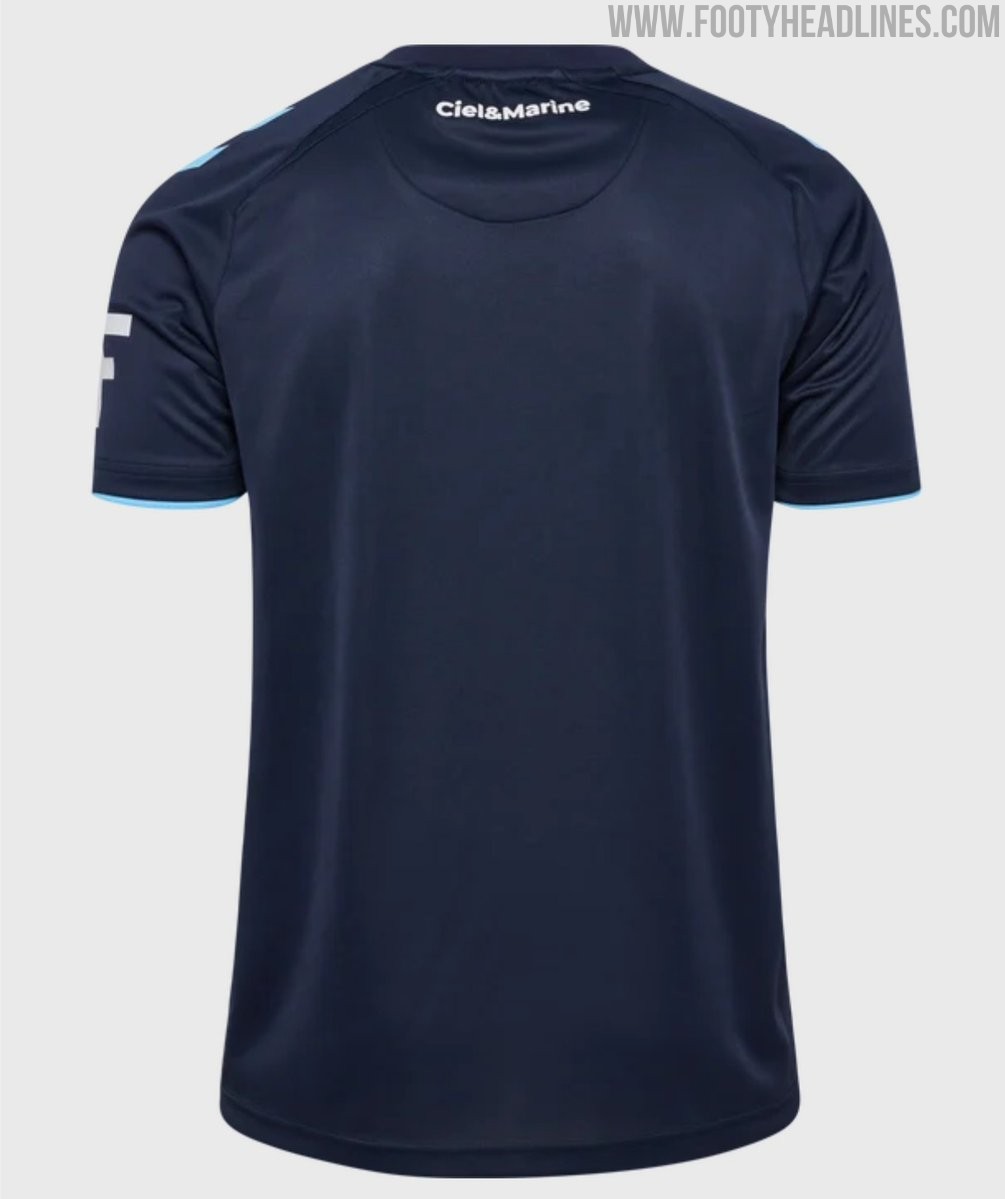
Le Havre 26-27 Home Kit Released
French club Le Havre AC have officially released their new 26-27 home kit, produced by Hummel. Teased earlier in July under the slogan 'les histoires fusionnent', the new jersey introduces a gradient design that has sparked mixed early reactions from the fanbase. The Le Havre 26-27 home kit is available to purchase through the official club and Hummel stores.
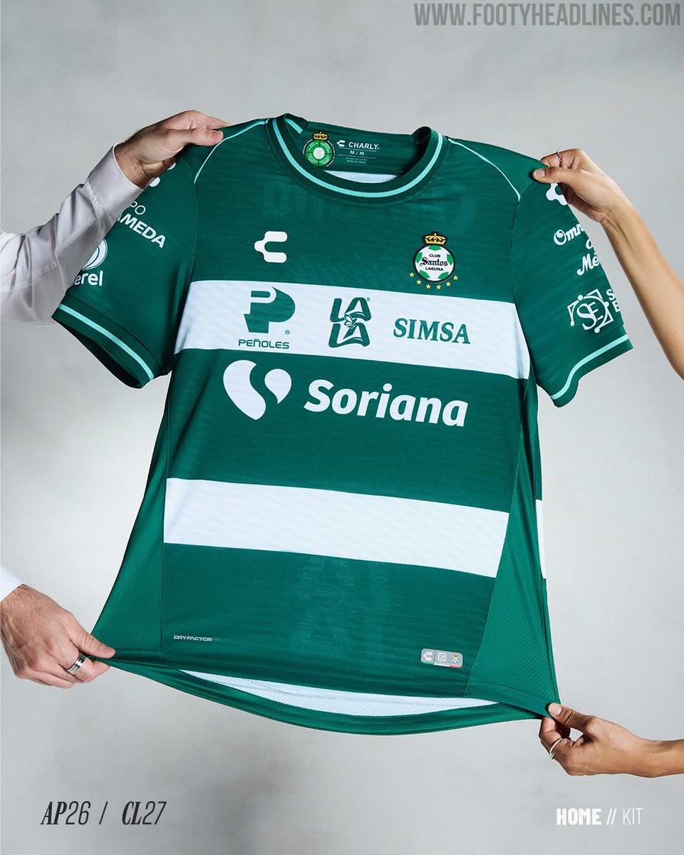
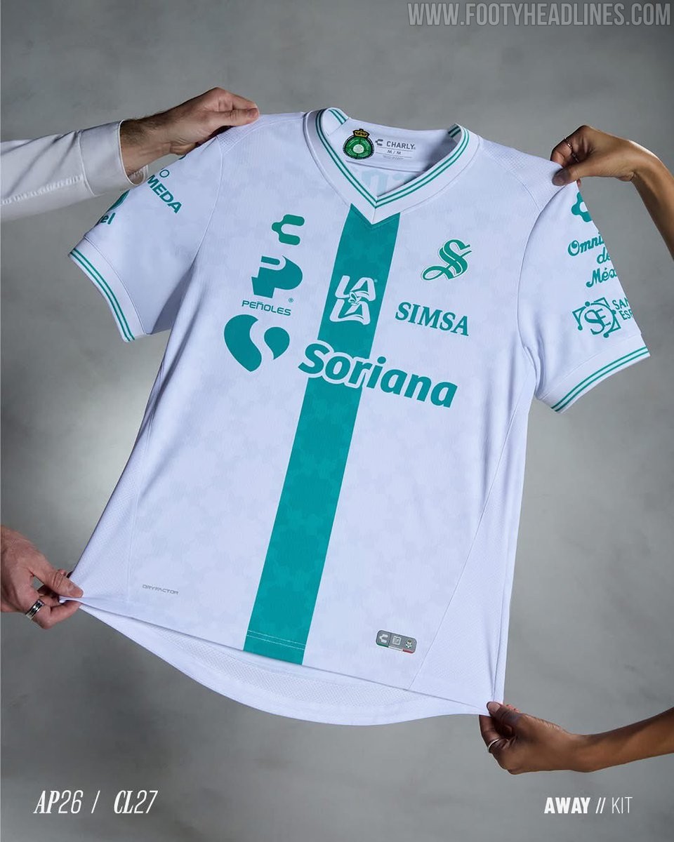
Santos Laguna 26-27 Home & Away Kits Released
Mexican brand Charly has officially released the new Santos Laguna 26-27 home and away kits for the upcoming Liga MX Apertura 2026 season.