Updated Spartak Moscow Logo Unveiled
 Feb 21, 2022, by Pat

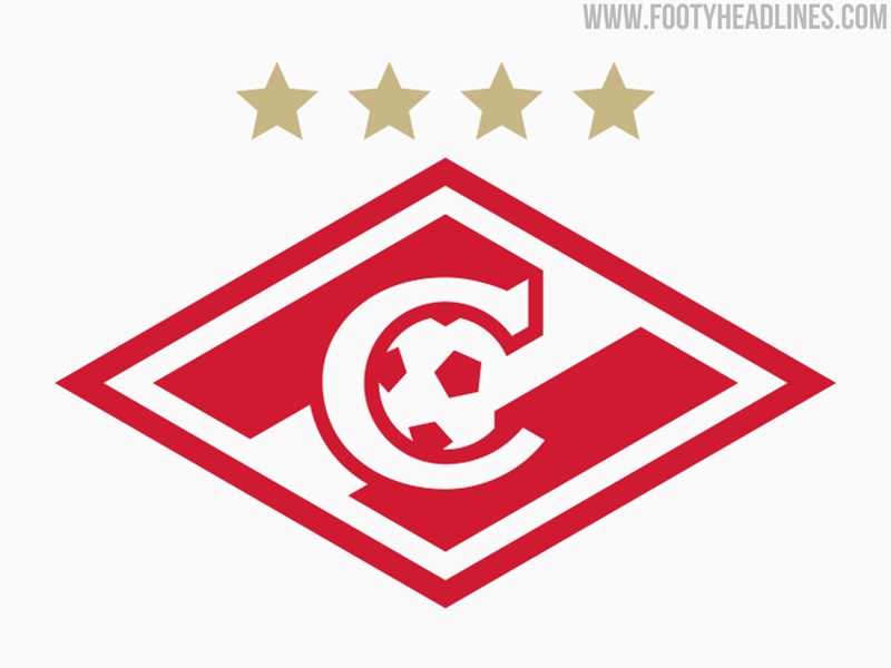
Spartak Moscow have updated their logo, introducing a number of small changes to the previous design.

The logo is part of a wider visual identity that also includes a custom font.
𝐄𝐯𝐞𝐫𝐲𝐨𝐧𝐞 𝐢𝐬 𝐢𝐦𝐩𝐨𝐫𝐭𝐚𝐧𝐭 𝐡𝐞𝐫𝐞 🔴⚪️
— FC Spartak Moscow (@fcsm_eng) February 21, 2022
Presenting our updated logo: pic.twitter.com/RYgTuYxUFH
Spartak Moscow 2022 Logo
This picture shows the new Spartak logo compared to the previous design.
The new Spartak Moscow logo keeps all key elements of the previous style, such as the red and white diagonal or the 'C' in the center.

As announced by the club and confirming our leak, Spartak will have a special 100th anniversary badge for next season, based on the new logo. The new logo itself will only debut on the Spartak Moscow kits in the 2023-24 season.
Here's what Rustam Makhmutov , Spartak Commercial Director had to say about the logo: The club welcomes its anniversary year with the same ambition to be a leader on the football field and in everything that surrounds our beloved team. Following modern trends, the club has updated the logo, rethinking all its elements, and created a unique font of its own."

Andrey Gorbunov , author of the project and art director of the sports design studio Quberten: "The rhombus appeared in the '30s and has remained the same since then, unless the strip changed its direction after the war. Based on archival photographs, we reconstructed the appearance of the logo for each Spartak year and for the first time saw in detail its evolution, the entire history of changes in the plasticity of the sign. The red diamond is truly sacred: concise and clear, it is one of the best sports symbols in our history."
What do you think about the updated Spartak Moscow logo? Comment below.


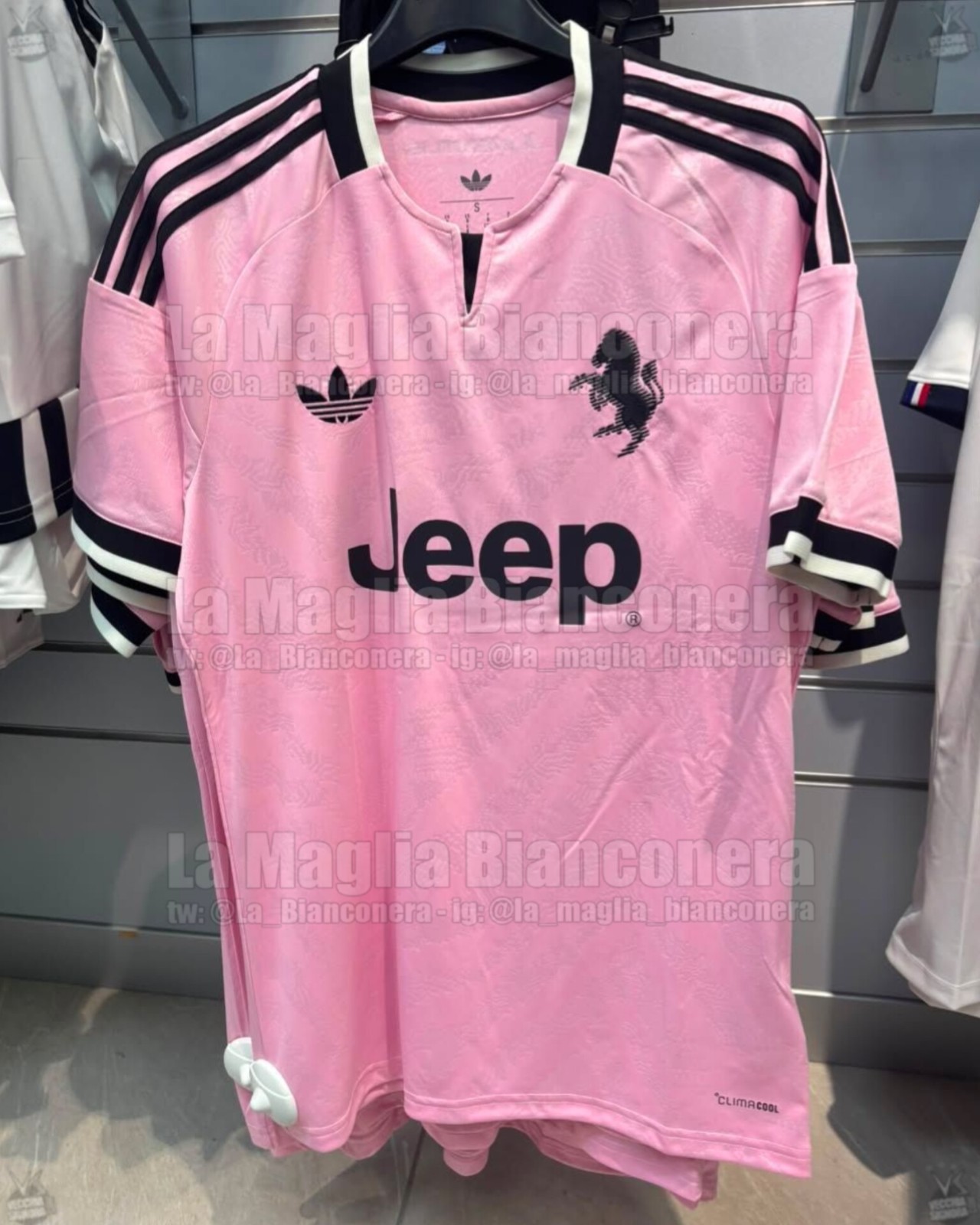
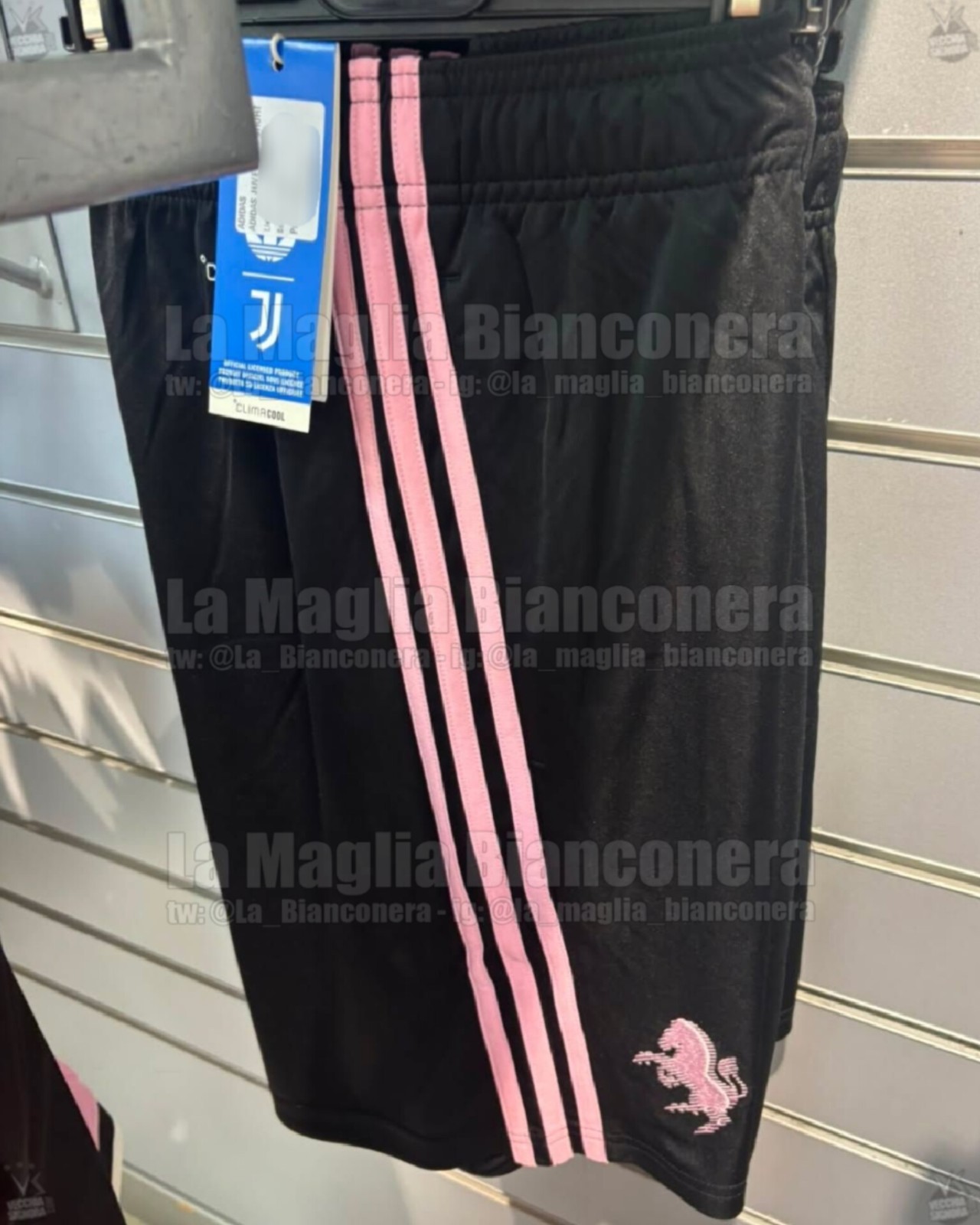
Juventus 26-27 Away Kit - Spotted for Sale Again
The Juventus 2026-27 away kit & the shorts have once again been spotted on sale at a retail store. Its official release is expected soon. Thanks to @La_Bianconera for the photos.
The kit includes speckled embossed details on the front, which are most likely drawn from zebra-inspired motifs.

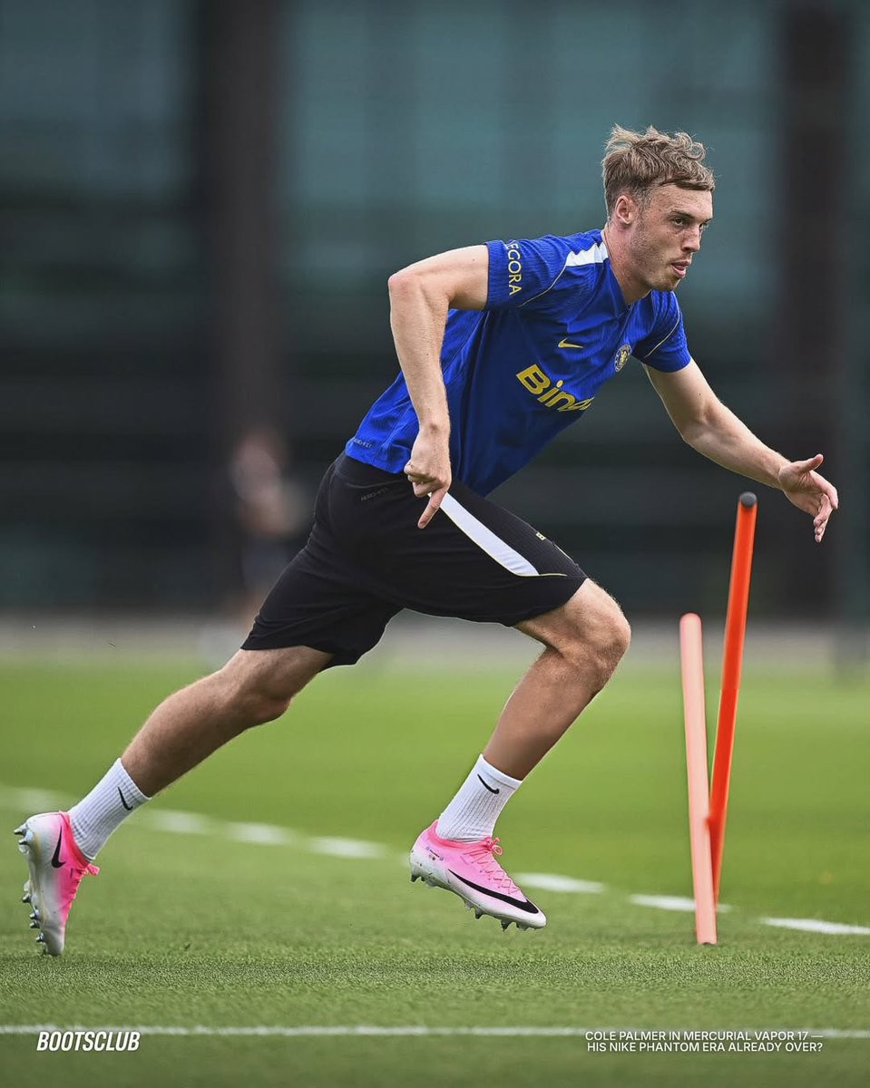
No More Phantom 6: Cole Palmer Back to the Mercurial Vapor 17 Boots?
Chelsea star Cole Palmer has been spotted wearing the new Nike Mercurial Vapor 17 boots during the club's 26-27 preseason training. This marks a surprising shift, as Nike has prominently positioned the attacking midfielder as a leading face of the Phantom boot line. Images from the training session show him testing the latest generation of the Mercurial Vapor, raising questions about a potential change in his footwear preference ahead of the new season. Thanks to Bootsclub.
Palmer previously favored the Mercurial line earlier in his career before becoming one of the main athletes for the Phantom series. It remains to be seen whether this is just a temporary test of the new Nike Mercurial Vapor 17 or a permanent return to his former boot of choice. As Chelsea continues their preparations for the 26-27 campaign, we will keep a close eye on Palmer's boots in upcoming preseason matches.
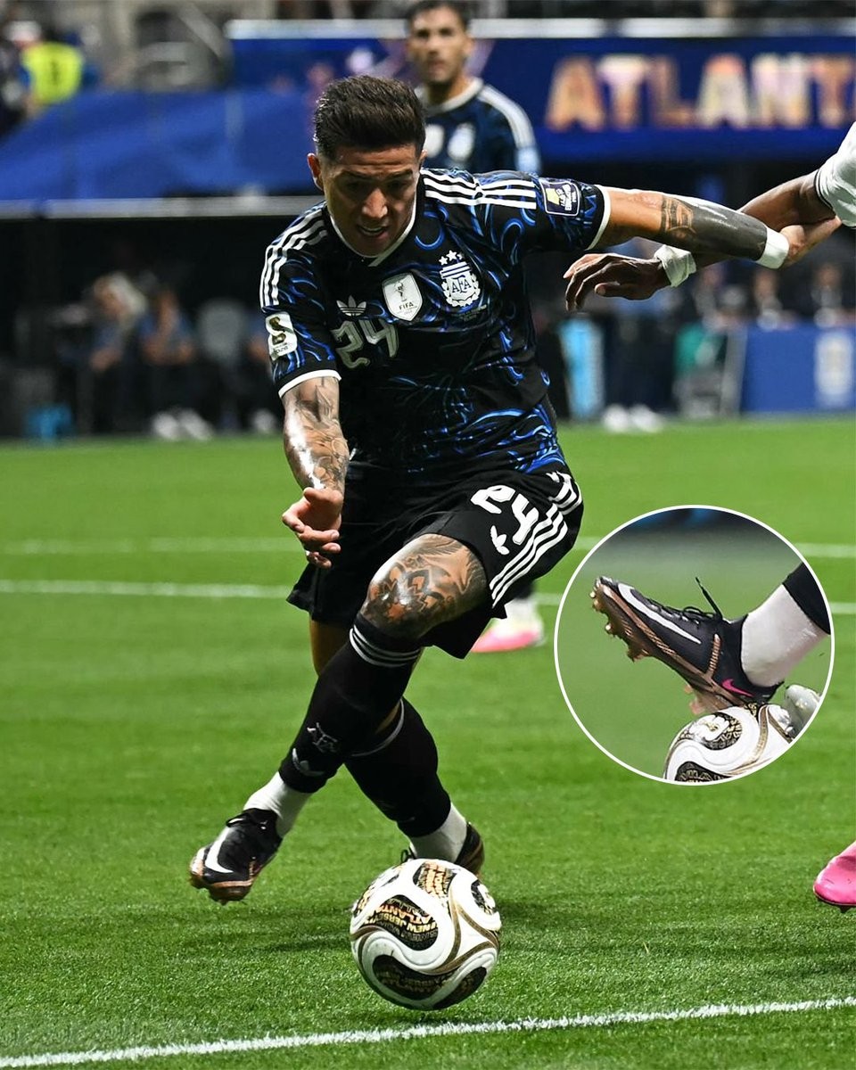

Enzo Fernandez Brings Back 2022 World Cup Nike Phantom GT2 Boots
During the recent match against England on July 15, Enzo Fernandez caught the attention of boot spotters by wearing a familiar pair of cleats. Instead of opting for the latest Nike releases, the Argentine midfielder laced up in the Nike Phantom GT2 boots, specifically the exact colorway he wore during the final stages of the 2022 World Cup in Qatar. Big thanks to @marcadegol.
This is not an isolated incident, as Fernandez was also spotted wearing the same Qatar-era boots earlier in the month on July 7. Returning to a boot model that is nearly four years old suggests that he may be looking for the same feel and comfort that accompanied his breakout performance and ultimate victory on the global stage, with some fans dubbing them his lucky boots. The Nike Phantom GT2 was officially succeeded by the Phantom GX and subsequently the Phantom GX 2 and Luna 2 lines.
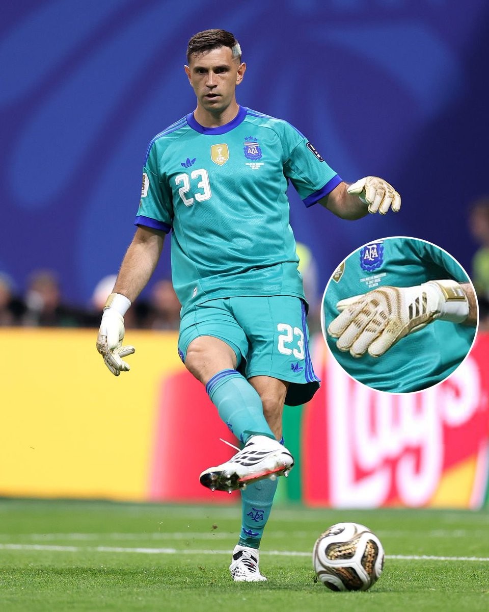
Emiliano Martinez Debuts Custom Golden Adidas Predator Yashin Trophy Gloves
Argentina goalkeeper Emiliano Martinez debuted a unique pair of custom golden Adidas Predator goalkeeper gloves during a recent match against England. The bespoke design was created exclusively for the shot-stopper by Adidas to commemorate a major individual milestone. Big thanks to @marcadegol.
The special edition gloves were presented to Martinez following his second consecutive Yashin Trophy win, honoring his standing as the best goalkeeper in world football. The design features a prominent metallic gold colorway across the backhand and punch zone, serving as a direct visual tribute to the prestigious award.
While the gloves sport this exclusive golden aesthetic, they utilize the standard technology and specifications of the current Adidas Predator goalkeeper line. These celebratory gloves appear to be a player-exclusive creation tailored specifically for Martinez, with no indications of a wider retail release from the Three Stripes.
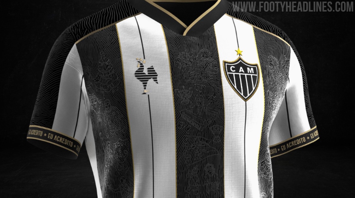
Nike Atlético Mineiro 2026 'Manto da Massa' Kit Confirmed
Atlético Mineiro's highly successful 'Manto da Massa' kit project is set to return in 2026, produced for the first time by their new technical sponsor, Nike.
The club's Director of Business officially revealed the revival of the initiative, though the announcement has sparked backlash among supporters. Fans are criticizing the modified format, which reportedly shifts away from the traditional open fan design and voting process, opting instead for Nike to produce the kit with only select fan involvement.
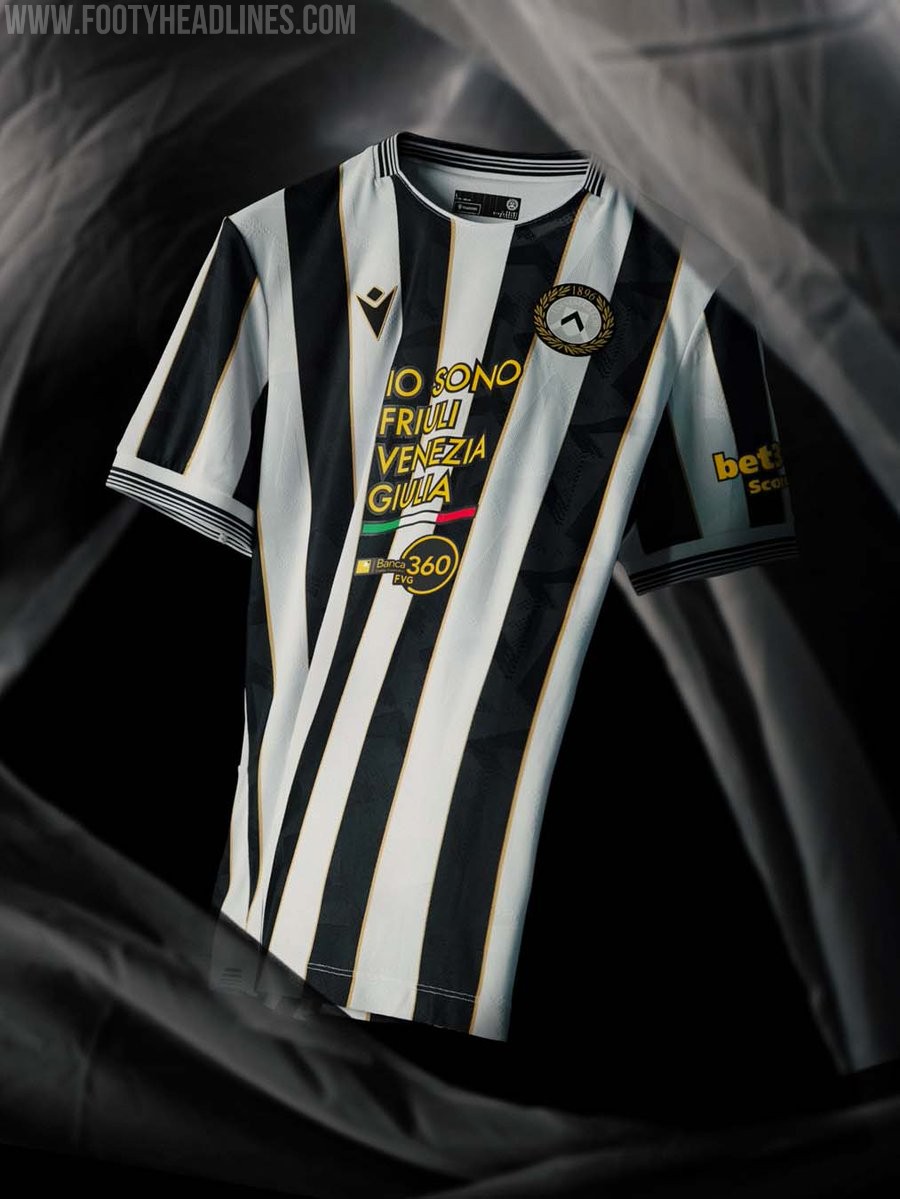
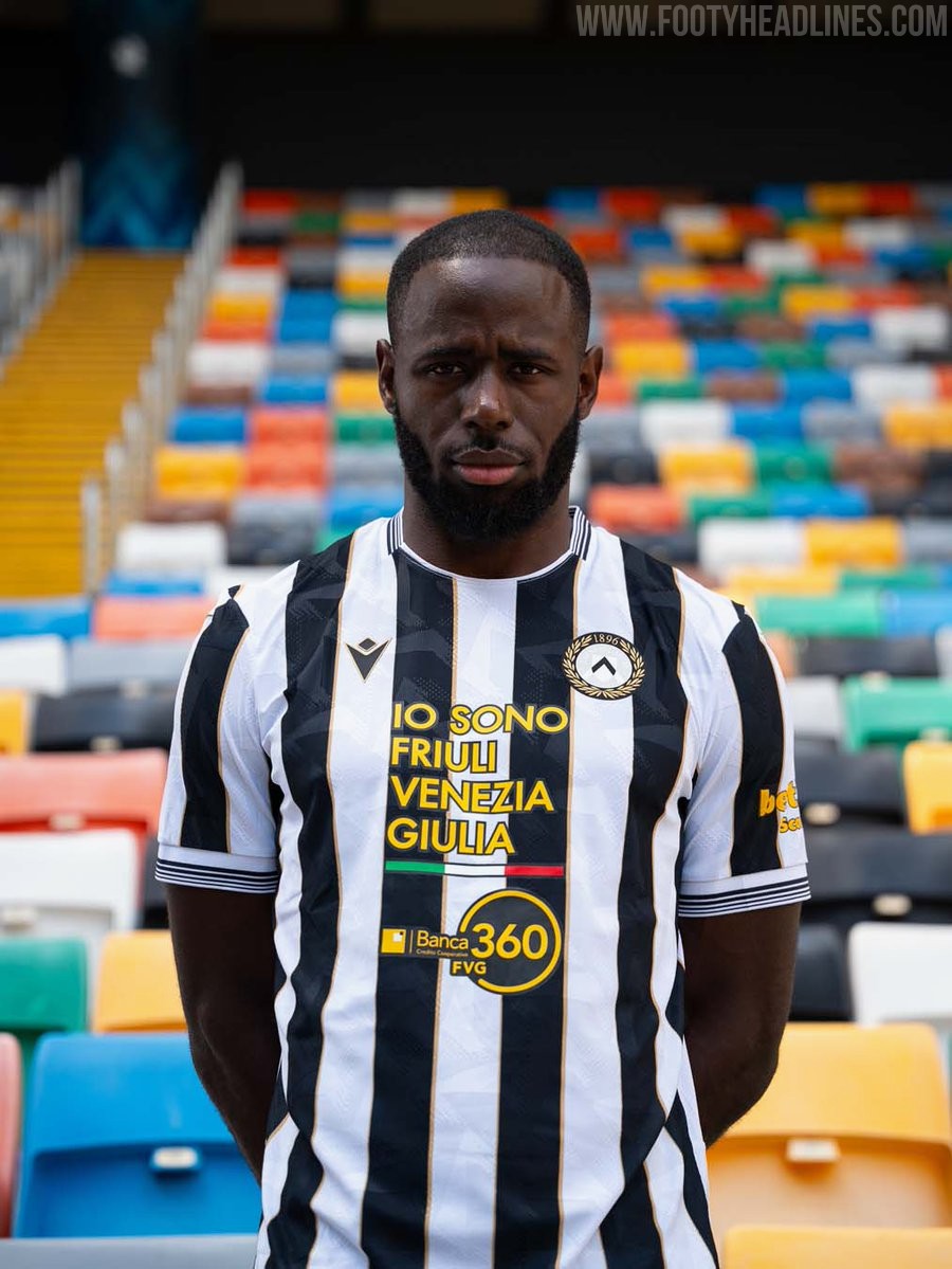
Udinese 26-27 Home Kit Released
The new Udinese 26-27 home kit was officially released today by Macron. Celebrating the club's upcoming 130th anniversary, the design brings a classic rendition of the traditional white and black stripes, elevated by golden trim.
A special detail is featured on the back of the Udinese 26-27 home shirt. The 'aquila patriarcale' (patriarchal eagle), a historical symbol of the Friuli region, is placed on the upper back, adding a strong localized touch to the classic aesthetic of the jersey.
The Macron Udinese 26-27 home kit is available to purchase through the club's and brand's official channels.
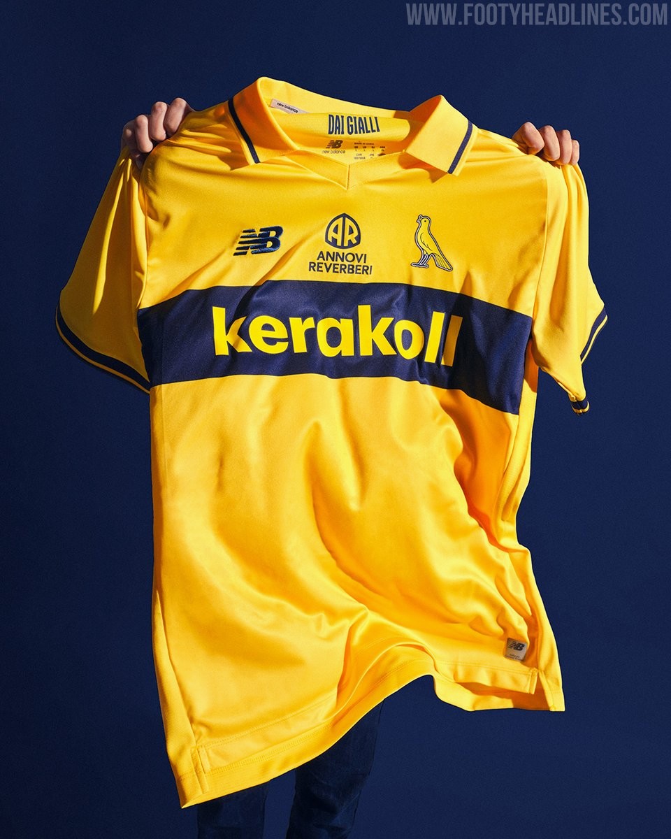
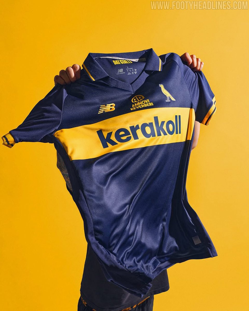
Modena 26-27 Home, Away & Third Kits Released
Modena FC and New Balance have officially unveiled the club's new home, away, and third kits for the 26-27 season. Released under the motto "Una città. Due colori. Tre maglie. Un'unica grande passione" (One city. Two colors. Three shirts. One great passion), the collection blends tradition with a contemporary design to celebrate the club's rich identity.
The New Balance Modena 26-27 home kit features the club's unmistakable yellow base, highlighted by a horizontal blue chest band that pays tribute to their iconic shirts from the early 1980s. The away kit flips the script, utilizing a dominant blue base accented by striking yellow inserts. Rounding out the collection, the third kit offers a refined aesthetic in white, featuring its own blue band to complete the set.
The New Balance Modena 26-27 home, away, and third kits are available at the club's physical store starting July 15, with online sales set to launch on July 16.
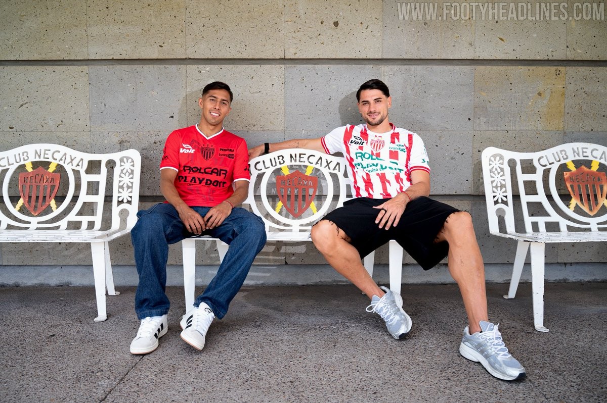
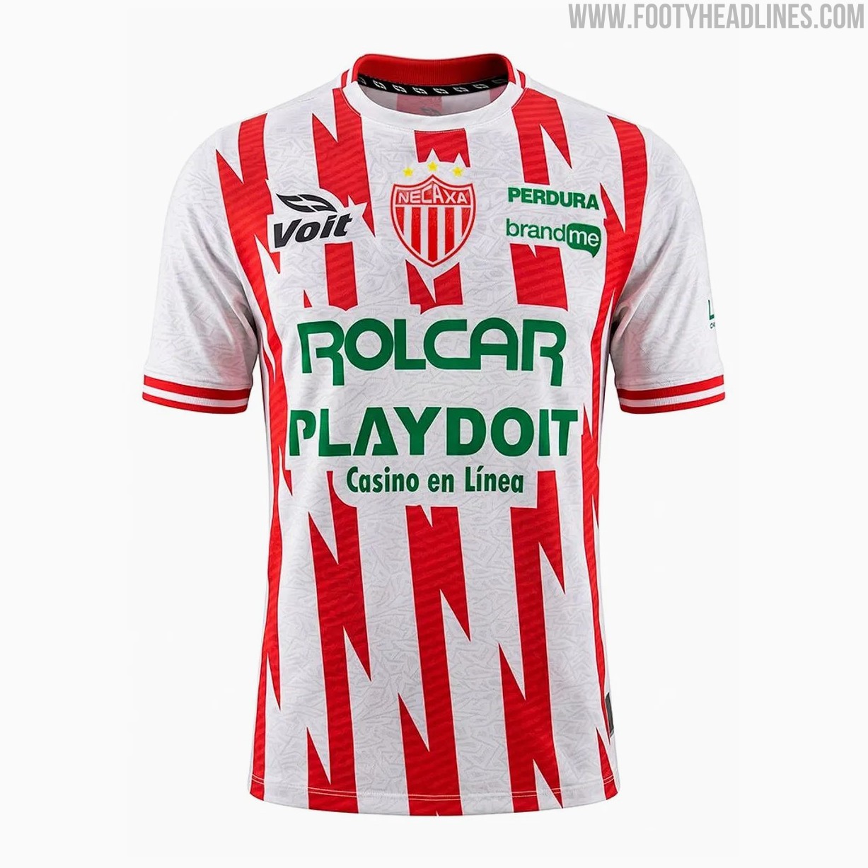
Club Necaxa 26-27 Home & Away Kits Released
Mexican Liga MX side Club Necaxa have officially unveiled their new 26-27 home and away kits made by Voit.
The new shirts feature striking designs that honor the club's nickname, "Los Rayos" (The Lightnings), with the home kit retaining the traditional red and white colors but reimagining the classic stripes as dynamic lightning bolts down the front. The away jersey follows a similar theme, showcasing a bold red base with black details and a corresponding lightning pattern.
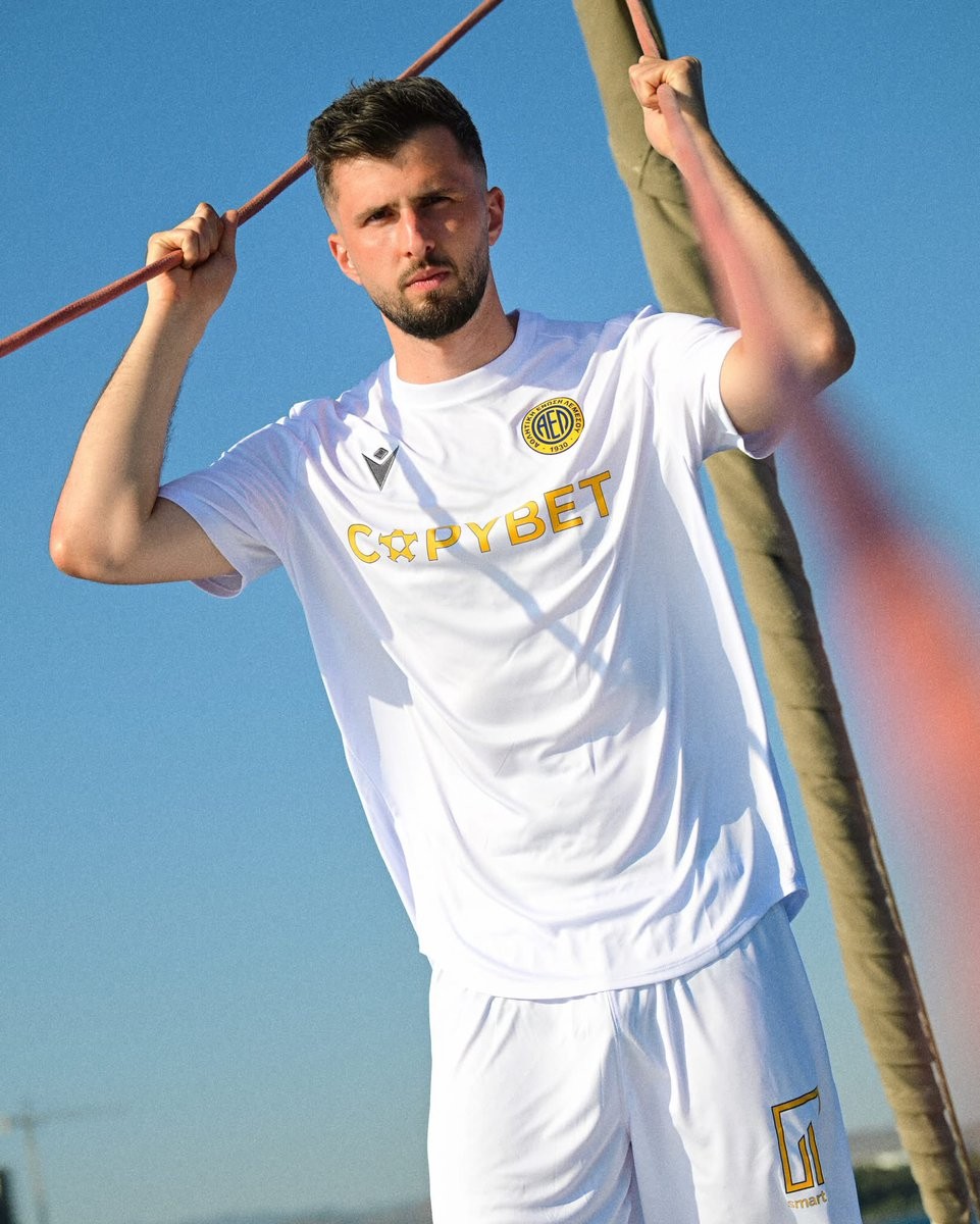
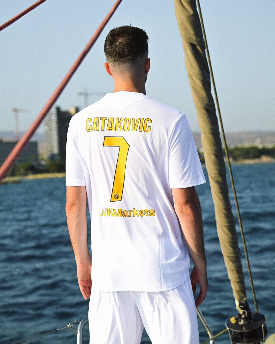
AEL Limassol 26-27 Away Kit Revealed
Cypriot First Division club AEL Limassol has officially revealed its new away kit for the 26-27 season. Manufactured by Italian sportswear brand Macron, the AEL Limassol 26-27 away kit could not be more basic.