FC Annecy Reveal New Logo

We have news from France as Ligue 2 side, FC Annecy, have recently revealed their new club crest.

New FC Annecy Logo
FC Annecy's new crest sees a complete redesign of the old logo. A red hexagonal shape is now used in place of the circle with the red and white stripes down away with.
The old stylized 'FC' has also been changed and now incorporates an 'A' as well. 'Annecy' is written above these three letters, meaning the founding year, 1927, now occupies a place near the bottom of the crest.

A white outline that is interrupted by the year surrounds all the elements with a small version of Annecy's flag completing the look.

Oddly enough, this logo change goes against the current trend. Various different shapes are often redesigned to fit a circular shape and become a roundel.
What do you think of Annecy's new logo? Comment below.


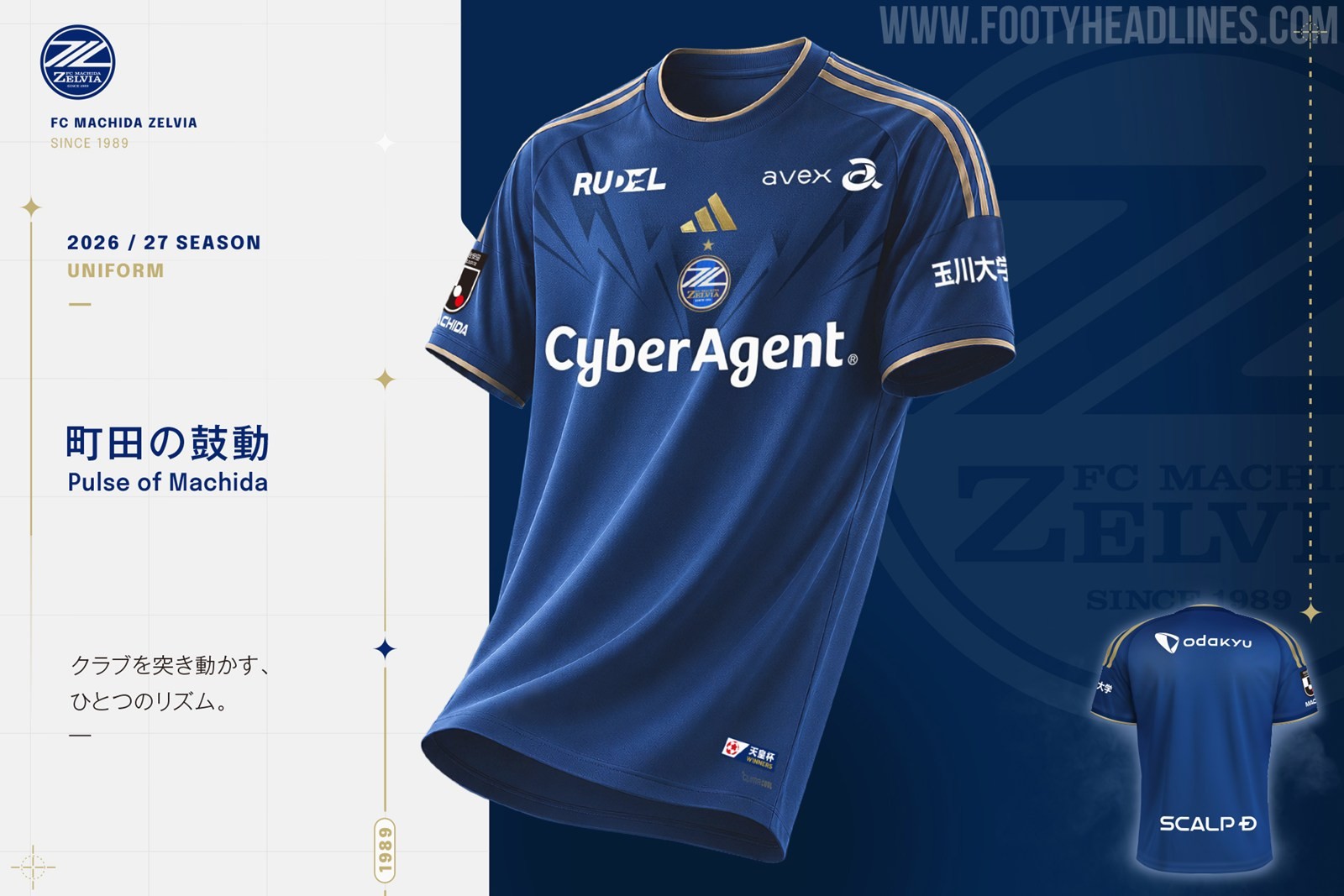
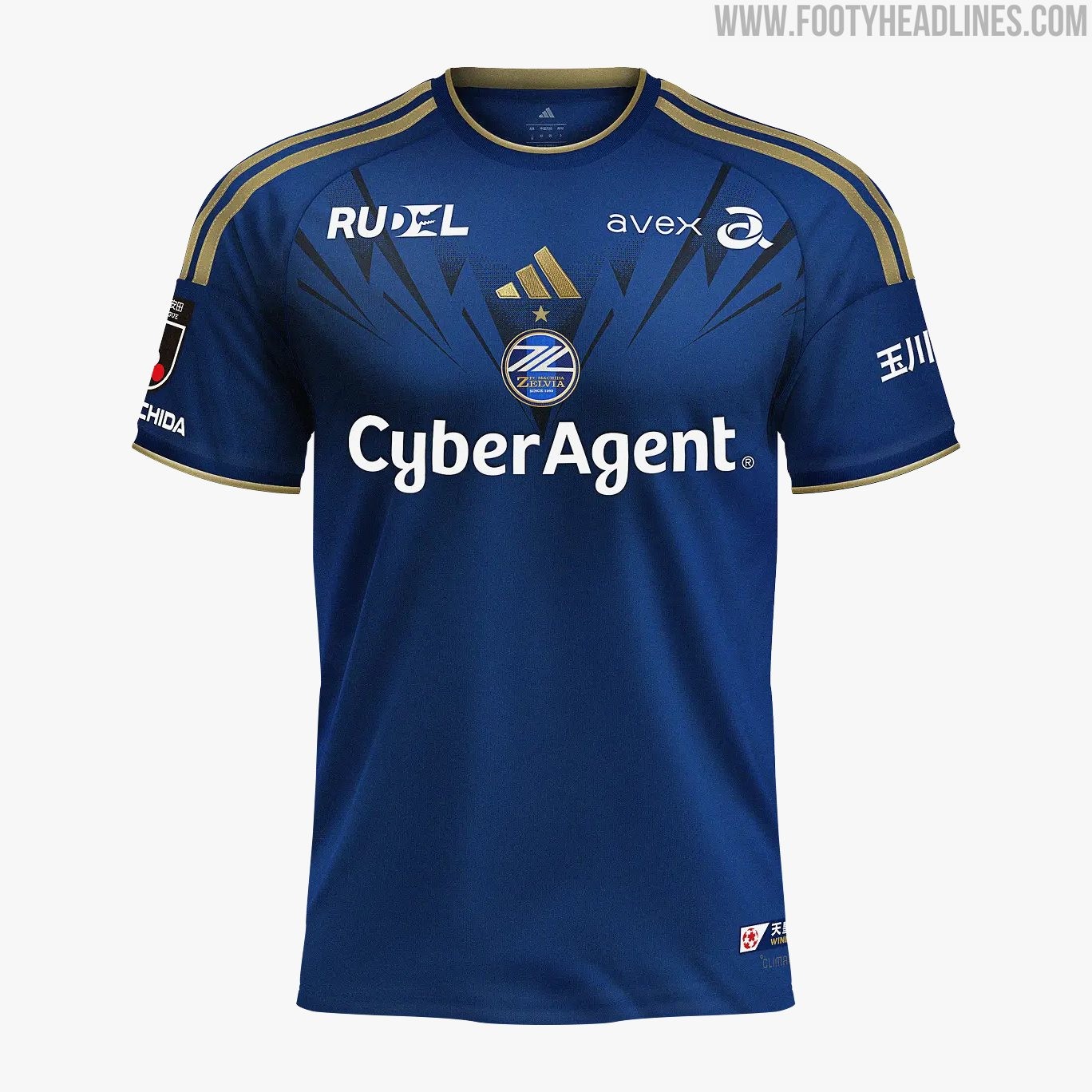
FC Machida Zelvia 26-27 Home Kit Released
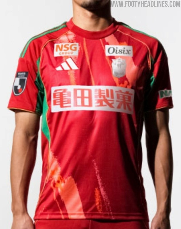
Japanese J1 League side FC Machida Zelvia has officially released its new home kit for the 2026-2027 season.
The Adidas FC Machida Zelvia 26-27 home shirt is anchored by the club's traditional deep blue base color, which is elevated by a striking, sharp geometric graphic across the upper chest. This graphic is not bespoke but a new streamlined graphic by Adidas, also used by the Faroes Islands.
To provide a premium contrast, metallic gold is heavily utilized for the classic Three Stripes on the shoulders, the collar and cuff trim, and the Adidas logo itself. The primary "CyberAgent" sponsor, along with secondary collarbone partners, are applied in white.
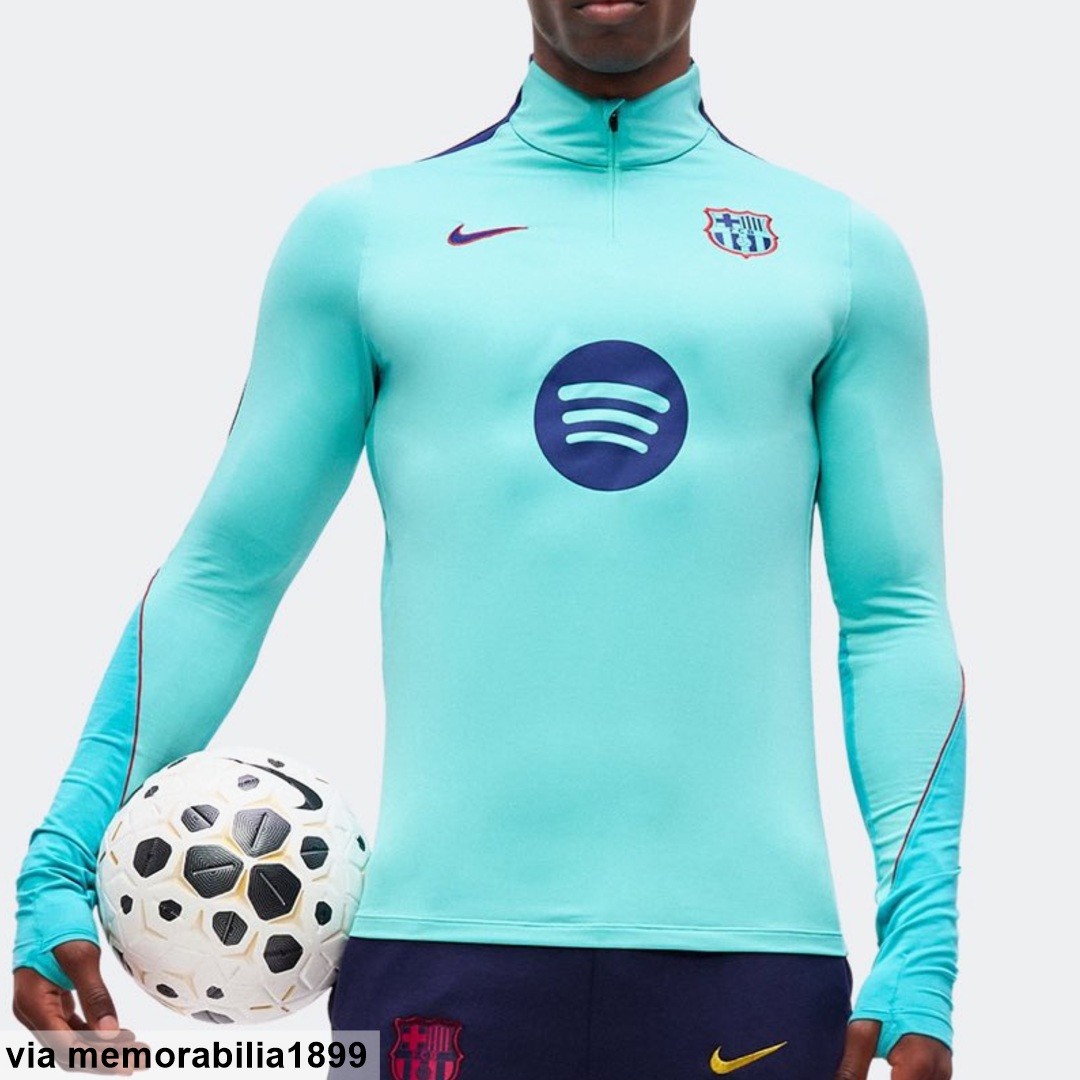
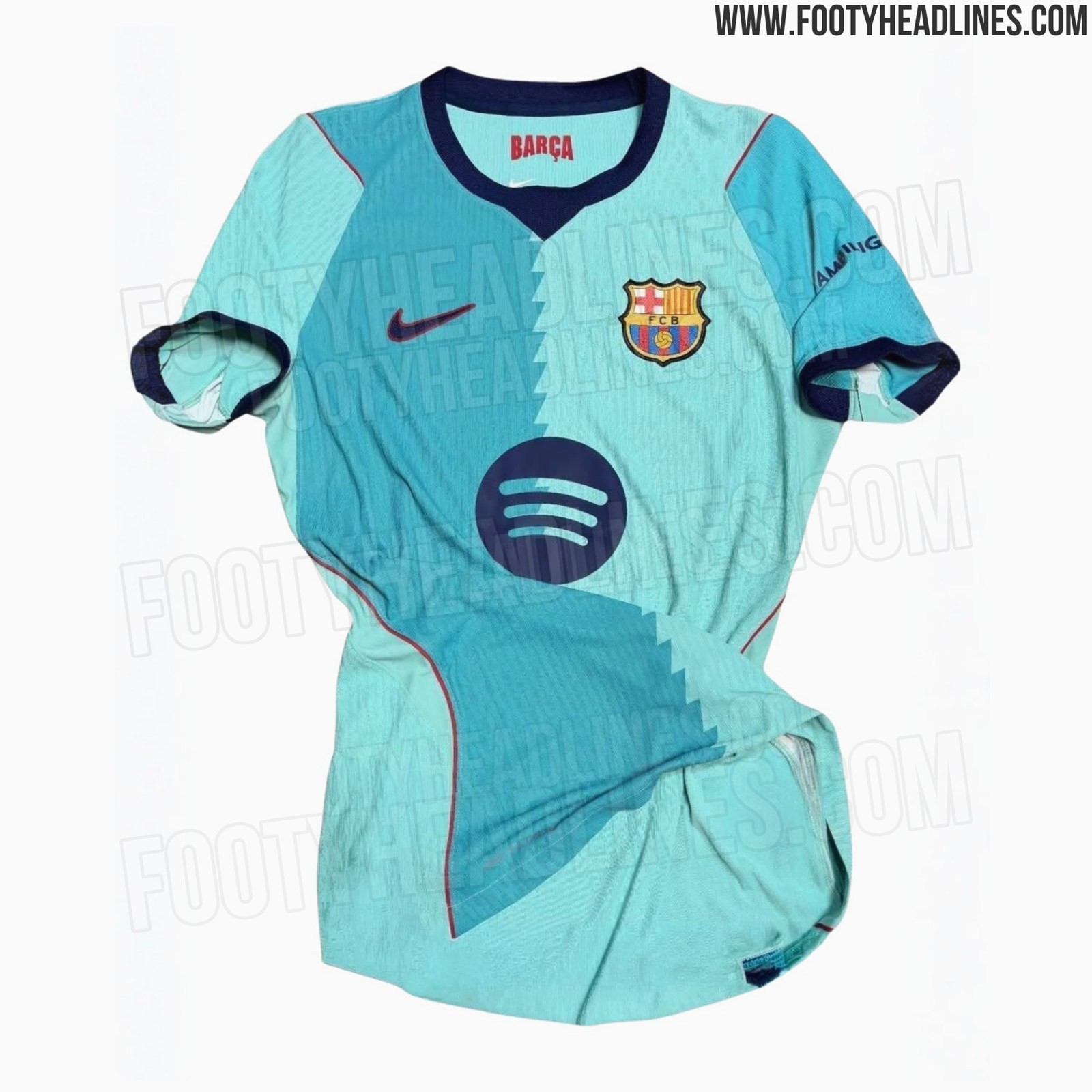
Barcelona 26-27 Third Training Leaked
Barcelona shirt insider @memorabilia1899 gives us a a look at the Barça Third Elite Drill Top 26-27, matching the 26-27 third kit colors.

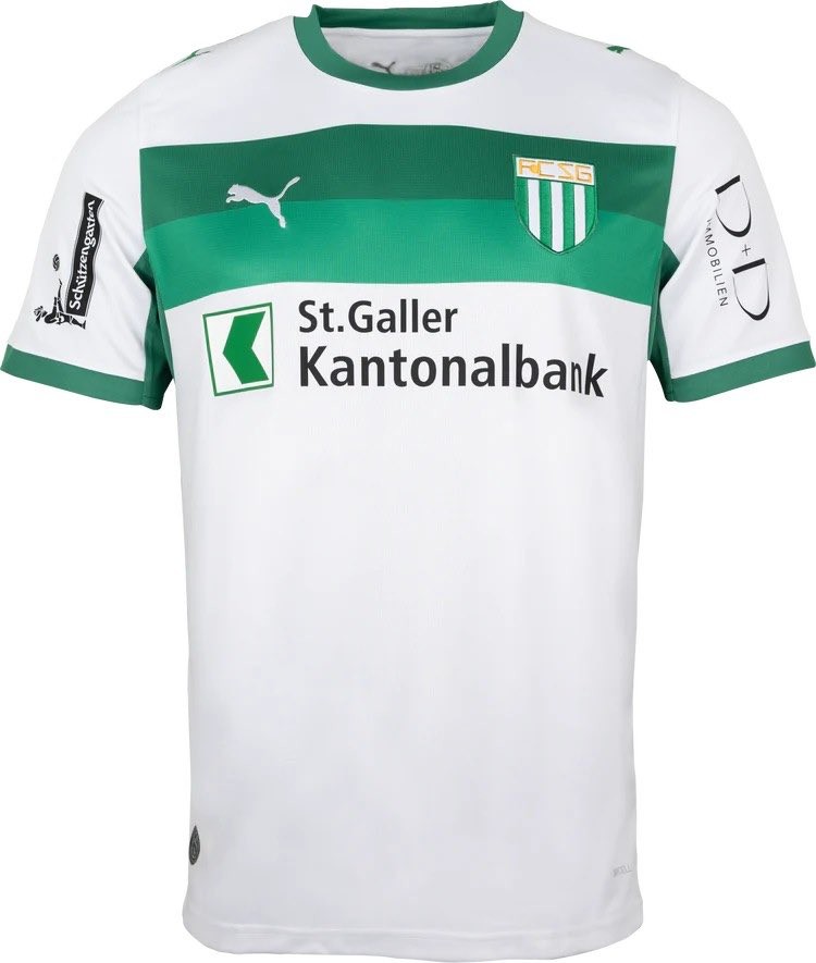
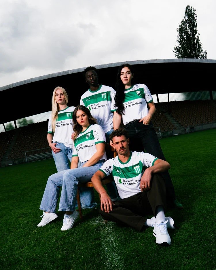
St. Gallen 2026-27 Third Kit Released
St. Gallen has released the new 26-27 third kit, made by Puma.
The Puma FC St. Gallen 2026-27 third jersey features a predominantly white base, highlighted by two distinct chest stripes in different shades of green. This crisp color combination stays true to the club's traditional identity while offering a unique variation for their change kit. The Puma logo and club crest are prominently displayed on the chest, completing the sleek look of the shirt.
