The Most Subtle Change Yet? Crystal Palace Update Club Crest

Crystal Palace today unveiled their updated crest, with only one detail changing from the previous version. The foundation year of 1905 has been replaced by 1861, following extensive research by the club's historian.

Crystal Palace Update Crest - 1861 Instead of 1905
The updated logo is identical to the previous version in every sense apart from the year that is shown at the centre. The year 1905 was when the professional football club was formed, but the original Crystal Palace Cricket Club was founded almost 50 years prior to this in 1857. Club historian, Peter Manning, traced the history of the early days of the cricket club and found that some of its members founded an amateur football team in 1861. According to the club:

"a direct lineage has been established between the amateur team and the professional club set up by the Crystal Palace Company in the early 20th century, making it the oldest league club in existence still playing professional football."
The overall aesthetic design of the badge remains the same as it has been since the 2013 redesign, with the change only noticeable from very close range. It is a rare case of a club going back even further into their history when modifying their badge, rather than trying to modernise it or even get ahead of the times with a new crest. The updated badge will feature on the club's shirts from the 22-23 season.

Simplified, classic and "shield" versions of the updated crest

What do you think of this update from Crystal Palace? Let us know in the comments.
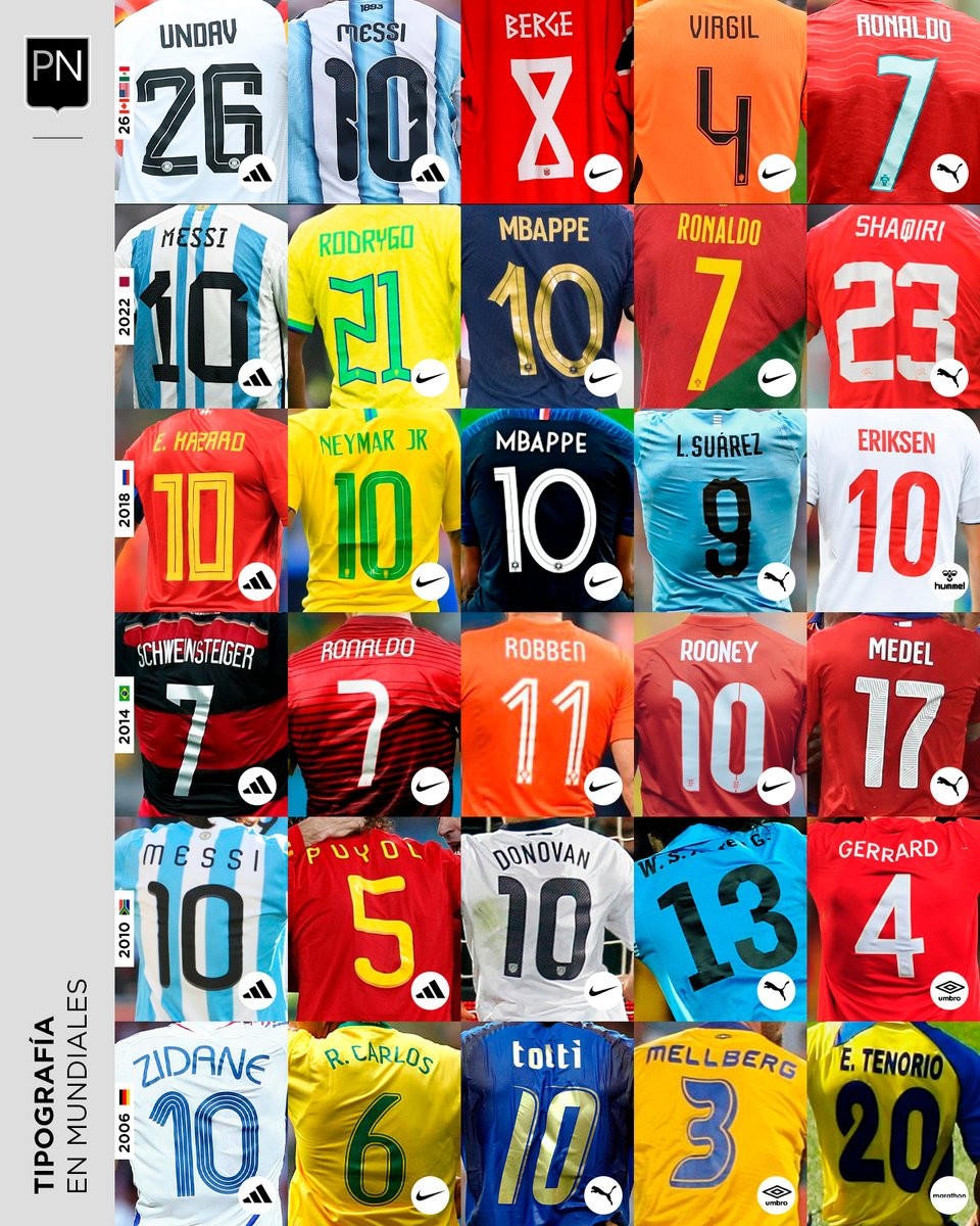
A Look Back at World Cup Shirt Number Typography
Football kit design account @PaladarNegroWeb has shared an interesting retrospective on the typography used for shirt numbers in recent World Cups. The visual language of football kits is often defined by these details, with fonts becoming instantly recognizable symbols of specific tournaments and eras.
The collage highlights various iconic typefaces worn by national teams on the biggest stage. spanning from the 2006 World Cup to the FIFA World Cup.
This overview is part of an ongoing series by the account exploring the visual elements of football. It serves as a great reminder of how deeply typography impacts the overall aesthetic and legacy of a football shirt.


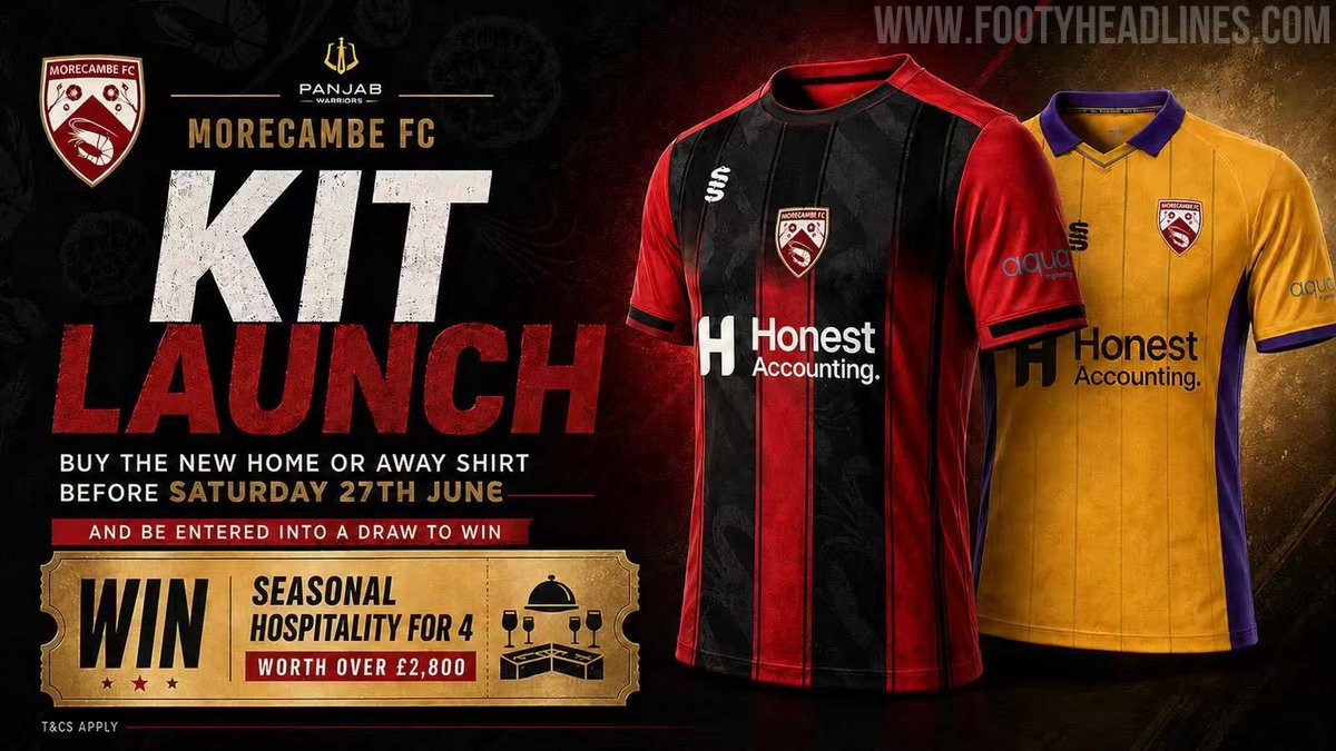
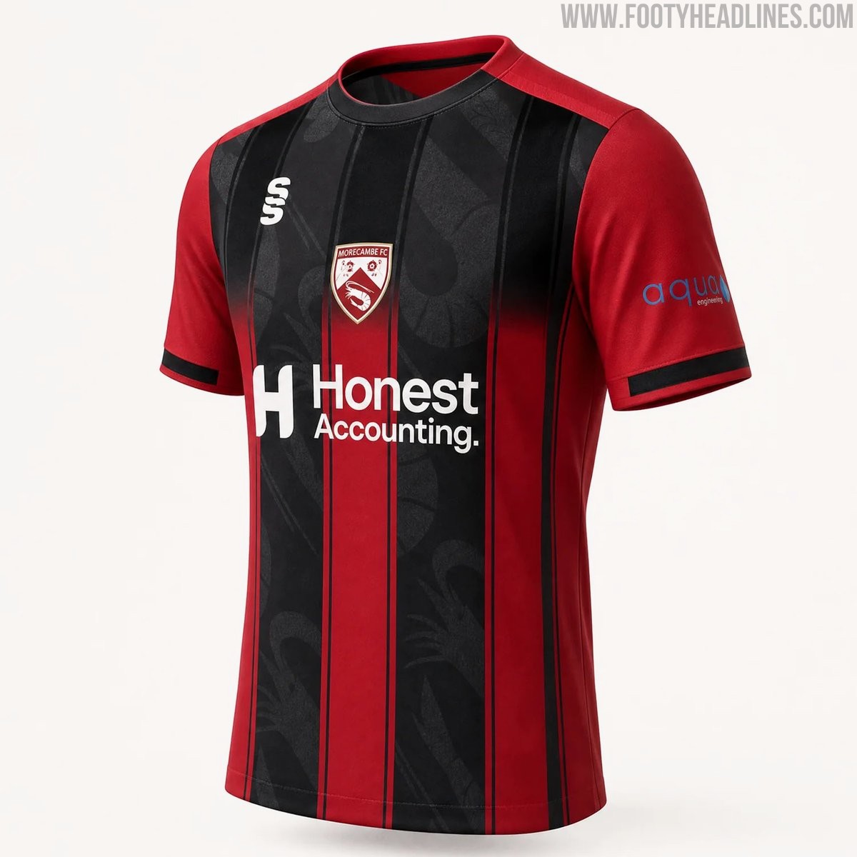
Morecambe 26-27 Home & Away Kits Released
Morecambe FC have officially launched their new 26-27 home and away kits, produced by Surridge Sports. The club received massive backlash for posting AI images for the launch, and later posted a clearer CAD of the home shirt.
The home shirt features the club's traditional red color palette with black detailing, while the away kit introduces a bold combination of purple and yellow. Both designs incorporate modern elements to provide a fresh look for the upcoming National League North campaign.
The new Surridge Sports Morecambe 2026-27 jerseys are currently available for pre-order through the club's official online store.


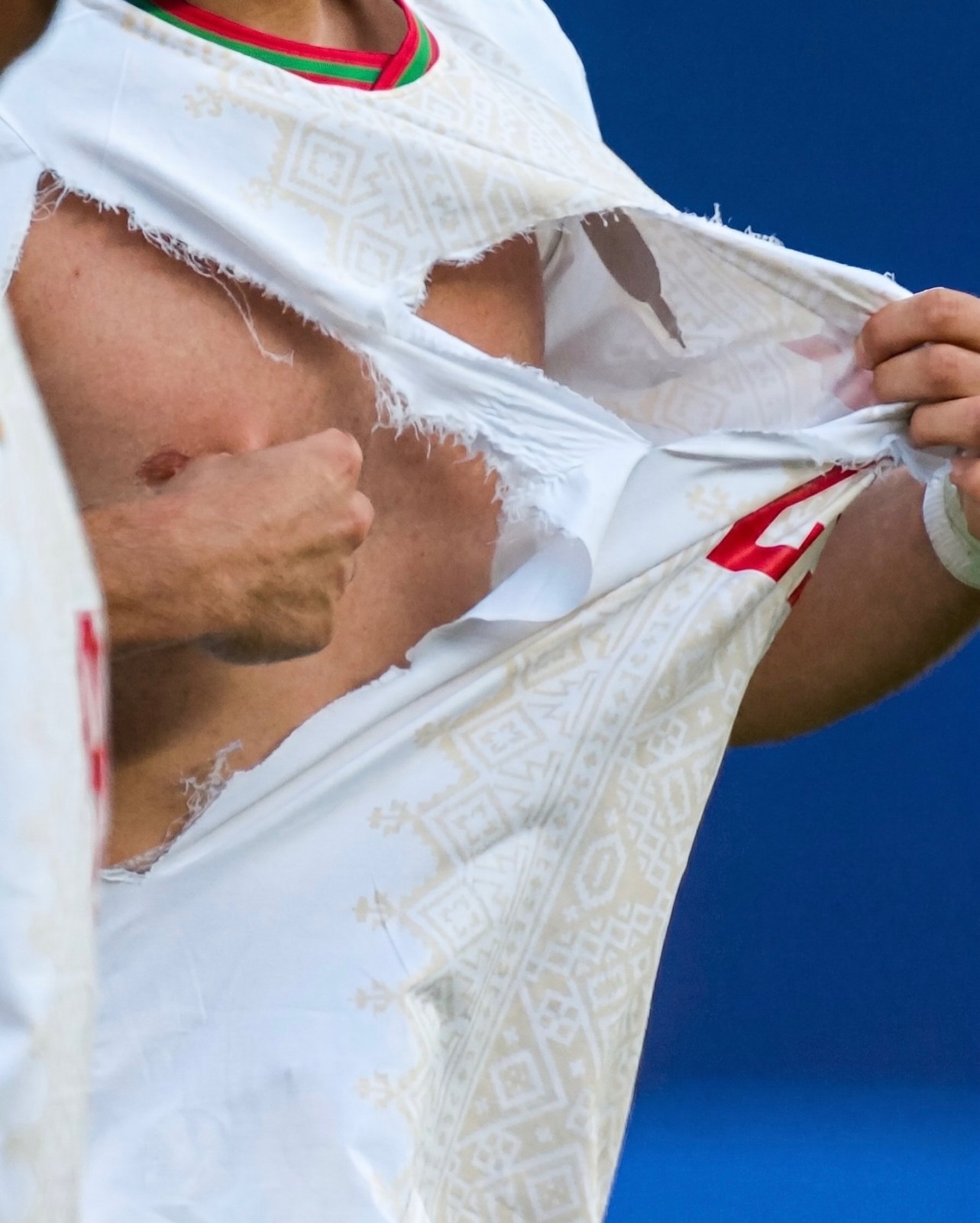
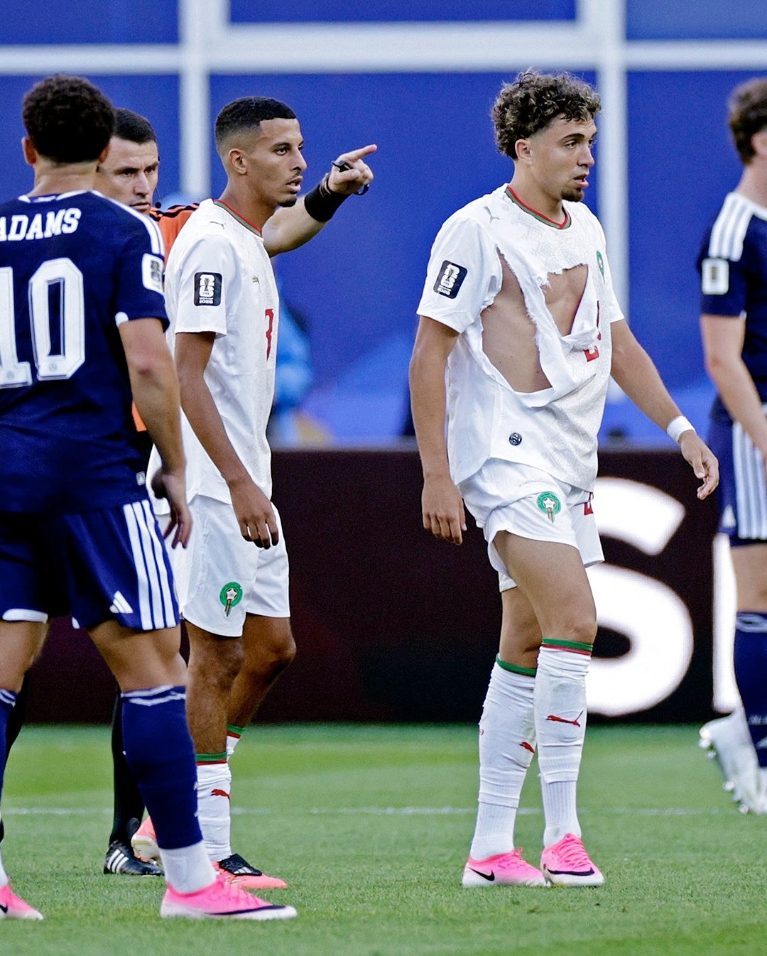
Puma Kits Keep Ripping at the 2026 World Cup
Puma is facing significant criticism at the 2026 World Cup as multiple national team jerseys have easily ripped during matches.
Incidents involving players from Czechia, Morocco, Egypt, and Paraguay have highlighted an ongoing durability issue with the brand's latest kits - every torn shirt in the tournament so far belongs to a Puma-sponsored team.
The Puma 2026 World Cup kits incorporate the latest version of PUMA's ULTRAWEAVE “Thermoadapt” technology, which obviously is not tear-resistant enough.
The recurring wardrobe malfunctions have resulted in terrible PR for the German sportswear manufacturer and even prompted the viral resurgence of Xherdan Shaqiri's infamous quote from Euro 2016, where he joked that he hopes Puma does not produce condoms.