Worst Rebranding Ever? - New Cercle Brugge Logo Revealed

In recent weeks, we have seen many new club crests be released for the coming 2022-23 season. Today, another club, this time from Belgium, revealed a revolutionary new look.
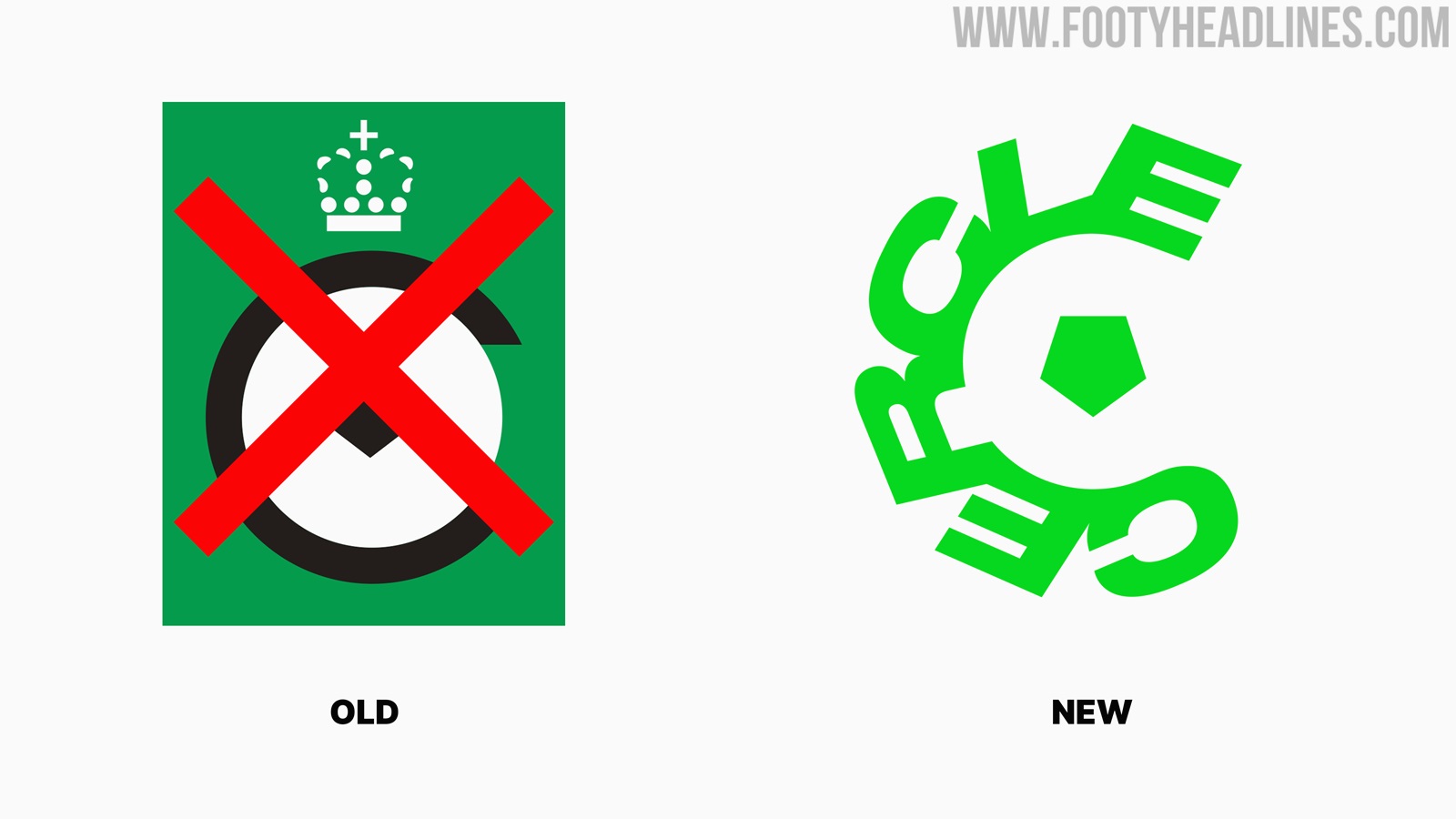
Cercle Brugge's New Crest
Designed by the Skinn Branding Agency from Bruges, a bold redesign of the old Cercle Brugge crest is attempted.
The first major change is the lack of a green background. The new Cercle logo can now be placed on different colored backgrounds, most likely black or white.

The crown on top of the old 'C' has also been done away with, however, the central pentagon shape remains intact. The simple 'C' that once surrounded it also remains, it is now formed by the word 'Cercle'.
Apart from the new shapes in the logo, the colors have also been altered. The entire logo now comes in a luminous shade of green, with the background often shown in black.

As was to be expected with such a drastic redesign, fans made their outrage known online. Rival club Beerschot even jokingly replied with a logo change of their own.
We got your back @cercleofficial pic.twitter.com/4sc2zKMGcB
— K. Beerschot V.A. (@kbeerschotva) June 23, 2022
Communication manager Louis-Philippe Depondt: “We wanted to honor our Bruges heritage, but above all show that we are no longer an underdog, but we do want to be assertive and eye-catching. Our name as well as our color are unique. Only Cercle plays in green and black and all other teams are clubs, but we are simply Cercle. We want to project that even more with our new logo.”

Club officials say they were aware of the fact that this rebrand would be met by a lot of criticism, but they nonetheless want to head into a new era with a new look.
What do you think of this complete redesign? Comment below.
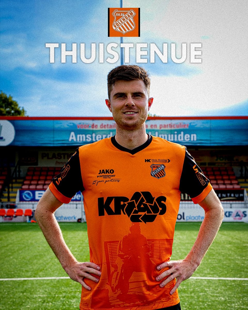
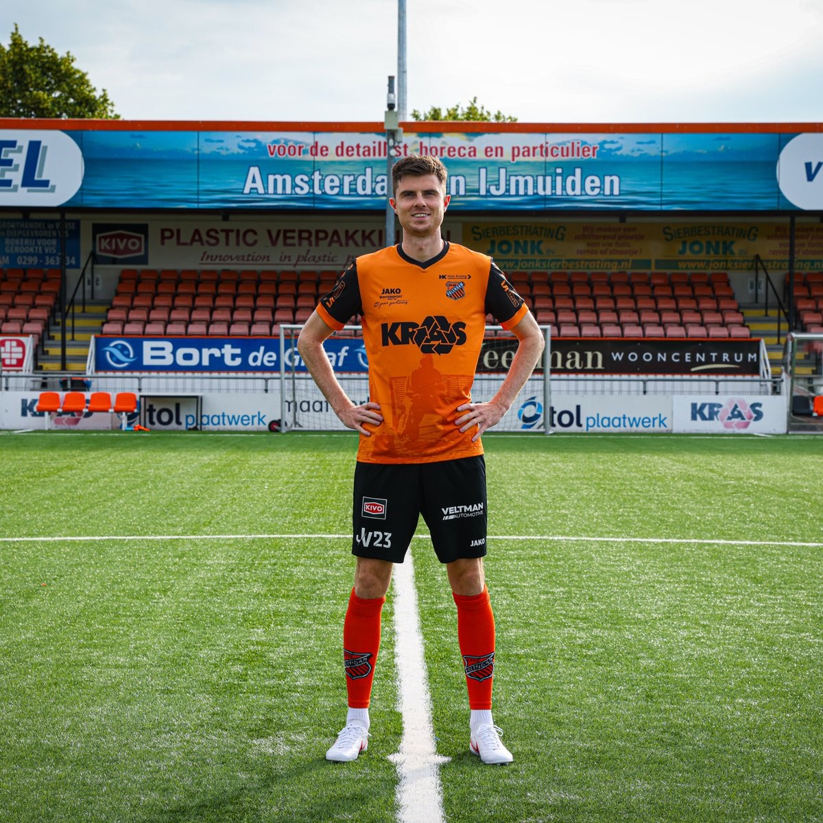
Volendam 26-27 Home Kit Released
Dutch Tweede Divisie team RKAV Volendam have revealed their new 2026-27 home kit. Made by Jako, the new RKAV Volendam 2026-27 home shirt features a traditional orange base with a special design paying tribute to "De Bap", a famous local statue of an old fisherman that overlooks the village's harbor. The new kit will be worn during the club's upcoming campaign and continues Jako's trend of heritage-inspired designs for the team.
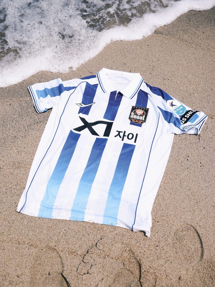
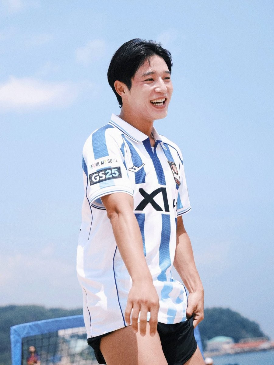
FC Seoul 2026 Summer Edition Kit Released
South Korean K League 1 club FC Seoul has officially released its new 2026 Summer Edition kit, produced by local sportswear brand Pro-Specs. Following up on the Seoul Blossom Special Kit launched earlier this year in March, the new Summer Edition jersey offers a fresh design for the warmer months of the 2026 season. The release continues the club's trend of introducing special seasonal uniforms to complement their standard home and away options.
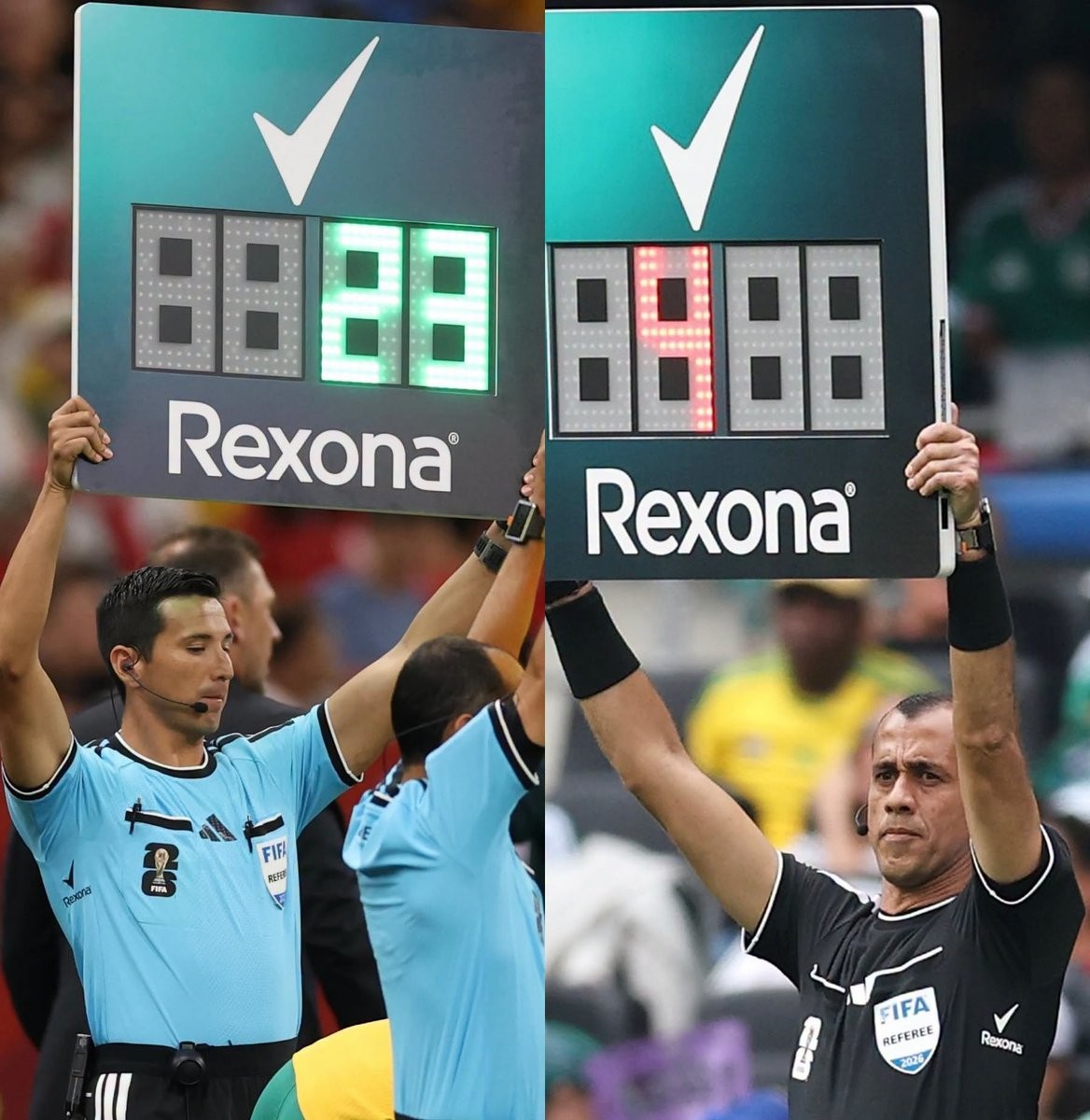
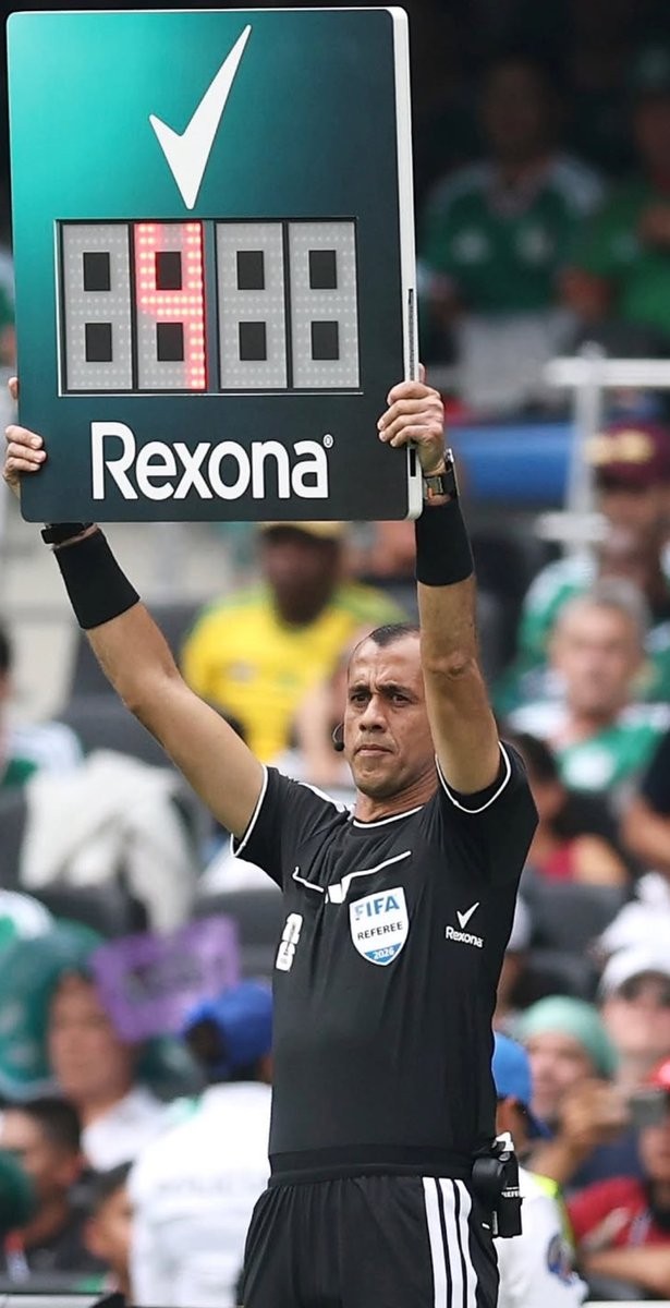
Good or Bad? Rexona Armpit Sponsorship on 2026 World Cup Referee Shirts
The 2026 World Cup referee shirts feature one of the most amusing and strategic sponsorship placements seen in football. Deodorant brand Rexona has their logo positioned directly under the armpits of the match officials' jerseys, creating a highly contextual advertising opportunity.
The Rexona logo remains largely hidden during regular play but becomes clearly visible whenever a referee raises their arms to signal a free kick, award a penalty, or issue a card. This placement perfectly matches the deodorant product being advertised, resulting in a memorable piece of marketing on the sport's biggest stage.
While this specific placement has caught the attention of fans during the 2026 tournament, it is not entirely unprecedented. A similar concept was previously executed in Brazil, where Avanço deodorant sponsored the armpits of Corinthians. However, Rexona's execution at a World Cup brings the clever concept to a massive global audience.
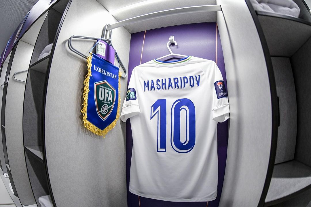
Uzbekistan 2026 World Cup Kits Feature Old La Liga Font
The Uzbekistan national team is making its debut at the 2026 FIFA World Cup, but their kit typography might look very familiar to football fans. For their 2026 World Cup jerseys, produced by the brand 7 Saber, Uzbekistan is using the official La Liga font from the 2017-18 season for their player numbers and names.
Interestingly, this is not the first time the Uzbekistan Football Association has opted for this specific typeface. The team previously utilized the exact same La Liga 2017-18 font on their kits when they were supplied by Jako. The continued use of an old league-wide font for a national team on the biggest global stage is a highly unusual kit quirk.
Uzbekistan is also not the only national team to recycle this design. The 2017-18 La Liga typography has been spotted on the kits of several other nations in recent years, including DR Congo, and at major tournaments such as the 2023 Asian Cup and the 2024 Africa Cup of Nations.
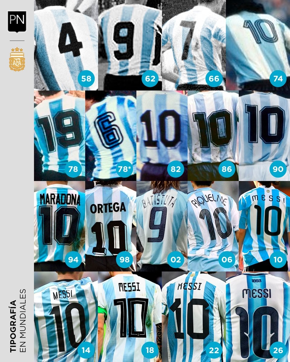
Argentina World Cup Kit Font History: Every Number Style Showcased
A fascinating new graphic created by football designer @PaladarNegroWeb showcases the complete evolution of the typography used on the Argentina national team kits across their FIFA World Cup history. The overview provides a direct look at how the squad numbers have transformed over the decades, highlighting the shift in design philosophies from tournament to tournament.
The visual comparison clearly illustrates the transition from the simple, classic block numbers of the past to the highly customized typefaces of the modern era. Fan reactions to the historical overview often favor the iconic, traditional fonts seen during the 1978, 1986, and 1990 World Cups. In contrast, the more experimental and uniform designs introduced by Adidas in recent tournaments, particularly the fonts used in 2010, 2018, and 2022.
Typography plays a crucial role in the overall aesthetic and historical memory of a football shirt. This comprehensive look at Argentina's World Cup numbers serves as a great reminder of how font choices can define a specific era of football, allowing fans to easily pinpoint exactly which tournament a classic jersey belongs to based on the style of the player's number.
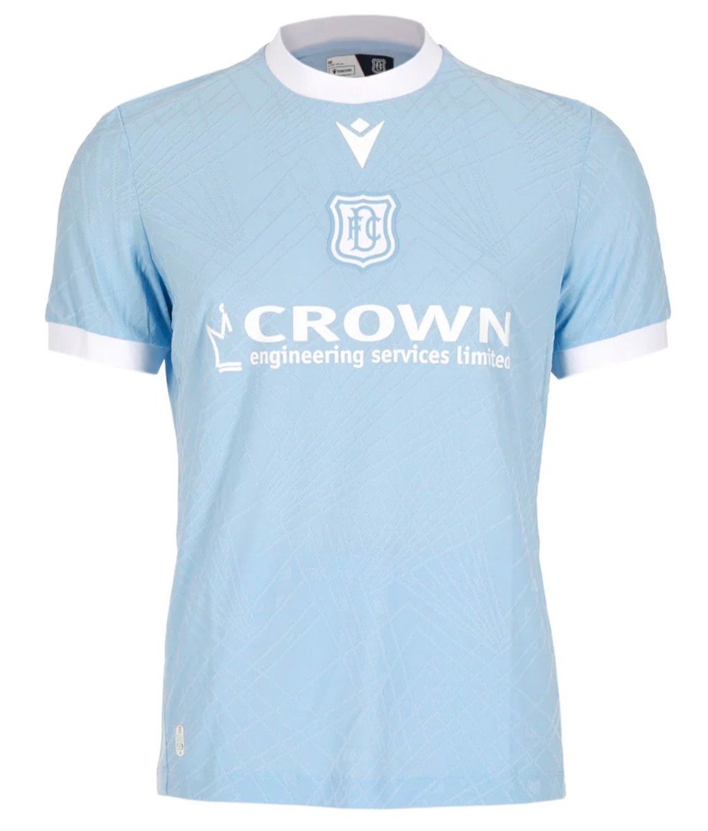
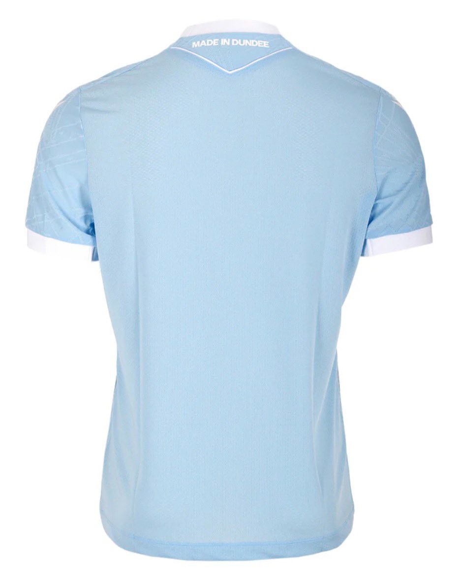
Dundee FC 2026-27 Away Kit Released
Scottish Premiership club Dundee FC have officially launched their new away kit for the 2026-27 season.
The new Macron Dundee FC 2026-27 away shirt features a predominantly sky-blue base complemented by subtle geometric and linear detailing across the front. The design is inspired by the city's rich industrial heritage and is completed with clean white trim on the collar and cuffs.
The official club crest and Macron logo are displayed prominently on the chest, tying into the fresh sky-blue aesthetic.
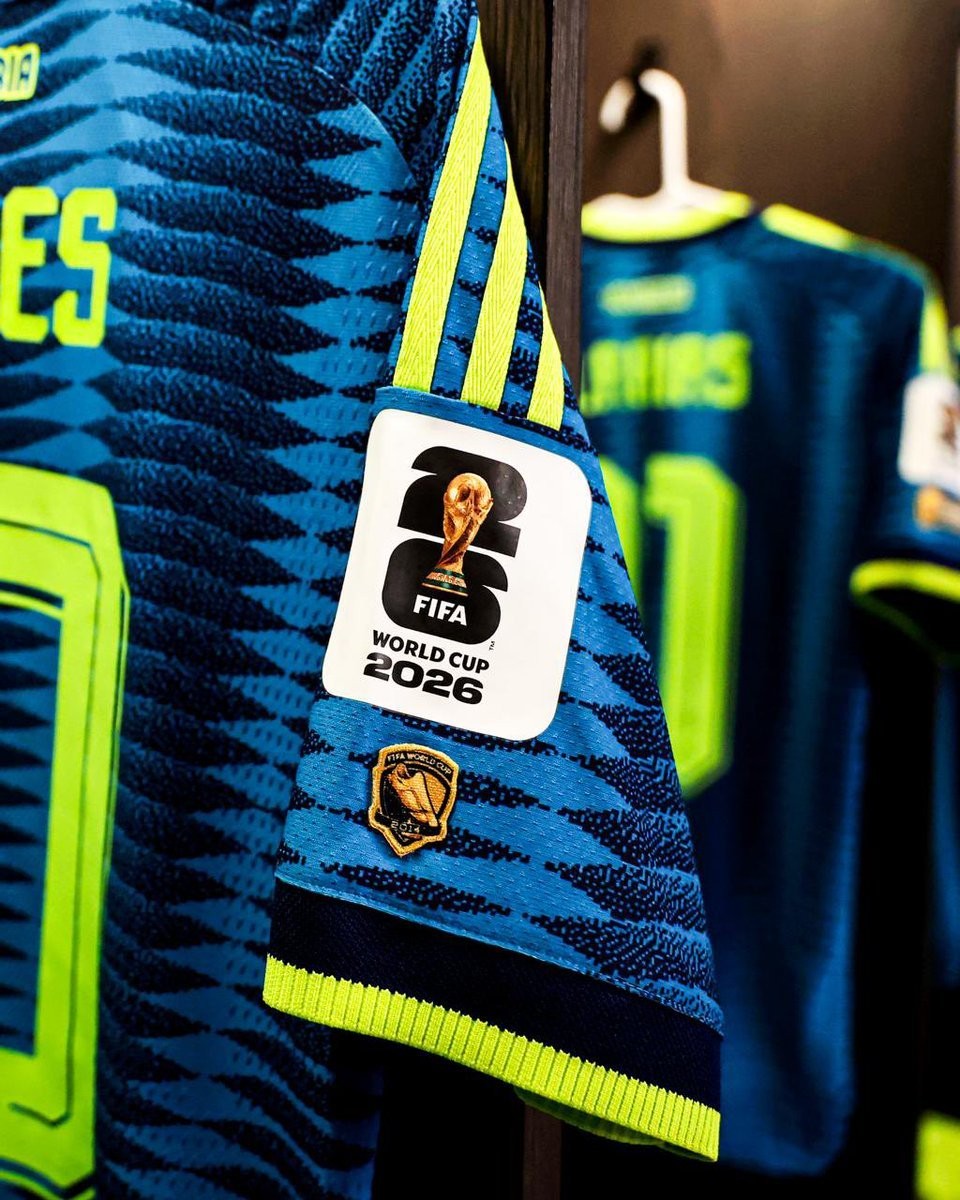
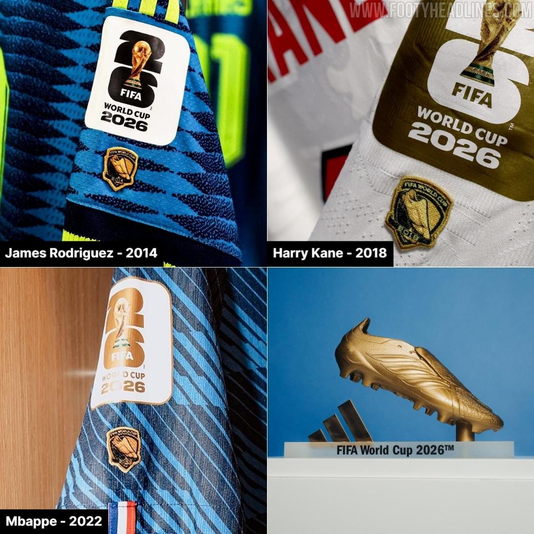
James Rodriguez Wears Special World Cup 'Golden Boot' Patch
In the World Cup 2026 match between Colombia and Uzbekistan, James Rodríguez was spotted wearing a special "Golden Boot" patch on the right sleeve of his jersey, honoring the Golden Boot award he won at the 2014 World Cup after scoring six goals, including his iconic volley against Uruguay.


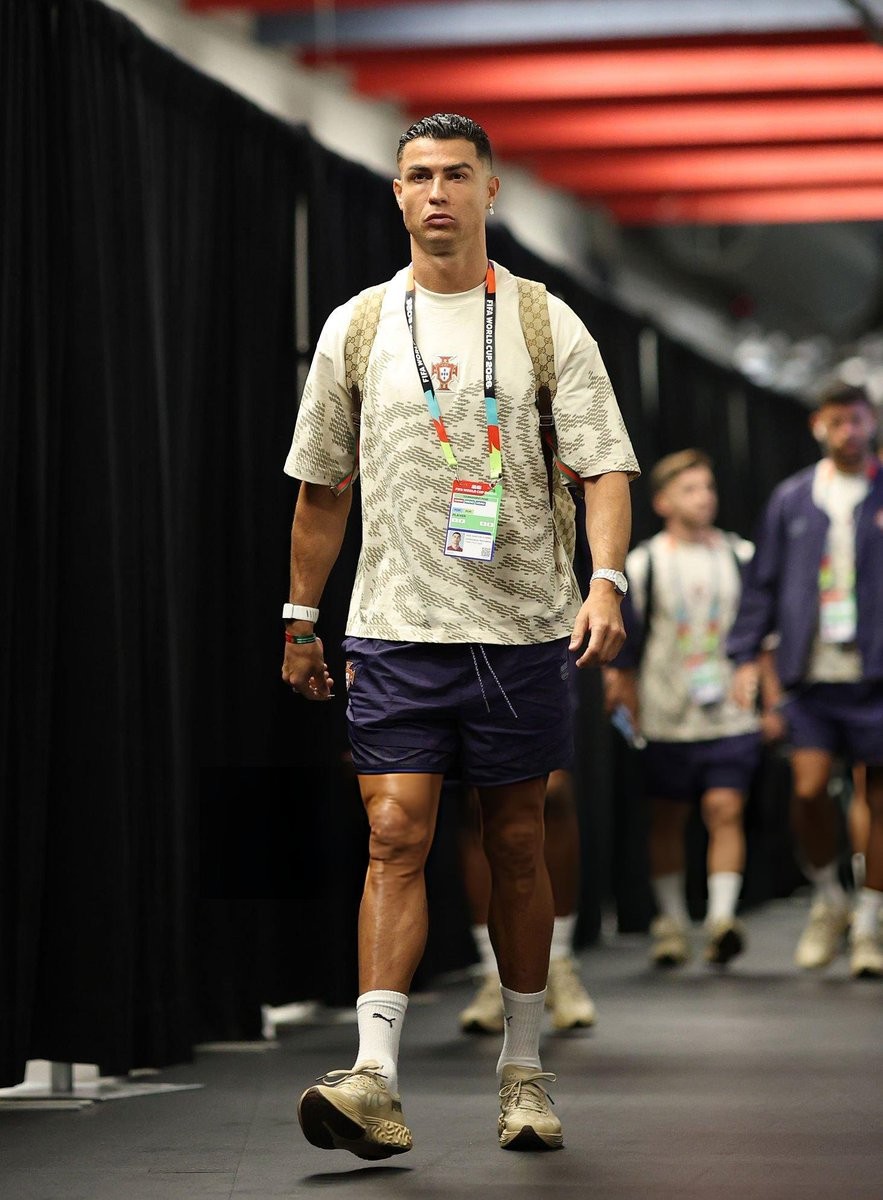
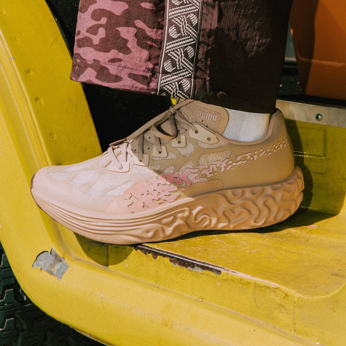
Cristiano Ronaldo Spotted Wearing Puma Sneakers Ahead of World Cup 2026 Match
Cristiano Ronaldo turned heads ahead of Portugal's 2026 World Cup match against DR Congo by arriving at the stadium wearing Puma sneakers. The Portuguese captain, making his record sixth World Cup appearance, paired his Portugal national team jersey with the Salehe Bembury Puma Velum Nitro collaboration sneakers.