Who Did it Best? Bayern vs 1860 Munich 22-23 Oktoberfest Kits
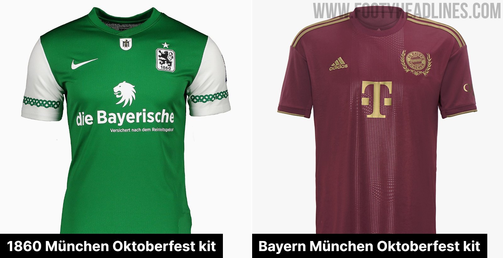
Munich's biggest clubs, Bayern München and 1860 München, have both released special Oktoberfest themed kits to celebrate the Bavarian festival. Here we compare both shirts to see which club can claim bragging rights for the best Oktoberfest kit.

Bayern vs 1860 München 22-23 Oktoberfest Kits
A few things have to be taken into consideration here. First of all, Bayern are one of Adidas' elite clubs, so the quality and customisation of their special kits could reasonably expected to be superior to those of 1860 Munich, who play in the third division of German football and generally receive teamwear from Nike. How the Oktoberfest shirts fit into each club's 22-23 set of kits will also be taken into account, and most importantly, how the theme has been worked into the design.
Bayern München 22-23 Oktoberfest Kit


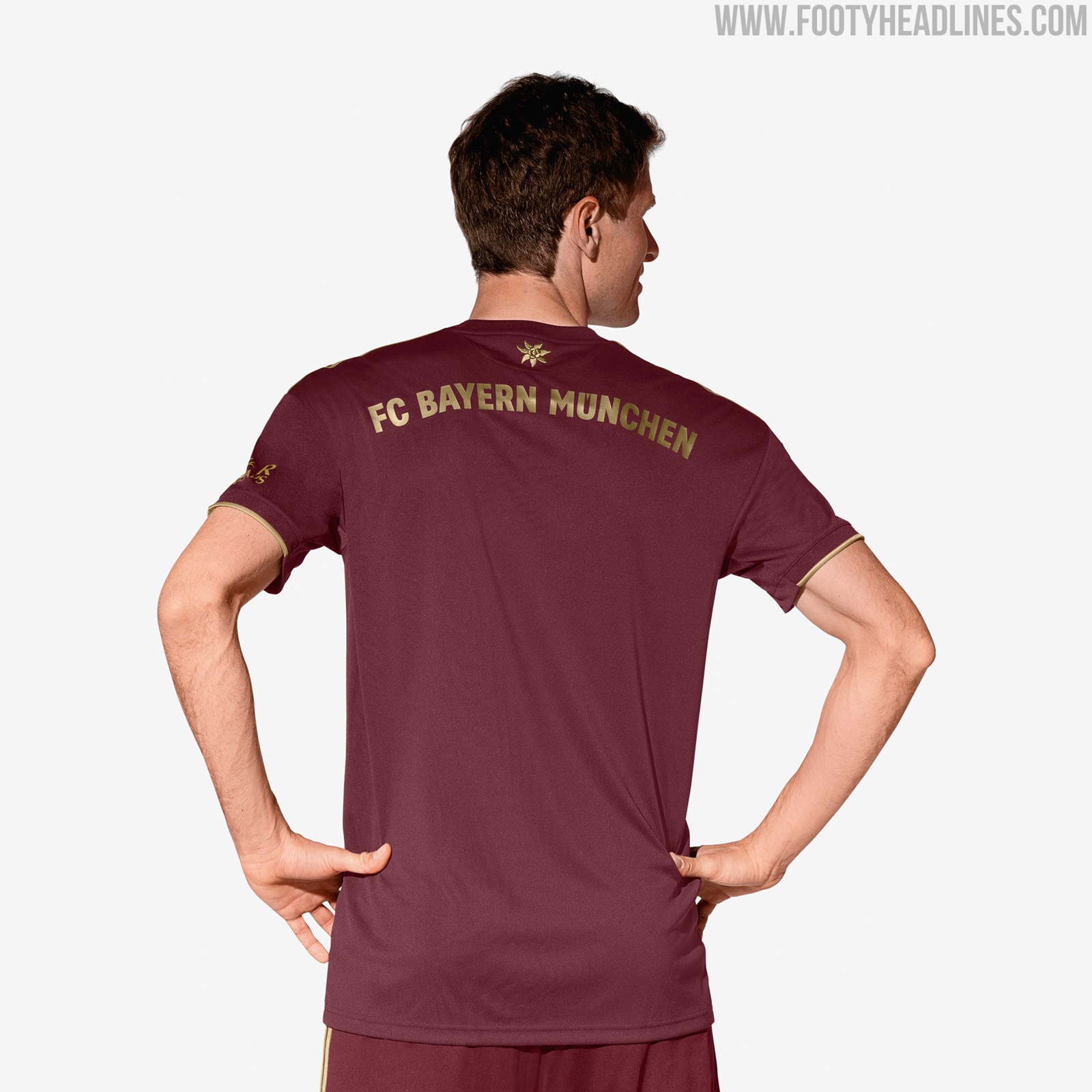
Adidas have given Bayern a Bordeaux coloured shirt with gold details, a smart colour combination albeit one with no obvious ties to the festival, although Adidas claim the gold creates a link to classic Bavarian clothing. An Edelweiss symbol is embroidered on the back below the neckline and the embroidery around the crest are supposedly references to Bavarian tradition.


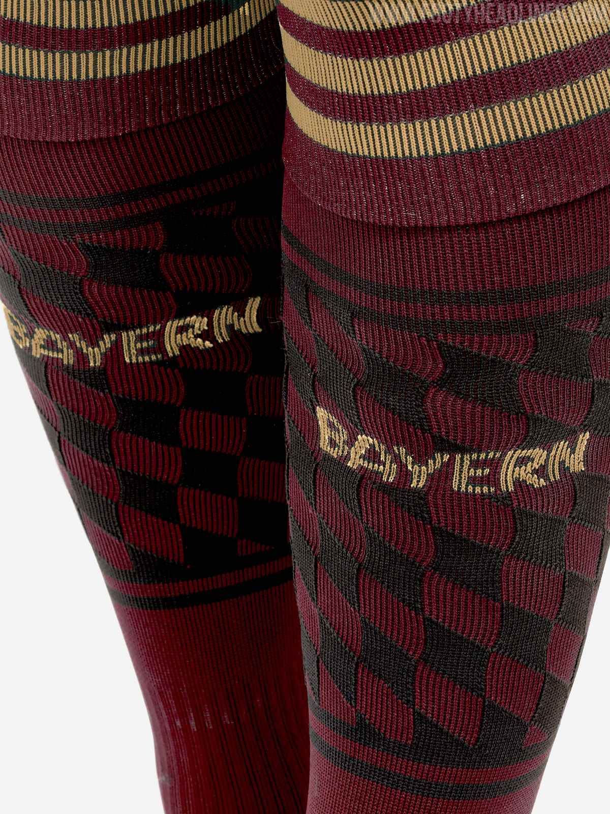
The socks also bear the pattern of the Bavarian flag but in a black and bordeaux colourway that adds some much needed detail to the otherwise plain - but good-looking - kit. This element could have been incorporated into the tonal band running down the centre of the shirt for a more interesting look.
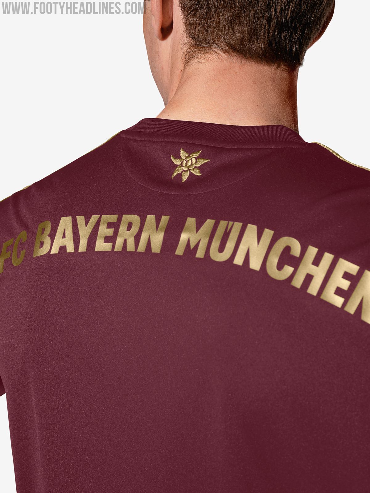


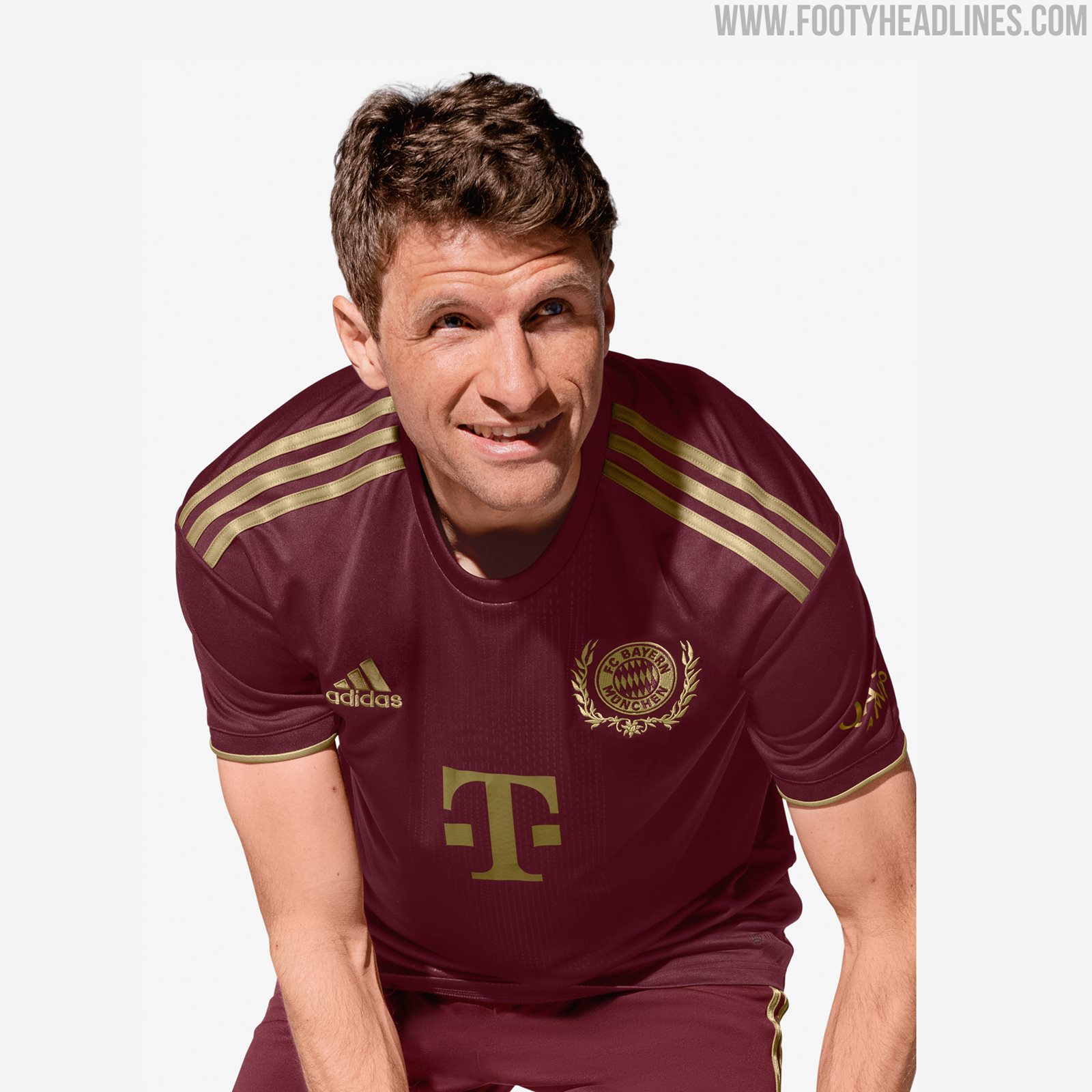
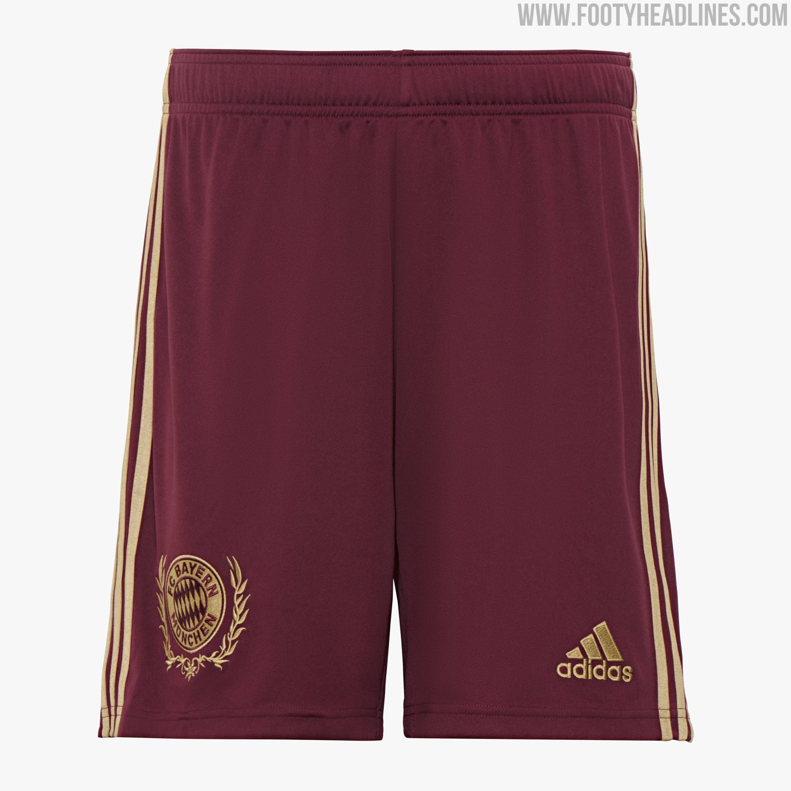
The shirt is basically identical to their 22-23 away jersey but with the base colour changed, and really seems like an opportunistic move to release another kit by slapping the Oktoberfest tag on it and adding some very minor details.

1860 München 22-23 Oktoberfest Kit


At first glance, this shirt may look like a weaker effort because of its teamwear template, but all in all it has more Oktoberfest credibility than Bayern's, thanks to its numerous details. The chain-link pretzels on the cuffs, Münchner Kindl below the collar, "O'zapft" motto accompanied by another pretzel above the hemline and Bavaria statue embossed into the fabric all mean that it definitely corresponds to the theme.


After many previous designs inspired by the blue and white "Tracht" shirts that are typical Oktoberfest attire, this year the colour scheme is a little less obviously linked to the festival. The green torso and white sleeves is possibly intended to resemble a green vest worn over a white shirt, another traditional look sported at Oktoberfest, which is also an easy fit for the Tiempo Premier II template.

Verdict


If we were judging the shirts based on looks alone, then Bayern would win quite easily, but if a club releases a shirt with a particular theme, there has to be a visible effort to make it relevant. As outlined above, 1860 München's green and white number comfortably beats Bayern's stylish bordeaux shirt on customisation, and is more worthy of being labelled an "Oktoberfest kit".

1860 Munich's previous Oktoberfest shirts.
With that said, compared to some of their own previous efforts, the references may be less blatant, but whether that's a good or a bad thing is down to personal opinion. Which of the shirts do you prefer? Let us know your thoughts in the comments?
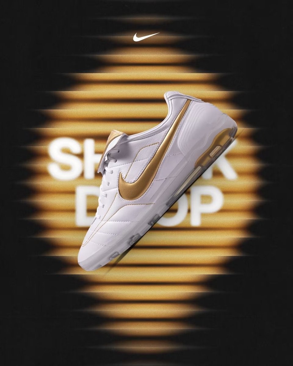
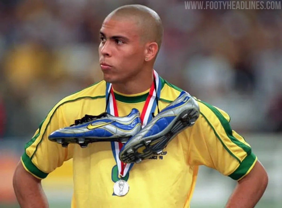
Shock Drop: Nike Cryoshot Mercurial R9 & Tiempo R10 Boots
Nike has surprised fans with a shock drop of two special-edition football boots on the SNKRS app, as spotted by House of Heat.
Released unexpectedly on June 24, 2026, the new Nike Cryoshot collection brings back legendary aesthetics inspired by Brazilian icons Ronaldo and Ronaldinho.
The release features two iconic models reimagined under the Cryoshot banner. The Nike Cryoshot Mercurial Vapor R9 OG arrives in an Old Royal and Metallic Silver colorway, paying homage to the original Mercurial worn by Ronaldo at the 1998 World Cup. Alongside it is the Nike Cryoshot Tiempo Legend R10 OG, which sports a White and Metallic Gold combination, celebrating Ronaldinho's famous Touch of Gold boots.
Both pairs were made available in highly limited quantities via direct links on the Nike SNKRS platform. They sold out almost immediately.
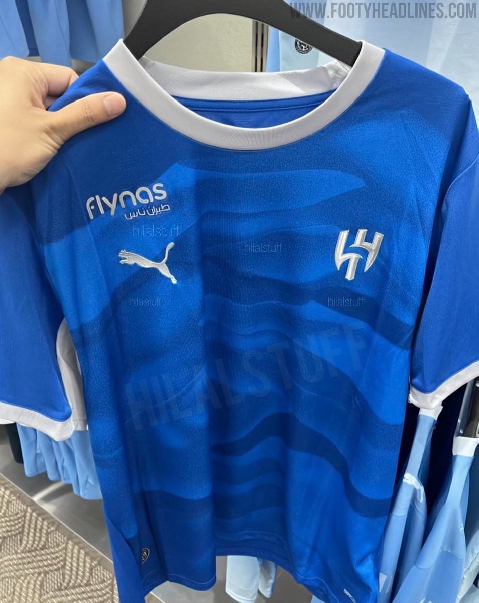
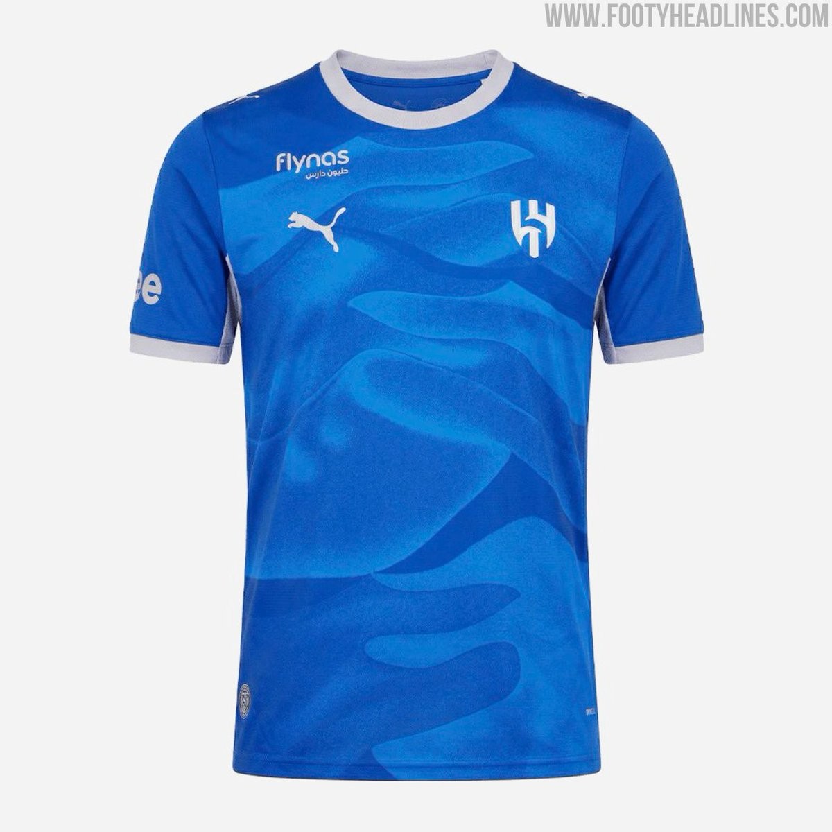
New Image of Al Hilal 26-27 Home Kit Leaked
A new image of the Al Hilal 2026-27 home kit has been leaked online, providing another look at the upcoming Puma design. Originally shared by @hilalstuff and @a_z055, the picture confirms the traditional blue base combined with a subtle all-over graphic pattern.
The Puma Al Hilal 2026-27 home shirt is expected to be officially launched in the coming weeks.
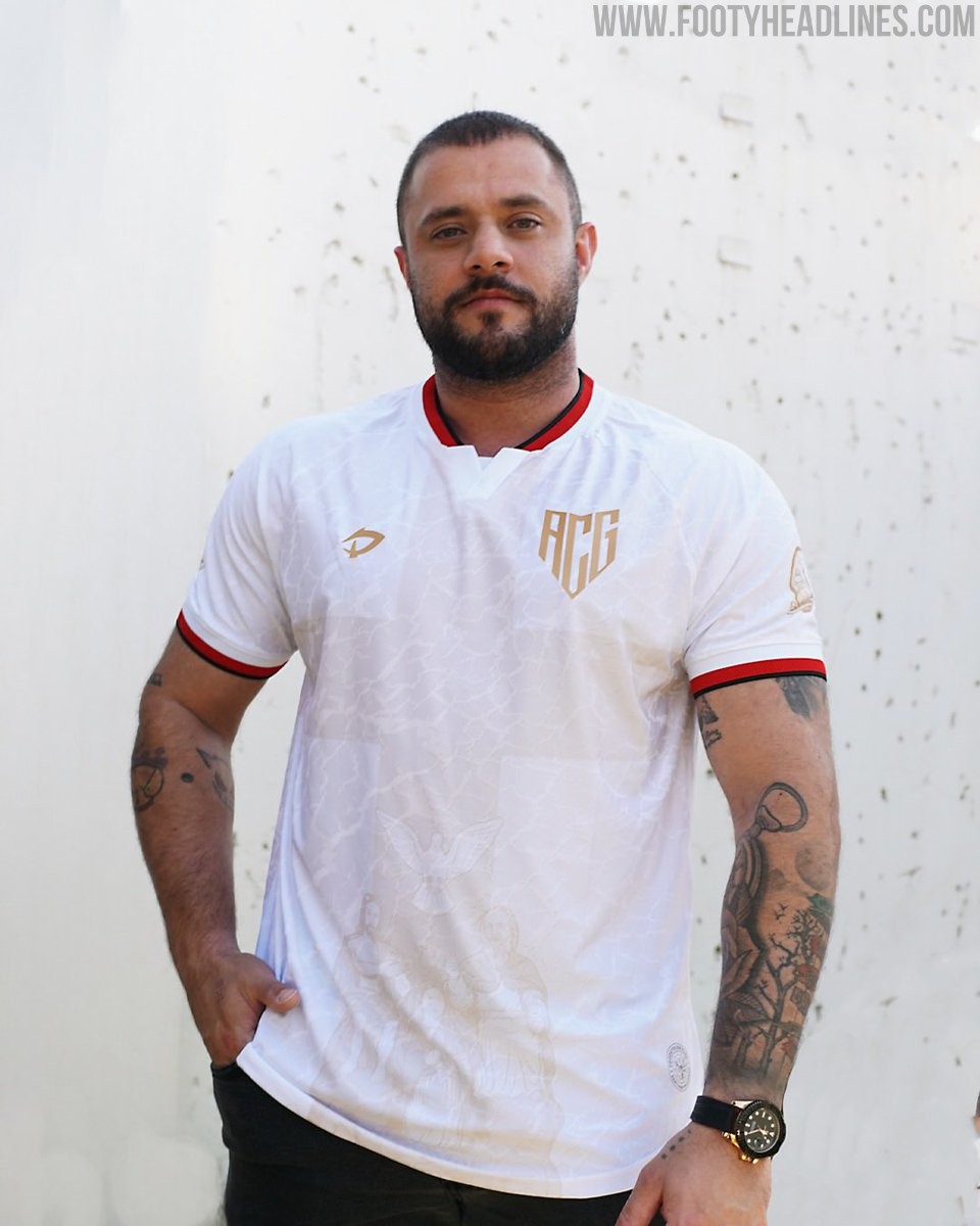
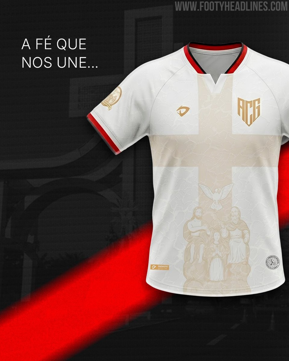
Atlético Goianiense 2026 Romaria do Divino Pai Eterno Kit Released
Atlético Goianiense has launched a special commemorative jersey honoring the Romaria do Divino Pai Eterno, a major Brazilian religious pilgrimage to the Basilica in Trindade, Goiás.
Officially authorized by the Basílica do Divino Pai Eterno, the shirt features design elements that represent the pilgrimage and the faith of the club's supporters while retaining the traditional Atlético identity. A portion of the proceeds from the shirt sales will be donated to the Basilica to support its mission and works, and each purchase uniquely includes a bottle of blessed holy water.
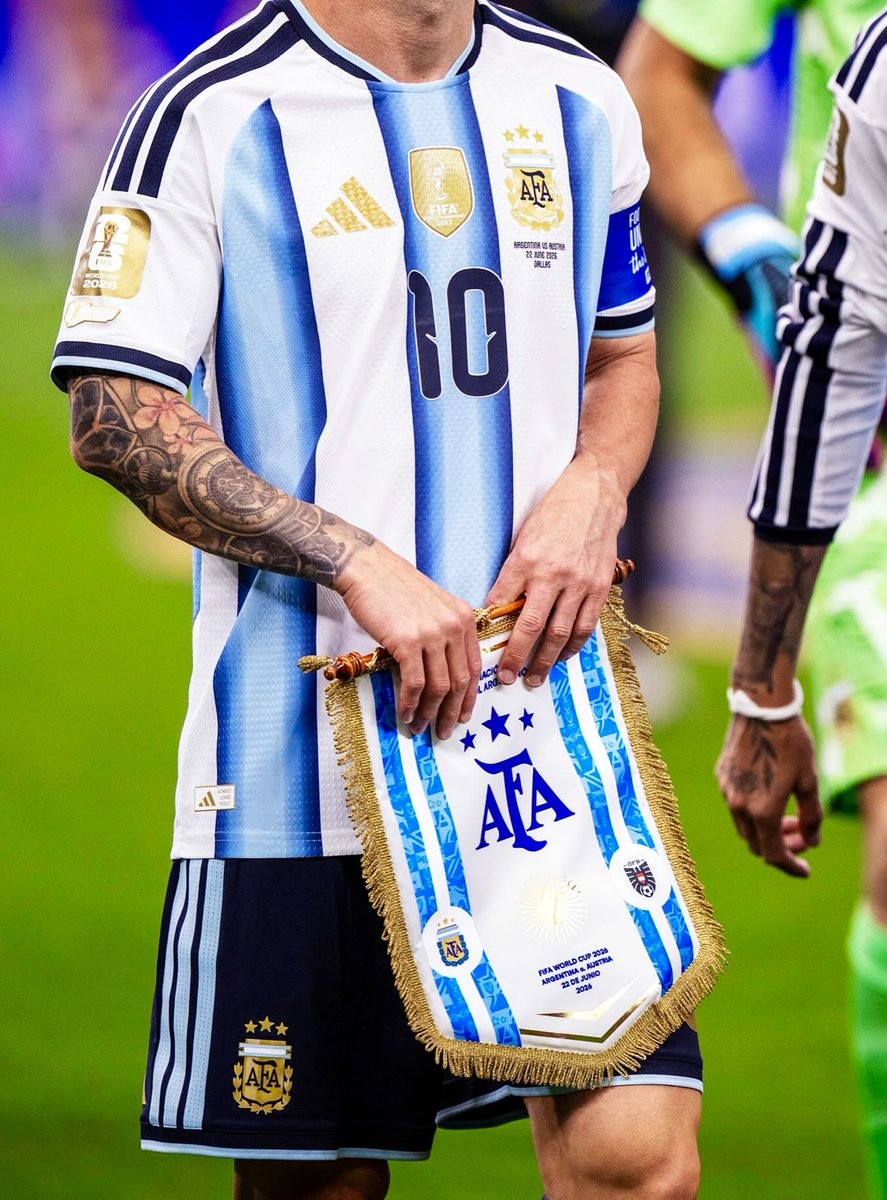
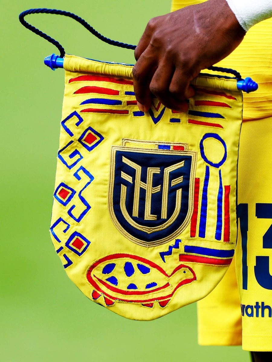
Unique 2026 World Cup Pennants
The football culture platform @vsrsus has shared a collection of pennants featuring unique and highly artistic designs from several national teams participating in the 2026 World Cup.
The designs feature intricate graphics, bespoke typography, and vibrant color palettes tailored to different nations competing in the tournament. Each pennant is reimagined not just as a ceremonial token, but as a standalone piece of football art that captures the distinct identity and heritage of the respective countries.
The peasants celebrate the intersection of graphic design and the global game during the 2026 World Cup.

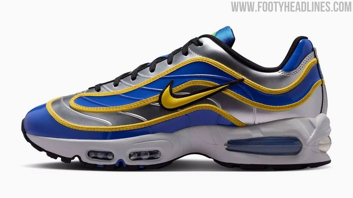
Nike Air Max Joga Bonito 'R9' Sneakers Revealed
Nike is set to release a special homage to Brazilian legend Ronaldo with the upcoming launch of the Nike Air Max Joga Bonito 'R9' sneakers. Bringing together elements from two iconic silhouettes, the new lifestyle shoe offers a unique fusion of football heritage and streetwear style.
The Nike Air Max Joga Bonito 'R9' features the classic upper of the legendary Mercurial R9 football boot, seamlessly paired with the recognizable Big Bubble soles of the Air Max 95.
The Nike Air Max Joga Bonito 'R9' sneakers, officially listed under style code IX8646-001, are scheduled to be released on July 2, 2026. They will be available for a retail price of $180.

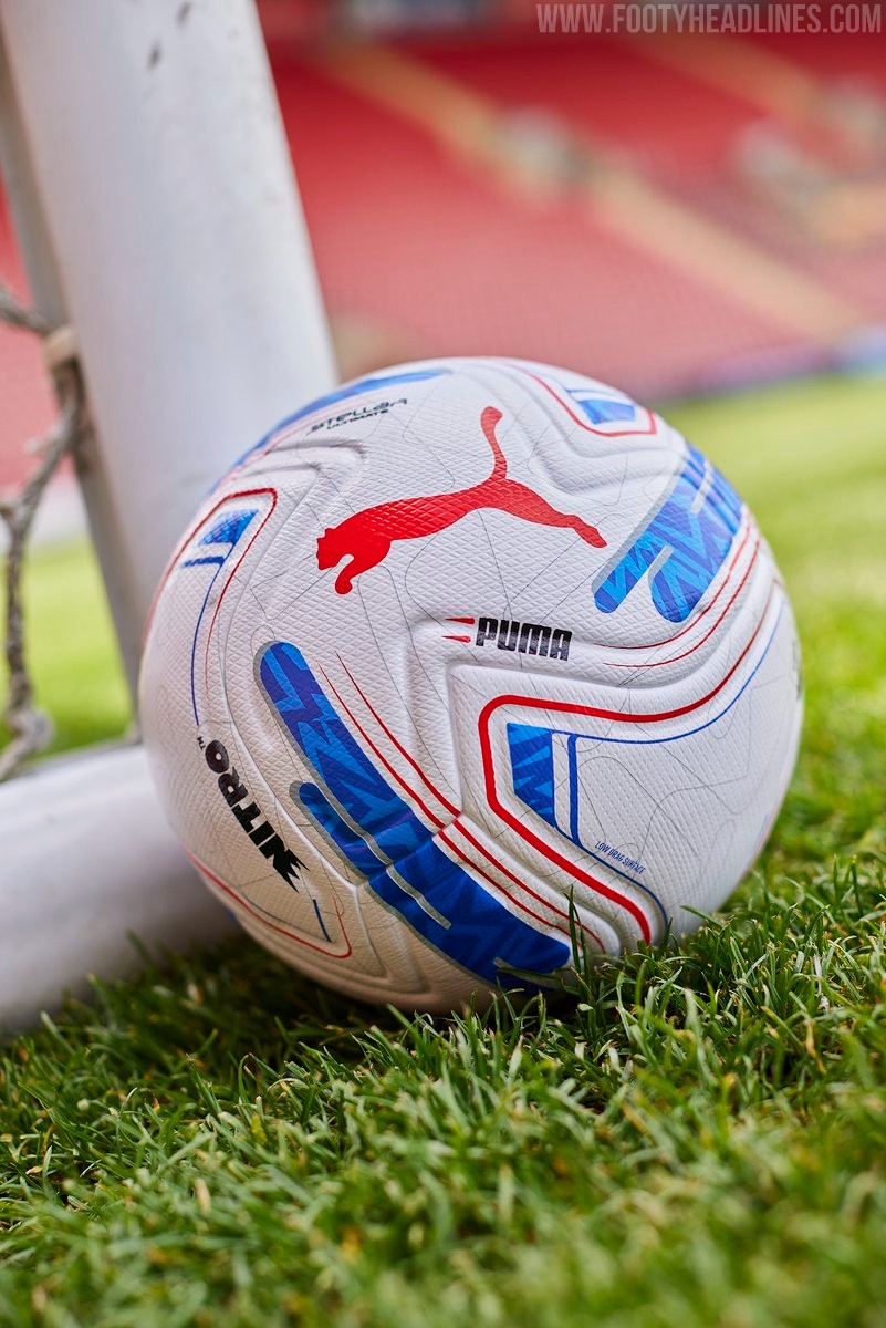
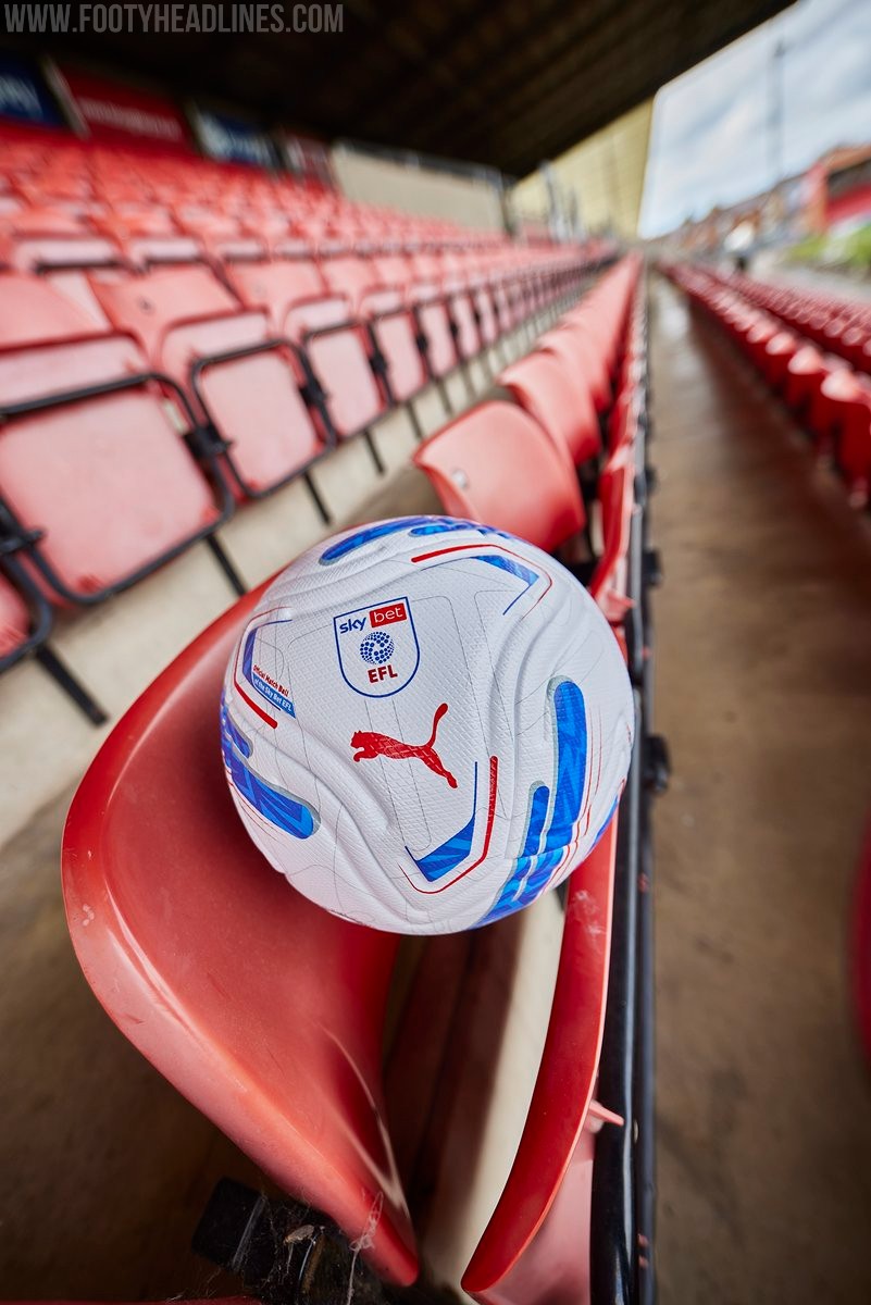
Puma EFL 26-27 Ball Released
The new Puma EFL 2026-27 match ball has been officially revealed, introducing the Puma Stellar Nitro model for the upcoming season. It will be used across the English Football League, encompassing the Championship, League One, and League Two.
The Puma EFL 2026-27 Stellar match ball features an updated panel shape, moving away from the previous Orbita edition.
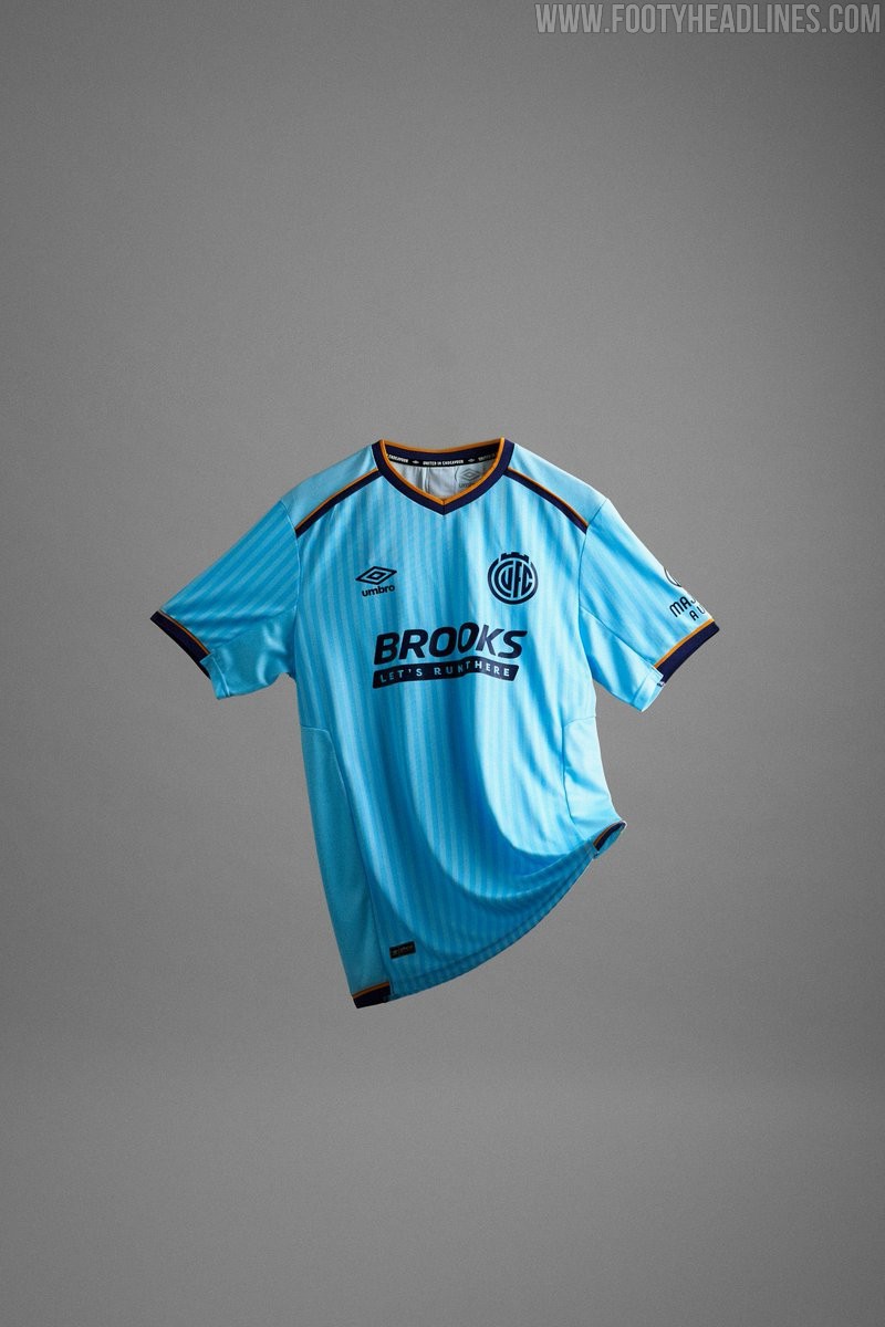
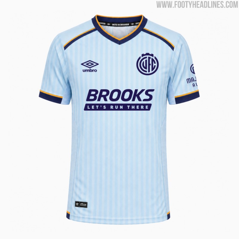
Cambridge United 26-27 Away Kit Released
The new Cambridge United 2026-27 away kit has been revealed. Made by Umbro, the Cambridge United 2026-27 away jersey introduces a fresh sky-blue look for the League One side, offering a clean aesthetic for their travels next season.
The launch of the new away strip follows the release of the club's 'United in Endeavour' home kit earlier in the month, completing a contrasting set for the upcoming campaign.
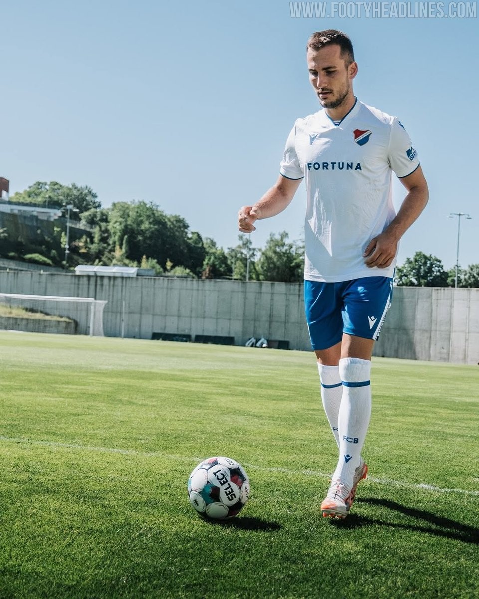
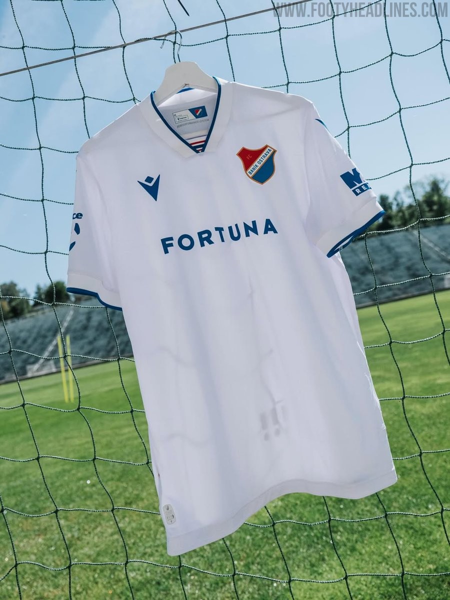
Baník Ostrava 26-27 Home Kit Released
The Baník Ostrava 2026-27 home kit has been officially released today. Made by Macron, the new Baník Ostrava home shirt features a clean, predominantly white design that uniquely incorporates special Braille text elements into the fabric.
In a meaningful initiative by the Czech First League club, a portion of the proceeds from the sales of the new home jersey will be donated to support children with visual impairments.