5 Clubs Who Should Update Their Crest

- Crest Updates are Common: Many football clubs have recently changed their crests, sometimes unnecessarily.
- Some Crests Need Modernizing: Certain clubs have outdated crests that could benefit from a redesign.
- Five Clubs Identified for Updates: The article highlights Southampton, SV Zulte Waregem, Sassuolo, Club Puebla, and Wigan Athletic as clubs needing crest updates due to various design flaws.
Dozens of clubs have made changes to their crests over the last few years, sometimes unnecessarily. Here are few whose image could actually do with a little modernising.

5 Clubs Who Could Do With Crest Update
A new or updated club badge is sure to cause a stir among football fans. Sometimes the reaction can be positive with fans in agreement that the new look is an improvement on the old one. However, we've seen plenty of redesigned badges that go for the ultra modern, corporate logo style, generally to the disappointment of fans, who'd prefer to keep their existing badge.

A lot of clubs with a perfectly representative badge have cast it aside in favour of current trends, but on the other end of the scale are the clubs whose crest is overdue an update. Check out our pick of five clubs who definitely have some room for improvement in the visual identity department.
Southampton

Southampton's badge has undergone minimal updates over the years, with the basic form first introduced in 1974 and most recently tweaked in 2011. The problem is, the graphic representations of all the elements are quite childish and outdated. The tree, scarf, football and halo symbols all look like clip art. The banner, tucked in underneath the shield and partially obscured, and the black space between the top of the shield and the scarf add to the amateurish aesthetic. Keep the elements, but surely there's a more stylish way to put them all together.

SV Zulte Waregem

Looking like a diagram from a chemistry textbook, Belgian side Zulte Waregem's crest has been in use since 2005, when they abandoned their striped shield for something less typical. Having a unique badge can be a source of pride for a club, but this one unfortunately just doesn't look like the badge of a football club, never mind a good one. The brushstroke effect is the opposite of timeless.

Sassuolo
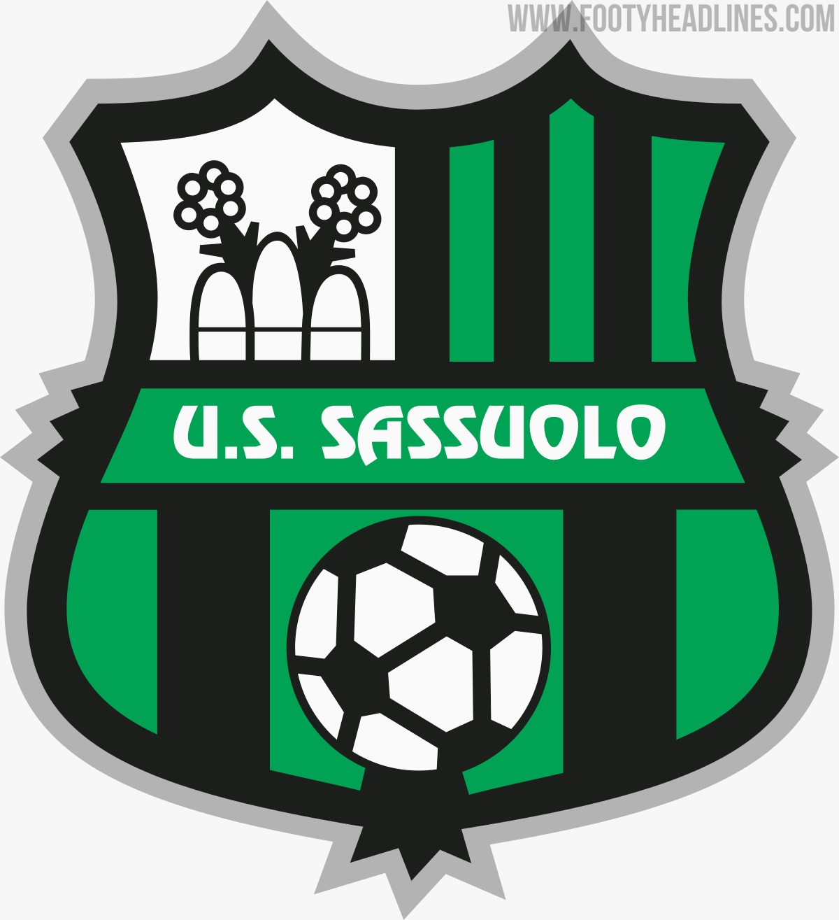
Sassuolo is a town of just 40,000 people but their football team managed to establish themselves as a fixture of Serie A since 2013. Prior to that, they had spent their entire history in the lower divisions. They were in Serie B in 2010 when they updated their crest, going for a shape similar to Barcelona's, but the end product again looks a little bit small time. The off centre spike at the bottom, the grey border and the football and aqueduct graphics need reworking, and an alternative font wouldn't go amiss either. They've got a great colour combo to work with so fine tuning the other aspects shouldn't be too difficult.

Club Puebla

Yet another amateur look from Mexico's Club Puebla. Look a bit closer and you'll see that a continuous, unbroken line forms the crest shape and the sash, starting at the top left and ending at the bottom right. A nice feature that is somewhat ruined by the contradictory outer border. Strangely, this border was only added in 2018, with previous versions faring much better without it. The team name across the centre and the football in motion at the top, along with the overall graphic style are not very befitting of a club playing in the top flight of their domestic league. A few minor adjustments could do the trick here, no need to reinvent the wheel.

Wigan Athletic

More clip art graphics here from Wigan. The shading on the tree and crown mark this one out pretty clearly as a 2000s design (this crest dates from 2008) and is a feature that has very much faded out of fashion. In contrast, the roundel shape has turned out to be a choice popular among many clubs who have redesigned their badge. Once again, nothing drastic is required here, but this one could be polished up for a much classier effect.

Are their any other clubs who you think should give some thought to a badge redesign? Comment below.

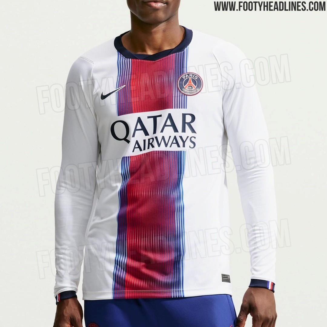
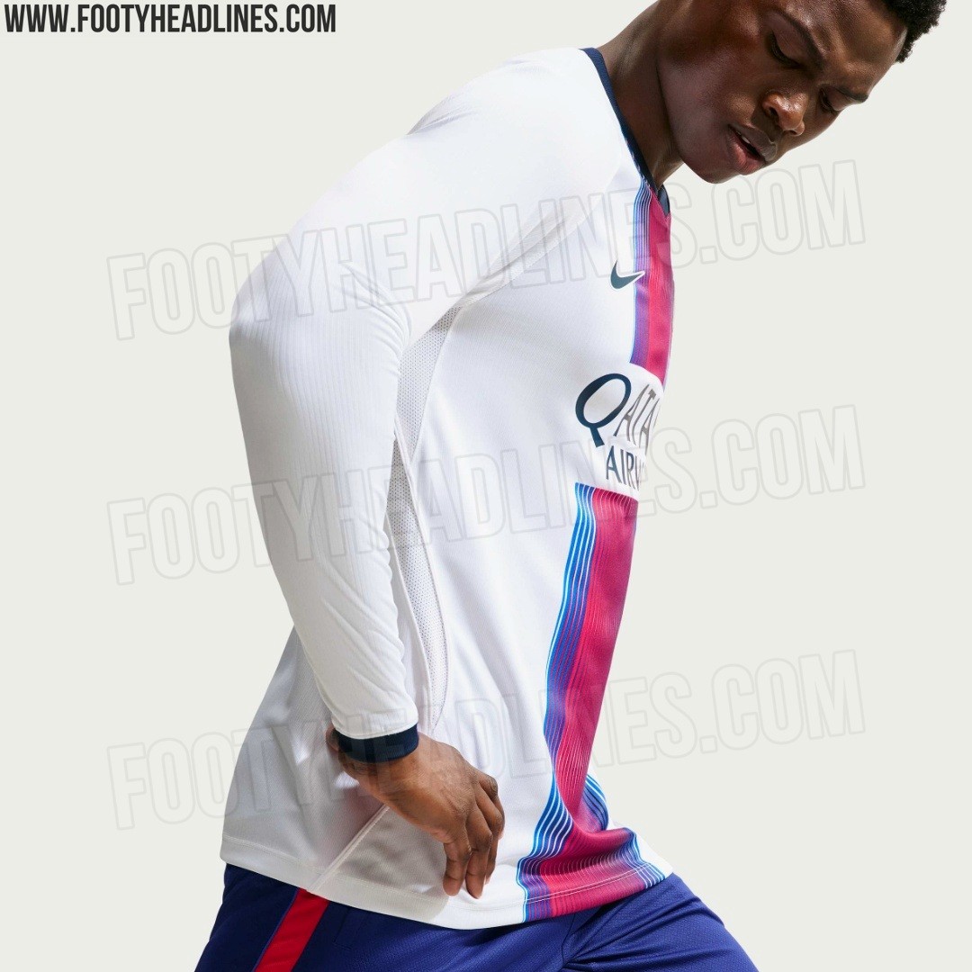
PSG 26-27 Away Kit - Long-Sleeve Version
Footy Headlines can leak 3 new pictures of the Nike PSG 26-27 away kit, long-sleeve version.
The kit is predominantly white and features a distinctive central gradient 'Hechter' stripe that transitions from red to navy blue with a vertical pinstripe effect, along with a matching lenticular crest and standard logo placements


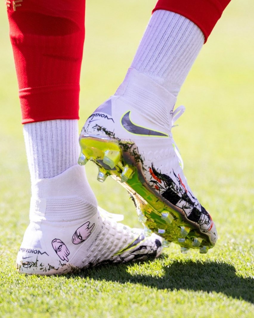
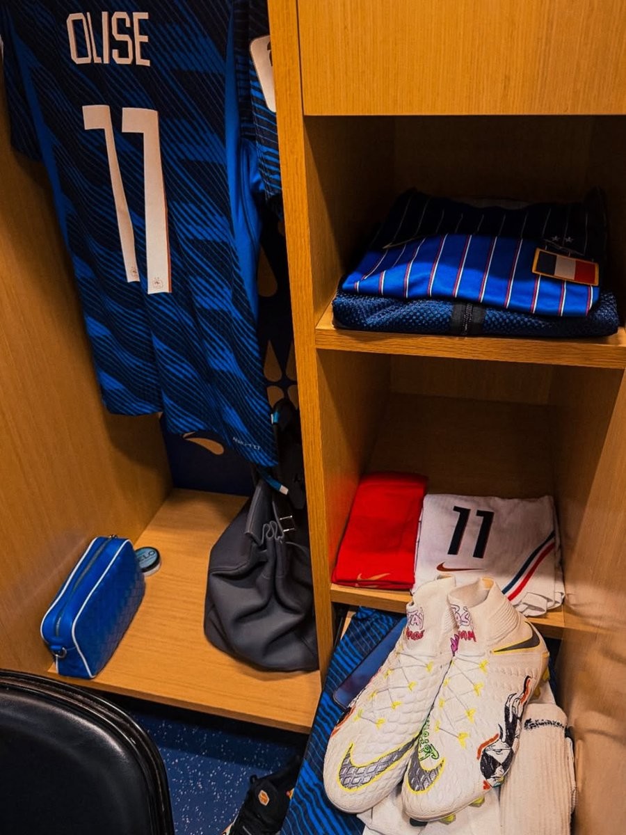
Michael Olise Wears Custom Nike Hypervenom Phantom 3 Boots by Matty Boy
Michael Olise took to the pitch for his first 2026 World Cup match against Senegal wearing a unique pair of custom football boots. Rather than opting for one of Nike's current mainline models, Olise laced up in a personalized version of the Nike Hypervenom Phantom III boots.
The boots were customized by artist Matt Digiacomo, widely known as Matty Boy. The design features a distinct hand-painted aesthetic, applying personalized graphics and details directly onto the classic Hypervenom Phantom III 'Just Do It', released in 2018. This choice by Olise highlights a continuing trend of players showcasing bespoke, artist-customized footwear during major tournaments.
The custom Matty Boy edition serves as a striking blend of high-performance football gear and individual streetwear-inspired artistry.

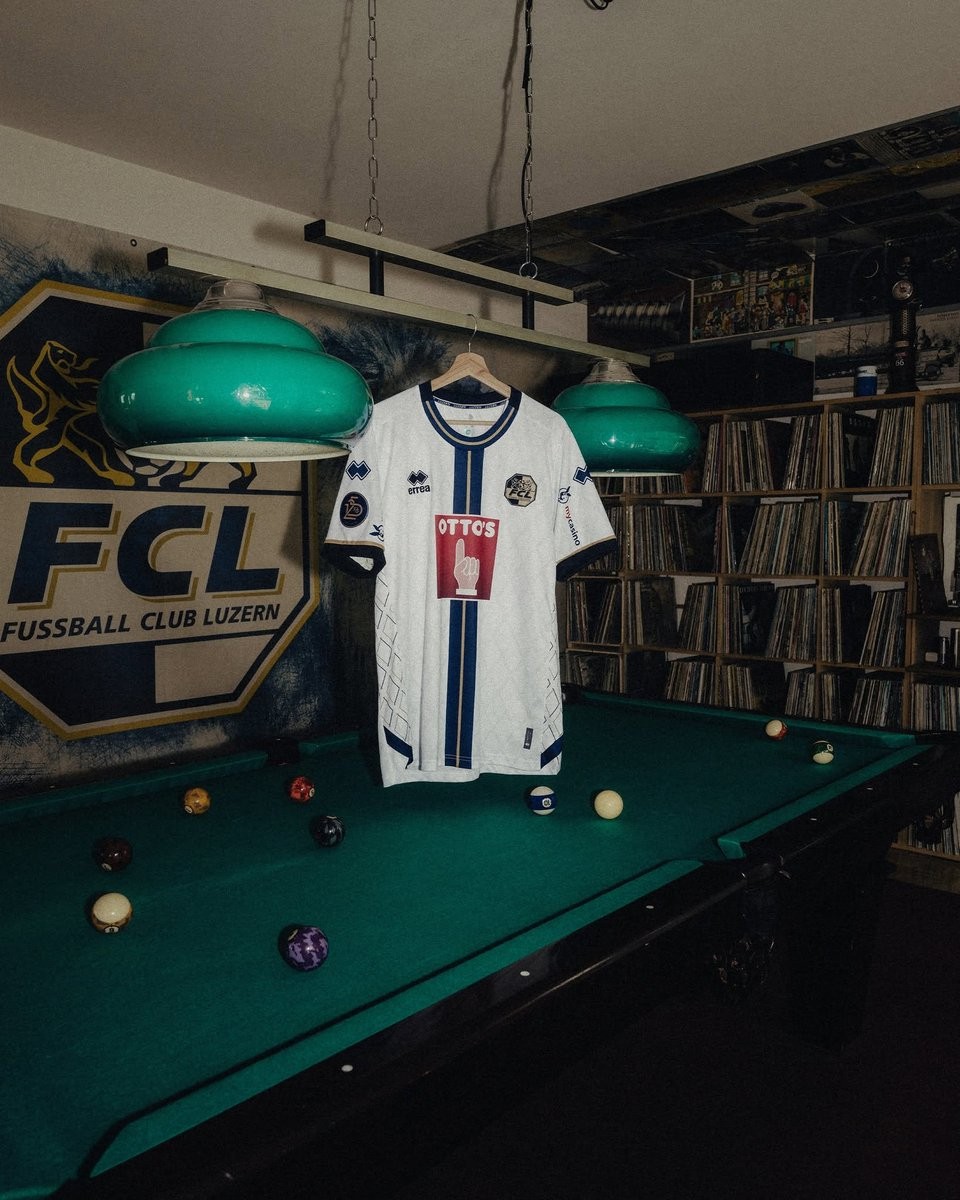
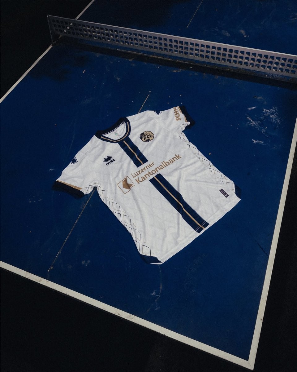
FC Luzern 2026-27 Away Kit Released
The new FC Luzern 2026-27 away kit has been officially released. Made by Erreà, the shirt will be worn during the club's 26-27 Swiss Super League campaign and follows the release of their 125th-anniversary home kit earlier in May.
The Erreà FC Luzern 2026-27 away shirt draws inspiration from one of the city's most representative architectural landmarks, the Jesuit Church. It features a sophisticated tone-on-tone ornamental pattern that runs discreetly across the fabric. A striking blue vertical stripe, enhanced by a subtle golden trim, runs down the center of the shirt, paying homage to the club's traditional colors and adding a touch of elegance to the overall design.
The new Erreà FC Luzern 2026-27 away jersey successfully connects the club's local heritage with a contemporary aesthetic. The kit is currently available to purchase through the official club store.

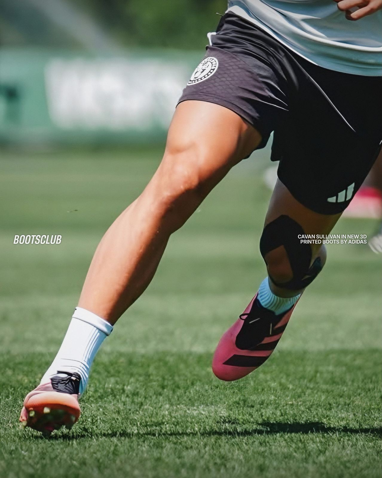
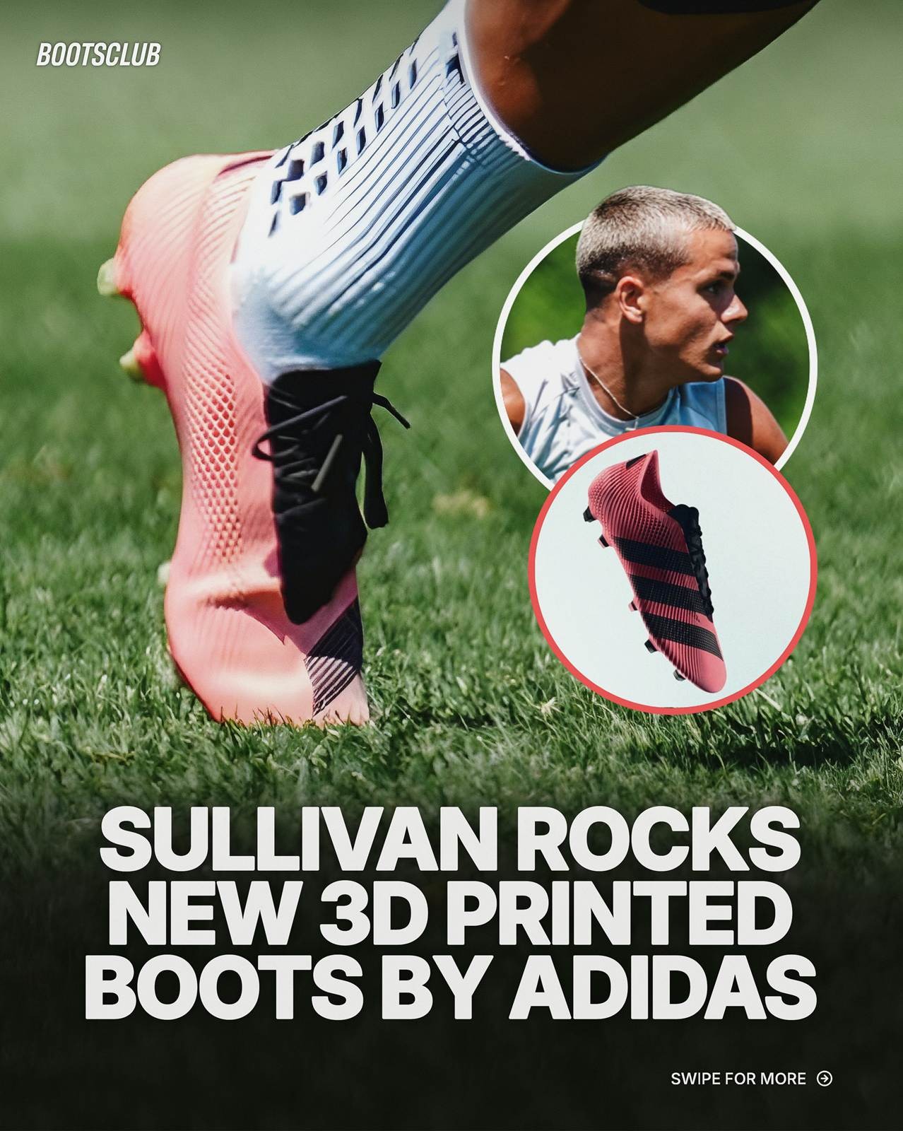
Spotted: Cavan Sullivan Wears Special Adidas 3D-Printed Boots
Cavan Sullivan is the latest player to be spotted wearing Adidas' newly developed 3D-printed boots. Before him, Atlético Madrid forward Ademola Lookman was the first player seen wearing this special footwear. Big thanks to bootsclub.
The innovative Adidas 3D-printed boots, officially unveiled in late April, are part of the R.A.P. (Radical Athlete Perception) project. The initiative transforms athlete insights into reality through feedback, testing, and performance data, creating products tailored to players' needs.