Exclusive: Every Bayern Munich 23-24 Away Kit to Feature Different World Map Graphic
 May 3, 2023, by Chris
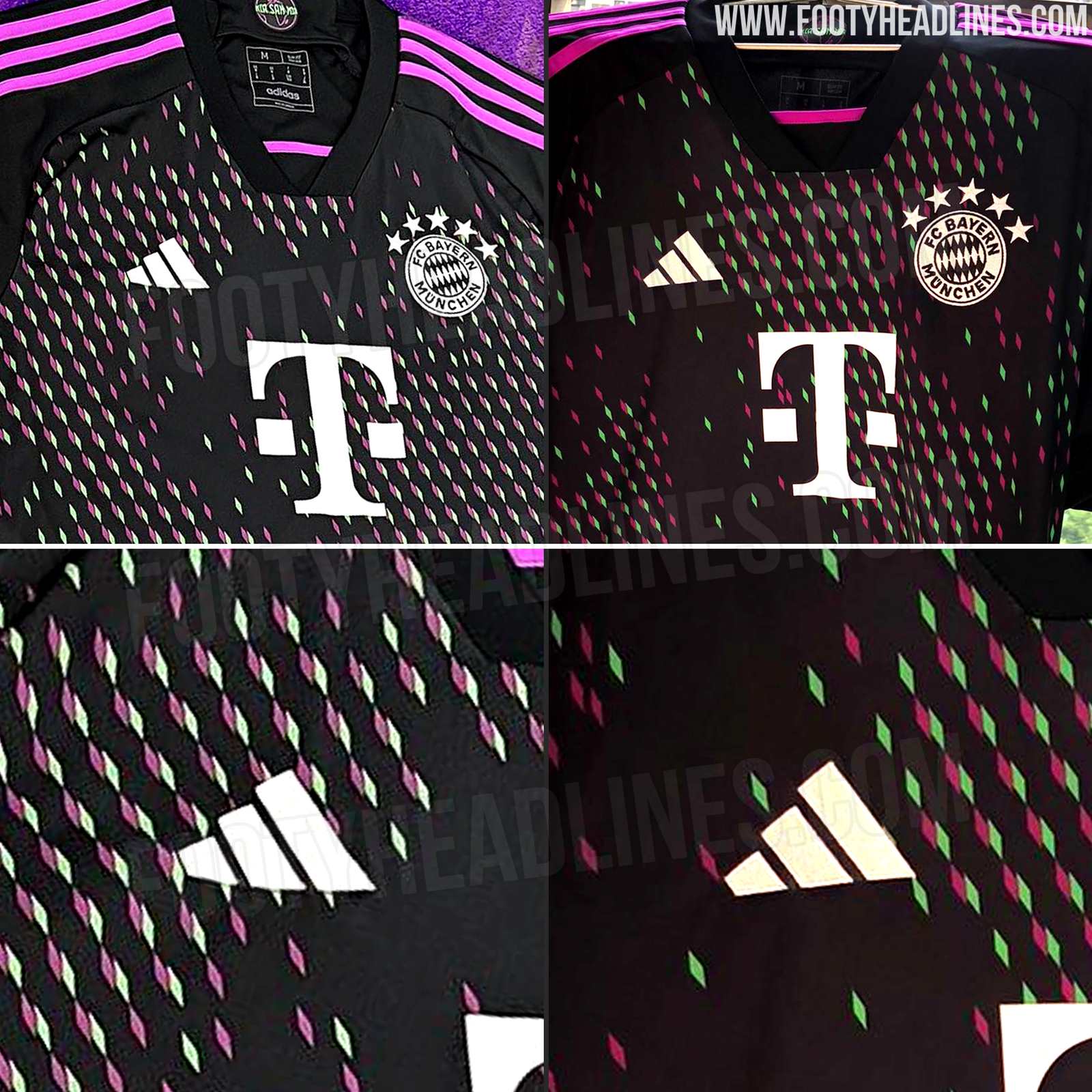
Last month, we leaked the Bayern Munich away kit for the 2023-24 season. Now we can reveal some interesting new info about the design.
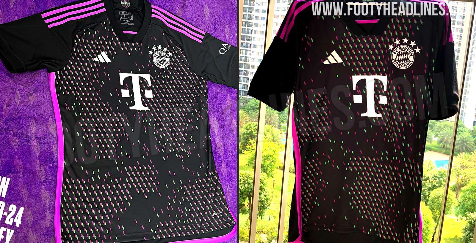
The German giants are known for their iconic red and white home kit but the club has been experimenting with their away kits in recent years. The 2023-24 away kit takes it a step further, with a very bold black, green, and purple color scheme.
So far, two different Bayern Munich 23-24 away shirts have been leaked. The world map is placed in significantly different positions between the two.
World Map Graphic Looks Different on Every Bayern Munich 23-24 Away Kit - Randomly Placed on Each Kit, Also Because of How It is Manufactured
Every jersey of the Bayern 23-24 away kit is a bit different from each other. The standout feature of the new away kit is the all-over world map graphic that has been randomly placed on each jersey. The graphic itself is in different shades of purple and green, made up of diamonds that are an integral part of the club's logo.

The collar features a graphic of a world map. Unlike the design of the shirt, each logo inside the collar is identical.

The random placement of the world map graphic means that every jersey is unique and no two jerseys are the same. This is not the first time for a football kit but is indeed a regular feature of football kits having an all-over pattern. This is because of how the kits are manufactured from the fabric.
However, Adidas will actively promote the different looks with the launch, and it appears that the brand did even push it to make it more remarkably than it would be by default with patterned kits.
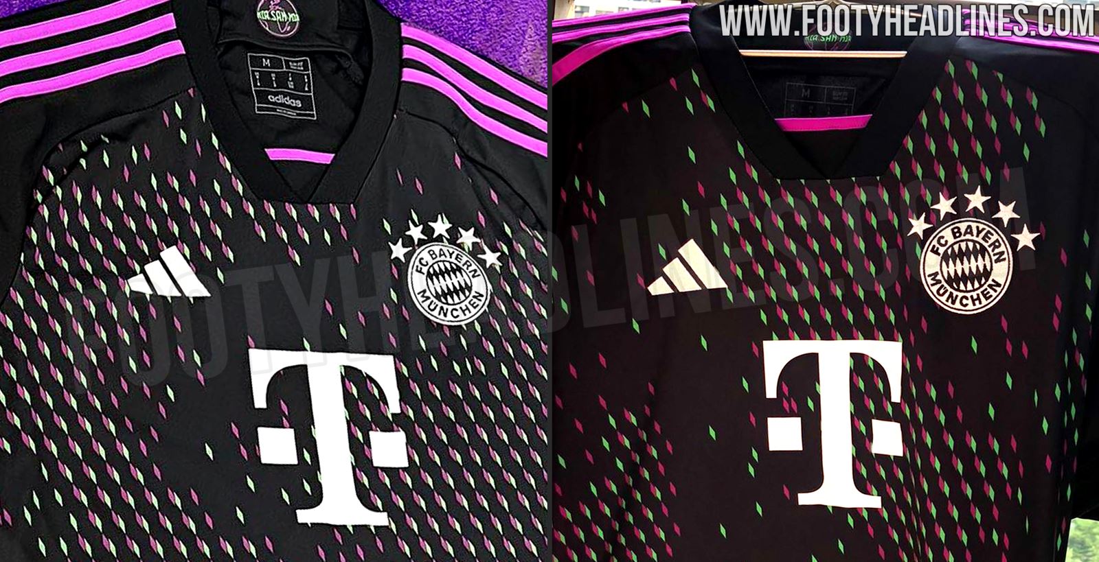
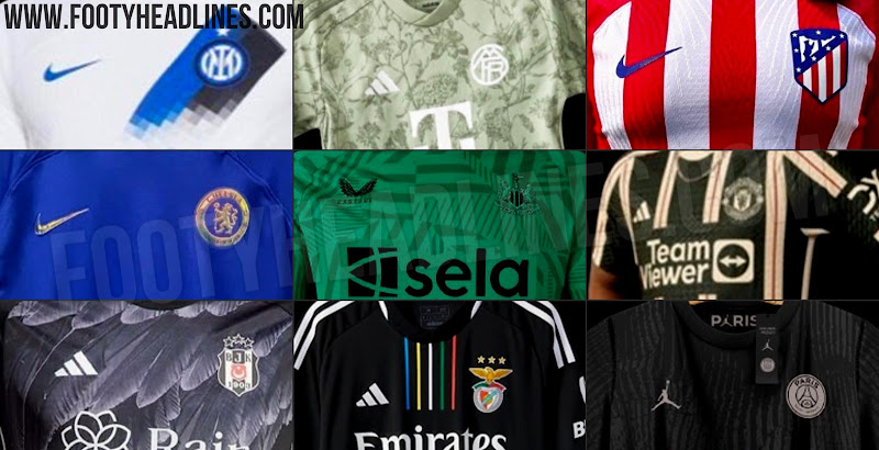
Are you a fan of the Adidas Bayern Munich 2023-2024 away kit? Let us know in the comments below.
Fleetwood Town Unveil Commemorative Puma Shirt for Arsenal Carabao Cup Tie
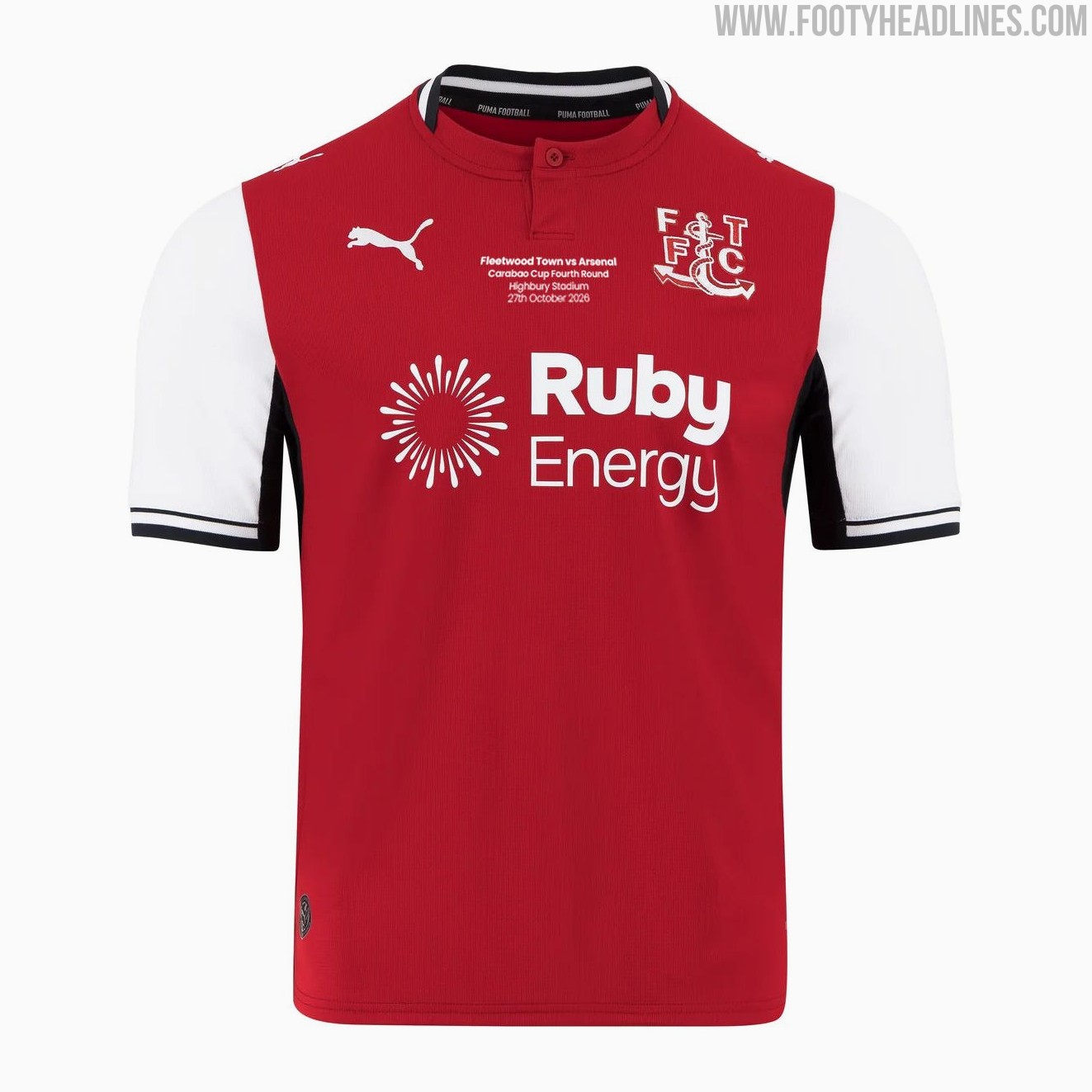
Fleetwood Town have unveiled a special commemorative Puma home shirt to celebrate their upcoming League Cup fourth-round clash against Premier League giants Arsenal. The Cod Army secured their place in the last 16 following an impressive cup run featuring clean-sheet home victories over Chesterfield, Shrewsbury Town, and Sheffield United. The historic tie is scheduled to be played at Fleetwood's own Highbury Stadium on Tuesday, 27 October 2026.
Manufactured by Puma, the special edition 26-27 kit builds on Fleetwood's traditional look with a red body, contrasting white sleeves, and black-and-white detailing along the collar and cuffs. The standout addition is the embroidered match inscription placed neatly on the chest between the Fleetwood Town crest and the Puma cat logo, detailing the fixture, tournament round, venue, and date, sitting directly above the Ruby Energy main sponsor.
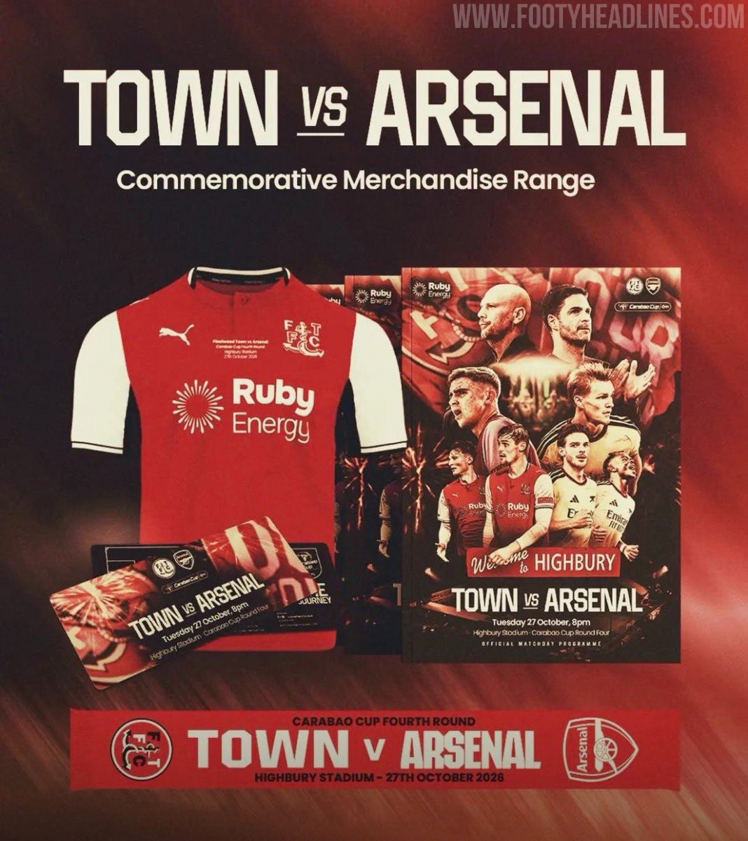
The shirt is the centerpiece of a broader official commemorative merchandise range released by the club for the occasion, which also includes a bespoke matchday programme, souvenir ticket, and commemorative scarf. Available in limited quantities, the jersey has been launched for pre-order through the club's online store priced at £70 for adult sizes and £60 for juniors.
Nike "Joga Bonito" React Gato & Streetgato Boots Released
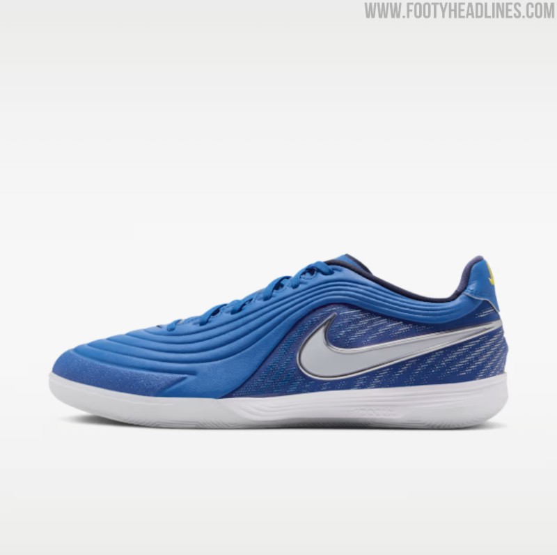
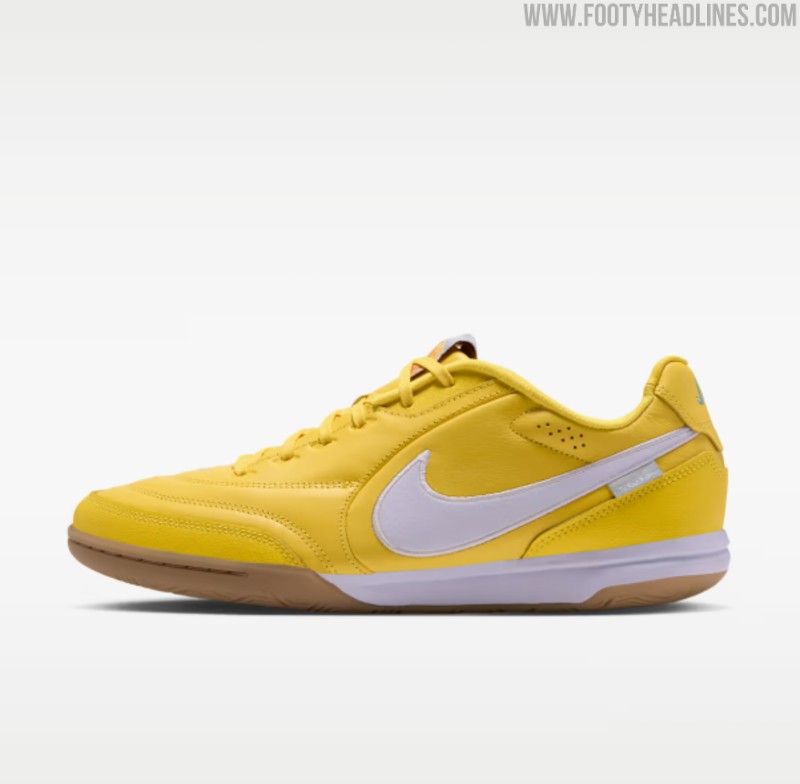
Nike has introduced Brazilian-inspired "Joga Bonito" editions for the React Gato and Streetgato, paying homage to the brand's iconic 2006 campaign. The lifestyle and small-sided Streetgato arrives in a vibrant canary yellow upper with white accents and a classic gum outsole, while the indoor-focused React Gato is dressed in royal blue with silver detailing and embroidered "Joga" branding on the heel tab. Both models feature soft synthetic leather across the forefoot for an enhanced touch, combining heritage flair with modern court performance and React cushioning.
PSG to Wear Special Pink October Kit Against Lyon
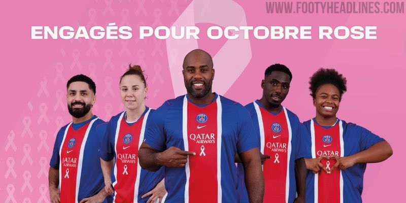
Paris Saint-Germain and main sponsor Qatar Airways have unveiled their fifth consecutive Pink October initiative to support breast cancer awareness and patient care. For the campaign, PSG's 26-27 home kit features the iconic pink ribbon placed underneath the Qatar Airways logo, complete with a pink gradient effect and matching pink player names and numbers on the back. The men's squad will wear the special shirt during their Ligue 1 clash against Olympique Lyonnais on October 25 at the Parc des Princes, following appearances by the women's team against OL Lyonnes on October 17 and the handball side on October 10. Match-worn shirts from these fixtures will be auctioned off to raise funds for the AP-HP Sorbonne Université hospital network.
In-House FC Barcelona 92-95 Remake Kit Released
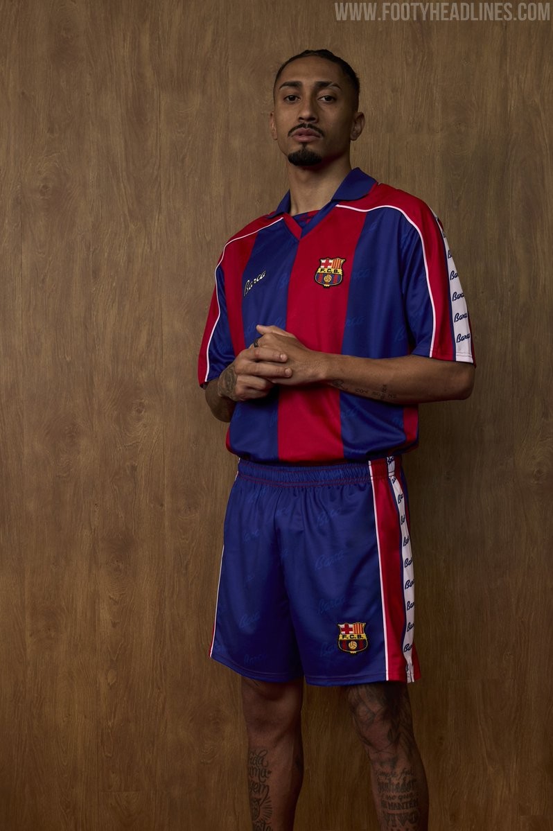
FC Barcelona has officially launched a brand new retro collection paying homage to one of the most celebrated eras in club history: the 1992-1995 Dream Team period. Fronted by first-team stars Pedri, Gavi, and Raphinha, the release takes heavy inspiration from the classic home kit worn under legendary manager Johan Cruyff during an era defined by domestic dominance and European glory.
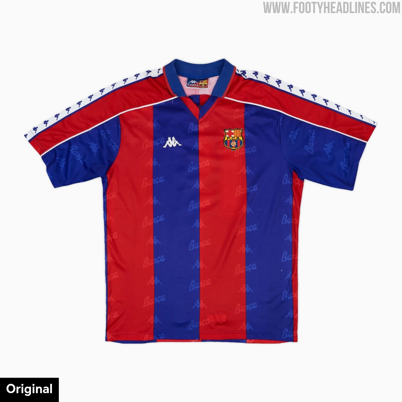
The centerpiece of the capsule is the 1992-95 retro shirt, which recreates the aesthetic of the iconic 1990s Kappa design without Kappa logos. It features traditional wide blaugrana vertical stripes, an authentic spread polo collar, and an all-over tonal jacquard pattern woven into the fabric. As an in-house club production rather than an official Kappa reissue, the original manufacturer branding and sleeve tape have been replaced with a stylish cursive "Barça" script on the chest and repeated along the sleeves.
Complementing the jersey, the retro capsule also includes matching blue shorts with branded side striping, an 1899 striped knitted sweater, and period-inspired socks, alongside optional #10 printing on the back of the shirt.
The Barcelona 1992-95 retro collection is available now exclusively through the official Barça online store and physical club shops, with the flagship shirt priced at €69.99.
Ecuador Release Special-Edition Kit for Japan Friendly
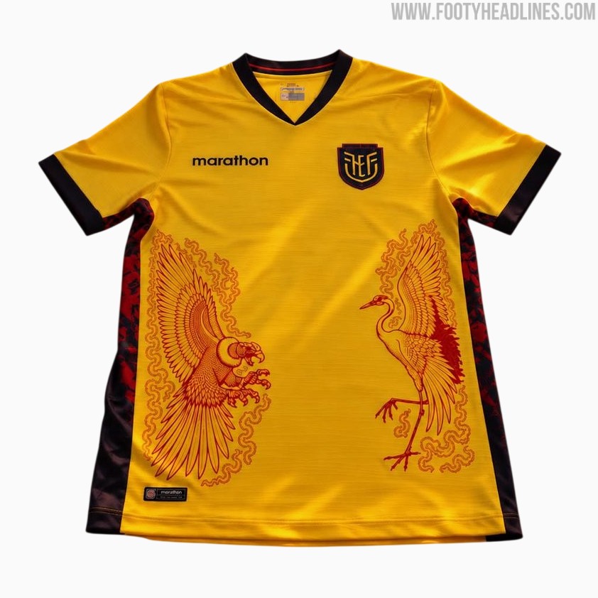
Ecuador and Marathon Sports have officially unveiled a special-edition yellow jersey for the national team's friendly against Japan on October 1, 2026, played at Yokohama International Stadium. The unique release continues Marathon's bespoke series designed specifically for Ecuador's late 2026 Asian tour.
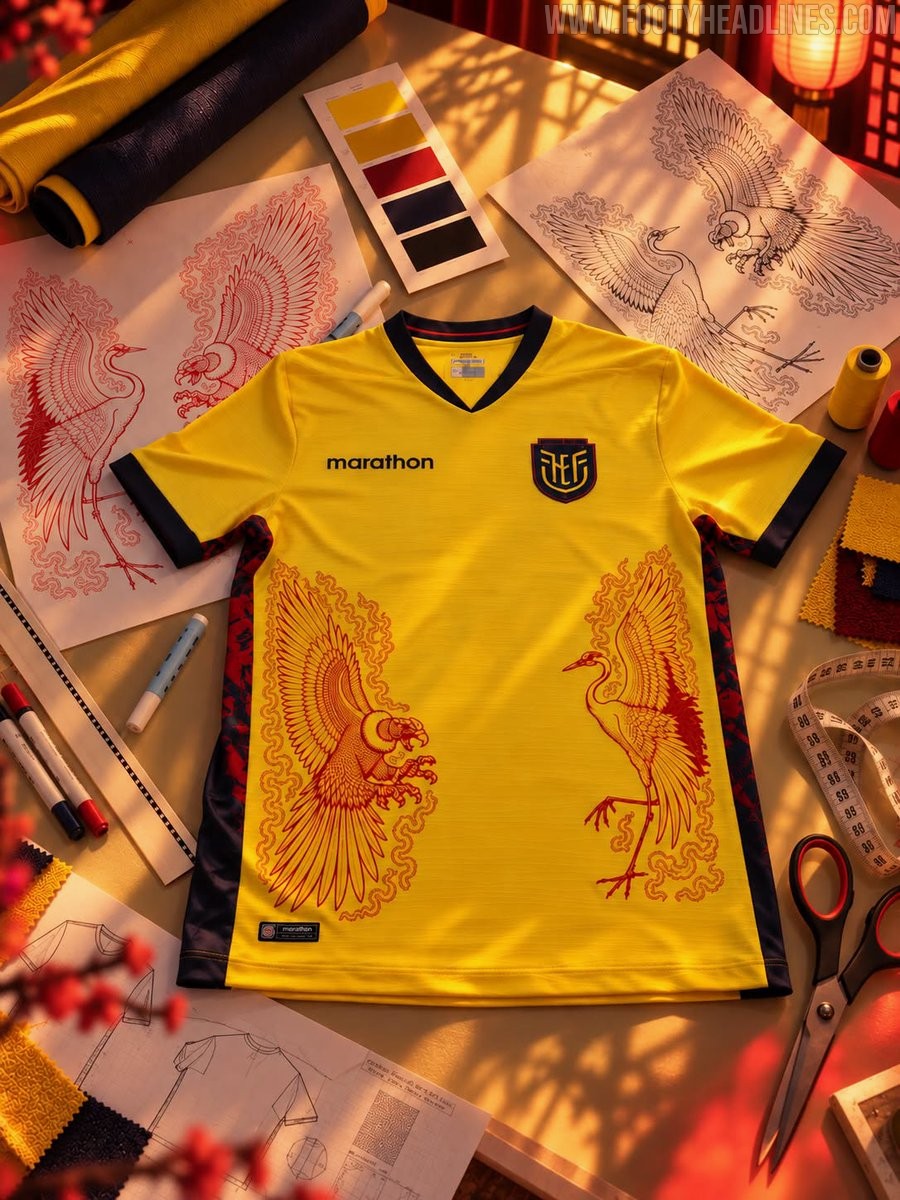
Based on Ecuador's traditional yellow home shirt, the jersey is highlighted by intricate red line-art graphics across the lower front. The artwork depicts an Andean condor facing a Japanese red-crowned crane, symbolizing a duel between the cultural icons of both nations. Dark navy trims on the v-neck collar and sleeve cuffs complete the look, alongside patterned side panels.
The shirt follows the matching white collector's edition kit Ecuador debuted against South Korea a week earlier, which featured an Andean condor opposite a Korean tiger. Produced in limited quantities, the shirt will be worn during the match in Yokohama.
Second Team After PSG: Jordan IF Brommapojkarna 2026 Special-Edition Kits Released
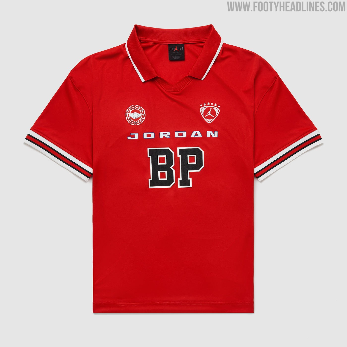
Swedish Allsvenskan side IF Brommapojkarna have officially teamed up with Jordan Brand to launch a bespoke special-edition collection. The release includes a one-off home jersey alongside a matching goalkeeper shirt, placing the renowned Stockholm club into rare company as one of the select few football teams to collaborate directly with the Jumpman.
The collection makes Brommapojkarna the second team to wear Jordan, after Paris Saint-Germain.
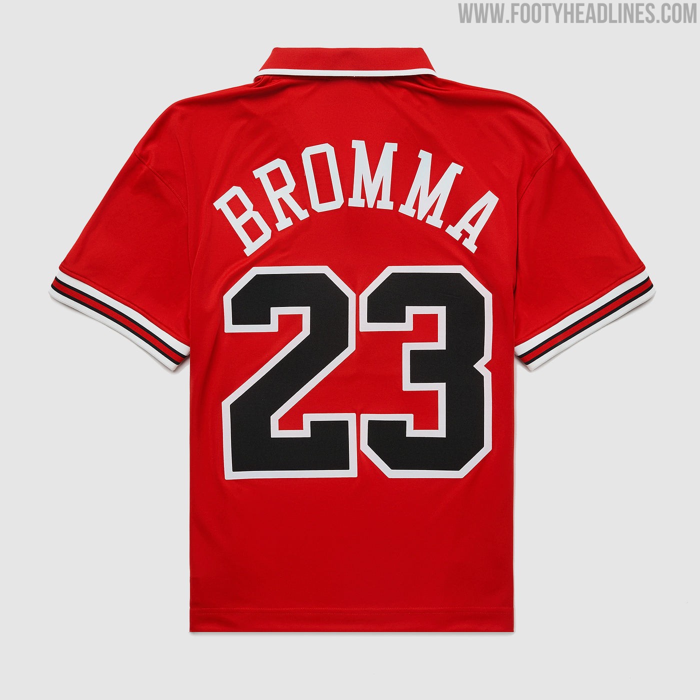
The Jordan IF Brommapojkarna 2026 special-edition home shirt is rendered in vibrant University Red and draws strong inspiration from classic football jerseys. It features a retro polo collar with white trim, complemented by striped ribbed cuffs in black, red, and white. The chest displays bespoke details, with a Jumpman shield crest on the left chest, a community-inspired handshake emblem encircled by laurels on the right, and collegiate-style "BP" lettering proudly sitting below the Jordan wordmark in the center.
Alongside the red outfield shirt, the collection also includes a stealthy black edition crafted for the goalkeeper.
Both special-edition jerseys are now available through Pro:Direct Soccer and select Swedish retailers like Stadium, retailing at 1,199 SEK.
Cesena 26-27 Third Kit Released
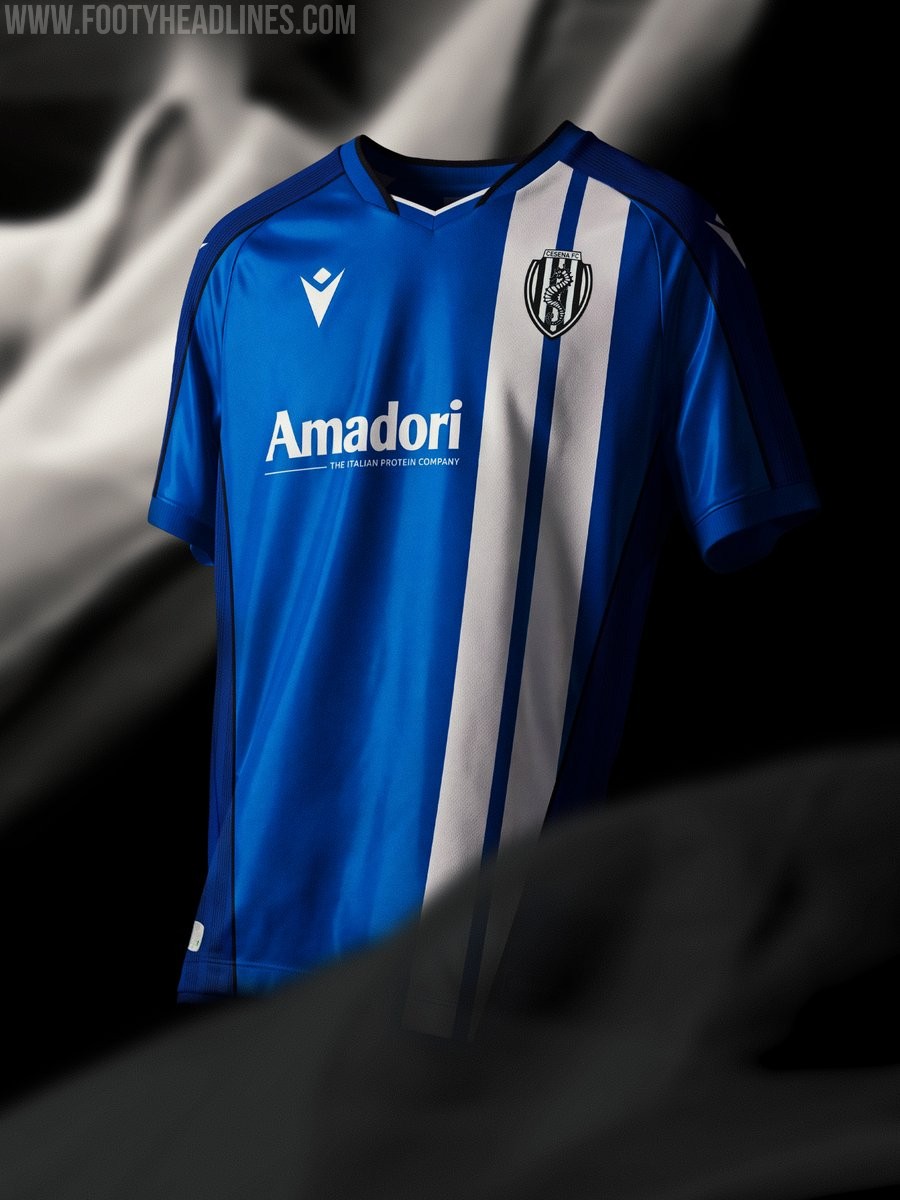
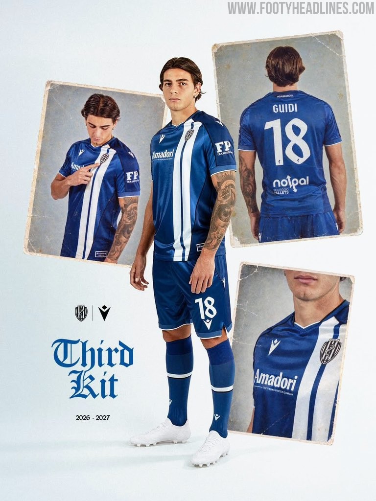
Cesena FC and Macron have officially unveiled the club's new third kit for the 26-27 season, commemorating the 50th anniversary of the side's historic 1976-77 UEFA Cup tie against 1.FC Magdeburg, the only European tie in the club's history.
The Cesena 2026-27 third shirt arrives in a royal blue base crafted from glossy Eco Everton fabric evoking retro 1980s and 90s aesthetics, complemented by darker blue inserts across the shoulders, sleeves, and sides framed by black piping. Running down the left chest behind the club crest are two vertical white stripes directly inspired by the jersey worn by Magdeburg during that memorable first-leg encounter in 1976. Completed with a woven Magdeburg 1976–2026 commemorative tag at the hem and the club's #DAIBURDEL motto on the upper back neck, the new look is paired with royal blue shorts and socks.