Standard Liege Anniversary Logo Revealed

Last week, Belgian club Standard Liege revealed a new logo, celebrating the club's 125th anniversary. The team was originally founded by students back in 1898.

Standard Liege Anniversary Logo
Here is a comparison between the regular and the anniversary logo.
The Standard Liege 125th anniversary logo is essentially a slight update of the regular version used since 2013. Added to the banner under the crest, which already contained the founding year 1898, are the current year, 2023, and Roman numerals 'CXXV' (125).
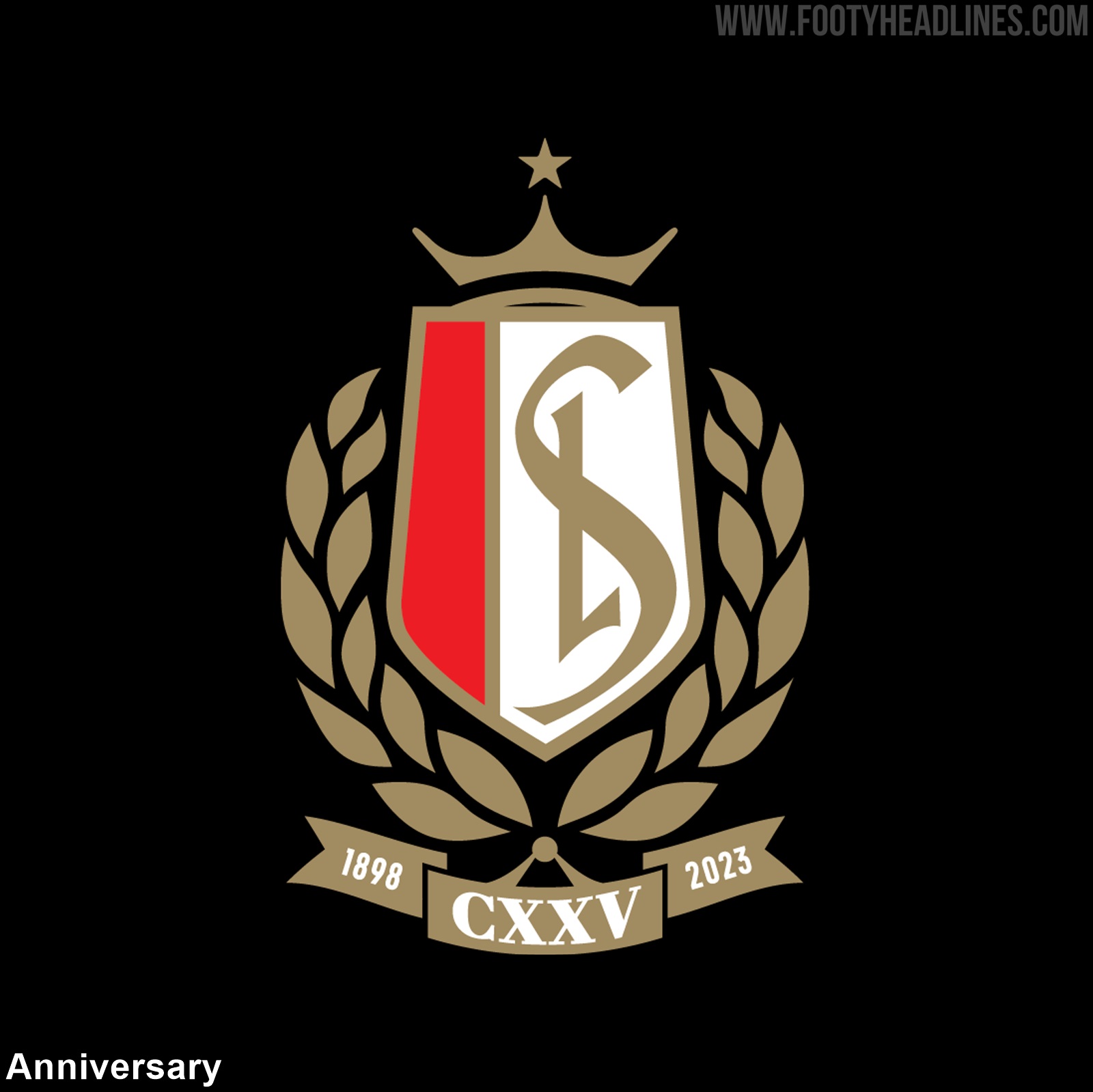
Otherwise the shade of gold has been lightened slightly, as well as the shield and hearth changed in certain proportions. The 'L' in the center also no longer has a white outline where it covers the 'S'.

Essential elements such as the crown, red and white shield, and 'SL' initials have been maintained for many decades.
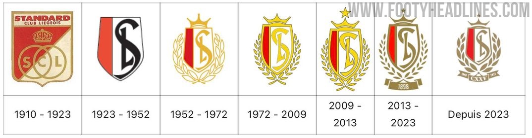
Liege will wear the anniversary crest on their 2023-24 kits, but likely only for the one season.
What do you think of Standard Liege's new anniversary logo? Should it be the foundation of a slightly updated logo for 2024 and beyond? Comment below.


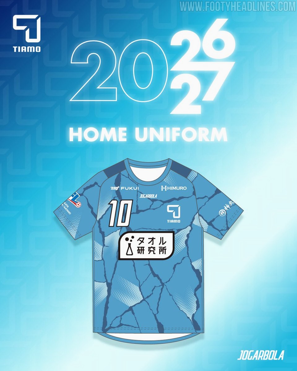
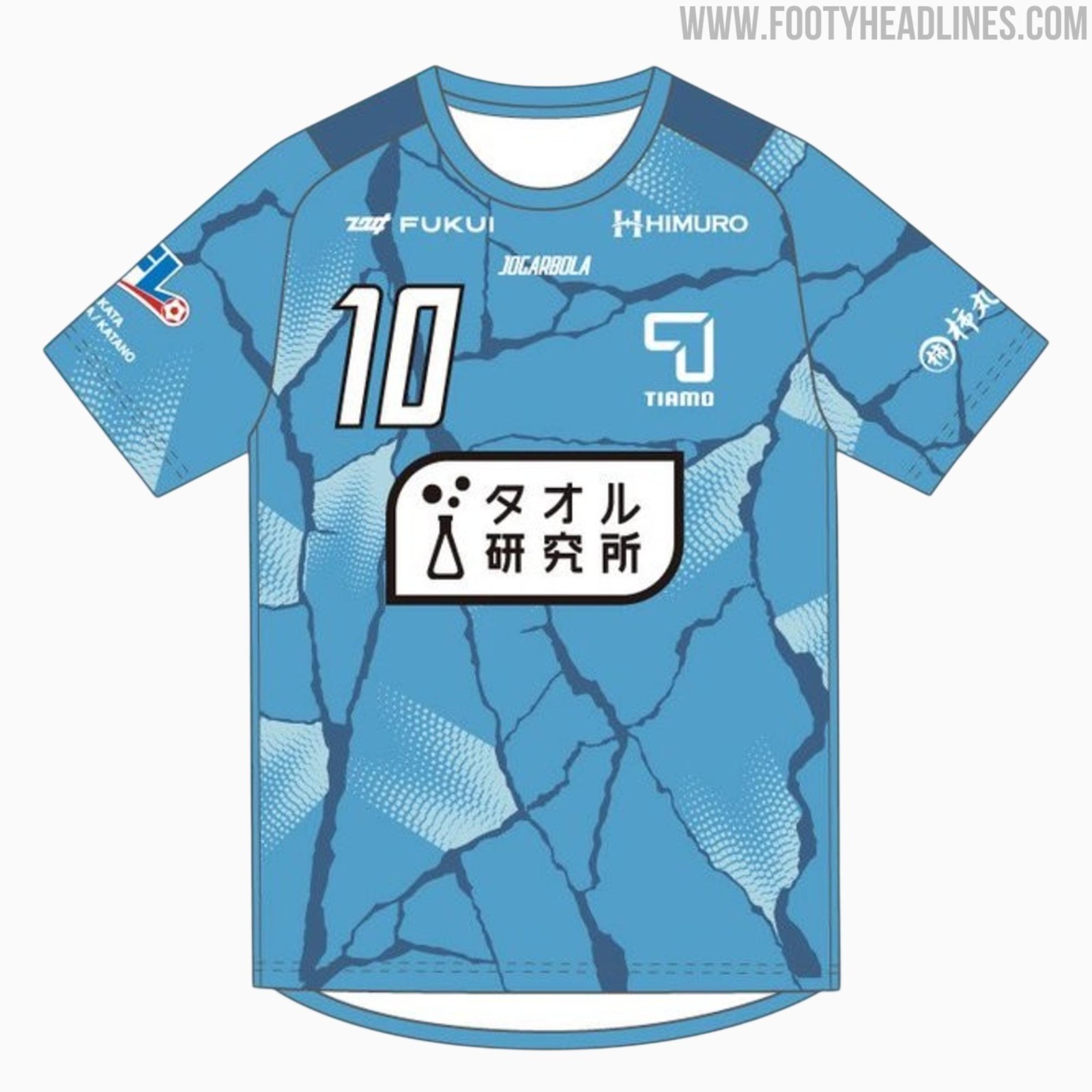
FC Tiamo Hirakata 26-27 Home Kit Released
Japanese Football League side FC Tiamo Hirakata has officially unveiled their new 2026-27 home kit, produced by sportswear brand Jogarbola. The release introduces a cracking design under the club's Reborn campaign for the upcoming JFL season, symbolizing a new beginning for the club.
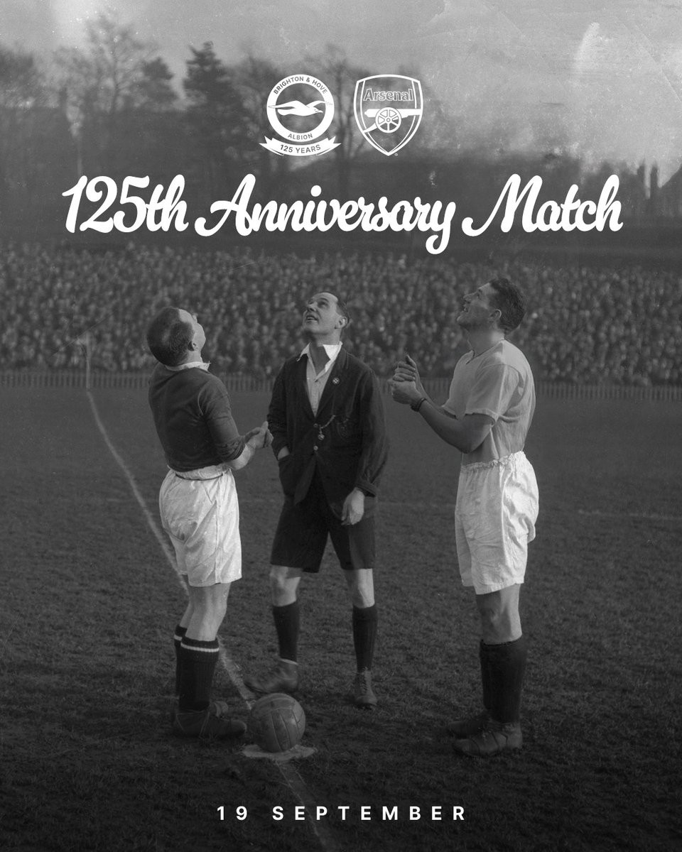
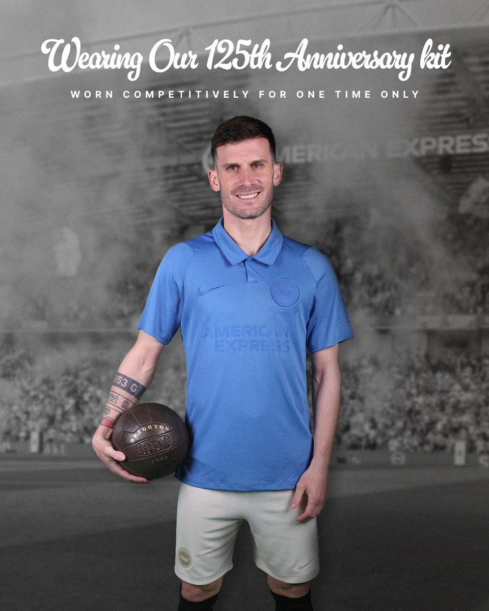
Brighton to Wear 125th Anniversary Kit Against Arsenal
Brighton & Hove Albion have confirmed they will wear their limited-edition Nike 125th anniversary kit during their 2026-27 match against Arsenal in September 2026. The special shirt, which was initially released in May 2026 and draws inspiration from the club's original 1901 kit, will be showcased on the pitch to celebrate the club's founding milestone. Although the official anniversary falls on June 24, the commemorative fixture against the Gunners has been selected as the dedicated anniversary match where the team will debut the historic design.
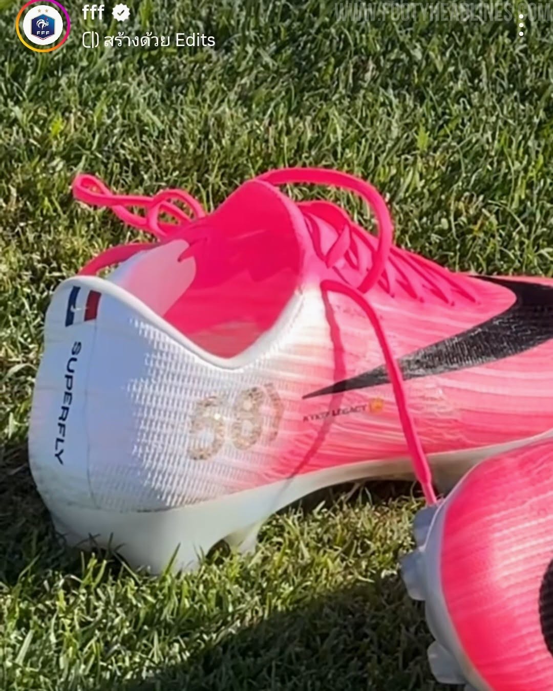
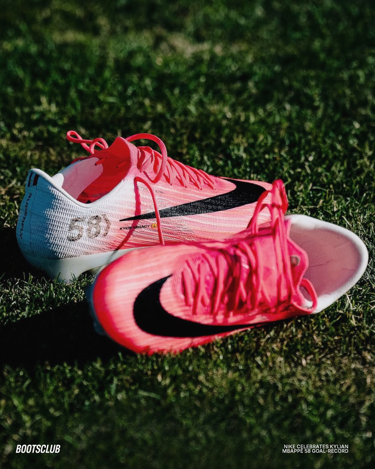
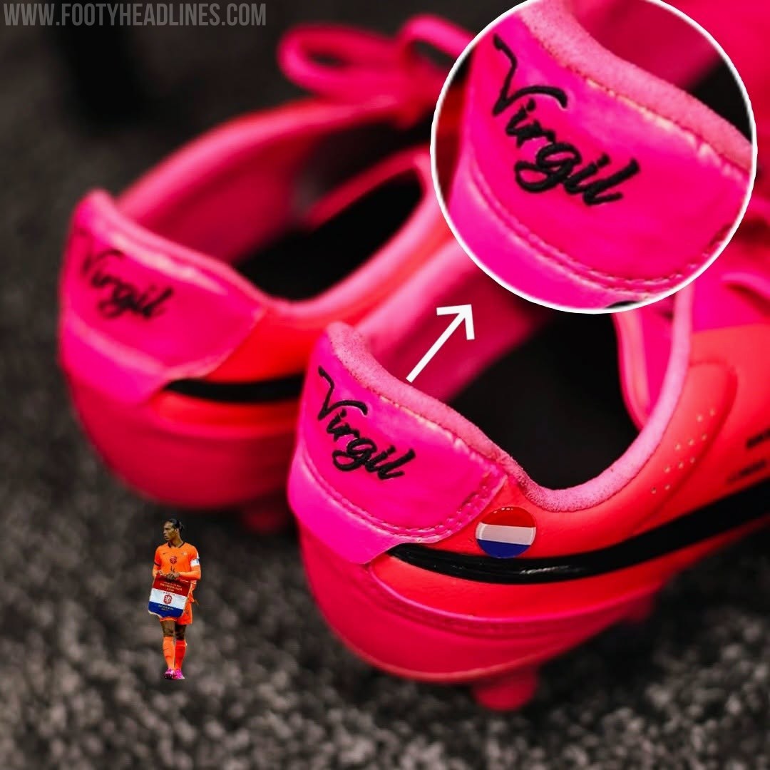
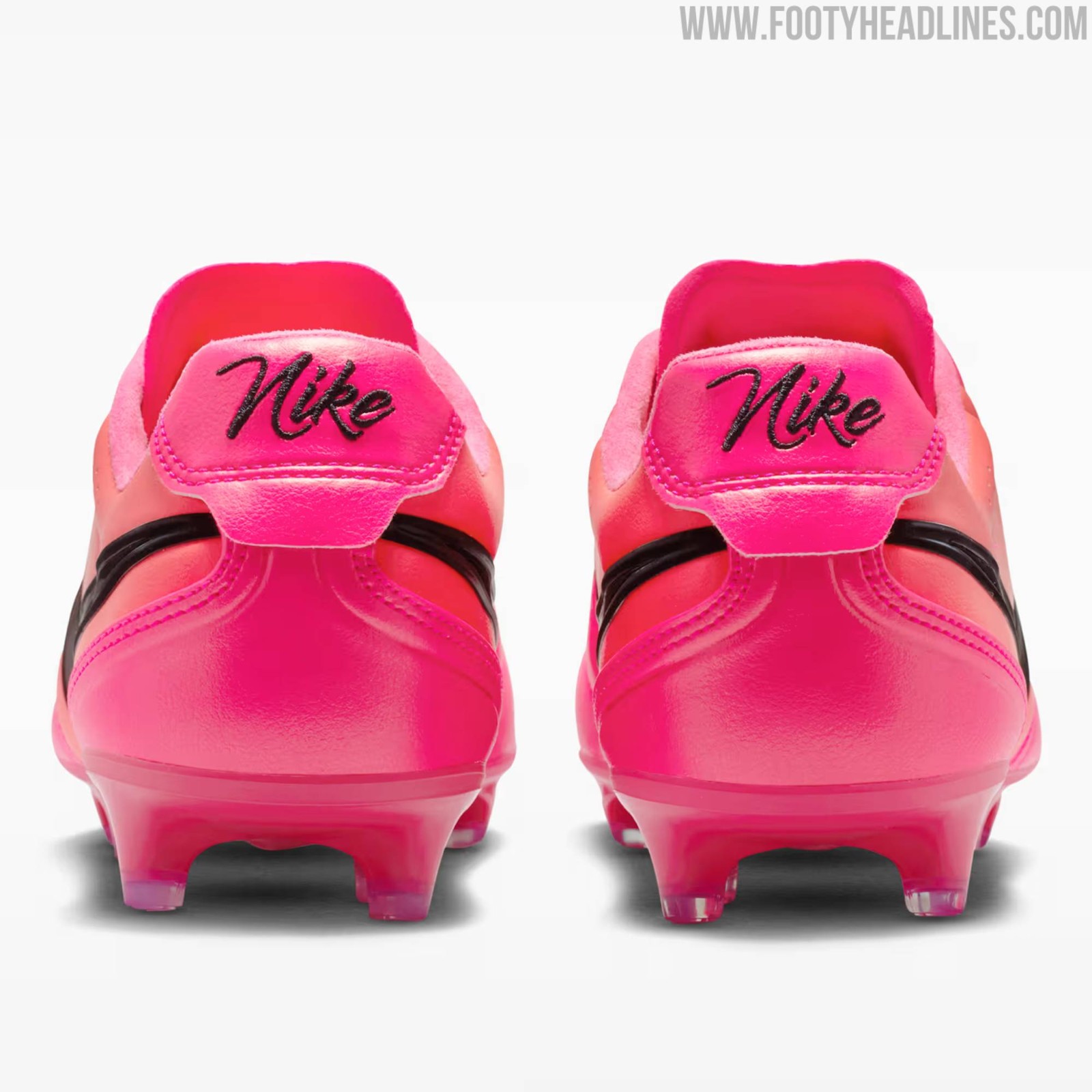
Nike Creates Personalized Mercurial 2026 World Cup Boots for Kylian Mbappé's France Goalscoring Record
Kylian Mbappé has officially cemented his legacy as the greatest goalscorer in the history of the French national team, surpassing Olivier Giroud to take the top spot. To celebrate this historic milestone of reaching 58 international goals, Nike has presented the star forward with a personalized pair of Mercurial Superfly 11 boots. This special edition footwear arrives just in time as Mbappé prepares to make his 100th appearance for Les Bleus.
The custom Nike Mercurial Superfly 11 Mbappé 2026 World Cup boots features a distinct "58" lightly printed on the lateral side of the heel, representing his record-breaking goal tally. Additionally, a small French tricolor flag is prominently positioned near the heel collar, paying direct homage to his national team.