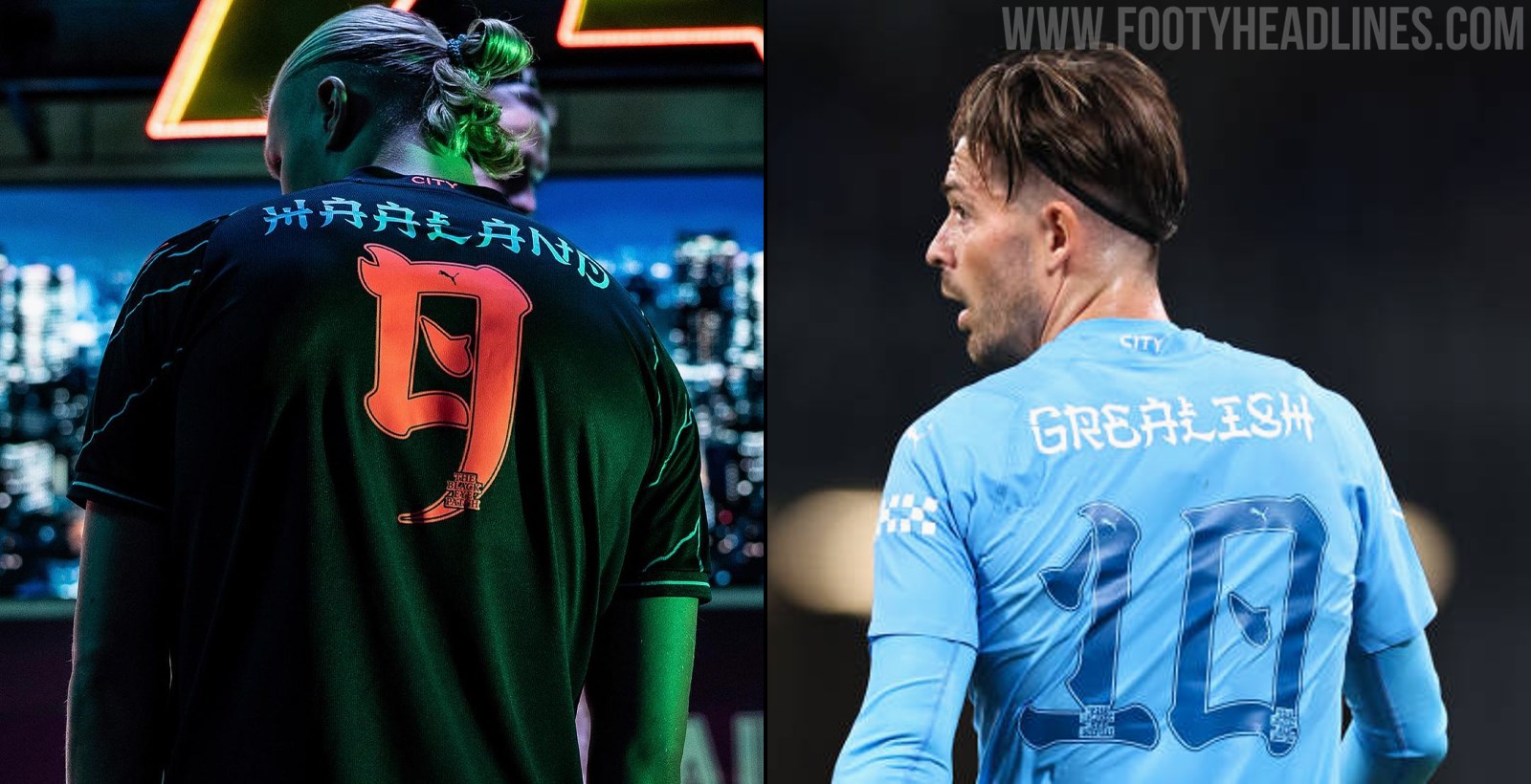
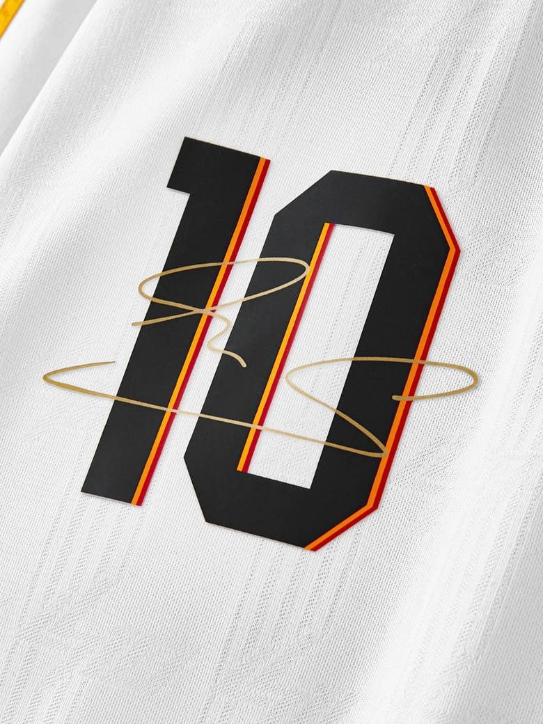
Manchester City Use Striking Bespoke Font for Japanese Tour
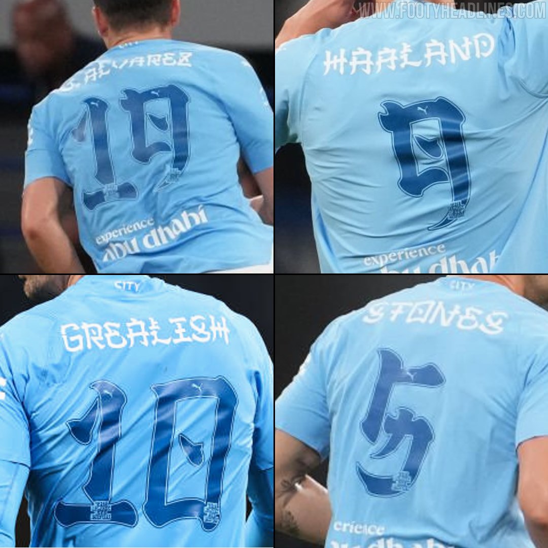
Man City are currently on their pre-season tour of Japan and they're using a special font on their kits that borrows from Japanese culture.

Man City Japanese kit font

We've seen quite a few teams over the years play with Chinese or Japanese namesets for certain friendly matches or Chinese New Year, but Manchester City have done something a little different for their pre-season tour of Japan. Rather than ditch the namesets we recognise in favour using the local language and it's symbols, Man City are using a bespoke font that takes stylistic cues from the Kanji characters that make up the Japanese alphabet.

The result is quite striking, and the colour combos add to the effect on both the home and third shirts. It has to be said that the use of the electric blue and neon pink namesets and numbers - matching the accent colours of the shirt - makes a real impression. The white names and blue numbers is a more reserved choice, although we're not too sure if the Premier League would allow numbering so close to the base colour of their shirt, never mind that extremely artistic interpretation of the number seven.

What do you think of the special font? Comment below.
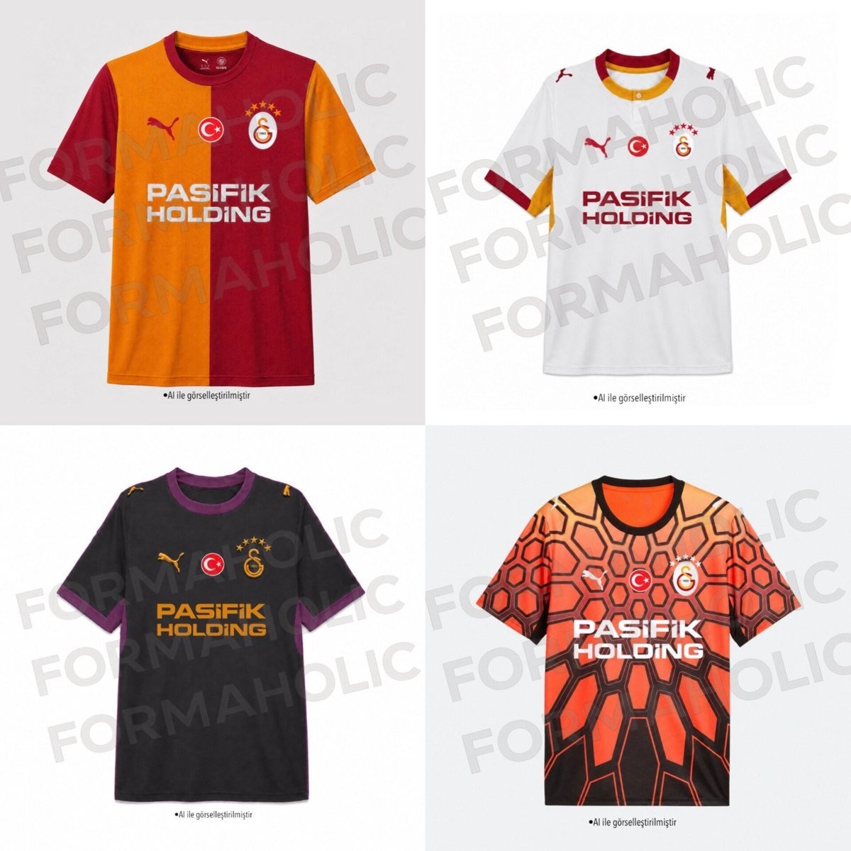
Galatasaray 26-27 Kit Launch Delayed - Coming July 2026
Galatasaray's 2026-27 kit launch faces a potential delay, pushing the release date back to July. Initially, reports from kit insider @Formaholic indicated that the club had advanced the presentation to June 25. However, recent updates suggest that the launch will likely revert to its original July timeframe.
The delay is reportedly due to logistical issues, specifically concerning the readiness of the new kit fonts and the club's desire to have players participate in the launch event. Earlier this month, it was revealed that Galatasaray would be moving away from the standard Arial font. The new typeface is expected to be similar to the one featured on a recent special Leroy Sane kit.

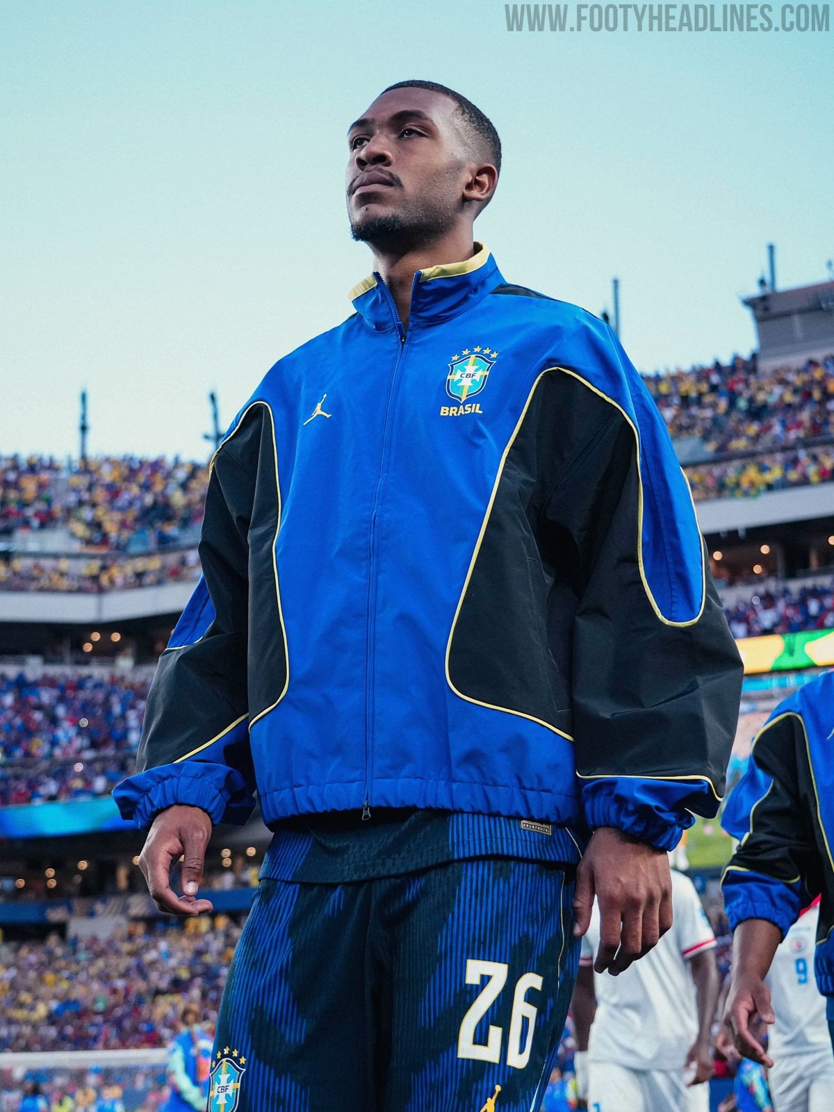
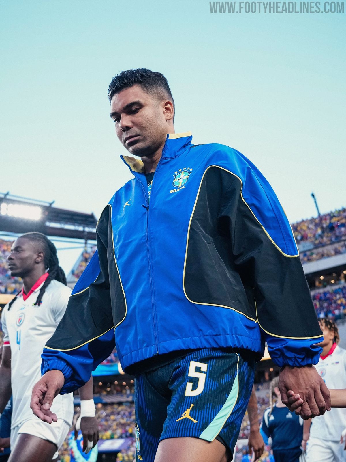
Jordan Brazil 2026 Away Anthem Jacket - On-Pitch Debut
In Brazil's World Cup 2026 match against Haiti, the players debuted their new 2026 away anthem Jacket by Jordan. The jacket looked absolutely stunning on the pitch.
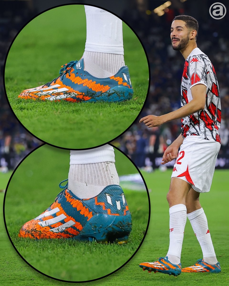
Mortadha Ben Ouanes Wears 2014 Adidas Messi 'Mirosar10' Signature Boots Against Japan
In Tunisia's 2026 World Cup group stage match against Japan at Estadio Monterrey, midfielder Mortadha Ben Ouanes caught the attention of boot spotters by wearing the classic Adidas Messi Mirosar10 boots.
Originally launched in late 2014, the Adidas Messi Mirosar10 boots were designed exclusively for the Argentine to celebrate his childhood in Rosario. The orange and green colorway pays tribute to Messi's first youth club, reflecting the local derby colors of his hometown. Ben Ouanes' decision to wear the 12-year-old signature boots provided a unique throwback moment on the game's biggest stage.


Norway 2026 Away Kit Debuted at 2026 World Cup
Yesterday, the Norway players debuted their new 2026 away kit on the World Cup stage. They defeated Senegal 3-2 and officially secured a place in the knockout stage
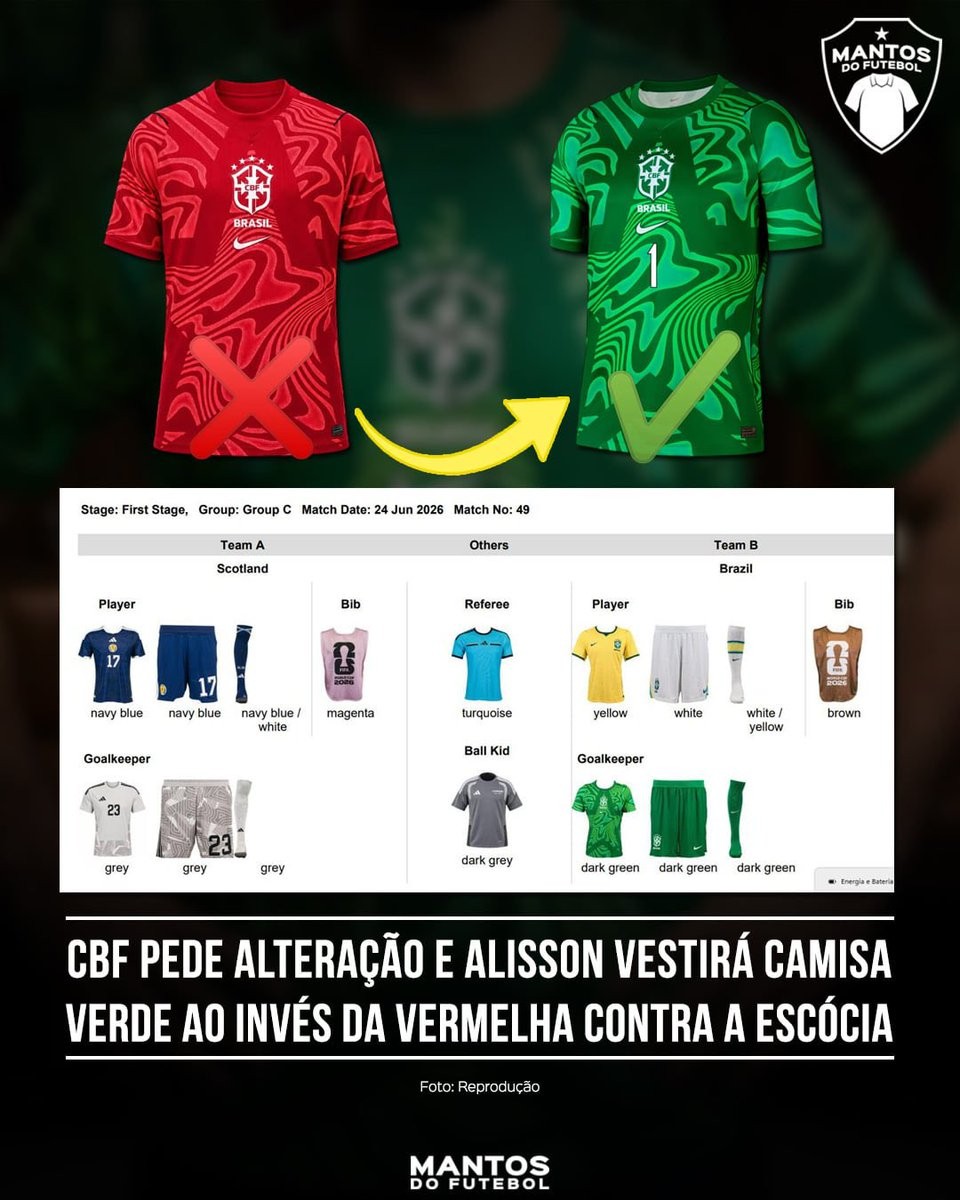
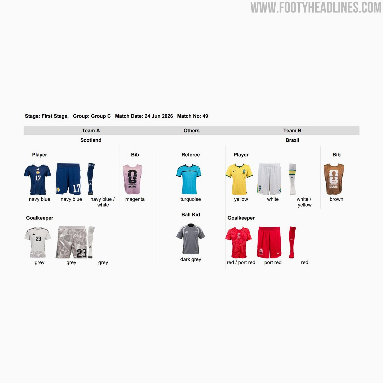
FIFA Changes Brazil Goalkeeper Kit for Scotland Match
FIFA has implemented a late change to Brazil's goalkeeper kit for their 2026 World Cup Group C encounter with Scotland. Initially slated to wear a red outfit, the Brazilian goalkeeper will now wear green for the match on June 24.
The reasons for the switch are not known.
Official match kit graphics confirm the switch, showing the Brazil goalkeeper in a dark green jersey, paired with matching dark green shorts and socks. This green kit is one of the primary options in Brazil's wardrobe for the tournament. Their opponents, Scotland, will have their goalkeeper dressed in a grey kit.
The update was brought to attention by Brazilian kit specialists Mantos do Futebol. The released FIFA match kit table visually confirms the swap from the originally planned red Nike goalkeeper shirt to the green alternative, alongside the outfield kits of both nations.
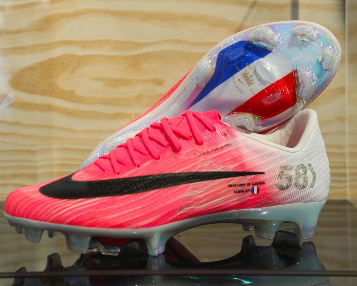
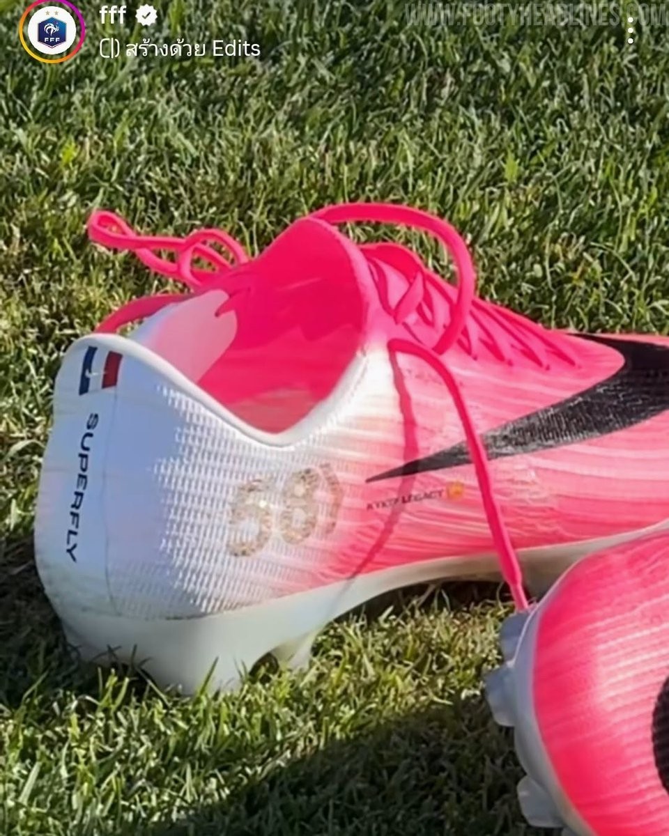
Nike Creates Personalized Mercurial Superfly 11 Boots for Kylian Mbappé's France Goal Record
Nike has presented Kylian Mbappé with a personalized pair of Mercurial Superfly 11 boots to celebrate his record as France's all-time top goalscorer. The special edition boots were created to commemorate his milestone of 58 goals for the national team, a record he reached ahead of his 100th cap.
The bespoke boots feature several unique design elements to honor his achievement. The number 58 is prominently displayed on the lateral heel, accompanied by a small French tricolor flag positioned near the heel collar. Additionally, the sole plate is completely customized in the colors of the French flag, adding a distinct national touch to the standard Mercurial Superfly 11 silhouette.
Mbappé debuted the new boots during the match vs Iraq. As a custom creation specifically designed to mark his record-breaking achievement, the personalized boots remain exclusive to the player and will not be available for public retail release.
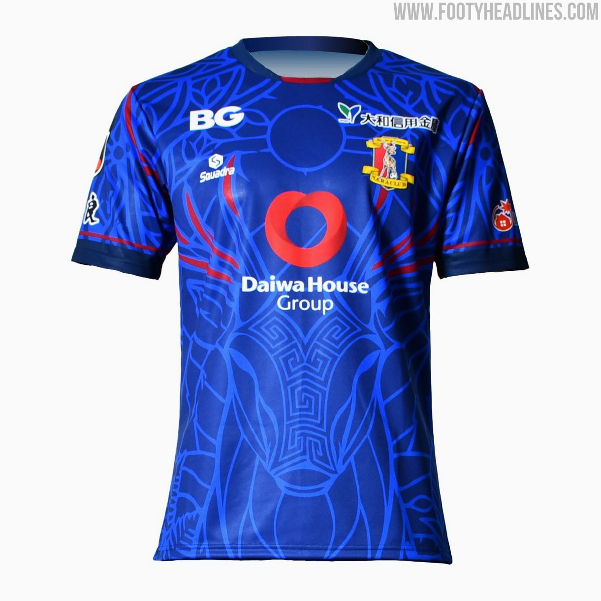
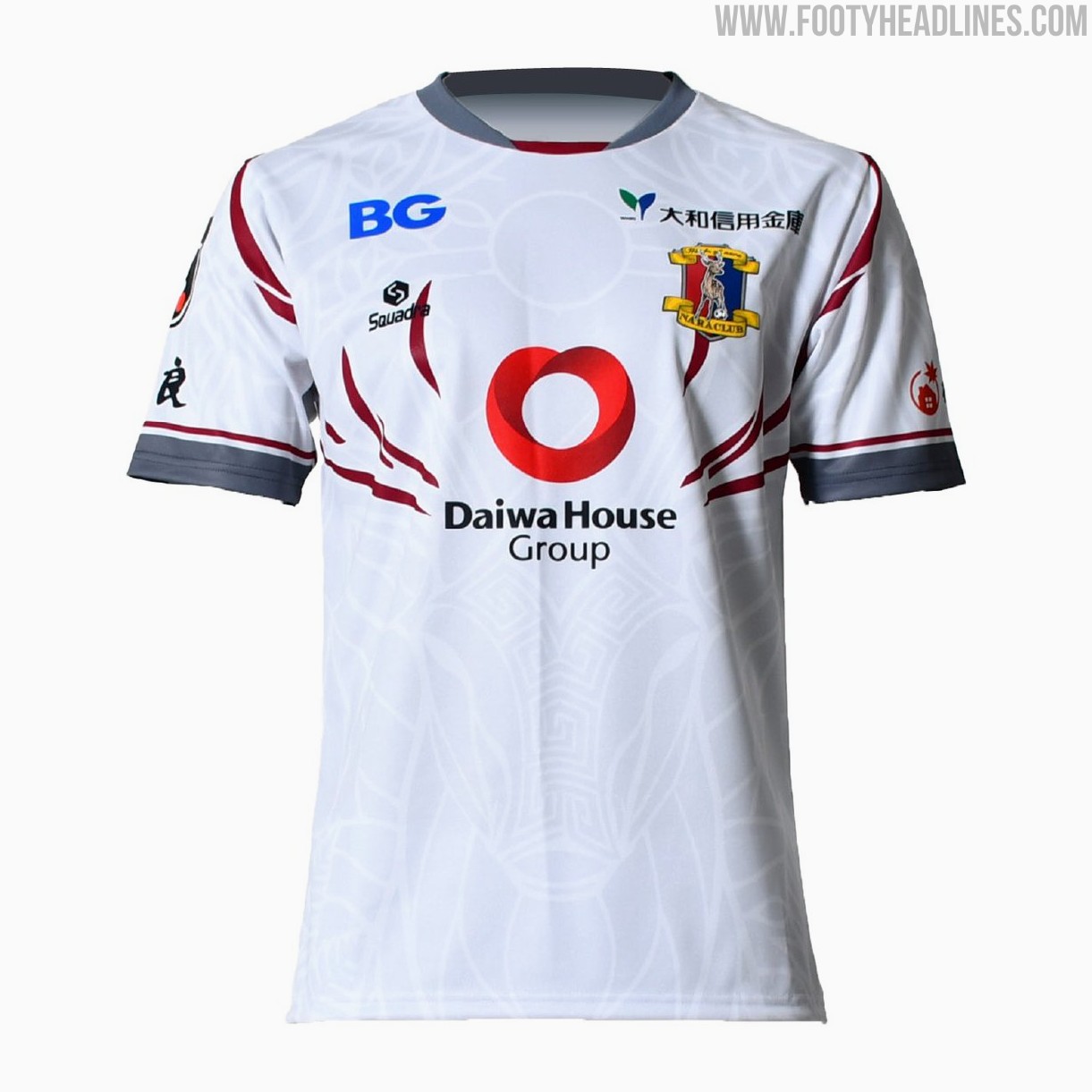
Nara Club 26-27 Kits Released
Japanese J3 League side Nara Club have officially released their new 2026-27 kits, produced by Squadra. The new shirts feature a bespoke design centered around the concept "God Deer Pulse" (神鹿の鼓動), paying homage to the sacred deer of Nara.
The collection includes home, away, and goalkeeper kits that all utilize the same thematic template with intricate graphic patterns across the body.
Pre-sales for the new Nara Club 2026-27 kits began on June 22.


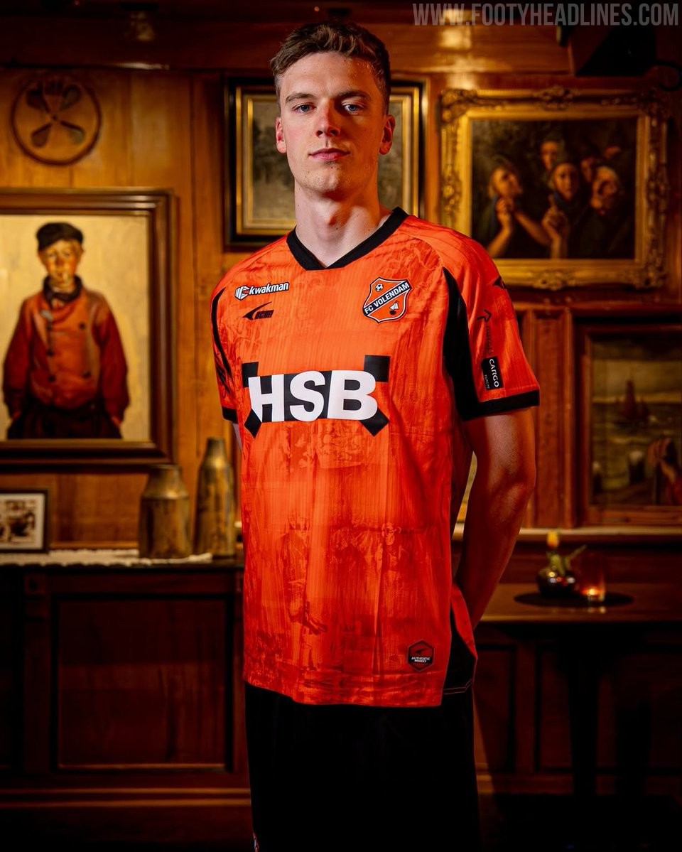
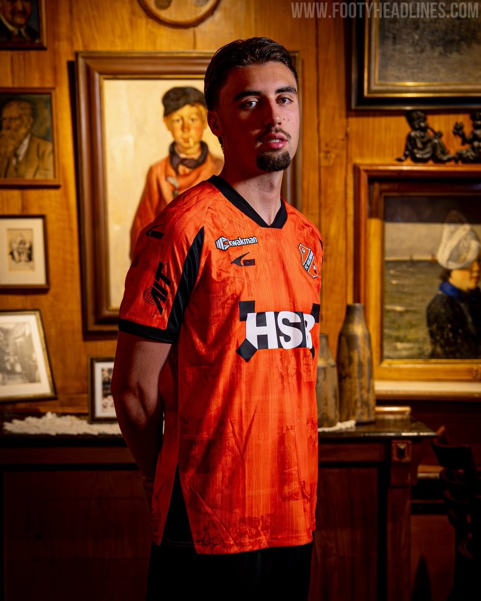
UCAN Enters Europe: FC Volendam 26-27 Home Kit Released
The new FC Volendam 2026-27 home kit has been officially released, marking the first foray into the European market for the club's new technical sponsor, UCAN, a Chinese brand.
The design pays tribute to local culture, serving as an ode to Volendamse schilderkunst (Volendam painting art) with a unique graphic pattern incorporated into the traditional orange base. The FC Volendam 2026-27 home kit is available to purchase through the club's official fanshop and webshop.

Adidas Celebrates Messi Breaking the All-Time World Cup Goalscoring Record
Lionel Messi has officially become the all-time leading goalscorer in FIFA World Cup history, netting his 17th goal in Argentina's match against Austria on June 22, 2026. To celebrate this historic milestone, Adidas immediately published a dedicated graphic on their social media channels, crowning their signature athlete with the caption RECORD BREAKER. HISTORY MAKER. The goal moves Messi past Miroslav Klose's long-standing record of 16 World Cup goals.
The achievement comes just days after Messi scored a hat-trick earlier in the tournament to tie the record. During this historic 2026 World Cup run, Messi has been wearing the Adidas F50 'El Último Tango' signature boots.