Typeface
Pachuca Spotted Using Same Kit Font as Tigres UANL
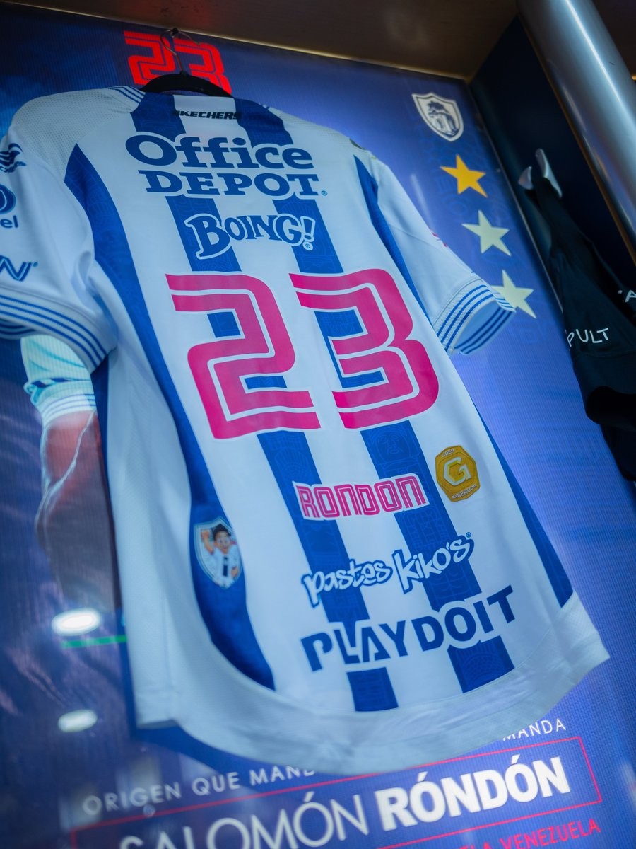
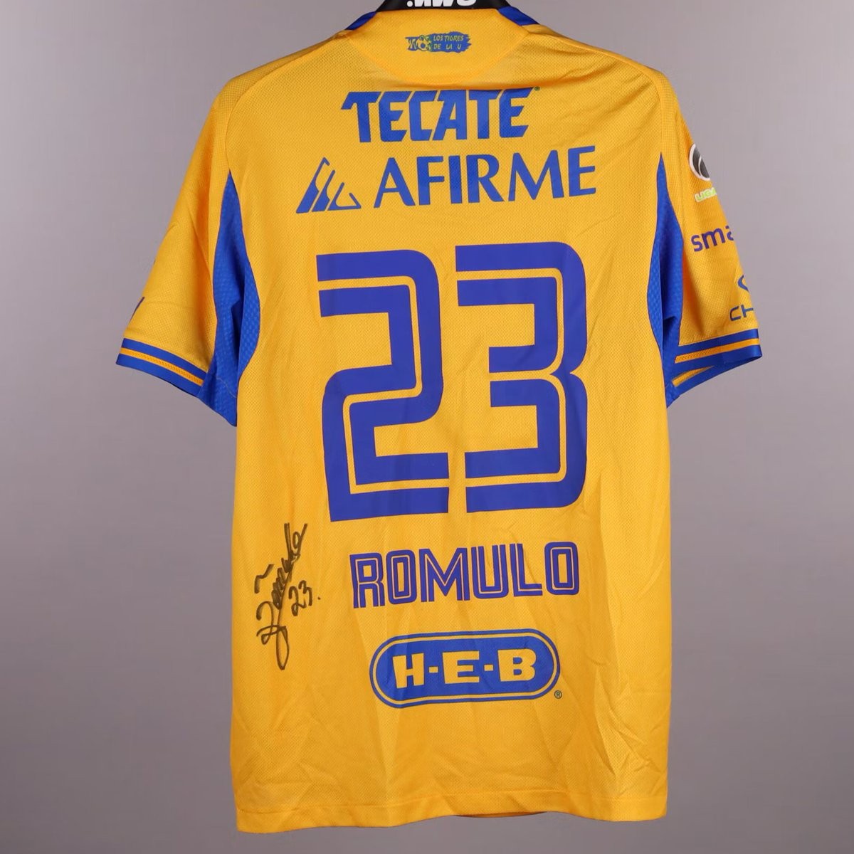
An observant kit collector has spotted a curious detail on Pachuca's kits this season. As pointed out by shirt enthusiast account @TigresJersey, Club Pachuca are using the exact same player name and number typography for the 26-27 season that Tigres UANL wore just one season prior in 25-26.
A side-by-side comparison of the number 23 and player names shows identical characters across both teams. The typeface features a distinct athletic block styling defined by an inner inline track cutout. While Tigres used a solid single-tone application on their 25-26 Adidas shirts, Pachuca and technical sponsor Skechers appear to have reused the exact same digital font file for their 26-27 jerseys, merely adding a white contour stroke around the numerals.
Unlike competitions such as the Premier League or La Liga, Liga MX does not mandate a centralized, unified league font, allowing clubs and brands full creative freedom for their name and number designs. Seeing a bespoke club font reused just twelve months later by a rival club—and across completely different manufacturers, transitioning from Adidas to Skechers—is an unusual misstep that has not gone unnoticed by Mexican kit fans.
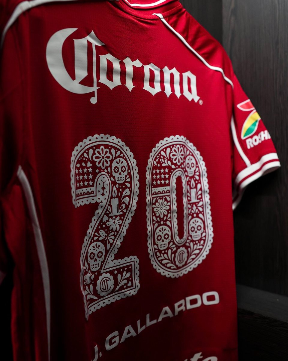
Toluca Unveil Special 26-27 Día de Muertos Font
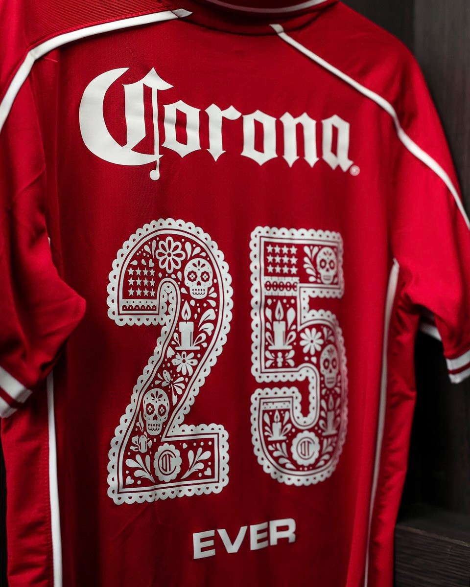
Toluca and New Balance have unveiled an ornate special Día de Muertos typeface for their 26-27 home kit. The commemorative numbering made its on-pitch debut during the club's Liga MX Apertura clash against Club América.
Rendered in clean white against the club's signature red jersey, the design draws heavy inspiration from traditional Mexican papel picado folk art. Each number features an elaborate scalloped lace outer border filled with rich Day of the Dead symbolism, including calaveras (sugar skulls), cempasúchil flowers, burning candles, stars, and the club's iconic monogram crest embedded near the bottom.
The special edition font continues Toluca's celebration of local culture this season, arriving shortly after the release of their Cosmovitral-inspired third kit and highlighting Liga MX's vibrant tradition of cultural tributes.
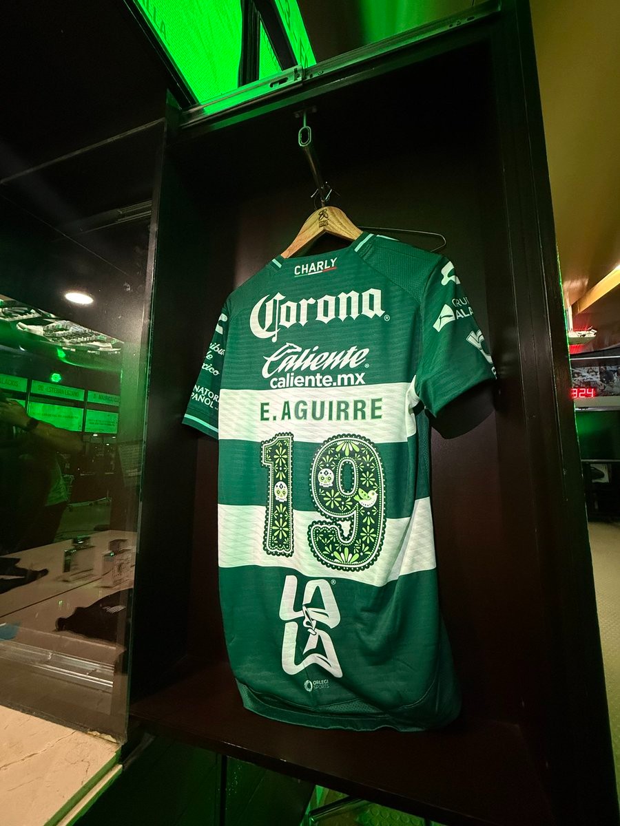
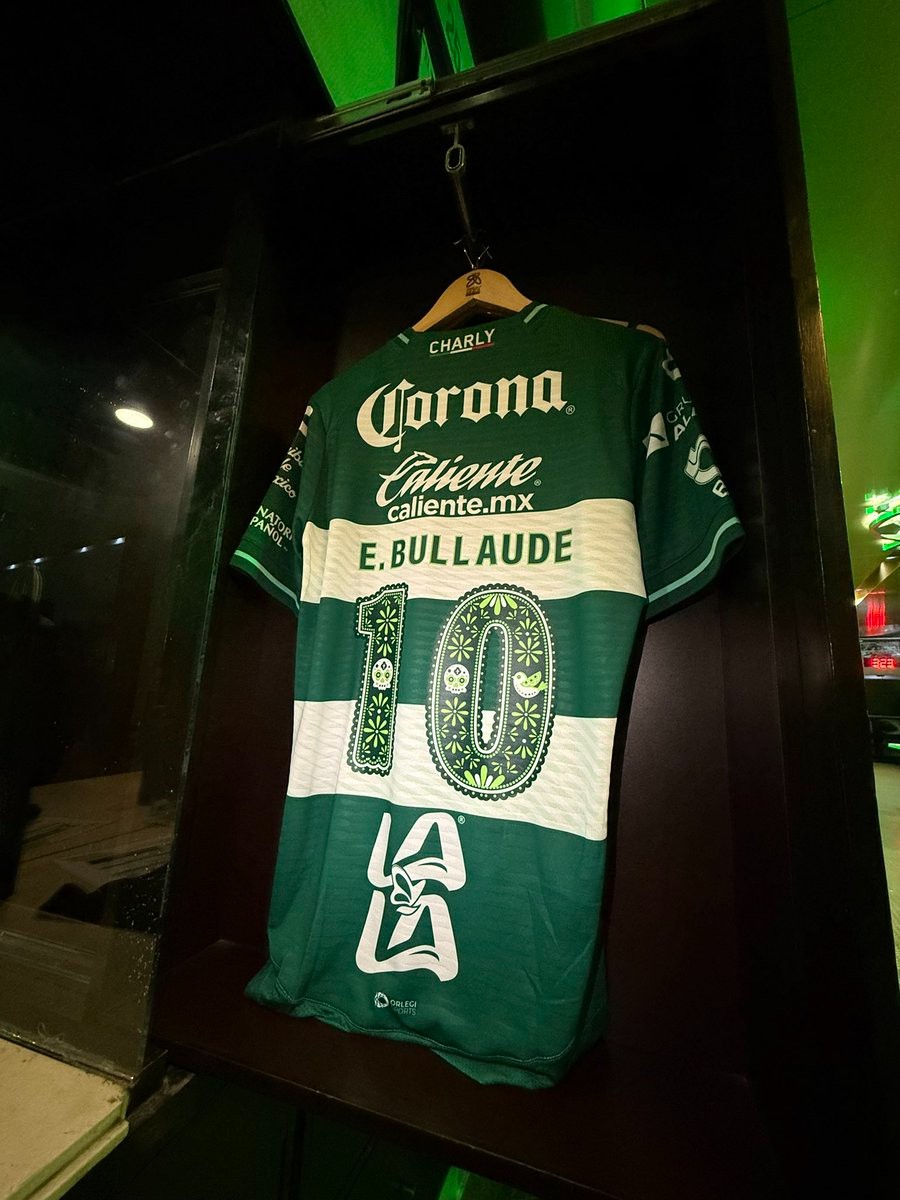
Special Santos Laguna Día de Muertos Kit Font Revealed
Liga MX side Santos Laguna paid homage to the traditional Mexican holiday Día de Muertos with a special commemorative kit font, worn on their 26-27 Charly home shirts during their league encounter against Club Necaxa.
Rather than launching a completely separate fourth kit, the club decorated their signature green-and-white hooped jerseys with bespoke typography on the back. The custom numbers feature intricate folk-art motifs closely tied to the Day of the Dead, including decorative sugar skulls (calaveras), cempasúchil flowers, delicate birds, and traditional patterned borders colored in matching shades of dark and light green.
The special edition numbering follows a growing trend in Liga MX of clubs celebrating the cultural holiday through customized matchday typography. While Santos Laguna previously debuted full Día de Muertos-themed kits alongside Charly in 2020, this year's subtle yet detailed tribute added a festive touch to their standard home strip.
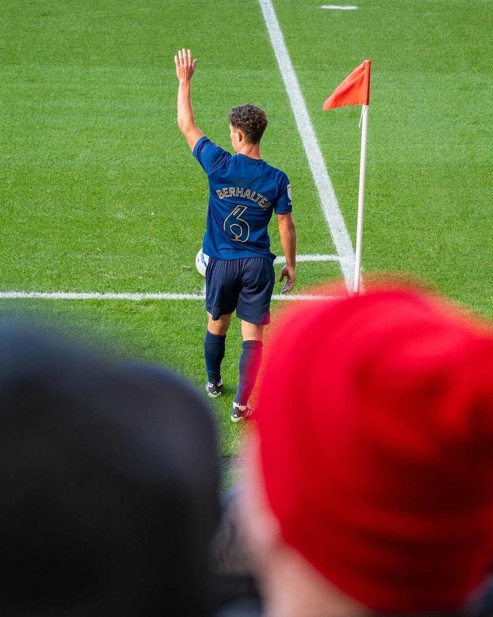
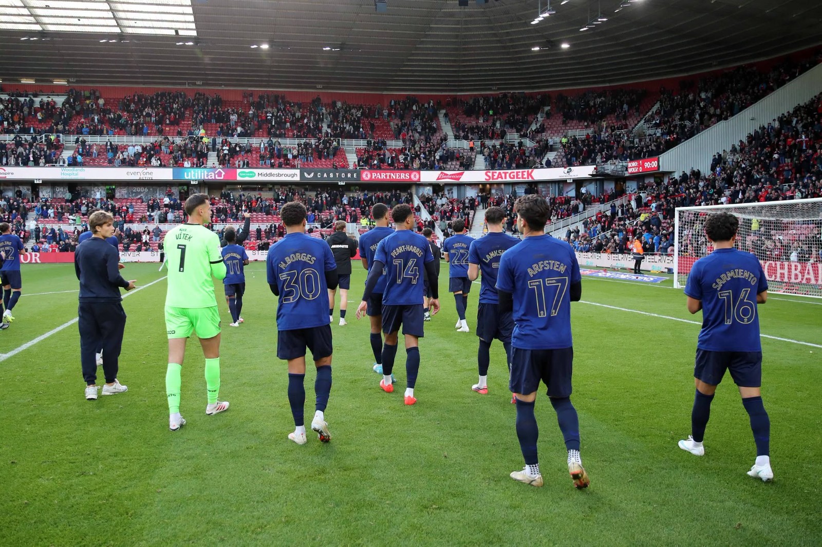
Middlesbrough 150th Anniversary Commemorative Kit Font Revealed
Middlesbrough FC debuted a bespoke font on their special 150th anniversary commemorative kit during their match against Wolves at the Riverside Stadium. Lettering and numbers specialist ID Unlimited provided the custom typeface for the occasion, designed specifically to match the limited-edition navy blue jersey crafted by Castore.
The commemorative font features an elegant gold finish that coordinates with the special 150th anniversary club crest and brand details. The numbers adopt a distinct inline double-contour structure with curved, retro-inspired geometry, while the player names are arched across the upper back in clean, refined typography. The look reinforces the heritage theme of the kit, which references Middlesbrough's founding in 1876 when players wore blue cricket whites before the club eventually adopted its traditional red.
The special nameset was worn exclusively for the anniversary celebration fixture and will not feature on the club's regular 26-27 league shirts, giving the rare commemorative jersey an even more distinct collector feel.
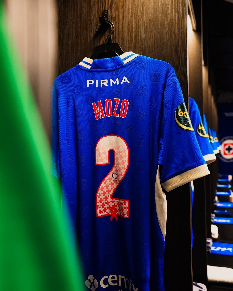
Cruz Azul Unveils Special 'Octubre Rosa' 26-27 Kit Font
Mexican giants Cruz Azul have unveiled a bespoke font on their 26-27 kits in support of Breast Cancer Awareness Month ("Octubre Rosa"). As part of a long-standing tradition across Liga MX each October, clubs incorporate pink detailing into their match gear to promote awareness, prevention, and early detection of the disease.
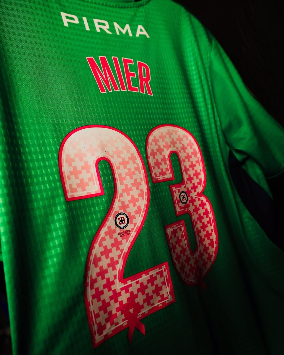
Crafted for their 26-27 Pirma home and goalkeeper jerseys, the custom numbers showcase a striking pink and white mosaic inspired by the club's iconic cross motif. At the base of each digit, the pattern subtly shapes into the awareness ribbon. Inside the numbering, the official Cruz Azul crest sits above "Número Oficial 2026-2027" text, while the player names are rendered in matching pink lettering framed with a crisp white border.
The special font was seen on match-prepared jerseys in the locker room for players including Alan Mozo, goalkeeper Kevin Mier, and forward Christian Ebere. Cruz Azul are wearing the commemorative typography across their Liga MX Apertura matches throughout October.
Ronald Araújo Wore Old Premier League Font
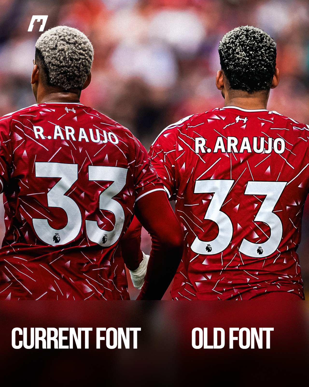
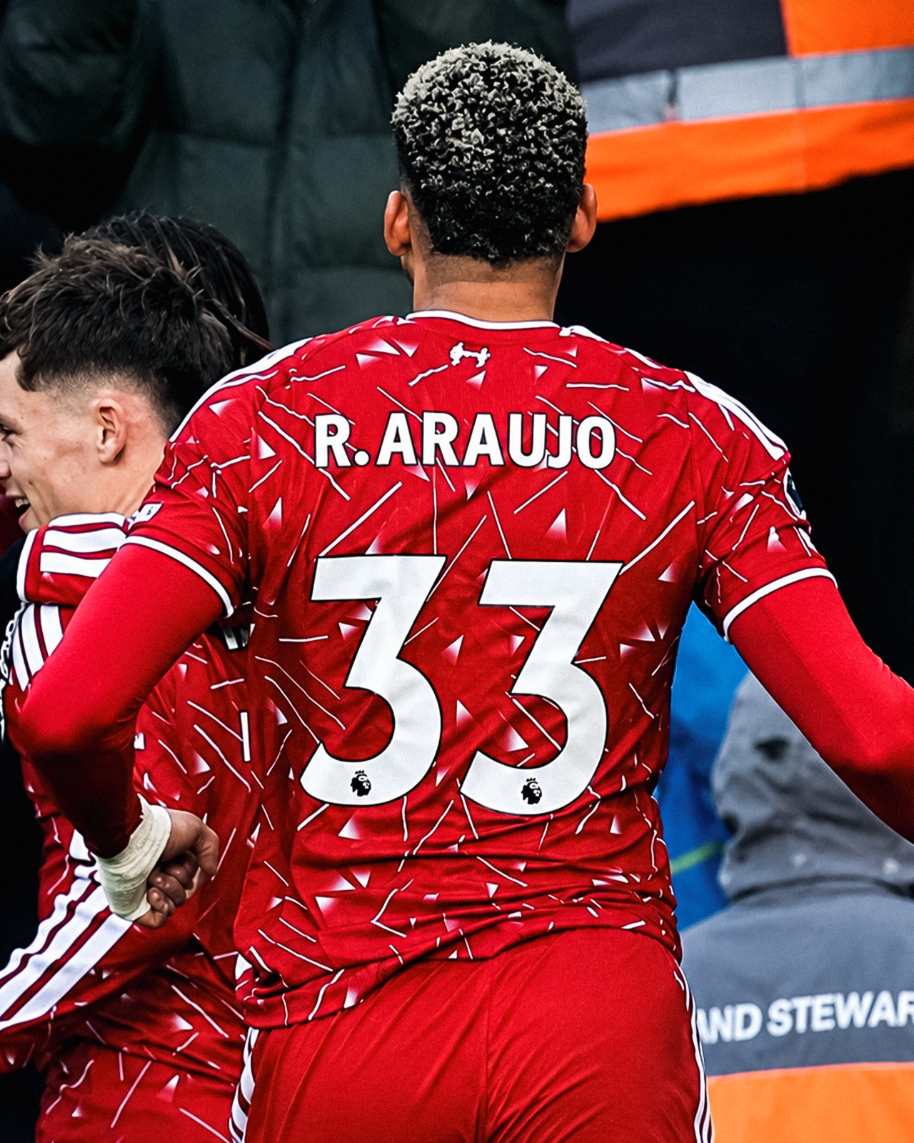
Despite being phased out over three years ago, the Premier League’s previous typography (used from 2017-18 to 2022-23) made an unexpected return during Liverpool’s recent win against Brighton, appearing on the back of Ronald Araújo's shirt.
For reasons yet to be officially confirmed, the Uruguayan defender’s number "33" was heat-pressed using the legacy Premier League font. Meanwhile, his surname and short numbering correctly featured the current league typeface introduced in 2023. In all prior fixtures this season, Araújo had worn the updated style without issue.
The mix-up is widely believed to be an emergency kit-room solution, likely caused by a temporary shortage of the standard large "3" printing stock on matchday.
Thanks to @whatthekit_x for the great spotting and create the comparison image.

Chivas Releases Special 26-27 'Día de Muertos' Kit Font
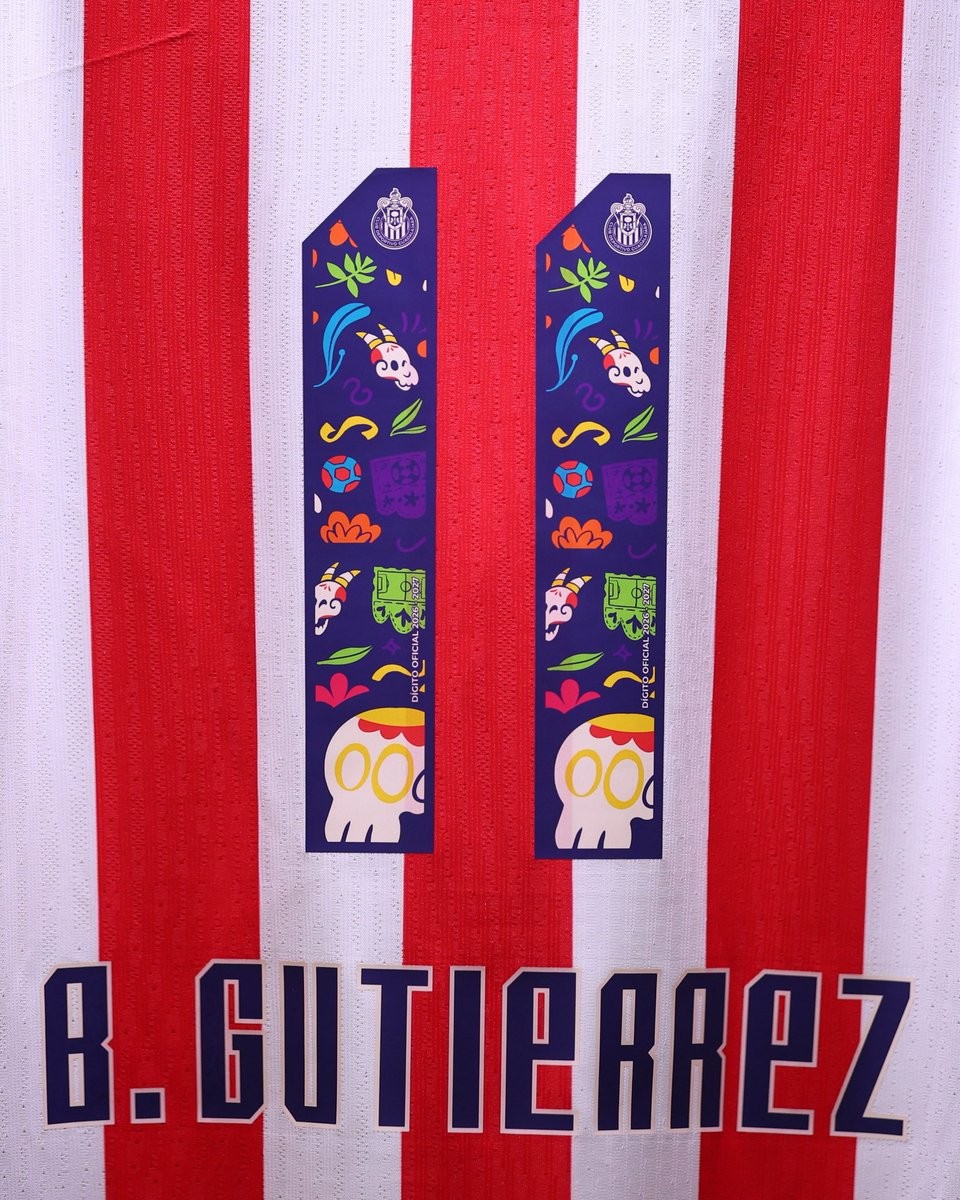
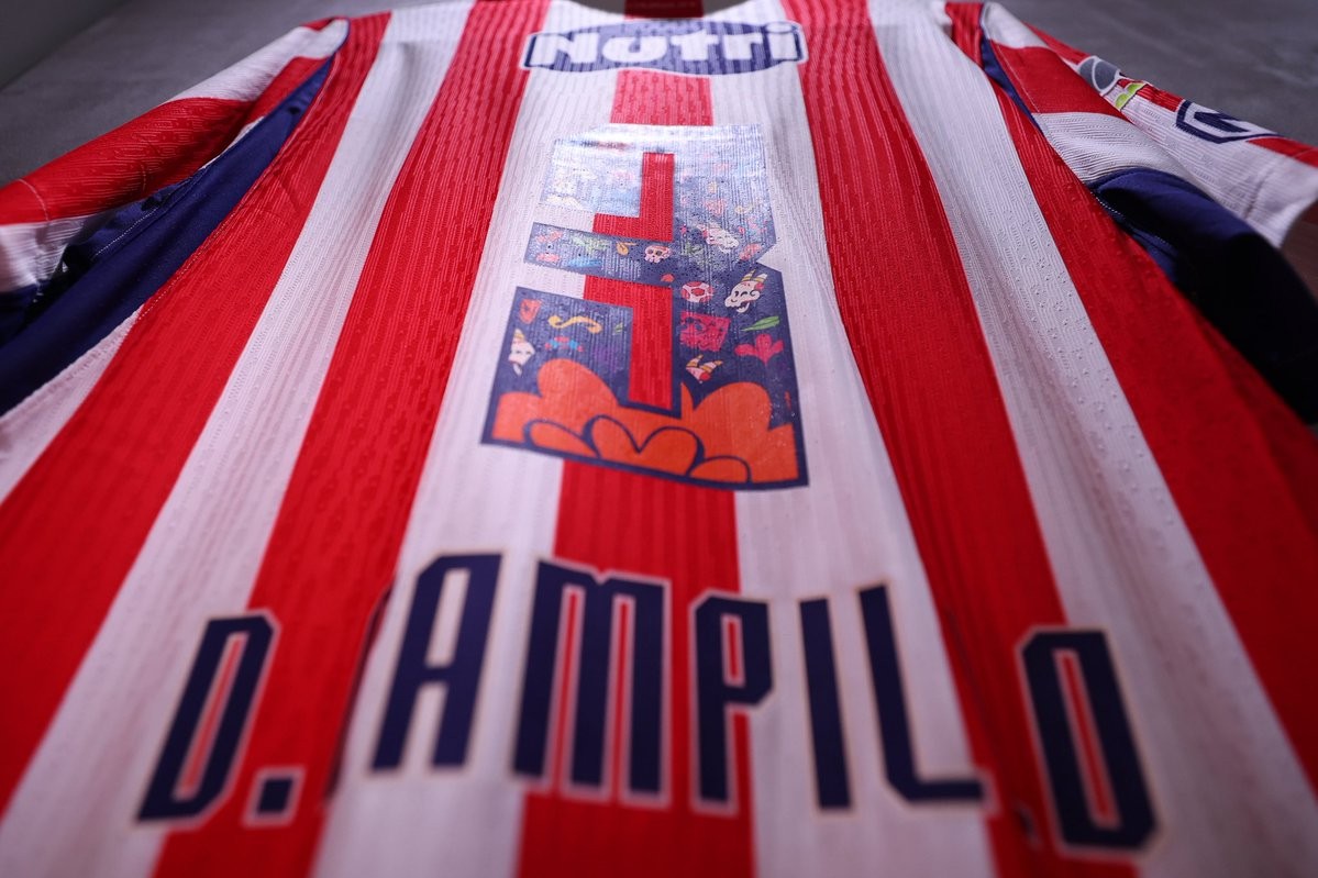
Mexican giants Chivas Guadalajara debuted a special custom shirt font during their Liga MX Apertura 2026 match against Tigres, celebrating the upcoming Día de Muertos (Day of the Dead) festivities.
Dubbed "Soy Chiva Hasta los Huesos" (Chiva to the Bone), the commemorative numbers were designed in collaboration with Mexican artist Sofy Lupercio. Set against a deep navy base to contrast the club's iconic red-and-white stripes, each digit is filled with colorful Mexican folk motifs. The intricate pattern includes traditional calaveras, goat-horned skulls referencing the club's Chivas identity, vibrant flowers, papel picado, and football icons, topped with the club crest.
This festive typography follows closely behind the release of the club's charrería-inspired "Herencia Sagrada" 26-27 third kit. While the player names retain the standard navy block lettering, the limited-edition squad numbers provide a vibrant, culturally rich tribute to one of Mexico's most cherished traditions.
Special Santos Laguna Día de Muertos Kit Font Revealed
Liga MX side Santos Laguna paid homage to the traditional Mexican holiday Día de Muertos with a special commemorative kit font, worn on their 26-27 Charly home shirts during their league encounter against Club Necaxa.
Rather than launching a completely separate fourth kit, the club decorated their signature green-and-white hooped jerseys with bespoke typography on the back. The custom numbers feature intricate folk-art motifs closely tied to the Day of the Dead, including decorative sugar skulls (calaveras), cempasúchil flowers, delicate birds, and traditional patterned borders colored in matching shades of dark and light green.
The special edition numbering follows a growing trend in Liga MX of clubs celebrating the cultural holiday through customized matchday typography. While Santos Laguna previously debuted full Día de Muertos-themed kits alongside Charly in 2020, this year's subtle yet detailed tribute added a festive touch to their standard home strip.
Cruz Azul Debuts Special 26-27 Día de Muertos Kit Font
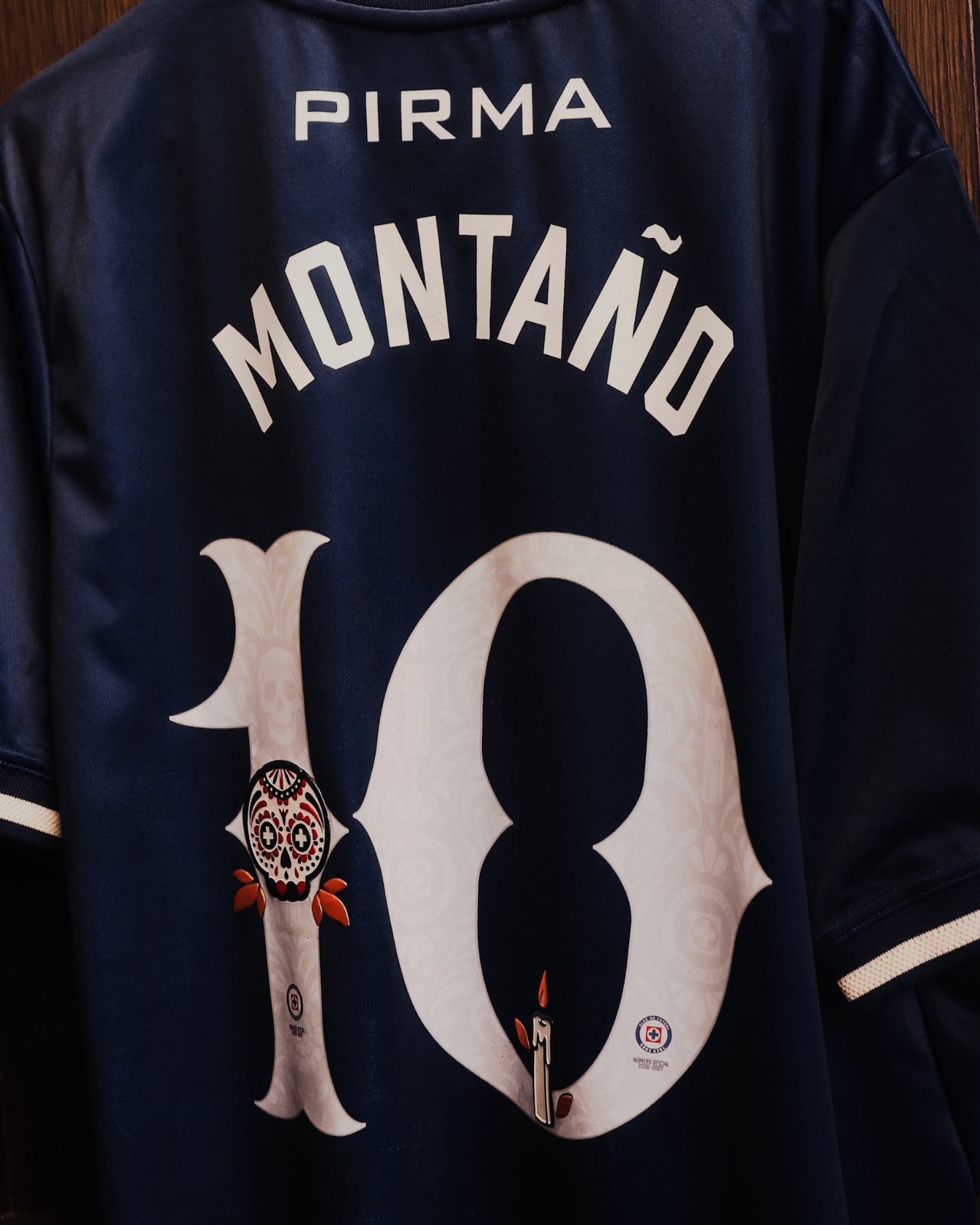
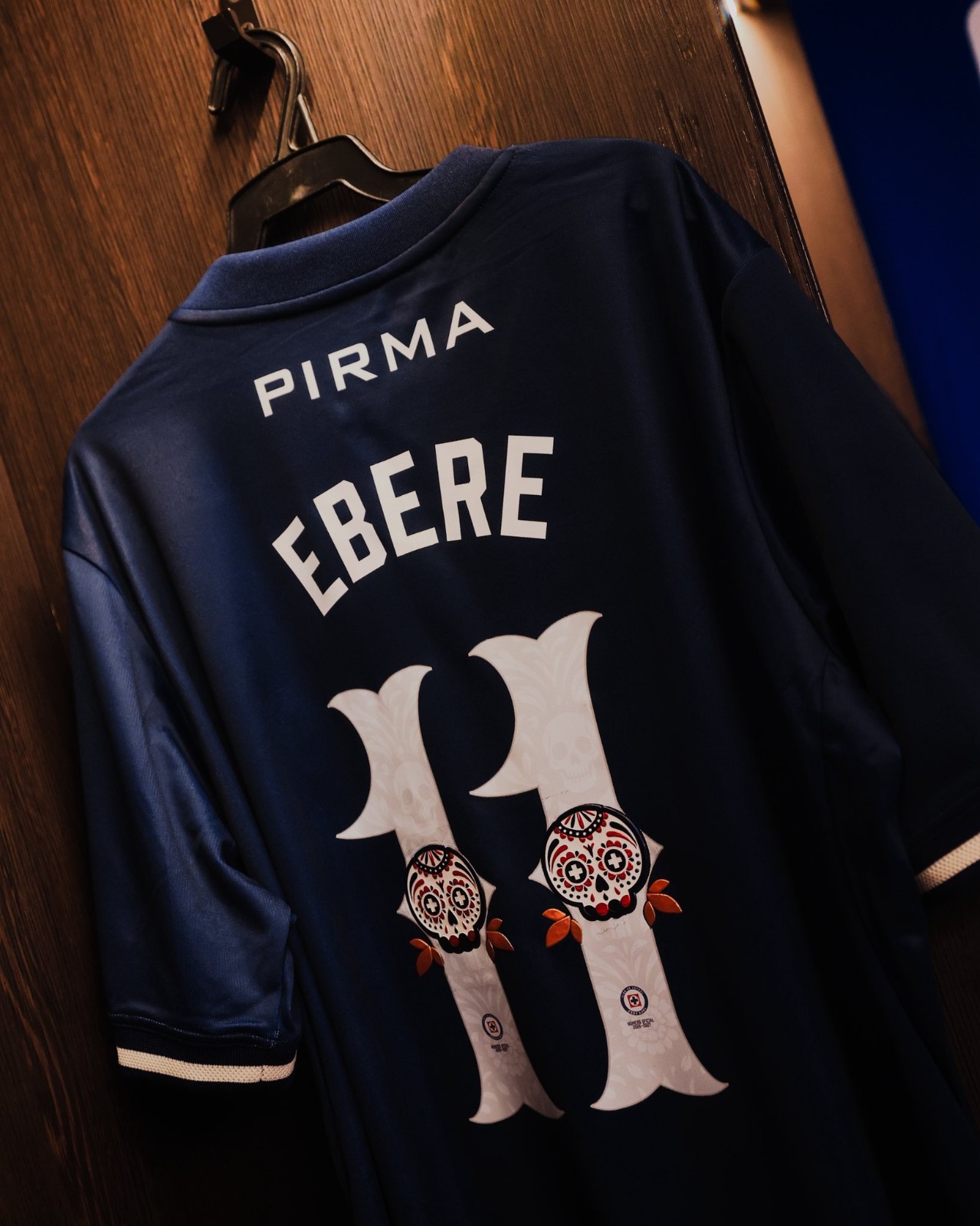
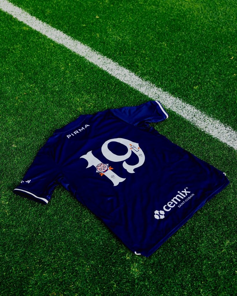
Cruz Azul debuted a custom Día de Muertos kit font during their Liga MX Apertura 2026 fixture against León. Celebrating one of Mexico's most meaningful cultural traditions, La Máquina showcased the commemorative lettering on their navy 26-27 Pirma home shirts as well as the bright green goalkeeper jersey.
The typography introduces custom white digits shaped with vintage flourishes and adorned with delicate Día de Muertos symbolism. Each numeral features an understated skull watermark patterned across the base, highlighted by colorful calavera (sugar skull) illustrations, glowing candles, and flower petals. The official club crest is placed at the base of each number, paired with arched, clean white lettering for the player names.
The celebratory font proved to be a good charm on the pitch, with Cruz Azul securing a 2-1 victory over León to mathematically guarantee their spot in the Apertura 2026 Liguilla. While several Liga MX teams embrace Day of the Dead details each autumn, Cruz Azul's custom Pirma typography was prepared specifically as a one-off matchday feature.
Toluca Unveil Special 26-27 Día de Muertos Font
Toluca and New Balance have unveiled an ornate special Día de Muertos typeface for their 26-27 home kit. The commemorative numbering made its on-pitch debut during the club's Liga MX Apertura clash against Club América.
Rendered in clean white against the club's signature red jersey, the design draws heavy inspiration from traditional Mexican papel picado folk art. Each number features an elaborate scalloped lace outer border filled with rich Day of the Dead symbolism, including calaveras (sugar skulls), cempasúchil flowers, burning candles, stars, and the club's iconic monogram crest embedded near the bottom.
The special edition font continues Toluca's celebration of local culture this season, arriving shortly after the release of their Cosmovitral-inspired third kit and highlighting Liga MX's vibrant tradition of cultural tributes.
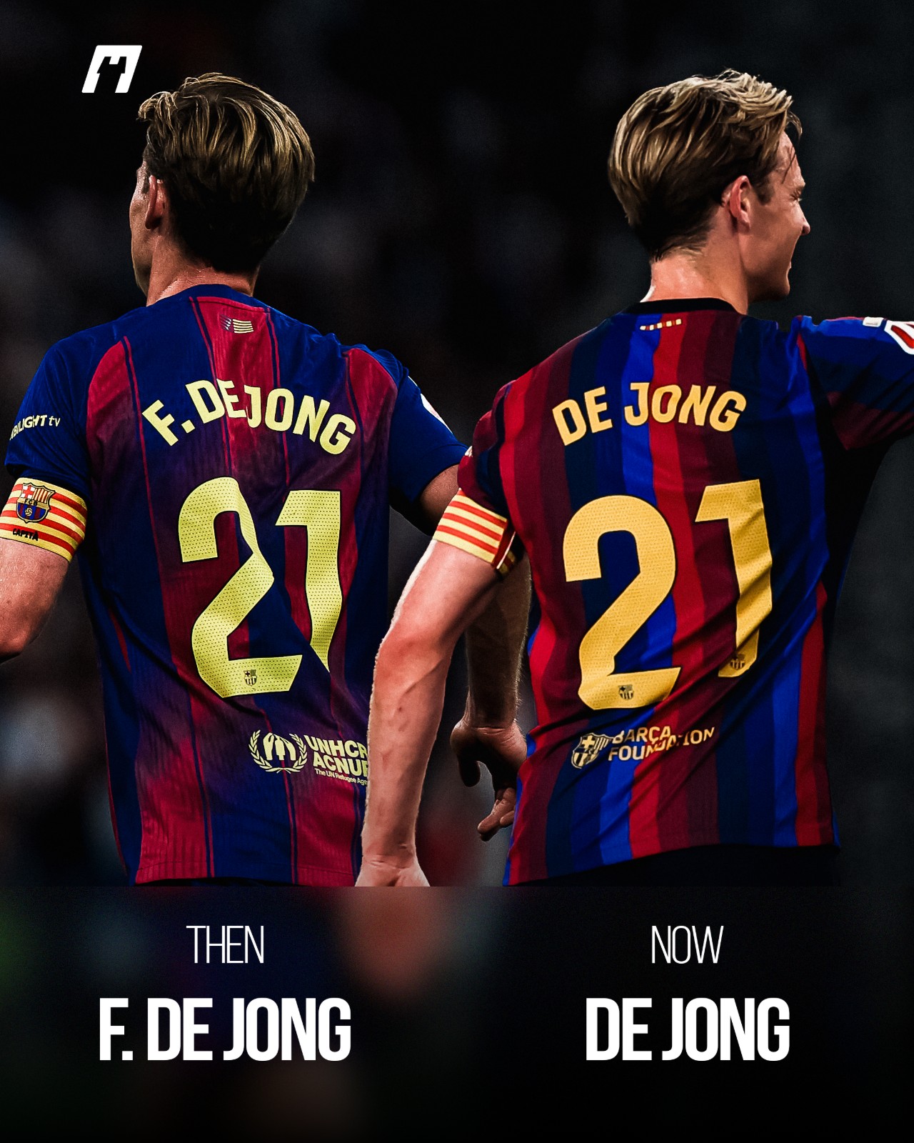
Frenkie de Jong Changes Barcelona Shirt Name After 7 Seasons
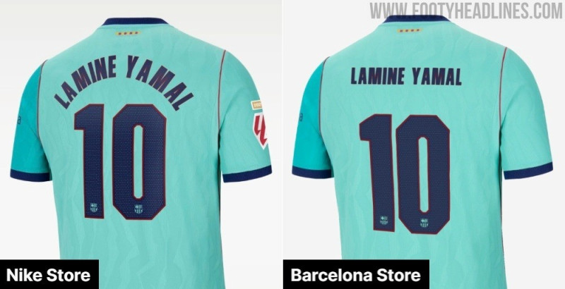
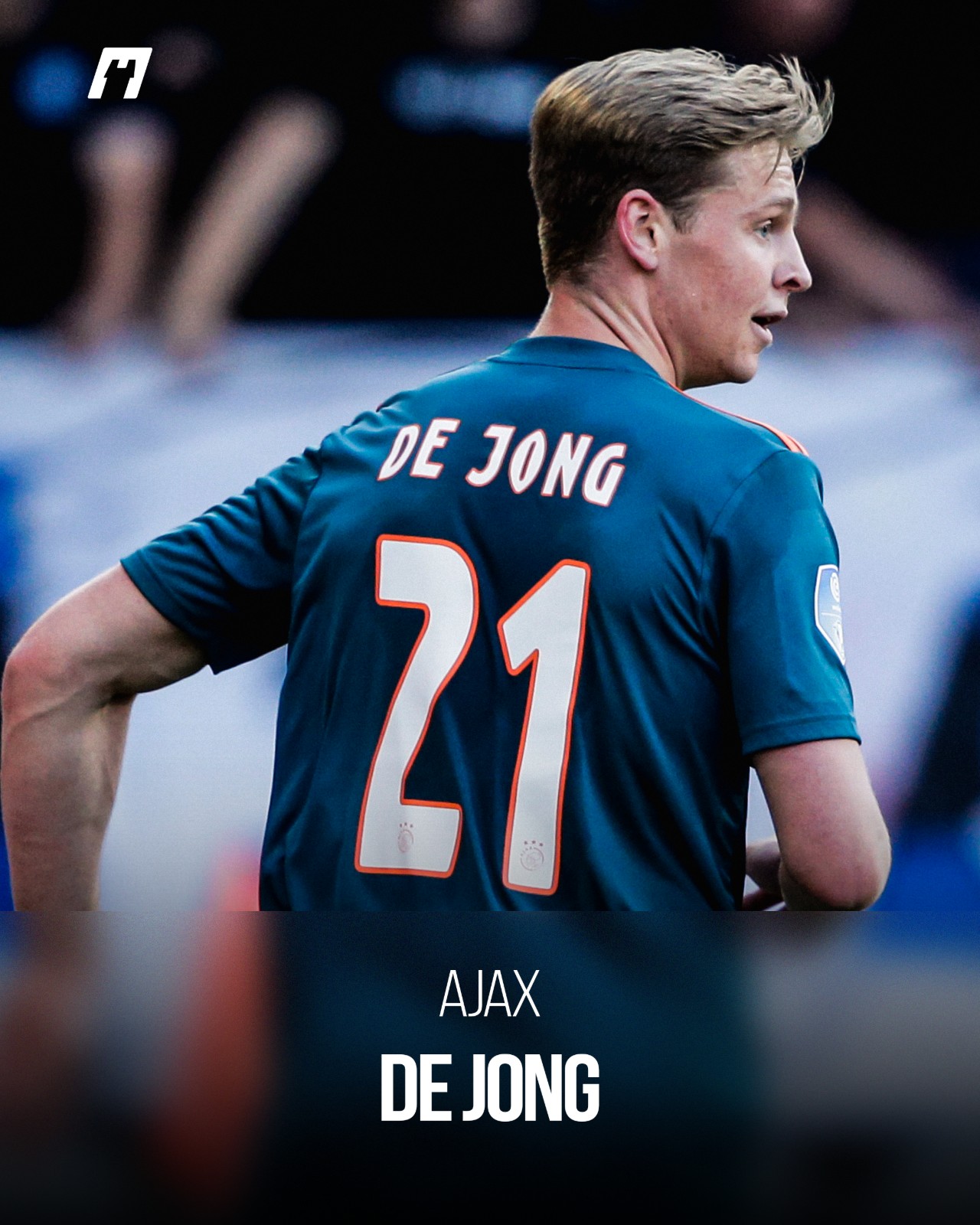
FC Barcelona midfielder Frenkie de Jong has made a subtle modification to his jersey printing, dropping the initial from his name to wear simply "DE JONG" above his trademark number 21. Since arriving at the Catalan club in the summer of 2019, the Dutch playmaker had consistently featured "F. DE JONG" across his back.
The change brings an end to a long-running kit compromise dating back to his transfer from Ajax. Ahead of his debut campaign in Catalonia, personal and club sponsor Nike had reportedly pushed for the midfielder to wear just "FRENKIE" on the back of his shirt for merchandising reasons. De Jong was reluctant to feature his first name and insisted on representing his surname, ultimately reaching an agreement with the brand and club to display "F. DE JONG".
Now deep into his Barcelona career, the 29-year-old has officially reverted to the format he originally wore during his breakthrough years in Amsterdam, where his Ajax kits read only "DE JONG". The streamlined look marks a clean and understated update to one of Barça's most recognizable squad numbers.
Thanks to @whatthekit_x for spotting and create comparison graphic.
Pachuca Spotted Using Same Kit Font as Tigres UANL
An observant kit collector has spotted a curious detail on Pachuca's kits this season. As pointed out by shirt enthusiast account @TigresJersey, Club Pachuca are using the exact same player name and number typography for the 26-27 season that Tigres UANL wore just one season prior in 25-26.
A side-by-side comparison of the number 23 and player names shows identical characters across both teams. The typeface features a distinct athletic block styling defined by an inner inline track cutout. While Tigres used a solid single-tone application on their 25-26 Adidas shirts, Pachuca and technical sponsor Skechers appear to have reused the exact same digital font file for their 26-27 jerseys, merely adding a white contour stroke around the numerals.
Unlike competitions such as the Premier League or La Liga, Liga MX does not mandate a centralized, unified league font, allowing clubs and brands full creative freedom for their name and number designs. Seeing a bespoke club font reused just twelve months later by a rival club—and across completely different manufacturers, transitioning from Adidas to Skechers—is an unusual misstep that has not gone unnoticed by Mexican kit fans.
Special Club América 26-27 'Día de Muertos' Kit Font Released
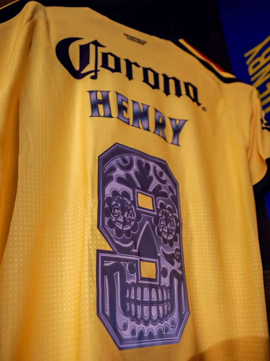
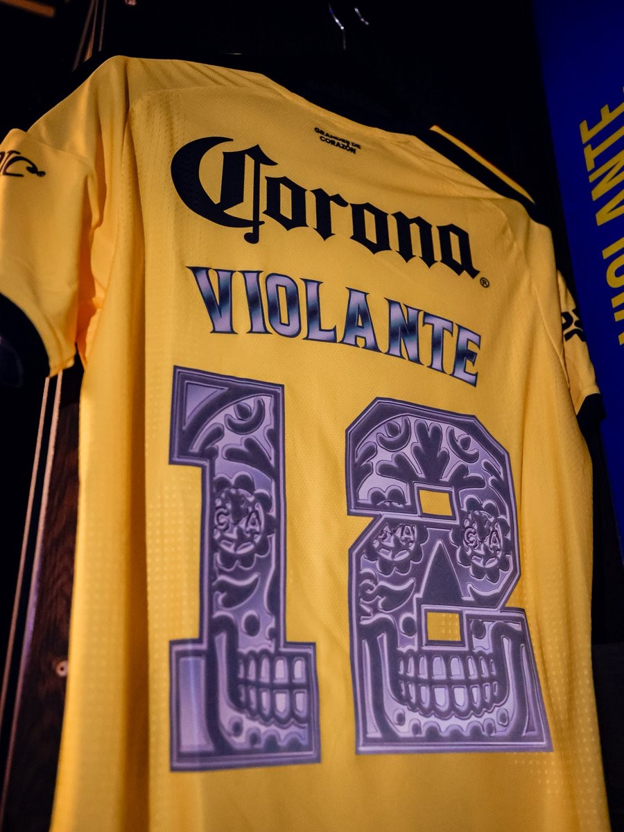
Club América debuted an intricate Día de Muertos kit font for their 26-27 Liga MX Apertura clash against Toluca. The Mexican giants showcased the commemorative lettering in their locker room ahead of the Jornada 15 match, continuing the growing tradition of Liga MX clubs celebrating the iconic Day of the Dead holiday through unique matchday details.
The custom numbers are applied in purple tones and transform each digit into a Mexican sugar skull (calavera). Each number features ornate floral flourishes, stylized geometric patterns, and tooth detailing along the lower jaw, with the club's iconic 'CA' crest subtly embedded into the circular eye sockets of the skull designs. Accompanying the numbers, the player names on the back also boast a matching gradient metallic purple finish.
The special font was worn exclusively for the celebratory fixture on América's yellow home shirts, following similar Día de Muertos typographic tributes recently showcased across Mexico by rivals such as Chivas and Cruz Azul.
Cruz Azul Unveil Special 'Día de Muertos' Kit Font
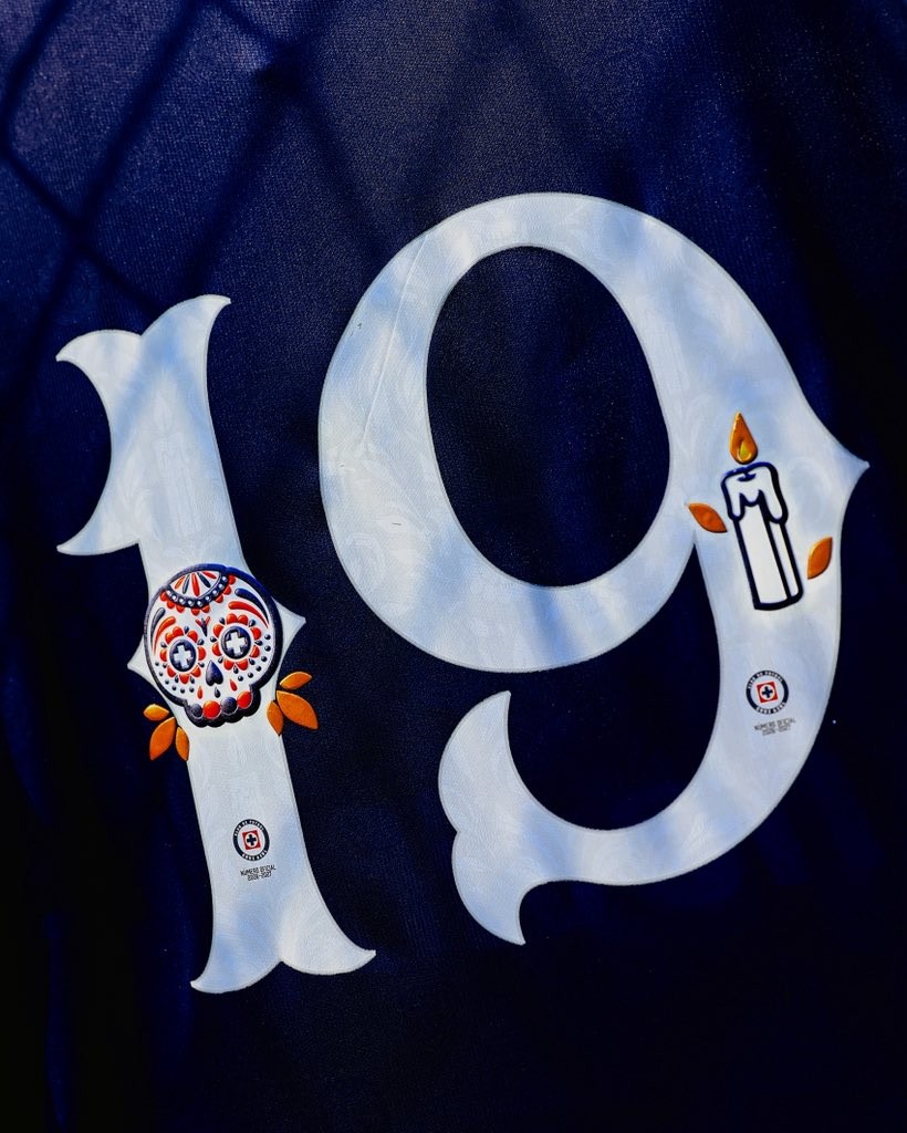
Cruz Azul have revealed a special-edition kit font and numbering to celebrate Día de Muertos (Day of the Dead). The commemorative design has been created ahead of their Liga MX Apertura match against León, paying tribute to one of Mexico's most iconic traditions.
Applied in white on their blue Pirma 26-27 home kit, the typography incorporates intricate cultural symbols. Key elements include a colorful calavera (sugar skull) adorned in red and blue with cross motifs inside the eye sockets referencing the club's emblem, alongside a lit candle and scattered orange cempasúchil (marigold) petals.
The special numbers are being offered to fans as custom heat-press prints available at Tienda La Noria and at the club's stadium store on matchday. Cruz Azul follow fellow Liga MX side Pumas, who also unveiled festive Día de Muertos back printing for the same round of matches.
Ronald Araújo Wore Old Premier League Font
Despite being phased out over three years ago, the Premier League’s previous typography (used from 2017-18 to 2022-23) made an unexpected return during Liverpool’s recent win against Brighton, appearing on the back of Ronald Araújo's shirt.
For reasons yet to be officially confirmed, the Uruguayan defender’s number "33" was heat-pressed using the legacy Premier League font. Meanwhile, his surname and short numbering correctly featured the current league typeface introduced in 2023. In all prior fixtures this season, Araújo had worn the updated style without issue.
The mix-up is widely believed to be an emergency kit-room solution, likely caused by a temporary shortage of the standard large "3" printing stock on matchday.
Thanks to @whatthekit_x for the great spotting and create the comparison image.
Cruz Azul Unveils Special 'Octubre Rosa' 26-27 Kit Font
Mexican giants Cruz Azul have unveiled a bespoke font on their 26-27 kits in support of Breast Cancer Awareness Month ("Octubre Rosa"). As part of a long-standing tradition across Liga MX each October, clubs incorporate pink detailing into their match gear to promote awareness, prevention, and early detection of the disease.
Crafted for their 26-27 Pirma home and goalkeeper jerseys, the custom numbers showcase a striking pink and white mosaic inspired by the club's iconic cross motif. At the base of each digit, the pattern subtly shapes into the awareness ribbon. Inside the numbering, the official Cruz Azul crest sits above "Número Oficial 2026-2027" text, while the player names are rendered in matching pink lettering framed with a crisp white border.
The special font was seen on match-prepared jerseys in the locker room for players including Alan Mozo, goalkeeper Kevin Mier, and forward Christian Ebere. Cruz Azul are wearing the commemorative typography across their Liga MX Apertura matches throughout October.
Standout 26-27 UEFA Champions League Shirt Fonts Highlighted
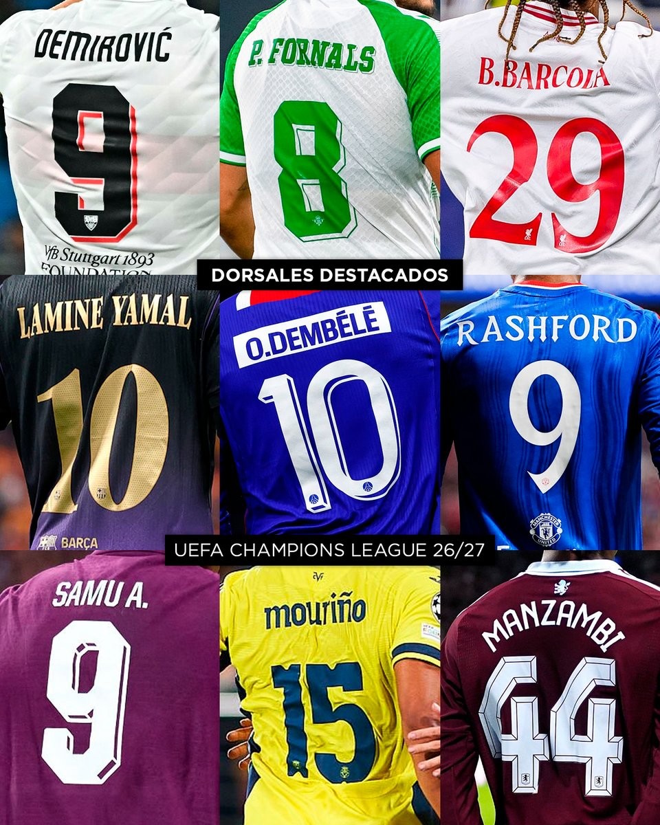
Football design account Paladar Negro has shared an eye-catching visual compilation showcasing some of the most striking squad number and name fonts featured across the 26-27 UEFA Champions League. While major domestic leagues like the Premier League, La Liga, and Ligue 1 enforce standardized typefaces, UEFA competitions give clubs the freedom to deploy bespoke cup fonts that elevate the overall identity of their kits.
The selection highlights nine distinctive shirt backs from around the continent, showcasing a great variety of design philosophies. Notable inclusions feature Ermedin Demirović's bold, shadowed number 9 on VfB Stuttgart's home shirt, Bradley Barcola's flowing red lettering, and Lamine Yamal sporting the legendary number 10 for FC Barcelona in metallic gold. Also showcased are Ousmane Dembélé's clean Paris Saint-Germain print, Marcus Rashford's number 9 on Manchester United's alternate strip, and Samu Aghehowa's vivid typography.
Particularly eye-catching are the retro-inspired creations, such as Santiago Mouriño's dynamic font on Villarreal's signature yellow jersey and the heavily beveled 3D block numbers sported by Johan Manzambi on Aston Villa's claret kit. These custom lettering styles show how much thoughtful typography can enhance kit design under the European lights.
Which 26-27 Champions League typeface is your favorite? Let us know in the comments below.