Missed Opportunity? Should Inter Milan Have Used the Dragon Logo Instead of the Regular Crest?

- Lunar New Year Kit: Inter Milan released a special kit with a dragon logo on the player numbers to celebrate the Lunar New Year.
- Missed Opportunity: There is discussion on whether the dragon logo should have replaced the regular crest on the front of the jersey for a greater impact.
- Production Limitations: Inter may not have replaced the regular logo with the dragon because of production costs, with Nike not being involved in the placement of the dragon logo on the numbers.
Inter Milan has announced special Lunar New Year kit names and numbers to celebrate the 2024 Lunar New Year in Eastern countries. The standout feature? A striking dragon logo is emblazoned on the kit numbers. However, the crest on the front remains untouched.

Missed Opportunity? Should Inter Have Used the Dragon Logo Instead of the Regular Crest?
Many wonder if the dragon logo should have replaced the regular crest for a more significant impact. While the dragon motif adds symbolic weight to the kit, its placement only on the numbers has left some feeling underwhelmed.
A Missed Chance?
Had the dragon logo adorned the front of the kit, would it have made a more profound statement? We created a concept of the Inter 23-24 away kit having the dragon logo on the front, and it works out pretty well.

The small dragon logo is hard to recognize on the numbers
It is not known why Inter decided to alter the names and numbers only. There are several options like kit regulations or the club not wanting to change its primary logo on the kit.

If Inter Milan had chosen to replace their regular crest with the dragon logo on their kits, Nike would have had to produce an additional set of jerseys. The dragon logo is only placed on the numbers and Nike is not involved in this process.

Should Inter have replaced its regular logo with the special dragon crest on the front? Let us know in the comments below.
Vintage Football Shirts
from Cult Kits
1995/96 Torino #3 L/S Home Shirt (S) Lotto

2015/16 Chelsea Falcao #9 Third Shirt (S) Adidas

2021/22 Atalanta Training Jacket (M) Joma

2012/13 New York Red Bulls Hertzog #6 *Player Issue* Home Shirt (L) Adidas

2012/13 Tampico Madero #7 Home Shirt (L) ADX

2005/06 Real Madrid Zidane #5 Home Shirt (M) Adidas

2003/04 Teramo L/S Home Shirt (XXL) Errea

2006/07 Le Mans *Player Issue* Home Shirt (L) Kappa

2002/03 Galatasaray Xavier #12 Home Shirt (M) Umbro

2003 Shonan Bellmare #2 Home Shirt (XS) Puma

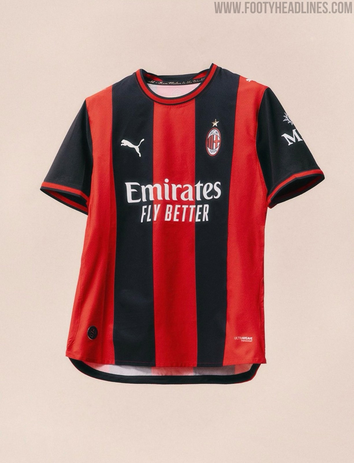

Milan 26-27 Home Kit - Launch Pictures
Classic Football Shirts posted two launch images of the 2026-27 home kit for AC Milan. Naturally, they were taken down immediately, since the official release is scheduled for tomorrow, May 22.


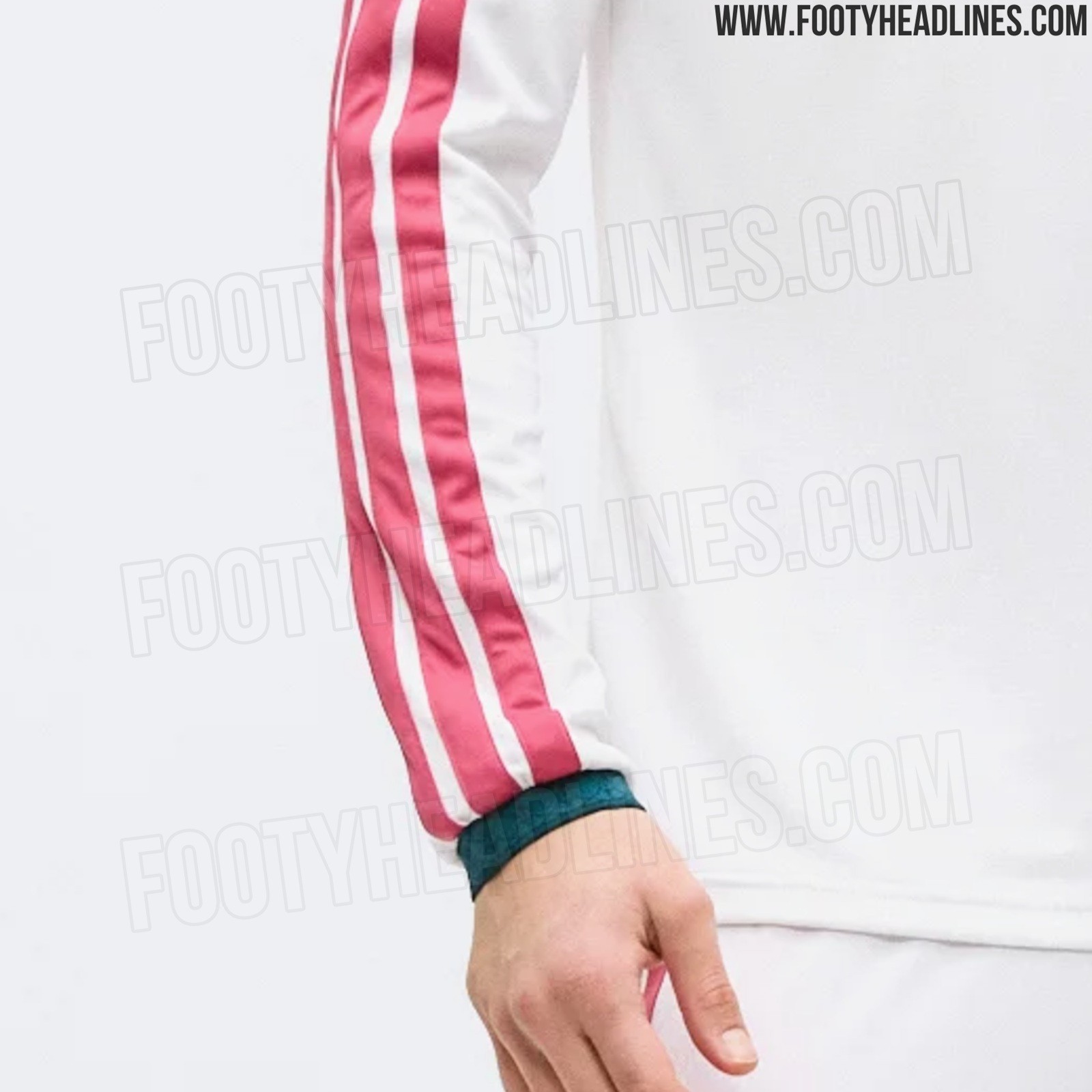
Real Madrid 26-27 Home Kit - Long-Sleeve Version + Shorts Leaked
We can give you the first look at the Adidas Madrid 26-27 home kit with long sleeves. It boasts the giant 3 stripes, in pink.


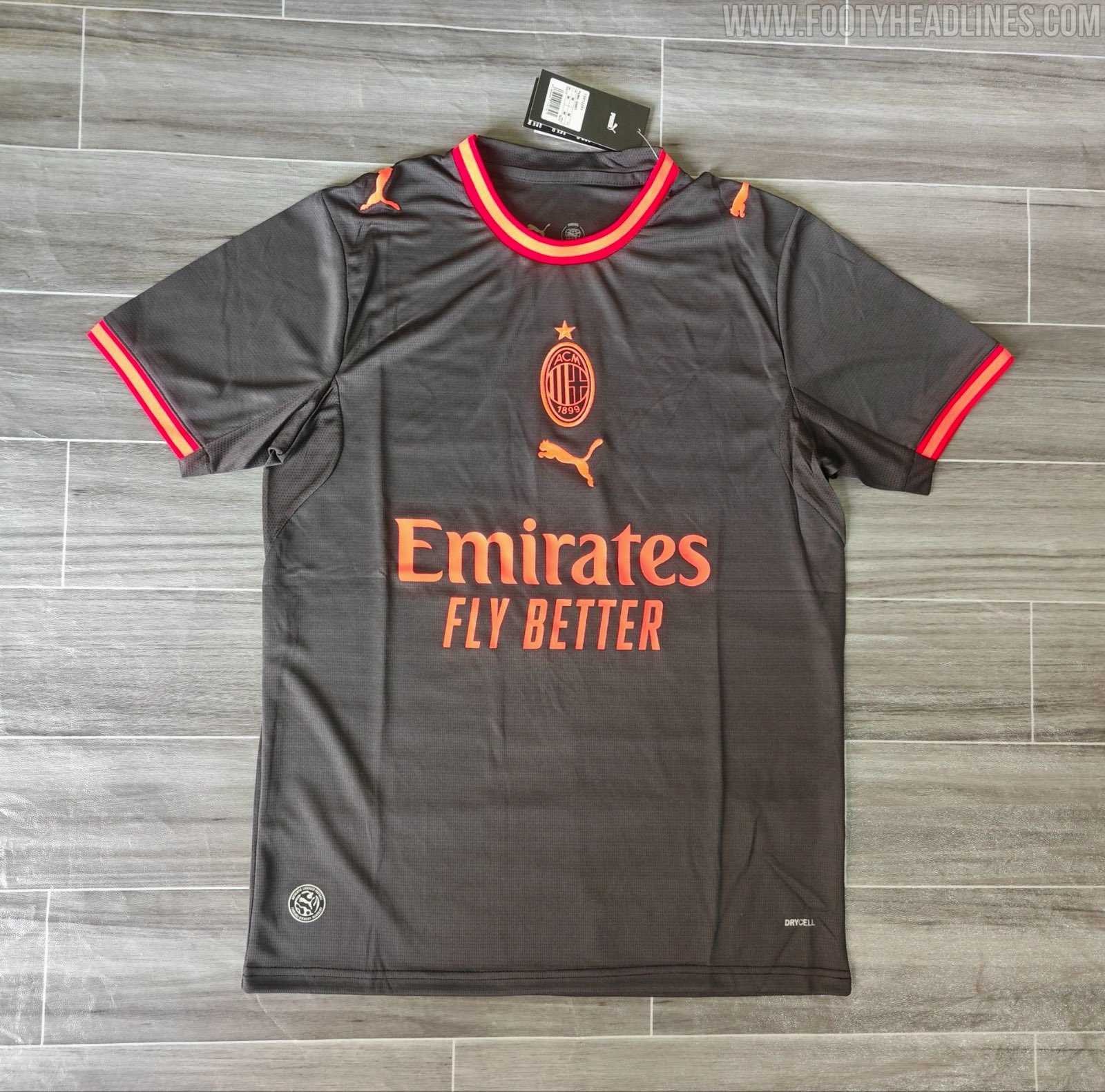
Milan 26-27 Third Kit
A new image of AC Milan’s 2026-27 third kit has leaked. However, this is only a fake version and not the final design yet. The final version will feature several different details.