Did Adidas & Juventus Create a Horrific Mismatch With the 25-26 Away Kit?

- Kit Debut: Juventus debuted their new Adidas 2025-2026 away kit at the FIFA Club World Cup.
- Color Mismatch: The solid, lighter shade of blue shorts create a visual disconnect from the teal, blue, and pale green/off-white patterned jersey.
- Fan Reaction: Many fans have voiced their opinion that the combination of the jersey and shorts looks awkward, with some calling the kit 'terrible overall.'
Juventus debuted their new Adidas 2025-2026 away kit during the FIFA Club World Cup, and the on-pitch debut has sparked debate among fans, particularly due to an apparent color "mismatch."

Juventus Debut 2025-26 Away Kit at Club World Cup – Shorts Create "Mismatch" Controversy
The Adidas Juventus 2025-2026 away shirt boasts a complex all-over graphic pattern in varying shades of light teal, blue, and possibly a very pale green/off-white. The Adidas logo and three stripes on the shoulders are a contrasting lime green/volt color.

The controversy arises from the shorts, which are a solid, lighter shade of blue. While this blue color is present on the jersey, specifically on paneling at the top of the back/shoulder area – its limited use on the shirt itself makes the shorts appear somewhat disconnected from the main patterned body of the jersey when viewed from the front.

Many fans, including Jake - Kit Nerd (@KitNerdUK) who stated, "The shorts also don't match. Urgh," have voiced their opinion that the combination looks awkward. Another user, N (@KitManRamsey), questioned, "Why oh why would they use sky blue shorts????? The shades are completely different, surely they'd go with a dark colour to contrast?"
Did Adidas Fail?
Technically, the shorts do take a color from the jersey's design palette, specifically from the upper back panels. However, because this blue is not a dominant color on the front of the patterned shirt, the overall impression for many is a visual disconnect, leading to the "mismatch" perception.


Adding to the somewhat chaotic look for some, the navy front sponsor ("Jeep") and the new black sleeve sponsor further introduce different dark shades to the ensemble, which don't harmonize with the intricate, lighter-toned jersey and the sky blue shorts. As Jack Henderson (@hendocfc) put it, "Terrible kit overall."


We will see two front sponsors in the Serie A, further disrupting the look compared to the stylish launch images
While the jersey's design itself might have looked better in initial release images, its on-pitch appearance with the chosen shorts combination has certainly divided opinion.
What are your thoughts on the Juventus 2025-26 away kit and the shorts combination? Is it a mismatch or a misunderstood design choice? Comment below.
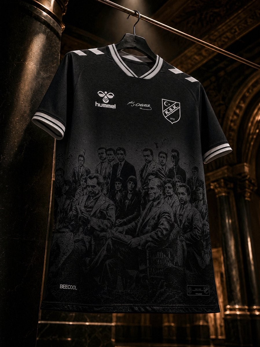
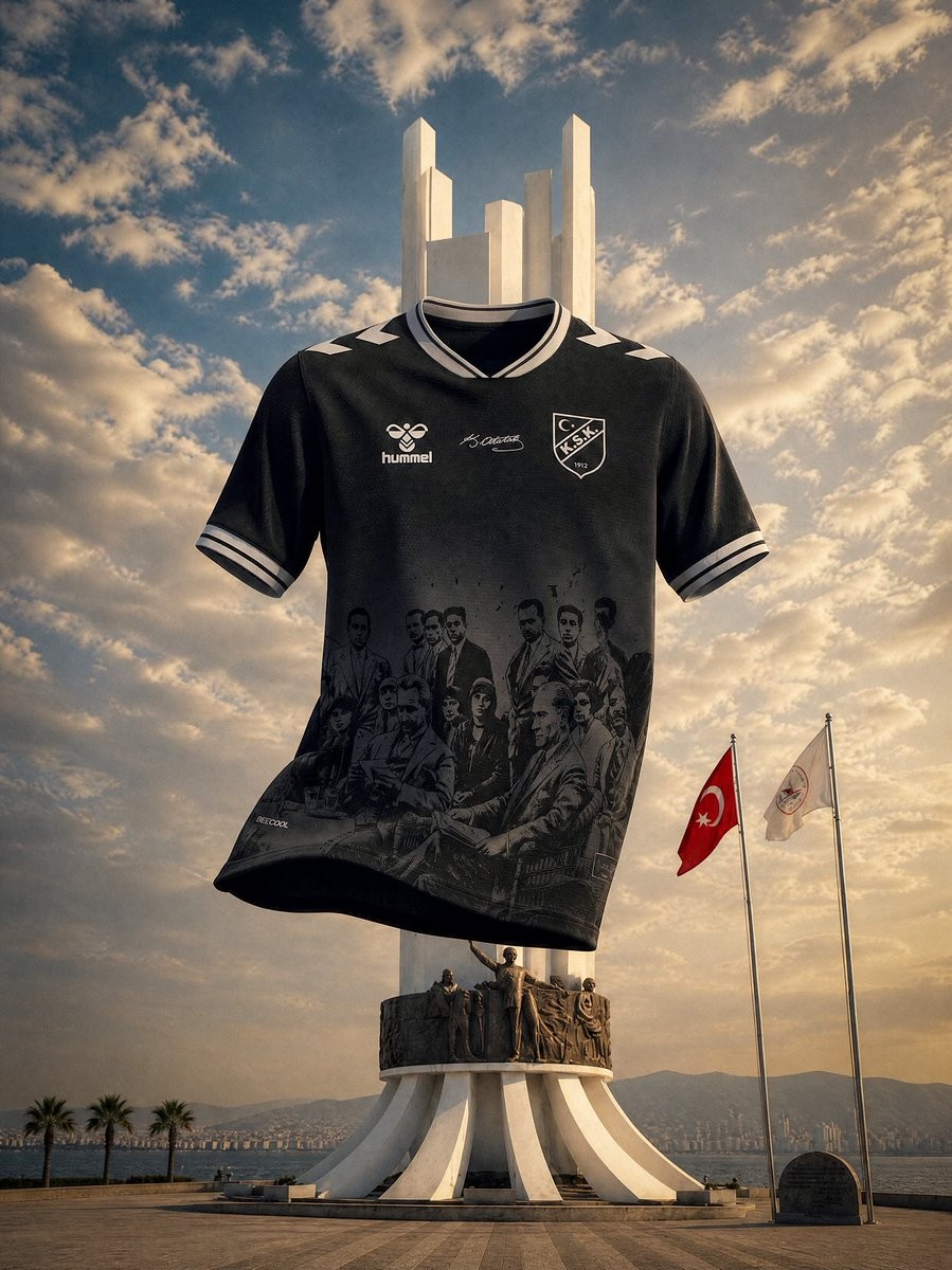
Special Karşıyaka 2026-27 'Ata Mirası' Kit Released
Turkish TFF Third League club Karşıyaka SK and Hummel have revealed a special "Ata Mirası" (Ancestral Legacy) kit for the 2026-27 season. The kit celebrates the 100th anniversary of the club receiving the Ay-Yıldız (Crescent-Star) emblem, which was granted by Mustafa Kemal Atatürk during his visit to the club in 1926.
The Hummel Karşıyaka 2026-27 Ata Mirası football shirt is predominantly black, featuring historical details that honor the club's unique status as the first and only club granted the crescent and star emblem by Atatürk. Hummel's classic chevrons and branding are present, blending the club's rich history with the brand's aesthetic.
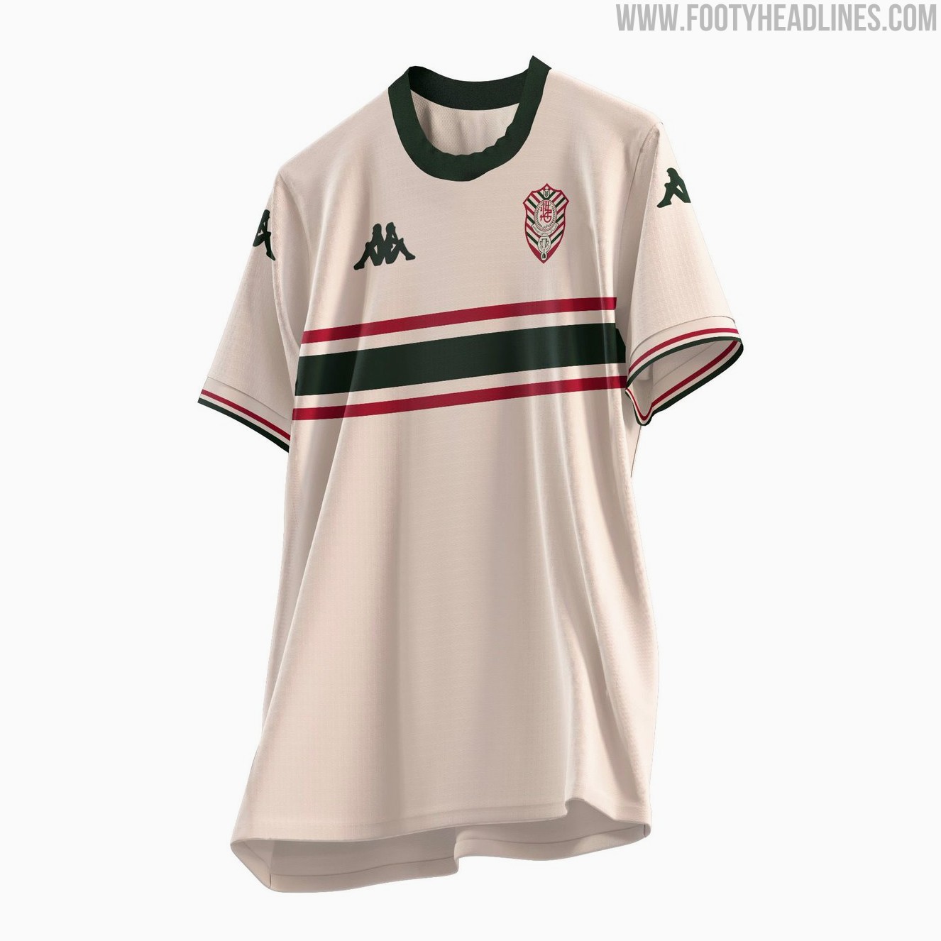
Al Khulood 26-27 Fourth Kit Revealed
Saudi Pro League club Al Khulood have unveiled their new fourth kit for the 2026-27 season. Made by Kappa, the Al Khulood 2026-27 fourth jersey has a stylish look in cream, green and red.
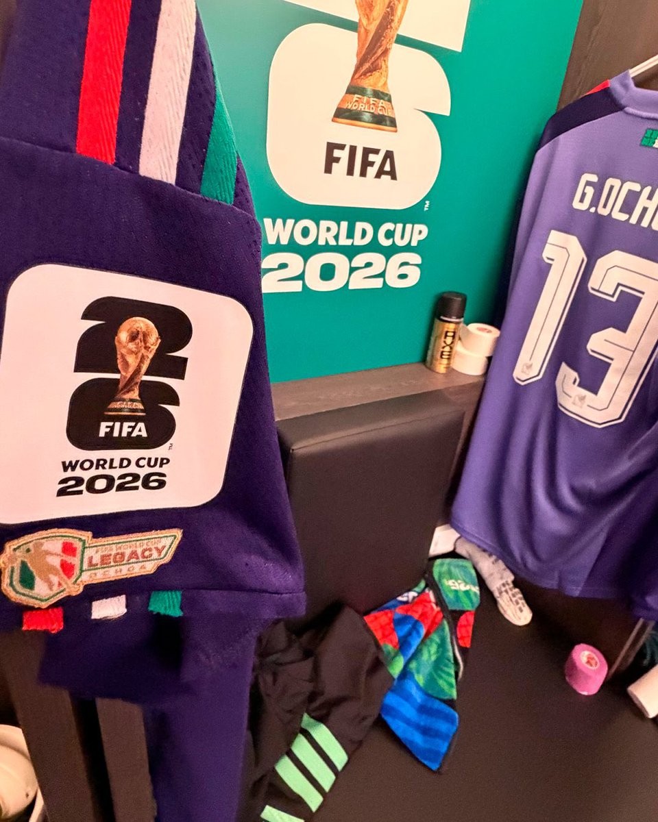
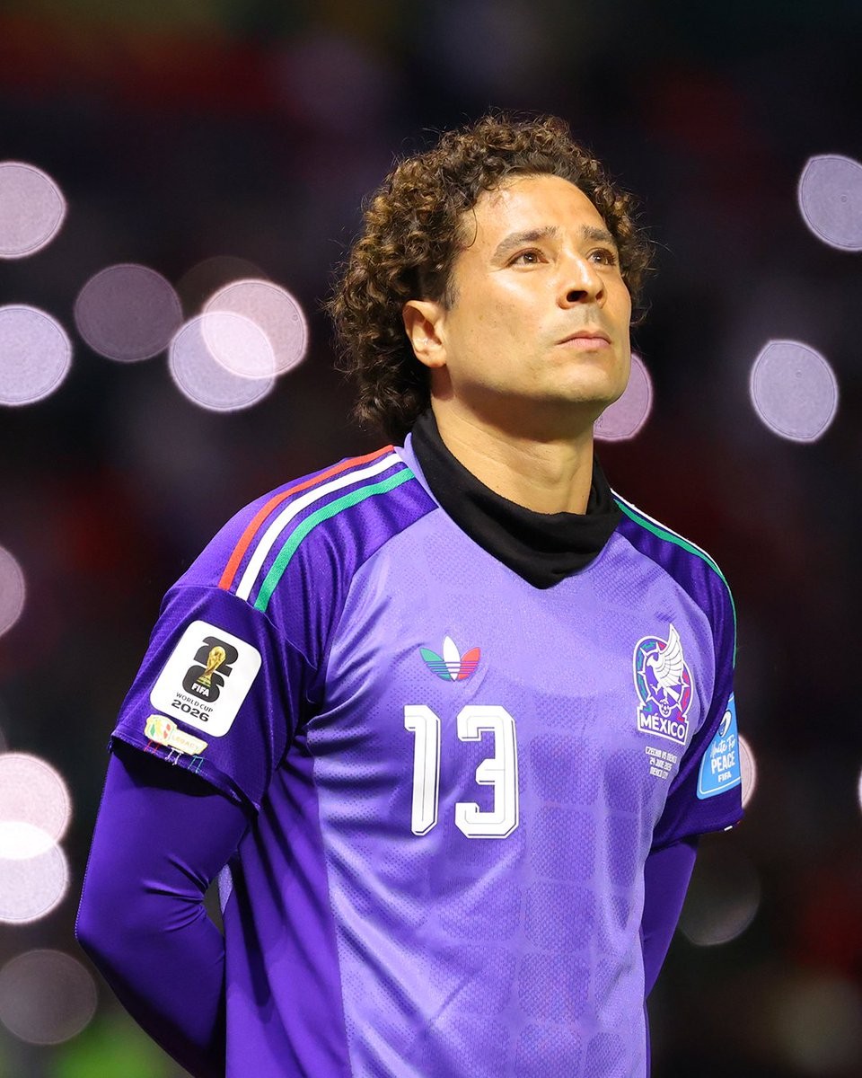
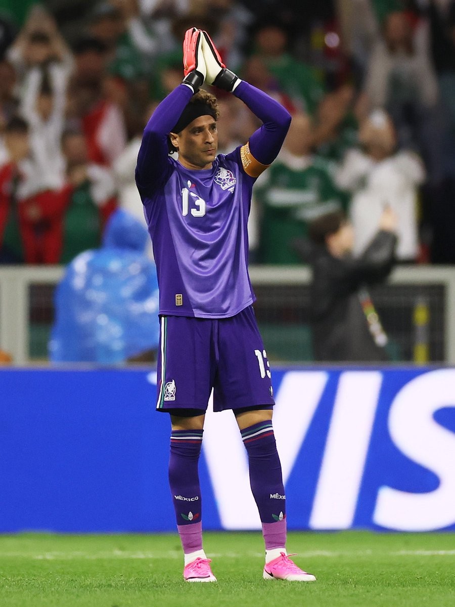
Guillermo Ochoa Wears World Cup 'Legacy' Patch Amid Eligibility Controversy
During Mexico's recent 2026 World Cup group stage match against Czechia, veteran goalkeeper Guillermo Ochoa was spotted wearing the exclusive FIFA Legacy patch. Ochoa, who entered the game as a substitute, displayed the special badge on his 2025-26 Mexico kit to celebrate his historic inclusion in a sixth World Cup squad. The newly introduced patch features "Legacy" text and is intended to honor players who have participated in five or more World Cup tournaments, a milestone shared by legends like Lionel Messi and Cristiano Ronaldo.
The appearance of the badge on Ochoa's jersey has sparked debate, as it seemingly contradicts FIFA's strict appearance rules. While Ochoa has been called up for six consecutive tournaments spanning from 2006 to 2026, he did not play a single minute in the 2006 and 2010 editions. According to official guidelines, a player must see actual on-pitch playing time in at least five different World Cups to qualify for the Legacy distinction.
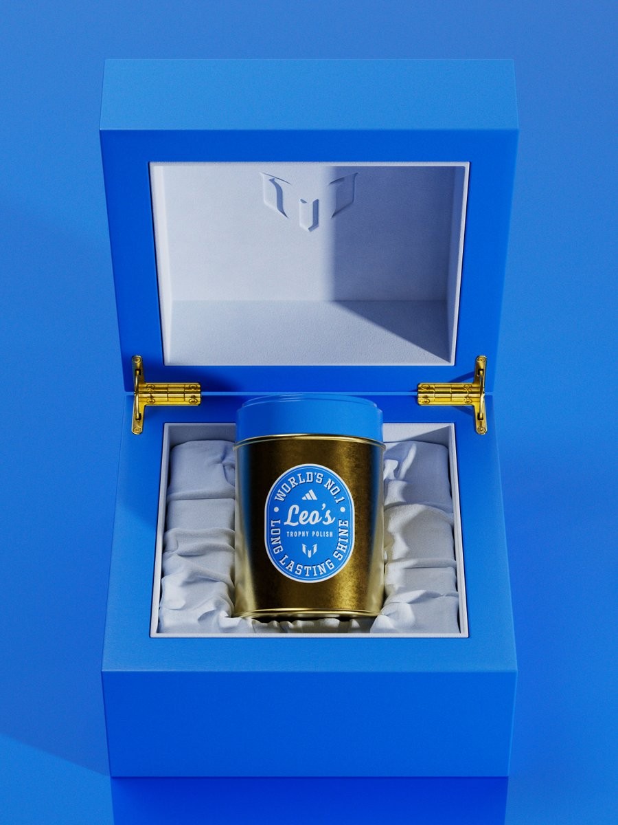
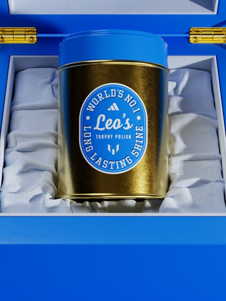
Adidas Teases "Trophy Polish" for Lionel Messi's Birthday
To celebrate Lionel Messi's 39th birthday, Adidas has teased a unique gift for the Argentine superstar. Taking to social media on June 24, the brand posed the question, "what do you gift the man who’s won everything?", accompanied by images of a special product.
The images reveal a custom "Trophy Polish" kit, designed specifically for Messi to maintain his extensive collection of silverware. The fitting tribute acknowledges his status as one of the most decorated players in football history, having won virtually every major team and individual honor available throughout his career.
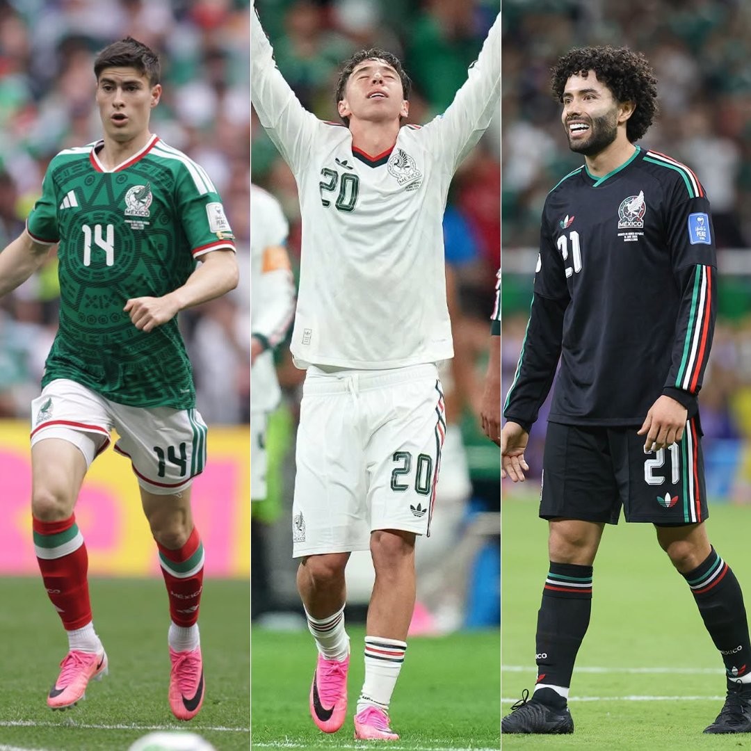
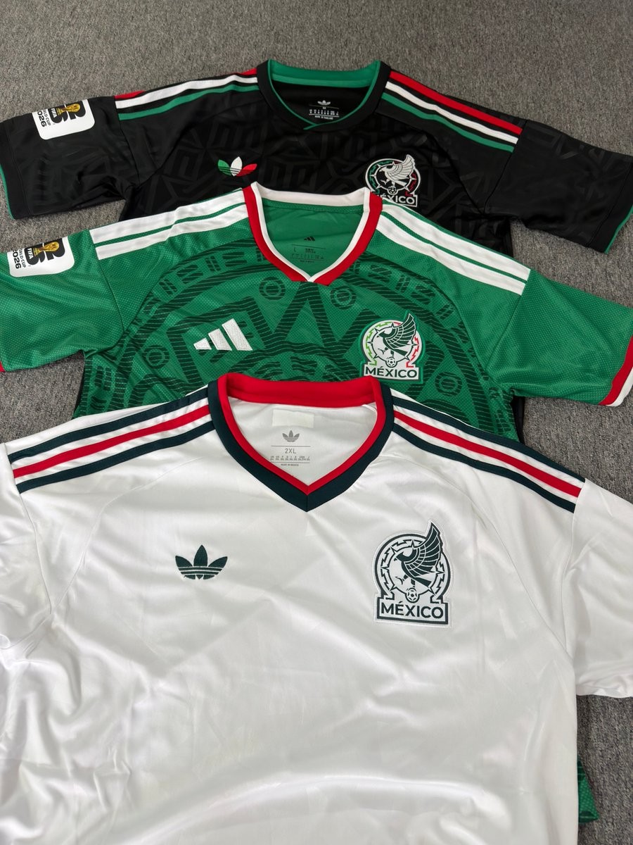
Mexico Wear All Three Kits in 2026 World Cup Group Stage
Mexico have made the most of their 2026 World Cup group stage campaign by wearing all three of their 2026 Adidas kits. As co-hosts of the tournament, El Tri showcased their complete wardrobe, wearing a different uniform in each of their three Group A fixtures.
The national team began the tournament against South Africa in their traditional green home kit. For their second match against South Korea, they switched to their black third kit. Finally, to close out the group stage against Czechia, Mexico took to the pitch in their predominantly white away kit, completing the full rotation of their 2026 World Cup set.
The decision to utilize the home, away, and third kits in the opening round highlights a modern trend of maximizing kit visibility during major international tournaments. The strategy ensured that their entire collection received time in the global spotlight before the knockout stages.
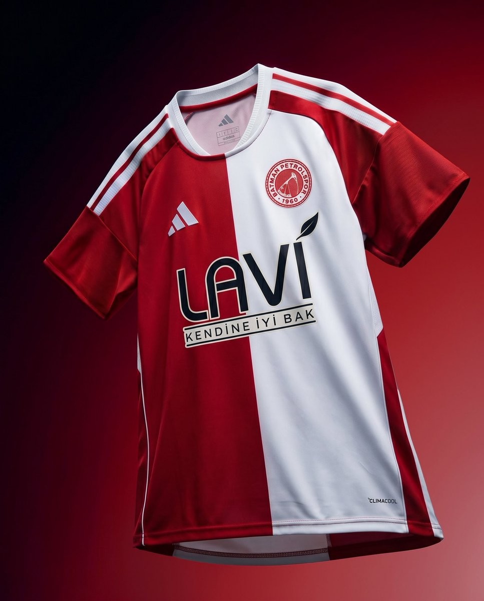
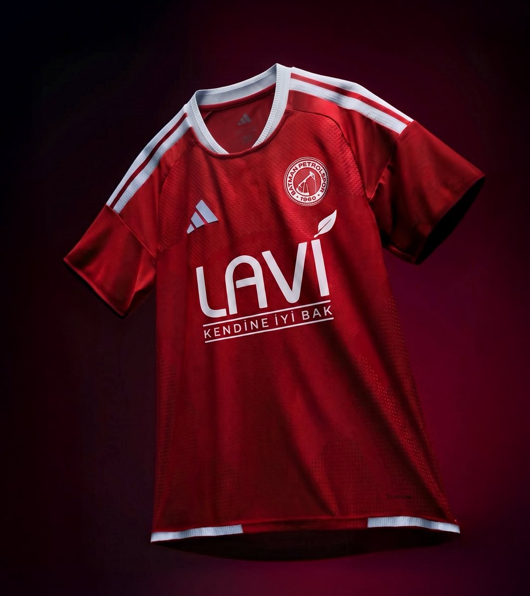
Batman Petrolspor 26-27 Kits Released
Turkish TFF 1. Lig side Batman Petrolspor have officially launched their new kits for the 2026-27 season. Made by Adidas, the new shirts were unveiled across the club's social media channels, highlighting their traditional colors and the club's fighting spirit ahead of the upcoming campaign.
The new Adidas Batman Petrolspor 2026-27 jerseys are based on standard Adidas teamwear templates, incorporating the club's signature crest and classic red and white color palette. Fans will soon be able to purchase the new 2026-27 shirts, as local media have confirmed they will be available at the official Petrolstore in the near future.
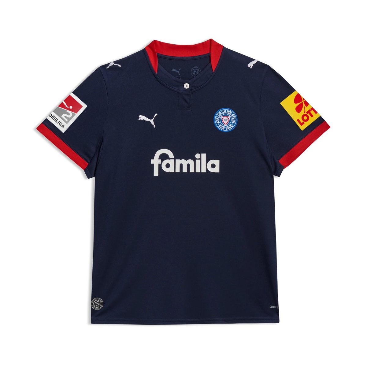
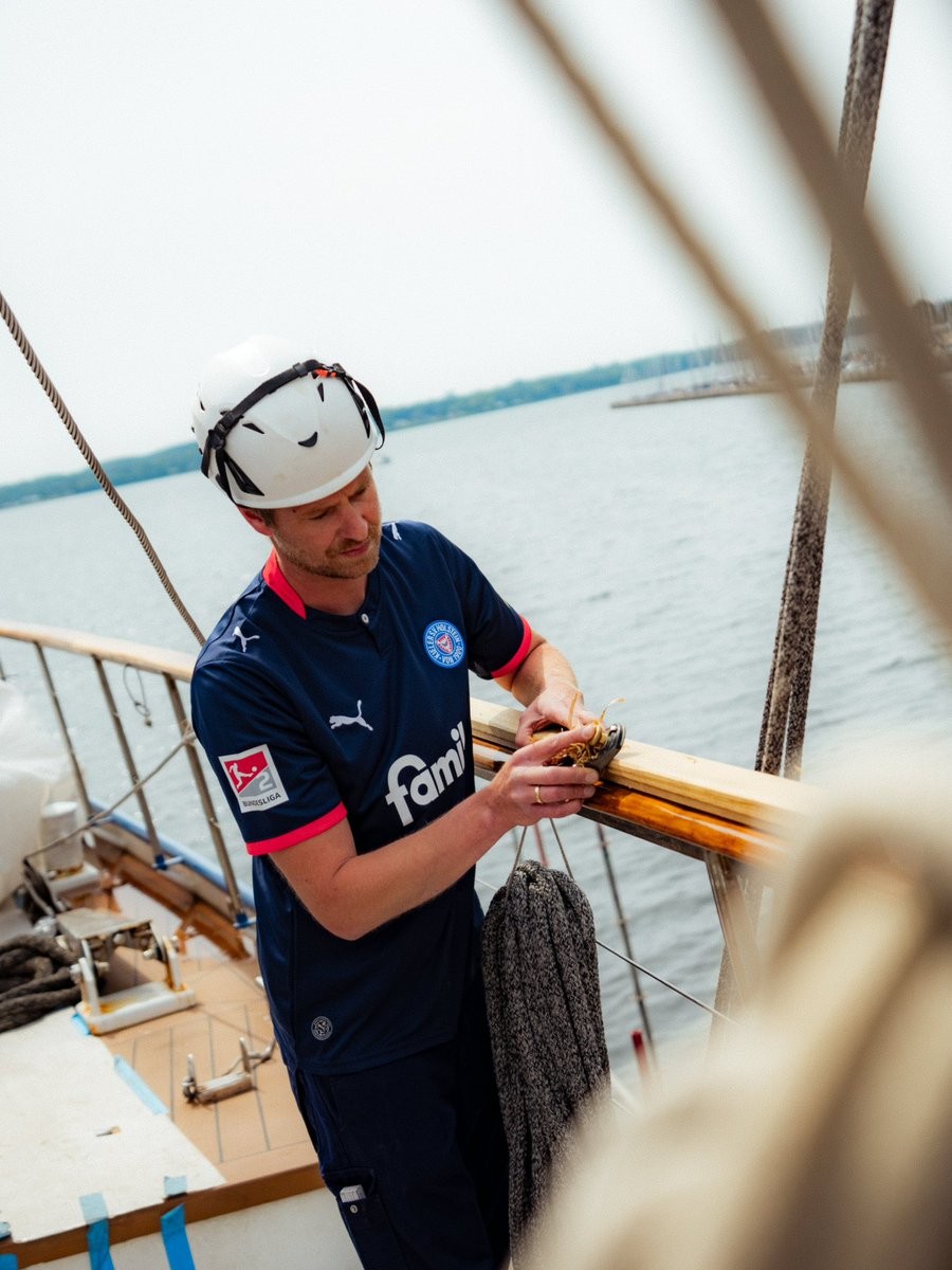
Holstein Kiel 26-27 Home & Away Kits Released
Holstein Kiel and Puma have officially released the club's new home and away kits for the 2026-27 2. Bundesliga season. The launch took place during the traditional Kieler Woche event, fulfilling the fans' desire for a simple and elegant northern German design.
The Puma Holstein Kiel 2026-27 home kit features a clean, maritime dark blue base, moving away from the prominent patterns of recent years. It is enhanced by harmonious red accents on the sleeves and a Henley collar that is finished with a white button. White logos, including the Puma cat and the main sponsor, complete the club's traditional blue, white, and red color scheme.
The Puma Holstein Kiel 2026-27 away kit introduces an elegant look for matches on the road. It has a crisp white base decorated with thin, classic red vertical stripes on the front. The club crest adds a blue color accent, perfectly rounding off the traditional colors of the northern German side.
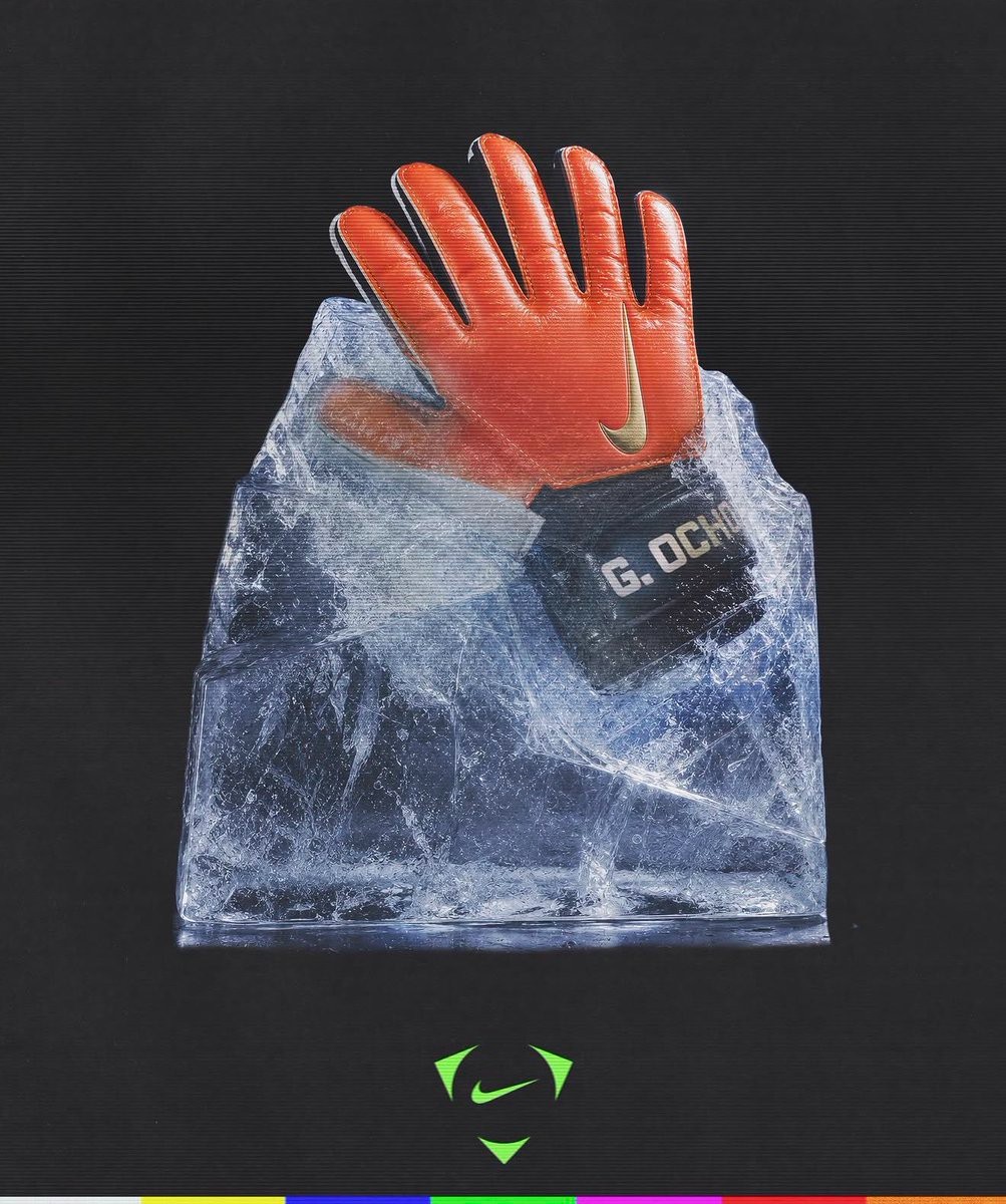
Nike Celebrates Guillermo Ochoa's Historic Sixth World Cup Appearance
Nike has officially recognized Guillermo Ochoa's historic achievement as the legendary Mexican goalkeeper makes his sixth FIFA World Cup appearance at the 2026 tournament. Joining an elite group of players to have reached this milestone, Ochoa's incredible longevity and dedication to the national team are being honored by his long-time sponsor.
To mark the occasion, Nike has created special custom gear for Ochoa, including a unique pair of goalkeeper gloves. The commemorative gloves feature the message "Seis convocatorias. 24 años rompiendo el guión. ¡Gracias, Memo!" (Six call-ups. 24 years breaking the script. Thank you, Memo!), paying tribute to his remarkable 24-year journey on the international stage.
Ochoa continues to be a crucial figure for Mexico. The special Nike tribute not only highlights his individual success but also cements his legacy as one of the most iconic goalkeepers in World Cup history.
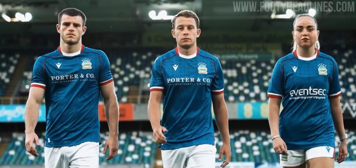
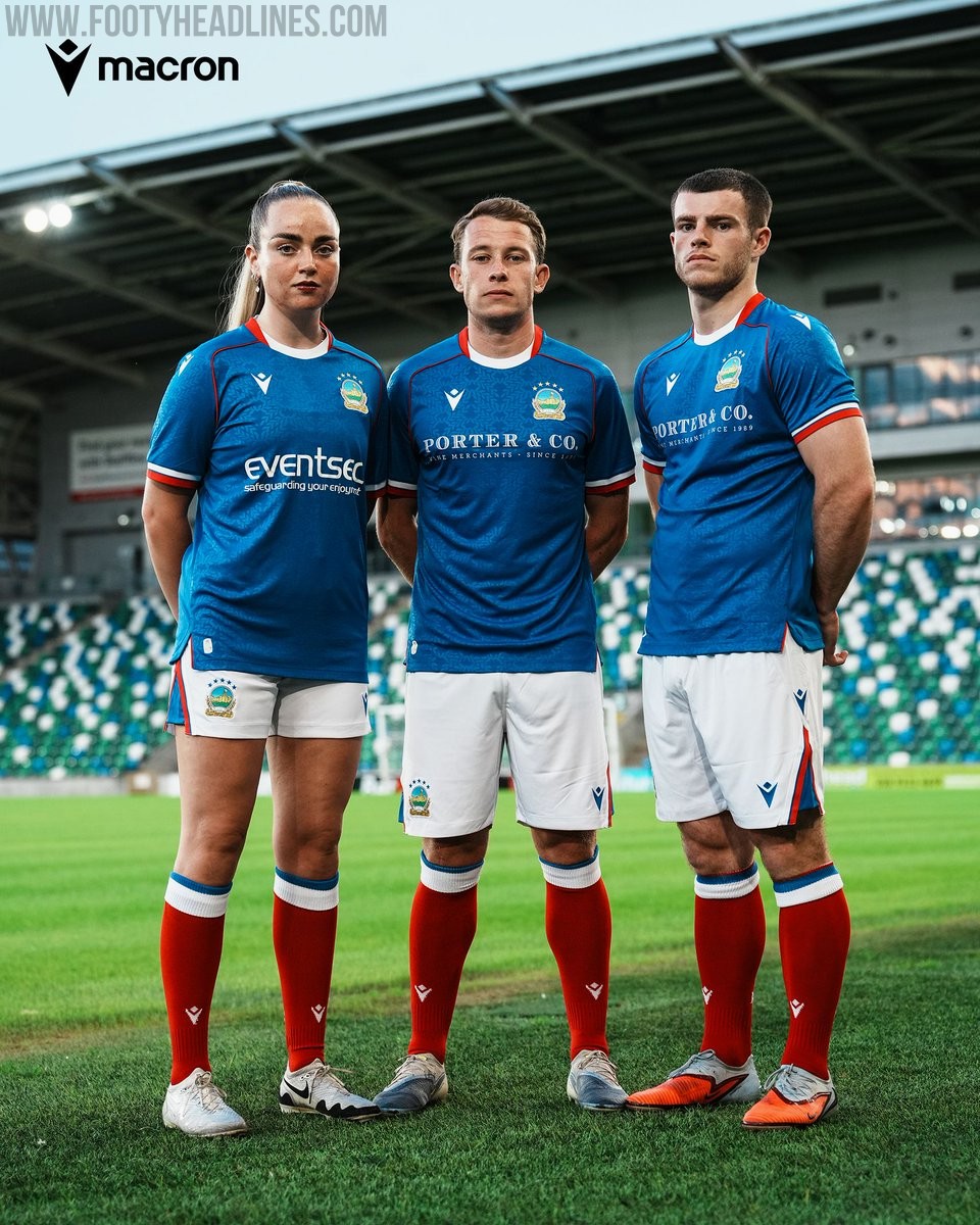
Linfield FC 26-27 Home Kit Released
Northern Irish club Linfield FC have officially revealed their new 2026-27 home kit, produced by Macron.
The design features a traditional blue base complemented by white and red accents. The release coincides with the club's announcement of a new three-year principal sponsorship agreement with Porter & Co. Wine Merchants, whose logo appears on the front of the shirt.
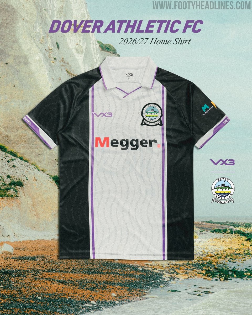
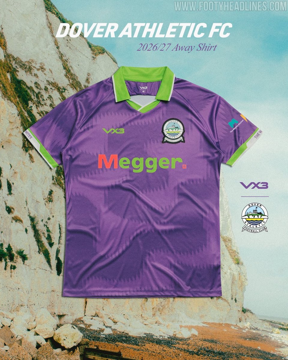
Dover Athletic 26-27 Kits Released
English National League South club Dover Athletic have officially released their new kits for the 2026-27 season.
Manufactured by VX3 Apparel, the new Dover Athletic 2026-27 kits feature 100% bespoke designs.