Hummel Replaces Standard Logo with Chevron Design

- New Kit Design: Hummel has replaced its standard logo with its chevron design on the new 2025 away kit for Forward Madison FC.
- Logo Placement: The chevrons have been moved to the right chest, the traditional spot for the kit manufacturer's logo, instead of the typical placement on the shoulders.
- Branding Strategy: Hummel's use of only the chevrons as the main logo raises questions about whether this is a one-off design or a new branding direction for the company.
Hummel has made an interesting and potentially significant branding decision on the newly released 2025 away kit for USL League One club Forward Madison FC. The Danish brand has replaced its standard logo on the chest with its iconic chevron design.

Hummel Replaces Standard Logo with Chevron Design

Typically, Hummel places its signature chevrons on the shoulders of its jerseys. However, on the new Forward Madison away kit, the chevrons have been moved to the right chest, the traditional spot for the kit manufacturer's logo.

The standard Hummel logo, featuring the bumblebee and wordmark, is absent from the front of the shirt.
A More Recognizable Logo?


Arguably, the chevrons are a more instantly recognizable brand identifier for Hummel than their full logo, much like the Adidas Three Stripes or the Nike Swoosh.


This cleaner branding allows the iconic symbol to speak for itself. It will be interesting to see if this is a one-off design for Forward Madison or a new direction Hummel will explore with other clubs in the future.

What do you think of Hummel using only their chevrons as the main logo? Is it a better look than the standard logo? Let us know in the comments below.
Vintage Football Shirts
from Cult Kits
2000/02 Nottingham Forest Home Shirt (L) Umbro

1997/99 Ipswich Town Home Shirt (L) Punch

1998/99 Manchester United Track Jacket (L) Umbro

1994 Germany Reusable Face Mask

1980'S Adidas Template Shirt (M)

2020/21 Atletico Madrid Track Jacket (M) Nike

2000/01 Farnborough Town Home Shirt (XL) Branded

1978/80 Dallas Tornado *BNWT* Home Shirt (M) Admiral Nasl

2018/19 Manchester United Womens Home Shirt (M) Adidas

1995/96 Mexico Home Shirt (L) ABA Sport


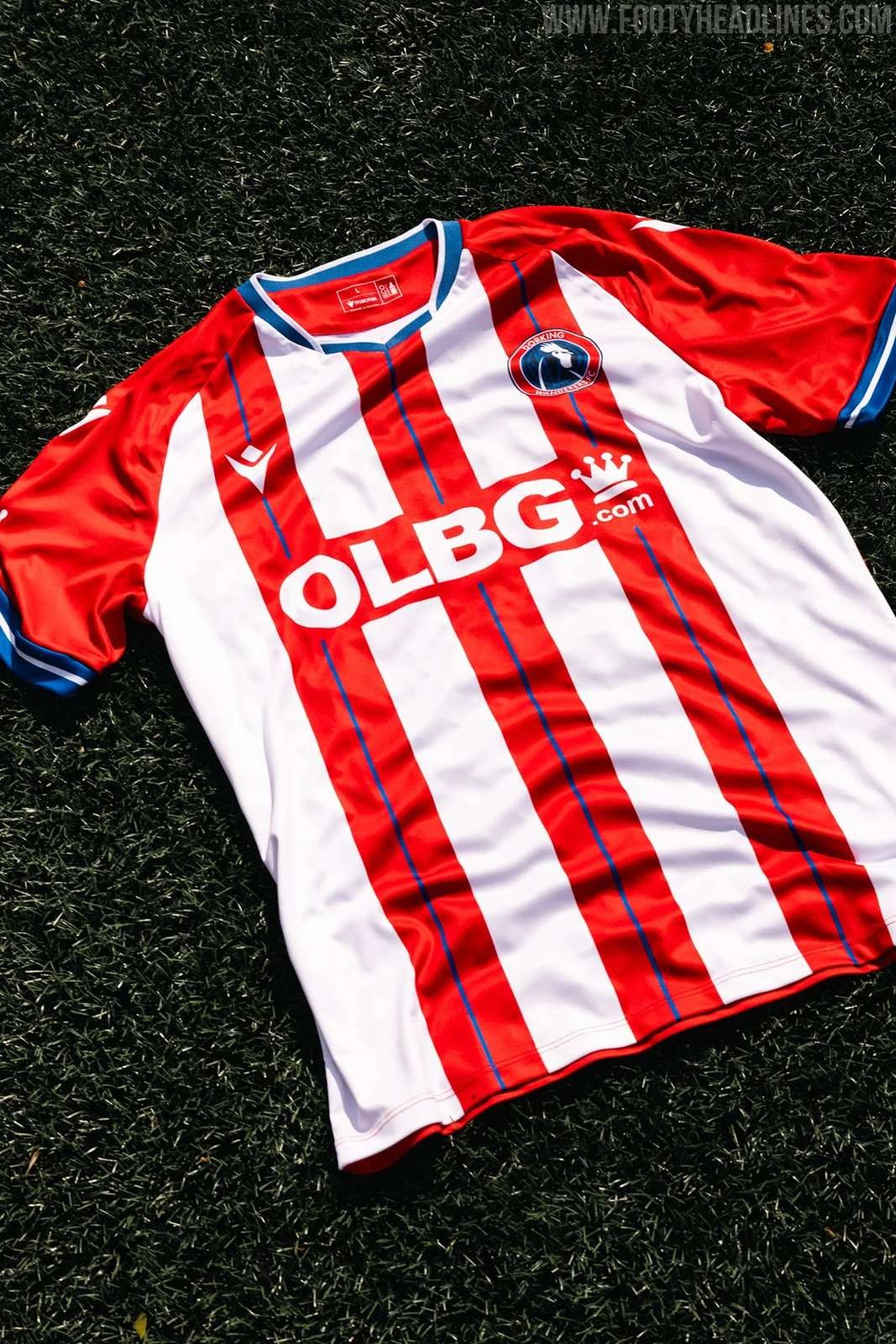
Dorking Wanderers 26-27 Home & Away Kits Released
English National League South side Dorking Wanderers have officially revealed their new home and away kits for the 2026-2027 season.
The new 26-27 home shirt introduces a classic and timeless design, stripping things back to a traditional aesthetic. It features bold red and white vertical stripes that draw inspiration from historic European football heritage. To complete the clean and authentic on-pitch look, the home jersey is perfectly paired with deep blue shorts and traditional white socks.
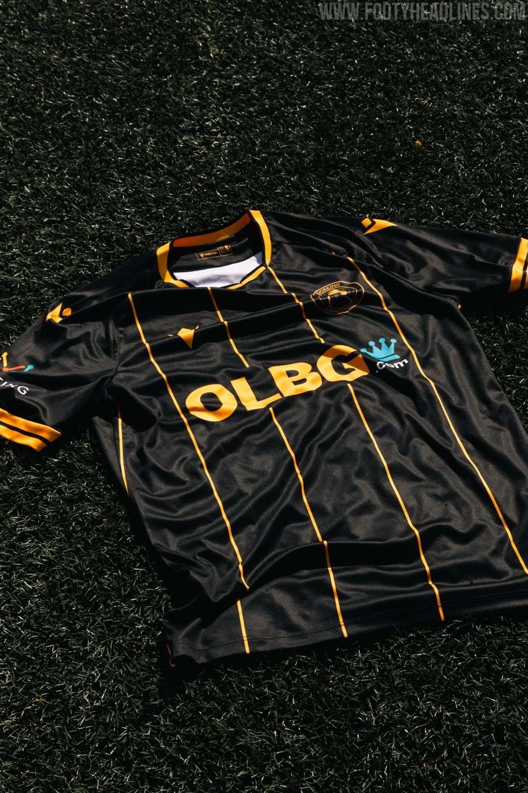
Following the launch of the primary strip, Dorking Wanderers also introduced their new 26-27 away kit, which delivers a much sharper and modern edge. This secondary jersey is defined by striking black and orange stripes, creating a strong contrast between dark and vibrant tones.
Notably, the club has thoughtfully replaced the betting sponsor with health and wellbeing partner Nuffield Health for all junior kits, while also actively reducing the price of youth shirts by £6 down to £39 to help younger fans afford their colors.
Which of these two striped Dorking Wanderers designs do you prefer? Let us know in the comments below.


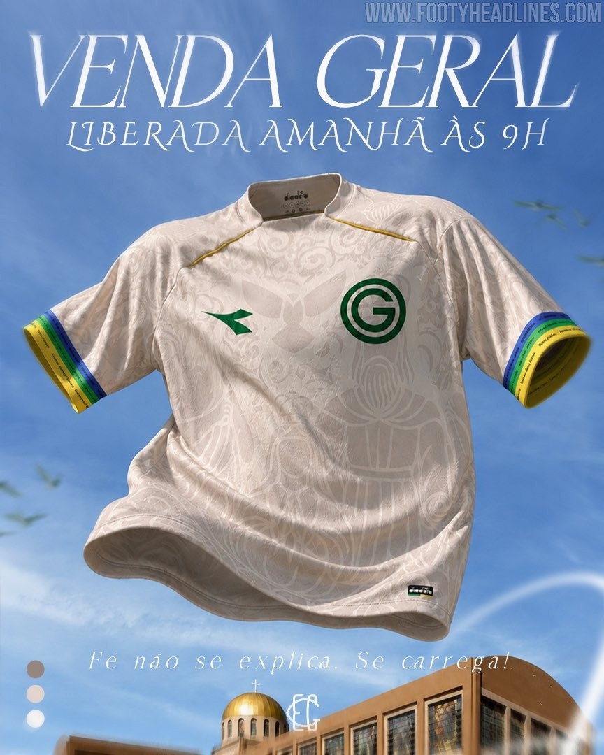
Special Goiás 2026 'Romaria' Kit Released
Brazilian side Goiás EC and technical sponsor Diadora have officially launched a special edition "Romaria" kit for the 2026 season. This unique jersey is designed to honor the deep-rooted faith and cultural traditions of the club's supporters, known as the Emerald Nation.
Tying heavily into the local religious pilgrimages that take place in the state of Goiás, the release operates under the fitting motto, "Faith is not explained. It is carried," successfully blending regional heritage with modern football apparel.
The design of the new Goiás 2026 Romaria shirt is anchored by an off-white base that is heavily detailed with an intricate, tonal graphic pattern. This all-over print features ornate filigree and religious iconography directly inspired by the Divino Pai Eterno (Divine Eternal Father), a central figure in the state's famous annual pilgrimage. To contrast the subtle background artwork, Diadora has applied its logo and the classic circular 'G' club crest in a sharp, dark green on the chest, while subtle gold piping accents the shoulder lines.
The most striking colorful details of the kit are reserved for the sleeve cuffs, which feature vibrant, tricolor bands of blue, green, and yellow. Upon closer inspection, these colored stripes are inscribed with repeating "Divino Pai Eterno" text, further cementing the jersey's homage to the region's spiritual traditions.
What are your thoughts on this intricately detailed Diadora and Goiás Romaria kit? Let us know in the comments below.

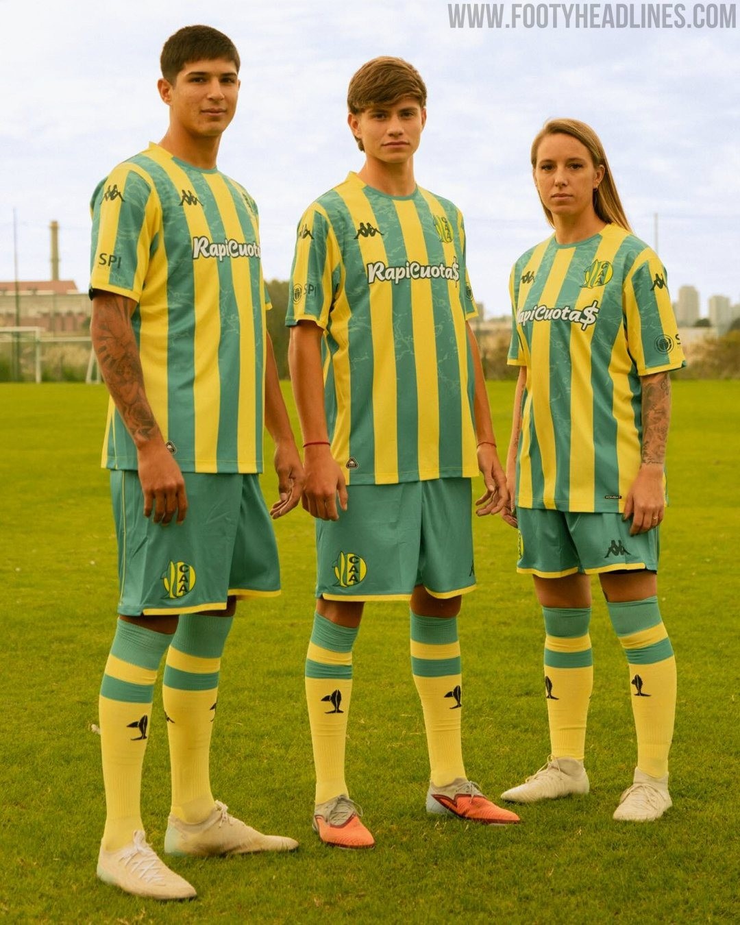

Aldosivi 2026 Home and Away Kits Released
Kappa has officially unveiled the new home and away kits for Argentine side Aldosivi ahead of the second half of the 2026 season. Launched under the campaign themes of "Familia" and "Barrio," the Italian sportswear brand has delivered a set of bespoke designs that celebrate the club's rich history and deep connection to its local community in Mar del Plata.
The Kappa Aldosivi 2026 home shirt is part of the "Familia" collection, which serves as a tribute to the inherited passion that unites different generations of the club's supporters. The design stays remarkably true to the team's historical visual identity, featuring the classic green and yellow vertical stripes. The green stripes have a subtle pattern.
Complementing the primary strip is the new Aldosivi 2026 away kit, introduced as part of the "Barrio" collection to honor the local neighborhood and the people who define the club's everyday identity. This alternative jersey opts for a modern look in black with gradient logos and elements.


