"Looks Shit" - Sunderland 25-26 Home Kit Has Awful On-Pitch Back

- Kit Discrepancy: The on-pitch version of Sunderland's 2025-26 home kit has a large, solid white panel on the back, unlike the fully striped version sold to fans.
- Premier League Regulations: The white panel was added to comply with Premier League regulations for player number visibility, but fans have criticized the design as unappealing.
- Alternative Solutions: Other Premier League teams and clubs like Atlético Madrid have found more aesthetically pleasing ways to incorporate number panels into striped kits, making Sunderland's solution look comparatively lazy.
Following the launch of their new 2025-26 home kit in late July, it has been revealed that the on-pitch version worn by Sunderland's players will feature a drastically different back design compared to the version being sold to fans. Big thanks to @brobbo55 for the picture.

The Back of Sunderland's 2025-26 Home Kit "Looks Shit"
A large, solid white panel has been added to the back of the player-issue shirts to comply with Premier League regulations, creating a look that has been slammed by fans as "shit."

On the official online store's description line, Sunderland confirmed the discrepancy. The club announced that after discussions with the Premier League, they will only sell a fully striped-back version to supporters to "preserve the traditional look of our home shirt."

However, the statement also confirmed that "the on-field shirt worn during Premier League matches features a solid panel to accommodate player numbers, in line with league requirements."
A Solution That Lacks Aesthetic Appeal
While complying with league rules for number visibility is necessary, the execution on the Sunderland kit is aesthetically very poor. The large white block abruptly cuts off the stripes and completely breaks the overall beauty of the jersey.

This solution looks particularly bad when compared to how other clubs and brands have handled the same issue. Other Premier League teams with striped kits, like Brentford, Brighton, and Newcastle, have opted for much cleaner and more integrated solutions, creating a simple box for the numbers that doesn't disrupt the design as jarringly.
Looking abroad, Atlético Madrid's striped Nike kit shows an even better approach. Nike created a white box within the stripes for the number, a solution that respects the primary design while still meeting regulations. Sunderland's version simply looks lazy in comparison.

While the club's decision to sell the "pure" version to fans is commendable, the on-pitch solution is a major design failure compared to how other brands and clubs have tackled the exact same problem.

What do you think of the on-pitch back of the Sunderland home kit? A necessary evil for league rules, or a poor design choice? Let us know in the comments below.
Perfectly Curacao Player Boot-Kit Combo at 2026 World Cup
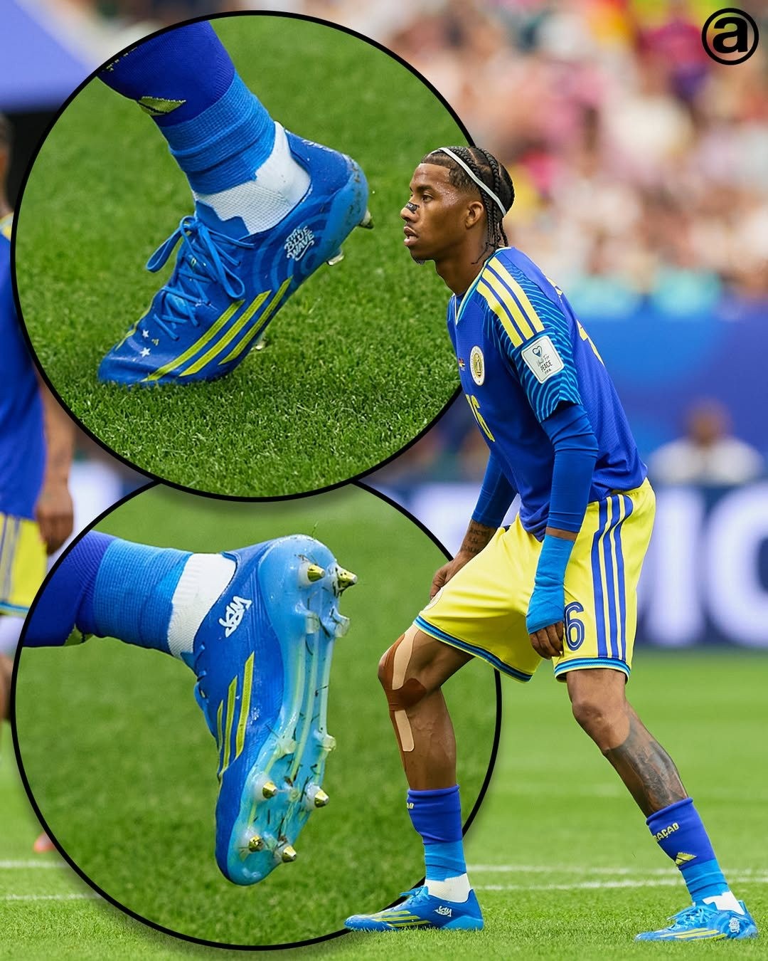
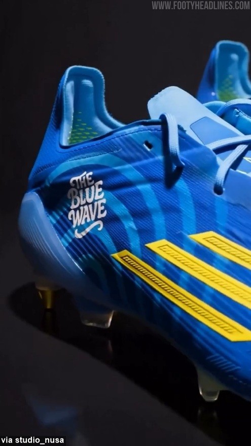
In the recent 2026 World Cup match, Curaçao national team player Jearl Margaritha wore the F50 "Ice Cold Precision" boots, but in a custom version with a slightly darker colorway to perfectly match the blue shade of Curaçao's 2026 home kit. Big thanks to @abcdefutbol.
The custom F50 was designed by @studio_nusa and draws inspiration from the waves surrounding the Caribbean island. The boots also feature the phrase "The Blue Wave" on the outer side.
https://www.footyheadlines.com/0747976324/messi-s-boots-match-his-kit-perfectly.html
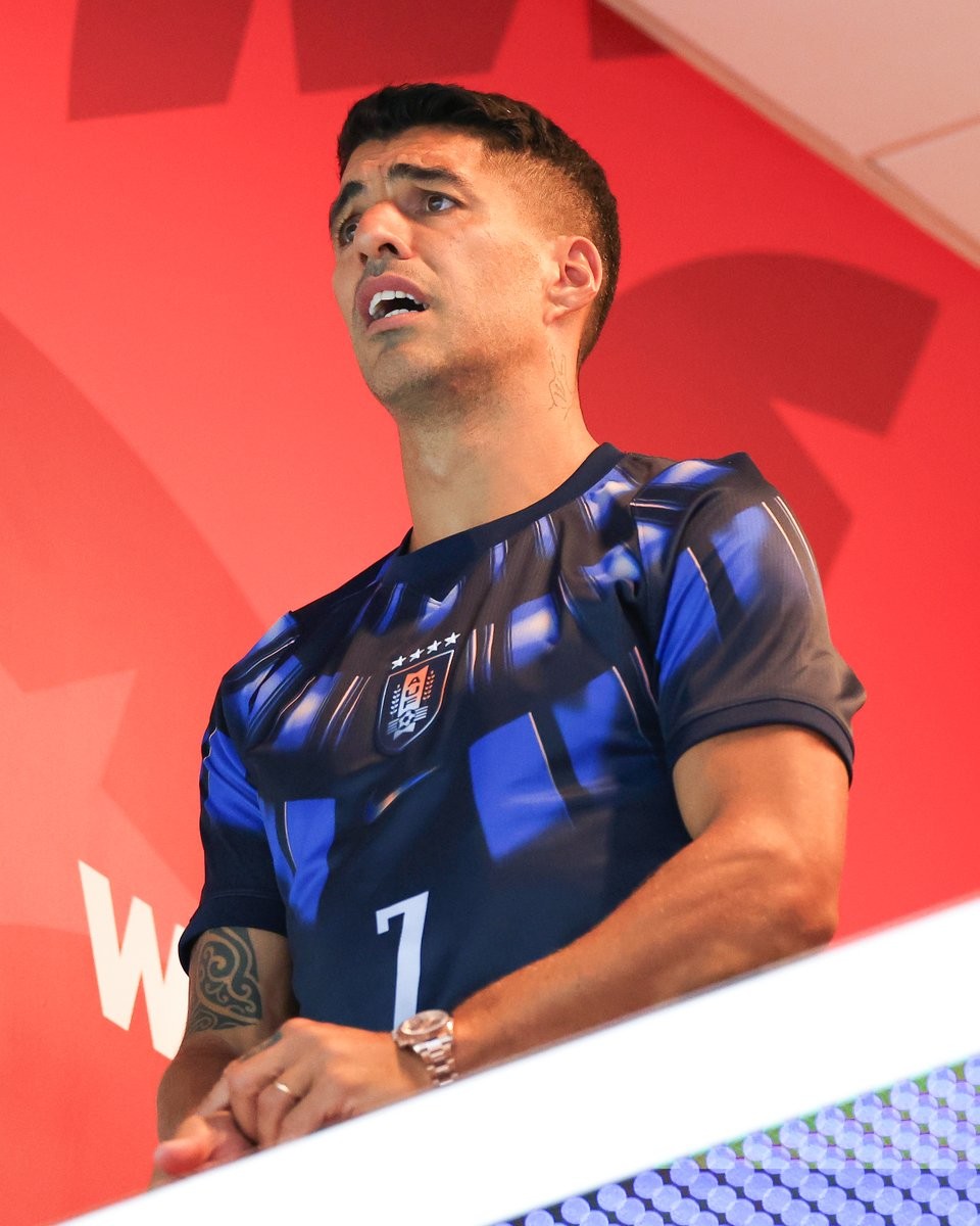
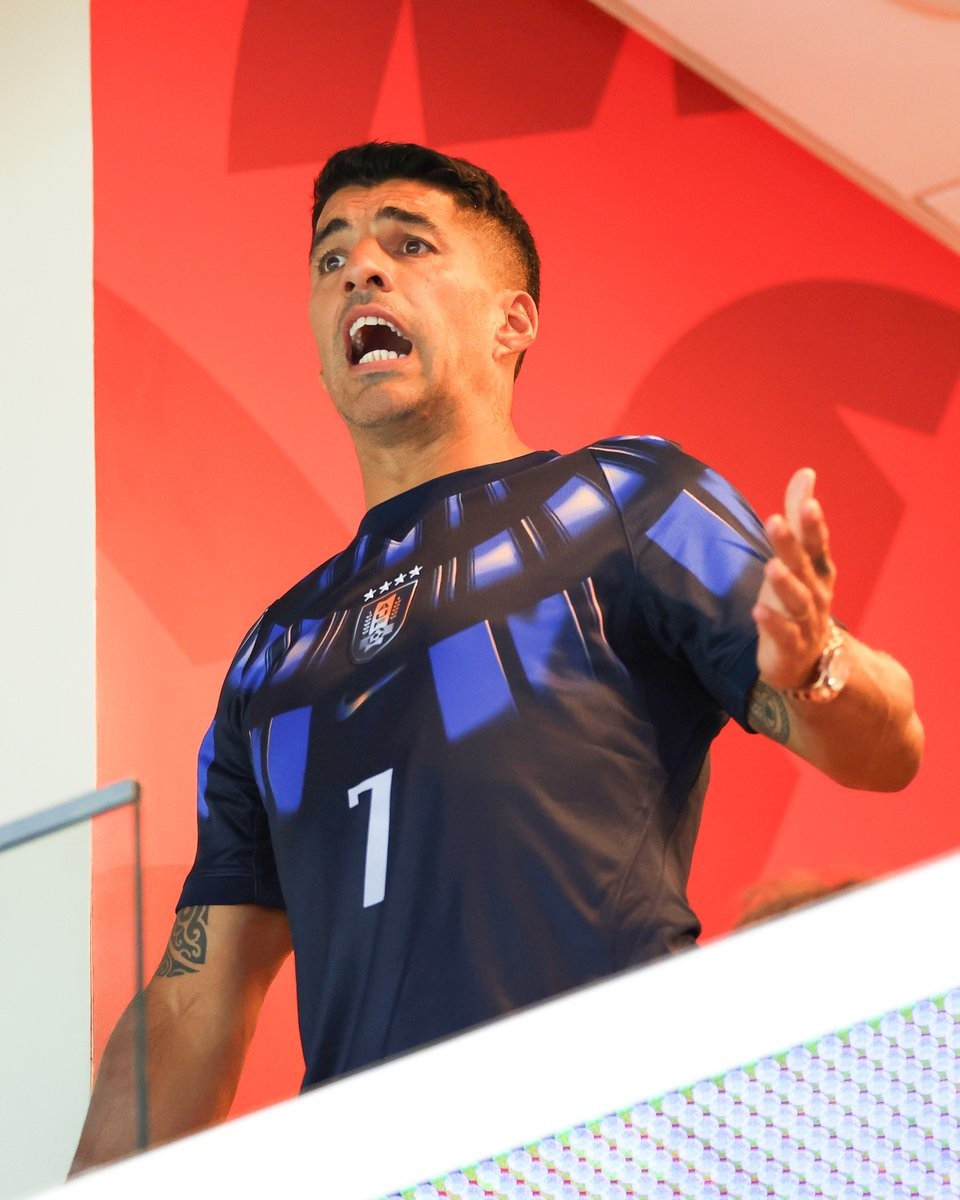
Luis Suarez Spotted in Uruguay 2026 Away Kit During Uruguay vs Cabo Verde Draw
Former Uruguay international Luis Suarez was spotted in the stands during Uruguay's 2026 World Cup match against Cabo Verde. Suarez, watching his nation from the sidelines, appeared visibly stressed as the game unfolded, ultimately ending in a surprising draw.
Suarez appeared wearing the Uruguay 2026 away jersey, seemingly to encourage his younger teammates from the stands. Surprisingly, he chose to wear the number 7 shirt instead of the iconic number 9 that he wore during his playing days with the national team. Images of him reacting to the tense moments of the match quickly circulated online, capturing his passionate support for the national team and drawing a wave of reactions across social media.


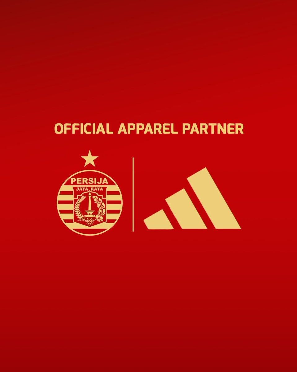
Persija Jakarta Announce Adidas Kit Deal
Indonesian club Persija Jakarta have officially announced a new kit partnership with Adidas. The announcement was made on June 22, 2026, coinciding with the 499th anniversary of the city of Jakarta. Adidas will replace Juara as the club's official apparel partner, taking over the production of all kits and training gear starting from the upcoming 2026-27 season.
Persija's move to a major global brand like Adidas is seen as a significant upgrade and a new chapter for the club. Further details regarding the official launch date of the 2026-27 kits are expected to be revealed in the coming weeks.
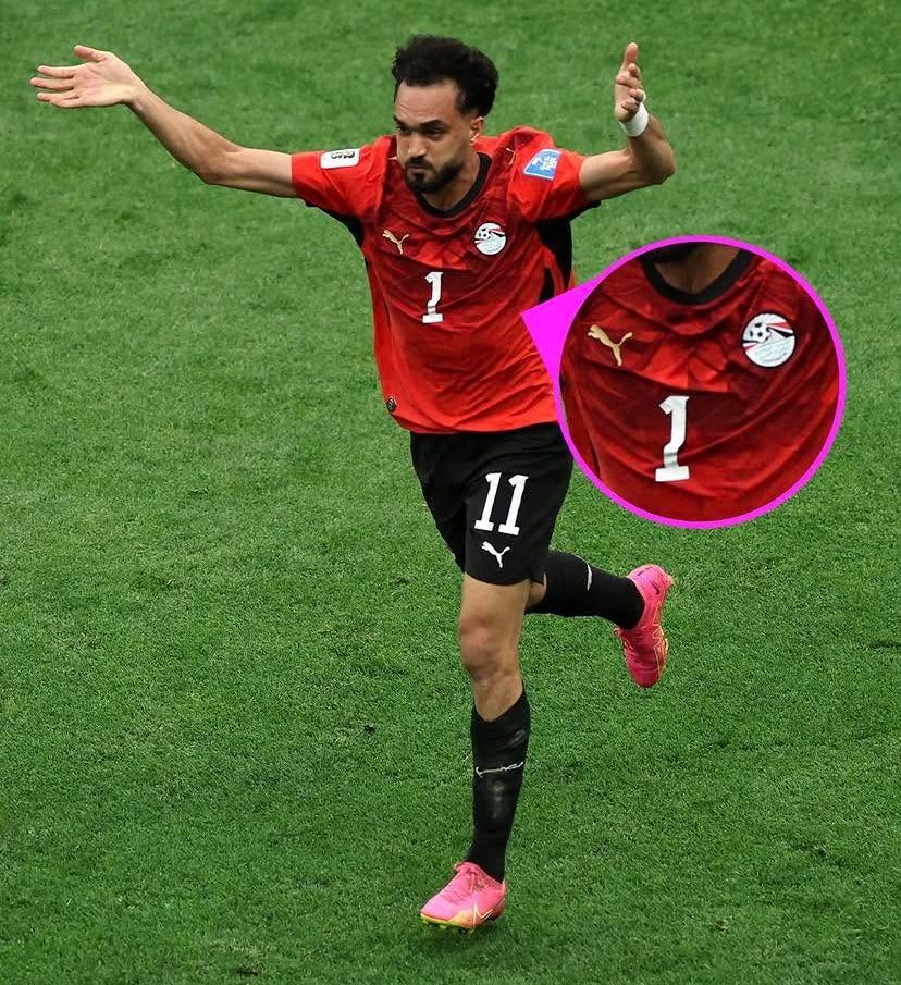
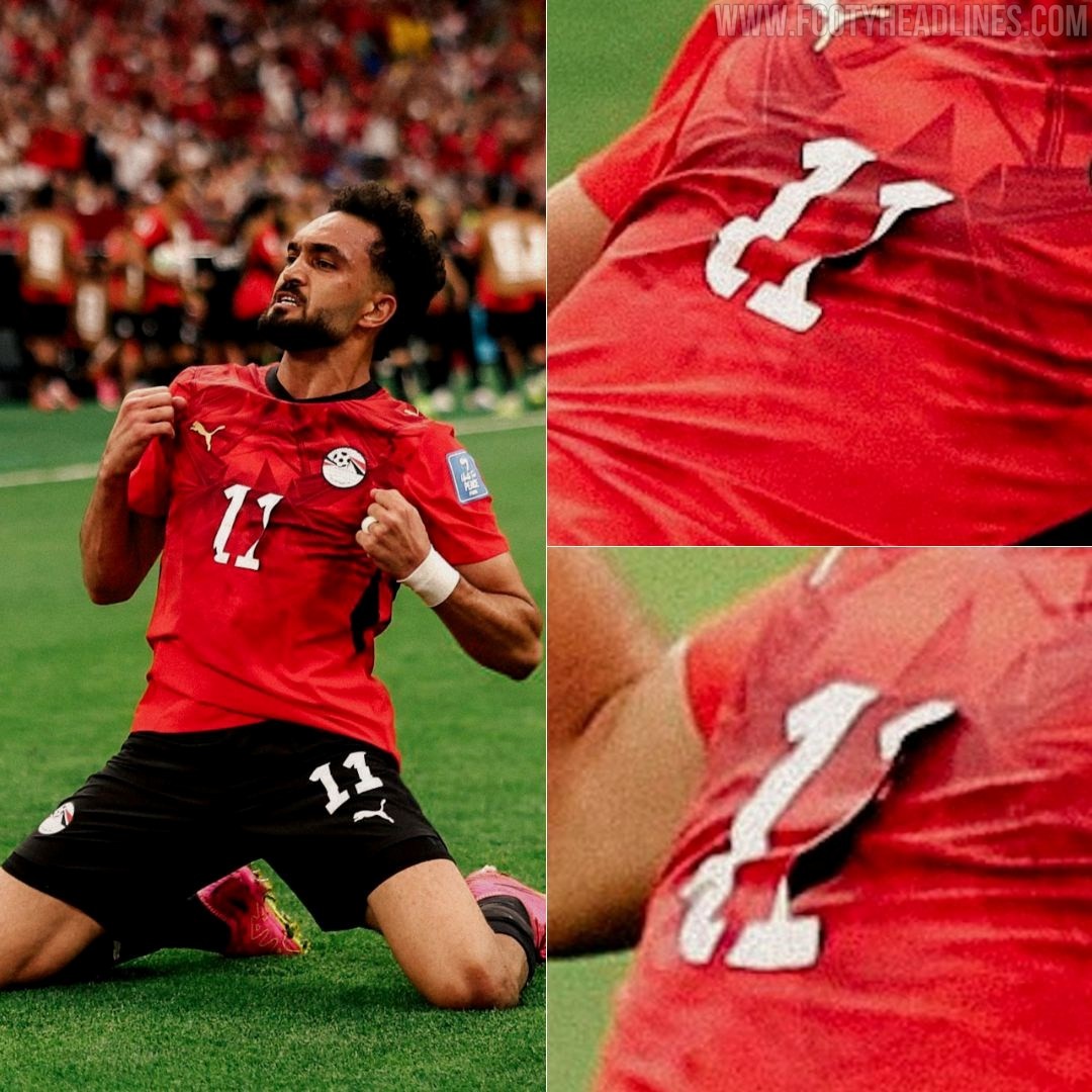
The Number on the Egypt Puma Kit Came Off
During Egypt's World Cup match against New Zealand, striker Mostafa Ziko was seen wearing a 'damaged' jersey after one of the digits on the front came off. Although he was wearing the number 11 shirt, one of the "1"s fell off, making it look like he was wearing number 1 instead.
The number appears to have been poorly heat-applied to the jersey and gradually peeled off due to sweat during the game. The incident occurred as Mostafa Ziko celebrated his goal, when one of the digits in his number 11 shirt detached, leaving only a single "1" visible on the front.


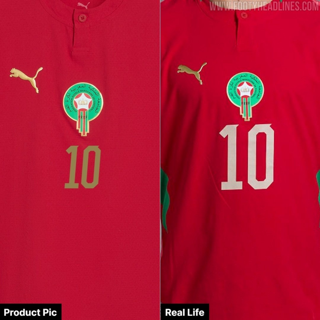
Morocco 2026 World Cup Kit Features Different Name Set to Commercial Version
Fans looking to purchase the exact Morocco 2026-27 home kit worn by the players at the World Cup will find a noticeable difference in the name and number sets. While official product pictures of the Puma kit display the chest numbers in gold, the actual shirts worn by the Moroccan national team feature a lighter, white-colored application. Big thanks to @rockonbaPES.
Alongside the retail discrepancies, there have been multiple reports of Puma kits easily ripping during tournament matches. These material failures have affected several of the brand's sponsored teams, including Morocco, Czechia, Egypt, and Paraguay.
https://www.footyheadlines.com/8529325653/puma-kits-keep-ripping-at-the-2026-world-cup.html


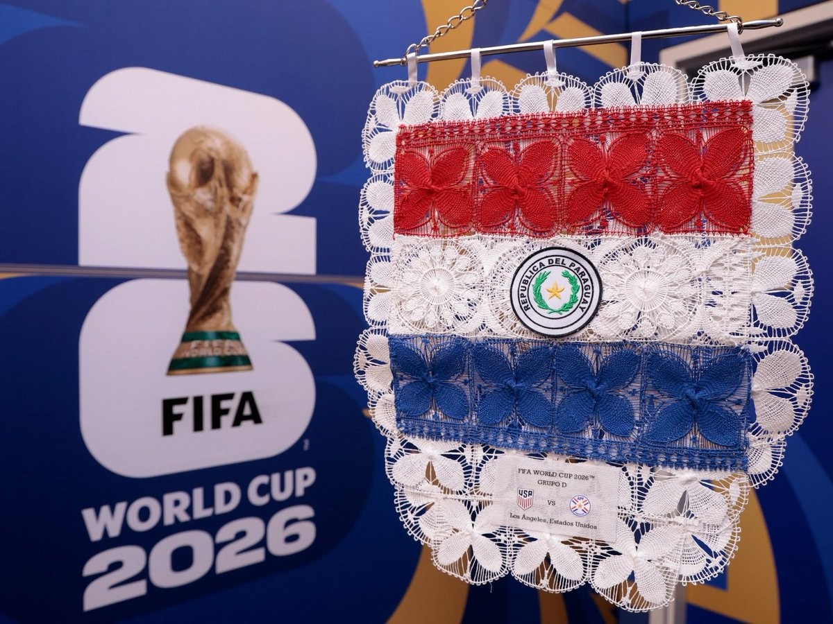
Special Paraguay 2026 World Cup Pennant
A look at the special exchange flag for the Paraguay national team at the 2026 World Cup has been shared online. These pennants are traditionally exchanged by team captains prior to kick-off during international matches.
The Paraguay 2026 World Cup exchange flag incorporates the traditional colors of the nation, tying into the visual identity established by Puma for the tournament. It prominently features the Paraguayan Football Association crest alongside the Puma logo.