Adidas Moves Logo on Back of Club Shorts in Team Kits After 7 Seasons
 May 2, 2026, by Phan Tich Giay

- Adidas Logo Placement Change: Adidas is moving its logo from the front to the back of club shorts for team kits starting with the 26-27 season.
- Reason for the Change: The primary reason for moving the logo to the back is to free up space on the front of the shorts for player squad numbers.
- Historical Context: Adidas used to place its logo on the back of the shorts until the 2018-19 season, after which they shifted to the front, and this change marks a return to the older template after seven seasons, with a possible exception for retro collections.
Based on recent leaks of the upcoming Manchester United and Bayern Munich 26-27 home kits, we can confirm a notable design shift: Adidas is moving its logo back to the reverse side of the shorts. This marks a return to a classic placement last seen several years ago.

Adidas 26-27 Shorts Logo Placement

The new Adidas 26-27 club kits will feature the manufacturer's logo on the back of the shorts rather than the front.

This change was actually first confirmed back in November 2025 during the launch of the Adidas 2026 World Cup home kits, where national team kits also debuted the rear logo placement.


A major practical benefit of placing the Adidas logo on the back is that it frees up valuable real estate on the front of the shorts. This allows for a much cleaner and more spacious area to print the players' squad numbers on the front thigh.

Placing the logo on the back is not a new concept for the German brand, but rather a return to a familiar format. As seen in the evolutionary graphic, Adidas placed its logo on the back of the shorts up until the 2018-19 season.

They only shifted the branding to the front starting with the 2019-20 campaign.

Now, after exactly seven seasons of utilizing the front-facing design, Adidas is reverting to its older template.


However, there is a likely exception regarding the brand's retro collections. The 2026 Trefoil away kits retained the classic Trefoil logo on the front of the shorts.

Therefore, it is highly expected that the upcoming 26-27 away kits featuring the Trefoil logo will also stick to this rule and keep the logo on the front.
Do you prefer the Adidas logo on the front or the back of the shorts? Comment below.

Central Coast Mariners 26-27 Home, Away & Third Kits Released
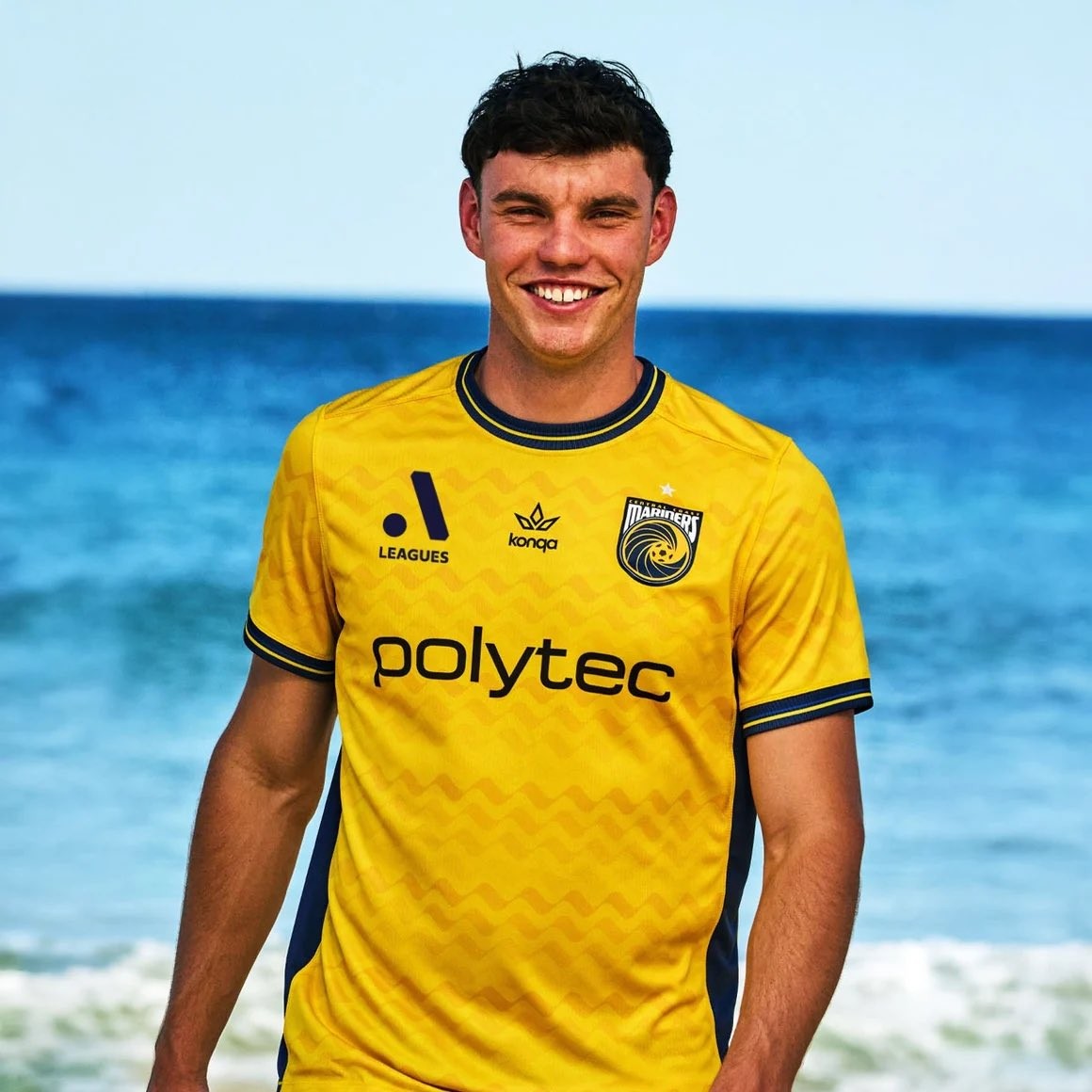
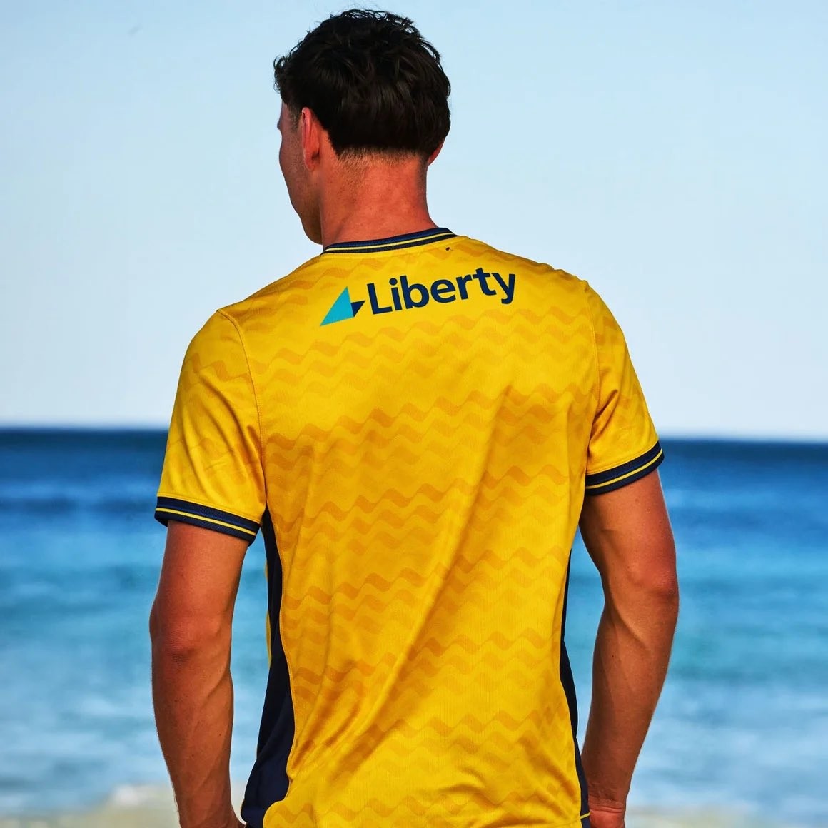
A-League side Central Coast Mariners have officially unveiled their new home, away, and third kits for the 26-27 season. Made by Australian brand Konqa in their debut A-Leagues collection following their Australia Cup release earlier this winter, the entire set is designed around the identity of the region, carrying the theme "inspired by the sand, the tide and the character of the Coast."
The 26-27 home kit represents the sand, sticking to the club's traditional bright yellow base complemented by navy accents. Across the front and back runs a subtle horizontal wave graphic reminiscent of ripples on the beach, completed by a ribbed navy-and-yellow crew collar and matching sleeve cuffs. In contrast, the away kit symbolizes the ocean's tide, featuring a navy foundation highlighted by electric blue vortex rings radiating outward from around the club crest.
Completing the trio, the sky blue third kit embodies the coast with a sublimated repeating palm tree graphic. The pattern draws directly from the iconic palm trees lining the bayside stadium in Gosford, paired with subtle Art Deco design elements. All three kits feature Polytec as the primary front-of-shirt sponsor and will be worn by both the men's and women's teams throughout the 26-27 campaign.

Not Unique: Inter Milan 26-27 Champions League Kit Font Is Identical to Barcelona's
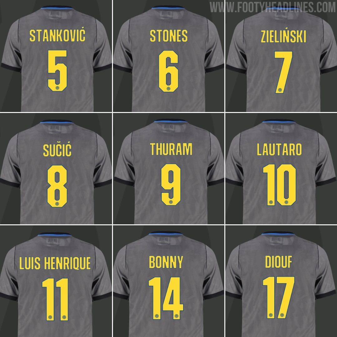
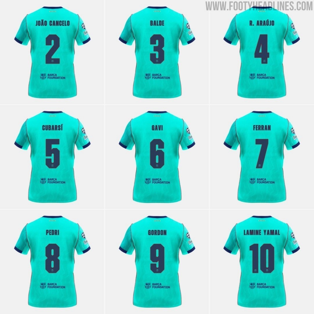
While the Nerazzurri introduced a dedicated cup font for their European campaign in the UEFA Champions League, the typeface is actually not exclusive to the Italian club. It is completely identical to the custom font introduced by FC Barcelona on their own 26-27 third kit.
Barcelona officially presented the typography in August alongside their third kit, sporting an angular, blocky, and squared-off aesthetic that contrasts with the curved, art-inspired font used on their home and away shirts. For Inter's 1990s-inspired Iron Ore grey third jersey, Nike used the exact same font set. The only differences are the color scheme - Speed Yellow with a subtle blue outline for Inter compared to deep navy for Barcelona - and the club crest stamped at the bottom of the numbers.
Inter Milan have traditionally stuck with the standard Serie A league font even in European fixtures, so the appearance of a bespoke Champions League typeface on their third kit caught plenty of attention. However, it seems Nike chose to streamline the design across their elite roster rather than creating a truly unique typography for each club.
FC Bourg-Péronnas 26-27 Away Kit Released
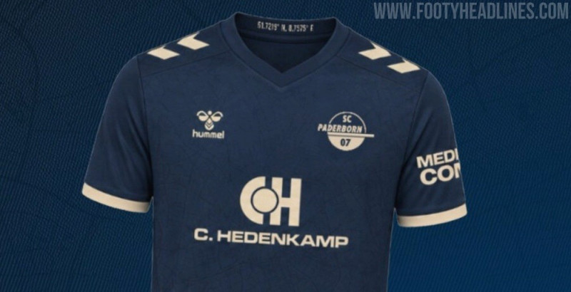
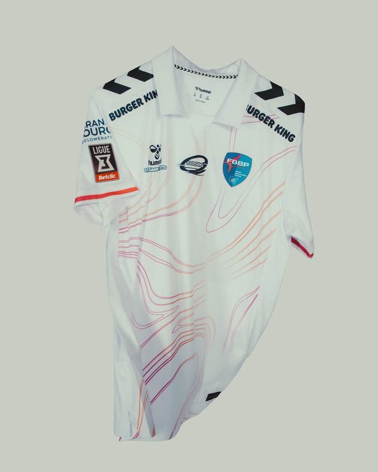
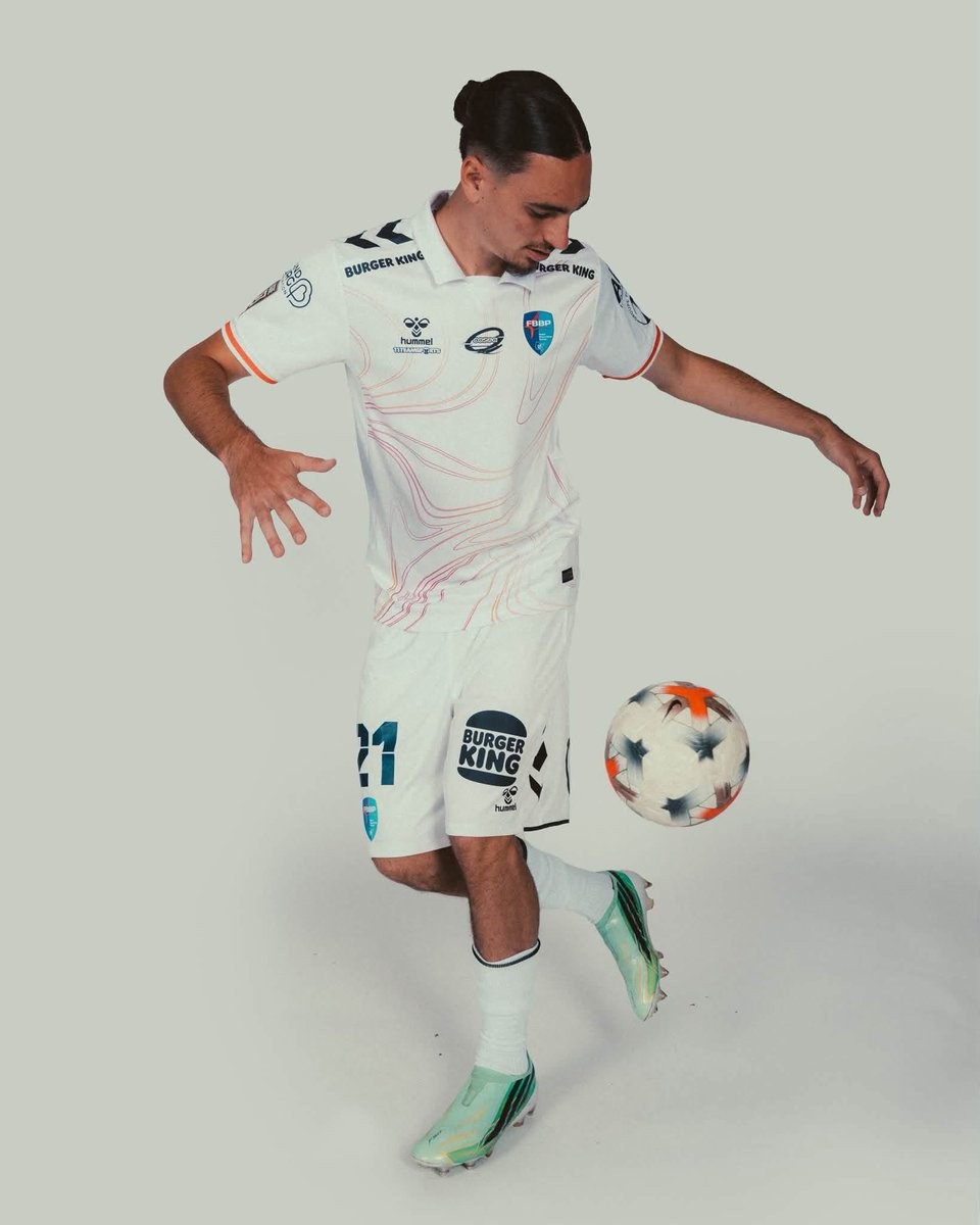
French Championnat National club Football Bourg-en-Bresse Péronnas 01 has officially launched its new away kit for the 26-27 campaign. Produced by Danish brand Hummel, the new design follows the earlier release of the team's home shirt.
The Hummel FBBP 01 26-27 away jersey is built on a clean white base and highlighted by an abstract, contour-like linework pattern flowing across the torso in subtle pink and orange hues. A traditional polo collar gives the shirt a refined aesthetic, accompanied by Hummel's signature black chevrons across the shoulders and vibrant contrast trim around the sleeve cuffs.
White shorts and matching white socks round out the full Bourg-en-Bresse Péronnas 26-27 away uniform.

Zulte Waregem Women 26-27 Away Kit Released
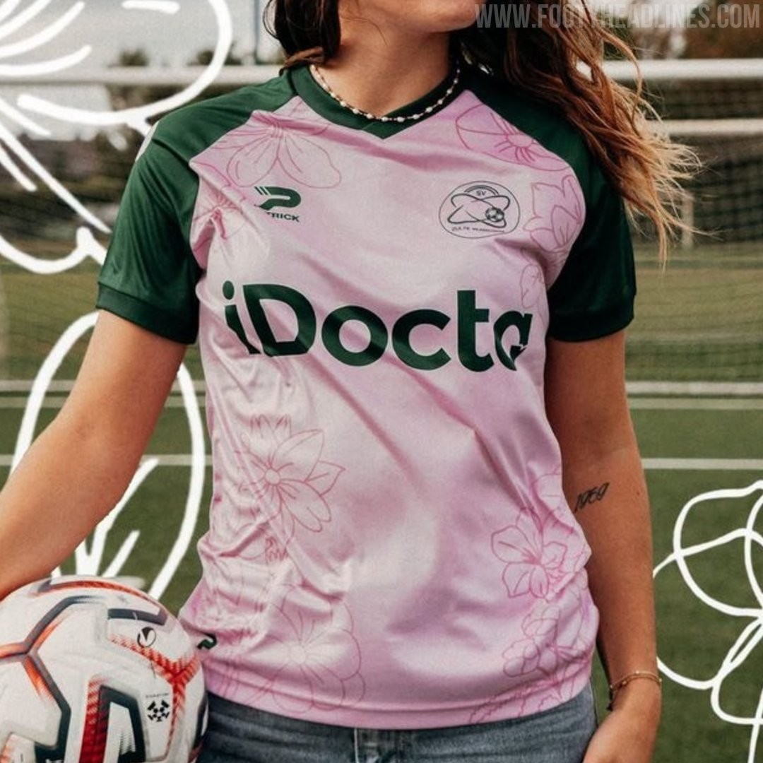
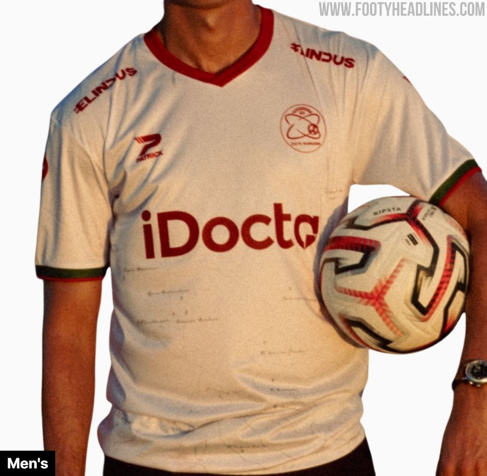
Belgian club SV Zulte Waregem and supplier Patrick have unveiled a bespoke 26-27 away kit created exclusively for the women's team. Marking the first time the women's side receives a completely independent design separate from the men's kit, the shirt features a light pink base paired with dark green raglan sleeves and trim. Subtle tonal floral illustrations run across the body, incorporating jasmine, alstroemeria, violet, and gladiolus inspired by player and youth academy drawings to represent friendship, trust, and strength, with dark green shorts and light pink socks rounding off the full strip.