

Adidas Brand System: Graphic Breakdown Explains Adidas Logo Ecosystem
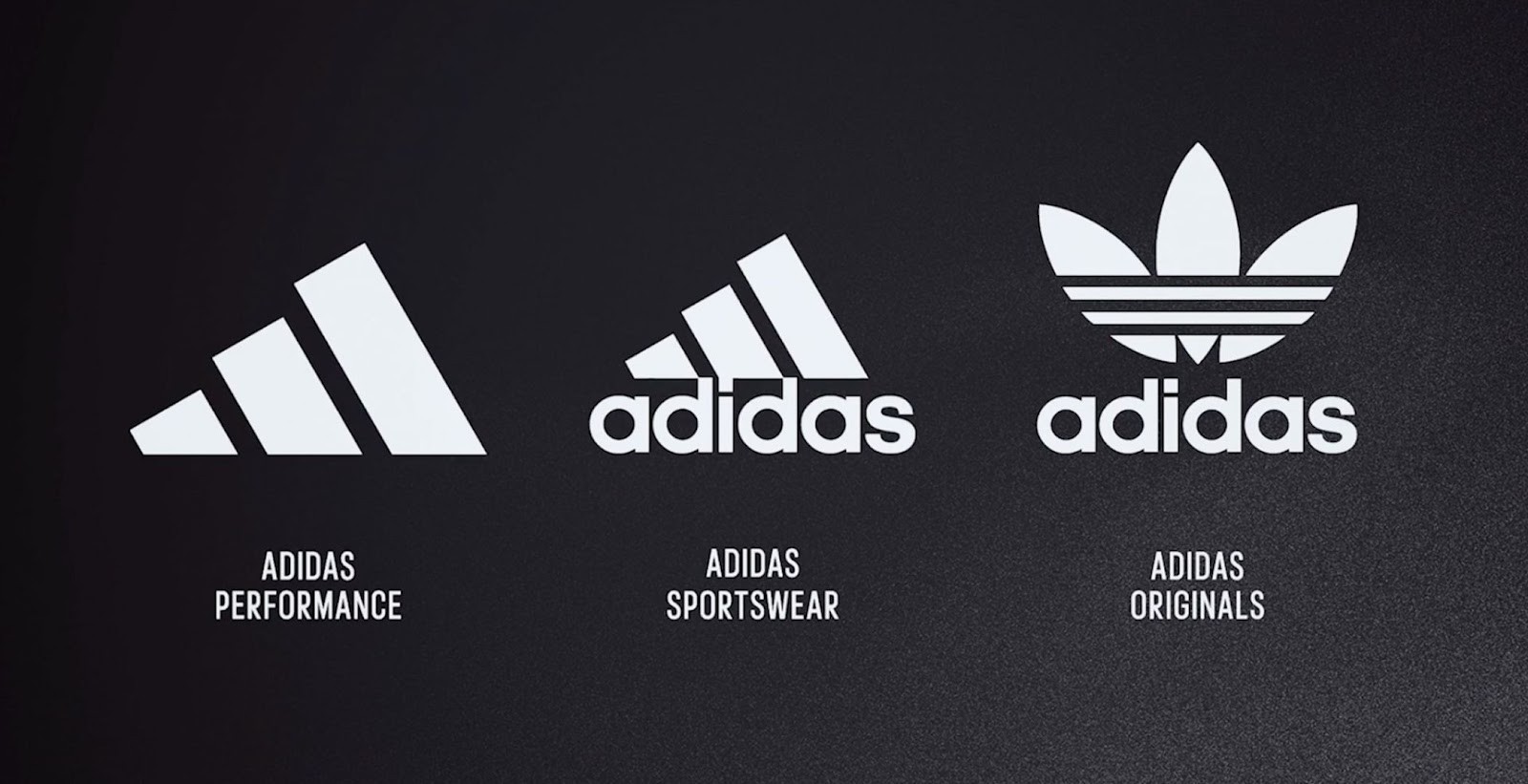
- Adidas Brand Hierarchy Explained: Football design platform Paladar Negro shared a graphic explaining the official branding hierarchy of Adidas, illustrating how the company organizes its visual identity across its various product lines.
- Key Logo Designations: The corporate identity is represented by the lowercase "adidas" wordmark, Adidas Performance uses the modern three slanted bars, and the iconic Trefoil logo is dedicated to Adidas Originals and lifestyle collections.
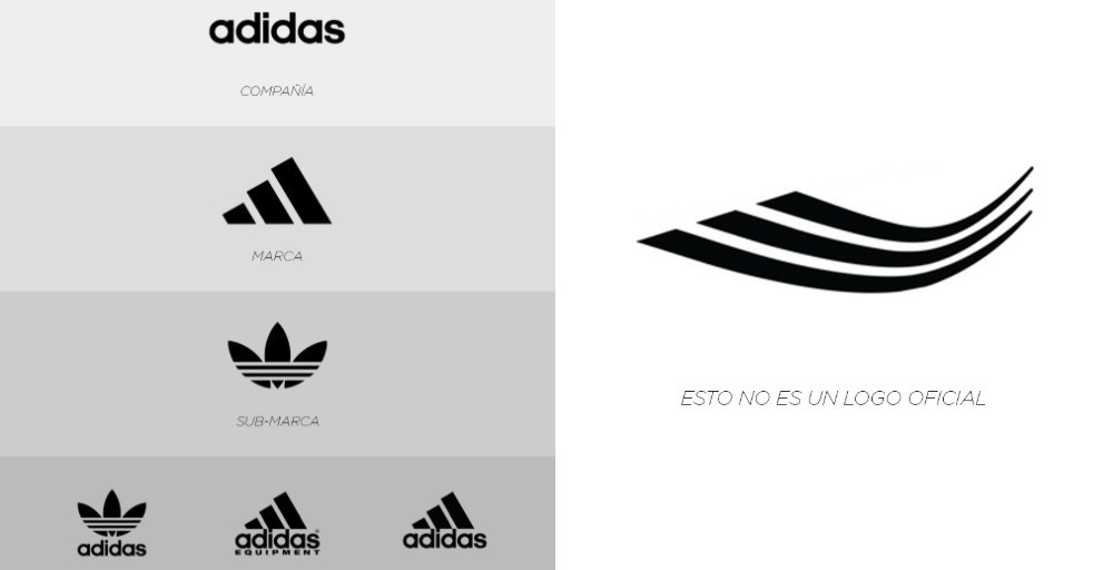
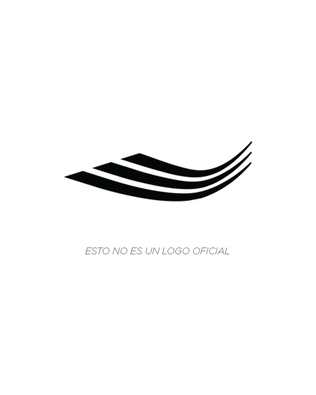
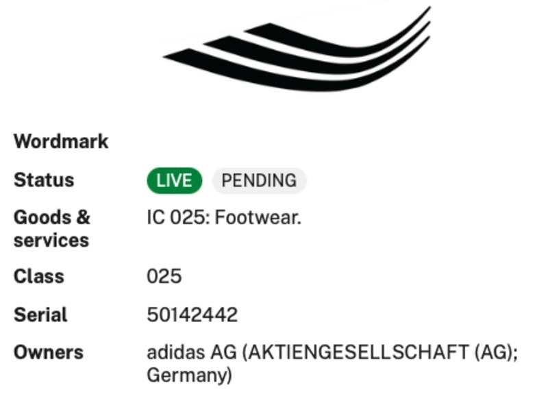
- Unofficial Logo Clarification: The graphic clarifies that a widely circulated curved, wavy three-stripe mark is not an official Adidas logo, but rather a variation specifically used on the brand's football boots and sneakers.
Football design platform Paladar Negro has shared a concise visual graphic breaking down the official branding hierarchy of German sportswear giant Adidas. With the Three Stripes managing multiple iterations of their iconic marks across performance sportswear, lifestyle collections, and archive retro lines, understanding the official brand ecosystem provides a clear look at how the company organizes its visual identity.
The Official Adidas Brand Architecture
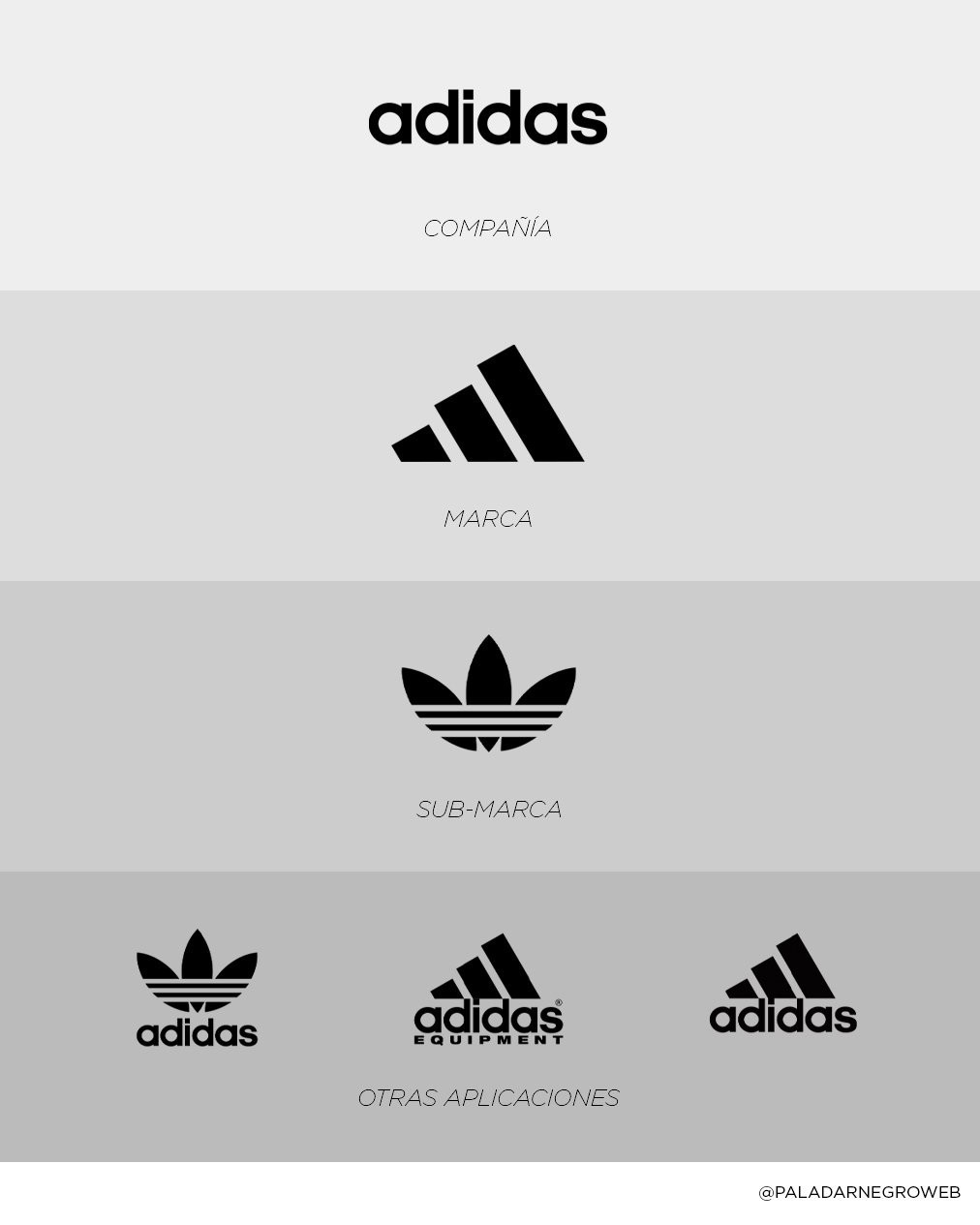
At the peak of the hierarchy sits the classic lowercase adidas wordmark, designated strictly as the corporate umbrella representing the company itself. Just beneath it is the modern three slanted bars mark, identified as the primary brand emblem for Adidas Performance.
Ahead of the 2022 World Cup, Adidas famously refreshed its visual identity by dropping the wordmark from below the three bars, allowing the standalone three-bar icon to serve as the pure performance badge on modern football kits and elite equipment.
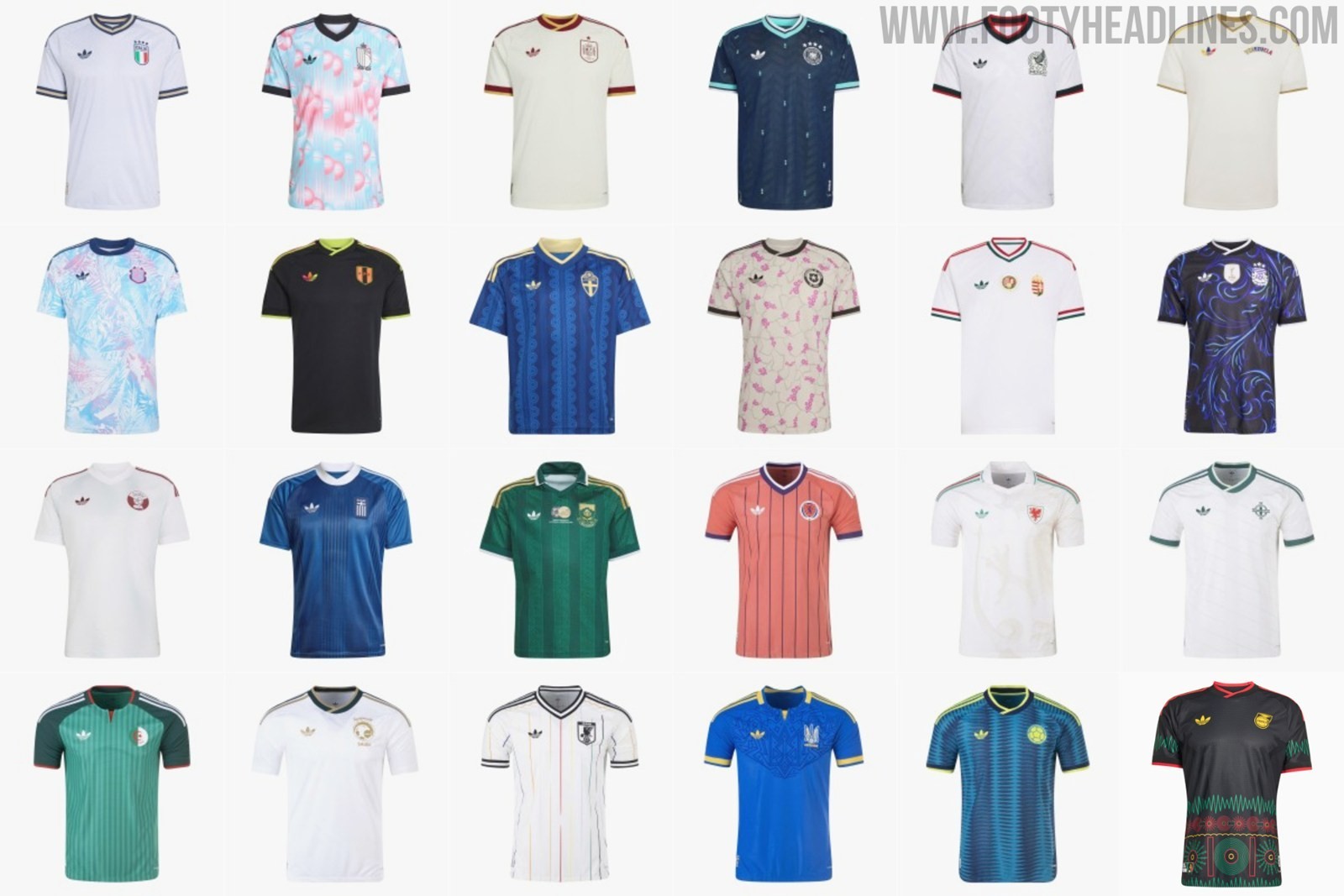
The iconic Trefoil logo occupies the sub-brand tier, representing Adidas Originals and lifestyle culture. Originally introduced in 1971 as Adidas expanded into apparel, the Trefoil has experienced a massive resurgence in football in recent seasons.
Notably, it has featured prominently on the 2026 national away kits & all Adidas-sponsored club 2026-27 away kits.
The chart also highlights other official lockups and historical applications that Adidas maintains in its archives. These include the heritage Originals lockup combining the Trefoil with the lowercase text, the famous 1991 Adidas Equipment (EQT) logo that defined 1990s kit culture, and the previous performance lockup featuring the angled bars directly over the wordmark.
Crucially, Paladar Negro dedicated a second image to busting a widespread internet misconception featuring a curved, swoosh-like wavy three-stripe mark labeled "Esto no es un logo oficial" (This is not an official logo). It is simply a logo variation that will be used on the brand's football boots and sneakers.


Which official Adidas logo application is your all-time favorite on football kits?