

2026-27 Kit Trend: Alternative Club Crests Are Everywhere
- Defining Kit Trend: The 2026-27 kit release season is clearly defined by the widespread use of alternative club logos, appearing on a significant number of kits, especially third kits.
- Evolution and Types of Alternative Crests: The use of alternative crests has evolved from simple retro throwbacks and minimalist experiments to include standalone symbols, historical emblems, and civic heraldry like city coats of arms.
- Commercial and Design Drivers: This trend is driven by brands aiming to bridge athletic and lifestyle apparel, the commercial success of simplified branding for streetwear, and the need for variety due to the increasing number of kits released annually.
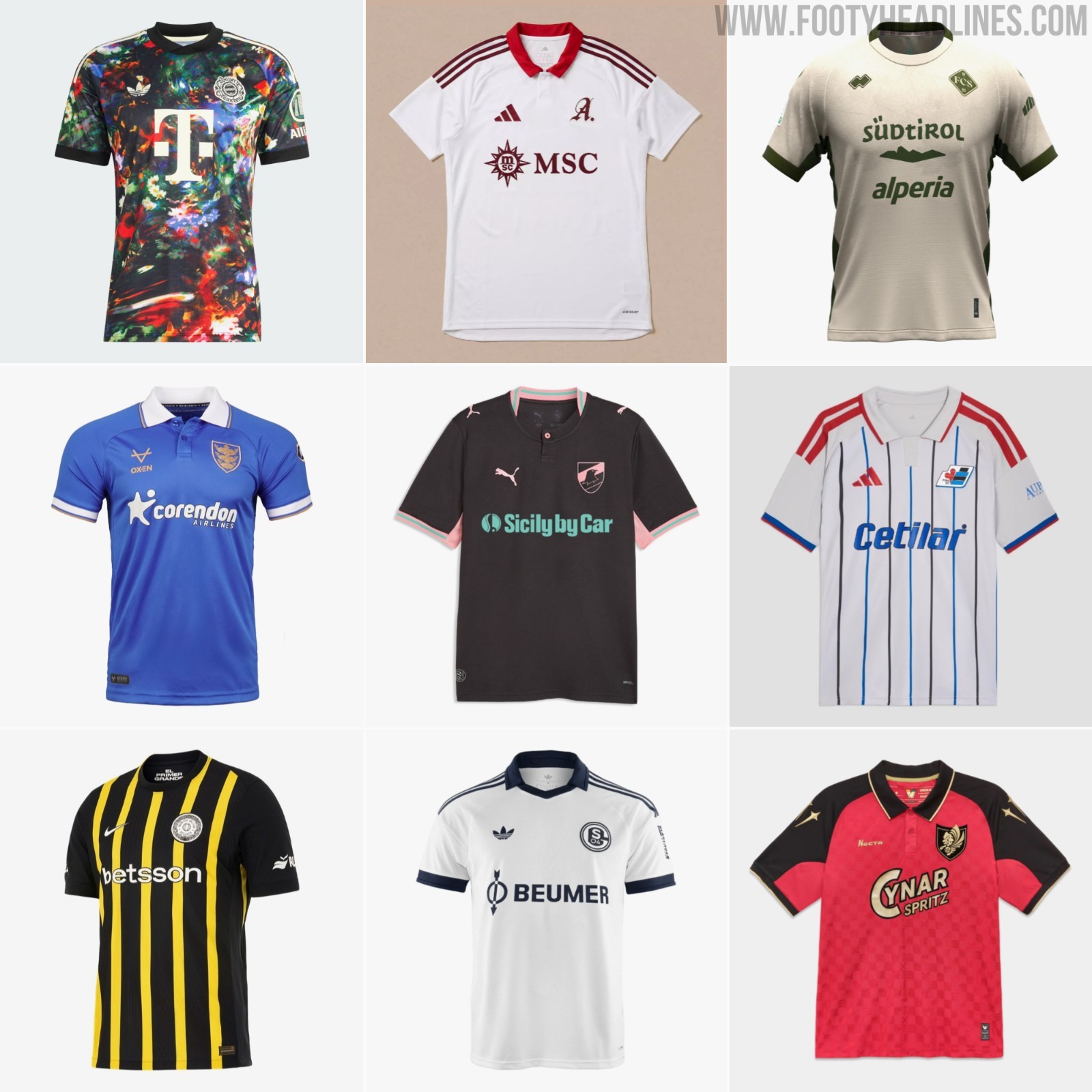
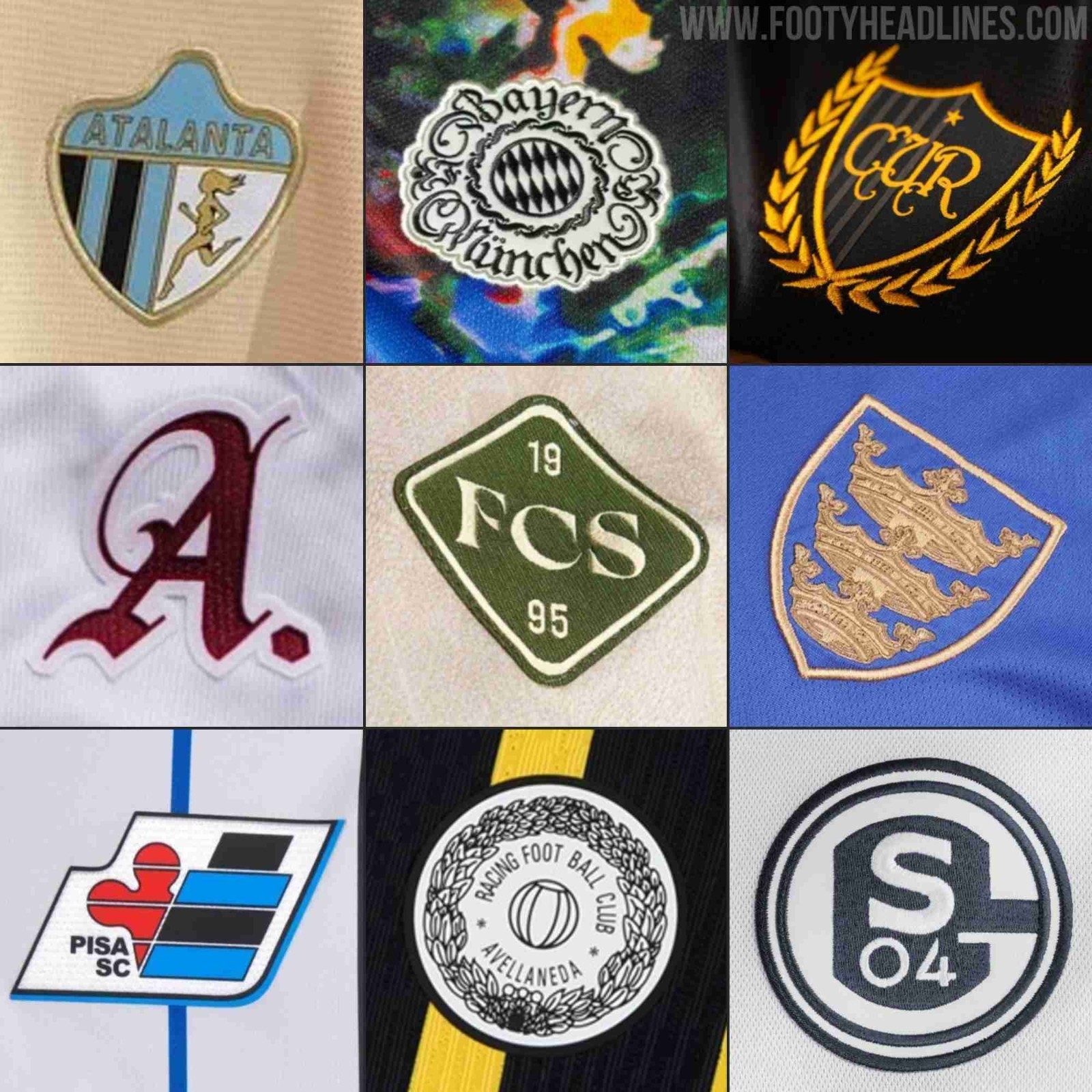
Update - Sunday, September 20, 2026: The 2026-27 release season is nearly over, and one trend has clearly defined it - the use of alternative club logos. For third kits, there are, based on feeling, more kits with alternative crests than with standard ones. We have put together nine more kits with alternative logos.
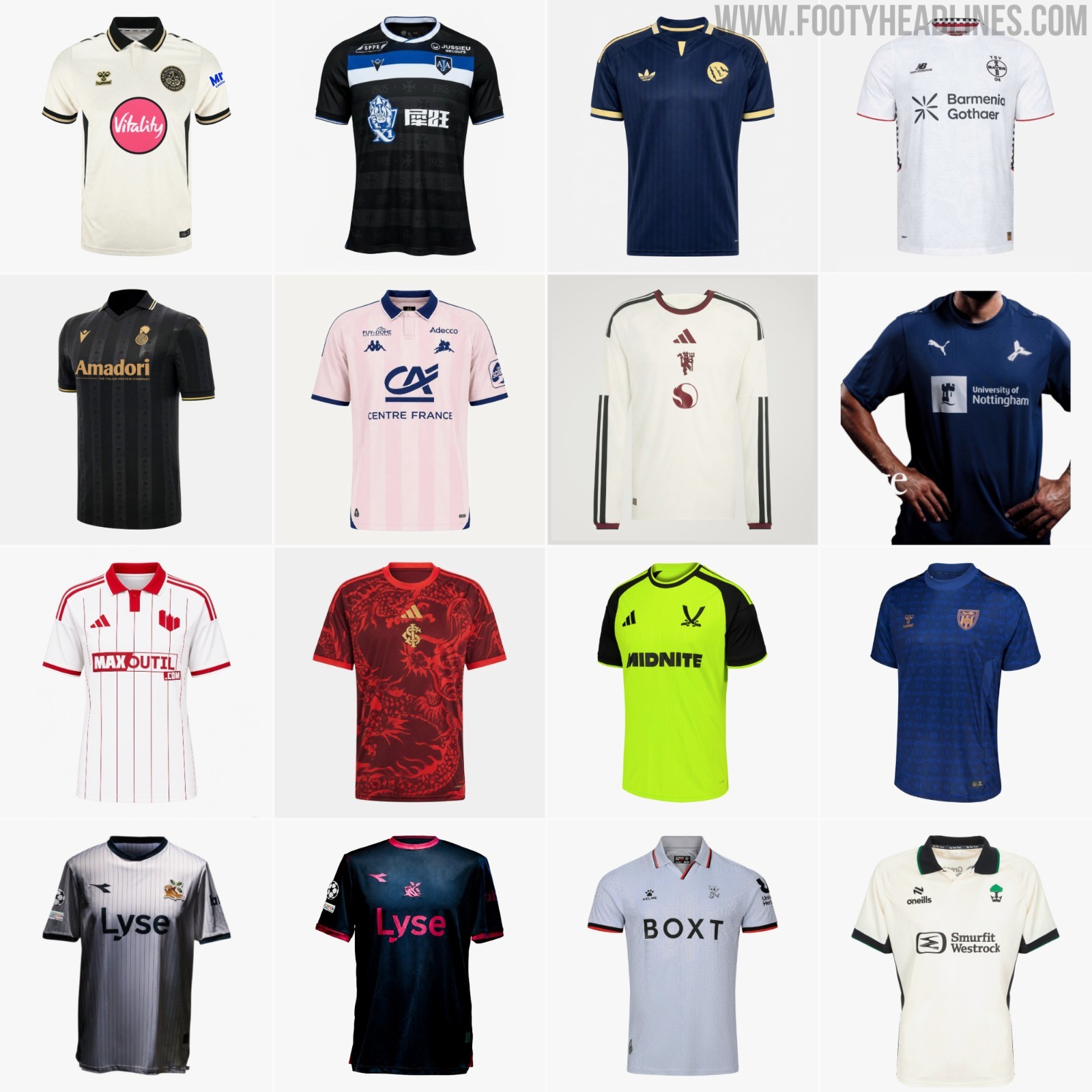
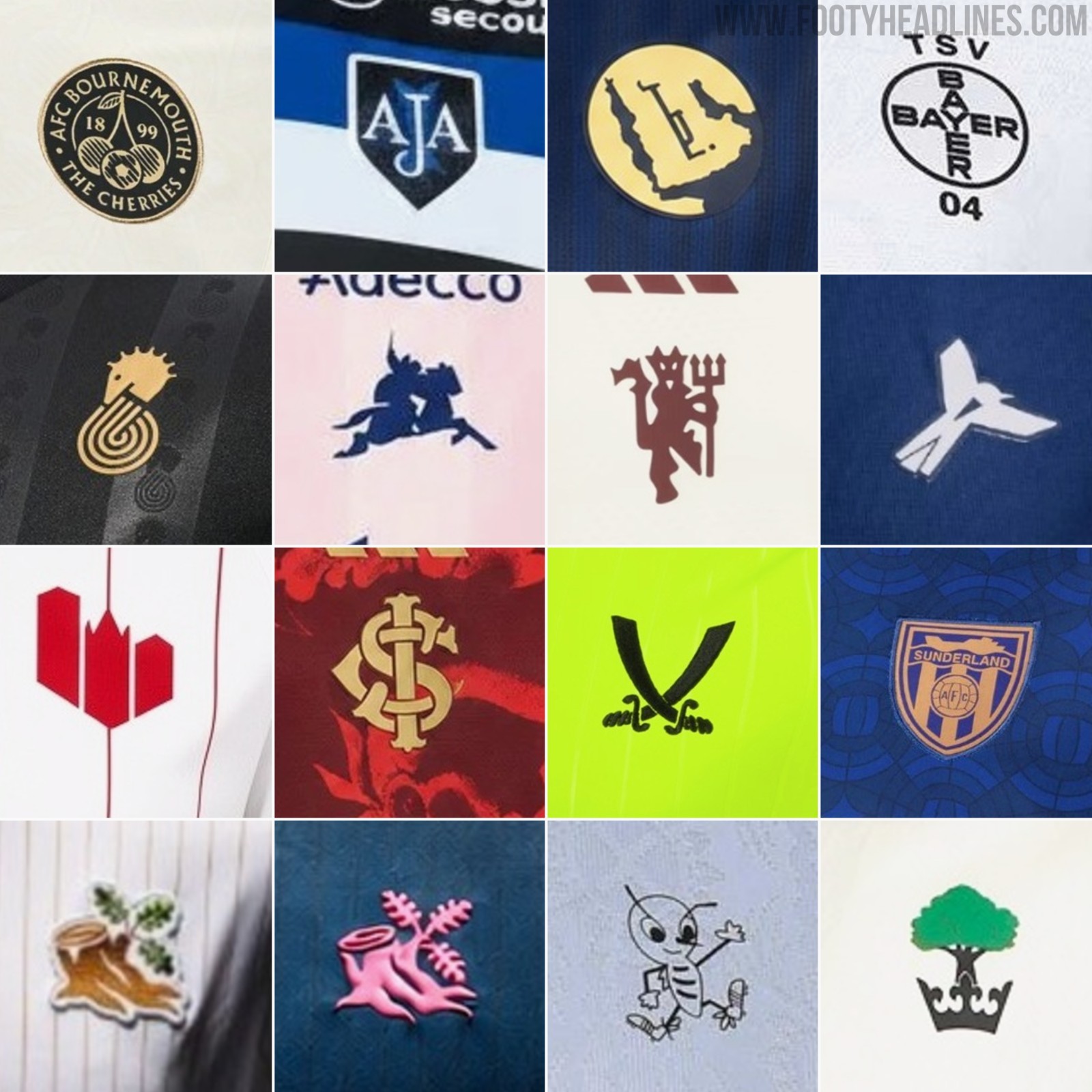
Update - Monday, August 17, 2026: Two weeks have passed since our last update, and again, more than 10 bigger clubs have released kits with alternative crests. The standout examples include the Wigan Athletic tree icon, Bayer's retro crest, and Watford's bee logo.
Update - Thursday, August 5, 2026: In the past two weeks, several new 2026-2027 kits were released. Many of them featured alternative crests, somehow confirming that this is the defining trend of the 26-27 season.
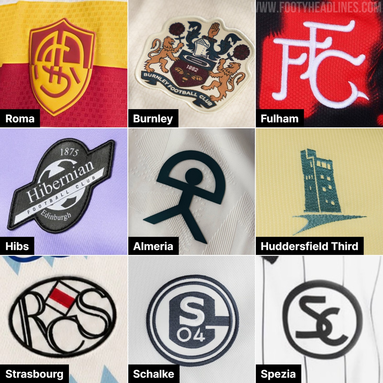
The 2026-2027 release season is going into its final phase. However, one trend is already obvious - the use of alternative club crests.

Alternative Club Logos on Kits: Civic Shields and Historical Symbols in 26-27

Alternative club crests are reaching a peak in the 26-27 season. What originally began as isolated retro throwbacks or minimalist experiments on third kits has evolved into a widespread design standard applied across home, away, and third jerseys. Sportswear manufacturers and clubs are increasingly opting for standalone symbols, historical emblems, and civic heraldry in place of traditional primary crests.

The cannon is synonymous with Arsenal, but it is the alternative logo
The initial phase of this trend was driven by brands seeking to bridge high-performance athletic kit specs with off-pitch lifestyle apparel. Adidas and Nike have helped establish the format by reintroducing standalone iconography - such as Arsenal's cannon, Liverpool's Liver Bird, and Roma's Lupetto. The commercial and visual success of these releases demonstrated strong demand for simplified branding, encouraging brands to expand alternative crest concepts across broader kit collections.


Wolves and Southampton
For the 26-27 season, alternative crest application has diversified into municipal and historical heraldry. A primary example is Southampton’s 26-27 Puma third kit, which replaces the standard club crest with the city's official coat of arms, set against an ivory base with subtle Bargate-inspired architectural patterning. Similarly, Wolverhampton Wanderers incorporated the city's coat of arms into their 26-27 home kit releases as part of the club's 150th anniversary celebrations.
This shift aligns with broader commercial strategies where kit design is tailored for streetwear integration. Simplified icons - such as Chelsea's standalone lion, Arsenal's cannon, or Manchester United's Lancashire rose accents- translate more easily into casual wear.


As the 26-27 kit rollout continues, crest flexibility has shifted from an occasional design choice into a core element of modern football branding. By balancing traditional primary crests with civic symbols and vintage emblems, kit manufacturers are able to offer distinct visual identities across a club's full three-kit lineup each season.
One of the main reasons for the use of alternative logos is the sheer number of kits coming out. With many teams releasing four or five kits per year, alternative crests provide a very effective change.

Indeed, the probably most prominent example of alternative logos is the Trefoil. By using their heritage symbol, Adidas managed to generate a real hype.
Do you like the use of different logos on kits? Comment below.