


All-New DFB-Pokal Logo & Visual Identity Unveiled
 , by Max
- New Visual Identity Launch: The German Football Association (DFB) has unveiled a brand-new visual identity and refreshed logos for the DFB-Pokal, DFB-Pokal Frauen, and DFB-Pokal Junioren, set to debut for the 26-27 campaign after a decade since the last major redesign.
- Logo Design Elements: Developed with Strichpunkt, the new competition emblems replace the spiraling ribbon with bold, realistic silhouettes of the actual trophies, featuring refined German flag accents, cleaner typography, and an updated DFB central emblem.
- Modern Tone & Digital Palette: The rebrand aims to connect with younger audiences through a raw, dynamic aesthetic for highlights and behind-the-scenes content, introducing violet/purple as a striking new electric contrast color for digital platforms, while classic Pokal green remains for venues.
The German Football Association (DFB) has officially launched a brand-new visual identity and refreshed logos for the DFB-Pokal ahead of the 26-27 campaign. Marking the tournament's first major visual overhaul in ten years since the previous 2016 redesign, the updated look unifies and modernizes the men's DFB-Pokal, the DFB-Pokal Frauen, and the DFB-Pokal Junioren.
Take a Look at the All-New Logos


Developed in collaboration with renowned Stuttgart design agency Strichpunkt, the new competition emblems say goodbye to the spiraling ribbon aesthetic used since 2016. In its place, the new logos feature realistic, bold silhouettes of the actual physical trophies. The outer circular framework has also been updated, featuring refined German flag accents (black, red, and gold) along the lower curve and modern, cleaner typography. The central DFB emblem placed on each trophy has also been aligned with the federation's recently updated brand identity.
Modern Tone & Purple Digital Palette

The rebrand aims to connect the historic knockout competition more closely with younger audiences. Built around the concept of making the tournament's energy "louder, emotional, and surprising," the new aesthetic adopts a raw, dynamic look for highlight clips, stadium stories, and locker room access.
While the stadiums and host venues will continue to emphasize classic Pokal green, the digital presentation is receiving a striking overhaul with the introduction of violet/purple as an electric contrast color across social media and digital platforms.
Before and After
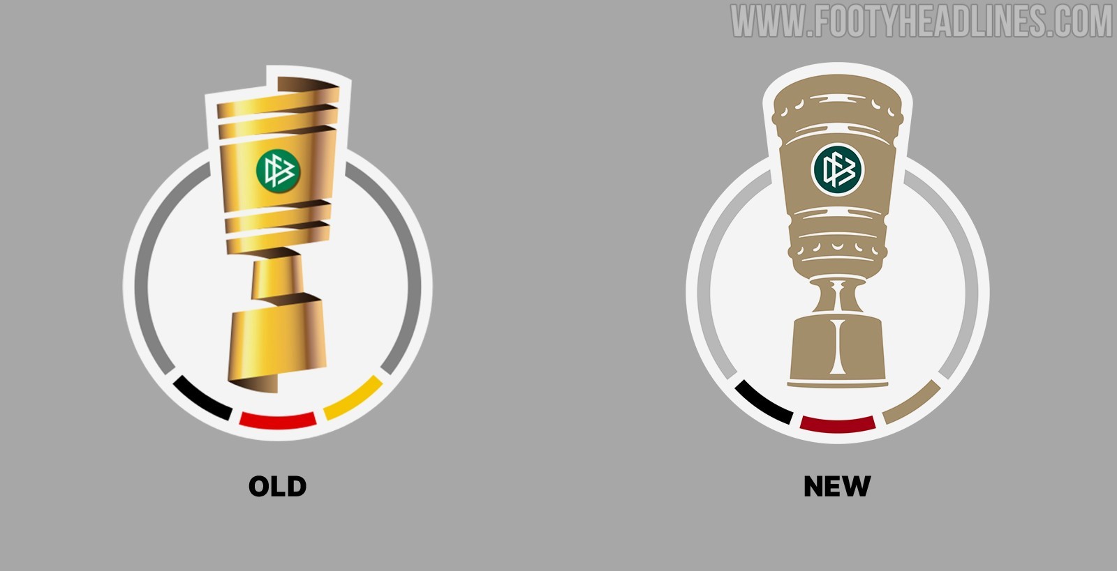
The full rebranding will debut across broadcast graphics, official sleeve patches, digital channels, and stadium dressing starting with the opening rounds of the 26-27 season.
What do you think of the new DFB-Pokal logo and visual identity?