

Chelsea Quietly Updates Club Logo
- Club Logo Update: Chelsea quietly debuted a newly refined version of their iconic club crest by updating their profile pictures across official social media platforms.
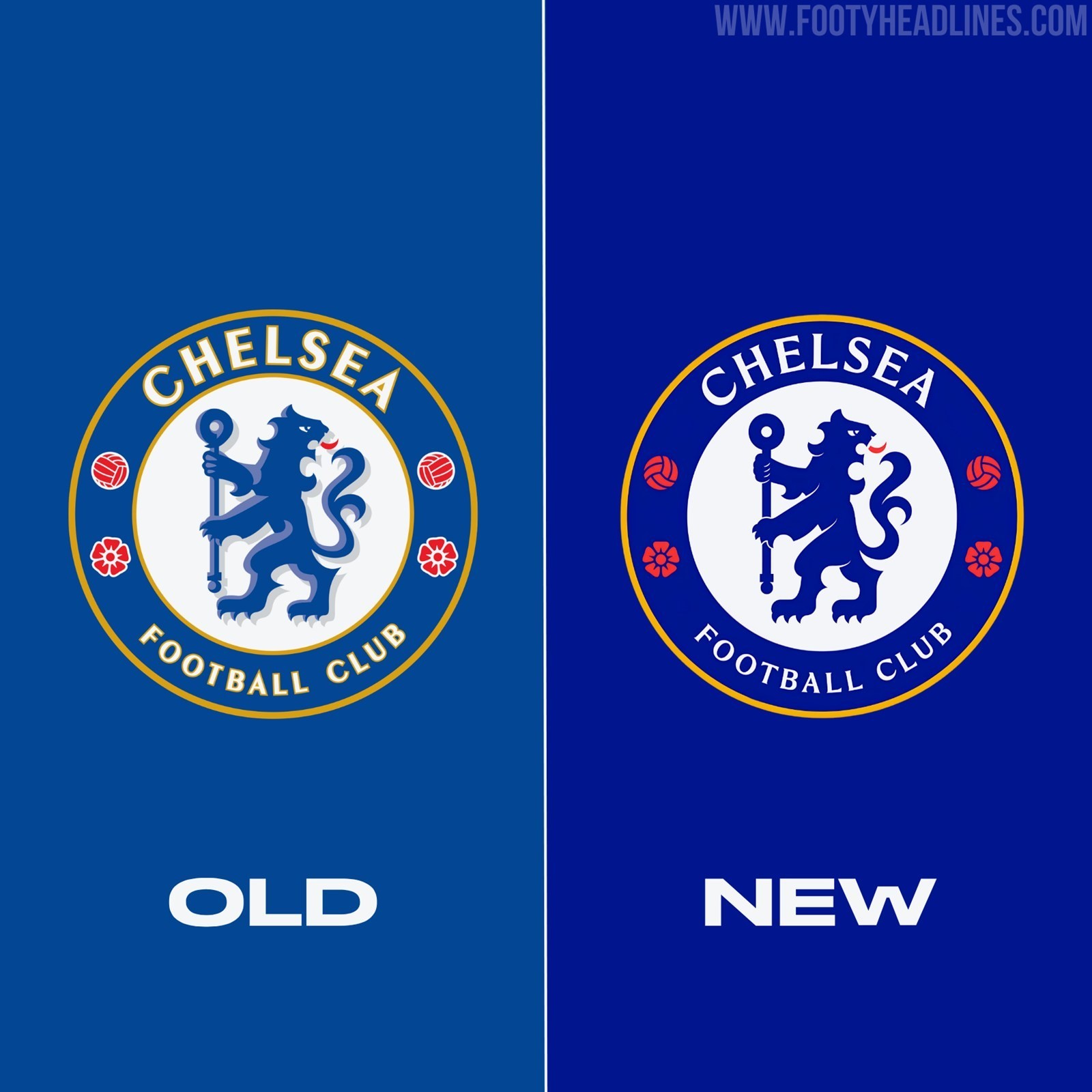
- Design Philosophy: The new Chelsea 2026 logo retains its original design, implementing subtle graphic modifications to streamline and modernize it with a flatter, borderless 2D aesthetic.
- Key Graphic Modifications: Specific tweaks include a deeper base blue color, removal of various yellow and white borders, simplifying the central lion to a flat 2D graphic, and updating the typography to match the club's bespoke typeface.
Yesterday, Chelsea surprised eagle-eyed fans by quietly updating their profile pictures across their official social media platforms, debuting a newly refined version of their iconic club crest.
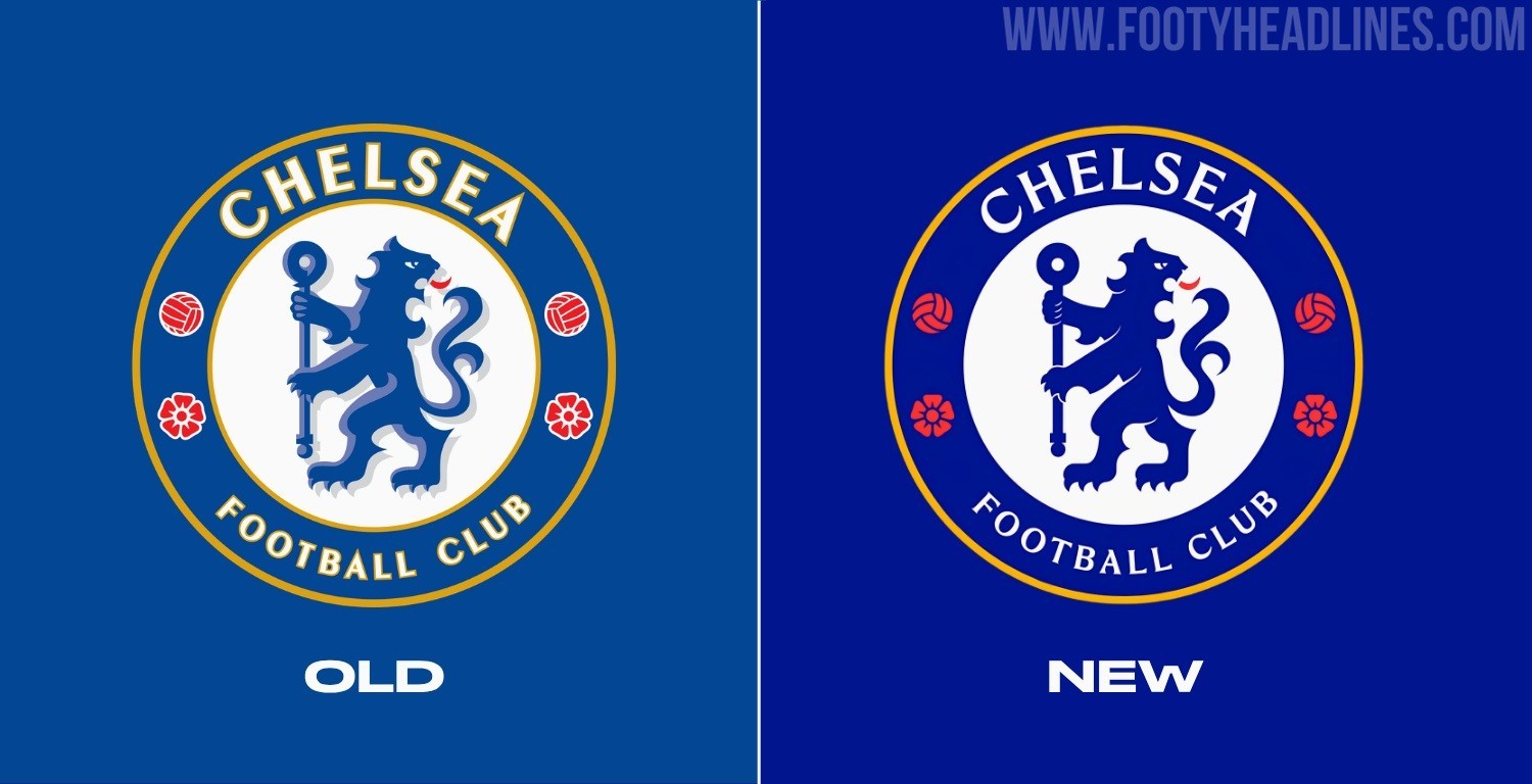
New Chelsea 2026 Logo
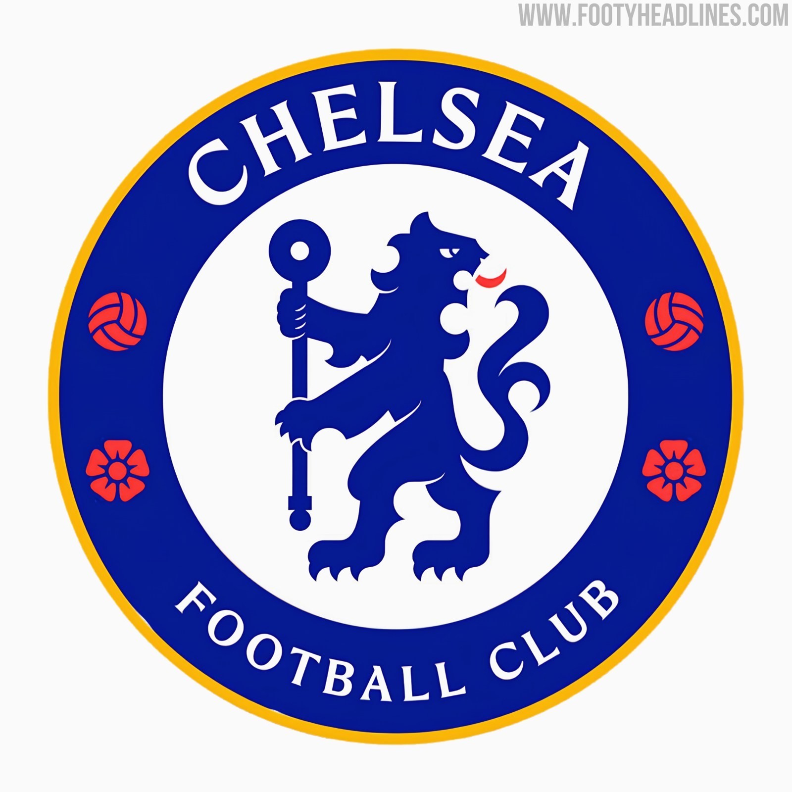
The new Chelsea 2026 logo retains its original design and overall layout. The club has implemented several subtle graphic modifications to streamline and modernize the logo.
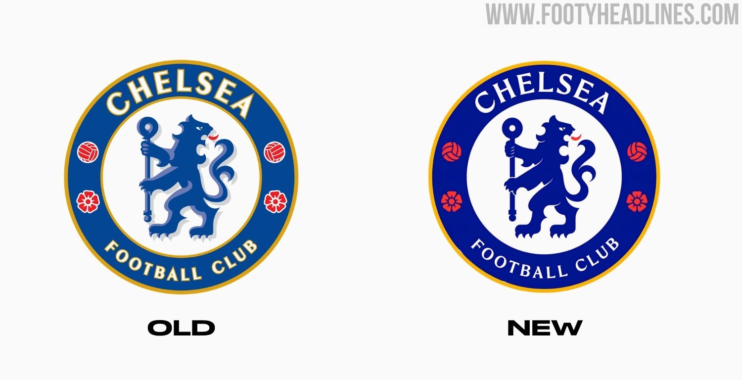
Here is a detailed breakdown of all the specific tweaks made to the new crest:
- Deeper Base Color: The primary blue background of the crest has been adjusted to a noticeably darker, richer shade.
- Border Removals: The yellow outlining that previously wrapped around the inner white circle, as well as the yellow borders around the "Chelsea" and "Football Club" text, have been completely stripped away. Additionally, the white borders surrounding the red footballs and Tudor roses have been removed to create a cleaner finish.
- Flat 2D Lion: Moving away from the dated 3D effects, the drop shadows on the central blue lion have been eliminated, simplifying the figure into a crisp, flat 2D graphic.
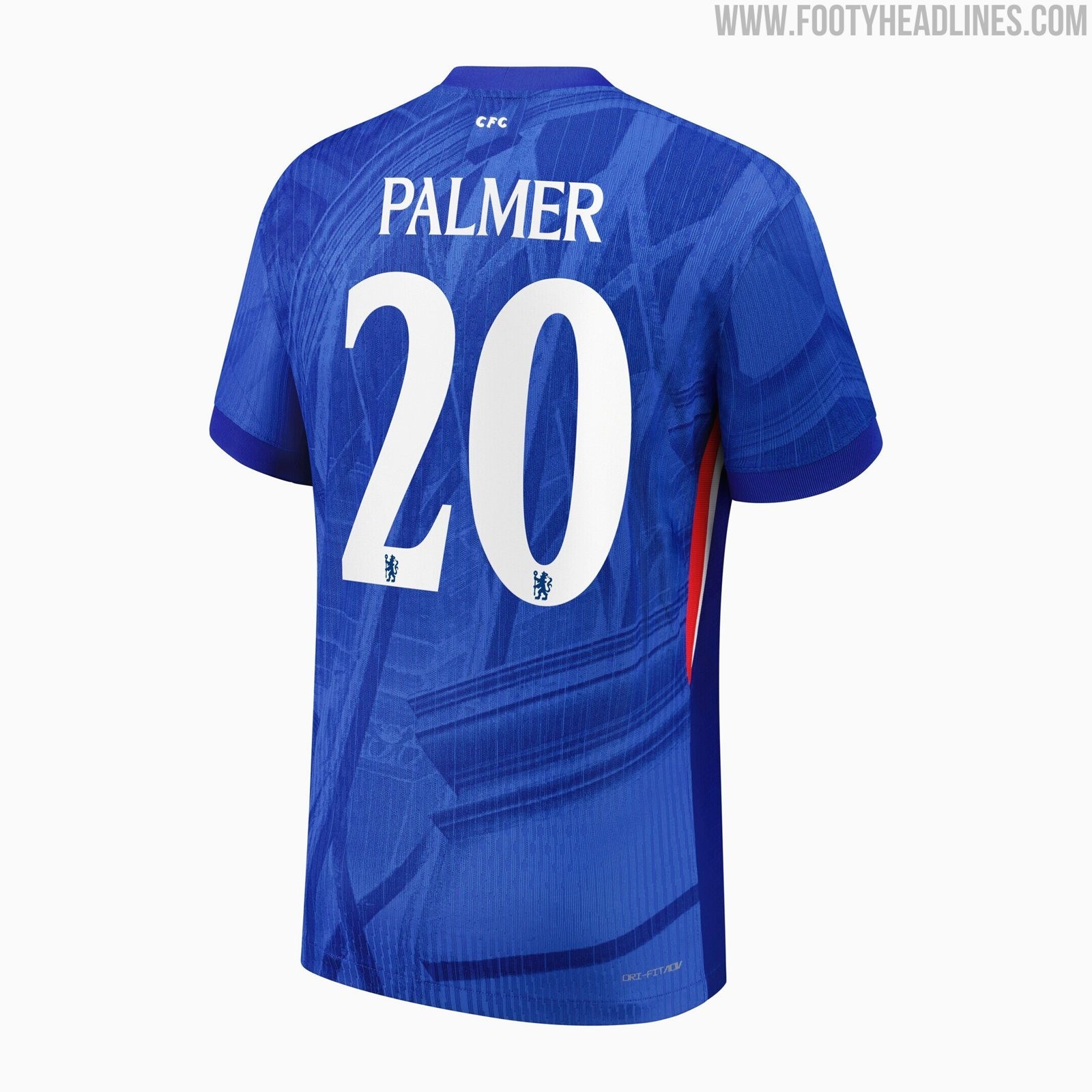
- Updated Typography: The lettering on the crest has been subtly updated to match the club's own bespoke typeface, creating visual consistency with the font used on their kits since the 2025-26 season.
This shift towards a flatter, borderless 2D aesthetic aligns perfectly with the current digital design trends seen across world football, resulting in a much cleaner and sharper look for the London club.
What do you think of these subtle graphical updates to the Chelsea logo? Do you prefer this modernized 2D flat design over the older 3D version? Let us know your thoughts in the comments below!