All-New Bundesliga & Premier League Sleeve Sponsors - Here Are The Best & Worst Ones


Both the German Bundesliga and the English Premier League are allowing all clubs to sign individual sleeve sponsorship deals from the 2017-18 season. Most teams had not many experiences with individual sleeve sponsors, and therefore the readability and the look of various sleeve advertisers is anything but perfect. We take a look at the best and worst examples of how to put a logo on the sleeves to generate a maximized advertising impact.

The sleeve logos in the Premier League can be a maximum of 100cm2, which is larger than what is possible in the Bundesliga.
2017-2018 Sleeve Sponsorship Logo Designs - Bad Ones


There are various examples of hardly readable and bad looking sponsor logos, especially in the German Bundesliga. The logos on the sleeves of teams such as RB Leipzig (CG Gruppe), Eintracht Frankfurt (Deutsche Börse) and FC Augsburg (Baramundi) could be much better readable, while Bayer Leverkusen's sleeve logo of the "Westminster-Unternehmensgruppe" is possibly the worst sleeve sponsor example in terms of readability (They receive 500,000 Euro / season for the deal).

Bundesliga teams also have the most outrageous logos on their sleeves, with Hertha BSC having the logo of 1 Euro store TEDi on the sleeves of their 85 Euro Nike kits.

Chelsea's Alliance Tyres, Leicester's SCB and Swansea's Barracuda are examples of rather bad looking / hardly readable sleeve sponsorships.


2017-2018 Sleeve Sponsorship Logo Design - Good Ones


Logically, many teams also managed to have good looking and easily visible sleeve sponsors, with Liverpool's Western Union, Manchester City's Nexen Tyres and Dortmund's Opel among the best looking / readable ones.

Another great example of how a sleeve sponsor can gain much attention just with the logo on the sleeves is UPS, Wolfsburg's new sleeve sponsor.
However, it is also important to note that the placement and look of the sleeve sponsorship logo is only the first task for advertisers and clubs, while the more difficult and equally important challenge is to 'activate' the sponsorship deal on social media and other platforms such as advertising LED panels. It is, however, safe to assume that there is a relation between the look of the logo on the sleeves and the attention a sleeve sponsor gets.


What do you think of this? Do you know other examples of nearly unreadable sponsor logos? Let us know in the comments below.


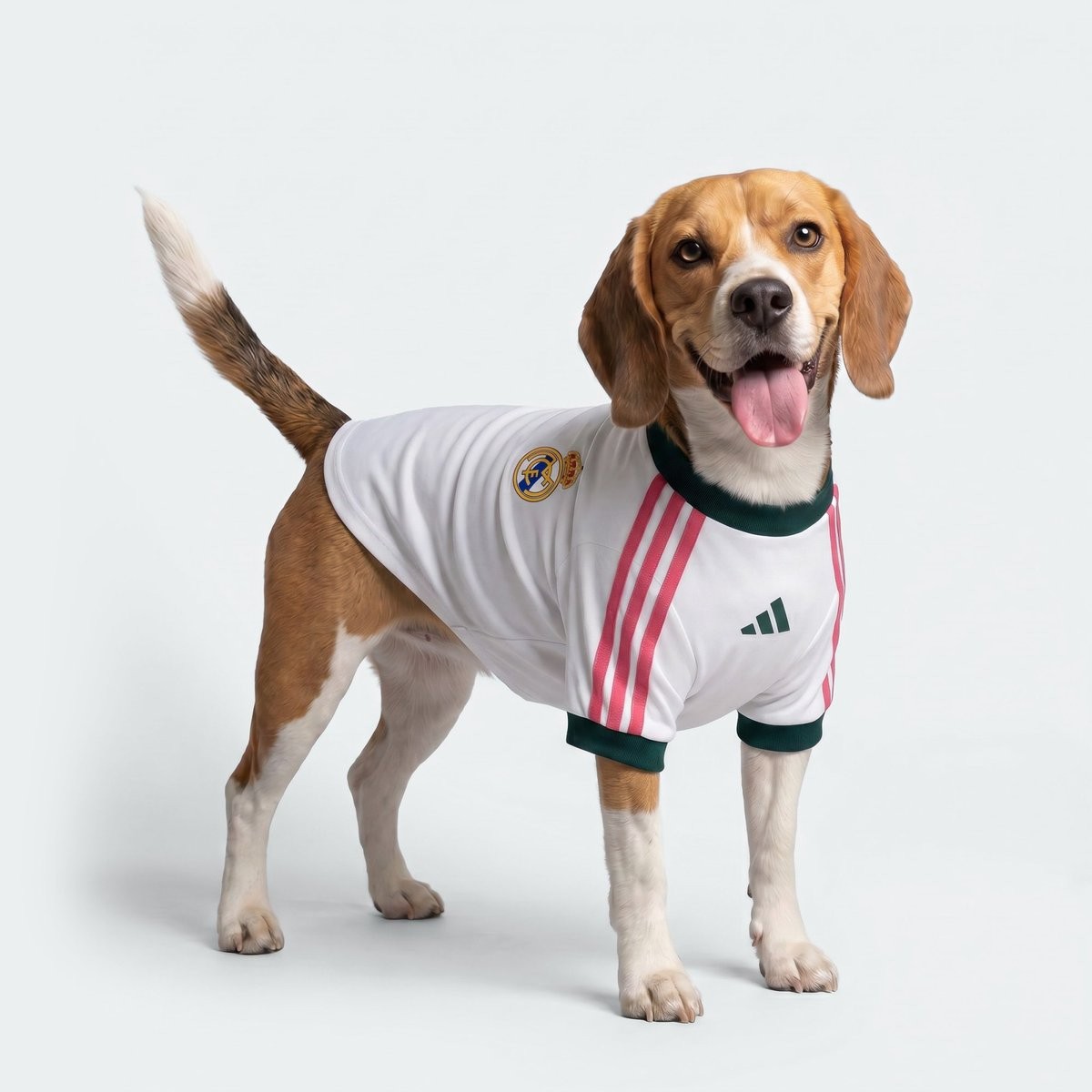
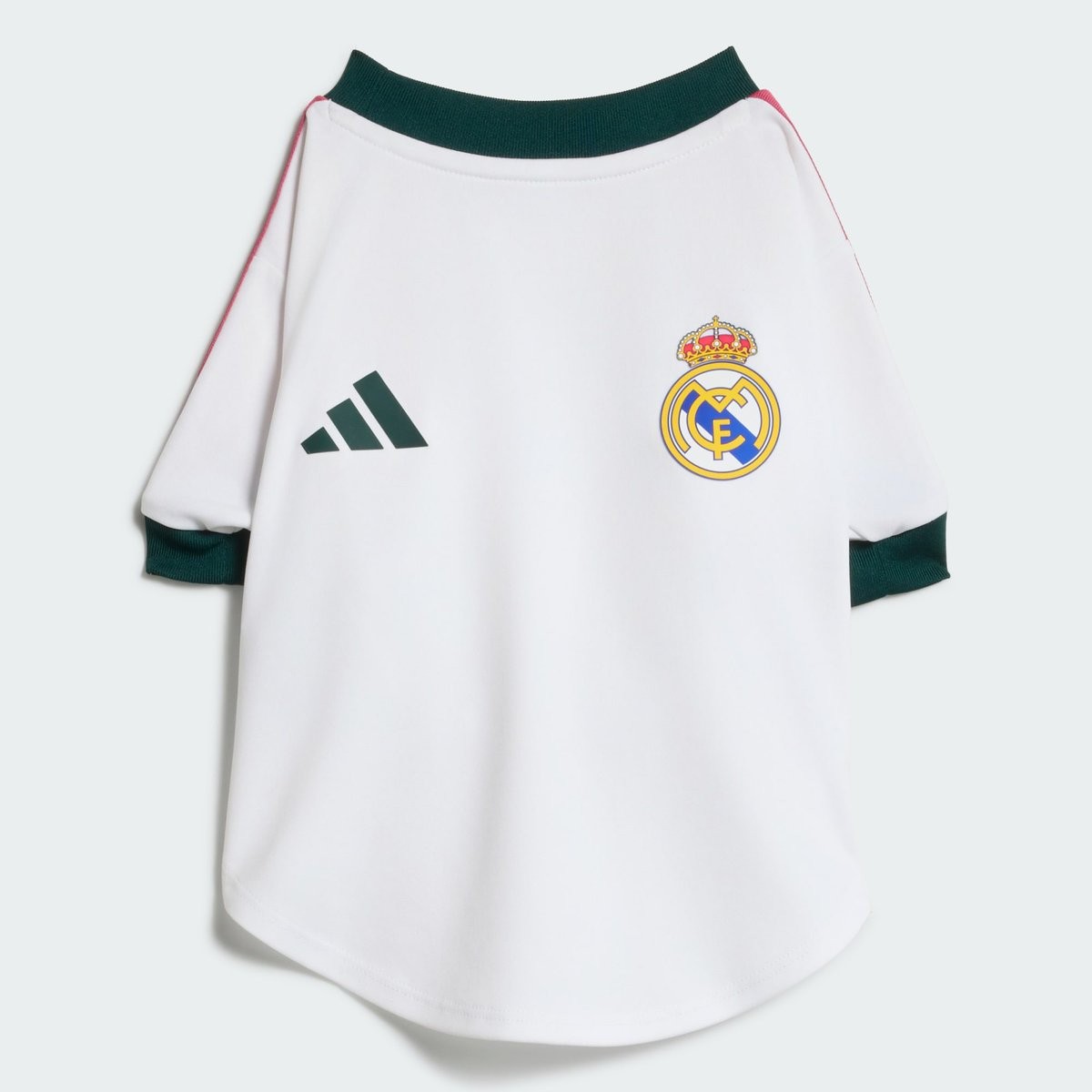
Adidas Launches Special 26-27 Dog Kit for Real Madrid
Adidas has released a dedicated kit for dogs linked to Real Madrid. The designs adapt the club's new 2026-2027 home kit.
The collection lets fans outfit their pets to match the team's look. It builds on Adidas's growing range of pet products, including similar jerseys created for select national teams ahead of the 2026 World Cup.
Arsenal Sends Kit Without Adidas Logo & Arsenal Crest
Arsenal shirt collector @NathanPanter_52 has posted images of the 26-27 home shirt bought for £136 that is missing both the Adidas logo and the club crest. The item is an official product - it is very uncommon that something like that happens.
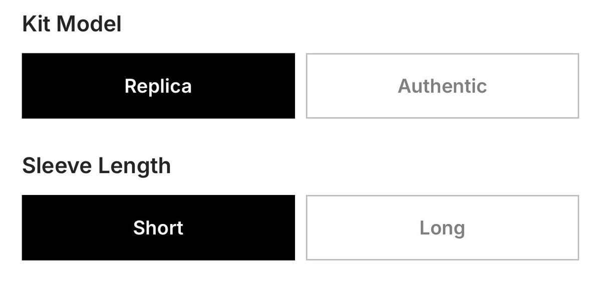
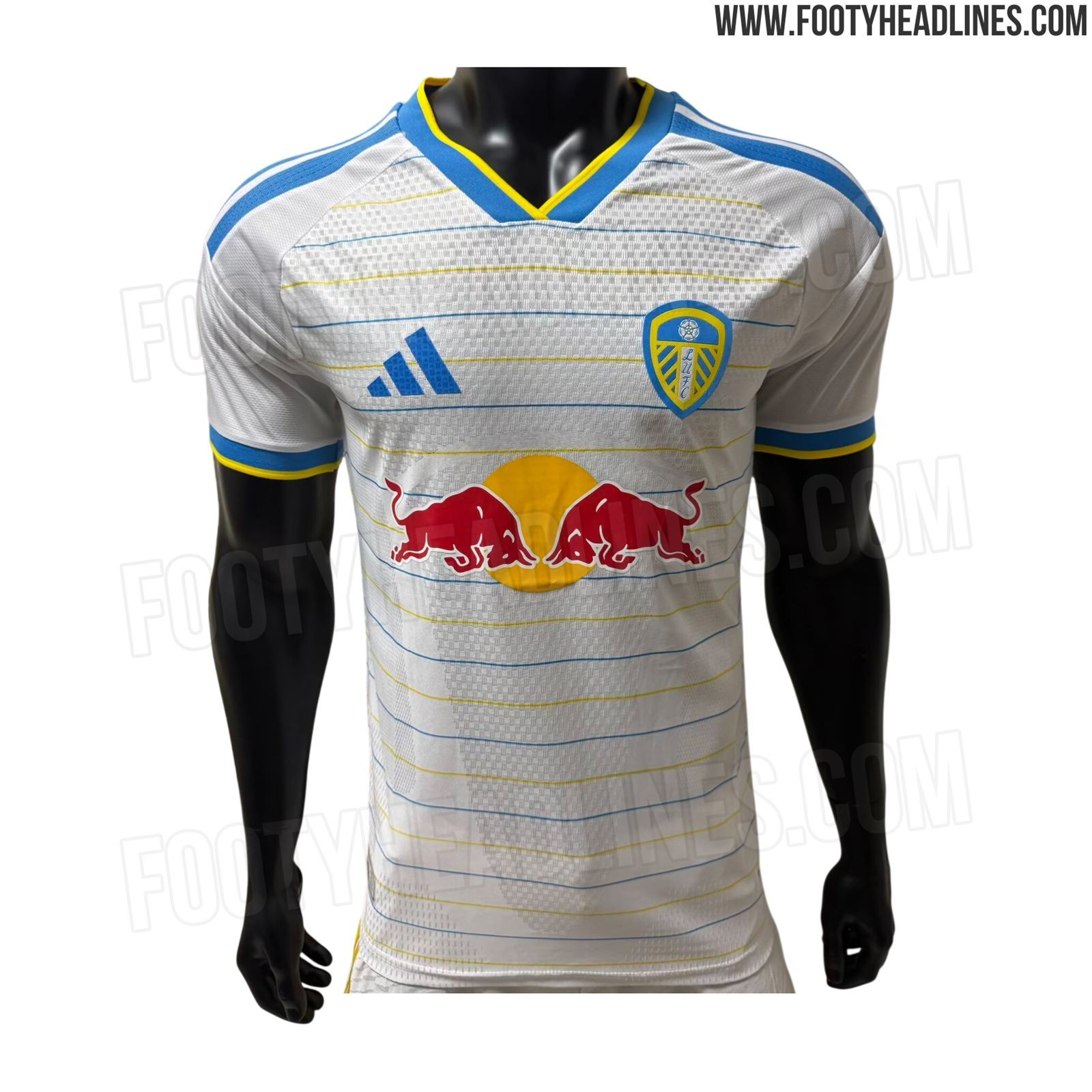
LEAKED: Adidas to Upgrade Leeds United to Local Elite Tier
As spotted by @theadelites, a new customisation option on the Leeds United club shop website allows fans to chosse between replica and authentic kits (added by error too early). This probably means that Adidas has upgraded the club from the B Premium tier to one of the Local A Elite tiers. The move gives fans the option to select authentic kits built around advanced Climacool+ performance technology.
Reports from February indicated similar upgrades for clubs including Ajax and Lyon ahead of the 2026-27 season, but Adidas apparently postponed/scrapped these. Adidas previously already upgraded British teams Celtic, Aston Villa, and Newcastle United.


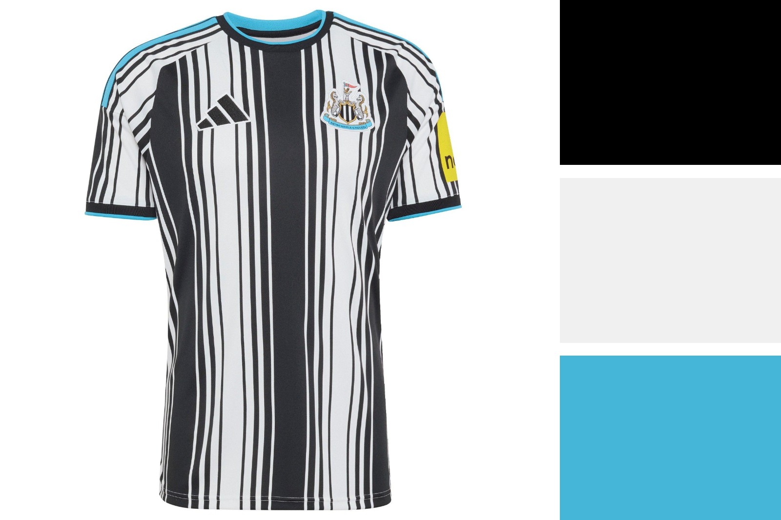
A quick color analysis of Newcastle's 26-27 home kit. It are not the colors that make this shirt bad, unlike the Madrid 26-27 kit.
