Real Madrid Debuts Remarkable Badly Prepared, Wrong La Liga Font

This week, we reported that Real Madrid and Atletico have somehow neglected the existence of the new league-wide La Liga font as they had been not wearing the typeface in any games so far and do not sell it in their stores. However, both teams logically had to use the league-wide font in their La Liga opener, respectively. But while Atletico's version of the league-wide font was spot on, Real Madrid 's typeface was not well prepared for the reigning champions.
Real Madrid Uses Non-Customized, Slightly Wrong Version Of New League-Wide La Liga Font
Real Madrid's numbers missed the Real Madrid crest as well as the white silhouette (via Pedro Mayo).
Real Madrid's typeface used in the La Liga opener against Deportivo missed two important parts. First, while all La Liga teams should have the club's crest on the bottom of the font, Real Madrid typeface did not have this feature. Second, the numbers and letters both missed the blanked-out parts creating a white silhouette.


To see how the Real Madrid font was intended look like on Real Madrid's kits, we can check out the FIFA 18 beta, which featured it as well as images of other teams such as Barcelona.


We strongly expect that Real Madrid will fix the problems with the league-wide font in the coming weeks as such as a unprofessional work is not typical for the club.

Share your thoughts in the comments below.


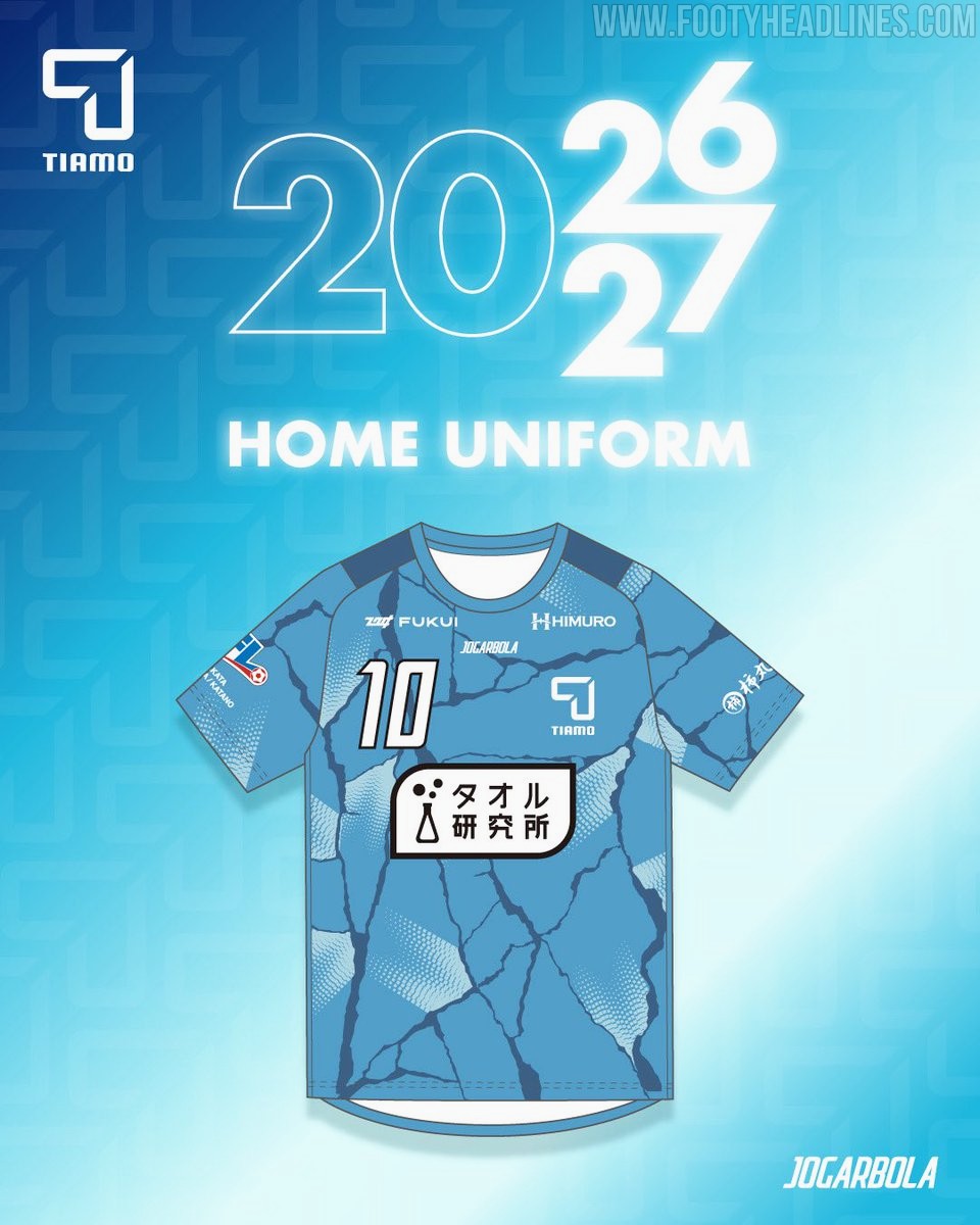
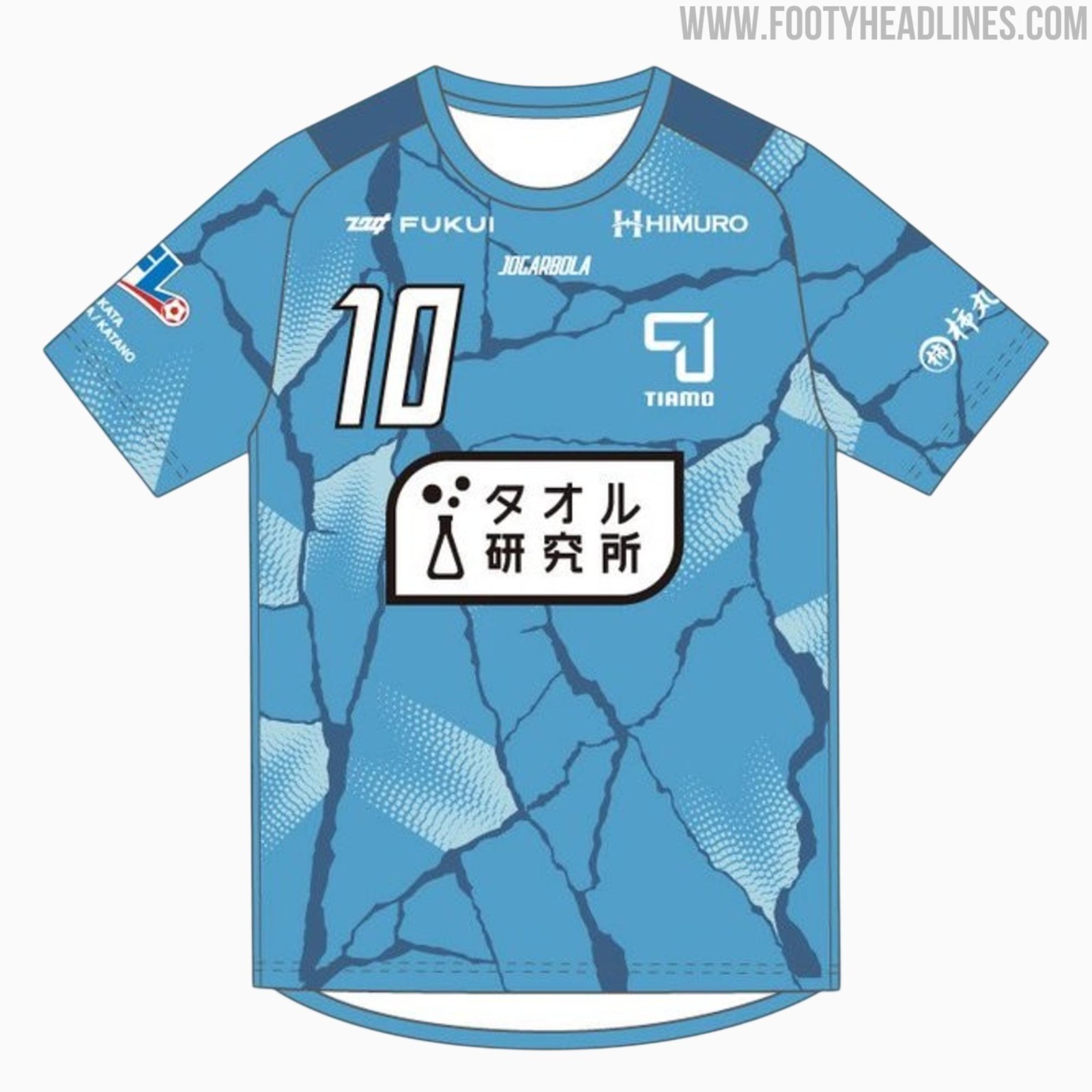
FC Tiamo Hirakata 26-27 Home Kit Released
Japanese Football League side FC Tiamo Hirakata has officially unveiled their new 2026-27 home kit, produced by sportswear brand Jogarbola. The release introduces a cracking design under the club's Reborn campaign for the upcoming JFL season, symbolizing a new beginning for the club.


Brighton to Wear 125th Anniversary Kit Against Arsenal
Brighton & Hove Albion have confirmed they will wear their limited-edition Nike 125th anniversary kit during their 2026-27 match against Arsenal in September 2026. The special shirt, which was initially released in May 2026 and draws inspiration from the club's original 1901 kit, will be showcased on the pitch to celebrate the club's founding milestone. Although the official anniversary falls on June 24, the commemorative fixture against the Gunners has been selected as the dedicated anniversary match where the team will debut the historic design.
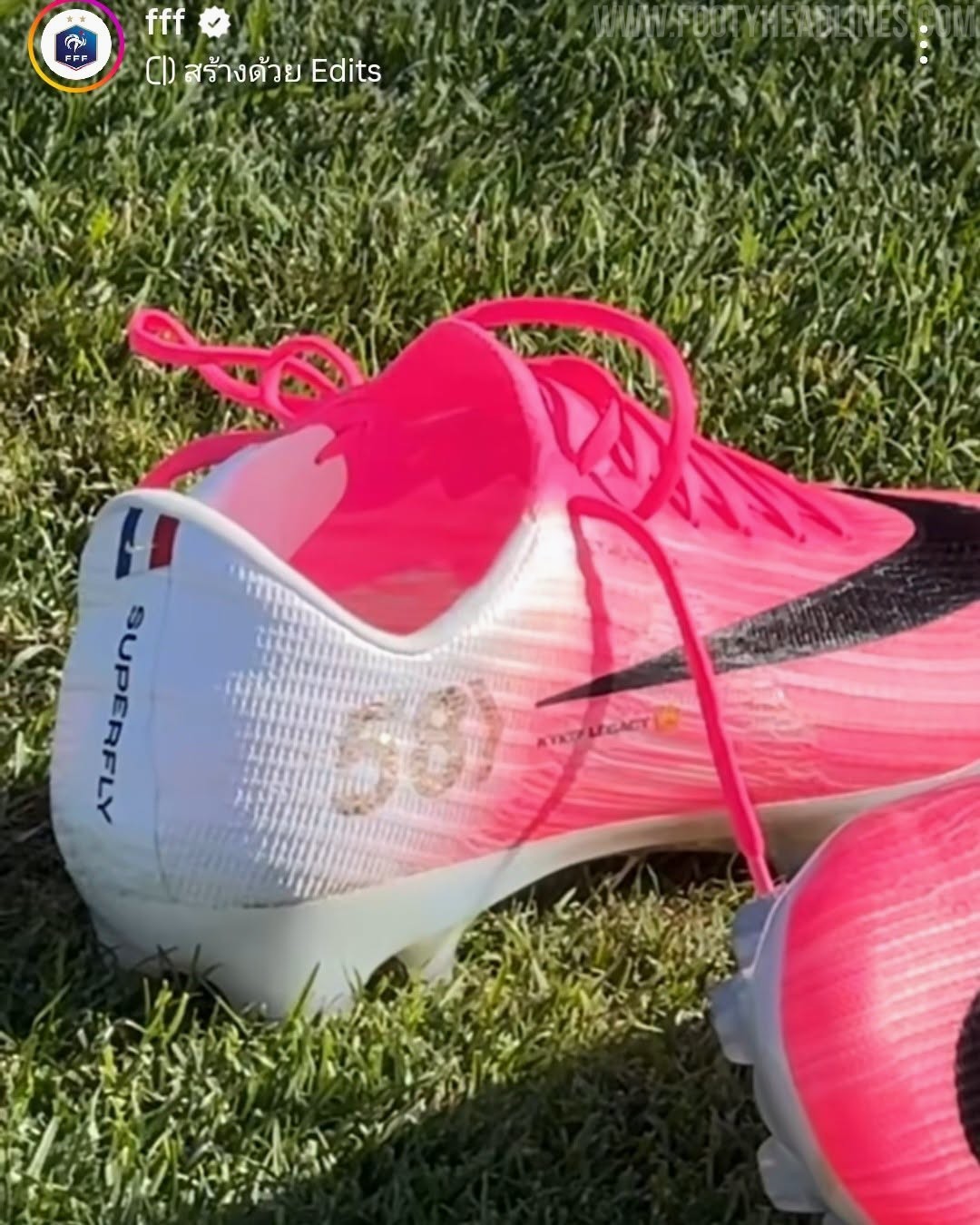
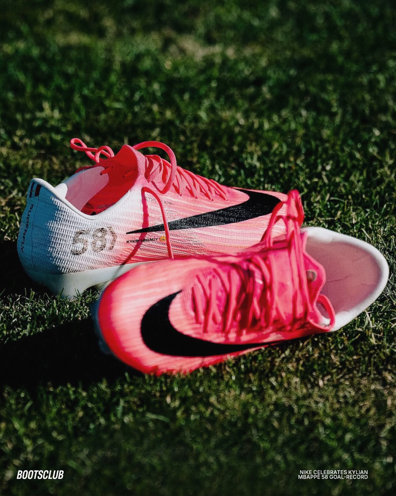
Nike Creates Personalized Mercurial 2026 World Cup Boots for Kylian Mbappé's France Goalscoring Record
Kylian Mbappé has officially cemented his legacy as the greatest goalscorer in the history of the French national team, surpassing Olivier Giroud to take the top spot. To celebrate this historic milestone of reaching 58 international goals, Nike has presented the star forward with a personalized pair of Mercurial Superfly 11 boots. This special edition footwear arrives just in time as Mbappé prepares to make his 100th appearance for Les Bleus.
The custom Nike Mercurial Superfly 11 Mbappé 2026 World Cup boots features a distinct "58" lightly printed on the lateral side of the heel, representing his record-breaking goal tally. Additionally, a small French tricolor flag is prominently positioned near the heel collar, paying direct homage to his national team.